Pharo 60 need help white-theme-color-for-button-is-not-good

https://pharo.fogbugz.com/f/cases/19657/white-theme-color-for-button-is-not-... If we compare the selection color for the dark theme, the blue is stronger and much better to see. This is particularly true for class/instance side button, I would be good to have a better white theme with stronger selection colors.

I proposed that a while ago because these gradients are bad looking (especially in an age of flat design). https://pharo.fogbugz.com/f/cases/13132/Ugly-gradients-in-Pharo3Theme-Not-in... Same for those ugly flat scrollbars. https://pharo.fogbugz.com/f/cases/13136/Pharo3Theme-scrollbars-looking-like-... This one has a slice. Maybe Pharo 6 is not too late for those slices. Phil On Mon, Feb 6, 2017 at 5:59 PM, Stephane Ducasse <stepharo.self@gmail.com> wrote:
https://pharo.fogbugz.com/f/cases/19657/white-theme-color- for-button-is-not-good
If we compare the selection color for the dark theme, the blue is stronger and much better to see. This is particularly true for class/instance side button,
I would be good to have a better white theme with stronger selection colors.
No it is important. There is no point to have a supercool system that looks so bad and turn people off. But I do not get it your 13136 was integrated. On Mon, Feb 6, 2017 at 6:28 PM, phil@highoctane.be <phil@highoctane.be> wrote:
I proposed that a while ago because these gradients are bad looking (especially in an age of flat design).
https://pharo.fogbugz.com/f/cases/13132/Ugly-gradients-in- Pharo3Theme-Not-in-line-with-the-times
Same for those ugly flat scrollbars.
https://pharo.fogbugz.com/f/cases/13136/Pharo3Theme- scrollbars-looking-like-dead-without-visual-indicators
This one has a slice.
Maybe Pharo 6 is not too late for those slices.
Phil
On Mon, Feb 6, 2017 at 5:59 PM, Stephane Ducasse <stepharo.self@gmail.com> wrote:
https://pharo.fogbugz.com/f/cases/19657/white-theme-color-fo r-button-is-not-good
If we compare the selection color for the dark theme, the blue is stronger and much better to see. This is particularly true for class/instance side button,
I would be good to have a better white theme with stronger selection colors.

On 7 Feb 2017, at 08:07, Stephane Ducasse <stepharo.self@gmail.com> wrote:
No it is important. There is no point to have a supercool system that looks so bad and turn people off. But I do not get it your 13136 was integrated.
No, this is exactly an example of this âeven the tiniest most obvious thing needs workâ. The slice was done for an older version, nobody cared to update it for the current development version, in the end the issue was closed as *nobody* cared to put 5 minutes in⦠There is no magic. "This issue is about Pharo3, with Pharo4 already released and Pharo5 under development, the changes can not be merged due to too many changes in the touched code. Please check Pharo5 and, if this change is still needed, resubmit a new slice. I will close this issue as "Stale (timeout)â.â Marcus
On Tue, Feb 7, 2017 at 8:07 AM, Stephane Ducasse <stepharo.self@gmail.com> wrote:
No it is important. There is no point to have a supercool system that looks so bad and turn people off.
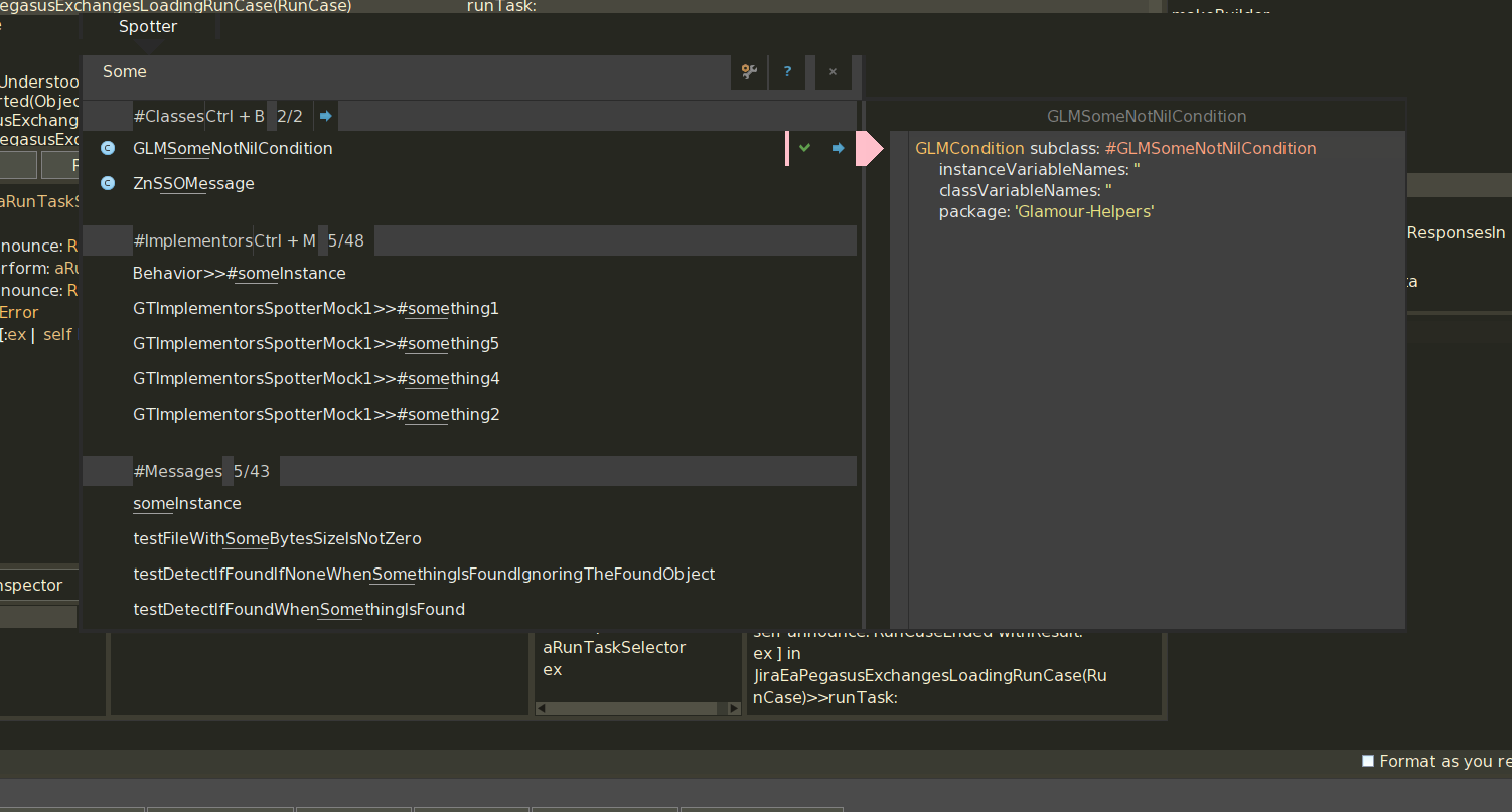
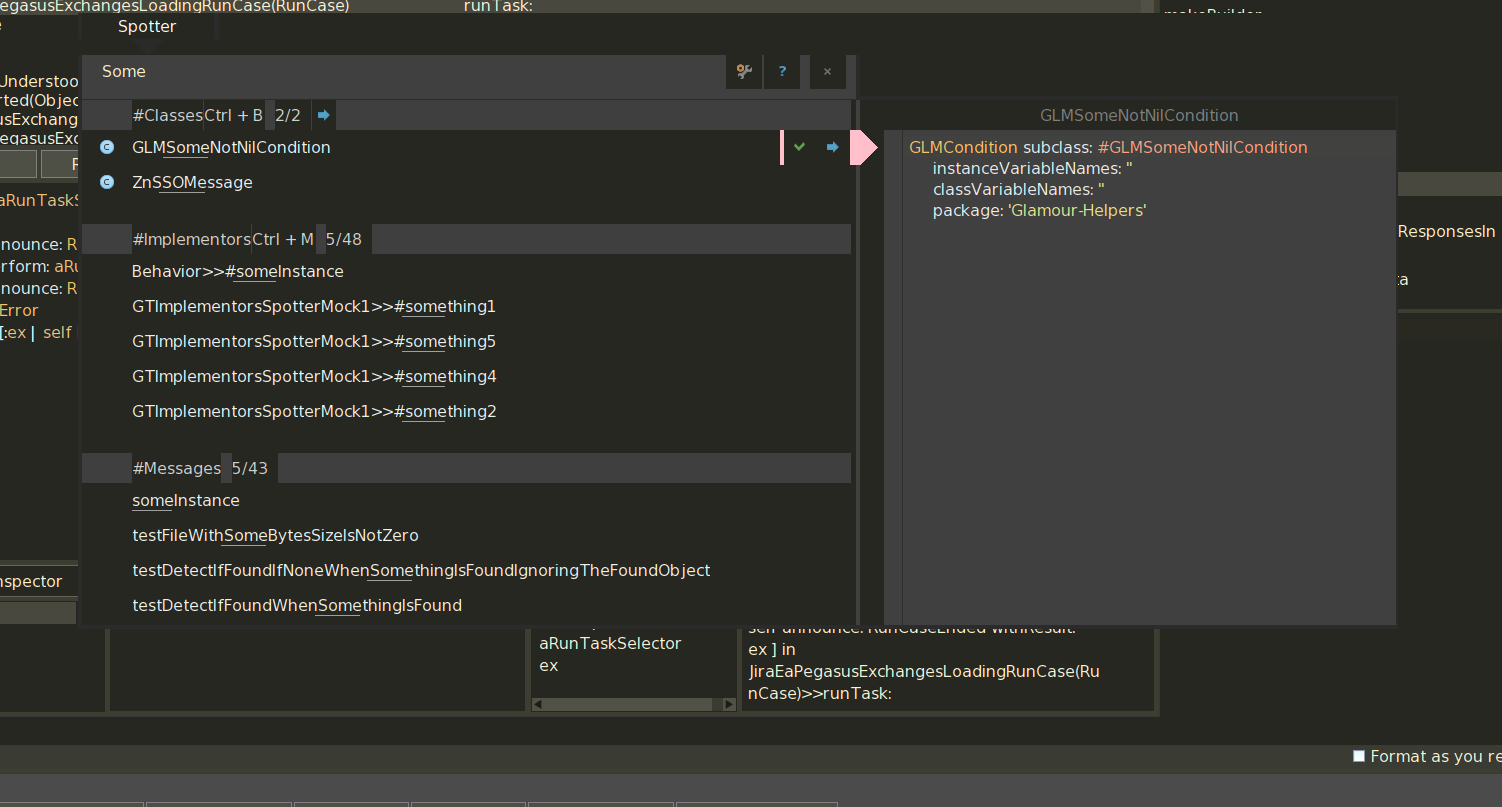
I agree to that. Skinning/Theming should be an important thing. I am working on Sublimish because it reveals a lot of things that are not in sync between GToolkit bits and Pharo standard bits (well, GT is now Pharo standard but still). See various grays/jungle grays discrepancy because of hardcoded things instead of having a ThemePalette thing (I do have one working for my local stuff, one I get the theme correct in full, I'll put it in the catalog of 5.0). [image: Inline image 2]
But I do not get it your 13136 was integrated.
Not in the way I wanted it. Scrollbar thumb is still needing a click to see it in light theme. I can have a look.
On Mon, Feb 6, 2017 at 6:28 PM, phil@highoctane.be <phil@highoctane.be> wrote:
I proposed that a while ago because these gradients are bad looking (especially in an age of flat design).
https://pharo.fogbugz.com/f/cases/13132/Ugly-gradients-in-Ph aro3Theme-Not-in-line-with-the-times
Same for those ugly flat scrollbars.
https://pharo.fogbugz.com/f/cases/13136/Pharo3Theme-scrollba rs-looking-like-dead-without-visual-indicators
This one has a slice.
Maybe Pharo 6 is not too late for those slices.
Phil
On Mon, Feb 6, 2017 at 5:59 PM, Stephane Ducasse <stepharo.self@gmail.com
wrote:
https://pharo.fogbugz.com/f/cases/19657/white-theme-color-fo r-button-is-not-good
If we compare the selection color for the dark theme, the blue is stronger and much better to see. This is particularly true for class/instance side button,
I would be good to have a better white theme with stronger selection colors.
Thanks this is important :) On Tue, Feb 7, 2017 at 11:36 AM, phil@highoctane.be <phil@highoctane.be> wrote:
On Tue, Feb 7, 2017 at 8:07 AM, Stephane Ducasse <stepharo.self@gmail.com> wrote:
No it is important. There is no point to have a supercool system that looks so bad and turn people off.
I agree to that. Skinning/Theming should be an important thing.
I am working on Sublimish because it reveals a lot of things that are not in sync between GToolkit bits and Pharo standard bits (well, GT is now Pharo standard but still). See various grays/jungle grays discrepancy because of hardcoded things instead of having a ThemePalette thing (I do have one working for my local stuff, one I get the theme correct in full, I'll put it in the catalog of 5.0).
[image: Inline image 2]
But I do not get it your 13136 was integrated.
Not in the way I wanted it. Scrollbar thumb is still needing a click to see it in light theme. I can have a look.
On Mon, Feb 6, 2017 at 6:28 PM, phil@highoctane.be <phil@highoctane.be> wrote:
I proposed that a while ago because these gradients are bad looking (especially in an age of flat design).
https://pharo.fogbugz.com/f/cases/13132/Ugly-gradients-in-Ph aro3Theme-Not-in-line-with-the-times
Same for those ugly flat scrollbars.
https://pharo.fogbugz.com/f/cases/13136/Pharo3Theme-scrollba rs-looking-like-dead-without-visual-indicators
This one has a slice.
Maybe Pharo 6 is not too late for those slices.
Phil
On Mon, Feb 6, 2017 at 5:59 PM, Stephane Ducasse < stepharo.self@gmail.com> wrote:
https://pharo.fogbugz.com/f/cases/19657/white-theme-color-fo r-button-is-not-good
If we compare the selection color for the dark theme, the blue is stronger and much better to see. This is particularly true for class/instance side button,
I would be good to have a better white theme with stronger selection colors.
participants (3)
-
 denker
 -
 phil@highoctane.be
 -
 Stephane Ducasse