On Tue, Feb 7, 2017 at 8:07 AM, Stephane Ducasse <stepharo.self@gmail.com> wrote:
No it is important. There is no point to have a supercool system that looks so bad and turn people off.
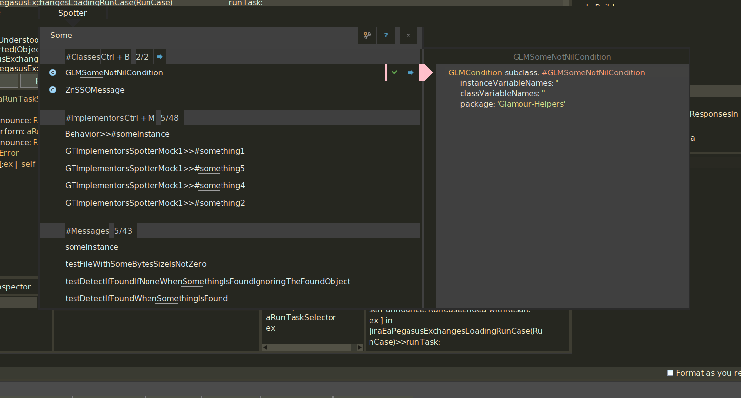
I agree to that. Skinning/Theming should be an important thing. I am working on Sublimish because it reveals a lot of things that are not in sync between GToolkit bits and Pharo standard bits (well, GT is now Pharo standard but still). See various grays/jungle grays discrepancy because of hardcoded things instead of having a ThemePalette thing (I do have one working for my local stuff, one I get the theme correct in full, I'll put it in the catalog of 5.0). [image: Inline image 2]
But I do not get it your 13136 was integrated.
Not in the way I wanted it. Scrollbar thumb is still needing a click to see it in light theme. I can have a look.
On Mon, Feb 6, 2017 at 6:28 PM, phil@highoctane.be <phil@highoctane.be> wrote:
I proposed that a while ago because these gradients are bad looking (especially in an age of flat design).
https://pharo.fogbugz.com/f/cases/13132/Ugly-gradients-in-Ph aro3Theme-Not-in-line-with-the-times
Same for those ugly flat scrollbars.
https://pharo.fogbugz.com/f/cases/13136/Pharo3Theme-scrollba rs-looking-like-dead-without-visual-indicators
This one has a slice.
Maybe Pharo 6 is not too late for those slices.
Phil
On Mon, Feb 6, 2017 at 5:59 PM, Stephane Ducasse <stepharo.self@gmail.com
wrote:
https://pharo.fogbugz.com/f/cases/19657/white-theme-color-fo r-button-is-not-good
If we compare the selection color for the dark theme, the blue is stronger and much better to see. This is particularly true for class/instance side button,
I would be good to have a better white theme with stronger selection colors.