
I found this interesting article <https://hackernoon.com/apple-and-others-need-a-dark-mode-for-people-like-mol...> . I wanted to express my opinion... Dark mode looks cool and all, but it does have a downside. I was very happy with the normal Pharo 5.0 look, but when Pharo 6.0 came out with its dark theme, I was rather put off by it. For me, at least, the dark theme makes it harder to read the text. Too bad Pharo isn't themable. -- View this message in context: http://forum.world.st/Dark-Mode-tp4964409.html Sent from the Pharo Smalltalk Users mailing list archive at Nabble.com.

Sure it is⦠AFAIK the light theme is still available in the settings On 27 August 2017 at 00:40, horrido <horrido.hobbies@gmail.com> wrote:
I found this interesting article <https://hackernoon.com/apple-and-others-need-a-dark-mode- for-people-like-molly-watt-ae9fdc38479f> . I wanted to express my opinion...
Dark mode looks cool and all, but it does have a downside. I was very happy with the normal Pharo 5.0 look, but when Pharo 6.0 came out with its dark theme, I was rather put off by it. For me, at least, the dark theme makes it harder to read the text. Too bad Pharo isn't themable.
-- View this message in context: http://forum.world.st/Dark- Mode-tp4964409.html Sent from the Pharo Smalltalk Users mailing list archive at Nabble.com.
Oh, cool! I didn't realize that. (I've never had a need to look at Settings.) Thanks. -- View this message in context: http://forum.world.st/Dark-Mode-tp4964409p4964436.html Sent from the Pharo Smalltalk Users mailing list archive at Nabble.com.

It's also a single click in the Welcome screen - which is maybe too obvious ;) Tim Sent from my iPhone
On 27 Aug 2017, at 03:17, horrido <horrido.hobbies@gmail.com> wrote:
Oh, cool! I didn't realize that. (I've never had a need to look at Settings.)
Thanks.
-- View this message in context: http://forum.world.st/Dark-Mode-tp4964409p4964436.html Sent from the Pharo Smalltalk Users mailing list archive at Nabble.com.

Too bad Pharo isn't themable.
If you don't know whether it is themable, you can just ask instead of issuing statements. ;) I've also seen Sublimish theme (don't know where the repo is), Dark Metal Theme ( https://github.com/estebanlm/themes ), Kilon has blue-ish theme (I don't think he published it anywhere), and there was also ubuntu theme (not sure if it still works, https://pharoweekly.wordpress.com/2015/07/04/ubuntu-theme-for-pharo/) But white & dark are supported. (I switch between them regularly, especially on projector.) Of course you can create your own theme. Peter On Sun, Aug 27, 2017 at 11:55 AM, Tim Mackinnon <tim@testit.works> wrote:
It's also a single click in the Welcome screen - which is maybe too obvious ;)
Tim
Sent from my iPhone
On 27 Aug 2017, at 03:17, horrido <horrido.hobbies@gmail.com> wrote:
Oh, cool! I didn't realize that. (I've never had a need to look at Settings.)
Thanks.
-- View this message in context: http://forum.world.st/Dark- Mode-tp4964409p4964436.html Sent from the Pharo Smalltalk Users mailing list archive at Nabble.com.

Kilon has blue-ish theme (I don't think he published it anywhere),
The theme is called Nireas , its a dark theme based on blue color and is inspired by the best computer of all time. Amiga 500. Nireas is also a special theme because its a themable theme. It comes with a GUI that allows you to change its colors very easily to whatever you like. Should have probably named it "Chameleon" ;) I was planning to create also a preset system for it but I have been so happy with the blue theme that I never bothered it , together with the fact that none shown an actual interest in having a theme creation GUI. Of course people think its a cool idea, but I am talking here actual help, not words. Its super easy to get Nireas, it installs with a single click from the Package Browser from inside the image , like you install many other things. Its tested with each version because well, I always use the latest version of Pharo and there is close to zero reason why it would not work other than someone actually changing the theme classes. Of course its hosted on Github https://github.com/kilon/Nireas

Le 27/08/2017 à 02:52, Damien Pollet a écrit :
Sure it is⦠AFAIK the light theme is still available in the settings
There is also the possibility to do it through the welcome window. -- Cyril Ferlicot https://ferlicot.fr http://www.synectique.eu 2 rue Jacques Prévert 01, 59650 Villeneuve d'ascq France

On Sat, Aug 26, 2017 at 03:40:04PM -0700, horrido wrote:
I found this interesting article <https://hackernoon.com/apple-and-others-need-a-dark-mode-for-people-like-mol...> . I wanted to express my opinion...
Dark mode looks cool and all, but it does have a downside. I was very happy with the normal Pharo 5.0 look, but when Pharo 6.0 came out with its dark theme, I was rather put off by it. For me, at least, the dark theme makes it harder to read the text. Too bad Pharo isn't themable.
I completely agree - dark mode is great for content that you want to look cool, but no one consumes. :-) You can also automate switching to the light theme with a startup.st: StartupPreferencesLoader default executeAtomicItems: { StartupAction name: 'Set light theme' code: [ Pharo3Theme beCurrent ] runOnce: true. } Disclaimer: my startup.st is different, I haven't tested this, but hopefully you can figure it out from here. Cheers, Alistair
I completely agree - dark mode is great for content that you want to look cool, but no one consumes. :-)
You assume wrong cause dark themes have been dominating GUIs for over 3 decades now. Pharo was the rare exception of using a white theme. Light themes may be popular but white are definitely not. The web is the last fort of bright themes, but the web was and still is eons behind when it comes to matters of UI. My first computer was black background with green fonts, black back in 80 and 90s was pretty much the norm. There was no white or bright themes back then. It was not because the monitors had any issues with displaying white. It was actually the web that made white a thing. Probably inexperienced web coders (there were no web devs back then ) thought it made sense transitioning from paper. Problem is that paper , reflects light, does not emit it. White or dark is a matter of preference. But the matter of preference is also a matter of biology . Not all eyes are same. Some eyes have hard time distinguishing elements in dark environments , others have hard time distinguishing elements in bright environments but excel at dark environments. I belong to the second case as such white themes for me are pretty much unacceptable for any content I have to read for a long time. My monitor as we speak is set to 1/16th of its brightness which is the minimum setting. During the day that sun goes in my room it goes up to 3/16 maximum. Above that I am forced to simply reduce the light in the room. Trying to use Moose especially that was even brighter it was even harder for me to the point I gave up and never used it since then. So yes there are many of us who were raised with dark themes, still use dark themes , will continue to use dark themes and criticise any app that does not support them. For me the Dark theme has been the most important improvement of Pharo and I am not exaggerating one tiny bit.
On 27-08-17 22:37, Dimitris Chloupis wrote:
White or dark is a matter of preference. But the matter of preference is also a matter of biology . Not all eyes are same.
The research is pretty clear: a large majority of developers does better with light themes. I have been sufficiently clear on the choice to make Pharo6 theme dark default Stephan
what research institute reached that conclusion the same institute that claims that Pharo and Git cannot mix ? Please say to your institute to do a simple search on google search and put two words "code editor" and then click the "images" section and then say hello to reality. In the first 40 most popular results only 2 use a light theme. The rest of results is 60/40 dark/light. We agree one things though, its definitely sufficiently clear which one is the most popular. On Sun, Aug 27, 2017 at 11:47 PM stephan <stephan@stack.nl> wrote:
On 27-08-17 22:37, Dimitris Chloupis wrote:
White or dark is a matter of preference. But the matter of preference is also a matter of biology . Not all eyes are same.
The research is pretty clear: a large majority of developers does better with light themes. I have been sufficiently clear on the choice to make Pharo6 theme dark default
Stephan

I agree with Dimitris - it is all a matter of preference - not all eyes are the same. For myself, I find the default dark theme in Pharo very uncomfortable. On my system, some elements have a black foreground on a dark grey background, which is almost impossible to see. This is always true of the maximise/minimise/close buttons, but sometimes also of text fields in a playground. Whenever I download a new image, I immediately switch to the Watery theme, with light background and nice coloured buttons on the windows. Of course, my eyes may not be typical. I am now aged 84, and I have had cataract operations on both eyes. My sight is actually quite good - my optometrist confirms that I am legal to drive without spectacles - but my adverse reaction to dark mode is strong and immediate. Just my 2p worth Peter Kenny -----Original Message----- From: Pharo-users [mailto:pharo-users-bounces@lists.pharo.org] On Behalf Of stephan Sent: 27 August 2017 21:46 To: pharo-users@lists.pharo.org Subject: Re: [Pharo-users] Dark Mode On 27-08-17 22:37, Dimitris Chloupis wrote:
White or dark is a matter of preference. But the matter of preference is also a matter of biology . Not all eyes are same.
The research is pretty clear: a large majority of developers does better with light themes. I have been sufficiently clear on the choice to make Pharo6 theme dark default Stephan
Also most don't know this but light themes of Pharo were in part hard coded. Esteban in order to create the dark theme which is based on the most popular dark theme ( if my memory serves correctly) , Darcula , he had to remove all this nasty code. He essentially made it possible for Pharo to have themes without worrying about hard coded colors. So if you ever want to make the light theme even lighter you have the dark theme to thank for making it easier for you. Quite an irony , would not agree ? If the doctors say your eye sight is great , he knows what he is talking about. Black foreground against dark grey background sound like a bug. Care to share a screenshot ? On Mon, 28 Aug 2017 at 00:51, PBKResearch <peter@pbkresearch.co.uk> wrote:
I agree with Dimitris - it is all a matter of preference - not all eyes are the same. For myself, I find the default dark theme in Pharo very uncomfortable. On my system, some elements have a black foreground on a dark grey background, which is almost impossible to see. This is always true of the maximise/minimise/close buttons, but sometimes also of text fields in a playground. Whenever I download a new image, I immediately switch to the Watery theme, with light background and nice coloured buttons on the windows.
Of course, my eyes may not be typical. I am now aged 84, and I have had cataract operations on both eyes. My sight is actually quite good - my optometrist confirms that I am legal to drive without spectacles - but my adverse reaction to dark mode is strong and immediate.
Just my 2p worth
Peter Kenny
-----Original Message----- From: Pharo-users [mailto:pharo-users-bounces@lists.pharo.org] On Behalf Of stephan Sent: 27 August 2017 21:46 To: pharo-users@lists.pharo.org Subject: Re: [Pharo-users] Dark Mode
On 27-08-17 22:37, Dimitris Chloupis wrote:
White or dark is a matter of preference. But the matter of preference is also a matter of biology . Not all eyes are same.
The research is pretty clear: a large majority of developers does better with light themes. I have been sufficiently clear on the choice to make Pharo6 theme dark default
Stephan
Dimitris Screenshot attached. Look particularly at the text in the right-hand page of the playground. Also the control buttons of the playground window â the buttons go black when the window gets focus. I opened the âAboutâ window so you can see which version I have â not yet Pharo 6.1, but not very out of date. Peter Kenny From: Pharo-users [mailto:pharo-users-bounces@lists.pharo.org] On Behalf Of Dimitris Chloupis Sent: 27 August 2017 23:10 To: Any question about pharo is welcome <pharo-users@lists.pharo.org> Subject: Re: [Pharo-users] Dark Mode Also most don't know this but light themes of Pharo were in part hard coded. Esteban in order to create the dark theme which is based on the most popular dark theme ( if my memory serves correctly) , Darcula , he had to remove all this nasty code. He essentially made it possible for Pharo to have themes without worrying about hard coded colors. So if you ever want to make the light theme even lighter you have the dark theme to thank for making it easier for you. Quite an irony , would not agree ? If the doctors say your eye sight is great , he knows what he is talking about. Black foreground against dark grey background sound like a bug. Care to share a screenshot ? On Mon, 28 Aug 2017 at 00:51, PBKResearch <peter@pbkresearch.co.uk <mailto:peter@pbkresearch.co.uk> > wrote: I agree with Dimitris - it is all a matter of preference - not all eyes are the same. For myself, I find the default dark theme in Pharo very uncomfortable. On my system, some elements have a black foreground on a dark grey background, which is almost impossible to see. This is always true of the maximise/minimise/close buttons, but sometimes also of text fields in a playground. Whenever I download a new image, I immediately switch to the Watery theme, with light background and nice coloured buttons on the windows. Of course, my eyes may not be typical. I am now aged 84, and I have had cataract operations on both eyes. My sight is actually quite good - my optometrist confirms that I am legal to drive without spectacles - but my adverse reaction to dark mode is strong and immediate. Just my 2p worth Peter Kenny -----Original Message----- From: Pharo-users [mailto:pharo-users-bounces@lists.pharo.org <mailto:pharo-users-bounces@lists.pharo.org> ] On Behalf Of stephan Sent: 27 August 2017 21:46 To: pharo-users@lists.pharo.org <mailto:pharo-users@lists.pharo.org> Subject: Re: [Pharo-users] Dark Mode On 27-08-17 22:37, Dimitris Chloupis wrote:
White or dark is a matter of preference. But the matter of preference is also a matter of biology . Not all eyes are same.
The research is pretty clear: a large majority of developers does better with light themes. I have been sufficiently clear on the choice to make Pharo6 theme dark default Stephan
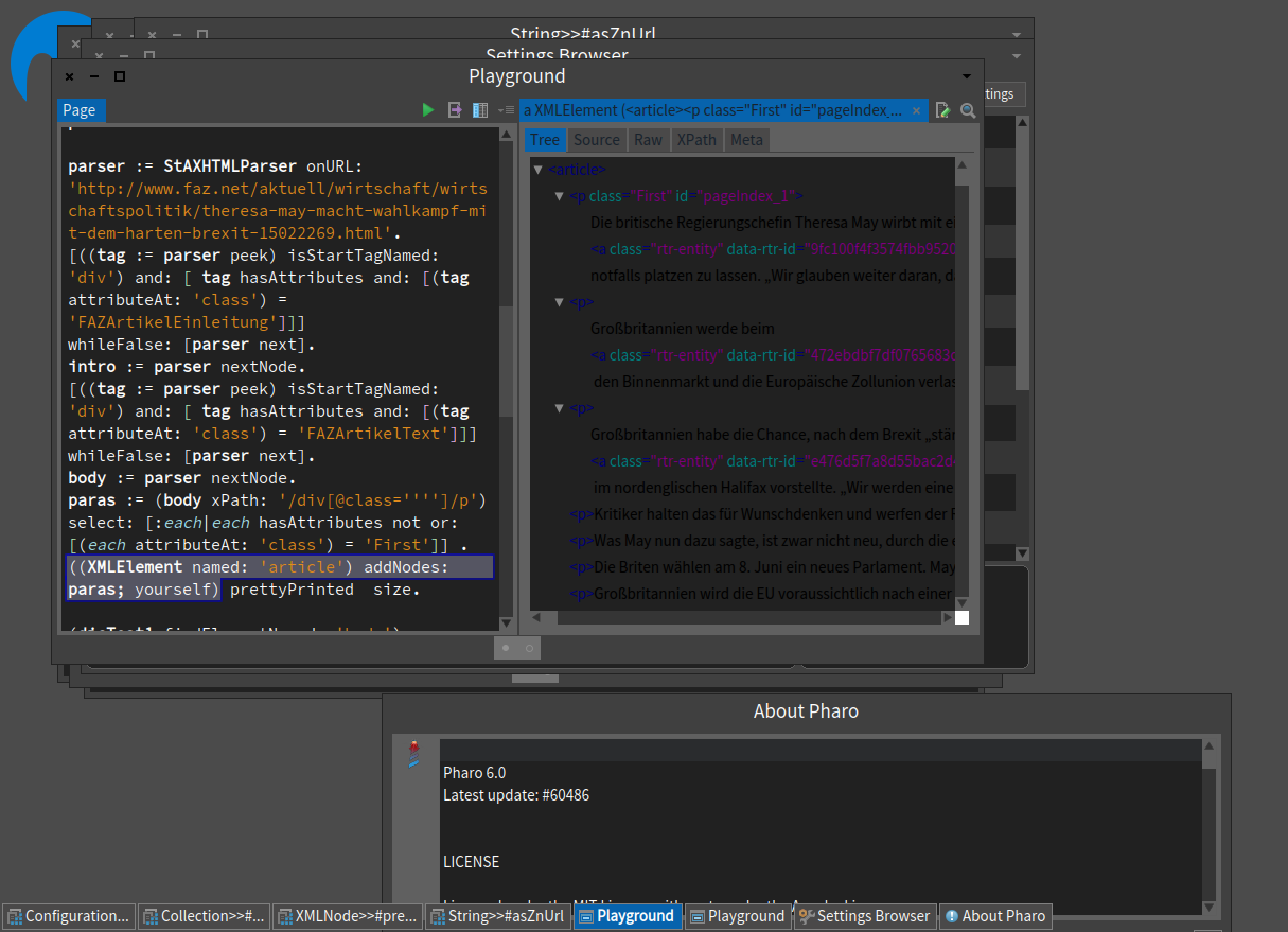
Dimitris Update â there is a sort of bug in the screenshot, which I have caused. I opened the page with my usual light theme, then changed themes. This updated the colour of the background, but not the text in the foreground. If I open the same playground display with the dark theme, the text is white and shows up OK. But I still donât like it. Peter Kenny From: Pharo-users [mailto:pharo-users-bounces@lists.pharo.org] On Behalf Of PBKResearch Sent: 27 August 2017 23:48 To: 'Any question about pharo is welcome' <pharo-users@lists.pharo.org> Subject: Re: [Pharo-users] Dark Mode Dimitris Screenshot attached. Look particularly at the text in the right-hand page of the playground. Also the control buttons of the playground window â the buttons go black when the window gets focus. I opened the âAboutâ window so you can see which version I have â not yet Pharo 6.1, but not very out of date. Peter Kenny From: Pharo-users [mailto:pharo-users-bounces@lists.pharo.org] On Behalf Of Dimitris Chloupis Sent: 27 August 2017 23:10 To: Any question about pharo is welcome <pharo-users@lists.pharo.org <mailto:pharo-users@lists.pharo.org> > Subject: Re: [Pharo-users] Dark Mode Also most don't know this but light themes of Pharo were in part hard coded. Esteban in order to create the dark theme which is based on the most popular dark theme ( if my memory serves correctly) , Darcula , he had to remove all this nasty code. He essentially made it possible for Pharo to have themes without worrying about hard coded colors. So if you ever want to make the light theme even lighter you have the dark theme to thank for making it easier for you. Quite an irony , would not agree ? If the doctors say your eye sight is great , he knows what he is talking about. Black foreground against dark grey background sound like a bug. Care to share a screenshot ? On Mon, 28 Aug 2017 at 00:51, PBKResearch <peter@pbkresearch.co.uk <mailto:peter@pbkresearch.co.uk> > wrote: I agree with Dimitris - it is all a matter of preference - not all eyes are the same. For myself, I find the default dark theme in Pharo very uncomfortable. On my system, some elements have a black foreground on a dark grey background, which is almost impossible to see. This is always true of the maximise/minimise/close buttons, but sometimes also of text fields in a playground. Whenever I download a new image, I immediately switch to the Watery theme, with light background and nice coloured buttons on the windows. Of course, my eyes may not be typical. I am now aged 84, and I have had cataract operations on both eyes. My sight is actually quite good - my optometrist confirms that I am legal to drive without spectacles - but my adverse reaction to dark mode is strong and immediate. Just my 2p worth Peter Kenny -----Original Message----- From: Pharo-users [mailto:pharo-users-bounces@lists.pharo.org <mailto:pharo-users-bounces@lists.pharo.org> ] On Behalf Of stephan Sent: 27 August 2017 21:46 To: pharo-users@lists.pharo.org <mailto:pharo-users@lists.pharo.org> Subject: Re: [Pharo-users] Dark Mode On 27-08-17 22:37, Dimitris Chloupis wrote:
White or dark is a matter of preference. But the matter of preference is also a matter of biology . Not all eyes are same.
The research is pretty clear: a large majority of developers does better with light themes. I have been sufficiently clear on the choice to make Pharo6 theme dark default Stephan
Yeah this is a known bug at least to me when I test my blue theme. I think however that it was fixed to an extend. Anyway closing and opening the window will update the colors so its not a serious bug. Once the theme is changed you should experience no issues. On Mon, Aug 28, 2017 at 2:09 AM PBKResearch <peter@pbkresearch.co.uk> wrote:
Dimitris
Update â there is a sort of bug in the screenshot, which I have caused. I opened the page with my usual light theme, then changed themes. This updated the colour of the background, but not the text in the foreground. If I open the same playground display with the dark theme, the text is white and shows up OK. But I still donât like it.
Peter Kenny
*From:* Pharo-users [mailto:pharo-users-bounces@lists.pharo.org] *On Behalf Of *PBKResearch *Sent:* 27 August 2017 23:48
*To:* 'Any question about pharo is welcome' <pharo-users@lists.pharo.org> *Subject:* Re: [Pharo-users] Dark Mode
Dimitris
Screenshot attached. Look particularly at the text in the right-hand page of the playground. Also the control buttons of the playground window â the buttons go black when the window gets focus. I opened the âAboutâ window so you can see which version I have â not yet Pharo 6.1, but not very out of date.
Peter Kenny
*From:* Pharo-users [mailto:pharo-users-bounces@lists.pharo.org <pharo-users-bounces@lists.pharo.org>] *On Behalf Of *Dimitris Chloupis *Sent:* 27 August 2017 23:10 *To:* Any question about pharo is welcome <pharo-users@lists.pharo.org> *Subject:* Re: [Pharo-users] Dark Mode
Also most don't know this but light themes of Pharo were in part hard coded. Esteban in order to create the dark theme which is based on the most popular dark theme ( if my memory serves correctly) , Darcula , he had to remove all this nasty code. He essentially made it possible for Pharo to have themes without worrying about hard coded colors. So if you ever want to make the light theme even lighter you have the dark theme to thank for making it easier for you.
Quite an irony , would not agree ?
If the doctors say your eye sight is great , he knows what he is talking about.
Black foreground against dark grey background sound like a bug. Care to share a screenshot ?
On Mon, 28 Aug 2017 at 00:51, PBKResearch <peter@pbkresearch.co.uk> wrote:
I agree with Dimitris - it is all a matter of preference - not all eyes are the same. For myself, I find the default dark theme in Pharo very uncomfortable. On my system, some elements have a black foreground on a dark grey background, which is almost impossible to see. This is always true of the maximise/minimise/close buttons, but sometimes also of text fields in a playground. Whenever I download a new image, I immediately switch to the Watery theme, with light background and nice coloured buttons on the windows.
Of course, my eyes may not be typical. I am now aged 84, and I have had cataract operations on both eyes. My sight is actually quite good - my optometrist confirms that I am legal to drive without spectacles - but my adverse reaction to dark mode is strong and immediate.
Just my 2p worth
Peter Kenny
-----Original Message----- From: Pharo-users [mailto:pharo-users-bounces@lists.pharo.org] On Behalf Of stephan Sent: 27 August 2017 21:46 To: pharo-users@lists.pharo.org Subject: Re: [Pharo-users] Dark Mode
On 27-08-17 22:37, Dimitris Chloupis wrote:
White or dark is a matter of preference. But the matter of preference is also a matter of biology . Not all eyes are same.
The research is pretty clear: a large majority of developers does better with light themes. I have been sufficiently clear on the choice to make Pharo6 theme dark default
Stephan
I found the place to adjust this - but I need to debug it as it seems my change also effects the colour used to highlight selected text (which is weird). If you modify the following method (possibly in a subclass), I found this helped - but havenât figured out why text highlight colour would be impacted by this change? configureWindowBorderFor: aWindow "Made window borders a bit thcker and slightly lighter to its easier to distinguish overlapping windows" | aStyle | aStyle := SimpleBorder new color: self borderColor lighter lighter lighter; width: 2. aWindow borderStyle: aStyle. Tim On 28 Aug 2017, at 01:08, PBKResearch <peter@pbkresearch.co.uk <mailto:peter@pbkresearch.co.uk>> wrote:
Dimitris
Update â there is a sort of bug in the screenshot, which I have caused. I opened the page with my usual light theme, then changed themes. This updated the colour of the background, but not the text in the foreground. If I open the same playground display with the dark theme, the text is white and shows up OK. But I still donât like it.
Peter Kenny
From: Pharo-users [mailto:pharo-users-bounces@lists.pharo.org <mailto:pharo-users-bounces@lists.pharo.org>] On Behalf Of PBKResearch Sent: 27 August 2017 23:48 To: 'Any question about pharo is welcome' <pharo-users@lists.pharo.org <mailto:pharo-users@lists.pharo.org>> Subject: Re: [Pharo-users] Dark Mode
Dimitris
Screenshot attached. Look particularly at the text in the right-hand page of the playground. Also the control buttons of the playground window â the buttons go black when the window gets focus. I opened the âAboutâ window so you can see which version I have â not yet Pharo 6.1, but not very out of date.
Peter Kenny
From: Pharo-users [mailto:pharo-users-bounces@lists.pharo.org <mailto:pharo-users-bounces@lists.pharo.org>] On Behalf Of Dimitris Chloupis Sent: 27 August 2017 23:10 To: Any question about pharo is welcome <pharo-users@lists.pharo.org <mailto:pharo-users@lists.pharo.org>> Subject: Re: [Pharo-users] Dark Mode
Also most don't know this but light themes of Pharo were in part hard coded. Esteban in order to create the dark theme which is based on the most popular dark theme ( if my memory serves correctly) , Darcula , he had to remove all this nasty code. He essentially made it possible for Pharo to have themes without worrying about hard coded colors. So if you ever want to make the light theme even lighter you have the dark theme to thank for making it easier for you.
Quite an irony , would not agree ?
If the doctors say your eye sight is great , he knows what he is talking about.
Black foreground against dark grey background sound like a bug. Care to share a screenshot ? On Mon, 28 Aug 2017 at 00:51, PBKResearch <peter@pbkresearch.co.uk <mailto:peter@pbkresearch.co.uk>> wrote: I agree with Dimitris - it is all a matter of preference - not all eyes are the same. For myself, I find the default dark theme in Pharo very uncomfortable. On my system, some elements have a black foreground on a dark grey background, which is almost impossible to see. This is always true of the maximise/minimise/close buttons, but sometimes also of text fields in a playground. Whenever I download a new image, I immediately switch to the Watery theme, with light background and nice coloured buttons on the windows.
Of course, my eyes may not be typical. I am now aged 84, and I have had cataract operations on both eyes. My sight is actually quite good - my optometrist confirms that I am legal to drive without spectacles - but my adverse reaction to dark mode is strong and immediate.
Just my 2p worth
Peter Kenny
-----Original Message----- From: Pharo-users [mailto:pharo-users-bounces@lists.pharo.org <mailto:pharo-users-bounces@lists.pharo.org>] On Behalf Of stephan Sent: 27 August 2017 21:46 To: pharo-users@lists.pharo.org <mailto:pharo-users@lists.pharo.org> Subject: Re: [Pharo-users] Dark Mode
On 27-08-17 22:37, Dimitris Chloupis wrote:
White or dark is a matter of preference. But the matter of preference is also a matter of biology . Not all eyes are same.
The research is pretty clear: a large majority of developers does better with light themes. I have been sufficiently clear on the choice to make Pharo6 theme dark default
Stephan

I think it not only a matter of user preference, but also environment lighting conditions. In bright environments, as with natural light, I prefer to use the light theme. At night or with artificial light dark theme fits better. Regards, Esteban A. Maringolo 2017-08-28 9:30 GMT-03:00 Tim Mackinnon <tim@testit.works>:
I found the place to adjust this - but I need to debug it as it seems my change also effects the colour used to highlight selected text (which is weird).
If you modify the following method (possibly in a subclass), I found this helped - but havenât figured out why text highlight colour would be impacted by this change?
configureWindowBorderFor: aWindow "Made window borders a bit thcker and slightly lighter to its easier to distinguish overlapping windows" | aStyle | aStyle := SimpleBorder new color: self borderColor lighter lighter lighter; width: 2. aWindow borderStyle: aStyle.
Tim
On 28 Aug 2017, at 01:08, PBKResearch <peter@pbkresearch.co.uk> wrote:
Dimitris
Update â there is a sort of bug in the screenshot, which I have caused. I opened the page with my usual light theme, then changed themes. This updated the colour of the background, but not the text in the foreground. If I open the same playground display with the dark theme, the text is white and shows up OK. But I still donât like it.
Peter Kenny
From: Pharo-users [mailto:pharo-users-bounces@lists.pharo.org] On Behalf Of PBKResearch Sent: 27 August 2017 23:48 To: 'Any question about pharo is welcome' <pharo-users@lists.pharo.org> Subject: Re: [Pharo-users] Dark Mode
Dimitris
Screenshot attached. Look particularly at the text in the right-hand page of the playground. Also the control buttons of the playground window â the buttons go black when the window gets focus. I opened the âAboutâ window so you can see which version I have â not yet Pharo 6.1, but not very out of date.
Peter Kenny
From: Pharo-users [mailto:pharo-users-bounces@lists.pharo.org] On Behalf Of Dimitris Chloupis Sent: 27 August 2017 23:10 To: Any question about pharo is welcome <pharo-users@lists.pharo.org> Subject: Re: [Pharo-users] Dark Mode
Also most don't know this but light themes of Pharo were in part hard coded. Esteban in order to create the dark theme which is based on the most popular dark theme ( if my memory serves correctly) , Darcula , he had to remove all this nasty code. He essentially made it possible for Pharo to have themes without worrying about hard coded colors. So if you ever want to make the light theme even lighter you have the dark theme to thank for making it easier for you.
Quite an irony , would not agree ?
If the doctors say your eye sight is great , he knows what he is talking about.
Black foreground against dark grey background sound like a bug. Care to share a screenshot ?
On Mon, 28 Aug 2017 at 00:51, PBKResearch <peter@pbkresearch.co.uk> wrote:
I agree with Dimitris - it is all a matter of preference - not all eyes are the same. For myself, I find the default dark theme in Pharo very uncomfortable. On my system, some elements have a black foreground on a dark grey background, which is almost impossible to see. This is always true of the maximise/minimise/close buttons, but sometimes also of text fields in a playground. Whenever I download a new image, I immediately switch to the Watery theme, with light background and nice coloured buttons on the windows.
Of course, my eyes may not be typical. I am now aged 84, and I have had cataract operations on both eyes. My sight is actually quite good - my optometrist confirms that I am legal to drive without spectacles - but my adverse reaction to dark mode is strong and immediate.
Just my 2p worth
Peter Kenny
-----Original Message----- From: Pharo-users [mailto:pharo-users-bounces@lists.pharo.org] On Behalf Of stephan Sent: 27 August 2017 21:46 To: pharo-users@lists.pharo.org Subject: Re: [Pharo-users] Dark Mode
On 27-08-17 22:37, Dimitris Chloupis wrote:
White or dark is a matter of preference. But the matter of preference is also a matter of biology . Not all eyes are same.
The research is pretty clear: a large majority of developers does better with light themes. I have been sufficiently clear on the choice to make Pharo6 theme dark default
Stephan

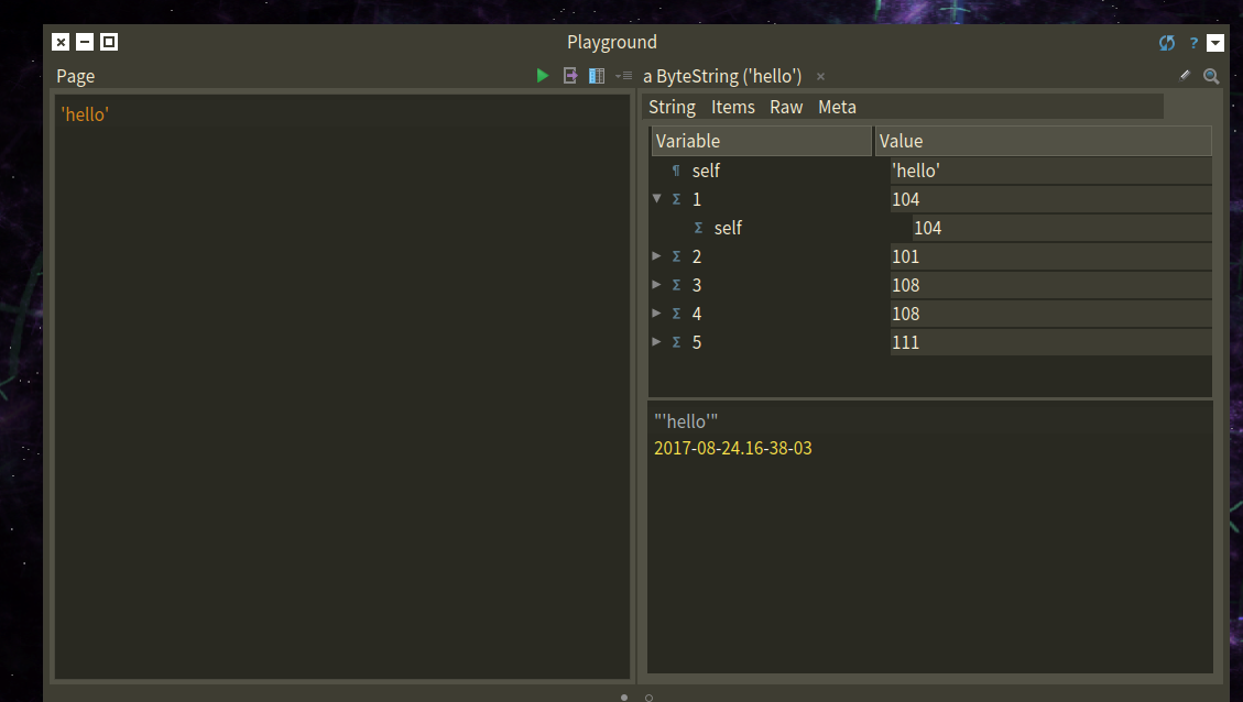
This is the sublimish theme in a 5.0, and the reversed controls. [image: Inline image 1] Phil On Mon, Aug 28, 2017 at 12:48 AM, PBKResearch <peter@pbkresearch.co.uk> wrote:
Dimitris
Screenshot attached. Look particularly at the text in the right-hand page of the playground. Also the control buttons of the playground window â the buttons go black when the window gets focus. I opened the âAboutâ window so you can see which version I have â not yet Pharo 6.1, but not very out of date.
Peter Kenny
*From:* Pharo-users [mailto:pharo-users-bounces@lists.pharo.org] *On Behalf Of *Dimitris Chloupis *Sent:* 27 August 2017 23:10 *To:* Any question about pharo is welcome <pharo-users@lists.pharo.org> *Subject:* Re: [Pharo-users] Dark Mode
Also most don't know this but light themes of Pharo were in part hard coded. Esteban in order to create the dark theme which is based on the most popular dark theme ( if my memory serves correctly) , Darcula , he had to remove all this nasty code. He essentially made it possible for Pharo to have themes without worrying about hard coded colors. So if you ever want to make the light theme even lighter you have the dark theme to thank for making it easier for you.
Quite an irony , would not agree ?
If the doctors say your eye sight is great , he knows what he is talking about.
Black foreground against dark grey background sound like a bug. Care to share a screenshot ?
On Mon, 28 Aug 2017 at 00:51, PBKResearch <peter@pbkresearch.co.uk> wrote:
I agree with Dimitris - it is all a matter of preference - not all eyes are the same. For myself, I find the default dark theme in Pharo very uncomfortable. On my system, some elements have a black foreground on a dark grey background, which is almost impossible to see. This is always true of the maximise/minimise/close buttons, but sometimes also of text fields in a playground. Whenever I download a new image, I immediately switch to the Watery theme, with light background and nice coloured buttons on the windows.
Of course, my eyes may not be typical. I am now aged 84, and I have had cataract operations on both eyes. My sight is actually quite good - my optometrist confirms that I am legal to drive without spectacles - but my adverse reaction to dark mode is strong and immediate.
Just my 2p worth
Peter Kenny
-----Original Message----- From: Pharo-users [mailto:pharo-users-bounces@lists.pharo.org] On Behalf Of stephan Sent: 27 August 2017 21:46 To: pharo-users@lists.pharo.org Subject: Re: [Pharo-users] Dark Mode
On 27-08-17 22:37, Dimitris Chloupis wrote:
White or dark is a matter of preference. But the matter of preference is also a matter of biology . Not all eyes are same.
The research is pretty clear: a large majority of developers does better with light themes. I have been sufficiently clear on the choice to make Pharo6 theme dark default
Stephan
On Mon, Aug 28, 2017 at 12:10 AM, Dimitris Chloupis <kilon.alios@gmail.com> wrote:
Also most don't know this but light themes of Pharo were in part hard coded. Esteban in order to create the dark theme which is based on the most popular dark theme ( if my memory serves correctly) , Darcula , he had to remove all this nasty code. He essentially made it possible for Pharo to have themes without worrying about hard coded colors. So if you ever want to make the light theme even lighter you have the dark theme to thank for making it easier for you.
Quite an irony , would not agree ?
If the doctors say your eye sight is great , he knows what he is talking about.
Black foreground against dark grey background sound like a bug. Care to share a screenshot ? On Mon, 28 Aug 2017 at 00:51, PBKResearch <peter@pbkresearch.co.uk> wrote:
I agree with Dimitris - it is all a matter of preference - not all eyes are the same. For myself, I find the default dark theme in Pharo very uncomfortable. On my system, some elements have a black foreground on a dark grey background, which is almost impossible to see. This is always true of the maximise/minimise/close buttons, but sometimes also of text fields in a playground. Whenever I download a new image, I immediately switch to the Watery theme, with light background and nice coloured buttons on the windows.
Of course, my eyes may not be typical. I am now aged 84, and I have had cataract operations on both eyes. My sight is actually quite good - my optometrist confirms that I am legal to drive without spectacles - but my adverse reaction to dark mode is strong and immediate.
Eye issues as well. Retinal detachment in both, and cataract on the right one. Loads of floaters. Light mode kills them. Dark theme : can code for hours without any trouble. At the office I am at now 90% of coders are using dark themes. Indeed the windows buttons are annoying, I have my own little hack to make them better. When a control bugs you, bring a halo and try to reverse the form, usually makes things readable. Phil
Just my 2p worth
Peter Kenny
-----Original Message----- From: Pharo-users [mailto:pharo-users-bounces@lists.pharo.org] On Behalf Of stephan Sent: 27 August 2017 21:46 To: pharo-users@lists.pharo.org Subject: Re: [Pharo-users] Dark Mode
On 27-08-17 22:37, Dimitris Chloupis wrote:
White or dark is a matter of preference. But the matter of preference is also a matter of biology . Not all eyes are same.
The research is pretty clear: a large majority of developers does better with light themes. I have been sufficiently clear on the choice to make Pharo6 theme dark default
Stephan
I am no authority on dark theme because I am using my blue theme full time and I have addressed any colour issues I had. Retina detachment, wow that is serious ! I hope you doing better :( Well I have myopia in both eyes, my left is 6 degrees which is pretty high. We myopics suppose to not see very well in the dark but my visual perception is great in dark environments even in almost complete darkness. Its weird because as I young boy I was non stop out in the sun and I live in Greece, here the Sun is very bright, yet it always hurt my eyes. Not much as knife pain, but more like feeling pressure on the eye. Of course I am not the only Greek in love with his sun glasses during summer. My eye doctor said it was because of my eyes being light color compared to the usual dark coloured eyes Greeks have. But I think the reason most likely is more mysterious :D On Mon, Aug 28, 2017 at 2:05 PM phil@highoctane.be <phil@highoctane.be> wrote:
On Mon, Aug 28, 2017 at 12:10 AM, Dimitris Chloupis <kilon.alios@gmail.com
wrote:
Also most don't know this but light themes of Pharo were in part hard coded. Esteban in order to create the dark theme which is based on the most popular dark theme ( if my memory serves correctly) , Darcula , he had to remove all this nasty code. He essentially made it possible for Pharo to have themes without worrying about hard coded colors. So if you ever want to make the light theme even lighter you have the dark theme to thank for making it easier for you.
Quite an irony , would not agree ?
If the doctors say your eye sight is great , he knows what he is talking about.
Black foreground against dark grey background sound like a bug. Care to share a screenshot ? On Mon, 28 Aug 2017 at 00:51, PBKResearch <peter@pbkresearch.co.uk> wrote:
I agree with Dimitris - it is all a matter of preference - not all eyes are the same. For myself, I find the default dark theme in Pharo very uncomfortable. On my system, some elements have a black foreground on a dark grey background, which is almost impossible to see. This is always true of the maximise/minimise/close buttons, but sometimes also of text fields in a playground. Whenever I download a new image, I immediately switch to the Watery theme, with light background and nice coloured buttons on the windows.
Of course, my eyes may not be typical. I am now aged 84, and I have had cataract operations on both eyes. My sight is actually quite good - my optometrist confirms that I am legal to drive without spectacles - but my adverse reaction to dark mode is strong and immediate.
Eye issues as well. Retinal detachment in both, and cataract on the right one. Loads of floaters.
Light mode kills them.
Dark theme : can code for hours without any trouble.
At the office I am at now 90% of coders are using dark themes.
Indeed the windows buttons are annoying, I have my own little hack to make them better. When a control bugs you, bring a halo and try to reverse the form, usually makes things readable.
Phil
Just my 2p worth
Peter Kenny
-----Original Message----- From: Pharo-users [mailto:pharo-users-bounces@lists.pharo.org] On Behalf Of stephan Sent: 27 August 2017 21:46 To: pharo-users@lists.pharo.org Subject: Re: [Pharo-users] Dark Mode
On 27-08-17 22:37, Dimitris Chloupis wrote:
White or dark is a matter of preference. But the matter of preference is also a matter of biology . Not all eyes are same.
The research is pretty clear: a large majority of developers does better with light themes. I have been sufficiently clear on the choice to make Pharo6 theme dark default
Stephan
On Mon, Aug 28, 2017 at 1:28 PM, Dimitris Chloupis <kilon.alios@gmail.com> wrote:
I am no authority on dark theme because I am using my blue theme full time and I have addressed any colour issues I had.
Retina detachment, wow that is serious ! I hope you doing better :(
Yeah, after that, not much can really stress me out that much. And 2 x 27 inch monitors help. Pharo is great because I can make it be the way I want it to code in it.
Well I have myopia in both eyes, my left is 6 degrees which is pretty high. We myopics suppose to not see very well in the dark but my visual perception is great in dark environments even in almost complete darkness.
Its weird because as I young boy I was non stop out in the sun and I live in Greece, here the Sun is very bright, yet it always hurt my eyes. Not much as knife pain, but more like feeling pressure on the eye. Of course I am not the only Greek in love with his sun glasses during summer.
My eye doctor said it was because of my eyes being light color compared to the usual dark coloured eyes Greeks have. But I think the reason most likely is more mysterious :D
Ah ah, 1/2 italian with green eyes here. I feel you. I am running with shades. Phil
On Mon, Aug 28, 2017 at 2:05 PM phil@highoctane.be <phil@highoctane.be> wrote:
On Mon, Aug 28, 2017 at 12:10 AM, Dimitris Chloupis < kilon.alios@gmail.com> wrote:
Also most don't know this but light themes of Pharo were in part hard coded. Esteban in order to create the dark theme which is based on the most popular dark theme ( if my memory serves correctly) , Darcula , he had to remove all this nasty code. He essentially made it possible for Pharo to have themes without worrying about hard coded colors. So if you ever want to make the light theme even lighter you have the dark theme to thank for making it easier for you.
Quite an irony , would not agree ?
If the doctors say your eye sight is great , he knows what he is talking about.
Black foreground against dark grey background sound like a bug. Care to share a screenshot ? On Mon, 28 Aug 2017 at 00:51, PBKResearch <peter@pbkresearch.co.uk> wrote:
I agree with Dimitris - it is all a matter of preference - not all eyes are the same. For myself, I find the default dark theme in Pharo very uncomfortable. On my system, some elements have a black foreground on a dark grey background, which is almost impossible to see. This is always true of the maximise/minimise/close buttons, but sometimes also of text fields in a playground. Whenever I download a new image, I immediately switch to the Watery theme, with light background and nice coloured buttons on the windows.
Of course, my eyes may not be typical. I am now aged 84, and I have had cataract operations on both eyes. My sight is actually quite good - my optometrist confirms that I am legal to drive without spectacles - but my adverse reaction to dark mode is strong and immediate.
Eye issues as well. Retinal detachment in both, and cataract on the right one. Loads of floaters.
Light mode kills them.
Dark theme : can code for hours without any trouble.
At the office I am at now 90% of coders are using dark themes.
Indeed the windows buttons are annoying, I have my own little hack to make them better. When a control bugs you, bring a halo and try to reverse the form, usually makes things readable.
Phil
Just my 2p worth
Peter Kenny
-----Original Message----- From: Pharo-users [mailto:pharo-users-bounces@lists.pharo.org] On Behalf Of stephan Sent: 27 August 2017 21:46 To: pharo-users@lists.pharo.org Subject: Re: [Pharo-users] Dark Mode
On 27-08-17 22:37, Dimitris Chloupis wrote:
White or dark is a matter of preference. But the matter of preference is also a matter of biology . Not all eyes are same.
The research is pretty clear: a large majority of developers does better with light themes. I have been sufficiently clear on the choice to make Pharo6 theme dark default
Stephan

If I can throw in my 2c, themes are like nutrition facts. When I was a kid eggs were the healthiest thing to consume in universe. Then they were a root of all evil, and now days are nutrition packed food. I have observed similar circles in background color usability. Pharo has ability to choose a theme, it has both currently fashionable and older ones to choose from. I do not see need for anything else on that front. Davorin Rusevljan

On 8/28/17, Davorin Rusevljan <davorin.rusevljan@gmail.com> wrote:
If I can throw in my 2c, themes are like nutrition facts. When I was a kid eggs were the healthiest thing to consume in universe. Then they were a root of all evil, and now days are nutrition packed food.
In the meantime eggs are fine again, I think :-)
I have observed similar circles in background color usability. Pharo has ability to choose a theme, it has both currently fashionable and older ones to choose from. I do not see need for anything else on that front.
Davorin Rusevljan
Nutrition wise, scientists always agreed that eggs contained pretty much everything the body needs. Problem was cholesterol which the egg does significant rise. The fact that did change was that high cholesterol is bad, some doctors would argue even deadly for ones health. Problem was that this fact was based on a research that was on a very small group of subjects and if I am not mistaken it was not even humans it was lab rats. The problem none really funded a serious research for this fact and when they did they discovered that indeed eggs and other food do raise cholesterol significantly but our liver is capable of reducing the production of cholesterol to compensate hence its nowhere near as harmful as they used to assume. Science is flawed mainly because finding small facts is easy and cheap but general fact are very complex and very very expensive. Like all things, you get what you are paying for. This is why you see and hear so many contradictory facts. They are mostly based on simple cheap research. Plus "fact" is purely a fantasy, our world is too complex for facts as most people define them. There is truth sure, but not as easy to consume and explain as we would wish. The preference to light and dark themes is not product of bad scientific research. I suspect the reasons are too complex for science anyway because we are even eons away from explaining the human brain and how it works. Pharo not only allow you to choose a theme but its theme classes are actually very easy to use which is something it inherit from Squeak. It took me a day to create my own theme. The Dark UI theme class is excellent example for anyone who wants to subclass it and create his own light or dark theme because its not that complex. On Mon, Aug 28, 2017 at 2:57 PM Davorin Rusevljan < davorin.rusevljan@gmail.com> wrote:
If I can throw in my 2c, themes are like nutrition facts. When I was a kid eggs were the healthiest thing to consume in universe. Then they were a root of all evil, and now days are nutrition packed food.
I have observed similar circles in background color usability. Pharo has ability to choose a theme, it has both currently fashionable and older ones to choose from. I do not see need for anything else on that front.
Davorin Rusevljan
You can eat eggs all you want provided you burn the calories. They are shock full of amino acids. Cholesterol is a precursor of testosterone, so, no cholesterol is going to put a man in a bad place. Eggs and heavy deadlifts and squats. Yay, feel the burn. Speaking of which: anyone have a .fit file binding for Pharo? See this forum thread for a clue: https://www.thisisant.com/forum/viewthread/4275 Roassal + Dataframe on fit files would be a great thing to have. Phil On Mon, Aug 28, 2017 at 2:20 PM, Dimitris Chloupis <kilon.alios@gmail.com> wrote:
Nutrition wise, scientists always agreed that eggs contained pretty much everything the body needs. Problem was cholesterol which the egg does significant rise.
The fact that did change was that high cholesterol is bad, some doctors would argue even deadly for ones health. Problem was that this fact was based on a research that was on a very small group of subjects and if I am not mistaken it was not even humans it was lab rats.
The problem none really funded a serious research for this fact and when they did they discovered that indeed eggs and other food do raise cholesterol significantly but our liver is capable of reducing the production of cholesterol to compensate hence its nowhere near as harmful as they used to assume.
Science is flawed mainly because finding small facts is easy and cheap but general fact are very complex and very very expensive.
Like all things, you get what you are paying for. This is why you see and hear so many contradictory facts. They are mostly based on simple cheap research. Plus "fact" is purely a fantasy, our world is too complex for facts as most people define them. There is truth sure, but not as easy to consume and explain as we would wish.
The preference to light and dark themes is not product of bad scientific research. I suspect the reasons are too complex for science anyway because we are even eons away from explaining the human brain and how it works.
Pharo not only allow you to choose a theme but its theme classes are actually very easy to use which is something it inherit from Squeak. It took me a day to create my own theme.
The Dark UI theme class is excellent example for anyone who wants to subclass it and create his own light or dark theme because its not that complex.
On Mon, Aug 28, 2017 at 2:57 PM Davorin Rusevljan < davorin.rusevljan@gmail.com> wrote:
If I can throw in my 2c, themes are like nutrition facts. When I was a kid eggs were the healthiest thing to consume in universe. Then they were a root of all evil, and now days are nutrition packed food.
I have observed similar circles in background color usability. Pharo has ability to choose a theme, it has both currently fashionable and older ones to choose from. I do not see need for anything else on that front.
Davorin Rusevljan

Hi Phil, Yes, I wrote a FIT file parser. FIT is used to store âscientificâ images, in particular for astronomy and medicine. Do you want the code? Alexandre -- _,.;:~^~:;._,.;:~^~:;._,.;:~^~:;._,.;:~^~:;._,.;: Alexandre Bergel http://www.bergel.eu ^~:;._,.;:~^~:;._,.;:~^~:;._,.;:~^~:;._,.;:~^~:;.
On Aug 28, 2017, at 9:36 AM, phil@highoctane.be wrote:
You can eat eggs all you want provided you burn the calories. They are shock full of amino acids.
Cholesterol is a precursor of testosterone, so, no cholesterol is going to put a man in a bad place.
Eggs and heavy deadlifts and squats. Yay, feel the burn.
Speaking of which: anyone have a .fit file binding for Pharo?
See this forum thread for a clue: https://www.thisisant.com/forum/viewthread/4275 <https://www.thisisant.com/forum/viewthread/4275>
Roassal + Dataframe on fit files would be a great thing to have.
Phil
On Mon, Aug 28, 2017 at 2:20 PM, Dimitris Chloupis <kilon.alios@gmail.com <mailto:kilon.alios@gmail.com>> wrote: Nutrition wise, scientists always agreed that eggs contained pretty much everything the body needs. Problem was cholesterol which the egg does significant rise.
The fact that did change was that high cholesterol is bad, some doctors would argue even deadly for ones health. Problem was that this fact was based on a research that was on a very small group of subjects and if I am not mistaken it was not even humans it was lab rats.
The problem none really funded a serious research for this fact and when they did they discovered that indeed eggs and other food do raise cholesterol significantly but our liver is capable of reducing the production of cholesterol to compensate hence its nowhere near as harmful as they used to assume.
Science is flawed mainly because finding small facts is easy and cheap but general fact are very complex and very very expensive.
Like all things, you get what you are paying for. This is why you see and hear so many contradictory facts. They are mostly based on simple cheap research. Plus "fact" is purely a fantasy, our world is too complex for facts as most people define them. There is truth sure, but not as easy to consume and explain as we would wish.
The preference to light and dark themes is not product of bad scientific research. I suspect the reasons are too complex for science anyway because we are even eons away from explaining the human brain and how it works.
Pharo not only allow you to choose a theme but its theme classes are actually very easy to use which is something it inherit from Squeak. It took me a day to create my own theme.
The Dark UI theme class is excellent example for anyone who wants to subclass it and create his own light or dark theme because its not that complex.
On Mon, Aug 28, 2017 at 2:57 PM Davorin Rusevljan <davorin.rusevljan@gmail.com <mailto:davorin.rusevljan@gmail.com>> wrote: If I can throw in my 2c, themes are like nutrition facts. When I was a kid eggs were the healthiest thing to consume in universe. Then they were a root of all evil, and now days are nutrition packed food.
I have observed similar circles in background color usability. Pharo has ability to choose a theme, it has both currently fashionable and older ones to choose from. I do not see need for anything else on that front.
Davorin Rusevljan
Ups⦠I think this FIT file format is for something else⦠Alexandre -- _,.;:~^~:;._,.;:~^~:;._,.;:~^~:;._,.;:~^~:;._,.;: Alexandre Bergel http://www.bergel.eu ^~:;._,.;:~^~:;._,.;:~^~:;._,.;:~^~:;._,.;:~^~:;.
On Aug 28, 2017, at 3:36 PM, Alexandre Bergel <alexandre.bergel@me.com> wrote:
Hi Phil,
Yes, I wrote a FIT file parser. FIT is used to store âscientificâ images, in particular for astronomy and medicine. Do you want the code?
Alexandre -- _,.;:~^~:;._,.;:~^~:;._,.;:~^~:;._,.;:~^~:;._,.;: Alexandre Bergel http://www.bergel.eu <http://www.bergel.eu/> ^~:;._,.;:~^~:;._,.;:~^~:;._,.;:~^~:;._,.;:~^~:;.
On Aug 28, 2017, at 9:36 AM, phil@highoctane.be <mailto:phil@highoctane.be> wrote:
You can eat eggs all you want provided you burn the calories. They are shock full of amino acids.
Cholesterol is a precursor of testosterone, so, no cholesterol is going to put a man in a bad place.
Eggs and heavy deadlifts and squats. Yay, feel the burn.
Speaking of which: anyone have a .fit file binding for Pharo?
See this forum thread for a clue: https://www.thisisant.com/forum/viewthread/4275 <https://www.thisisant.com/forum/viewthread/4275>
Roassal + Dataframe on fit files would be a great thing to have.
Phil
On Mon, Aug 28, 2017 at 2:20 PM, Dimitris Chloupis <kilon.alios@gmail.com <mailto:kilon.alios@gmail.com>> wrote: Nutrition wise, scientists always agreed that eggs contained pretty much everything the body needs. Problem was cholesterol which the egg does significant rise.
The fact that did change was that high cholesterol is bad, some doctors would argue even deadly for ones health. Problem was that this fact was based on a research that was on a very small group of subjects and if I am not mistaken it was not even humans it was lab rats.
The problem none really funded a serious research for this fact and when they did they discovered that indeed eggs and other food do raise cholesterol significantly but our liver is capable of reducing the production of cholesterol to compensate hence its nowhere near as harmful as they used to assume.
Science is flawed mainly because finding small facts is easy and cheap but general fact are very complex and very very expensive.
Like all things, you get what you are paying for. This is why you see and hear so many contradictory facts. They are mostly based on simple cheap research. Plus "fact" is purely a fantasy, our world is too complex for facts as most people define them. There is truth sure, but not as easy to consume and explain as we would wish.
The preference to light and dark themes is not product of bad scientific research. I suspect the reasons are too complex for science anyway because we are even eons away from explaining the human brain and how it works.
Pharo not only allow you to choose a theme but its theme classes are actually very easy to use which is something it inherit from Squeak. It took me a day to create my own theme.
The Dark UI theme class is excellent example for anyone who wants to subclass it and create his own light or dark theme because its not that complex.
On Mon, Aug 28, 2017 at 2:57 PM Davorin Rusevljan <davorin.rusevljan@gmail.com <mailto:davorin.rusevljan@gmail.com>> wrote: If I can throw in my 2c, themes are like nutrition facts. When I was a kid eggs were the healthiest thing to consume in universe. Then they were a root of all evil, and now days are nutrition packed food.
I have observed similar circles in background color usability. Pharo has ability to choose a theme, it has both currently fashionable and older ones to choose from. I do not see need for anything else on that front.
Davorin Rusevljan
Or you people can just dim your screen instead of staring into a 60W lightbulb... then the theme doesn't matter. On Mon, Aug 28, 2017 at 8:38 PM, Alexandre Bergel <alexandre.bergel@me.com> wrote:
Ups⦠I think this FIT file format is for something elseâ¦
Alexandre -- _,.;:~^~:;._,.;:~^~:;._,.;:~^~:;._,.;:~^~:;._,.;: Alexandre Bergel http://www.bergel.eu ^~:;._,.;:~^~:;._,.;:~^~:;._,.;:~^~:;._,.;:~^~:;.
On Aug 28, 2017, at 3:36 PM, Alexandre Bergel <alexandre.bergel@me.com> wrote:
Hi Phil,
Yes, I wrote a FIT file parser. FIT is used to store âscientificâ images, in particular for astronomy and medicine. Do you want the code?
Alexandre -- _,.;:~^~:;._,.;:~^~:;._,.;:~^~:;._,.;:~^~:;._,.;: Alexandre Bergel http://www.bergel.eu ^~:;._,.;:~^~:;._,.;:~^~:;._,.;:~^~:;._,.;:~^~:;.
On Aug 28, 2017, at 9:36 AM, phil@highoctane.be wrote:
You can eat eggs all you want provided you burn the calories. They are shock full of amino acids.
Cholesterol is a precursor of testosterone, so, no cholesterol is going to put a man in a bad place.
Eggs and heavy deadlifts and squats. Yay, feel the burn.
Speaking of which: anyone have a .fit file binding for Pharo?
See this forum thread for a clue: https://www.thisisant. com/forum/viewthread/4275
Roassal + Dataframe on fit files would be a great thing to have.
Phil
On Mon, Aug 28, 2017 at 2:20 PM, Dimitris Chloupis <kilon.alios@gmail.com> wrote:
Nutrition wise, scientists always agreed that eggs contained pretty much everything the body needs. Problem was cholesterol which the egg does significant rise.
The fact that did change was that high cholesterol is bad, some doctors would argue even deadly for ones health. Problem was that this fact was based on a research that was on a very small group of subjects and if I am not mistaken it was not even humans it was lab rats.
The problem none really funded a serious research for this fact and when they did they discovered that indeed eggs and other food do raise cholesterol significantly but our liver is capable of reducing the production of cholesterol to compensate hence its nowhere near as harmful as they used to assume.
Science is flawed mainly because finding small facts is easy and cheap but general fact are very complex and very very expensive.
Like all things, you get what you are paying for. This is why you see and hear so many contradictory facts. They are mostly based on simple cheap research. Plus "fact" is purely a fantasy, our world is too complex for facts as most people define them. There is truth sure, but not as easy to consume and explain as we would wish.
The preference to light and dark themes is not product of bad scientific research. I suspect the reasons are too complex for science anyway because we are even eons away from explaining the human brain and how it works.
Pharo not only allow you to choose a theme but its theme classes are actually very easy to use which is something it inherit from Squeak. It took me a day to create my own theme.
The Dark UI theme class is excellent example for anyone who wants to subclass it and create his own light or dark theme because its not that complex.
On Mon, Aug 28, 2017 at 2:57 PM Davorin Rusevljan < davorin.rusevljan@gmail.com> wrote:
If I can throw in my 2c, themes are like nutrition facts. When I was a kid eggs were the healthiest thing to consume in universe. Then they were a root of all evil, and now days are nutrition packed food.
I have observed similar circles in background color usability. Pharo has ability to choose a theme, it has both currently fashionable and older ones to choose from. I do not see need for anything else on that front.
Davorin Rusevljan
Actually what you say makes no sense to me because my monitor is already at bare minimum. Its not the intensity, its the contrast. The problem obviously is not an exposure of 30 minutes. The mail I am writing now has a white background. But its not a problem because I spent an 1 hour tops with email total time. I would like if Gmail had a dark theme but its no big deal. However when one spent more than 8 hours it becomes a problem. It was the same when I was studying in UK law. I was very used into reading english because the vast majority of the coding books I had bought and reading since I was 13 years old were in english. It was not a problem reading for an hour, but after 5 hours both my eyes and brain were tired. Its that extra effort that accumulates hour by hour and the more time you spent, the more obvious it becomes. 5 hours reading a book in my mother tongue is like night and day. So when I was spending a lot of hours working with Pharo the white them did became a major problem for me. Its not as if I see a light theme and after a few minutes I scream in pain "Oh my eyes are burning" :D On Mon, Aug 28, 2017 at 9:55 PM Peter Uhnák <i.uhnak@gmail.com> wrote:
Or you people can just dim your screen instead of staring into a 60W lightbulb... then the theme doesn't matter.
On Mon, Aug 28, 2017 at 8:38 PM, Alexandre Bergel <alexandre.bergel@me.com
wrote:
Ups⦠I think this FIT file format is for something elseâ¦
Alexandre -- _,.;:~^~:;._,.;:~^~:;._,.;:~^~:;._,.;:~^~:;._,.;: Alexandre Bergel http://www.bergel.eu ^~:;._,.;:~^~:;._,.;:~^~:;._,.;:~^~:;._,.;:~^~:;.
On Aug 28, 2017, at 3:36 PM, Alexandre Bergel <alexandre.bergel@me.com> wrote:
Hi Phil,
Yes, I wrote a FIT file parser. FIT is used to store âscientificâ images, in particular for astronomy and medicine. Do you want the code?
Alexandre -- _,.;:~^~:;._,.;:~^~:;._,.;:~^~:;._,.;:~^~:;._,.;: Alexandre Bergel http://www.bergel.eu ^~:;._,.;:~^~:;._,.;:~^~:;._,.;:~^~:;._,.;:~^~:;.
On Aug 28, 2017, at 9:36 AM, phil@highoctane.be wrote:
You can eat eggs all you want provided you burn the calories. They are shock full of amino acids.
Cholesterol is a precursor of testosterone, so, no cholesterol is going to put a man in a bad place.
Eggs and heavy deadlifts and squats. Yay, feel the burn.
Speaking of which: anyone have a .fit file binding for Pharo?
See this forum thread for a clue: https://www.thisisant.com/forum/viewthread/4275
Roassal + Dataframe on fit files would be a great thing to have.
Phil
On Mon, Aug 28, 2017 at 2:20 PM, Dimitris Chloupis <kilon.alios@gmail.com
wrote:
Nutrition wise, scientists always agreed that eggs contained pretty much everything the body needs. Problem was cholesterol which the egg does significant rise.
The fact that did change was that high cholesterol is bad, some doctors would argue even deadly for ones health. Problem was that this fact was based on a research that was on a very small group of subjects and if I am not mistaken it was not even humans it was lab rats.
The problem none really funded a serious research for this fact and when they did they discovered that indeed eggs and other food do raise cholesterol significantly but our liver is capable of reducing the production of cholesterol to compensate hence its nowhere near as harmful as they used to assume.
Science is flawed mainly because finding small facts is easy and cheap but general fact are very complex and very very expensive.
Like all things, you get what you are paying for. This is why you see and hear so many contradictory facts. They are mostly based on simple cheap research. Plus "fact" is purely a fantasy, our world is too complex for facts as most people define them. There is truth sure, but not as easy to consume and explain as we would wish.
The preference to light and dark themes is not product of bad scientific research. I suspect the reasons are too complex for science anyway because we are even eons away from explaining the human brain and how it works.
Pharo not only allow you to choose a theme but its theme classes are actually very easy to use which is something it inherit from Squeak. It took me a day to create my own theme.
The Dark UI theme class is excellent example for anyone who wants to subclass it and create his own light or dark theme because its not that complex.
On Mon, Aug 28, 2017 at 2:57 PM Davorin Rusevljan < davorin.rusevljan@gmail.com> wrote:
If I can throw in my 2c, themes are like nutrition facts. When I was a kid eggs were the healthiest thing to consume in universe. Then they were a root of all evil, and now days are nutrition packed food.
I have observed similar circles in background color usability. Pharo has ability to choose a theme, it has both currently fashionable and older ones to choose from. I do not see need for anything else on that front.
Davorin Rusevljan
Dark Gmail, Dark Twitter, Wikipedia... etc no problem with Stylish. https://userstyles.org/styles/browse?search_terms=gmail Or make your own - here are a few I made. https://userstyles.org/users/304480 I should do a dark Pharo.org :-) Phil On Mon, Aug 28, 2017 at 9:11 PM, Dimitris Chloupis <kilon.alios@gmail.com> wrote:
Actually what you say makes no sense to me because my monitor is already at bare minimum. Its not the intensity, its the contrast. The problem obviously is not an exposure of 30 minutes. The mail I am writing now has a white background. But its not a problem because I spent an 1 hour tops with email total time. I would like if Gmail had a dark theme but its no big deal. However when one spent more than 8 hours it becomes a problem.
It was the same when I was studying in UK law. I was very used into reading english because the vast majority of the coding books I had bought and reading since I was 13 years old were in english. It was not a problem reading for an hour, but after 5 hours both my eyes and brain were tired. Its that extra effort that accumulates hour by hour and the more time you spent, the more obvious it becomes. 5 hours reading a book in my mother tongue is like night and day.
So when I was spending a lot of hours working with Pharo the white them did became a major problem for me. Its not as if I see a light theme and after a few minutes I scream in pain "Oh my eyes are burning" :D
On Mon, Aug 28, 2017 at 9:55 PM Peter Uhnák <i.uhnak@gmail.com> wrote:
Or you people can just dim your screen instead of staring into a 60W lightbulb... then the theme doesn't matter.
On Mon, Aug 28, 2017 at 8:38 PM, Alexandre Bergel < alexandre.bergel@me.com> wrote:
Ups⦠I think this FIT file format is for something elseâ¦
Alexandre -- _,.;:~^~:;._,.;:~^~:;._,.;:~^~:;._,.;:~^~:;._,.;: Alexandre Bergel http://www.bergel.eu ^~:;._,.;:~^~:;._,.;:~^~:;._,.;:~^~:;._,.;:~^~:;.
On Aug 28, 2017, at 3:36 PM, Alexandre Bergel <alexandre.bergel@me.com> wrote:
Hi Phil,
Yes, I wrote a FIT file parser. FIT is used to store âscientificâ images, in particular for astronomy and medicine. Do you want the code?
Alexandre -- _,.;:~^~:;._,.;:~^~:;._,.;:~^~:;._,.;:~^~:;._,.;: Alexandre Bergel http://www.bergel.eu ^~:;._,.;:~^~:;._,.;:~^~:;._,.;:~^~:;._,.;:~^~:;.
On Aug 28, 2017, at 9:36 AM, phil@highoctane.be wrote:
You can eat eggs all you want provided you burn the calories. They are shock full of amino acids.
Cholesterol is a precursor of testosterone, so, no cholesterol is going to put a man in a bad place.
Eggs and heavy deadlifts and squats. Yay, feel the burn.
Speaking of which: anyone have a .fit file binding for Pharo?
See this forum thread for a clue: https://www.thisisant. com/forum/viewthread/4275
Roassal + Dataframe on fit files would be a great thing to have.
Phil
On Mon, Aug 28, 2017 at 2:20 PM, Dimitris Chloupis < kilon.alios@gmail.com> wrote:
Nutrition wise, scientists always agreed that eggs contained pretty much everything the body needs. Problem was cholesterol which the egg does significant rise.
The fact that did change was that high cholesterol is bad, some doctors would argue even deadly for ones health. Problem was that this fact was based on a research that was on a very small group of subjects and if I am not mistaken it was not even humans it was lab rats.
The problem none really funded a serious research for this fact and when they did they discovered that indeed eggs and other food do raise cholesterol significantly but our liver is capable of reducing the production of cholesterol to compensate hence its nowhere near as harmful as they used to assume.
Science is flawed mainly because finding small facts is easy and cheap but general fact are very complex and very very expensive.
Like all things, you get what you are paying for. This is why you see and hear so many contradictory facts. They are mostly based on simple cheap research. Plus "fact" is purely a fantasy, our world is too complex for facts as most people define them. There is truth sure, but not as easy to consume and explain as we would wish.
The preference to light and dark themes is not product of bad scientific research. I suspect the reasons are too complex for science anyway because we are even eons away from explaining the human brain and how it works.
Pharo not only allow you to choose a theme but its theme classes are actually very easy to use which is something it inherit from Squeak. It took me a day to create my own theme.
The Dark UI theme class is excellent example for anyone who wants to subclass it and create his own light or dark theme because its not that complex.
On Mon, Aug 28, 2017 at 2:57 PM Davorin Rusevljan < davorin.rusevljan@gmail.com> wrote:
If I can throw in my 2c, themes are like nutrition facts. When I was a kid eggs were the healthiest thing to consume in universe. Then they were a root of all evil, and now days are nutrition packed food.
I have observed similar circles in background color usability. Pharo has ability to choose a theme, it has both currently fashionable and older ones to choose from. I do not see need for anything else on that front.
Davorin Rusevljan
Dimming a LED screen is a bad idea. It flickers because of PWM. My older Dell CCFL monitor feels better than brand new LED things with brightness down. http://www.flatpanelshd.com/focus.php?subaction=showfull&id=1362457985 Nvidia drivers are indeed a good thing! Phil On Mon, Aug 28, 2017 at 8:54 PM, Peter Uhnák <i.uhnak@gmail.com> wrote:
Or you people can just dim your screen instead of staring into a 60W lightbulb... then the theme doesn't matter.
On Mon, Aug 28, 2017 at 8:38 PM, Alexandre Bergel <alexandre.bergel@me.com
wrote:
Ups⦠I think this FIT file format is for something elseâ¦
Alexandre -- _,.;:~^~:;._,.;:~^~:;._,.;:~^~:;._,.;:~^~:;._,.;: Alexandre Bergel http://www.bergel.eu ^~:;._,.;:~^~:;._,.;:~^~:;._,.;:~^~:;._,.;:~^~:;.
On Aug 28, 2017, at 3:36 PM, Alexandre Bergel <alexandre.bergel@me.com> wrote:
Hi Phil,
Yes, I wrote a FIT file parser. FIT is used to store âscientificâ images, in particular for astronomy and medicine. Do you want the code?
Alexandre -- _,.;:~^~:;._,.;:~^~:;._,.;:~^~:;._,.;:~^~:;._,.;: Alexandre Bergel http://www.bergel.eu ^~:;._,.;:~^~:;._,.;:~^~:;._,.;:~^~:;._,.;:~^~:;.
On Aug 28, 2017, at 9:36 AM, phil@highoctane.be wrote:
You can eat eggs all you want provided you burn the calories. They are shock full of amino acids.
Cholesterol is a precursor of testosterone, so, no cholesterol is going to put a man in a bad place.
Eggs and heavy deadlifts and squats. Yay, feel the burn.
Speaking of which: anyone have a .fit file binding for Pharo?
See this forum thread for a clue: https://www.thisisant.co m/forum/viewthread/4275
Roassal + Dataframe on fit files would be a great thing to have.
Phil
On Mon, Aug 28, 2017 at 2:20 PM, Dimitris Chloupis <kilon.alios@gmail.com
wrote:
Nutrition wise, scientists always agreed that eggs contained pretty much everything the body needs. Problem was cholesterol which the egg does significant rise.
The fact that did change was that high cholesterol is bad, some doctors would argue even deadly for ones health. Problem was that this fact was based on a research that was on a very small group of subjects and if I am not mistaken it was not even humans it was lab rats.
The problem none really funded a serious research for this fact and when they did they discovered that indeed eggs and other food do raise cholesterol significantly but our liver is capable of reducing the production of cholesterol to compensate hence its nowhere near as harmful as they used to assume.
Science is flawed mainly because finding small facts is easy and cheap but general fact are very complex and very very expensive.
Like all things, you get what you are paying for. This is why you see and hear so many contradictory facts. They are mostly based on simple cheap research. Plus "fact" is purely a fantasy, our world is too complex for facts as most people define them. There is truth sure, but not as easy to consume and explain as we would wish.
The preference to light and dark themes is not product of bad scientific research. I suspect the reasons are too complex for science anyway because we are even eons away from explaining the human brain and how it works.
Pharo not only allow you to choose a theme but its theme classes are actually very easy to use which is something it inherit from Squeak. It took me a day to create my own theme.
The Dark UI theme class is excellent example for anyone who wants to subclass it and create his own light or dark theme because its not that complex.
On Mon, Aug 28, 2017 at 2:57 PM Davorin Rusevljan < davorin.rusevljan@gmail.com> wrote:
If I can throw in my 2c, themes are like nutrition facts. When I was a kid eggs were the healthiest thing to consume in universe. Then they were a root of all evil, and now days are nutrition packed food.
I have observed similar circles in background color usability. Pharo has ability to choose a theme, it has both currently fashionable and older ones to choose from. I do not see need for anything else on that front.
Davorin Rusevljan
Alexandre, Sure, I have swimming files from my Garmin Swim watch and I'd love to graph them in Roassal/Datatable/Pharo. Hope we are talking about the same format. Phil On Mon, Aug 28, 2017 at 8:36 PM, Alexandre Bergel <alexandre.bergel@me.com> wrote:
Hi Phil,
Yes, I wrote a FIT file parser. FIT is used to store âscientificâ images, in particular for astronomy and medicine. Do you want the code?
Alexandre -- _,.;:~^~:;._,.;:~^~:;._,.;:~^~:;._,.;:~^~:;._,.;: Alexandre Bergel http://www.bergel.eu ^~:;._,.;:~^~:;._,.;:~^~:;._,.;:~^~:;._,.;:~^~:;.
On Aug 28, 2017, at 9:36 AM, phil@highoctane.be wrote:
You can eat eggs all you want provided you burn the calories. They are shock full of amino acids.
Cholesterol is a precursor of testosterone, so, no cholesterol is going to put a man in a bad place.
Eggs and heavy deadlifts and squats. Yay, feel the burn.
Speaking of which: anyone have a .fit file binding for Pharo?
See this forum thread for a clue: https://www.thisisant. com/forum/viewthread/4275
Roassal + Dataframe on fit files would be a great thing to have.
Phil
On Mon, Aug 28, 2017 at 2:20 PM, Dimitris Chloupis <kilon.alios@gmail.com> wrote:
Nutrition wise, scientists always agreed that eggs contained pretty much everything the body needs. Problem was cholesterol which the egg does significant rise.
The fact that did change was that high cholesterol is bad, some doctors would argue even deadly for ones health. Problem was that this fact was based on a research that was on a very small group of subjects and if I am not mistaken it was not even humans it was lab rats.
The problem none really funded a serious research for this fact and when they did they discovered that indeed eggs and other food do raise cholesterol significantly but our liver is capable of reducing the production of cholesterol to compensate hence its nowhere near as harmful as they used to assume.
Science is flawed mainly because finding small facts is easy and cheap but general fact are very complex and very very expensive.
Like all things, you get what you are paying for. This is why you see and hear so many contradictory facts. They are mostly based on simple cheap research. Plus "fact" is purely a fantasy, our world is too complex for facts as most people define them. There is truth sure, but not as easy to consume and explain as we would wish.
The preference to light and dark themes is not product of bad scientific research. I suspect the reasons are too complex for science anyway because we are even eons away from explaining the human brain and how it works.
Pharo not only allow you to choose a theme but its theme classes are actually very easy to use which is something it inherit from Squeak. It took me a day to create my own theme.
The Dark UI theme class is excellent example for anyone who wants to subclass it and create his own light or dark theme because its not that complex.
On Mon, Aug 28, 2017 at 2:57 PM Davorin Rusevljan < davorin.rusevljan@gmail.com> wrote:
If I can throw in my 2c, themes are like nutrition facts. When I was a kid eggs were the healthiest thing to consume in universe. Then they were a root of all evil, and now days are nutrition packed food.
I have observed similar circles in background color usability. Pharo has ability to choose a theme, it has both currently fashionable and older ones to choose from. I do not see need for anything else on that front.
Davorin Rusevljan
Hi Dimitris, On Sun, Aug 27, 2017 at 08:37:56PM +0000, Dimitris Chloupis wrote:
I completely agree - dark mode is great for content that you want to look cool, but no one consumes. :-)
I actually meant this in jest, which is why it has the smiley face afterwords. I don't know which is more popular, light or dark themes, I'm glad that Pharo makes it easy to automatically change to which ever one prefers - which was what the code following this sentence was demonstrating.
You assume wrong cause dark themes have been dominating GUIs for over 3 decades now. Pharo was the rare exception of using a white theme. Light themes may be popular but white are definitely not. The web is the last fort of bright themes, but the web was and still is eons behind when it comes to matters of UI.
My first computer was black background with green fonts, black back in 80 and 90s was pretty much the norm. There was no white or bright themes back then. It was not because the monitors had any issues with displaying white.
I had my terminals set to black background with green fonts up to last year since that is what I was used to from my Dick Smith System 80 (TRS-80 clone). :-) Going slightly off topic: I suspect terminals used a dark theme by default because a light theme would burn out the CRT. If I remember correctly, DEC VT-220's had a light theme (which I didn't use).
It was actually the web that made white a thing. Probably inexperienced web coders (there were no web devs back then ) thought it made sense transitioning from paper. Problem is that paper , reflects light, does not emit it.
White or dark is a matter of preference. But the matter of preference is also a matter of biology . Not all eyes are same. Some eyes have hard time distinguishing elements in dark environments , others have hard time distinguishing elements in bright environments but excel at dark environments. I belong to the second case as such white themes for me are pretty much unacceptable for any content I have to read for a long time.
My monitor as we speak is set to 1/16th of its brightness which is the minimum setting. During the day that sun goes in my room it goes up to 3/16 maximum. Above that I am forced to simply reduce the light in the room.
Trying to use Moose especially that was even brighter it was even harder for me to the point I gave up and never used it since then.
So yes there are many of us who were raised with dark themes, still use dark themes , will continue to use dark themes and criticise any app that does not support them. For me the Dark theme has been the most important improvement of Pharo and I am not exaggerating one tiny bit.
I largely agree with what you've said. My eyes have just deteriorated in the opposite direction - I can't read with a dark theme (my terminals are now dark text on a white background). My apologies for any offence, it wasn't intended. Cheers, Alistair
no offence my friend, even when i did not understand the joke. I am completely respectful of the people who find it hard to work with a dark theme and I always stated that Pharo should have both, ideally ever more themes. Of course we don't have the size of the community to do that. Ideally Pharo could offer the choice at welcome screen but to be fair to devs its super easy to change it, a couple of clicks away. Light theme definitely wont go anywhere , which one is more popular is not really my point and frankly it does not matter both of them have quite a large following and its great we have them both in image. If we want people to love Pharo then we have to accept that each person has it own preferences and sometime its for good reason like eye strain. I am definitely a big defender of choice , after all my theme has that as a feature ;) I suspect dark monitor may have been an energy issue. Another issue is that back then monitors were CRT and there was actual radiation that affected the eye. For example my monitor was making my eyes seeing things pink for a while till my eye rested. It may have been the green color. I remember my glasses even came with layers specialised to reflect some of the radiation and it actually helped a bit. On the other hand bright themes did emerge at the time of window 3.1 and of course we still had CRT monitors so you may be correct and it was mainly a energy consumption issue. I simply dont know, life tends to be appear simple , but alas its far from it :D On Mon, Aug 28, 2017 at 12:24 AM Alistair Grant <akgrant0710@gmail.com> wrote:
Hi Dimitris,
On Sun, Aug 27, 2017 at 08:37:56PM +0000, Dimitris Chloupis wrote:
I completely agree - dark mode is great for content that you want to look cool, but no one consumes. :-)
I actually meant this in jest, which is why it has the smiley face afterwords.
I don't know which is more popular, light or dark themes, I'm glad that Pharo makes it easy to automatically change to which ever one prefers - which was what the code following this sentence was demonstrating.
You assume wrong cause dark themes have been dominating GUIs for over 3 decades now. Pharo was the rare exception of using a white theme. Light themes may be popular but white are definitely not. The web is the last fort of bright themes, but the web was and still is eons behind when it comes to matters of UI.
My first computer was black background with green fonts, black back in 80 and 90s was pretty much the norm. There was no white or bright themes back then. It was not because the monitors had any issues with displaying white.
I had my terminals set to black background with green fonts up to last year since that is what I was used to from my Dick Smith System 80 (TRS-80 clone). :-)
Going slightly off topic: I suspect terminals used a dark theme by default because a light theme would burn out the CRT. If I remember correctly, DEC VT-220's had a light theme (which I didn't use).
It was actually the web that made white a thing. Probably inexperienced web coders (there were no web devs back then ) thought it made sense transitioning from paper. Problem is that paper , reflects light, does not emit it.
White or dark is a matter of preference. But the matter of preference is also a matter of biology . Not all eyes are same. Some eyes have hard time distinguishing elements in dark environments , others have hard time distinguishing elements in bright environments but excel at dark environments. I belong to the second case as such white themes for me are pretty much unacceptable for any content I have to read for a long time.
My monitor as we speak is set to 1/16th of its brightness which is the minimum setting. During the day that sun goes in my room it goes up to 3/16 maximum. Above that I am forced to simply reduce the light in the room.
Trying to use Moose especially that was even brighter it was even harder for me to the point I gave up and never used it since then.
So yes there are many of us who were raised with dark themes, still use dark themes , will continue to use dark themes and criticise any app that does not support them. For me the Dark theme has been the most important improvement of Pharo and I am not exaggerating one tiny bit.
I largely agree with what you've said. My eyes have just deteriorated in the opposite direction - I can't read with a dark theme (my terminals are now dark text on a white background).
My apologies for any offence, it wasn't intended.
Cheers, Alistair

On the history of screens and light versus dark... [The TL;DR answer is "technological limitations of the era."] Way back, in the days when Smalltalk was but a gleam in its fathers' eyes, we had CRT technology. You know, magnetic coils sweeping a beam of electrons across a phosphor coated glass surface to make the phosphor glow and present images to people on the other side of the glass. There were two common forms of this device: computer terminals and televisions. There wasn't a lot of difference between the two. Back in those days, the electron beam hitting the phosphor typically caused a lot of "blooming" in terms of how much illumination occurred. In other words, when writing green text on black, the pixels of phosphor glowed brighter and spread out a bit into the surrounding black. Inverse video text, on the other hand, showed a green or white background with black text (the absence of electrons hitting the phosphor). The bloom from the background squeezed in to the letter space and made letters much harder to read. Back in the 60s and 70s, computer screens tended to support 80x24 (or 25) lines of text. 80 because that was the width of a Hollerith punched card, of course. Graphics? Almost unheard of. There were efforts like Sketchpad [Sutherland, and probably et al.]. Graphics didn't make much of an appearance until the mid-70s with the early personal computers, most notably the Apple II. The earlier Radio Shack TRS-80 was purely character oriented, and the Exidy Sorcerer was character oriented but allowed one to programmatically define the glyphs used for the character set (which allowed a limited form of graphics). Those early PCs utilized existing screen technology for their displays. By "existing", I mean televisions. The RF (radio frequency) conversion and the sloppy/low resolution of TVs at that time still left one with a greatly limited display capability. The first IBM PCs came with a CGA resolution video adapter. You can look up the details. It was limited, to say the least. About this time, the market for specialized monitors took off and the use of TVs as monitors started to dwindle. Coincident with this, the computer graphics market took off and the specialized monitors / resolution race began. With higher and higher resolution and better electronics, the phosphor bloom effect was correspondingly reduced. And of course, with solid state displays, the bloom effect disappeared entirely. (It's hard to have that bloom when there is no phosphor and no electron beam sweeping over it.) Coincident with the introduction of bitmapped graphics (the Smalltalk machines, things like the envisioned Dynabook, and so on) created the opportunity to have displays that mimicked the way we worked outside the computer world. i.e. dark text on white paper. -- View this message in context: http://forum.world.st/Dark-Mode-tp4964409p4965170.html Sent from the Pharo Smalltalk Users mailing list archive at Nabble.com.

On 28/08/17 06:07, Dimitris Chloupis wrote:
I completely agree - dark mode is great for content that you want to look cool, but no one consumes. :-)
You assume wrong cause dark themes have been dominating GUIs for over 3 decades now.
Not really; bright on dark was only dominant in the days of the CRT terminal when there were no "themes". (Even if you could do it as a hardware switch, setting, say, a VT220 to black-on-white both looked terrible as it was more an uneven gray, and tended to dim the tube more quickly by burning in the background.) Instead, since full bitmap graphics happened, all screen interfaces back to Xerox's prototype office systems, then Lisa/Macintosh, and then Windows 2.1 have been using dark type on a white background for text work. Partly this was because of the original office metaphor, but partly also because it was shown that it was easier (meaning, less error prone) to read. Here's a study that showed that participants were 26% more accurate in reading text that way (note that "contrast reversal" on displays in those days meant dark characters on white background): Bauer, D., & Cavonius, C., R. (1980). Improving the legibility of visual display units through contrast reversal. In E. Grandjean, E. Vigliani (Eds.), Ergonomic Aspects of Visual Display Terminals (pp. 137-142). London: Taylor & Francis There were other studies in the 1980s that didn't report lower errors but instead faster reading with black on white. Academically, the matter's pretty much considered settled - black on white is better for most of the population, and that's on screen, not on paper. (You can substitute any degree of light or creamy for the white, that's really a variation of screen quality.) The engineering workstations of the late 80s and 90s (Sun etc) used black and white as the application default as well, with white on black limited to console/shell windows. This was partly for consistency with the old style, partly for easy contrast with application windows in a multi-window environment.
Pharo was the rare exception of using a white theme. Light themes may be popular but white are definitely not. The web is the last fort of bright themes, but the web was and still is eons behind when it comes to matters of UI. Most other Smalltalks are dark-on-light by default all the way back to Smalltalk-80 out of Xerox PARC. None of this had anything to do with the Web, which came after, but which obviously also profits from the same increase in readability. Rather than behind, Smalltalk was ahead and the rest of the world followed.
The dark theme as default in Pharo I personally consider a step back. As someone who's been busy for 25+ years defending use of Smalltalk for real applications, a return to a primarily developer-cool presentation instead of a user-oriented default is IMO not a plus for a language branch that was billed as more industry-oriented (which IMO is not exactly the same as developer-oriented). But I also understand the desire to attract developers with the look that's currently fashionable. That said, I wonder if the recent preference for dark among developers (not Pharo-specific, but many languages) has to do with the rise of widespread code highlighting. I could see how colour highlighting shows up better on a dark background than being glared over by a white one. Markus
80s was the time of home computer with 1985 the rise of Amiga which was light years ahead of theme support, it practically established GUIs, GPU, dedicated hardware components, gaming, computer graphics and of course 3d graphics, together with many other things. Plus a theme was super easy to make because all you had to do is change the colour of foreground and background. Smalltalk lost its chance by making a huge mistake investing on Apple instead of Home computers. BASIC on the other hand did not make that mistake and its creators made sure it was available on every home computer. You turned on the computer and immediately sent you to a BASIC interpreter that acted also as the OS. It was BASIC that established the dark theme popularity as it chose it as its dafault theme. Smalltalk faded, BASIC became insanely popular and still dominates mainly through Visual Basic and Visual Basic .NET. Smalltalk would have been amazing as game orientated , easy to learn , home computer OS replacement for BASIC. So I am not surprised that dark theme has been such a big discussion here even though its non existent discussion to any other software I have used. On Tue, Aug 29, 2017 at 7:03 AM Markus Stumptner <mst@cs.unisa.edu.au> wrote:
On 28/08/17 06:07, Dimitris Chloupis wrote:
I completely agree - dark mode is great for content that you want to look cool, but no one consumes. :-)
You assume wrong cause dark themes have been dominating GUIs for over 3 decades now.
Not really; bright on dark was only dominant in the days of the CRT terminal when there were no "themes". (Even if you could do it as a hardware switch, setting, say, a VT220 to black-on-white both looked terrible as it was more an uneven gray, and tended to dim the tube more quickly by burning in the background.)
Instead, since full bitmap graphics happened, all screen interfaces back to Xerox's prototype office systems, then Lisa/Macintosh, and then Windows 2.1 have been using dark type on a white background for text work. Partly this was because of the original office metaphor, but partly also because it was shown that it was easier (meaning, less error prone) to read.
Here's a study that showed that participants were 26% more accurate in reading text that way (note that "contrast reversal" on displays in those days meant dark characters on white background):
Bauer, D., & Cavonius, C., R. (1980). Improving the legibility of visual display units through contrast reversal. In E. Grandjean, E. Vigliani (Eds.), Ergonomic Aspects of Visual Display Terminals (pp. 137-142). London: Taylor & Francis
There were other studies in the 1980s that didn't report lower errors but instead faster reading with black on white. Academically, the matter's pretty much considered settled - black on white is better for most of the population, and that's on screen, not on paper. (You can substitute any degree of light or creamy for the white, that's really a variation of screen quality.) The engineering workstations of the late 80s and 90s (Sun etc) used black and white as the application default as well, with white on black limited to console/shell windows. This was partly for consistency with the old style, partly for easy contrast with application windows in a multi-window environment.
Pharo was the rare exception of using a white theme. Light themes may be popular but white are definitely not. The web is the last fort of bright themes, but the web was and still is eons behind when it comes to matters of UI.
Most other Smalltalks are dark-on-light by default all the way back to Smalltalk-80 out of Xerox PARC. None of this had anything to do with the Web, which came after, but which obviously also profits from the same increase in readability. Rather than behind, Smalltalk was ahead and the rest of the world followed.
The dark theme as default in Pharo I personally consider a step back. As someone who's been busy for 25+ years defending use of Smalltalk for real applications, a return to a primarily developer-cool presentation instead of a user-oriented default is IMO not a plus for a language branch that was billed as more industry-oriented (which IMO is not exactly the same as developer-oriented). But I also understand the desire to attract developers with the look that's currently fashionable.
That said, I wonder if the recent preference for dark among developers (not Pharo-specific, but many languages) has to do with the rise of widespread code highlighting. I could see how colour highlighting shows up better on a dark background than being glared over by a white one.
Markus
White all over Smalltalks UIs are a reason why I do *not* use them. Dark Pharo: good. Properly themeable Pharo with a palette and logical color mappings: nirvana. I hope to contribute to that. I did some GToolkit dark theming but it was too late for 6.0 so maybe for 7. Try to code against a white background when you have floaters casting shadows on your retina. I sucks big time. I noticed that a lot of older folk suffer from this. I once had a guy who wasn't telling younger team members that he wasn't able to read their document due to too small fonts. We are talking C level executives here... These accessibility issues are going to become huge with people getting older and having cash to spend.
From what I can so see, hearing problems will be quite a thing with newer generations.
Anyway, there is NegativeScreen on Windows to get whatever I want. http://arcanesanctum.net/negativescreen/ Phil On Aug 29, 2017 6:02 AM, "Markus Stumptner" <mst@cs.unisa.edu.au> wrote:
On 28/08/17 06:07, Dimitris Chloupis wrote:
I completely agree - dark mode is great for content that you want to look cool, but no one consumes. :-)
You assume wrong cause dark themes have been dominating GUIs for over 3 decades now.
Not really; bright on dark was only dominant in the days of the CRT terminal when there were no "themes". (Even if you could do it as a hardware switch, setting, say, a VT220 to black-on-white both looked terrible as it was more an uneven gray, and tended to dim the tube more quickly by burning in the background.)
Instead, since full bitmap graphics happened, all screen interfaces back to Xerox's prototype office systems, then Lisa/Macintosh, and then Windows 2.1 have been using dark type on a white background for text work. Partly this was because of the original office metaphor, but partly also because it was shown that it was easier (meaning, less error prone) to read.
Here's a study that showed that participants were 26% more accurate in reading text that way (note that "contrast reversal" on displays in those days meant dark characters on white background):
Bauer, D., & Cavonius, C., R. (1980). Improving the legibility of visual display units through contrast reversal. In E. Grandjean, E. Vigliani (Eds.), Ergonomic Aspects of Visual Display Terminals (pp. 137-142). London: Taylor & Francis
There were other studies in the 1980s that didn't report lower errors but instead faster reading with black on white. Academically, the matter's pretty much considered settled - black on white is better for most of the population, and that's on screen, not on paper. (You can substitute any degree of light or creamy for the white, that's really a variation of screen quality.) The engineering workstations of the late 80s and 90s (Sun etc) used black and white as the application default as well, with white on black limited to console/shell windows. This was partly for consistency with the old style, partly for easy contrast with application windows in a multi-window environment.
Pharo was the rare exception of using a white theme. Light themes may be popular but white are definitely not. The web is the last fort of bright themes, but the web was and still is eons behind when it comes to matters of UI.
Most other Smalltalks are dark-on-light by default all the way back to Smalltalk-80 out of Xerox PARC. None of this had anything to do with the Web, which came after, but which obviously also profits from the same increase in readability. Rather than behind, Smalltalk was ahead and the rest of the world followed.
The dark theme as default in Pharo I personally consider a step back. As someone who's been busy for 25+ years defending use of Smalltalk for real applications, a return to a primarily developer-cool presentation instead of a user-oriented default is IMO not a plus for a language branch that was billed as more industry-oriented (which IMO is not exactly the same as developer-oriented). But I also understand the desire to attract developers with the look that's currently fashionable.
That said, I wonder if the recent preference for dark among developers (not Pharo-specific, but many languages) has to do with the rise of widespread code highlighting. I could see how colour highlighting shows up better on a dark background than being glared over by a white one.
Markus
"I once had a guy who wasn't telling younger team members that he wasn't able to read their document due to too small fonts. We are talking C level executives here..." You mean he was embarrassed to admit he could not read small fonts ? How small we talking here bellow 12 point size ? On Tue, Aug 29, 2017 at 11:28 AM phil@highoctane.be <phil@highoctane.be> wrote:
White all over Smalltalks UIs are a reason why I do *not* use them.
Dark Pharo: good.
Properly themeable Pharo with a palette and logical color mappings: nirvana. I hope to contribute to that. I did some GToolkit dark theming but it was too late for 6.0 so maybe for 7.
Try to code against a white background when you have floaters casting shadows on your retina. I sucks big time.
I noticed that a lot of older folk suffer from this.
I once had a guy who wasn't telling younger team members that he wasn't able to read their document due to too small fonts. We are talking C level executives here...
These accessibility issues are going to become huge with people getting older and having cash to spend.
From what I can so see, hearing problems will be quite a thing with newer generations.
Anyway, there is NegativeScreen on Windows to get whatever I want.
http://arcanesanctum.net/negativescreen/
Phil
On Aug 29, 2017 6:02 AM, "Markus Stumptner" <mst@cs.unisa.edu.au> wrote:
On 28/08/17 06:07, Dimitris Chloupis wrote:
I completely agree - dark mode is great for content that you want to look cool, but no one consumes. :-)
You assume wrong cause dark themes have been dominating GUIs for over 3 decades now.
Not really; bright on dark was only dominant in the days of the CRT terminal when there were no "themes". (Even if you could do it as a hardware switch, setting, say, a VT220 to black-on-white both looked terrible as it was more an uneven gray, and tended to dim the tube more quickly by burning in the background.)
Instead, since full bitmap graphics happened, all screen interfaces back to Xerox's prototype office systems, then Lisa/Macintosh, and then Windows 2.1 have been using dark type on a white background for text work. Partly this was because of the original office metaphor, but partly also because it was shown that it was easier (meaning, less error prone) to read.
Here's a study that showed that participants were 26% more accurate in reading text that way (note that "contrast reversal" on displays in those days meant dark characters on white background):
Bauer, D., & Cavonius, C., R. (1980). Improving the legibility of visual display units through contrast reversal. In E. Grandjean, E. Vigliani (Eds.), Ergonomic Aspects of Visual Display Terminals (pp. 137-142). London: Taylor & Francis
There were other studies in the 1980s that didn't report lower errors but instead faster reading with black on white. Academically, the matter's pretty much considered settled - black on white is better for most of the population, and that's on screen, not on paper. (You can substitute any degree of light or creamy for the white, that's really a variation of screen quality.) The engineering workstations of the late 80s and 90s (Sun etc) used black and white as the application default as well, with white on black limited to console/shell windows. This was partly for consistency with the old style, partly for easy contrast with application windows in a multi-window environment.
Pharo was the rare exception of using a white theme. Light themes may be popular but white are definitely not. The web is the last fort of bright themes, but the web was and still is eons behind when it comes to matters of UI.
Most other Smalltalks are dark-on-light by default all the way back to Smalltalk-80 out of Xerox PARC. None of this had anything to do with the Web, which came after, but which obviously also profits from the same increase in readability. Rather than behind, Smalltalk was ahead and the rest of the world followed.
The dark theme as default in Pharo I personally consider a step back. As someone who's been busy for 25+ years defending use of Smalltalk for real applications, a return to a primarily developer-cool presentation instead of a user-oriented default is IMO not a plus for a language branch that was billed as more industry-oriented (which IMO is not exactly the same as developer-oriented). But I also understand the desire to attract developers with the look that's currently fashionable.
That said, I wonder if the recent preference for dark among developers (not Pharo-specific, but many languages) has to do with the rise of widespread code highlighting. I could see how colour highlighting shows up better on a dark background than being glared over by a white one.
Markus
participants (16)
-
 Alexandre Bergel
 -
 Alistair Grant
 -
 Cyril Ferlicot D.
 -
 Damien Pollet
 -
 Davorin Rusevljan
 -
 Dimitris Chloupis
 -
 Esteban A. Maringolo
 -
 H. Hirzel
 -
 horrido
 -
 Markus Stumptner
 -
 PBKResearch
 -
 Peter Uhnák
 -
 phil@highoctane.be
 -
 Richard Sargent
 -
 stephan
 -
 Tim Mackinnon