June 24, 2016
4:52 p.m.
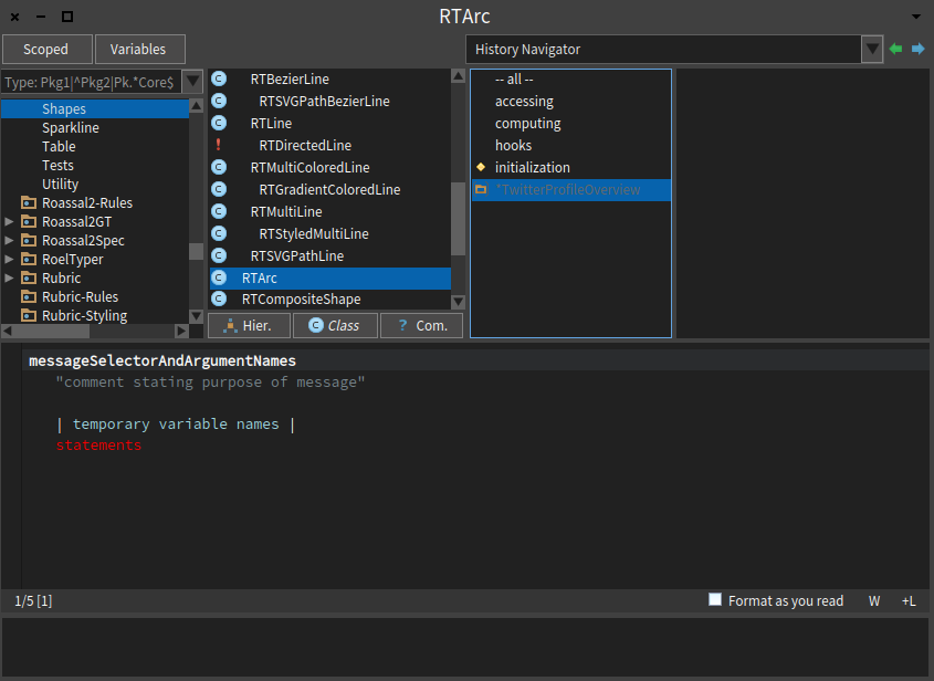
Hi :), I'm enjoying the Pharo Dark Theme a lot (in fact my tweet on a 10 minutes hack about it[1] have more impact that the tweets with month and a half work behind for Panama Papers[2]... that's life :-P), but I still have some suggestions on color contrast, particularly when you're doing class extensions and the light gray over blue makes the reading really difficult (see screenshot at bottom). [1] https://twitter.com/offrayLC/status/738828257680850944 [2] https://twitter.com/offrayLC/status/729069808684285953 Hope this helps to improve this theme. Cheers, Offray