Better color contrast for class extensions in dark theme

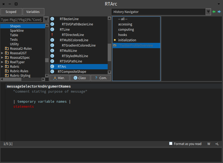
Hi :), I'm enjoying the Pharo Dark Theme a lot (in fact my tweet on a 10 minutes hack about it[1] have more impact that the tweets with month and a half work behind for Panama Papers[2]... that's life :-P), but I still have some suggestions on color contrast, particularly when you're doing class extensions and the light gray over blue makes the reading really difficult (see screenshot at bottom). [1] https://twitter.com/offrayLC/status/738828257680850944 [2] https://twitter.com/offrayLC/status/729069808684285953 Hope this helps to improve this theme. Cheers, Offray
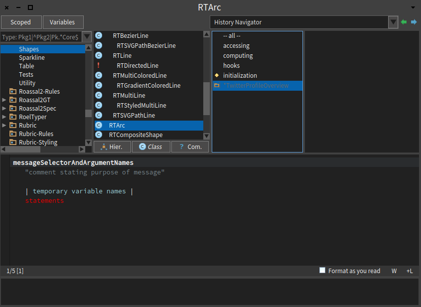
Hi :), Well, in the spirit of today's bug fixing hackathon, I should ask better some pointers about how to fix the color issue myself. So any advice is appreciated. Cheers, Offray On 24/06/16 11:52, Offray Vladimir Luna Cárdenas wrote:
Hi :),
I'm enjoying the Pharo Dark Theme a lot (in fact my tweet on a 10 minutes hack about it[1] have more impact that the tweets with month and a half work behind for Panama Papers[2]... that's life :-P), but I still have some suggestions on color contrast, particularly when you're doing class extensions and the light gray over blue makes the reading really difficult (see screenshot at bottom).
[1]https://twitter.com/offrayLC/status/738828257680850944 [2]https://twitter.com/offrayLC/status/729069808684285953
Hope this helps to improve this theme.
Cheers,
Offray
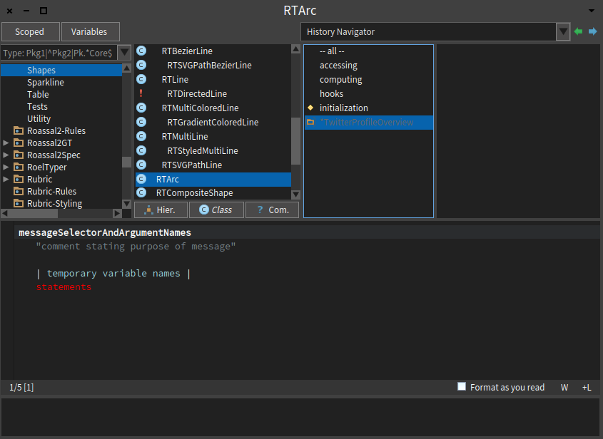

Pharo3DarkTheme >>#selectionColor From: Pharo-users [mailto:pharo-users-bounces@lists.pharo.org] On Behalf Of Offray Vladimir Luna Cárdenas Sent: Friday, June 24, 2016 7:20 PM To: pharo-users@lists.pharo.org Subject: Re: [Pharo-users] Better color contrast for class extensions in dark theme Hi :), Well, in the spirit of today's bug fixing hackathon, I should ask better some pointers about how to fix the color issue myself. So any advice is appreciated. Cheers, Offray On 24/06/16 11:52, Offray Vladimir Luna Cárdenas wrote: Hi :), I'm enjoying the Pharo Dark Theme a lot (in fact my tweet on a 10 minutes hack about it[1] have more impact that the tweets with month and a half work behind for Panama Papers[2]... that's life :-P), but I still have some suggestions on color contrast, particularly when you're doing class extensions and the light gray over blue makes the reading really difficult (see screenshot at bottom). [1] https://twitter.com/offrayLC/status/738828257680850944 [2] https://twitter.com/offrayLC/status/729069808684285953 [cid:image001.png@01D1CE52.7B5408C0] Hope this helps to improve this theme. Cheers, Offray

On Friday, 24 June 2016, Henrik Nergaard <henrik.nergaard@uia.no> wrote:
Pharo3DarkTheme >>#selectionColor
The problem is that for the extension color it is hard coded into Nautilus. We should add a method in UITheme and use it.
From my phone -- Cyril
*From:* Pharo-users [mailto:pharo-users-bounces@lists.pharo.org <javascript:_e(%7B%7D,'cvml','pharo-users-bounces@lists.pharo.org');>] *On Behalf Of *Offray Vladimir Luna Cárdenas *Sent:* Friday, June 24, 2016 7:20 PM *To:* pharo-users@lists.pharo.org <javascript:_e(%7B%7D,'cvml','pharo-users@lists.pharo.org');> *Subject:* Re: [Pharo-users] Better color contrast for class extensions in dark theme
Hi :),
Well, in the spirit of today's bug fixing hackathon, I should ask better some pointers about how to fix the color issue myself. So any advice is appreciated.
Cheers,
Offray
On 24/06/16 11:52, Offray Vladimir Luna Cárdenas wrote:
Hi :),
I'm enjoying the Pharo Dark Theme a lot (in fact my tweet on a 10 minutes hack about it[1] have more impact that the tweets with month and a half work behind for Panama Papers[2]... that's life :-P), but I still have some suggestions on color contrast, particularly when you're doing class extensions and the light gray over blue makes the reading really difficult (see screenshot at bottom).
[1] https://twitter.com/offrayLC/status/738828257680850944
[2] https://twitter.com/offrayLC/status/729069808684285953
Hope this helps to improve this theme.
Cheers,
Offray
-- Cheers Cyril Ferlicot

It should be a settings in Nautilus (then may be a uitheme) Le 24/6/16 à 20:41, Cyril Ferlicot a écrit :
On Friday, 24 June 2016, Henrik Nergaard <henrik.nergaard@uia.no <mailto:henrik.nergaard@uia.no>> wrote:
Pharo3DarkTheme >>#selectionColor
The problem is that for the extension color it is hard coded into Nautilus. We should add a method in UITheme and use it.
From my phone -- Cyril
*From:*Pharo-users [mailto:pharo-users-bounces@lists.pharo.org <javascript:_e(%7B%7D,'cvml','pharo-users-bounces@lists.pharo.org');>] *On Behalf Of *Offray Vladimir Luna Cárdenas *Sent:* Friday, June 24, 2016 7:20 PM *To:* pharo-users@lists.pharo.org <javascript:_e(%7B%7D,'cvml','pharo-users@lists.pharo.org');> *Subject:* Re: [Pharo-users] Better color contrast for class extensions in dark theme
Hi :),
Well, in the spirit of today's bug fixing hackathon, I should ask better some pointers about how to fix the color issue myself. So any advice is appreciated.
Cheers,
Offray
On 24/06/16 11:52, Offray Vladimir Luna Cárdenas wrote:
Hi :),
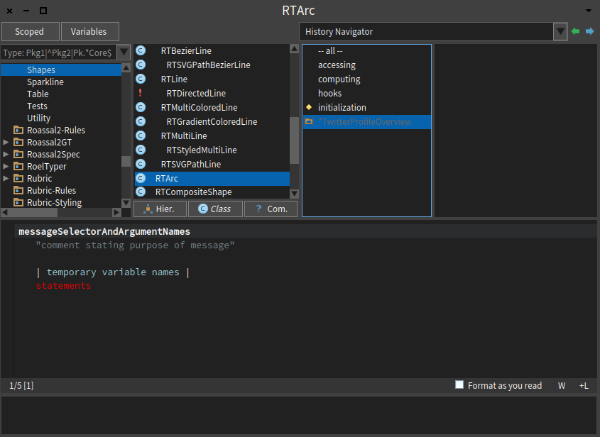
I'm enjoying the Pharo Dark Theme a lot (in fact my tweet on a 10 minutes hack about it[1] have more impact that the tweets with month and a half work behind for Panama Papers[2]... that's life :-P), but I still have some suggestions on color contrast, particularly when you're doing class extensions and the light gray over blue makes the reading really difficult (see screenshot at bottom).
[1]https://twitter.com/offrayLC/status/738828257680850944
[2]https://twitter.com/offrayLC/status/729069808684285953
Hope this helps to improve this theme.
Cheers,
Offray
-- Cheers Cyril Ferlicot

On 25 Jun 2016, at 08:15, stepharo <stepharo@free.fr> wrote:
It should be a settings in Nautilus (then may be a uitheme)
yes, this is about the theme :)
Le 24/6/16 à 20:41, Cyril Ferlicot a écrit :
On Friday, 24 June 2016, Henrik Nergaard < <mailto:henrik.nergaard@uia.no>henrik.nergaard@uia.no <mailto:henrik.nergaard@uia.no>> wrote: Pharo3DarkTheme >>#selectionColor
The problem is that for the extension color it is hard coded into Nautilus. We should add a method in UITheme and use it.
From my phone -- Cyril
From: Pharo-users [mailto:pharo-users-bounces@lists.pharo.org <javascript:_e(%7B%7D,'cvml','pharo-users-bounces@lists.pharo.org');>] On Behalf Of Offray Vladimir Luna Cárdenas Sent: Friday, June 24, 2016 7:20 PM To: pharo-users@lists.pharo.org <javascript:_e(%7B%7D,'cvml','pharo-users@lists.pharo.org');> Subject: Re: [Pharo-users] Better color contrast for class extensions in dark theme
Hi :),
Well, in the spirit of today's bug fixing hackathon, I should ask better some pointers about how to fix the color issue myself. So any advice is appreciated.
Cheers,
Offray
On 24/06/16 11:52, Offray Vladimir Luna Cárdenas wrote:
Hi :),
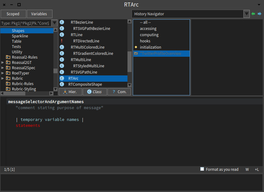
I'm enjoying the Pharo Dark Theme a lot (in fact my tweet on a 10 minutes hack about it[1] have more impact that the tweets with month and a half work behind for Panama Papers[2]... that's life :-P), but I still have some suggestions on color contrast, particularly when you're doing class extensions and the light gray over blue makes the reading really difficult (see screenshot at bottom).
[1] https://twitter.com/offrayLC/status/738828257680850944 <https://twitter.com/offrayLC/status/738828257680850944> [2] https://twitter.com/offrayLC/status/729069808684285953 <https://twitter.com/offrayLC/status/729069808684285953>
<Mail Attachment.png>
Hope this helps to improve this theme.
Cheers,
Offray
-- Cheers Cyril Ferlicot
participants (5)
-
 Cyril Ferlicot
 -
 Esteban Lorenzano
 -
 Henrik Nergaard
 -
 Offray Vladimir Luna Cárdenas
 -
 stepharo