
Hi, the issue that sets the new Pharo 3.0 look&feel uses a monospaced font for the code. It is only a coincidence that it is not set this way in the prebuild Pharo image. I have big doubts if this is the way to go. I think that proportional fonts are more natural for Smalltalk and without them the code is harder to read and not so beauty. I think that something like elastic tabstops would be much better solution. http://tibleiz.net/code-browser/elastic-tabstops.html On the other way, it is only my personal opinion and if you think that the Eclipse-like look will attract more new users... -- Pavel
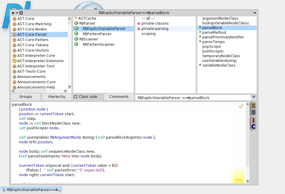
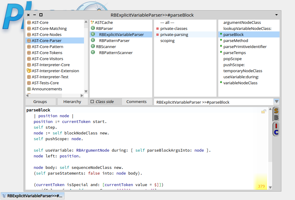

On Oct 15, 2013, at 8:31 AM, Pavel Krivanek <pavel.krivanek@gmail.com> wrote:
Hi,
the issue that sets the new Pharo 3.0 look&feel uses a monospaced font for the code. It is only a coincidence that it is not set this way in the prebuild Pharo image.
technical problem, fonts are somehow resetted on the build server, no idea why.
tI have big doubts if this is the way to go. I think that proportional fonts are more natural for Smalltalk and without them the code is harder to read and not so beauty. I think that something like elastic tabstops would be much better solution. http://tibleiz.net/code-browser/elastic-tabstops.html
It's a matter of taste I fear⦠we will see if everyone is against it or not. First we should set those fonts that where meant to be set and try.
On the other way, it is only my personal opinion and if you think that the Eclipse-like look will attract more new usersâ¦
For me who never uses eclipse they just are cleaner icons⦠Marcus

I don't like Eclipse myself, I do like the new icons. We can definitely "steal" some ideas from Eclipse. One I liked was perspectives, which are windows layout setups. I also don't like that pharo has poped up windows and I prefer Eclipse approach of more like docked windows. So we can definitely takes some good ideas from Eclipse and unite them with the good ideas of Pharo , while leave Eclipse bad ideas out. about elastic fonts, I am not against it, as long as it does not complicate things up. I can't say I have an issue reading pharo code. For me managing multiple windows is far more bothersome problem. The question as always whos the one that will implement it ? Because its one thing to like it, another to implement it :D Marcus Denker-4 wrote
On Oct 15, 2013, at 8:31 AM, Pavel Krivanek <
pavel.krivanek@
> wrote:
Hi,
the issue that sets the new Pharo 3.0 look&feel uses a monospaced font for the code. It is only a coincidence that it is not set this way in the prebuild Pharo image.
technical problem, fonts are somehow resetted on the build server, no idea why.
tI have big doubts if this is the way to go. I think that proportional fonts are more natural for Smalltalk and without them the code is harder to read and not so beauty. I think that something like elastic tabstops would be much better solution. http://tibleiz.net/code-browser/elastic-tabstops.html
It's a matter of taste I fear⦠we will see if everyone is against it or not. First we should set those fonts that where meant to be set and try.
On the other way, it is only my personal opinion and if you think that the Eclipse-like look will attract more new usersâ¦
For me who never uses eclipse they just are cleaner iconsâ¦
Marcus
signature.asc (210 bytes) <http://forum.world.st/attachment/4714435/0/signature.asc>;
-- View this message in context: http://forum.world.st/default-monospaced-code-font-tp4714433p4714460.html Sent from the Pharo Smalltalk Developers mailing list archive at Nabble.com.

On Oct 15, 2013, at 8:30 , Pavel Krivanek <pavel.krivanek@gmail.com> wrote:
Hi,
the issue that sets the new Pharo 3.0 look&feel uses a monospaced font for the code. It is only a coincidence that it is not set this way in the prebuild Pharo image.
I have big doubts if this is the way to go. I think that proportional fonts are more natural for Smalltalk and without them the code is harder to read and not so beauty.
+1 from me, I much prefer a proportional font, and letting the auto-format take care of alignment with tabs for the elements that need it. It may not be 100%, but it's good enough that I don't feel I'm using a large quantity of coding time actually formatting my code. If switching to monospaced, at least do so for ALL elements in the browser, mixing font like in that bottom picture (other than emphasis/size) is *really* jarring to the eye. Cheers, Henry

On 15 Oct 2013, at 08:30, Pavel Krivanek <pavel.krivanek@gmail.com> wrote:
the issue that sets the new Pharo 3.0 look&feel uses a monospaced font for the code. It is only a coincidence that it is not set this way in the prebuild Pharo image.
I have big doubts if this is the way to go. I think that proportional fonts are more natural for Smalltalk and without them the code is harder to read and not so beauty. I think that something like elastic tabstops would be much better solution. http://tibleiz.net/code-browser/elastic-tabstops.html
Yeah, I can't imagine many Smalltalkers liking a mono-spaced font, I personally hate it.
On the other way, it is only my personal opinion and if you think that the Eclipse-like look will attract more new users...
I don't like Eclipse ;-) But like Marcus says, it is just a different icon set. We want win any points on originality or personality though, which is a missed opportunity.

well... fonts and UX in general are two different (yet related) issues. UX is a huge an complicated task, and has to be taken very seriously if we want to succeed. To allow the appropriate/productive/happy flows in an environment requires a lot of effort and to put all the pieces together. Yes, I know, that sounds so general that is like not saying anything :) Here is the concrete: Put all the UX pieces together requires a lot of effort usually not taken into account. That's how the UX evolved more or less the same way as morphic: a patch over a patch without much thinking about the issue, just takign what is there and parching/extending as needed. As morphic, the current UX in pharo is broken: there is no coherence between tools and sometimes even inside the same tool (for example nautilus has different behavior inside the code panel than in the list panels on top). This is not the fault of any tool, just a consequence of how evolution was managed until now. So, we wanted a better UX for Pharo3 that included: a new Theme, new Icon set, and new tools that worked well together. But task demonstrated to be a hard to beat beast, and we just moved forward in small areas (there is for example a new centralized menu coming along with a new spotlight). And there is a prototype of a new theme and also some icons that where thought specially and that will fit nicely. But they will not be ready this year and after thinking a while (and getting feedback of people in community), we decided, for Pharo3: - adopt the glamour theme. This is a step forward our current one because glamour guys (specially Doru) continued working on it to have a really clean and simple theme. - adopt the EclipsePack theme because is an iconset specially thought for programming that plays very well together. No matter if you do not like Eclipse (even if I think you are missing the relevance of Eclipse and a lot of good ideas that we could take from them), is about creating a unified vision. The old icon set (famfam) was not intended for programming environment and also there were a lot of different icons incorporated anarchically. - adopt a monospaced font for coding (right now Source Code Pro) and a non-monospaced for the rest (right now Open Sans). The objective is to offer a L&F that where visual elements plays well together. And there is another more important (IMHO) objective: to offer newcomers an environment easier to approach. Pharo (and all Smalltalk-inspired environments) is already very alien for newcomers. We get a lot of power in exchange of that alienish stuff, but very often the curve of learning or acceptance is too high and people that could step closer to us are pushed away. So, my idea is to keep been as alien as possible in the things that make us Pharo and be the less alien possible in the rest: A nice L&F that can be feel as "some kind" familiar, is part of it. Said so... well you still can switch back to the old and ugly (IMO) L&F executing some lines of code in your workspace. Same to fonts: monospaced fonts is the worldwide accepted way of present source code. Why should we stay different? In any case, please give it a chance before drop it (once I can actually see why the fonts are not really applied) and we'll see how it works. Esteban On Oct 15, 2013, at 12:18 PM, Sven Van Caekenberghe <sven@stfx.eu> wrote:
On 15 Oct 2013, at 08:30, Pavel Krivanek <pavel.krivanek@gmail.com> wrote:
the issue that sets the new Pharo 3.0 look&feel uses a monospaced font for the code. It is only a coincidence that it is not set this way in the prebuild Pharo image.
I have big doubts if this is the way to go. I think that proportional fonts are more natural for Smalltalk and without them the code is harder to read and not so beauty. I think that something like elastic tabstops would be much better solution. http://tibleiz.net/code-browser/elastic-tabstops.html
Yeah, I can't imagine many Smalltalkers liking a mono-spaced font, I personally hate it.
On the other way, it is only my personal opinion and if you think that the Eclipse-like look will attract more new users...
I don't like Eclipse ;-) But like Marcus says, it is just a different icon set. We want win any points on originality or personality though, which is a missed opportunity.
On 15 Oct 2013, at 13:29, Esteban Lorenzano <estebanlm@gmail.com> wrote:
well... fonts and UX in general are two different (yet related) issues.
UX is a huge an complicated task, and has to be taken very seriously if we want to succeed. To allow the appropriate/productive/happy flows in an environment requires a lot of effort and to put all the pieces together. Yes, I know, that sounds so general that is like not saying anything :) Here is the concrete: Put all the UX pieces together requires a lot of effort usually not taken into account. That's how the UX evolved more or less the same way as morphic: a patch over a patch without much thinking about the issue, just takign what is there and parching/extending as needed. As morphic, the current UX in pharo is broken: there is no coherence between tools and sometimes even inside the same tool (for example nautilus has different behavior inside the code panel than in the list panels on top). This is not the fault of any tool, just a consequence of how evolution was managed until now. So, we wanted a better UX for Pharo3 that included: a new Theme, new Icon set, and new tools that worked well together. But task demonstrated to be a hard to beat beast, and we just moved forward in small areas (there is for example a new centralized menu coming along with a new spotlight). And there is a prototype of a new theme and also some icons that where thought specially and that will fit nicely. But they will not be ready this year and after thinking a while (and getting feedback of people in community), we decided, for Pharo3:
- adopt the glamour theme. This is a step forward our current one because glamour guys (specially Doru) continued working on it to have a really clean and simple theme. - adopt the EclipsePack theme because is an iconset specially thought for programming that plays very well together. No matter if you do not like Eclipse (even if I think you are missing the relevance of Eclipse and a lot of good ideas that we could take from them), is about creating a unified vision. The old icon set (famfam) was not intended for programming environment and also there were a lot of different icons incorporated anarchically. - adopt a monospaced font for coding (right now Source Code Pro) and a non-monospaced for the rest (right now Open Sans).
I agree with everything, except the monospaced font. When, where, how was this decided ? I didn't see any discussion about this. I would be very surprised if you, or anyone else of the key developers, used that font. Anyone else having an opinion about the mono spaced font ? It is not by erasing all differences with other systems that we will gain traction ! BTW: I don't see the any monospaced font in 30484, luckily ;-)
The objective is to offer a L&F that where visual elements plays well together. And there is another more important (IMHO) objective: to offer newcomers an environment easier to approach. Pharo (and all Smalltalk-inspired environments) is already very alien for newcomers. We get a lot of power in exchange of that alienish stuff, but very often the curve of learning or acceptance is too high and people that could step closer to us are pushed away. So, my idea is to keep been as alien as possible in the things that make us Pharo and be the less alien possible in the rest: A nice L&F that can be feel as "some kind" familiar, is part of it.
Said so... well you still can switch back to the old and ugly (IMO) L&F executing some lines of code in your workspace.
Same to fonts: monospaced fonts is the worldwide accepted way of present source code. Why should we stay different?
In any case, please give it a chance before drop it (once I can actually see why the fonts are not really applied) and we'll see how it works.
Esteban
On Oct 15, 2013, at 12:18 PM, Sven Van Caekenberghe <sven@stfx.eu> wrote:
On 15 Oct 2013, at 08:30, Pavel Krivanek <pavel.krivanek@gmail.com> wrote:
the issue that sets the new Pharo 3.0 look&feel uses a monospaced font for the code. It is only a coincidence that it is not set this way in the prebuild Pharo image.
I have big doubts if this is the way to go. I think that proportional fonts are more natural for Smalltalk and without them the code is harder to read and not so beauty. I think that something like elastic tabstops would be much better solution. http://tibleiz.net/code-browser/elastic-tabstops.html
Yeah, I can't imagine many Smalltalkers liking a mono-spaced font, I personally hate it.
On the other way, it is only my personal opinion and if you think that the Eclipse-like look will attract more new users...
I don't like Eclipse ;-) But like Marcus says, it is just a different icon set. We want win any points on originality or personality though, which is a missed opportunity.
On Oct 15, 2013, at 1:47 PM, Sven Van Caekenberghe <sven@stfx.eu> wrote:
On 15 Oct 2013, at 13:29, Esteban Lorenzano <estebanlm@gmail.com> wrote:
well... fonts and UX in general are two different (yet related) issues.
UX is a huge an complicated task, and has to be taken very seriously if we want to succeed. To allow the appropriate/productive/happy flows in an environment requires a lot of effort and to put all the pieces together. Yes, I know, that sounds so general that is like not saying anything :) Here is the concrete: Put all the UX pieces together requires a lot of effort usually not taken into account. That's how the UX evolved more or less the same way as morphic: a patch over a patch without much thinking about the issue, just takign what is there and parching/extending as needed. As morphic, the current UX in pharo is broken: there is no coherence between tools and sometimes even inside the same tool (for example nautilus has different behavior inside the code panel than in the list panels on top). This is not the fault of any tool, just a consequence of how evolution was managed until now. So, we wanted a better UX for Pharo3 that included: a new Theme, new Icon set, and new tools that worked well together. But task demonstrated to be a hard to beat beast, and we just moved forward in small areas (there is for example a new centralized menu coming along with a new spotlight). And there is a prototype of a new theme and also some icons that where thought specially and that will fit nicely. But they will not be ready this year and after thinking a while (and getting feedback of people in community), we decided, for Pharo3:
- adopt the glamour theme. This is a step forward our current one because glamour guys (specially Doru) continued working on it to have a really clean and simple theme. - adopt the EclipsePack theme because is an iconset specially thought for programming that plays very well together. No matter if you do not like Eclipse (even if I think you are missing the relevance of Eclipse and a lot of good ideas that we could take from them), is about creating a unified vision. The old icon set (famfam) was not intended for programming environment and also there were a lot of different icons incorporated anarchically. - adopt a monospaced font for coding (right now Source Code Pro) and a non-monospaced for the rest (right now Open Sans).
I agree with everything, except the monospaced font. When, where, how was this decided ? I didn't see any discussion about this. I would be very surprised if you, or anyone else of the key developers, used that font.
mmm... there was a "subjacent" discussion for months, but I agree that we should use more the list. In any case, this is still an open discussion.
Anyone else having an opinion about the mono spaced font ?
It is not by erasing all differences with other systems that we will gain traction !
is not about erasing differences, is about not been different when been different does not follows a meaning. I have my own experience to support my pov here: in my years teaching with pharo, I always had "lateral problems" with things that were not relevant... I would like to erase that, yes. To keep pharo been unique in the things that really matters.
BTW: I don't see the any monospaced font in 30484, luckily ;-)
The objective is to offer a L&F that where visual elements plays well together. And there is another more important (IMHO) objective: to offer newcomers an environment easier to approach. Pharo (and all Smalltalk-inspired environments) is already very alien for newcomers. We get a lot of power in exchange of that alienish stuff, but very often the curve of learning or acceptance is too high and people that could step closer to us are pushed away. So, my idea is to keep been as alien as possible in the things that make us Pharo and be the less alien possible in the rest: A nice L&F that can be feel as "some kind" familiar, is part of it.
Said so... well you still can switch back to the old and ugly (IMO) L&F executing some lines of code in your workspace.
Same to fonts: monospaced fonts is the worldwide accepted way of present source code. Why should we stay different?
In any case, please give it a chance before drop it (once I can actually see why the fonts are not really applied) and we'll see how it works.
Esteban
On Oct 15, 2013, at 12:18 PM, Sven Van Caekenberghe <sven@stfx.eu> wrote:
On 15 Oct 2013, at 08:30, Pavel Krivanek <pavel.krivanek@gmail.com> wrote:
the issue that sets the new Pharo 3.0 look&feel uses a monospaced font for the code. It is only a coincidence that it is not set this way in the prebuild Pharo image.
not a coincidence, a bug that arise when I tried to change it :)
I have big doubts if this is the way to go. I think that proportional fonts are more natural for Smalltalk and without them the code is harder to read and not so beauty. I think that something like elastic tabstops would be much better solution. http://tibleiz.net/code-browser/elastic-tabstops.html
Well... we can still iterate over the idea before release, but we do the best we can with the tools we have in the moment :) For me, is frankly uncomfortable to use proportional fonts when coding... is so annoying that I even use monospaced for lists, etc... but well, I accept the "current legislation": monospaced for code, proportional for the rest.
Yeah, I can't imagine many Smalltalkers liking a mono-spaced font, I personally hate it.
Oh well, I'm a pharoer, and I love them :)
On the other way, it is only my personal opinion and if you think that the Eclipse-like look will attract more new users...
I don't like Eclipse ;-) But like Marcus says, it is just a different icon set. We want win any points on originality or personality though, which is a missed opportunity.

Since the days when editors was able to allow me using any fonts, i was always switching to variable-spaced font for code pane. And i am not speaking about smalltalk or pharo here, it was C and Pascal those days :) guess, what i would prefer in pharo? :) The bad things about getting used to monospaced fonts is that you format code and it looks perfect, but then you print it or copy/paste it somewhere else where it uses other font, and all your beautiful formatting are gone. Needless to say, that printing press was invented way before first computer or digital printer, and all we know about fonts came to us from the printing world.. and i think i would be right saying that before first digital printers there was not such thing as monospaced fonts, because it is not economically efficient: you don't want to waste space on front page of your newspaper by aligning glyphs to some virtual grid. More than that, it works well only if you using same font size and no bold/underline variants whatever.. as soon as you use variants or different font size, all the benefits of 'formatting' using monospaced font is gone. That means, if we employ monospaced font for code, we will be forced to not use bold/italic variants, or different font size (for instance, i would be like to play with code highlight scheme, where comments using different font size, or where method name uses bigger font size etc). -- Best regards, Igor Stasenko.
Excellent arguments ! I am with you 100% On 15 Oct 2013, at 15:21, Igor Stasenko <siguctua@gmail.com> wrote:
Since the days when editors was able to allow me using any fonts, i was always switching to variable-spaced font for code pane. And i am not speaking about smalltalk or pharo here, it was C and Pascal those days :)
guess, what i would prefer in pharo? :)
The bad things about getting used to monospaced fonts is that you format code and it looks perfect, but then you print it or copy/paste it somewhere else where it uses other font, and all your beautiful formatting are gone. Needless to say, that printing press was invented way before first computer or digital printer, and all we know about fonts came to us from the printing world.. and i think i would be right saying that before first digital printers there was not such thing as monospaced fonts, because it is not economically efficient: you don't want to waste space on front page of your newspaper by aligning glyphs to some virtual grid. More than that, it works well only if you using same font size and no bold/underline variants whatever.. as soon as you use variants or different font size, all the benefits of 'formatting' using monospaced font is gone. That means, if we employ monospaced font for code, we will be forced to not use bold/italic variants, or different font size (for instance, i would be like to play with code highlight scheme, where comments using different font size, or where method name uses bigger font size etc).
-- Best regards, Igor Stasenko.
except that it is not accurate :) - with a monospace you can have bolds and italic without problems (it is a decent one)... and you also can play with sizes (for example, for comments) - when you copy&paste you will lose part of your formatting no matter if you have a fixed font or a proportional one (is not true that you lose all of them... in fact I usually do not lose any) On Oct 15, 2013, at 3:53 PM, Sven Van Caekenberghe <sven@stfx.eu> wrote:
Excellent arguments ! I am with you 100%
On 15 Oct 2013, at 15:21, Igor Stasenko <siguctua@gmail.com> wrote:
Since the days when editors was able to allow me using any fonts, i was always switching to variable-spaced font for code pane. And i am not speaking about smalltalk or pharo here, it was C and Pascal those days :)
guess, what i would prefer in pharo? :)
The bad things about getting used to monospaced fonts is that you format code and it looks perfect, but then you print it or copy/paste it somewhere else where it uses other font, and all your beautiful formatting are gone. Needless to say, that printing press was invented way before first computer or digital printer, and all we know about fonts came to us from the printing world.. and i think i would be right saying that before first digital printers there was not such thing as monospaced fonts, because it is not economically efficient: you don't want to waste space on front page of your newspaper by aligning glyphs to some virtual grid. More than that, it works well only if you using same font size and no bold/underline variants whatever.. as soon as you use variants or different font size, all the benefits of 'formatting' using monospaced font is gone. That means, if we employ monospaced font for code, we will be forced to not use bold/italic variants, or different font size (for instance, i would be like to play with code highlight scheme, where comments using different font size, or where method name uses bigger font size etc).
-- Best regards, Igor Stasenko.
On 15 October 2013 16:35, Esteban Lorenzano <estebanlm@gmail.com> wrote:
except that it is not accurate :)
- with a monospace you can have bolds and italic without problems (it is a decent one)... and you also can play with sizes (for example, for comments) - when you copy&paste you will lose part of your formatting no matter if you have a fixed font or a proportional one (is not true that you lose all of them... in fact I usually do not lose any)
yaya... "you can use any spaced font, as long as it monospaced" :P
but taking serious.. it is just about personal preference, nothing more. I don't see how monospaced fonts are any better than normal ones. I agree in only one: it must be a decent, clearly readable font.
On Oct 15, 2013, at 3:53 PM, Sven Van Caekenberghe <sven@stfx.eu> wrote:
Excellent arguments ! I am with you 100%
On 15 Oct 2013, at 15:21, Igor Stasenko <siguctua@gmail.com> wrote:
Since the days when editors was able to allow me using any fonts, i was always switching to variable-spaced font for code pane. And i am not speaking about smalltalk or pharo here, it was C and Pascal those days :)
guess, what i would prefer in pharo? :)
The bad things about getting used to monospaced fonts is that you format code and it looks perfect, but then you print it or copy/paste it somewhere else where it uses other font, and all your beautiful formatting are gone. Needless to say, that printing press was invented way before first computer or digital printer, and all we know about fonts came to us from the printing world.. and i think i would be right saying that before first digital printers there was not such thing as monospaced fonts, because it is not economically efficient: you don't want to waste space on front page of your newspaper by aligning glyphs to some virtual grid. More than that, it works well only if you using same font size and no bold/underline variants whatever.. as soon as you use variants or different font size, all the benefits of 'formatting' using monospaced font is gone. That means, if we employ monospaced font for code, we will be forced to not use bold/italic variants, or different font size (for instance, i would be like to play with code highlight scheme, where comments using different font size, or where method name uses bigger font size etc).
-- Best regards, Igor Stasenko.
-- Best regards, Igor Stasenko.
On 15 Oct 2013, at 16:35, Esteban Lorenzano <estebanlm@gmail.com> wrote:
except that it is not accurate :)
- with a monospace you can have bolds and italic without problems (it is a decent one)... and you also can play with sizes (for example, for comments) - when you copy&paste you will lose part of your formatting no matter if you have a fixed font or a proportional one (is not true that you lose all of them... in fact I usually do not lose any)
Sorry, but there are no sensible arguments in favour of a monospaced font. It is just not needed (in Smalltalk). Another way to look at it is: 99.99 % of the world use proportional fonts. BTW, I think whoever made this 'decision' knew it would be _very_ hard to get this passed ;-) Maybe we should switch to C/Java/Javascript syntax so that we do not scare newcomers ? Sorry, I could not resist.
On Oct 15, 2013, at 3:53 PM, Sven Van Caekenberghe <sven@stfx.eu> wrote:
Excellent arguments ! I am with you 100%
On 15 Oct 2013, at 15:21, Igor Stasenko <siguctua@gmail.com> wrote:
Since the days when editors was able to allow me using any fonts, i was always switching to variable-spaced font for code pane. And i am not speaking about smalltalk or pharo here, it was C and Pascal those days :)
guess, what i would prefer in pharo? :)
The bad things about getting used to monospaced fonts is that you format code and it looks perfect, but then you print it or copy/paste it somewhere else where it uses other font, and all your beautiful formatting are gone. Needless to say, that printing press was invented way before first computer or digital printer, and all we know about fonts came to us from the printing world.. and i think i would be right saying that before first digital printers there was not such thing as monospaced fonts, because it is not economically efficient: you don't want to waste space on front page of your newspaper by aligning glyphs to some virtual grid. More than that, it works well only if you using same font size and no bold/underline variants whatever.. as soon as you use variants or different font size, all the benefits of 'formatting' using monospaced font is gone. That means, if we employ monospaced font for code, we will be forced to not use bold/italic variants, or different font size (for instance, i would be like to play with code highlight scheme, where comments using different font size, or where method name uses bigger font size etc).
-- Best regards, Igor Stasenko.
On Oct 15, 2013, at 4:52 PM, Sven Van Caekenberghe <sven@stfx.eu> wrote:
On 15 Oct 2013, at 16:35, Esteban Lorenzano <estebanlm@gmail.com> wrote:
except that it is not accurate :)
- with a monospace you can have bolds and italic without problems (it is a decent one)... and you also can play with sizes (for example, for comments) - when you copy&paste you will lose part of your formatting no matter if you have a fixed font or a proportional one (is not true that you lose all of them... in fact I usually do not lose any)
Sorry, but there are no sensible arguments in favour of a monospaced font. It is just not needed (in Smalltalk). Another way to look at it is: 99.99 % of the world use proportional fonts.
BTW, I think whoever made this 'decision' knew it would be _very_ hard to get this passed ;-)
Maybe we should switch to C/Java/Javascript syntax so that we do not scare newcomers ? Sorry, I could not resist.
not taken. and non sense. idea is to welcome newcomers, not to became another language. Now... if font is *part* of the language, we could be talking about the same. But since it is not, then we are comparing apples with tomatoes. I can say that no, 99% of the world do not use proportional fonts... every other programing environment uses monospaced fonts. yeah, I know "we are different"... but we still code. Ah, no, sorry... we "manipulate objects", but that looks really close to coding for me. and yes... I was expecting a lot of whining (even if it was not me *alone* who took the decision), but I was expecting from people at least wait to see the fonts before start the bashing ;)
On Oct 15, 2013, at 3:53 PM, Sven Van Caekenberghe <sven@stfx.eu> wrote:
Excellent arguments ! I am with you 100%
On 15 Oct 2013, at 15:21, Igor Stasenko <siguctua@gmail.com> wrote:
Since the days when editors was able to allow me using any fonts, i was always switching to variable-spaced font for code pane. And i am not speaking about smalltalk or pharo here, it was C and Pascal those days :)
guess, what i would prefer in pharo? :)
The bad things about getting used to monospaced fonts is that you format code and it looks perfect, but then you print it or copy/paste it somewhere else where it uses other font, and all your beautiful formatting are gone. Needless to say, that printing press was invented way before first computer or digital printer, and all we know about fonts came to us from the printing world.. and i think i would be right saying that before first digital printers there was not such thing as monospaced fonts, because it is not economically efficient: you don't want to waste space on front page of your newspaper by aligning glyphs to some virtual grid. More than that, it works well only if you using same font size and no bold/underline variants whatever.. as soon as you use variants or different font size, all the benefits of 'formatting' using monospaced font is gone. That means, if we employ monospaced font for code, we will be forced to not use bold/italic variants, or different font size (for instance, i would be like to play with code highlight scheme, where comments using different font size, or where method name uses bigger font size etc).
-- Best regards, Igor Stasenko.
On 15 Oct 2013, at 17:05, Esteban Lorenzano <estebanlm@gmail.com> wrote:
On Oct 15, 2013, at 4:52 PM, Sven Van Caekenberghe <sven@stfx.eu> wrote:
On 15 Oct 2013, at 16:35, Esteban Lorenzano <estebanlm@gmail.com> wrote:
except that it is not accurate :)
- with a monospace you can have bolds and italic without problems (it is a decent one)... and you also can play with sizes (for example, for comments) - when you copy&paste you will lose part of your formatting no matter if you have a fixed font or a proportional one (is not true that you lose all of them... in fact I usually do not lose any)
Sorry, but there are no sensible arguments in favour of a monospaced font. It is just not needed (in Smalltalk). Another way to look at it is: 99.99 % of the world use proportional fonts.
BTW, I think whoever made this 'decision' knew it would be _very_ hard to get this passed ;-)
Maybe we should switch to C/Java/Javascript syntax so that we do not scare newcomers ? Sorry, I could not resist.
not taken. and non sense. idea is to welcome newcomers, not to became another language. Now... if font is *part* of the language, we could be talking about the same. But since it is not, then we are comparing apples with tomatoes.
I can say that no, 99% of the world do not use proportional fonts... every other programing environment uses monospaced fonts. yeah, I know "we are different"... but we still code. Ah, no, sorry... we "manipulate objects", but that looks really close to coding for me.
and yes... I was expecting a lot of whining (even if it was not me *alone* who took the decision), but I was expecting from people at least wait to see the fonts before start the bashing ;)
Well, it is not 'bashing', I just totally do not agree. And I would like to know who else is in favour, how the decision was made. But I'll wait a bit for other comments.
On Oct 15, 2013, at 3:53 PM, Sven Van Caekenberghe <sven@stfx.eu> wrote:
Excellent arguments ! I am with you 100%
On 15 Oct 2013, at 15:21, Igor Stasenko <siguctua@gmail.com> wrote:
Since the days when editors was able to allow me using any fonts, i was always switching to variable-spaced font for code pane. And i am not speaking about smalltalk or pharo here, it was C and Pascal those days :)
guess, what i would prefer in pharo? :)
The bad things about getting used to monospaced fonts is that you format code and it looks perfect, but then you print it or copy/paste it somewhere else where it uses other font, and all your beautiful formatting are gone. Needless to say, that printing press was invented way before first computer or digital printer, and all we know about fonts came to us from the printing world.. and i think i would be right saying that before first digital printers there was not such thing as monospaced fonts, because it is not economically efficient: you don't want to waste space on front page of your newspaper by aligning glyphs to some virtual grid. More than that, it works well only if you using same font size and no bold/underline variants whatever.. as soon as you use variants or different font size, all the benefits of 'formatting' using monospaced font is gone. That means, if we employ monospaced font for code, we will be forced to not use bold/italic variants, or different font size (for instance, i would be like to play with code highlight scheme, where comments using different font size, or where method name uses bigger font size etc).
-- Best regards, Igor Stasenko.
On Oct 15, 2013, at 5:18 PM, Sven Van Caekenberghe <sven@stfx.eu> wrote:
On 15 Oct 2013, at 17:05, Esteban Lorenzano <estebanlm@gmail.com> wrote:
On Oct 15, 2013, at 4:52 PM, Sven Van Caekenberghe <sven@stfx.eu> wrote:
On 15 Oct 2013, at 16:35, Esteban Lorenzano <estebanlm@gmail.com> wrote:
except that it is not accurate :)
- with a monospace you can have bolds and italic without problems (it is a decent one)... and you also can play with sizes (for example, for comments) - when you copy&paste you will lose part of your formatting no matter if you have a fixed font or a proportional one (is not true that you lose all of them... in fact I usually do not lose any)
Sorry, but there are no sensible arguments in favour of a monospaced font. It is just not needed (in Smalltalk). Another way to look at it is: 99.99 % of the world use proportional fonts.
BTW, I think whoever made this 'decision' knew it would be _very_ hard to get this passed ;-)
Maybe we should switch to C/Java/Javascript syntax so that we do not scare newcomers ? Sorry, I could not resist.
not taken. and non sense. idea is to welcome newcomers, not to became another language. Now... if font is *part* of the language, we could be talking about the same. But since it is not, then we are comparing apples with tomatoes.
I can say that no, 99% of the world do not use proportional fonts... every other programing environment uses monospaced fonts. yeah, I know "we are different"... but we still code. Ah, no, sorry... we "manipulate objects", but that looks really close to coding for me.
and yes... I was expecting a lot of whining (even if it was not me *alone* who took the decision), but I was expecting from people at least wait to see the fonts before start the bashing ;)
Well, it is not 'bashing', I just totally do not agree.
yeah, I know... and I'm ok with the discussion :)
And I would like to know who else is in favour, how the decision was made.
was taken essentially by me and others here, and after talking about this in the last hangout. In any case, I already said that is not a closed discussion :)
But I'll wait a bit for other comments.
yep, I agree :)
On Oct 15, 2013, at 3:53 PM, Sven Van Caekenberghe <sven@stfx.eu> wrote:
Excellent arguments ! I am with you 100%
On 15 Oct 2013, at 15:21, Igor Stasenko <siguctua@gmail.com> wrote:
Since the days when editors was able to allow me using any fonts, i was always switching to variable-spaced font for code pane. And i am not speaking about smalltalk or pharo here, it was C and Pascal those days :)
guess, what i would prefer in pharo? :)
The bad things about getting used to monospaced fonts is that you format code and it looks perfect, but then you print it or copy/paste it somewhere else where it uses other font, and all your beautiful formatting are gone. Needless to say, that printing press was invented way before first computer or digital printer, and all we know about fonts came to us from the printing world.. and i think i would be right saying that before first digital printers there was not such thing as monospaced fonts, because it is not economically efficient: you don't want to waste space on front page of your newspaper by aligning glyphs to some virtual grid. More than that, it works well only if you using same font size and no bold/underline variants whatever.. as soon as you use variants or different font size, all the benefits of 'formatting' using monospaced font is gone. That means, if we employ monospaced font for code, we will be forced to not use bold/italic variants, or different font size (for instance, i would be like to play with code highlight scheme, where comments using different font size, or where method name uses bigger font size etc).
-- Best regards, Igor Stasenko.

Hi, I am in favor of using monospaced fonts for the code and sans serif fonts for the rest of the things. I pushed the Source Sans + Source Code fonts for the Moose image since half a year, and actually people like the look of them. I am a bit surprised to see such virulent reactions :). @Sven: the mail discussions that led to the fonts choice had you in CC the whole time :). Cheers, Doru On Tue, Oct 15, 2013 at 5:18 PM, Sven Van Caekenberghe <sven@stfx.eu> wrote:
On 15 Oct 2013, at 17:05, Esteban Lorenzano <estebanlm@gmail.com> wrote:
On Oct 15, 2013, at 4:52 PM, Sven Van Caekenberghe <sven@stfx.eu> wrote:
On 15 Oct 2013, at 16:35, Esteban Lorenzano <estebanlm@gmail.com>
wrote:
except that it is not accurate :)
- with a monospace you can have bolds and italic without problems (it
is a decent one)... and you also can play with sizes (for example, for comments)
- when you copy&paste you will lose part of your formatting no matter if you have a fixed font or a proportional one (is not true that you lose all of them... in fact I usually do not lose any)
Sorry, but there are no sensible arguments in favour of a monospaced font. It is just not needed (in Smalltalk). Another way to look at it is: 99.99 % of the world use proportional fonts.
BTW, I think whoever made this 'decision' knew it would be _very_ hard to get this passed ;-)
Maybe we should switch to C/Java/Javascript syntax so that we do not scare newcomers ? Sorry, I could not resist. not taken. and non sense. idea is to welcome newcomers, not to became another language. Now... if font is *part* of the language, we could be talking about the same. But since it is not, then we are comparing apples with tomatoes.
I can say that no, 99% of the world do not use proportional fonts... every other programing environment uses monospaced fonts. yeah, I know "we are different"... but we still code. Ah, no, sorry... we "manipulate objects", but that looks really close to coding for me.
and yes... I was expecting a lot of whining (even if it was not me *alone* who took the decision), but I was expecting from people at least wait to see the fonts before start the bashing ;)
Well, it is not 'bashing', I just totally do not agree. And I would like to know who else is in favour, how the decision was made. But I'll wait a bit for other comments.
On Oct 15, 2013, at 3:53 PM, Sven Van Caekenberghe <sven@stfx.eu> wrote:
Excellent arguments ! I am with you 100%
On 15 Oct 2013, at 15:21, Igor Stasenko <siguctua@gmail.com> wrote:
Since the days when editors was able to allow me using any fonts, i was always switching to variable-spaced font for code pane. And i am not speaking about smalltalk or pharo here, it was C and Pascal those days :)
guess, what i would prefer in pharo? :)
The bad things about getting used to monospaced fonts is that you format code and it looks perfect, but then you print it or copy/paste it somewhere else where it uses other font, and all your beautiful formatting are gone. Needless to say, that printing press was invented way before first computer or digital printer, and all we know about fonts came to us from the printing world.. and i think i would be right saying that before first digital printers there was not such thing as monospaced fonts, because it is not economically efficient: you don't want to waste space on front page of your newspaper by aligning glyphs to some virtual grid. More than that, it works well only if you using same font size and no bold/underline variants whatever.. as soon as you use variants or different font size, all the benefits of 'formatting' using monospaced font is gone. That means, if we employ monospaced font for code, we will be forced to not use bold/italic variants, or different font size (for instance, i would be like to play with code highlight scheme, where comments using different font size, or where method name uses bigger font size etc).
-- Best regards, Igor Stasenko.
-- www.tudorgirba.com "Every thing has its own flow"

On Tue, Oct 15, 2013 at 8:29 AM, Tudor Girba <tudor@tudorgirba.com> wrote:
Hi,
I am in favor of using monospaced fonts for the code and sans serif fonts for the rest of the things. I pushed the Source Sans + Source Code fonts for the Moose image since half a year, and actually people like the look of them. I am a bit surprised to see such virulent reactions :).
again, ad hominem.
@Sven: the mail discussions that led to the fonts choice had you in CC the whole time :).
Cheers, Doru
On Tue, Oct 15, 2013 at 5:18 PM, Sven Van Caekenberghe <sven@stfx.eu>wrote:
On 15 Oct 2013, at 17:05, Esteban Lorenzano <estebanlm@gmail.com> wrote:
On Oct 15, 2013, at 4:52 PM, Sven Van Caekenberghe <sven@stfx.eu>
wrote:
On 15 Oct 2013, at 16:35, Esteban Lorenzano <estebanlm@gmail.com>
wrote:
except that it is not accurate :)
- with a monospace you can have bolds and italic without problems (it
is a decent one)... and you also can play with sizes (for example, for comments)
- when you copy&paste you will lose part of your formatting no matter if you have a fixed font or a proportional one (is not true that you lose all of them... in fact I usually do not lose any)
Sorry, but there are no sensible arguments in favour of a monospaced font. It is just not needed (in Smalltalk). Another way to look at it is: 99.99 % of the world use proportional fonts.
BTW, I think whoever made this 'decision' knew it would be _very_ hard to get this passed ;-)
Maybe we should switch to C/Java/Javascript syntax so that we do not scare newcomers ? Sorry, I could not resist. not taken. and non sense. idea is to welcome newcomers, not to became another language. Now... if font is *part* of the language, we could be talking about the same. But since it is not, then we are comparing apples with tomatoes.
I can say that no, 99% of the world do not use proportional fonts... every other programing environment uses monospaced fonts. yeah, I know "we are different"... but we still code. Ah, no, sorry... we "manipulate objects", but that looks really close to coding for me.
and yes... I was expecting a lot of whining (even if it was not me *alone* who took the decision), but I was expecting from people at least wait to see the fonts before start the bashing ;)
Well, it is not 'bashing', I just totally do not agree. And I would like to know who else is in favour, how the decision was made. But I'll wait a bit for other comments.
On Oct 15, 2013, at 3:53 PM, Sven Van Caekenberghe <sven@stfx.eu> wrote:
Excellent arguments ! I am with you 100%
On 15 Oct 2013, at 15:21, Igor Stasenko <siguctua@gmail.com> wrote:
Since the days when editors was able to allow me using any fonts, i was always switching to variable-spaced font for code pane. And i am not speaking about smalltalk or pharo here, it was C and Pascal those days :)
guess, what i would prefer in pharo? :)
The bad things about getting used to monospaced fonts is that you format code and it looks perfect, but then you print it or copy/paste it somewhere else where it uses other font, and all your beautiful formatting are gone. Needless to say, that printing press was invented way before first computer or digital printer, and all we know about fonts came to us from the printing world.. and i think i would be right saying that before first digital printers there was not such thing as monospaced fonts, because it is not economically efficient: you don't want to waste space on front page of your newspaper by aligning glyphs to some virtual grid. More than that, it works well only if you using same font size and no bold/underline variants whatever.. as soon as you use variants or different font size, all the benefits of 'formatting' using monospaced font is gone. That means, if we employ monospaced font for code, we will be forced to not use bold/italic variants, or different font size (for instance, i would be like to play with code highlight scheme, where comments using different font size, or where method name uses bigger font size etc).
-- Best regards, Igor Stasenko.
-- www.tudorgirba.com
"Every thing has its own flow"
-- best, Eliot
I kindly disagree :). I answered the request of Sven because I felt the discussion was highly unfair towards Esteban and I just offered my relaxed support. I see little constructivism in this discussion and my actual arguments would likely not add any value at this point. Doru On Tue, Oct 15, 2013 at 5:47 PM, Eliot Miranda <eliot.miranda@gmail.com>wrote:
On Tue, Oct 15, 2013 at 8:29 AM, Tudor Girba <tudor@tudorgirba.com> wrote:
Hi,
I am in favor of using monospaced fonts for the code and sans serif fonts for the rest of the things. I pushed the Source Sans + Source Code fonts for the Moose image since half a year, and actually people like the look of them. I am a bit surprised to see such virulent reactions :).
again, ad hominem.
@Sven: the mail discussions that led to the fonts choice had you in CC the whole time :).
Cheers, Doru
On Tue, Oct 15, 2013 at 5:18 PM, Sven Van Caekenberghe <sven@stfx.eu>wrote:
On 15 Oct 2013, at 17:05, Esteban Lorenzano <estebanlm@gmail.com> wrote:
On Oct 15, 2013, at 4:52 PM, Sven Van Caekenberghe <sven@stfx.eu>
wrote:
On 15 Oct 2013, at 16:35, Esteban Lorenzano <estebanlm@gmail.com>
wrote:
except that it is not accurate :)
- with a monospace you can have bolds and italic without problems
(it is a decent one)... and you also can play with sizes (for example, for comments)
- when you copy&paste you will lose part of your formatting no matter if you have a fixed font or a proportional one (is not true that you lose all of them... in fact I usually do not lose any)
Sorry, but there are no sensible arguments in favour of a monospaced font. It is just not needed (in Smalltalk). Another way to look at it is: 99.99 % of the world use proportional fonts.
BTW, I think whoever made this 'decision' knew it would be _very_ hard to get this passed ;-)
Maybe we should switch to C/Java/Javascript syntax so that we do not scare newcomers ? Sorry, I could not resist. not taken. and non sense. idea is to welcome newcomers, not to became another language. Now... if font is *part* of the language, we could be talking about the same. But since it is not, then we are comparing apples with tomatoes.
I can say that no, 99% of the world do not use proportional fonts... every other programing environment uses monospaced fonts. yeah, I know "we are different"... but we still code. Ah, no, sorry... we "manipulate objects", but that looks really close to coding for me.
and yes... I was expecting a lot of whining (even if it was not me *alone* who took the decision), but I was expecting from people at least wait to see the fonts before start the bashing ;)
Well, it is not 'bashing', I just totally do not agree. And I would like to know who else is in favour, how the decision was made. But I'll wait a bit for other comments.
On Oct 15, 2013, at 3:53 PM, Sven Van Caekenberghe <sven@stfx.eu> wrote:
Excellent arguments ! I am with you 100%
On 15 Oct 2013, at 15:21, Igor Stasenko <siguctua@gmail.com> wrote:
Since the days when editors was able to allow me using any fonts, i was always switching to variable-spaced font for code pane. And i am not speaking about smalltalk or pharo here, it was C and Pascal those days :)
guess, what i would prefer in pharo? :)
The bad things about getting used to monospaced fonts is that you format code and it looks perfect, but then you print it or copy/paste it somewhere else where it uses other font, and all your beautiful formatting are gone. Needless to say, that printing press was invented way before first computer or digital printer, and all we know about fonts came to us from the printing world.. and i think i would be right saying that before first digital printers there was not such thing as monospaced fonts, because it is not economically efficient: you don't want to waste space on front page of your newspaper by aligning glyphs to some virtual grid. More than that, it works well only if you using same font size and no bold/underline variants whatever.. as soon as you use variants or different font size, all the benefits of 'formatting' using monospaced font is gone. That means, if we employ monospaced font for code, we will be forced to not use bold/italic variants, or different font size (for instance, i would be like to play with code highlight scheme, where comments using different font size, or where method name uses bigger font size etc).
-- Best regards, Igor Stasenko.
-- www.tudorgirba.com
"Every thing has its own flow"
-- best, Eliot
-- www.tudorgirba.com "Every thing has its own flow"
On 15 Oct 2013, at 17:29, Tudor Girba <tudor@tudorgirba.com> wrote:
Hi,
I am in favor of using monospaced fonts for the code and sans serif fonts for the rest of the things. I pushed the Source Sans + Source Code fonts for the Moose image since half a year, and actually people like the look of them. I am a bit surprised to see such virulent reactions :).
@Sven: the mail discussions that led to the fonts choice had you in CC the whole time :).
OK, maybe a didn't pay enough attention: I knew it was about look and feel and (a) new font(s), I failed to register that it actually was about using a monospaced font. I can't belief that you are surprised about the reactions ;-) For what it is worth, I still haven't heard any solid argument for the change. Even if it is just aesthetics and it doesn't make a difference, there is still the question why we have to change.
Cheers, Doru
On Tue, Oct 15, 2013 at 5:18 PM, Sven Van Caekenberghe <sven@stfx.eu> wrote:
On 15 Oct 2013, at 17:05, Esteban Lorenzano <estebanlm@gmail.com> wrote:
On Oct 15, 2013, at 4:52 PM, Sven Van Caekenberghe <sven@stfx.eu> wrote:
On 15 Oct 2013, at 16:35, Esteban Lorenzano <estebanlm@gmail.com> wrote:
except that it is not accurate :)
- with a monospace you can have bolds and italic without problems (it is a decent one)... and you also can play with sizes (for example, for comments) - when you copy&paste you will lose part of your formatting no matter if you have a fixed font or a proportional one (is not true that you lose all of them... in fact I usually do not lose any)
Sorry, but there are no sensible arguments in favour of a monospaced font. It is just not needed (in Smalltalk). Another way to look at it is: 99.99 % of the world use proportional fonts.
BTW, I think whoever made this 'decision' knew it would be _very_ hard to get this passed ;-)
Maybe we should switch to C/Java/Javascript syntax so that we do not scare newcomers ? Sorry, I could not resist.
not taken. and non sense. idea is to welcome newcomers, not to became another language. Now... if font is *part* of the language, we could be talking about the same. But since it is not, then we are comparing apples with tomatoes.
I can say that no, 99% of the world do not use proportional fonts... every other programing environment uses monospaced fonts. yeah, I know "we are different"... but we still code. Ah, no, sorry... we "manipulate objects", but that looks really close to coding for me.
and yes... I was expecting a lot of whining (even if it was not me *alone* who took the decision), but I was expecting from people at least wait to see the fonts before start the bashing ;)
Well, it is not 'bashing', I just totally do not agree. And I would like to know who else is in favour, how the decision was made. But I'll wait a bit for other comments.
On Oct 15, 2013, at 3:53 PM, Sven Van Caekenberghe <sven@stfx.eu> wrote:
Excellent arguments ! I am with you 100%
On 15 Oct 2013, at 15:21, Igor Stasenko <siguctua@gmail.com> wrote:
Since the days when editors was able to allow me using any fonts, i was always switching to variable-spaced font for code pane. And i am not speaking about smalltalk or pharo here, it was C and Pascal those days :)
guess, what i would prefer in pharo? :)
The bad things about getting used to monospaced fonts is that you format code and it looks perfect, but then you print it or copy/paste it somewhere else where it uses other font, and all your beautiful formatting are gone. Needless to say, that printing press was invented way before first computer or digital printer, and all we know about fonts came to us from the printing world.. and i think i would be right saying that before first digital printers there was not such thing as monospaced fonts, because it is not economically efficient: you don't want to waste space on front page of your newspaper by aligning glyphs to some virtual grid. More than that, it works well only if you using same font size and no bold/underline variants whatever.. as soon as you use variants or different font size, all the benefits of 'formatting' using monospaced font is gone. That means, if we employ monospaced font for code, we will be forced to not use bold/italic variants, or different font size (for instance, i would be like to play with code highlight scheme, where comments using different font size, or where method name uses bigger font size etc).
-- Best regards, Igor Stasenko.
-- www.tudorgirba.com
"Every thing has its own flow"

Pushing the newcomers argument: if newcomers are used to using if then else and switch case, why did you deprecate usage caseOf:? If newcomers argument counts, shouldn't we remove text editing, browser, etc..., go back to file based development and create an eclipse (or emacs) plugin? I saw very good arguments for proportional: more readable/natural/more text on the line... So I'm inlne with Pavel, Is there any argument for fixed space (but the hypothetical newcomer). There are some times when we must educate rather than imitate. 2013/10/15 Sven Van Caekenberghe <sven@stfx.eu>
On 15 Oct 2013, at 17:29, Tudor Girba <tudor@tudorgirba.com> wrote:
Hi,
I am in favor of using monospaced fonts for the code and sans serif fonts for the rest of the things. I pushed the Source Sans + Source Code fonts for the Moose image since half a year, and actually people like the look of them. I am a bit surprised to see such virulent reactions :).
@Sven: the mail discussions that led to the fonts choice had you in CC the whole time :).
OK, maybe a didn't pay enough attention: I knew it was about look and feel and (a) new font(s), I failed to register that it actually was about using a monospaced font.
I can't belief that you are surprised about the reactions ;-)
For what it is worth, I still haven't heard any solid argument for the change. Even if it is just aesthetics and it doesn't make a difference, there is still the question why we have to change.
Cheers, Doru
On Tue, Oct 15, 2013 at 5:18 PM, Sven Van Caekenberghe <sven@stfx.eu> wrote:
On 15 Oct 2013, at 17:05, Esteban Lorenzano <estebanlm@gmail.com> wrote:
On Oct 15, 2013, at 4:52 PM, Sven Van Caekenberghe <sven@stfx.eu>
wrote:
On 15 Oct 2013, at 16:35, Esteban Lorenzano <estebanlm@gmail.com>
wrote:
except that it is not accurate :)
- with a monospace you can have bolds and italic without problems
(it is a decent one)... and you also can play with sizes (for example, for comments)
- when you copy&paste you will lose part of your formatting no matter if you have a fixed font or a proportional one (is not true that you lose all of them... in fact I usually do not lose any)
Sorry, but there are no sensible arguments in favour of a monospaced font. It is just not needed (in Smalltalk). Another way to look at it is: 99.99 % of the world use proportional fonts.
BTW, I think whoever made this 'decision' knew it would be _very_ hard to get this passed ;-)
Maybe we should switch to C/Java/Javascript syntax so that we do not scare newcomers ? Sorry, I could not resist. not taken. and non sense. idea is to welcome newcomers, not to became another language. Now... if font is *part* of the language, we could be talking about the same. But since it is not, then we are comparing apples with tomatoes.
I can say that no, 99% of the world do not use proportional fonts... every other programing environment uses monospaced fonts. yeah, I know "we are different"... but we still code. Ah, no, sorry... we "manipulate objects", but that looks really close to coding for me.
and yes... I was expecting a lot of whining (even if it was not me *alone* who took the decision), but I was expecting from people at least wait to see the fonts before start the bashing ;)
Well, it is not 'bashing', I just totally do not agree. And I would like to know who else is in favour, how the decision was made. But I'll wait a bit for other comments.
On Oct 15, 2013, at 3:53 PM, Sven Van Caekenberghe <sven@stfx.eu> wrote:
Excellent arguments ! I am with you 100%
On 15 Oct 2013, at 15:21, Igor Stasenko <siguctua@gmail.com> wrote:
Since the days when editors was able to allow me using any fonts, i was always switching to variable-spaced font for code pane. And i am not speaking about smalltalk or pharo here, it was C and Pascal those days :)
guess, what i would prefer in pharo? :)
The bad things about getting used to monospaced fonts is that you format code and it looks perfect, but then you print it or copy/paste it somewhere else where it uses other font, and all your beautiful formatting are gone. Needless to say, that printing press was invented way before first computer or digital printer, and all we know about fonts came to us from the printing world.. and i think i would be right saying that before first digital printers there was not such thing as monospaced fonts, because it is not economically efficient: you don't want to waste space on front page of your newspaper by aligning glyphs to some virtual grid. More than that, it works well only if you using same font size and no bold/underline variants whatever.. as soon as you use variants or different font size, all the benefits of 'formatting' using monospaced font is gone. That means, if we employ monospaced font for code, we will be forced to not use bold/italic variants, or different font size (for instance, i would be like to play with code highlight scheme, where comments using different font size, or where method name uses bigger font size etc).
-- Best regards, Igor Stasenko.
-- www.tudorgirba.com
"Every thing has its own flow"

If newcomers argument counts, shouldn't we remove text editing, browser, etc..., go back to file based development and create an eclipse (or emacs) plugin?
we're on our way, github we're coming. In return, smalltalk is not defined by monospaced nor proportional fonts. So dear list, I am happy that you join this discussion, though invest your energy wisely: - have you fixed a bug today? - have you corrected a typo today? - have you reviewed a bug yet? If no, please have a look here: https://pharo.fogbugz.com/f/filters/45/Review
If that's some sort of intimidation: contribute or shut up, then I'll shut up. Ciao 2013/10/15 Camillo Bruni <camillobruni@gmail.com>
If newcomers argument counts, shouldn't we remove text editing, browser, etc..., go back to file based development and create an eclipse (or emacs) plugin?
we're on our way, github we're coming. In return, smalltalk is not defined by monospaced nor proportional fonts.
So dear list, I am happy that you join this discussion, though invest your energy wisely: - have you fixed a bug today? - have you corrected a typo today? - have you reviewed a bug yet?
If no, please have a look here: https://pharo.fogbugz.com/f/filters/45/Review

Sorry, not been following the thread but is there really a problem? Code font is specifiable in settings. Guess we are all just arguing about what the default may be... Regards, Gary ----- Original Message ----- From: Nicolas Cellier To: Pharo Development List Sent: Tuesday, October 15, 2013 5:42 PM Subject: Re: [Pharo-dev] default monospaced code font Pushing the newcomers argument: if newcomers are used to using if then else and switch case, why did you deprecate usage caseOf:? If newcomers argument counts, shouldn't we remove text editing, browser, etc..., go back to file based development and create an eclipse (or emacs) plugin? I saw very good arguments for proportional: more readable/natural/more text on the line... So I'm inlne with Pavel, Is there any argument for fixed space (but the hypothetical newcomer). There are some times when we must educate rather than imitate. 2013/10/15 Sven Van Caekenberghe <sven@stfx.eu> On 15 Oct 2013, at 17:29, Tudor Girba <tudor@tudorgirba.com> wrote: > Hi, > > I am in favor of using monospaced fonts for the code and sans serif fonts for the rest of the things. I pushed the Source Sans + Source Code fonts for the Moose image since half a year, and actually people like the look of them. I am a bit surprised to see such virulent reactions :). > > @Sven: the mail discussions that led to the fonts choice had you in CC the whole time :). OK, maybe a didn't pay enough attention: I knew it was about look and feel and (a) new font(s), I failed to register that it actually was about using a monospaced font. I can't belief that you are surprised about the reactions ;-) For what it is worth, I still haven't heard any solid argument for the change. Even if it is just aesthetics and it doesn't make a difference, there is still the question why we have to change. > Cheers, > Doru > > > > On Tue, Oct 15, 2013 at 5:18 PM, Sven Van Caekenberghe <sven@stfx.eu> wrote: > > On 15 Oct 2013, at 17:05, Esteban Lorenzano <estebanlm@gmail.com> wrote: > > > > > On Oct 15, 2013, at 4:52 PM, Sven Van Caekenberghe <sven@stfx.eu> wrote: > > > >> > >> On 15 Oct 2013, at 16:35, Esteban Lorenzano <estebanlm@gmail.com> wrote: > >> > >>> except that it is not accurate :) > >>> > >>> - with a monospace you can have bolds and italic without problems (it is a decent one)... and you also can play with sizes (for example, for comments) > >>> - when you copy&paste you will lose part of your formatting no matter if you have a fixed font or a proportional one (is not true that you lose all of them... in fact I usually do not lose any) > >> > >> Sorry, but there are no sensible arguments in favour of a monospaced font. It is just not needed (in Smalltalk). Another way to look at it is: 99.99 % of the world use proportional fonts. > >> > >> BTW, I think whoever made this 'decision' knew it would be _very_ hard to get this passed ;-) > >> > >> Maybe we should switch to C/Java/Javascript syntax so that we do not scare newcomers ? Sorry, I could not resist. > > not taken. > > and non sense. > > idea is to welcome newcomers, not to became another language. > > Now... if font is *part* of the language, we could be talking about the same. But since it is not, then we are comparing apples with tomatoes. > > > > I can say that no, 99% of the world do not use proportional fonts... every other programing environment uses monospaced fonts. > > yeah, I know "we are different"... but we still code. Ah, no, sorry... we "manipulate objects", but that looks really close to coding for me. > > > > and yes... I was expecting a lot of whining (even if it was not me *alone* who took the decision), but I was expecting from people at least wait to see the fonts before start the bashing ;) > > Well, it is not 'bashing', I just totally do not agree. > And I would like to know who else is in favour, how the decision was made. > But I'll wait a bit for other comments. > > >>> On Oct 15, 2013, at 3:53 PM, Sven Van Caekenberghe <sven@stfx.eu> wrote: > >>> > >>>> Excellent arguments ! > >>>> I am with you 100% > >>>> > >>>> On 15 Oct 2013, at 15:21, Igor Stasenko <siguctua@gmail.com> wrote: > >>>> > >>>>> Since the days when editors was able to allow me using any fonts, i was always switching to variable-spaced font > >>>>> for code pane. And i am not speaking about smalltalk or pharo here, it was C and Pascal those days :) > >>>>> > >>>>> guess, what i would prefer in pharo? :) > >>>>> > >>>>> The bad things about getting used to monospaced fonts is that you format code and it looks perfect, > >>>>> but then you print it or copy/paste it somewhere else where it uses other font, and all your beautiful formatting are gone. > >>>>> Needless to say, that printing press was invented way before first computer or digital printer, and all we know about fonts came > >>>>> to us from the printing world.. and i think i would be right saying that before first digital printers there was not such thing as monospaced > >>>>> fonts, because it is not economically efficient: you don't want to waste space on front page of your newspaper by aligning glyphs to some virtual grid. > >>>>> More than that, it works well only if you using same font size and no bold/underline variants whatever.. as soon as you use variants or different font size, > >>>>> all the benefits of 'formatting' using monospaced font is gone. > >>>>> That means, if we employ monospaced font for code, we will be forced to not use bold/italic variants, or different font size (for instance, > >>>>> i would be like to play with code highlight scheme, where comments using different font size, or where method name uses bigger font size etc). > >>>>> > >>>>> > >>>>> -- > >>>>> Best regards, > >>>>> Igor Stasenko. > >>>> > >>>> > >>> > >>> > >> > >> > > > > > > > > > > -- > www.tudorgirba.com > > "Every thing has its own flow"
On Oct 15, 2013, at 6:53 PM, Gary Chambers <gazzaguru2@btinternet.com> wrote:
Sorry, not been following the thread but is there really a problem? Code font is specifiable in settings. Guess we are all just arguing about what the default may be...
exactly :)
Regards, Gary ----- Original Message ----- From: Nicolas Cellier To: Pharo Development List Sent: Tuesday, October 15, 2013 5:42 PM Subject: Re: [Pharo-dev] default monospaced code font
Pushing the newcomers argument: if newcomers are used to using if then else and switch case, why did you deprecate usage caseOf:? If newcomers argument counts, shouldn't we remove text editing, browser, etc..., go back to file based development and create an eclipse (or emacs) plugin?
I saw very good arguments for proportional: more readable/natural/more text on the line... So I'm inlne with Pavel,
Is there any argument for fixed space (but the hypothetical newcomer). There are some times when we must educate rather than imitate.
2013/10/15 Sven Van Caekenberghe <sven@stfx.eu>
On 15 Oct 2013, at 17:29, Tudor Girba <tudor@tudorgirba.com> wrote:
Hi,
I am in favor of using monospaced fonts for the code and sans serif fonts for the rest of the things. I pushed the Source Sans + Source Code fonts for the Moose image since half a year, and actually people like the look of them. I am a bit surprised to see such virulent reactions :).
@Sven: the mail discussions that led to the fonts choice had you in CC the whole time :).
OK, maybe a didn't pay enough attention: I knew it was about look and feel and (a) new font(s), I failed to register that it actually was about using a monospaced font.
I can't belief that you are surprised about the reactions ;-)
For what it is worth, I still haven't heard any solid argument for the change. Even if it is just aesthetics and it doesn't make a difference, there is still the question why we have to change.
Cheers, Doru
On Tue, Oct 15, 2013 at 5:18 PM, Sven Van Caekenberghe <sven@stfx.eu> wrote:
On 15 Oct 2013, at 17:05, Esteban Lorenzano <estebanlm@gmail.com> wrote:
On Oct 15, 2013, at 4:52 PM, Sven Van Caekenberghe <sven@stfx.eu> wrote:
On 15 Oct 2013, at 16:35, Esteban Lorenzano <estebanlm@gmail.com> wrote:
except that it is not accurate :)
- with a monospace you can have bolds and italic without problems (it is a decent one)... and you also can play with sizes (for example, for comments) - when you copy&paste you will lose part of your formatting no matter if you have a fixed font or a proportional one (is not true that you lose all of them... in fact I usually do not lose any)
Sorry, but there are no sensible arguments in favour of a monospaced font. It is just not needed (in Smalltalk). Another way to look at it is: 99.99 % of the world use proportional fonts.
BTW, I think whoever made this 'decision' knew it would be _very_ hard to get this passed ;-)
Maybe we should switch to C/Java/Javascript syntax so that we do not scare newcomers ? Sorry, I could not resist.
not taken. and non sense. idea is to welcome newcomers, not to became another language. Now... if font is *part* of the language, we could be talking about the same. But since it is not, then we are comparing apples with tomatoes.
I can say that no, 99% of the world do not use proportional fonts... every other programing environment uses monospaced fonts. yeah, I know "we are different"... but we still code. Ah, no, sorry... we "manipulate objects", but that looks really close to coding for me.
and yes... I was expecting a lot of whining (even if it was not me *alone* who took the decision), but I was expecting from people at least wait to see the fonts before start the bashing ;)
Well, it is not 'bashing', I just totally do not agree. And I would like to know who else is in favour, how the decision was made. But I'll wait a bit for other comments.
On Oct 15, 2013, at 3:53 PM, Sven Van Caekenberghe <sven@stfx.eu> wrote:
Excellent arguments ! I am with you 100%
On 15 Oct 2013, at 15:21, Igor Stasenko <siguctua@gmail.com> wrote:
Since the days when editors was able to allow me using any fonts, i was always switching to variable-spaced font for code pane. And i am not speaking about smalltalk or pharo here, it was C and Pascal those days :)
guess, what i would prefer in pharo? :)
The bad things about getting used to monospaced fonts is that you format code and it looks perfect, but then you print it or copy/paste it somewhere else where it uses other font, and all your beautiful formatting are gone. Needless to say, that printing press was invented way before first computer or digital printer, and all we know about fonts came to us from the printing world.. and i think i would be right saying that before first digital printers there was not such thing as monospaced fonts, because it is not economically efficient: you don't want to waste space on front page of your newspaper by aligning glyphs to some virtual grid. More than that, it works well only if you using same font size and no bold/underline variants whatever.. as soon as you use variants or different font size, all the benefits of 'formatting' using monospaced font is gone. That means, if we employ monospaced font for code, we will be forced to not use bold/italic variants, or different font size (for instance, i would be like to play with code highlight scheme, where comments using different font size, or where method name uses bigger font size etc).
-- Best regards, Igor Stasenko.
-- www.tudorgirba.com
"Every thing has its own flow"

And can I have a setting with the - Pharo theme (not pharo3) - and the eclipse icon set ? :) (Of course I should set an issue and write a Slice, otherwise Camillo will get angry at me ;)) Thierry ________________________________ De : Pharo-dev [pharo-dev-bounces@lists.pharo.org] de la part de Esteban Lorenzano [estebanlm@gmail.com] Date d'envoi : mardi 15 octobre 2013 20:07 Ã : Pharo Development List Objet : Re: [Pharo-dev] default monospaced code font On Oct 15, 2013, at 6:53 PM, Gary Chambers <gazzaguru2@btinternet.com<mailto:gazzaguru2@btinternet.com>> wrote: Sorry, not been following the thread but is there really a problem? Code font is specifiable in settings. Guess we are all just arguing about what the default may be... exactly :) Regards, Gary ----- Original Message ----- From: Nicolas Cellier<mailto:nicolas.cellier.aka.nice@gmail.com> To: Pharo Development List<mailto:pharo-dev@lists.pharo.org> Sent: Tuesday, October 15, 2013 5:42 PM Subject: Re: [Pharo-dev] default monospaced code font Pushing the newcomers argument: if newcomers are used to using if then else and switch case, why did you deprecate usage caseOf:? If newcomers argument counts, shouldn't we remove text editing, browser, etc..., go back to file based development and create an eclipse (or emacs) plugin? I saw very good arguments for proportional: more readable/natural/more text on the line... So I'm inlne with Pavel, Is there any argument for fixed space (but the hypothetical newcomer). There are some times when we must educate rather than imitate. 2013/10/15 Sven Van Caekenberghe <sven@stfx.eu<mailto:sven@stfx.eu>> On 15 Oct 2013, at 17:29, Tudor Girba <tudor@tudorgirba.com<mailto:tudor@tudorgirba.com>> wrote:
Hi,
I am in favor of using monospaced fonts for the code and sans serif fonts for the rest of the things. I pushed the Source Sans + Source Code fonts for the Moose image since half a year, and actually people like the look of them. I am a bit surprised to see such virulent reactions :).
@Sven: the mail discussions that led to the fonts choice had you in CC the whole time :).
OK, maybe a didn't pay enough attention: I knew it was about look and feel and (a) new font(s), I failed to register that it actually was about using a monospaced font. I can't belief that you are surprised about the reactions ;-) For what it is worth, I still haven't heard any solid argument for the change. Even if it is just aesthetics and it doesn't make a difference, there is still the question why we have to change.
Cheers, Doru
On Tue, Oct 15, 2013 at 5:18 PM, Sven Van Caekenberghe <sven@stfx.eu<mailto:sven@stfx.eu>> wrote:
On 15 Oct 2013, at 17:05, Esteban Lorenzano <estebanlm@gmail.com<mailto:estebanlm@gmail.com>> wrote:
On Oct 15, 2013, at 4:52 PM, Sven Van Caekenberghe <sven@stfx.eu<mailto:sven@stfx.eu>> wrote:
On 15 Oct 2013, at 16:35, Esteban Lorenzano <estebanlm@gmail.com<mailto:estebanlm@gmail.com>> wrote:
except that it is not accurate :)
- with a monospace you can have bolds and italic without problems (it is a decent one)... and you also can play with sizes (for example, for comments) - when you copy&paste you will lose part of your formatting no matter if you have a fixed font or a proportional one (is not true that you lose all of them... in fact I usually do not lose any)
Sorry, but there are no sensible arguments in favour of a monospaced font. It is just not needed (in Smalltalk). Another way to look at it is: 99.99 % of the world use proportional fonts.
BTW, I think whoever made this 'decision' knew it would be _very_ hard to get this passed ;-)
Maybe we should switch to C/Java/Javascript syntax so that we do not scare newcomers ? Sorry, I could not resist.
not taken. and non sense. idea is to welcome newcomers, not to became another language. Now... if font is *part* of the language, we could be talking about the same. But since it is not, then we are comparing apples with tomatoes.
I can say that no, 99% of the world do not use proportional fonts... every other programing environment uses monospaced fonts. yeah, I know "we are different"... but we still code. Ah, no, sorry... we "manipulate objects", but that looks really close to coding for me.
and yes... I was expecting a lot of whining (even if it was not me *alone* who took the decision), but I was expecting from people at least wait to see the fonts before start the bashing ;)
Well, it is not 'bashing', I just totally do not agree. And I would like to know who else is in favour, how the decision was made. But I'll wait a bit for other comments.
On Oct 15, 2013, at 3:53 PM, Sven Van Caekenberghe <sven@stfx.eu<mailto:sven@stfx.eu>> wrote:
Excellent arguments ! I am with you 100%
On 15 Oct 2013, at 15:21, Igor Stasenko <siguctua@gmail.com<mailto:siguctua@gmail.com>> wrote:
Since the days when editors was able to allow me using any fonts, i was always switching to variable-spaced font for code pane. And i am not speaking about smalltalk or pharo here, it was C and Pascal those days :)
guess, what i would prefer in pharo? :)
The bad things about getting used to monospaced fonts is that you format code and it looks perfect, but then you print it or copy/paste it somewhere else where it uses other font, and all your beautiful formatting are gone. Needless to say, that printing press was invented way before first computer or digital printer, and all we know about fonts came to us from the printing world.. and i think i would be right saying that before first digital printers there was not such thing as monospaced fonts, because it is not economically efficient: you don't want to waste space on front page of your newspaper by aligning glyphs to some virtual grid. More than that, it works well only if you using same font size and no bold/underline variants whatever.. as soon as you use variants or different font size, all the benefits of 'formatting' using monospaced font is gone. That means, if we employ monospaced font for code, we will be forced to not use bold/italic variants, or different font size (for instance, i would be like to play with code highlight scheme, where comments using different font size, or where method name uses bigger font size etc).
-- Best regards, Igor Stasenko.
-- www.tudorgirba.com<http://www.tudorgirba.com>
"Every thing has its own flow"
theme and iconset are decoupled, so yes you can :) problem is that I still didn't added the preference for choosing iconsets (my bad, didn't have the time yet). On Oct 15, 2013, at 8:19 PM, GOUBIER Thierry <thierry.goubier@cea.fr> wrote:
And can I have a setting with the
- Pharo theme (not pharo3) - and the eclipse icon set ?
:)
(Of course I should set an issue and write a Slice, otherwise Camillo will get angry at me ;))
Thierry De : Pharo-dev [pharo-dev-bounces@lists.pharo.org] de la part de Esteban Lorenzano [estebanlm@gmail.com] Date d'envoi : mardi 15 octobre 2013 20:07 Ã : Pharo Development List Objet : Re: [Pharo-dev] default monospaced code font
On Oct 15, 2013, at 6:53 PM, Gary Chambers <gazzaguru2@btinternet.com> wrote:
Sorry, not been following the thread but is there really a problem? Code font is specifiable in settings. Guess we are all just arguing about what the default may be...
exactly :)
Regards, Gary ----- Original Message ----- From: Nicolas Cellier To: Pharo Development List Sent: Tuesday, October 15, 2013 5:42 PM Subject: Re: [Pharo-dev] default monospaced code font
Pushing the newcomers argument: if newcomers are used to using if then else and switch case, why did you deprecate usage caseOf:? If newcomers argument counts, shouldn't we remove text editing, browser, etc..., go back to file based development and create an eclipse (or emacs) plugin?
I saw very good arguments for proportional: more readable/natural/more text on the line... So I'm inlne with Pavel,
Is there any argument for fixed space (but the hypothetical newcomer). There are some times when we must educate rather than imitate.
2013/10/15 Sven Van Caekenberghe <sven@stfx.eu>
On 15 Oct 2013, at 17:29, Tudor Girba <tudor@tudorgirba.com> wrote:
Hi,
I am in favor of using monospaced fonts for the code and sans serif fonts for the rest of the things. I pushed the Source Sans + Source Code fonts for the Moose image since half a year, and actually people like the look of them. I am a bit surprised to see such virulent reactions :).
@Sven: the mail discussions that led to the fonts choice had you in CC the whole time :).
OK, maybe a didn't pay enough attention: I knew it was about look and feel and (a) new font(s), I failed to register that it actually was about using a monospaced font.
I can't belief that you are surprised about the reactions ;-)
For what it is worth, I still haven't heard any solid argument for the change. Even if it is just aesthetics and it doesn't make a difference, there is still the question why we have to change.
Cheers, Doru
On Tue, Oct 15, 2013 at 5:18 PM, Sven Van Caekenberghe <sven@stfx.eu> wrote:
On 15 Oct 2013, at 17:05, Esteban Lorenzano <estebanlm@gmail.com> wrote:
On Oct 15, 2013, at 4:52 PM, Sven Van Caekenberghe <sven@stfx.eu> wrote:
On 15 Oct 2013, at 16:35, Esteban Lorenzano <estebanlm@gmail.com> wrote:
except that it is not accurate :)
- with a monospace you can have bolds and italic without problems (it is a decent one)... and you also can play with sizes (for example, for comments) - when you copy&paste you will lose part of your formatting no matter if you have a fixed font or a proportional one (is not true that you lose all of them... in fact I usually do not lose any)
Sorry, but there are no sensible arguments in favour of a monospaced font. It is just not needed (in Smalltalk). Another way to look at it is: 99.99 % of the world use proportional fonts.
BTW, I think whoever made this 'decision' knew it would be _very_ hard to get this passed ;-)
Maybe we should switch to C/Java/Javascript syntax so that we do not scare newcomers ? Sorry, I could not resist.
not taken. and non sense. idea is to welcome newcomers, not to became another language. Now... if font is *part* of the language, we could be talking about the same. But since it is not, then we are comparing apples with tomatoes.
I can say that no, 99% of the world do not use proportional fonts... every other programing environment uses monospaced fonts. yeah, I know "we are different"... but we still code. Ah, no, sorry... we "manipulate objects", but that looks really close to coding for me.
and yes... I was expecting a lot of whining (even if it was not me *alone* who took the decision), but I was expecting from people at least wait to see the fonts before start the bashing ;)
Well, it is not 'bashing', I just totally do not agree. And I would like to know who else is in favour, how the decision was made. But I'll wait a bit for other comments.
On Oct 15, 2013, at 3:53 PM, Sven Van Caekenberghe <sven@stfx.eu> wrote:
Excellent arguments ! I am with you 100%
On 15 Oct 2013, at 15:21, Igor Stasenko <siguctua@gmail.com> wrote:
Since the days when editors was able to allow me using any fonts, i was always switching to variable-spaced font for code pane. And i am not speaking about smalltalk or pharo here, it was C and Pascal those days :)
guess, what i would prefer in pharo? :)
The bad things about getting used to monospaced fonts is that you format code and it looks perfect, but then you print it or copy/paste it somewhere else where it uses other font, and all your beautiful formatting are gone. Needless to say, that printing press was invented way before first computer or digital printer, and all we know about fonts came to us from the printing world.. and i think i would be right saying that before first digital printers there was not such thing as monospaced fonts, because it is not economically efficient: you don't want to waste space on front page of your newspaper by aligning glyphs to some virtual grid. More than that, it works well only if you using same font size and no bold/underline variants whatever.. as soon as you use variants or different font size, all the benefits of 'formatting' using monospaced font is gone. That means, if we employ monospaced font for code, we will be forced to not use bold/italic variants, or different font size (for instance, i would be like to play with code highlight scheme, where comments using different font size, or where method name uses bigger font size etc).
-- Best regards, Igor Stasenko.
-- www.tudorgirba.com
"Every thing has its own flow"
It's just that changing the theme also changes the iconset in the settings at the moment, that's all. Nothing much, really. I do like what you're trying to do, and I like to see this being discussed. I do think this is an important issue and I'd like to see a more unified GUI, for one. Would make it a lot simpler to describe to newcomers instead of describing half a dozen different GUIs for doing more or less the same thing: system browser, message browser, finder, change set, packages browser, spotlight. I'm half-way through that with my Alt Browser, but it starts to take its toll on my ability to invest in it (and its complete enough for me not needing to work on it much; no itch to scratch anymore :)). Thierry ________________________________ De : Pharo-dev [pharo-dev-bounces@lists.pharo.org] de la part de Esteban Lorenzano [estebanlm@gmail.com] Date d'envoi : mardi 15 octobre 2013 20:31 Ã : Pharo Development List Objet : Re: [Pharo-dev] default monospaced code font theme and iconset are decoupled, so yes you can :) problem is that I still didn't added the preference for choosing iconsets (my bad, didn't have the time yet). On Oct 15, 2013, at 8:19 PM, GOUBIER Thierry <thierry.goubier@cea.fr<mailto:thierry.goubier@cea.fr>> wrote: And can I have a setting with the - Pharo theme (not pharo3) - and the eclipse icon set ? :) (Of course I should set an issue and write a Slice, otherwise Camillo will get angry at me ;)) Thierry ________________________________ De : Pharo-dev [pharo-dev-bounces@lists.pharo.org<mailto:pharo-dev-bounces@lists.pharo.org>] de la part de Esteban Lorenzano [estebanlm@gmail.com<mailto:estebanlm@gmail.com>] Date d'envoi : mardi 15 octobre 2013 20:07 Ã : Pharo Development List Objet : Re: [Pharo-dev] default monospaced code font On Oct 15, 2013, at 6:53 PM, Gary Chambers <gazzaguru2@btinternet.com<mailto:gazzaguru2@btinternet.com>> wrote: Sorry, not been following the thread but is there really a problem? Code font is specifiable in settings. Guess we are all just arguing about what the default may be... exactly :) Regards, Gary ----- Original Message ----- From: Nicolas Cellier<mailto:nicolas.cellier.aka.nice@gmail.com> To: Pharo Development List<mailto:pharo-dev@lists.pharo.org> Sent: Tuesday, October 15, 2013 5:42 PM Subject: Re: [Pharo-dev] default monospaced code font Pushing the newcomers argument: if newcomers are used to using if then else and switch case, why did you deprecate usage caseOf:? If newcomers argument counts, shouldn't we remove text editing, browser, etc..., go back to file based development and create an eclipse (or emacs) plugin? I saw very good arguments for proportional: more readable/natural/more text on the line... So I'm inlne with Pavel, Is there any argument for fixed space (but the hypothetical newcomer). There are some times when we must educate rather than imitate. 2013/10/15 Sven Van Caekenberghe <sven@stfx.eu<mailto:sven@stfx.eu>> On 15 Oct 2013, at 17:29, Tudor Girba <tudor@tudorgirba.com<mailto:tudor@tudorgirba.com>> wrote:
Hi,
I am in favor of using monospaced fonts for the code and sans serif fonts for the rest of the things. I pushed the Source Sans + Source Code fonts for the Moose image since half a year, and actually people like the look of them. I am a bit surprised to see such virulent reactions :).
@Sven: the mail discussions that led to the fonts choice had you in CC the whole time :).
OK, maybe a didn't pay enough attention: I knew it was about look and feel and (a) new font(s), I failed to register that it actually was about using a monospaced font. I can't belief that you are surprised about the reactions ;-) For what it is worth, I still haven't heard any solid argument for the change. Even if it is just aesthetics and it doesn't make a difference, there is still the question why we have to change.
Cheers, Doru
On Tue, Oct 15, 2013 at 5:18 PM, Sven Van Caekenberghe <sven@stfx.eu<mailto:sven@stfx.eu>> wrote:
On 15 Oct 2013, at 17:05, Esteban Lorenzano <estebanlm@gmail.com<mailto:estebanlm@gmail.com>> wrote:
On Oct 15, 2013, at 4:52 PM, Sven Van Caekenberghe <sven@stfx.eu<mailto:sven@stfx.eu>> wrote:
On 15 Oct 2013, at 16:35, Esteban Lorenzano <estebanlm@gmail.com<mailto:estebanlm@gmail.com>> wrote:
except that it is not accurate :)
- with a monospace you can have bolds and italic without problems (it is a decent one)... and you also can play with sizes (for example, for comments) - when you copy&paste you will lose part of your formatting no matter if you have a fixed font or a proportional one (is not true that you lose all of them... in fact I usually do not lose any)
Sorry, but there are no sensible arguments in favour of a monospaced font. It is just not needed (in Smalltalk). Another way to look at it is: 99.99 % of the world use proportional fonts.
BTW, I think whoever made this 'decision' knew it would be _very_ hard to get this passed ;-)
Maybe we should switch to C/Java/Javascript syntax so that we do not scare newcomers ? Sorry, I could not resist.
not taken. and non sense. idea is to welcome newcomers, not to became another language. Now... if font is *part* of the language, we could be talking about the same. But since it is not, then we are comparing apples with tomatoes.
I can say that no, 99% of the world do not use proportional fonts... every other programing environment uses monospaced fonts. yeah, I know "we are different"... but we still code. Ah, no, sorry... we "manipulate objects", but that looks really close to coding for me.
and yes... I was expecting a lot of whining (even if it was not me *alone* who took the decision), but I was expecting from people at least wait to see the fonts before start the bashing ;)
Well, it is not 'bashing', I just totally do not agree. And I would like to know who else is in favour, how the decision was made. But I'll wait a bit for other comments.
On Oct 15, 2013, at 3:53 PM, Sven Van Caekenberghe <sven@stfx.eu<mailto:sven@stfx.eu>> wrote:
Excellent arguments ! I am with you 100%
On 15 Oct 2013, at 15:21, Igor Stasenko <siguctua@gmail.com<mailto:siguctua@gmail.com>> wrote:
Since the days when editors was able to allow me using any fonts, i was always switching to variable-spaced font for code pane. And i am not speaking about smalltalk or pharo here, it was C and Pascal those days :)
guess, what i would prefer in pharo? :)
The bad things about getting used to monospaced fonts is that you format code and it looks perfect, but then you print it or copy/paste it somewhere else where it uses other font, and all your beautiful formatting are gone. Needless to say, that printing press was invented way before first computer or digital printer, and all we know about fonts came to us from the printing world.. and i think i would be right saying that before first digital printers there was not such thing as monospaced fonts, because it is not economically efficient: you don't want to waste space on front page of your newspaper by aligning glyphs to some virtual grid. More than that, it works well only if you using same font size and no bold/underline variants whatever.. as soon as you use variants or different font size, all the benefits of 'formatting' using monospaced font is gone. That means, if we employ monospaced font for code, we will be forced to not use bold/italic variants, or different font size (for instance, i would be like to play with code highlight scheme, where comments using different font size, or where method name uses bigger font size etc).
-- Best regards, Igor Stasenko.
-- www.tudorgirba.com<http://www.tudorgirba.com>
"Every thing has its own flow"

Well⦠I'm for monospaces font because you can make your code look nice at last. And yes you are writing code, instructions for one of the most stupid things in the world: a computer. And no, it's not meant for people. It's good that we can make it more understandable for ourselves by giving items appropriate names, and it's good that pharo has not a lot of rules that we have to follow (language grammar). Ruby has something that makes you read a code like a prose, but when it comes to understanding you don't have any idea what of the special cases took place in that part of code. Please, don't tell that you want to read code like a newspaper. News paper is for humans only, code is used by computer. uko P.S. don't be mad, it's just my humble opinion On Oct 15, 2013, at 8:59 PM, GOUBIER Thierry <thierry.goubier@cea.fr> wrote:
It's just that changing the theme also changes the iconset in the settings at the moment, that's all. Nothing much, really.
I do like what you're trying to do, and I like to see this being discussed. I do think this is an important issue and I'd like to see a more unified GUI, for one. Would make it a lot simpler to describe to newcomers instead of describing half a dozen different GUIs for doing more or less the same thing: system browser, message browser, finder, change set, packages browser, spotlight.
I'm half-way through that with my Alt Browser, but it starts to take its toll on my ability to invest in it (and its complete enough for me not needing to work on it much; no itch to scratch anymore :)).
Thierry De : Pharo-dev [pharo-dev-bounces@lists.pharo.org] de la part de Esteban Lorenzano [estebanlm@gmail.com] Date d'envoi : mardi 15 octobre 2013 20:31 Ã : Pharo Development List Objet : Re: [Pharo-dev] default monospaced code font
theme and iconset are decoupled, so yes you can :)
problem is that I still didn't added the preference for choosing iconsets (my bad, didn't have the time yet).
On Oct 15, 2013, at 8:19 PM, GOUBIER Thierry <thierry.goubier@cea.fr> wrote:
And can I have a setting with the
- Pharo theme (not pharo3) - and the eclipse icon set ?
:)
(Of course I should set an issue and write a Slice, otherwise Camillo will get angry at me ;))
Thierry De : Pharo-dev [pharo-dev-bounces@lists.pharo.org] de la part de Esteban Lorenzano [estebanlm@gmail.com] Date d'envoi : mardi 15 octobre 2013 20:07 Ã : Pharo Development List Objet : Re: [Pharo-dev] default monospaced code font
On Oct 15, 2013, at 6:53 PM, Gary Chambers <gazzaguru2@btinternet.com> wrote:
Sorry, not been following the thread but is there really a problem? Code font is specifiable in settings. Guess we are all just arguing about what the default may be...
exactly :)
Regards, Gary ----- Original Message ----- From: Nicolas Cellier To: Pharo Development List Sent: Tuesday, October 15, 2013 5:42 PM Subject: Re: [Pharo-dev] default monospaced code font
Pushing the newcomers argument: if newcomers are used to using if then else and switch case, why did you deprecate usage caseOf:? If newcomers argument counts, shouldn't we remove text editing, browser, etc..., go back to file based development and create an eclipse (or emacs) plugin?
I saw very good arguments for proportional: more readable/natural/more text on the line... So I'm inlne with Pavel,
Is there any argument for fixed space (but the hypothetical newcomer). There are some times when we must educate rather than imitate.
2013/10/15 Sven Van Caekenberghe <sven@stfx.eu>
On 15 Oct 2013, at 17:29, Tudor Girba <tudor@tudorgirba.com> wrote:
Hi,
I am in favor of using monospaced fonts for the code and sans serif fonts for the rest of the things. I pushed the Source Sans + Source Code fonts for the Moose image since half a year, and actually people like the look of them. I am a bit surprised to see such virulent reactions :).
@Sven: the mail discussions that led to the fonts choice had you in CC the whole time :).
OK, maybe a didn't pay enough attention: I knew it was about look and feel and (a) new font(s), I failed to register that it actually was about using a monospaced font.
I can't belief that you are surprised about the reactions ;-)
For what it is worth, I still haven't heard any solid argument for the change. Even if it is just aesthetics and it doesn't make a difference, there is still the question why we have to change.
Cheers, Doru
On Tue, Oct 15, 2013 at 5:18 PM, Sven Van Caekenberghe <sven@stfx.eu> wrote:
On 15 Oct 2013, at 17:05, Esteban Lorenzano <estebanlm@gmail.com> wrote:
On Oct 15, 2013, at 4:52 PM, Sven Van Caekenberghe <sven@stfx.eu> wrote:
On 15 Oct 2013, at 16:35, Esteban Lorenzano <estebanlm@gmail.com> wrote:
except that it is not accurate :)
- with a monospace you can have bolds and italic without problems (it is a decent one)... and you also can play with sizes (for example, for comments) - when you copy&paste you will lose part of your formatting no matter if you have a fixed font or a proportional one (is not true that you lose all of them... in fact I usually do not lose any)
Sorry, but there are no sensible arguments in favour of a monospaced font. It is just not needed (in Smalltalk). Another way to look at it is: 99.99 % of the world use proportional fonts.
BTW, I think whoever made this 'decision' knew it would be _very_ hard to get this passed ;-)
Maybe we should switch to C/Java/Javascript syntax so that we do not scare newcomers ? Sorry, I could not resist.
not taken. and non sense. idea is to welcome newcomers, not to became another language. Now... if font is *part* of the language, we could be talking about the same. But since it is not, then we are comparing apples with tomatoes.
I can say that no, 99% of the world do not use proportional fonts... every other programing environment uses monospaced fonts. yeah, I know "we are different"... but we still code. Ah, no, sorry... we "manipulate objects", but that looks really close to coding for me.
and yes... I was expecting a lot of whining (even if it was not me *alone* who took the decision), but I was expecting from people at least wait to see the fonts before start the bashing ;)
Well, it is not 'bashing', I just totally do not agree. And I would like to know who else is in favour, how the decision was made. But I'll wait a bit for other comments.
On Oct 15, 2013, at 3:53 PM, Sven Van Caekenberghe <sven@stfx.eu> wrote:
Excellent arguments ! I am with you 100%
On 15 Oct 2013, at 15:21, Igor Stasenko <siguctua@gmail.com> wrote:
Since the days when editors was able to allow me using any fonts, i was always switching to variable-spaced font for code pane. And i am not speaking about smalltalk or pharo here, it was C and Pascal those days :)
guess, what i would prefer in pharo? :)
The bad things about getting used to monospaced fonts is that you format code and it looks perfect, but then you print it or copy/paste it somewhere else where it uses other font, and all your beautiful formatting are gone. Needless to say, that printing press was invented way before first computer or digital printer, and all we know about fonts came to us from the printing world.. and i think i would be right saying that before first digital printers there was not such thing as monospaced fonts, because it is not economically efficient: you don't want to waste space on front page of your newspaper by aligning glyphs to some virtual grid. More than that, it works well only if you using same font size and no bold/underline variants whatever.. as soon as you use variants or different font size, all the benefits of 'formatting' using monospaced font is gone. That means, if we employ monospaced font for code, we will be forced to not use bold/italic variants, or different font size (for instance, i would be like to play with code highlight scheme, where comments using different font size, or where method name uses bigger font size etc).
-- Best regards, Igor Stasenko.
-- www.tudorgirba.com
"Every thing has its own flow"
Hi uko, I'd disagree with you :) simply because I spend a lot of time reading code... readable code, recognizable code (I use my memory when scanning code, recognizing shapes is much faster than literal reading). So I'd take seriously anybody who tells me than the switch to a monospaced font disturbs its ability to read Smalltalk code... That is per essence a usability issue and should come to no surprise to anybody of that field. And yes, I find reading github diffs (monospaced font) on my own code painfull. For one, my web browser isn't wide enough for long lines :) Regards, Thierry ________________________________ De : Pharo-dev [pharo-dev-bounces@lists.pharo.org] de la part de Yuriy Tymchuk [yuriy.tymchuk@me.com] Date d'envoi : mardi 15 octobre 2013 21:12 à : Pharo Development List Objet : Re: [Pharo-dev] default monospaced code font Well⦠I'm for monospaces font because you can make your code look nice at last. And yes you are writing code, instructions for one of the most stupid things in the world: a computer. And no, it's not meant for people. It's good that we can make it more understandable for ourselves by giving items appropriate names, and it's good that pharo has not a lot of rules that we have to follow (language grammar). Ruby has something that makes you read a code like a prose, but when it comes to understanding you don't have any idea what of the special cases took place in that part of code. Please, don't tell that you want to read code like a newspaper. News paper is for humans only, code is used by computer. uko P.S. don't be mad, it's just my humble opinion On Oct 15, 2013, at 8:59 PM, GOUBIER Thierry <thierry.goubier@cea.fr<mailto:thierry.goubier@cea.fr>> wrote: It's just that changing the theme also changes the iconset in the settings at the moment, that's all. Nothing much, really. I do like what you're trying to do, and I like to see this being discussed. I do think this is an important issue and I'd like to see a more unified GUI, for one. Would make it a lot simpler to describe to newcomers instead of describing half a dozen different GUIs for doing more or less the same thing: system browser, message browser, finder, change set, packages browser, spotlight. I'm half-way through that with my Alt Browser, but it starts to take its toll on my ability to invest in it (and its complete enough for me not needing to work on it much; no itch to scratch anymore :)). Thierry ________________________________ De : Pharo-dev [pharo-dev-bounces@lists.pharo.org<mailto:pharo-dev-bounces@lists.pharo.org>] de la part de Esteban Lorenzano [estebanlm@gmail.com<mailto:estebanlm@gmail.com>] Date d'envoi : mardi 15 octobre 2013 20:31 à : Pharo Development List Objet : Re: [Pharo-dev] default monospaced code font theme and iconset are decoupled, so yes you can :) problem is that I still didn't added the preference for choosing iconsets (my bad, didn't have the time yet). On Oct 15, 2013, at 8:19 PM, GOUBIER Thierry <thierry.goubier@cea.fr<mailto:thierry.goubier@cea.fr>> wrote: And can I have a setting with the - Pharo theme (not pharo3) - and the eclipse icon set ? :) (Of course I should set an issue and write a Slice, otherwise Camillo will get angry at me ;)) Thierry ________________________________ De : Pharo-dev [pharo-dev-bounces@lists.pharo.org<mailto:pharo-dev-bounces@lists.pharo.org>] de la part de Esteban Lorenzano [estebanlm@gmail.com<mailto:estebanlm@gmail.com>] Date d'envoi : mardi 15 octobre 2013 20:07 à : Pharo Development List Objet : Re: [Pharo-dev] default monospaced code font On Oct 15, 2013, at 6:53 PM, Gary Chambers <gazzaguru2@btinternet.com<mailto:gazzaguru2@btinternet.com>> wrote: Sorry, not been following the thread but is there really a problem? Code font is specifiable in settings. Guess we are all just arguing about what the default may be... exactly :) Regards, Gary ----- Original Message ----- From: Nicolas Cellier<mailto:nicolas.cellier.aka.nice@gmail.com> To: Pharo Development List<mailto:pharo-dev@lists.pharo.org> Sent: Tuesday, October 15, 2013 5:42 PM Subject: Re: [Pharo-dev] default monospaced code font Pushing the newcomers argument: if newcomers are used to using if then else and switch case, why did you deprecate usage caseOf:? If newcomers argument counts, shouldn't we remove text editing, browser, etc..., go back to file based development and create an eclipse (or emacs) plugin? I saw very good arguments for proportional: more readable/natural/more text on the line... So I'm inlne with Pavel, Is there any argument for fixed space (but the hypothetical newcomer). There are some times when we must educate rather than imitate. 2013/10/15 Sven Van Caekenberghe <sven@stfx.eu<mailto:sven@stfx.eu>> On 15 Oct 2013, at 17:29, Tudor Girba <tudor@tudorgirba.com<mailto:tudor@tudorgirba.com>> wrote:
Hi,
I am in favor of using monospaced fonts for the code and sans serif fonts for the rest of the things. I pushed the Source Sans + Source Code fonts for the Moose image since half a year, and actually people like the look of them. I am a bit surprised to see such virulent reactions :).
@Sven: the mail discussions that led to the fonts choice had you in CC the whole time :).
OK, maybe a didn't pay enough attention: I knew it was about look and feel and (a) new font(s), I failed to register that it actually was about using a monospaced font. I can't belief that you are surprised about the reactions ;-) For what it is worth, I still haven't heard any solid argument for the change. Even if it is just aesthetics and it doesn't make a difference, there is still the question why we have to change.
Cheers, Doru
On Tue, Oct 15, 2013 at 5:18 PM, Sven Van Caekenberghe <sven@stfx.eu<mailto:sven@stfx.eu>> wrote:
On 15 Oct 2013, at 17:05, Esteban Lorenzano <estebanlm@gmail.com<mailto:estebanlm@gmail.com>> wrote:
On Oct 15, 2013, at 4:52 PM, Sven Van Caekenberghe <sven@stfx.eu<mailto:sven@stfx.eu>> wrote:
On 15 Oct 2013, at 16:35, Esteban Lorenzano <estebanlm@gmail.com<mailto:estebanlm@gmail.com>> wrote:
except that it is not accurate :)
- with a monospace you can have bolds and italic without problems (it is a decent one)... and you also can play with sizes (for example, for comments) - when you copy&paste you will lose part of your formatting no matter if you have a fixed font or a proportional one (is not true that you lose all of them... in fact I usually do not lose any)
Sorry, but there are no sensible arguments in favour of a monospaced font. It is just not needed (in Smalltalk). Another way to look at it is: 99.99 % of the world use proportional fonts.
BTW, I think whoever made this 'decision' knew it would be _very_ hard to get this passed ;-)
Maybe we should switch to C/Java/Javascript syntax so that we do not scare newcomers ? Sorry, I could not resist.
not taken. and non sense. idea is to welcome newcomers, not to became another language. Now... if font is *part* of the language, we could be talking about the same. But since it is not, then we are comparing apples with tomatoes.
I can say that no, 99% of the world do not use proportional fonts... every other programing environment uses monospaced fonts. yeah, I know "we are different"... but we still code. Ah, no, sorry... we "manipulate objects", but that looks really close to coding for me.
and yes... I was expecting a lot of whining (even if it was not me *alone* who took the decision), but I was expecting from people at least wait to see the fonts before start the bashing ;)
Well, it is not 'bashing', I just totally do not agree. And I would like to know who else is in favour, how the decision was made. But I'll wait a bit for other comments.
On Oct 15, 2013, at 3:53 PM, Sven Van Caekenberghe <sven@stfx.eu<mailto:sven@stfx.eu>> wrote:
Excellent arguments ! I am with you 100%
On 15 Oct 2013, at 15:21, Igor Stasenko <siguctua@gmail.com<mailto:siguctua@gmail.com>> wrote:
Since the days when editors was able to allow me using any fonts, i was always switching to variable-spaced font for code pane. And i am not speaking about smalltalk or pharo here, it was C and Pascal those days :)
guess, what i would prefer in pharo? :)
The bad things about getting used to monospaced fonts is that you format code and it looks perfect, but then you print it or copy/paste it somewhere else where it uses other font, and all your beautiful formatting are gone. Needless to say, that printing press was invented way before first computer or digital printer, and all we know about fonts came to us from the printing world.. and i think i would be right saying that before first digital printers there was not such thing as monospaced fonts, because it is not economically efficient: you don't want to waste space on front page of your newspaper by aligning glyphs to some virtual grid. More than that, it works well only if you using same font size and no bold/underline variants whatever.. as soon as you use variants or different font size, all the benefits of 'formatting' using monospaced font is gone. That means, if we employ monospaced font for code, we will be forced to not use bold/italic variants, or different font size (for instance, i would be like to play with code highlight scheme, where comments using different font size, or where method name uses bigger font size etc).
-- Best regards, Igor Stasenko.
-- www.tudorgirba.com<http://www.tudorgirba.com>
"Every thing has its own flow"
well... I already said it: being welcoming does not means becoming another language. The proposal is to remove non-sense differences, not to remove the ones that actually matters (and syntax matters a lot). And yes, sometimes (like when we deprecated #caseOf:) we need to enforce differences, just because we are another environment, another language, another libraries (and #caseOf: like the abuse of ifs is procedural programming... or encourages procedural programming). On Oct 15, 2013, at 6:42 PM, Nicolas Cellier <nicolas.cellier.aka.nice@gmail.com> wrote:
Pushing the newcomers argument: if newcomers are used to using if then else and switch case, why did you deprecate usage caseOf:? If newcomers argument counts, shouldn't we remove text editing, browser, etc..., go back to file based development and create an eclipse (or emacs) plugin?
I saw very good arguments for proportional: more readable/natural/more text on the line... So I'm inlne with Pavel,
Is there any argument for fixed space (but the hypothetical newcomer). There are some times when we must educate rather than imitate.
2013/10/15 Sven Van Caekenberghe <sven@stfx.eu>
On 15 Oct 2013, at 17:29, Tudor Girba <tudor@tudorgirba.com> wrote:
Hi,
I am in favor of using monospaced fonts for the code and sans serif fonts for the rest of the things. I pushed the Source Sans + Source Code fonts for the Moose image since half a year, and actually people like the look of them. I am a bit surprised to see such virulent reactions :).
@Sven: the mail discussions that led to the fonts choice had you in CC the whole time :).
OK, maybe a didn't pay enough attention: I knew it was about look and feel and (a) new font(s), I failed to register that it actually was about using a monospaced font.
I can't belief that you are surprised about the reactions ;-)
For what it is worth, I still haven't heard any solid argument for the change. Even if it is just aesthetics and it doesn't make a difference, there is still the question why we have to change.
Cheers, Doru
On Tue, Oct 15, 2013 at 5:18 PM, Sven Van Caekenberghe <sven@stfx.eu> wrote:
On 15 Oct 2013, at 17:05, Esteban Lorenzano <estebanlm@gmail.com> wrote:
On Oct 15, 2013, at 4:52 PM, Sven Van Caekenberghe <sven@stfx.eu> wrote:
On 15 Oct 2013, at 16:35, Esteban Lorenzano <estebanlm@gmail.com> wrote:
except that it is not accurate :)
- with a monospace you can have bolds and italic without problems (it is a decent one)... and you also can play with sizes (for example, for comments) - when you copy&paste you will lose part of your formatting no matter if you have a fixed font or a proportional one (is not true that you lose all of them... in fact I usually do not lose any)
Sorry, but there are no sensible arguments in favour of a monospaced font. It is just not needed (in Smalltalk). Another way to look at it is: 99.99 % of the world use proportional fonts.
BTW, I think whoever made this 'decision' knew it would be _very_ hard to get this passed ;-)
Maybe we should switch to C/Java/Javascript syntax so that we do not scare newcomers ? Sorry, I could not resist.
not taken. and non sense. idea is to welcome newcomers, not to became another language. Now... if font is *part* of the language, we could be talking about the same. But since it is not, then we are comparing apples with tomatoes.
I can say that no, 99% of the world do not use proportional fonts... every other programing environment uses monospaced fonts. yeah, I know "we are different"... but we still code. Ah, no, sorry... we "manipulate objects", but that looks really close to coding for me.
and yes... I was expecting a lot of whining (even if it was not me *alone* who took the decision), but I was expecting from people at least wait to see the fonts before start the bashing ;)
Well, it is not 'bashing', I just totally do not agree. And I would like to know who else is in favour, how the decision was made. But I'll wait a bit for other comments.
On Oct 15, 2013, at 3:53 PM, Sven Van Caekenberghe <sven@stfx.eu> wrote:
Excellent arguments ! I am with you 100%
On 15 Oct 2013, at 15:21, Igor Stasenko <siguctua@gmail.com> wrote:
Since the days when editors was able to allow me using any fonts, i was always switching to variable-spaced font for code pane. And i am not speaking about smalltalk or pharo here, it was C and Pascal those days :)
guess, what i would prefer in pharo? :)
The bad things about getting used to monospaced fonts is that you format code and it looks perfect, but then you print it or copy/paste it somewhere else where it uses other font, and all your beautiful formatting are gone. Needless to say, that printing press was invented way before first computer or digital printer, and all we know about fonts came to us from the printing world.. and i think i would be right saying that before first digital printers there was not such thing as monospaced fonts, because it is not economically efficient: you don't want to waste space on front page of your newspaper by aligning glyphs to some virtual grid. More than that, it works well only if you using same font size and no bold/underline variants whatever.. as soon as you use variants or different font size, all the benefits of 'formatting' using monospaced font is gone. That means, if we employ monospaced font for code, we will be forced to not use bold/italic variants, or different font size (for instance, i would be like to play with code highlight scheme, where comments using different font size, or where method name uses bigger font size etc).
-- Best regards, Igor Stasenko.
-- www.tudorgirba.com
"Every thing has its own flow"

Nicolas Cellier wrote:
Pushing the newcomers argument: if newcomers are used to using if then else and switch case, why did you deprecate usage caseOf:? If newcomers argument counts, shouldn't we remove text editing, browser, etc..., go back to file based development and create an eclipse (or emacs) plugin?
I saw very good arguments for proportional: more readable/natural/more text on the line... So I'm inlne with Pavel,
Is there any argument for fixed space (but the hypothetical newcomer). There are some times when we must educate rather than imitate.
Links [1] & [2] provide some good points both ways. I agree that we ultimately want to educate - but sometimes its good to avoid educating too-much at once. I think the point is that fonts are not a "distinctive" feature Smalltalk, although Eliot argued Smalltalk it has a tighter binding that other languages. Even so, lets not deter newcomers on the basis of fonts before we hook them with experience of Smalltalk's advantages. Before you consider glossing over this thinking "it shouldn't be a big deal to newcomers, they should get over it" consider the emotion evoked in this thread. One significant cognitive rule of persuasion is "that you cannot use logic to argue a decision made on the basis emotion". I think it is useful for newcomers to have time to absorb the alien nature of Smalltalk without the distraction of acclimatising to a different font regime. Some interesting points I picked up. * Most proportional fonts are designed for prose and only little punctuation (which in turn is usually one or rarely two characters). The C family of languages have lots of punctuation, which simply does not look good [with proportional] and is harder to read than necessary. [2] [and Smalltalk is more like prose.] * [With proportional...] feel better about using longer, more descriptive variable names (maybe because they scan better, maybe because the horizontal size of the text is compressed) [2] * All it takes is a few hours of trying to figure out why a search isn't finding something because you have 2 spaces instead of 1 in your literal, to realize you should use Monospace fonts. [2] * With monospace you can select rectangular sections [1] Not sure how well that relates to Smalltalk. Now having tried the directions provided by Pavel to sample the new font, upon review of a small amount of code, I quite like the font. In comparison the proportional font seems too compressed. However this could be resolved for the proportional font by making the 'spaces' wider. (One of the central features of graphic design is liberal use of whitespace.) In the end I am sitting on the fence. Perhaps there just needs to be a welcome screen that with a big switch easily thrown between the choices, along with a couple of others like Smart Quotes that are foreign and irritating to newcomers (and even though I sometime try again, I still struggle with and have to turn off) cheers -ben [1] http://programmers.stackexchange.com/questions/5473/does-anyone-prefer-propo... [2] http://stackoverflow.com/questions/218623/why-use-monospace-fonts-in-your-id...
OK, so with Pavel's code I got my 3.0 image capable of showing the new fonts. Since I do respect those arguing in favour, I will give it a try - but I am still not sure why it had to change in the first place. I think the progression from Small to Medium is skipping at least one step (10 -> 13), here is my setup for now: On 15 Oct 2013, at 18:28, Sven Van Caekenberghe <sven@stfx.eu> wrote:
On 15 Oct 2013, at 17:29, Tudor Girba <tudor@tudorgirba.com> wrote:
Hi,
I am in favor of using monospaced fonts for the code and sans serif fonts for the rest of the things. I pushed the Source Sans + Source Code fonts for the Moose image since half a year, and actually people like the look of them. I am a bit surprised to see such virulent reactions :).
@Sven: the mail discussions that led to the fonts choice had you in CC the whole time :).
OK, maybe a didn't pay enough attention: I knew it was about look and feel and (a) new font(s), I failed to register that it actually was about using a monospaced font.
I can't belief that you are surprised about the reactions ;-)
For what it is worth, I still haven't heard any solid argument for the change. Even if it is just aesthetics and it doesn't make a difference, there is still the question why we have to change.
Cheers, Doru
On Tue, Oct 15, 2013 at 5:18 PM, Sven Van Caekenberghe <sven@stfx.eu> wrote:
On 15 Oct 2013, at 17:05, Esteban Lorenzano <estebanlm@gmail.com> wrote:
On Oct 15, 2013, at 4:52 PM, Sven Van Caekenberghe <sven@stfx.eu> wrote:
On 15 Oct 2013, at 16:35, Esteban Lorenzano <estebanlm@gmail.com> wrote:
except that it is not accurate :)
- with a monospace you can have bolds and italic without problems (it is a decent one)... and you also can play with sizes (for example, for comments) - when you copy&paste you will lose part of your formatting no matter if you have a fixed font or a proportional one (is not true that you lose all of them... in fact I usually do not lose any)
Sorry, but there are no sensible arguments in favour of a monospaced font. It is just not needed (in Smalltalk). Another way to look at it is: 99.99 % of the world use proportional fonts.
BTW, I think whoever made this 'decision' knew it would be _very_ hard to get this passed ;-)
Maybe we should switch to C/Java/Javascript syntax so that we do not scare newcomers ? Sorry, I could not resist.
not taken. and non sense. idea is to welcome newcomers, not to became another language. Now... if font is *part* of the language, we could be talking about the same. But since it is not, then we are comparing apples with tomatoes.
I can say that no, 99% of the world do not use proportional fonts... every other programing environment uses monospaced fonts. yeah, I know "we are different"... but we still code. Ah, no, sorry... we "manipulate objects", but that looks really close to coding for me.
and yes... I was expecting a lot of whining (even if it was not me *alone* who took the decision), but I was expecting from people at least wait to see the fonts before start the bashing ;)
Well, it is not 'bashing', I just totally do not agree. And I would like to know who else is in favour, how the decision was made. But I'll wait a bit for other comments.
On Oct 15, 2013, at 3:53 PM, Sven Van Caekenberghe <sven@stfx.eu> wrote:
Excellent arguments ! I am with you 100%
On 15 Oct 2013, at 15:21, Igor Stasenko <siguctua@gmail.com> wrote:
Since the days when editors was able to allow me using any fonts, i was always switching to variable-spaced font for code pane. And i am not speaking about smalltalk or pharo here, it was C and Pascal those days :)
guess, what i would prefer in pharo? :)
The bad things about getting used to monospaced fonts is that you format code and it looks perfect, but then you print it or copy/paste it somewhere else where it uses other font, and all your beautiful formatting are gone. Needless to say, that printing press was invented way before first computer or digital printer, and all we know about fonts came to us from the printing world.. and i think i would be right saying that before first digital printers there was not such thing as monospaced fonts, because it is not economically efficient: you don't want to waste space on front page of your newspaper by aligning glyphs to some virtual grid. More than that, it works well only if you using same font size and no bold/underline variants whatever.. as soon as you use variants or different font size, all the benefits of 'formatting' using monospaced font is gone. That means, if we employ monospaced font for code, we will be forced to not use bold/italic variants, or different font size (for instance, i would be like to play with code highlight scheme, where comments using different font size, or where method name uses bigger font size etc).
-- Best regards, Igor Stasenko.
-- www.tudorgirba.com
"Every thing has its own flow"
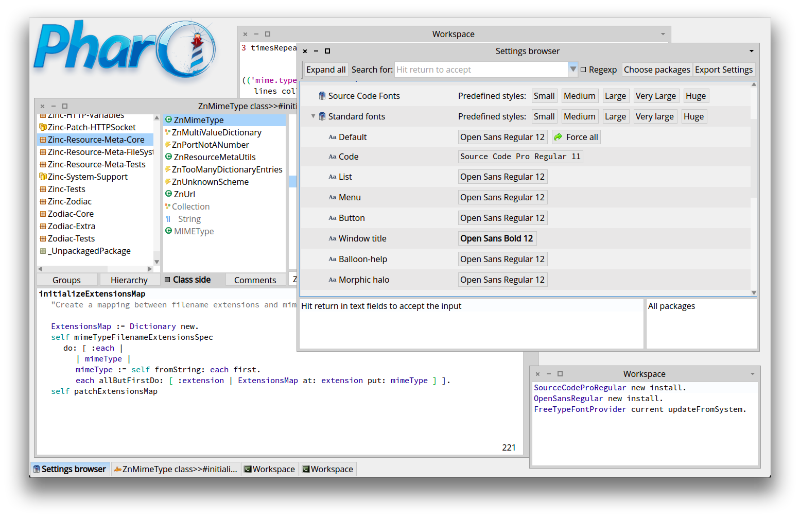

I like those fonts, and are actually my default setup (+ the new plain them also) :) On Tue, Oct 15, 2013 at 9:29 PM, Sven Van Caekenberghe <sven@stfx.eu> wrote:
OK, so with Pavel's code I got my 3.0 image capable of showing the new fonts. Since I do respect those arguing in favour, I will give it a try - but I am still not sure why it had to change in the first place.
I think the progression from Small to Medium is skipping at least one step (10 -> 13), here is my setup for now:
On 15 Oct 2013, at 18:28, Sven Van Caekenberghe <sven@stfx.eu> wrote:
On 15 Oct 2013, at 17:29, Tudor Girba <tudor@tudorgirba.com> wrote:
Hi,
I am in favor of using monospaced fonts for the code and sans serif fonts for the rest of the things. I pushed the Source Sans + Source Code fonts for the Moose image since half a year, and actually people like the look of them. I am a bit surprised to see such virulent reactions :).
@Sven: the mail discussions that led to the fonts choice had you in CC the whole time :).
OK, maybe a didn't pay enough attention: I knew it was about look and feel and (a) new font(s), I failed to register that it actually was about using a monospaced font.
I can't belief that you are surprised about the reactions ;-)
For what it is worth, I still haven't heard any solid argument for the change. Even if it is just aesthetics and it doesn't make a difference, there is still the question why we have to change.
Cheers, Doru
On Tue, Oct 15, 2013 at 5:18 PM, Sven Van Caekenberghe <sven@stfx.eu> wrote:
On 15 Oct 2013, at 17:05, Esteban Lorenzano <estebanlm@gmail.com> wrote:
On Oct 15, 2013, at 4:52 PM, Sven Van Caekenberghe <sven@stfx.eu> wrote:
On 15 Oct 2013, at 16:35, Esteban Lorenzano <estebanlm@gmail.com> wrote:
except that it is not accurate :)
- with a monospace you can have bolds and italic without problems (it is a decent one)... and you also can play with sizes (for example, for comments) - when you copy&paste you will lose part of your formatting no matter if you have a fixed font or a proportional one (is not true that you lose all of them... in fact I usually do not lose any)
Sorry, but there are no sensible arguments in favour of a monospaced font. It is just not needed (in Smalltalk). Another way to look at it is: 99.99 % of the world use proportional fonts.
BTW, I think whoever made this 'decision' knew it would be _very_ hard to get this passed ;-)
Maybe we should switch to C/Java/Javascript syntax so that we do not scare newcomers ? Sorry, I could not resist.
not taken. and non sense. idea is to welcome newcomers, not to became another language. Now... if font is *part* of the language, we could be talking about the same. But since it is not, then we are comparing apples with tomatoes.
I can say that no, 99% of the world do not use proportional fonts... every other programing environment uses monospaced fonts. yeah, I know "we are different"... but we still code. Ah, no, sorry... we "manipulate objects", but that looks really close to coding for me.
and yes... I was expecting a lot of whining (even if it was not me *alone* who took the decision), but I was expecting from people at least wait to see the fonts before start the bashing ;)
Well, it is not 'bashing', I just totally do not agree. And I would like to know who else is in favour, how the decision was made. But I'll wait a bit for other comments.
On Oct 15, 2013, at 3:53 PM, Sven Van Caekenberghe <sven@stfx.eu> wrote:
Excellent arguments ! I am with you 100%
On 15 Oct 2013, at 15:21, Igor Stasenko <siguctua@gmail.com> wrote:
Since the days when editors was able to allow me using any fonts, i was always switching to variable-spaced font for code pane. And i am not speaking about smalltalk or pharo here, it was C and Pascal those days :)
guess, what i would prefer in pharo? :)
The bad things about getting used to monospaced fonts is that you format code and it looks perfect, but then you print it or copy/paste it somewhere else where it uses other font, and all your beautiful formatting are gone. Needless to say, that printing press was invented way before first computer or digital printer, and all we know about fonts came to us from the printing world.. and i think i would be right saying that before first digital printers there was not such thing as monospaced fonts, because it is not economically efficient: you don't want to waste space on front page of your newspaper by aligning glyphs to some virtual grid. More than that, it works well only if you using same font size and no bold/underline variants whatever.. as soon as you use variants or different font size, all the benefits of 'formatting' using monospaced font is gone. That means, if we employ monospaced font for code, we will be forced to not use bold/italic variants, or different font size (for instance, i would be like to play with code highlight scheme, where comments using different font size, or where method name uses bigger font size etc).
-- Best regards, Igor Stasenko.
-- www.tudorgirba.com
"Every thing has its own flow"
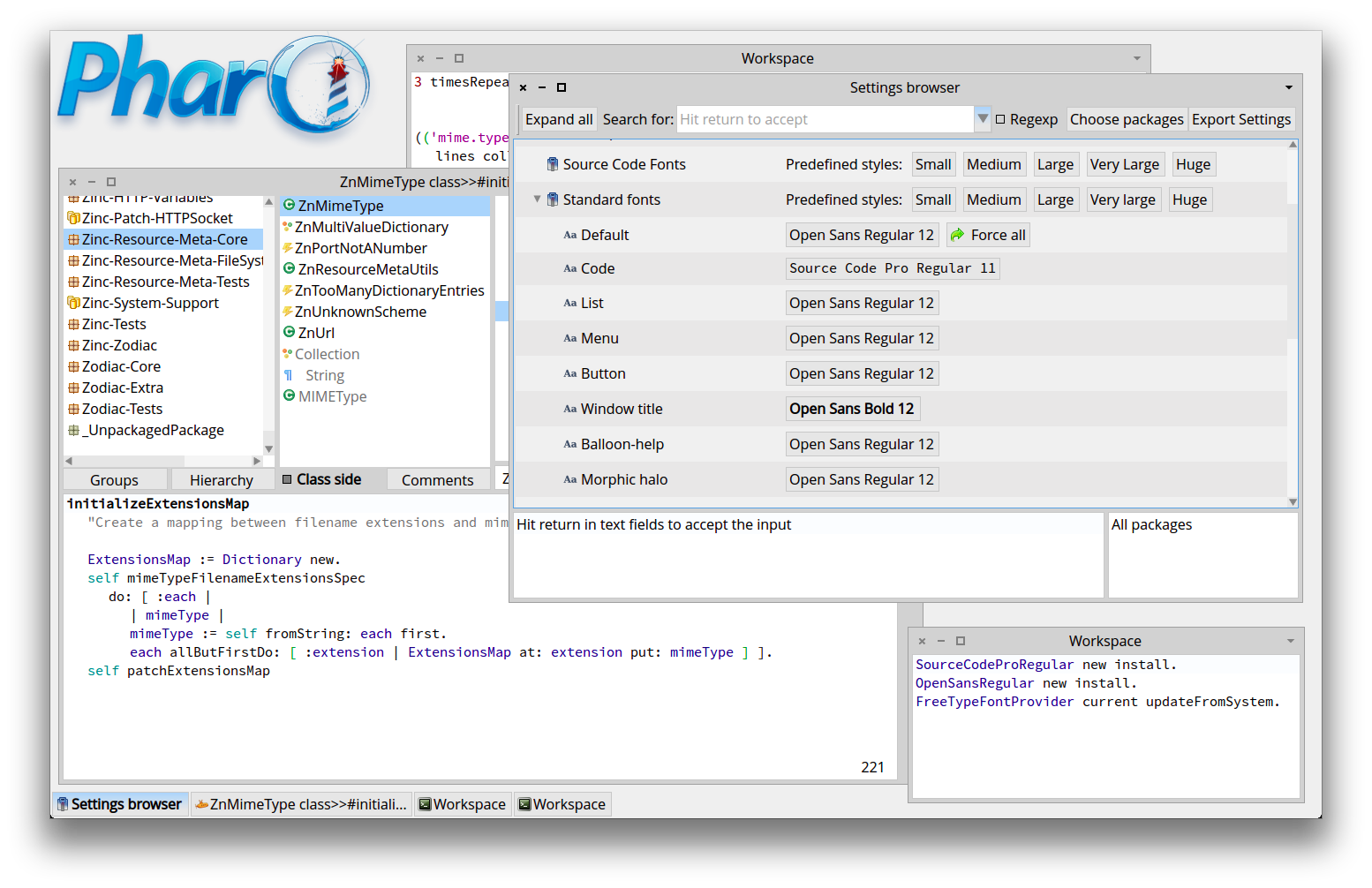

I have been using the Source Code Pro fonts for some weeks and now I have to say that I like them a lot. At the first moment my reaction was bad but very soon I started to like them. Please give them a try. MartÃn On Tue, Oct 15, 2013 at 10:01 PM, Guillermo Polito < guillermopolito@gmail.com> wrote:
I like those fonts, and are actually my default setup (+ the new plain them also) :)
On Tue, Oct 15, 2013 at 9:29 PM, Sven Van Caekenberghe <sven@stfx.eu>wrote:
OK, so with Pavel's code I got my 3.0 image capable of showing the new fonts. Since I do respect those arguing in favour, I will give it a try - but I am still not sure why it had to change in the first place.
I think the progression from Small to Medium is skipping at least one step (10 -> 13), here is my setup for now:
On 15 Oct 2013, at 18:28, Sven Van Caekenberghe <sven@stfx.eu> wrote:
On 15 Oct 2013, at 17:29, Tudor Girba <tudor@tudorgirba.com> wrote:
Hi,
I am in favor of using monospaced fonts for the code and sans serif fonts for the rest of the things. I pushed the Source Sans + Source Code fonts for the Moose image since half a year, and actually people like the look of them. I am a bit surprised to see such virulent reactions :).
@Sven: the mail discussions that led to the fonts choice had you in CC the whole time :).
OK, maybe a didn't pay enough attention: I knew it was about look and feel and (a) new font(s), I failed to register that it actually was about using a monospaced font.
I can't belief that you are surprised about the reactions ;-)
For what it is worth, I still haven't heard any solid argument for the change. Even if it is just aesthetics and it doesn't make a difference, there is still the question why we have to change.
Cheers, Doru
On Tue, Oct 15, 2013 at 5:18 PM, Sven Van Caekenberghe <sven@stfx.eu> wrote:
On 15 Oct 2013, at 17:05, Esteban Lorenzano <estebanlm@gmail.com> wrote:
On Oct 15, 2013, at 4:52 PM, Sven Van Caekenberghe <sven@stfx.eu> wrote:
On 15 Oct 2013, at 16:35, Esteban Lorenzano <estebanlm@gmail.com> wrote:
except that it is not accurate :)
- with a monospace you can have bolds and italic without problems (it is a decent one)... and you also can play with sizes (for example, for comments) - when you copy&paste you will lose part of your formatting no matter if you have a fixed font or a proportional one (is not true that you lose all of them... in fact I usually do not lose any)
Sorry, but there are no sensible arguments in favour of a monospaced font. It is just not needed (in Smalltalk). Another way to look at it is: 99.99 % of the world use proportional fonts.
BTW, I think whoever made this 'decision' knew it would be _very_ hard to get this passed ;-)
Maybe we should switch to C/Java/Javascript syntax so that we do not scare newcomers ? Sorry, I could not resist.
not taken. and non sense. idea is to welcome newcomers, not to became another language. Now... if font is *part* of the language, we could be talking about the same. But since it is not, then we are comparing apples with tomatoes.
I can say that no, 99% of the world do not use proportional fonts... every other programing environment uses monospaced fonts. yeah, I know "we are different"... but we still code. Ah, no, sorry... we "manipulate objects", but that looks really close to coding for me.
and yes... I was expecting a lot of whining (even if it was not me *alone* who took the decision), but I was expecting from people at least wait to see the fonts before start the bashing ;)
Well, it is not 'bashing', I just totally do not agree. And I would like to know who else is in favour, how the decision was made. But I'll wait a bit for other comments.
On Oct 15, 2013, at 3:53 PM, Sven Van Caekenberghe <sven@stfx.eu> wrote:
Excellent arguments ! I am with you 100%
On 15 Oct 2013, at 15:21, Igor Stasenko <siguctua@gmail.com> wrote:
Since the days when editors was able to allow me using any fonts, i was always switching to variable-spaced font for code pane. And i am not speaking about smalltalk or pharo here, it was C and Pascal those days :)
guess, what i would prefer in pharo? :)
The bad things about getting used to monospaced fonts is that you format code and it looks perfect, but then you print it or copy/paste it somewhere else where it uses other font, and all your beautiful formatting are gone. Needless to say, that printing press was invented way before first computer or digital printer, and all we know about fonts came to us from the printing world.. and i think i would be right saying that before first digital printers there was not such thing as monospaced fonts, because it is not economically efficient: you don't want to waste space on front page of your newspaper by aligning glyphs to some virtual grid. More than that, it works well only if you using same font size and no bold/underline variants whatever.. as soon as you use variants or different font size, all the benefits of 'formatting' using monospaced font is gone. That means, if we employ monospaced font for code, we will be forced to not use bold/italic variants, or different font size (for instance, i would be like to play with code highlight scheme, where comments using different font size, or where method name uses bigger font size etc).
-- Best regards, Igor Stasenko.
-- www.tudorgirba.com
"Every thing has its own flow"
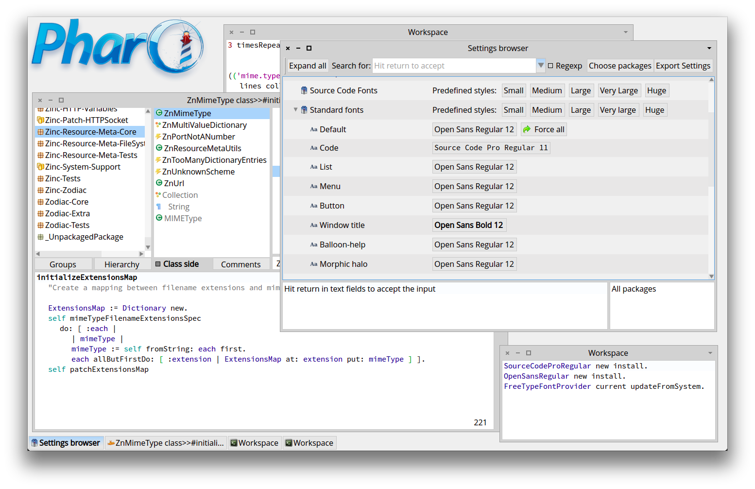

Nice wall of (mono|proportional) text guys... Just ship a couple of preferences files and be done with this, no? As we are talking about usability, let me tell you that having a proper dark theme (and not the Moose Retina Burner (tm) one - whiter than white, kill the remaining cells style) would do marvels. I got eye surgery in both eyes and enough white, it hurts and shows shadows with floaters, which, no matter how proportional or fixed font, makes the chars unreadable as they are behind the shadow. Here are some useful pointers to what they do at JetBrains: http://blog.jetbrains.com/blog/2013/06/11/inside-darcula-look-and-feel-an-in... Theming Pharo dark is a major undertaking (as colors are all over in the most erratic possible way - for fun, turn the background of controls to nuclear green and see where that shows). And trying to lake one proved to be non useful on 2.0 as 3.0 has everything changed already (as Ben showed me at one point). But if one manages to do that, it would mean that the themes are somewhat more under control. So, WTF about fonts, what matters to me is dark stuff. (some more fuel to the fire, sorry couldn't resist). Phil

philippeback wrote
Theming Pharo dark is a major undertaking (as colors are all over in the most erratic possible way - for fun, turn the background of controls to nuclear green and see where that shows). And trying to lake one proved to be non useful on 2.0 as 3.0 has everything changed already (as Ben showed me at one point).
I know this is not what you mean but in the Mac if you go to System Preferences >> Accessiblity >> Display there is a setting for 'Invert Colors' which is not awful. <http://forum.world.st/file/n4714688/Screen_Shot_2013-10-15_at_3.44.09_PM.png> -- View this message in context: http://forum.world.st/default-monospaced-code-font-tp4714433p4714688.html Sent from the Pharo Smalltalk Developers mailing list archive at Nabble.com.
it is obvious that i don't like it. :) my eyes is sunk through the holes (the extra space between letters), which makes reading lot more harder. In writing, the white space was invented and used for separating words, not the letters belonging to same word. Now, it is me. Others may find it easier to read. What i certainly agree with is that we need a good readable font for code. On 15 October 2013 21:29, Sven Van Caekenberghe <sven@stfx.eu> wrote:
OK, so with Pavel's code I got my 3.0 image capable of showing the new fonts. Since I do respect those arguing in favour, I will give it a try - but I am still not sure why it had to change in the first place.
I think the progression from Small to Medium is skipping at least one step (10 -> 13), here is my setup for now:
On 15 Oct 2013, at 18:28, Sven Van Caekenberghe <sven@stfx.eu> wrote:
On 15 Oct 2013, at 17:29, Tudor Girba <tudor@tudorgirba.com> wrote:
Hi,
I am in favor of using monospaced fonts for the code and sans serif fonts for the rest of the things. I pushed the Source Sans + Source Code fonts for the Moose image since half a year, and actually people like the look of them. I am a bit surprised to see such virulent reactions :).
@Sven: the mail discussions that led to the fonts choice had you in CC the whole time :).
OK, maybe a didn't pay enough attention: I knew it was about look and feel and (a) new font(s), I failed to register that it actually was about using a monospaced font.
I can't belief that you are surprised about the reactions ;-)
For what it is worth, I still haven't heard any solid argument for the change. Even if it is just aesthetics and it doesn't make a difference, there is still the question why we have to change.
Cheers, Doru
On Tue, Oct 15, 2013 at 5:18 PM, Sven Van Caekenberghe <sven@stfx.eu> wrote:
On 15 Oct 2013, at 17:05, Esteban Lorenzano <estebanlm@gmail.com> wrote:
On Oct 15, 2013, at 4:52 PM, Sven Van Caekenberghe <sven@stfx.eu> wrote:
On 15 Oct 2013, at 16:35, Esteban Lorenzano <estebanlm@gmail.com> wrote:
except that it is not accurate :)
- with a monospace you can have bolds and italic without problems (it is a decent one)... and you also can play with sizes (for example, for comments) - when you copy&paste you will lose part of your formatting no matter if you have a fixed font or a proportional one (is not true that you lose all of them... in fact I usually do not lose any)
Sorry, but there are no sensible arguments in favour of a monospaced font. It is just not needed (in Smalltalk). Another way to look at it is: 99.99 % of the world use proportional fonts.
BTW, I think whoever made this 'decision' knew it would be _very_ hard to get this passed ;-)
Maybe we should switch to C/Java/Javascript syntax so that we do not scare newcomers ? Sorry, I could not resist.
not taken. and non sense. idea is to welcome newcomers, not to became another language. Now... if font is *part* of the language, we could be talking about the same. But since it is not, then we are comparing apples with tomatoes.
I can say that no, 99% of the world do not use proportional fonts... every other programing environment uses monospaced fonts. yeah, I know "we are different"... but we still code. Ah, no, sorry... we "manipulate objects", but that looks really close to coding for me.
and yes... I was expecting a lot of whining (even if it was not me *alone* who took the decision), but I was expecting from people at least wait to see the fonts before start the bashing ;)
Well, it is not 'bashing', I just totally do not agree. And I would like to know who else is in favour, how the decision was made. But I'll wait a bit for other comments.
On Oct 15, 2013, at 3:53 PM, Sven Van Caekenberghe <sven@stfx.eu> wrote:
Excellent arguments ! I am with you 100%
On 15 Oct 2013, at 15:21, Igor Stasenko <siguctua@gmail.com> wrote:
Since the days when editors was able to allow me using any fonts, i was always switching to variable-spaced font for code pane. And i am not speaking about smalltalk or pharo here, it was C and Pascal those days :)
guess, what i would prefer in pharo? :)
The bad things about getting used to monospaced fonts is that you format code and it looks perfect, but then you print it or copy/paste it somewhere else where it uses other font, and all your beautiful formatting are gone. Needless to say, that printing press was invented way before first computer or digital printer, and all we know about fonts came to us from the printing world.. and i think i would be right saying that before first digital printers there was not such thing as monospaced fonts, because it is not economically efficient: you don't want to waste space on front page of your newspaper by aligning glyphs to some virtual grid. More than that, it works well only if you using same font size and no bold/underline variants whatever.. as soon as you use variants or different font size, all the benefits of 'formatting' using monospaced font is gone. That means, if we employ monospaced font for code, we will be forced to not use bold/italic variants, or different font size (for instance, i would be like to play with code highlight scheme, where comments using different font size, or where method name uses bigger font size etc).
-- Best regards, Igor Stasenko.
-- www.tudorgirba.com
"Every thing has its own flow"
-- Best regards, Igor Stasenko.
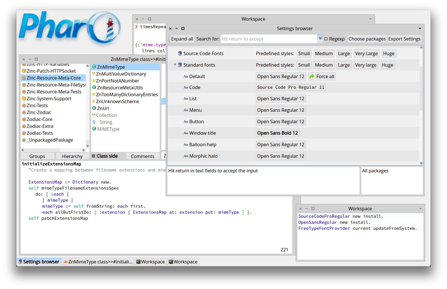
Interesting display, Sven. My take on that: * Aesthetics: the system has two fonts, not one. -1 if I review a document with more than one font. * Coherence / uniformity: A class name, a method selector has a different shape in the GUI (proportional) than in the code (monospaced). Are they different objects? Can I recognize my class name in the code without reading it? Regards, Thierry Le 15/10/2013 21:29, Sven Van Caekenberghe a écrit :
OK, so with Pavel's code I got my 3.0 image capable of showing the new fonts. Since I do respect those arguing in favour, I will give it a try - but I am still not sure why it had to change in the first place.
I think the progression from Small to Medium is skipping at least one step (10 -> 13), here is my setup for now:
On 15 Oct 2013, at 18:28, Sven Van Caekenberghe <sven@stfx.eu <mailto:sven@stfx.eu>> wrote:
On 15 Oct 2013, at 17:29, Tudor Girba <tudor@tudorgirba.com <mailto:tudor@tudorgirba.com>> wrote:
Hi,
I am in favor of using monospaced fonts for the code and sans serif fonts for the rest of the things. I pushed the Source Sans + Source Code fonts for the Moose image since half a year, and actually people like the look of them. I am a bit surprised to see such virulent reactions :).
@Sven: the mail discussions that led to the fonts choice had you in CC the whole time :).
OK, maybe a didn't pay enough attention: I knew it was about look and feel and (a) new font(s), I failed to register that it actually was about using a monospaced font.
I can't belief that you are surprised about the reactions ;-)
For what it is worth, I still haven't heard any solid argument for the change. Even if it is just aesthetics and it doesn't make a difference, there is still the question why we have to change.
Cheers, Doru
On Tue, Oct 15, 2013 at 5:18 PM, Sven Van Caekenberghe <sven@stfx.eu <mailto:sven@stfx.eu>> wrote:
On 15 Oct 2013, at 17:05, Esteban Lorenzano <estebanlm@gmail.com <mailto:estebanlm@gmail.com>> wrote:
On Oct 15, 2013, at 4:52 PM, Sven Van Caekenberghe <sven@stfx.eu <mailto:sven@stfx.eu>> wrote:
On 15 Oct 2013, at 16:35, Esteban Lorenzano <estebanlm@gmail.com <mailto:estebanlm@gmail.com>> wrote:
except that it is not accurate :)
- with a monospace you can have bolds and italic without problems (it is a decent one)... and you also can play with sizes (for example, for comments) - when you copy&paste you will lose part of your formatting no matter if you have a fixed font or a proportional one (is not true that you lose all of them... in fact I usually do not lose any)
Sorry, but there are no sensible arguments in favour of a monospaced font. It is just not needed (in Smalltalk). Another way to look at it is: 99.99 % of the world use proportional fonts.
BTW, I think whoever made this 'decision' knew it would be _very_ hard to get this passed ;-)
Maybe we should switch to C/Java/Javascript syntax so that we do not scare newcomers ? Sorry, I could not resist.
not taken. and non sense. idea is to welcome newcomers, not to became another language. Now... if font is *part* of the language, we could be talking about the same. But since it is not, then we are comparing apples with tomatoes.
I can say that no, 99% of the world do not use proportional fonts... every other programing environment uses monospaced fonts. yeah, I know "we are different"... but we still code. Ah, no, sorry... we "manipulate objects", but that looks really close to coding for me.
and yes... I was expecting a lot of whining (even if it was not me *alone* who took the decision), but I was expecting from people at least wait to see the fonts before start the bashing ;)
Well, it is not 'bashing', I just totally do not agree. And I would like to know who else is in favour, how the decision was made. But I'll wait a bit for other comments.
On Oct 15, 2013, at 3:53 PM, Sven Van Caekenberghe <sven@stfx.eu <mailto:sven@stfx.eu>> wrote:
Excellent arguments ! I am with you 100%
On 15 Oct 2013, at 15:21, Igor Stasenko <siguctua@gmail.com <mailto:siguctua@gmail.com>> wrote:
Since the days when editors was able to allow me using any fonts, i was always switching to variable-spaced font for code pane. And i am not speaking about smalltalk or pharo here, it was C and Pascal those days :)
guess, what i would prefer in pharo? :)
The bad things about getting used to monospaced fonts is that you format code and it looks perfect, but then you print it or copy/paste it somewhere else where it uses other font, and all your beautiful formatting are gone. Needless to say, that printing press was invented way before first computer or digital printer, and all we know about fonts came to us from the printing world.. and i think i would be right saying that before first digital printers there was not such thing as monospaced fonts, because it is not economically efficient: you don't want to waste space on front page of your newspaper by aligning glyphs to some virtual grid. More than that, it works well only if you using same font size and no bold/underline variants whatever.. as soon as you use variants or different font size, all the benefits of 'formatting' using monospaced font is gone. That means, if we employ monospaced font for code, we will be forced to not use bold/italic variants, or different font size (for instance, i would be like to play with code highlight scheme, where comments using different font size, or where method name uses bigger font size etc).
-- Best regards, Igor Stasenko.
-- www.tudorgirba.com <http://www.tudorgirba.com>
"Every thing has its own flow"
-- Thierry Goubier CEA list Laboratoire des Fondations des Systèmes Temps Réel Embarqués 91191 Gif sur Yvette Cedex France Phone/Fax: +33 (0) 1 69 08 32 92 / 83 95
On 16 Oct 2013, at 10:20, Goubier Thierry <thierry.goubier@cea.fr> wrote:
Interesting display, Sven.
My take on that:
* Aesthetics: the system has two fonts, not one. -1 if I review a document with more than one font.
In all documents, you have at least two fonts: body and headings, often quotes, examples, listings, etc have an another font to make them stand out. In the new approach, the idea is that monospaced fonts indicate code (in browsers, debuggers, workspaces). It is a useful principle.
* Coherence / uniformity: A class name, a method selector has a different shape in the GUI (proportional) than in the code (monospaced). Are they different objects? Can I recognize my class name in the code without reading it?
Syntax highlighting should take care of that I guess. I think that if the monospaced font is a point size smaller that the main sans font (e.g. 12 and 11) the excessive width problem or visual shock is much more manageable. In any case, I am giving it a try.
Regards,
Thierry
Le 15/10/2013 21:29, Sven Van Caekenberghe a écrit :
OK, so with Pavel's code I got my 3.0 image capable of showing the new fonts. Since I do respect those arguing in favour, I will give it a try - but I am still not sure why it had to change in the first place.
I think the progression from Small to Medium is skipping at least one step (10 -> 13), here is my setup for now:
On 15 Oct 2013, at 18:28, Sven Van Caekenberghe <sven@stfx.eu <mailto:sven@stfx.eu>> wrote:
On 15 Oct 2013, at 17:29, Tudor Girba <tudor@tudorgirba.com <mailto:tudor@tudorgirba.com>> wrote:
Hi,
I am in favor of using monospaced fonts for the code and sans serif fonts for the rest of the things. I pushed the Source Sans + Source Code fonts for the Moose image since half a year, and actually people like the look of them. I am a bit surprised to see such virulent reactions :).
@Sven: the mail discussions that led to the fonts choice had you in CC the whole time :).
OK, maybe a didn't pay enough attention: I knew it was about look and feel and (a) new font(s), I failed to register that it actually was about using a monospaced font.
I can't belief that you are surprised about the reactions ;-)
For what it is worth, I still haven't heard any solid argument for the change. Even if it is just aesthetics and it doesn't make a difference, there is still the question why we have to change.
Cheers, Doru
On Tue, Oct 15, 2013 at 5:18 PM, Sven Van Caekenberghe <sven@stfx.eu <mailto:sven@stfx.eu>> wrote:
On 15 Oct 2013, at 17:05, Esteban Lorenzano <estebanlm@gmail.com <mailto:estebanlm@gmail.com>> wrote:
On Oct 15, 2013, at 4:52 PM, Sven Van Caekenberghe <sven@stfx.eu <mailto:sven@stfx.eu>> wrote:
On 15 Oct 2013, at 16:35, Esteban Lorenzano <estebanlm@gmail.com <mailto:estebanlm@gmail.com>> wrote:
except that it is not accurate :)
- with a monospace you can have bolds and italic without problems (it is a decent one)... and you also can play with sizes (for example, for comments) - when you copy&paste you will lose part of your formatting no matter if you have a fixed font or a proportional one (is not true that you lose all of them... in fact I usually do not lose any)
Sorry, but there are no sensible arguments in favour of a monospaced font. It is just not needed (in Smalltalk). Another way to look at it is: 99.99 % of the world use proportional fonts.
BTW, I think whoever made this 'decision' knew it would be _very_ hard to get this passed ;-)
Maybe we should switch to C/Java/Javascript syntax so that we do not scare newcomers ? Sorry, I could not resist.
not taken. and non sense. idea is to welcome newcomers, not to became another language. Now... if font is *part* of the language, we could be talking about the same. But since it is not, then we are comparing apples with tomatoes.
I can say that no, 99% of the world do not use proportional fonts... every other programing environment uses monospaced fonts. yeah, I know "we are different"... but we still code. Ah, no, sorry... we "manipulate objects", but that looks really close to coding for me.
and yes... I was expecting a lot of whining (even if it was not me *alone* who took the decision), but I was expecting from people at least wait to see the fonts before start the bashing ;)
Well, it is not 'bashing', I just totally do not agree. And I would like to know who else is in favour, how the decision was made. But I'll wait a bit for other comments.
On Oct 15, 2013, at 3:53 PM, Sven Van Caekenberghe <sven@stfx.eu <mailto:sven@stfx.eu>> wrote:
Excellent arguments ! I am with you 100%
On 15 Oct 2013, at 15:21, Igor Stasenko <siguctua@gmail.com <mailto:siguctua@gmail.com>> wrote:
Since the days when editors was able to allow me using any fonts, i was always switching to variable-spaced font for code pane. And i am not speaking about smalltalk or pharo here, it was C and Pascal those days :)
guess, what i would prefer in pharo? :)
The bad things about getting used to monospaced fonts is that you format code and it looks perfect, but then you print it or copy/paste it somewhere else where it uses other font, and all your beautiful formatting are gone. Needless to say, that printing press was invented way before first computer or digital printer, and all we know about fonts came to us from the printing world.. and i think i would be right saying that before first digital printers there was not such thing as monospaced fonts, because it is not economically efficient: you don't want to waste space on front page of your newspaper by aligning glyphs to some virtual grid. More than that, it works well only if you using same font size and no bold/underline variants whatever.. as soon as you use variants or different font size, all the benefits of 'formatting' using monospaced font is gone. That means, if we employ monospaced font for code, we will be forced to not use bold/italic variants, or different font size (for instance, i would be like to play with code highlight scheme, where comments using different font size, or where method name uses bigger font size etc).
-- Best regards, Igor Stasenko.
-- www.tudorgirba.com <http://www.tudorgirba.com>
"Every thing has its own flow"
-- Thierry Goubier CEA list Laboratoire des Fondations des Systèmes Temps Réel Embarqués 91191 Gif sur Yvette Cedex France Phone/Fax: +33 (0) 1 69 08 32 92 / 83 95
Le 16/10/2013 11:50, Sven Van Caekenberghe a écrit :
On 16 Oct 2013, at 10:20, Goubier Thierry <thierry.goubier@cea.fr> wrote:
Interesting display, Sven.
My take on that:
* Aesthetics: the system has two fonts, not one. -1 if I review a document with more than one font.
In all documents, you have at least two fonts: body and headings, often quotes, examples, listings, etc have an another font to make them stand out. In the new approach, the idea is that monospaced fonts indicate code (in browsers, debuggers, workspaces). It is a useful principle.
You're right. But nobody would dare write headings in a monospaced font :) unless for an art project.
* Coherence / uniformity: A class name, a method selector has a different shape in the GUI (proportional) than in the code (monospaced). Are they different objects? Can I recognize my class name in the code without reading it?
Syntax highlighting should take care of that I guess.
I don't think so. This is no by making the selector green that it will look more like the proportional version in the pane above. Kind of disrupting the uniformity of the underlying model, when I'm pushing for things like smart suggestions where the GUI understands the objects written in the code.
I think that if the monospaced font is a point size smaller that the main sans font (e.g. 12 and 11) the excessive width problem or visual shock is much more manageable. In any case, I am giving it a try.
Probably. But then individual characters may become harder to read and distinguish... sort of compromising character readability to make space for the added whitespace inherent to the monospaced font. I'd be more impressed if the argument was helping me distinguish between | and l. I'l let you try, then :) Thierry -- Thierry Goubier CEA list Laboratoire des Fondations des Systèmes Temps Réel Embarqués 91191 Gif sur Yvette Cedex France Phone/Fax: +33 (0) 1 69 08 32 92 / 83 95
On 16 October 2013 13:11, Goubier Thierry <thierry.goubier@cea.fr> wrote:
Le 16/10/2013 11:50, Sven Van Caekenberghe a écrit :
On 16 Oct 2013, at 10:20, Goubier Thierry <thierry.goubier@cea.fr> wrote:
Interesting display, Sven.
My take on that:
* Aesthetics: the system has two fonts, not one. -1 if I review a document with more than one font.
In all documents, you have at least two fonts: body and headings, often quotes, examples, listings, etc have an another font to make them stand out. In the new approach, the idea is that monospaced fonts indicate code (in browsers, debuggers, workspaces). It is a useful principle.
You're right. But nobody would dare write headings in a monospaced font :) unless for an art project.
* Coherence / uniformity: A class name, a method selector has a different
shape in the GUI (proportional) than in the code (monospaced). Are they different objects? Can I recognize my class name in the code without reading it?
Syntax highlighting should take care of that I guess.
I don't think so. This is no by making the selector green that it will look more like the proportional version in the pane above.
Kind of disrupting the uniformity of the underlying model, when I'm pushing for things like smart suggestions where the GUI understands the objects written in the code.
I think that if the monospaced font is a point size smaller that the main
sans font (e.g. 12 and 11) the excessive width problem or visual shock is much more manageable. In any case, I am giving it a try.
Probably. But then individual characters may become harder to read and distinguish... sort of compromising character readability to make space for the added whitespace inherent to the monospaced font.
I'd be more impressed if the argument was helping me distinguish between | and l.
usually, most of sans-serif fonts barely distinguish between following 3:
l I | (capital i, low-case el, pipe) I'l let you try, then :)
Thierry
-- Thierry Goubier CEA list Laboratoire des Fondations des Systèmes Temps Réel Embarqués 91191 Gif sur Yvette Cedex France Phone/Fax: +33 (0) 1 69 08 32 92 / 83 95
-- Best regards, Igor Stasenko.
On 16 October 2013 16:31, Igor Stasenko <siguctua@gmail.com> wrote:
On 16 October 2013 13:11, Goubier Thierry <thierry.goubier@cea.fr> wrote:
Le 16/10/2013 11:50, Sven Van Caekenberghe a écrit :
On 16 Oct 2013, at 10:20, Goubier Thierry <thierry.goubier@cea.fr> wrote:
Interesting display, Sven.
My take on that:
* Aesthetics: the system has two fonts, not one. -1 if I review a document with more than one font.
In all documents, you have at least two fonts: body and headings, often quotes, examples, listings, etc have an another font to make them stand out. In the new approach, the idea is that monospaced fonts indicate code (in browsers, debuggers, workspaces). It is a useful principle.
You're right. But nobody would dare write headings in a monospaced font :) unless for an art project.
* Coherence / uniformity: A class name, a method selector has a
different shape in the GUI (proportional) than in the code (monospaced). Are they different objects? Can I recognize my class name in the code without reading it?
Syntax highlighting should take care of that I guess.
I don't think so. This is no by making the selector green that it will look more like the proportional version in the pane above.
Kind of disrupting the uniformity of the underlying model, when I'm pushing for things like smart suggestions where the GUI understands the objects written in the code.
I think that if the monospaced font is a point size smaller that the
main sans font (e.g. 12 and 11) the excessive width problem or visual shock is much more manageable. In any case, I am giving it a try.
Probably. But then individual characters may become harder to read and distinguish... sort of compromising character readability to make space for the added whitespace inherent to the monospaced font.
I'd be more impressed if the argument was helping me distinguish between | and l.
usually, most of sans-serif fonts barely distinguish between following 3:
l I | (capital i, low-case el, pipe)
test word:
Illiterate :)
I'l let you try, then :)
Thierry
-- Thierry Goubier CEA list Laboratoire des Fondations des Systèmes Temps Réel Embarqués 91191 Gif sur Yvette Cedex France Phone/Fax: +33 (0) 1 69 08 32 92 / 83 95
-- Best regards, Igor Stasenko.
-- Best regards, Igor Stasenko.
Goubier Thierry wrote:
Le 16/10/2013 11:50, Sven Van Caekenberghe a écrit :
On 16 Oct 2013, at 10:20, Goubier Thierry <thierry.goubier@cea.fr> wrote:
Interesting display, Sven.
My take on that:
* Aesthetics: the system has two fonts, not one. -1 if I review a document with more than one font.
In all documents, you have at least two fonts: body and headings, often quotes, examples, listings, etc have an another font to make them stand out. In the new approach, the idea is that monospaced fonts indicate code (in browsers, debuggers, workspaces). It is a useful principle.
You're right. But nobody would dare write headings in a monospaced font :) unless for an art project.
* Coherence / uniformity: A class name, a method selector has a different shape in the GUI (proportional) than in the code (monospaced). Are they different objects? Can I recognize my class name in the code without reading it?
Syntax highlighting should take care of that I guess.
I don't think so. This is no by making the selector green that it will look more like the proportional version in the pane above.
Kind of disrupting the uniformity of the underlying model, when I'm pushing for things like smart suggestions where the GUI understands the objects written in the code.
I think that if the monospaced font is a point size smaller that the main sans font (e.g. 12 and 11) the excessive width problem or visual shock is much more manageable. In any case, I am giving it a try.
Probably. But then individual characters may become harder to read and distinguish... sort of compromising character readability to make space for the added whitespace inherent to the monospaced font.
I'd be more impressed if the argument was helping me distinguish between | and l.
Yes. It is designed to do that. Some common failings of monospaced fonts are noted [1] and dealt with. There comment section is also interesting. The attached PDFs are the result of getting the urge to compare a broad coverage of code examples (taken from "Terse Guide to Squeak") against three fonts: * DejaVu Sans 9 point * Source Code Pro [1] [2] 9 point * Source Sans Pro [3] [4] 9 point & 10 point, since the width of 10 was the same as the others at 9. Also attached is the source excel file. cheers -ben [1] http://blogs.adobe.com/typblography/2012/09/source-code-pro.html [2] http://sourceforge.net/projects/sourcecodepro.adobe/files/ [3] http://blogs.adobe.com/typblography/2012/08/source-sans-pro.html [4] http://sourceforge.net/projects/sourcesans.adobe/postdownload?source=dlp
I'l let you try, then :)
Thierry
Very good comparison, thanks! Source code pro is so disgracious to my eyes, I can't stand it. Source code sans 10 not that bad. But my old eyes are much more comfortable with dejaVu, even if less code fits. 2013/10/16 <btc@openinworld.com>
Goubier Thierry wrote:
Le 16/10/2013 11:50, Sven Van Caekenberghe a écrit :
On 16 Oct 2013, at 10:20, Goubier Thierry <thierry.goubier@cea.fr> wrote:
Interesting display, Sven.
My take on that:
* Aesthetics: the system has two fonts, not one. -1 if I review a document with more than one font.
In all documents, you have at least two fonts: body and headings, often quotes, examples, listings, etc have an another font to make them stand out. In the new approach, the idea is that monospaced fonts indicate code (in browsers, debuggers, workspaces). It is a useful principle.
You're right. But nobody would dare write headings in a monospaced font :) unless for an art project.
* Coherence / uniformity: A class name, a method selector has a
different shape in the GUI (proportional) than in the code (monospaced). Are they different objects? Can I recognize my class name in the code without reading it?
Syntax highlighting should take care of that I guess.
I don't think so. This is no by making the selector green that it will look more like the proportional version in the pane above.
Kind of disrupting the uniformity of the underlying model, when I'm pushing for things like smart suggestions where the GUI understands the objects written in the code.
I think that if the monospaced font is a point size smaller that the
main sans font (e.g. 12 and 11) the excessive width problem or visual shock is much more manageable. In any case, I am giving it a try.
Probably. But then individual characters may become harder to read and distinguish... sort of compromising character readability to make space for the added whitespace inherent to the monospaced font.
I'd be more impressed if the argument was helping me distinguish between | and l.
Yes. It is designed to do that. Some common failings of monospaced fonts are noted [1] and dealt with. There comment section is also interesting.
The attached PDFs are the result of getting the urge to compare a broad coverage of code examples (taken from "Terse Guide to Squeak") against three fonts: * DejaVu Sans 9 point * Source Code Pro [1] [2] 9 point * Source Sans Pro [3] [4] 9 point & 10 point, since the width of 10 was the same as the others at 9. Also attached is the source excel file.
cheers -ben
[1] http://blogs.adobe.com/**typblography/2012/09/source-**code-pro.html<http://blogs.adobe.com/typblography/2012/09/source-code-pro.html> [2] http://sourceforge.net/**projects/sourcecodepro.adobe/**files/<http://sourceforge.net/projects/sourcecodepro.adobe/files/> [3] http://blogs.adobe.com/**typblography/2012/08/source-**sans-pro.html<http://blogs.adobe.com/typblography/2012/08/source-sans-pro.html> [4] http://sourceforge.net/**projects/sourcesans.adobe/** postdownload?source=dlp<http://sourceforge.net/projects/sourcesans.adobe/postdownload?source=dlp>
I'l let you try, then :)
Thierry

Am 16.10.2013 um 21:43 schrieb Nicolas Cellier <nicolas.cellier.aka.nice@gmail.com>:
Very good comparison, thanks! Source code pro is so disgracious to my eyes, I can't stand it. Source code sans 10 not that bad. But my old eyes are much more comfortable with dejaVu, even if less code fits.
+1 to every sentence Norbert
2013/10/16 <btc@openinworld.com> Goubier Thierry wrote:
Le 16/10/2013 11:50, Sven Van Caekenberghe a écrit :
On 16 Oct 2013, at 10:20, Goubier Thierry <thierry.goubier@cea.fr> wrote:
Interesting display, Sven.
My take on that:
* Aesthetics: the system has two fonts, not one. -1 if I review a document with more than one font.
In all documents, you have at least two fonts: body and headings, often quotes, examples, listings, etc have an another font to make them stand out. In the new approach, the idea is that monospaced fonts indicate code (in browsers, debuggers, workspaces). It is a useful principle.
You're right. But nobody would dare write headings in a monospaced font :) unless for an art project.
* Coherence / uniformity: A class name, a method selector has a different shape in the GUI (proportional) than in the code (monospaced). Are they different objects? Can I recognize my class name in the code without reading it?
Syntax highlighting should take care of that I guess.
I don't think so. This is no by making the selector green that it will look more like the proportional version in the pane above.
Kind of disrupting the uniformity of the underlying model, when I'm pushing for things like smart suggestions where the GUI understands the objects written in the code.
I think that if the monospaced font is a point size smaller that the main sans font (e.g. 12 and 11) the excessive width problem or visual shock is much more manageable. In any case, I am giving it a try.
Probably. But then individual characters may become harder to read and distinguish... sort of compromising character readability to make space for the added whitespace inherent to the monospaced font.
I'd be more impressed if the argument was helping me distinguish between | and l.
Yes. It is designed to do that. Some common failings of monospaced fonts are noted [1] and dealt with. There comment section is also interesting.
The attached PDFs are the result of getting the urge to compare a broad coverage of code examples (taken from "Terse Guide to Squeak") against three fonts: * DejaVu Sans 9 point * Source Code Pro [1] [2] 9 point * Source Sans Pro [3] [4] 9 point & 10 point, since the width of 10 was the same as the others at 9. Also attached is the source excel file.
cheers -ben
[1] http://blogs.adobe.com/typblography/2012/09/source-code-pro.html [2] http://sourceforge.net/projects/sourcecodepro.adobe/files/ [3] http://blogs.adobe.com/typblography/2012/08/source-sans-pro.html [4] http://sourceforge.net/projects/sourcesans.adobe/postdownload?source=dlp
I'l let you try, then :)
Thierry
Excellent, I like the comparison a lot! Thanks! My take is: - Unable to like Source Code Pro 9 (and it's so wide); - Source Sans Pro 9 has spacing issues (16r, the r is too close) and reading issues (it's the worse for the lL|i characters) - Source sans Pro 10 is better than 9 (but what with the 2x space?) Overall, I'd stay with DejaVu Sans 9 based on this sample. In my opinion, the best compromise density / readability. Thierry Le 16/10/2013 19:56, btc@openinworld.com a écrit :
Goubier Thierry wrote:
I'd be more impressed if the argument was helping me distinguish between | and l.
Yes. It is designed to do that. Some common failings of monospaced fonts are noted [1] and dealt with. There comment section is also interesting.
The attached PDFs are the result of getting the urge to compare a broad coverage of code examples (taken from "Terse Guide to Squeak") against three fonts: * DejaVu Sans 9 point * Source Code Pro [1] [2] 9 point * Source Sans Pro [3] [4] 9 point & 10 point, since the width of 10 was the same as the others at 9. Also attached is the source excel file.
cheers -ben
[1] http://blogs.adobe.com/typblography/2012/09/source-code-pro.html [2] http://sourceforge.net/projects/sourcecodepro.adobe/files/ [3] http://blogs.adobe.com/typblography/2012/08/source-sans-pro.html [4] http://sourceforge.net/projects/sourcesans.adobe/postdownload?source=dlp
I'l let you try, then :)
Thierry
-- Thierry Goubier CEA list Laboratoire des Fondations des Systèmes Temps Réel Embarqués 91191 Gif sur Yvette Cedex France Phone/Fax: +33 (0) 1 69 08 32 92 / 83 95
hmm.. i have suspicion that it is actually adobe who can't handle the font properly.. because in some examples for source code pro font, the adjacent letters jump onto each other. i don't believe it is that bad (see attached)[image: Inline images 1] On 17 October 2013 09:28, Goubier Thierry <thierry.goubier@cea.fr> wrote:
Excellent, I like the comparison a lot! Thanks!
My take is: - Unable to like Source Code Pro 9 (and it's so wide); - Source Sans Pro 9 has spacing issues (16r, the r is too close) and reading issues (it's the worse for the lL|i characters) - Source sans Pro 10 is better than 9 (but what with the 2x space?)
Overall, I'd stay with DejaVu Sans 9 based on this sample. In my opinion, the best compromise density / readability.
Thierry
Le 16/10/2013 19:56, btc@openinworld.com a écrit :
Goubier Thierry wrote:
I'd be more impressed if the argument was helping me distinguish between | and l.
Yes. It is designed to do that. Some common failings of monospaced fonts are noted [1] and dealt with. There comment section is also interesting.
The attached PDFs are the result of getting the urge to compare a broad coverage of code examples (taken from "Terse Guide to Squeak") against three fonts: * DejaVu Sans 9 point * Source Code Pro [1] [2] 9 point * Source Sans Pro [3] [4] 9 point & 10 point, since the width of 10 was the same as the others at 9. Also attached is the source excel file.
cheers -ben
[1] http://blogs.adobe.com/**typblography/2012/09/source-**code-pro.html<http://blogs.adobe.com/typblography/2012/09/source-code-pro.html> [2] http://sourceforge.net/**projects/sourcecodepro.adobe/**files/<http://sourceforge.net/projects/sourcecodepro.adobe/files/> [3] http://blogs.adobe.com/**typblography/2012/08/source-**sans-pro.html<http://blogs.adobe.com/typblography/2012/08/source-sans-pro.html> [4] http://sourceforge.net/**projects/sourcesans.adobe/** postdownload?source=dlp<http://sourceforge.net/projects/sourcesans.adobe/postdownload?source=dlp>
I'l let you try, then :)
Thierry
-- Thierry Goubier CEA list Laboratoire des Fondations des Systèmes Temps Réel Embarqués 91191 Gif sur Yvette Cedex France Phone/Fax: +33 (0) 1 69 08 32 92 / 83 95
-- Best regards, Igor Stasenko.
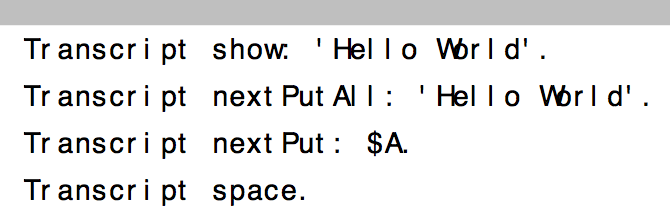
Le 17/10/2013 10:29, Igor Stasenko a écrit :
hmm.. i have suspicion that it is actually adobe who can't handle the font properly.. because in some examples for source code pro font, the adjacent letters jump onto each other. i don't believe it is that bad (see attached)Inline images 1
Adobe or the viewer? I used evince to view it, not acrobat reader. It may point to incorrect spacing information in Source Sans Pro (I have not the errors you see in Source Code Pro). Who is in charge of the Source Pro font? Which typographer? Oh, Adobe apparently. If they can't handle it properly... Thierry
On 17 October 2013 09:28, Goubier Thierry <thierry.goubier@cea.fr <mailto:thierry.goubier@cea.fr>> wrote:
Excellent, I like the comparison a lot! Thanks!
My take is: - Unable to like Source Code Pro 9 (and it's so wide); - Source Sans Pro 9 has spacing issues (16r, the r is too close) and reading issues (it's the worse for the lL|i characters) - Source sans Pro 10 is better than 9 (but what with the 2x space?)
Overall, I'd stay with DejaVu Sans 9 based on this sample. In my opinion, the best compromise density / readability.
Thierry
Le 16/10/2013 19:56, btc@openinworld.com <mailto:btc@openinworld.com> a écrit :
Goubier Thierry wrote:
I'd be more impressed if the argument was helping me distinguish between | and l.
Yes. It is designed to do that. Some common failings of monospaced fonts are noted [1] and dealt with. There comment section is also interesting.
The attached PDFs are the result of getting the urge to compare a broad coverage of code examples (taken from "Terse Guide to Squeak") against three fonts: * DejaVu Sans 9 point * Source Code Pro [1] [2] 9 point * Source Sans Pro [3] [4] 9 point & 10 point, since the width of 10 was the same as the others at 9. Also attached is the source excel file.
cheers -ben
[1] http://blogs.adobe.com/__typblography/2012/09/source-__code-pro.html <http://blogs.adobe.com/typblography/2012/09/source-code-pro.html> [2] http://sourceforge.net/__projects/sourcecodepro.adobe/__files/ <http://sourceforge.net/projects/sourcecodepro.adobe/files/> [3] http://blogs.adobe.com/__typblography/2012/08/source-__sans-pro.html <http://blogs.adobe.com/typblography/2012/08/source-sans-pro.html> [4] http://sourceforge.net/__projects/sourcesans.adobe/__postdownload?source=dlp <http://sourceforge.net/projects/sourcesans.adobe/postdownload?source=dlp>
I'l let you try, then :)
Thierry
-- Thierry Goubier CEA list Laboratoire des Fondations des Systèmes Temps Réel Embarqués 91191 Gif sur Yvette Cedex France Phone/Fax: +33 (0) 1 69 08 32 92 / 83 95
-- Best regards, Igor Stasenko.
-- Thierry Goubier CEA list Laboratoire des Fondations des Systèmes Temps Réel Embarqués 91191 Gif sur Yvette Cedex France Phone/Fax: +33 (0) 1 69 08 32 92 / 83 95
On 17 October 2013 10:47, Goubier Thierry <thierry.goubier@cea.fr> wrote:
Le 17/10/2013 10:29, Igor Stasenko a écrit :
hmm.. i have suspicion that it is actually adobe who can't handle the font properly.. because in some examples for source code pro font, the adjacent letters jump onto each other. i don't believe it is that bad (see attached)Inline images 1
Adobe or the viewer? I used evince to view it, not acrobat reader. It may point to incorrect spacing information in Source Sans Pro (I have not the errors you see in Source Code Pro).
Who is in charge of the Source Pro font? Which typographer? Oh, Adobe apparently. If they can't handle it properly...
i am far from blaming adobe, just wanted to say that in my viewer it does not shows things properly, because when rendered in pharo it don't have such problems. so i cannot have decent comparison..
Thierry
On 17 October 2013 09:28, Goubier Thierry <thierry.goubier@cea.fr <mailto:thierry.goubier@cea.fr**>> wrote:
Excellent, I like the comparison a lot! Thanks!
My take is: - Unable to like Source Code Pro 9 (and it's so wide); - Source Sans Pro 9 has spacing issues (16r, the r is too close) and reading issues (it's the worse for the lL|i characters) - Source sans Pro 10 is better than 9 (but what with the 2x space?)
Overall, I'd stay with DejaVu Sans 9 based on this sample. In my opinion, the best compromise density / readability.
Thierry
Le 16/10/2013 19:56, btc@openinworld.com <mailto:btc@openinworld.com> a écrit :
Goubier Thierry wrote:
I'd be more impressed if the argument was helping me distinguish between | and l.
Yes. It is designed to do that. Some common failings of monospaced fonts are noted [1] and dealt with. There comment section is also interesting.
The attached PDFs are the result of getting the urge to compare a broad coverage of code examples (taken from "Terse Guide to Squeak") against three fonts: * DejaVu Sans 9 point * Source Code Pro [1] [2] 9 point * Source Sans Pro [3] [4] 9 point & 10 point, since the width of 10 was the same as the others at 9. Also attached is the source excel file.
cheers -ben
[1] http://blogs.adobe.com/__**typblography/2012/09/source-__** code-pro.html<http://blogs.adobe.com/__typblography/2012/09/source-__code-pro.html> <http://blogs.adobe.com/**typblography/2012/09/source-** code-pro.html<http://blogs.adobe.com/typblography/2012/09/source-code-pro.html>
[2] http://sourceforge.net/__**projects/sourcecodepro.adobe/_** _files/ <http://sourceforge.net/__projects/sourcecodepro.adobe/__files/> <http://sourceforge.net/**projects/sourcecodepro.adobe/**files/<http://sourceforge.net/projects/sourcecodepro.adobe/files/>
[3] http://blogs.adobe.com/__**typblography/2012/08/source-__** sans-pro.html<http://blogs.adobe.com/__typblography/2012/08/source-__sans-pro.html> <http://blogs.adobe.com/**typblography/2012/08/source-** sans-pro.html<http://blogs.adobe.com/typblography/2012/08/source-sans-pro.html>
[4] http://sourceforge.net/__**projects/sourcesans.adobe/__** postdownload?source=dlp<http://sourceforge.net/__projects/sourcesans.adobe/__postdownload?source=dlp>
<http://sourceforge.net/**projects/sourcesans.adobe/** postdownload?source=dlp<http://sourceforge.net/projects/sourcesans.adobe/postdownload?source=dlp>
I'l let you try, then :)
Thierry
-- Thierry Goubier CEA list Laboratoire des Fondations des Systèmes Temps Réel Embarqués 91191 Gif sur Yvette Cedex France Phone/Fax: +33 (0) 1 69 08 32 92 / 83 95
-- Best regards, Igor Stasenko.
-- Thierry Goubier CEA list Laboratoire des Fondations des Systèmes Temps Réel Embarqués 91191 Gif sur Yvette Cedex France Phone/Fax: +33 (0) 1 69 08 32 92 / 83 95
-- Best regards, Igor Stasenko.
ok i looked at .xlxslsx file at least, in google preview it looks more or less close to the truth :) and i can say that Source Sans Pro is a winner ( to my taste ). I like that for 'i' in it don't closes together as in 'it', comparing to dejavu , where it does. It reads very clear yet compact. On 17 October 2013 10:43, Igor Stasenko <siguctua@gmail.com> wrote:
On 17 October 2013 10:47, Goubier Thierry <thierry.goubier@cea.fr> wrote:
Le 17/10/2013 10:29, Igor Stasenko a écrit :
hmm.. i have suspicion that it is actually adobe who can't handle the font properly.. because in some examples for source code pro font, the adjacent letters jump onto each other. i don't believe it is that bad (see attached)Inline images 1
Adobe or the viewer? I used evince to view it, not acrobat reader. It may point to incorrect spacing information in Source Sans Pro (I have not the errors you see in Source Code Pro).
Who is in charge of the Source Pro font? Which typographer? Oh, Adobe apparently. If they can't handle it properly...
i am far from blaming adobe, just wanted to say that in my viewer it does not shows things properly, because when rendered in pharo it don't have such problems.
so i cannot have decent comparison..
Thierry
On 17 October 2013 09:28, Goubier Thierry <thierry.goubier@cea.fr <mailto:thierry.goubier@cea.fr**>> wrote:
Excellent, I like the comparison a lot! Thanks!
My take is: - Unable to like Source Code Pro 9 (and it's so wide); - Source Sans Pro 9 has spacing issues (16r, the r is too close) and reading issues (it's the worse for the lL|i characters) - Source sans Pro 10 is better than 9 (but what with the 2x space?)
Overall, I'd stay with DejaVu Sans 9 based on this sample. In my opinion, the best compromise density / readability.
Thierry
Le 16/10/2013 19:56, btc@openinworld.com <mailto:btc@openinworld.com> a écrit :
Goubier Thierry wrote:
I'd be more impressed if the argument was helping me distinguish between | and l.
Yes. It is designed to do that. Some common failings of monospaced fonts are noted [1] and dealt with. There comment section is also interesting.
The attached PDFs are the result of getting the urge to compare a broad coverage of code examples (taken from "Terse Guide to Squeak") against three fonts: * DejaVu Sans 9 point * Source Code Pro [1] [2] 9 point * Source Sans Pro [3] [4] 9 point & 10 point, since the width of 10 was the same as the others at 9. Also attached is the source excel file.
cheers -ben
[1] http://blogs.adobe.com/__**typblography/2012/09/source-__** code-pro.html<http://blogs.adobe.com/__typblography/2012/09/source-__code-pro.html> <http://blogs.adobe.com/**typblography/2012/09/source-** code-pro.html<http://blogs.adobe.com/typblography/2012/09/source-code-pro.html>
[2] http://sourceforge.net/__**projects/sourcecodepro.adobe/_** _files/ <http://sourceforge.net/__projects/sourcecodepro.adobe/__files/> <http://sourceforge.net/**projects/sourcecodepro.adobe/**files/<http://sourceforge.net/projects/sourcecodepro.adobe/files/>
[3] http://blogs.adobe.com/__**typblography/2012/08/source-__** sans-pro.html<http://blogs.adobe.com/__typblography/2012/08/source-__sans-pro.html> <http://blogs.adobe.com/**typblography/2012/08/source-** sans-pro.html<http://blogs.adobe.com/typblography/2012/08/source-sans-pro.html>
[4] http://sourceforge.net/__**projects/sourcesans.adobe/__** postdownload?source=dlp<http://sourceforge.net/__projects/sourcesans.adobe/__postdownload?source=dlp>
<http://sourceforge.net/**projects/sourcesans.adobe/** postdownload?source=dlp<http://sourceforge.net/projects/sourcesans.adobe/postdownload?source=dlp>
I'l let you try, then :)
Thierry
-- Thierry Goubier CEA list Laboratoire des Fondations des Systèmes Temps Réel Embarqués 91191 Gif sur Yvette Cedex France Phone/Fax: +33 (0) 1 69 08 32 92 / 83 95
-- Best regards, Igor Stasenko.
-- Thierry Goubier CEA list Laboratoire des Fondations des Systèmes Temps Réel Embarqués 91191 Gif sur Yvette Cedex France Phone/Fax: +33 (0) 1 69 08 32 92 / 83 95
-- Best regards, Igor Stasenko.
-- Best regards, Igor Stasenko.
I'll do like you because... I only managed to install the source code pro font so far (no default install in ubuntu) and Pharo doesn't see it (LibreOffice does). I'll look for the source sans pro download as well. (May explain the pdf issues if the fonts are not embedded in the pdf document). Thierry Le 17/10/2013 10:57, Igor Stasenko a écrit :
ok i looked at .xlxslsx file at least, in google preview it looks more or less close to the truth :)
and i can say that Source Sans Pro is a winner ( to my taste ). I like that for 'i' in it don't closes together as in 'it', comparing to dejavu , where it does. It reads very clear yet compact.
On 17 October 2013 10:43, Igor Stasenko <siguctua@gmail.com <mailto:siguctua@gmail.com>> wrote:
On 17 October 2013 10:47, Goubier Thierry <thierry.goubier@cea.fr <mailto:thierry.goubier@cea.fr>> wrote:
Le 17/10/2013 10:29, Igor Stasenko a écrit :
hmm.. i have suspicion that it is actually adobe who can't handle the font properly.. because in some examples for source code pro font, the adjacent letters jump onto each other. i don't believe it is that bad (see attached)Inline images 1
Adobe or the viewer? I used evince to view it, not acrobat reader. It may point to incorrect spacing information in Source Sans Pro (I have not the errors you see in Source Code Pro).
Who is in charge of the Source Pro font? Which typographer? Oh, Adobe apparently. If they can't handle it properly...
i am far from blaming adobe, just wanted to say that in my viewer it does not shows things properly, because when rendered in pharo it don't have such problems.
so i cannot have decent comparison..
Thierry
On 17 October 2013 09:28, Goubier Thierry <thierry.goubier@cea.fr <mailto:thierry.goubier@cea.fr> <mailto:thierry.goubier@cea.fr <mailto:thierry.goubier@cea.fr>__>> wrote:
Excellent, I like the comparison a lot! Thanks!
My take is: - Unable to like Source Code Pro 9 (and it's so wide); - Source Sans Pro 9 has spacing issues (16r, the r is too close) and reading issues (it's the worse for the lL|i characters) - Source sans Pro 10 is better than 9 (but what with the 2x space?)
Overall, I'd stay with DejaVu Sans 9 based on this sample. In my opinion, the best compromise density / readability.
Thierry
Le 16/10/2013 19:56, btc@openinworld.com <mailto:btc@openinworld.com> <mailto:btc@openinworld.com <mailto:btc@openinworld.com>> a écrit :
Goubier Thierry wrote:
I'd be more impressed if the argument was helping me distinguish between | and l.
Yes. It is designed to do that. Some common failings of monospaced fonts are noted [1] and dealt with. There comment section is also interesting.
The attached PDFs are the result of getting the urge to compare a broad coverage of code examples (taken from "Terse Guide to Squeak") against three fonts: * DejaVu Sans 9 point * Source Code Pro [1] [2] 9 point * Source Sans Pro [3] [4] 9 point & 10 point, since the width of 10 was the same as the others at 9. Also attached is the source excel file.
cheers -ben
[1] http://blogs.adobe.com/____typblography/2012/09/source-____code-pro.html <http://blogs.adobe.com/__typblography/2012/09/source-__code-pro.html>
<http://blogs.adobe.com/__typblography/2012/09/source-__code-pro.html <http://blogs.adobe.com/typblography/2012/09/source-code-pro.html>> [2] http://sourceforge.net/____projects/sourcecodepro.adobe/____files/ <http://sourceforge.net/__projects/sourcecodepro.adobe/__files/>
<http://sourceforge.net/__projects/sourcecodepro.adobe/__files/ <http://sourceforge.net/projects/sourcecodepro.adobe/files/>> [3] http://blogs.adobe.com/____typblography/2012/08/source-____sans-pro.html <http://blogs.adobe.com/__typblography/2012/08/source-__sans-pro.html>
<http://blogs.adobe.com/__typblography/2012/08/source-__sans-pro.html <http://blogs.adobe.com/typblography/2012/08/source-sans-pro.html>> [4] http://sourceforge.net/____projects/sourcesans.adobe/____postdownload?source... <http://sourceforge.net/__projects/sourcesans.adobe/__postdownload?source=dlp>
<http://sourceforge.net/__projects/sourcesans.adobe/__postdownload?source=dlp <http://sourceforge.net/projects/sourcesans.adobe/postdownload?source=dlp>>
I'l let you try, then :)
Thierry
-- Thierry Goubier CEA list Laboratoire des Fondations des Systèmes Temps Réel Embarqués 91191 Gif sur Yvette Cedex France Phone/Fax: +33 (0) 1 69 08 32 92 / 83 95
-- Best regards, Igor Stasenko.
-- Thierry Goubier CEA list Laboratoire des Fondations des Systèmes Temps Réel Embarqués 91191 Gif sur Yvette Cedex France Phone/Fax: +33 (0) 1 69 08 32 92 / 83 95
-- Best regards, Igor Stasenko.
-- Best regards, Igor Stasenko.
-- Thierry Goubier CEA list Laboratoire des Fondations des Systèmes Temps Réel Embarqués 91191 Gif sur Yvette Cedex France Phone/Fax: +33 (0) 1 69 08 32 92 / 83 95
Goubier Thierry wrote:
I'll do like you because...
I only managed to install the source code pro font so far (no default install in ubuntu) and Pharo doesn't see it (LibreOffice does). I'll look for the source sans pro download as well.
(May explain the pdf issues if the fonts are not embedded in the pdf document). Good point. So I've made it PDF/A to embed fonts. Try attached file. cheers -ben
Thierry
Le 17/10/2013 10:57, Igor Stasenko a écrit :
ok i looked at .xlxslsx file at least, in google preview it looks more or less close to the truth :)
and i can say that Source Sans Pro is a winner ( to my taste ). I like that for 'i' in it don't closes together as in 'it', comparing to dejavu , where it does. It reads very clear yet compact.
On 17 October 2013 10:43, Igor Stasenko <siguctua@gmail.com <mailto:siguctua@gmail.com>> wrote:
On 17 October 2013 10:47, Goubier Thierry <thierry.goubier@cea.fr <mailto:thierry.goubier@cea.fr>> wrote:
Le 17/10/2013 10:29, Igor Stasenko a écrit :
hmm.. i have suspicion that it is actually adobe who can't handle the font properly.. because in some examples for source code pro font, the adjacent letters jump onto each other. i don't believe it is that bad (see attached)Inline images 1
Adobe or the viewer? I used evince to view it, not acrobat reader. It may point to incorrect spacing information in Source Sans Pro (I have not the errors you see in Source Code Pro).
Who is in charge of the Source Pro font? Which typographer? Oh, Adobe apparently. If they can't handle it properly...
i am far from blaming adobe, just wanted to say that in my viewer it does not shows things properly, because when rendered in pharo it don't have such problems.
so i cannot have decent comparison..
Thierry
On 17 October 2013 09:28, Goubier Thierry <thierry.goubier@cea.fr <mailto:thierry.goubier@cea.fr> <mailto:thierry.goubier@cea.fr <mailto:thierry.goubier@cea.fr>__>> wrote:
Excellent, I like the comparison a lot! Thanks!
My take is: - Unable to like Source Code Pro 9 (and it's so wide); - Source Sans Pro 9 has spacing issues (16r, the r is too close) and reading issues (it's the worse for the lL|i characters) - Source sans Pro 10 is better than 9 (but what with the 2x space?)
Overall, I'd stay with DejaVu Sans 9 based on this sample. In my opinion, the best compromise density / readability.
Thierry
Le 16/10/2013 19:56, btc@openinworld.com <mailto:btc@openinworld.com> <mailto:btc@openinworld.com <mailto:btc@openinworld.com>> a écrit :
Goubier Thierry wrote:
I'd be more impressed if the argument was helping me distinguish between | and l.
Yes. It is designed to do that. Some common failings of monospaced fonts are noted [1] and dealt with. There comment section is also interesting.
The attached PDFs are the result of getting the urge to compare a broad coverage of code examples (taken from "Terse Guide to Squeak") against three fonts: * DejaVu Sans 9 point * Source Code Pro [1] [2] 9 point * Source Sans Pro [3] [4] 9 point & 10 point, since the width of 10 was the same as the others at 9. Also attached is the source excel file.
cheers -ben
[1]
http://blogs.adobe.com/____typblography/2012/09/source-____code-pro.html
<http://blogs.adobe.com/__typblography/2012/09/source-__code-pro.html>
<http://blogs.adobe.com/__typblography/2012/09/source-__code-pro.html
<http://blogs.adobe.com/typblography/2012/09/source-code-pro.html>> [2]
http://sourceforge.net/____projects/sourcecodepro.adobe/____files/
<http://sourceforge.net/__projects/sourcecodepro.adobe/__files/>
<http://sourceforge.net/__projects/sourcecodepro.adobe/__files/
<http://sourceforge.net/projects/sourcecodepro.adobe/files/>> [3]
http://blogs.adobe.com/____typblography/2012/08/source-____sans-pro.html
<http://blogs.adobe.com/__typblography/2012/08/source-__sans-pro.html>
<http://blogs.adobe.com/__typblography/2012/08/source-__sans-pro.html
<http://blogs.adobe.com/typblography/2012/08/source-sans-pro.html>> [4]
http://sourceforge.net/____projects/sourcesans.adobe/____postdownload?source...
<http://sourceforge.net/__projects/sourcesans.adobe/__postdownload?source=dlp>
<http://sourceforge.net/__projects/sourcesans.adobe/__postdownload?source=dlp
<http://sourceforge.net/projects/sourcesans.adobe/postdownload?source=dlp>>
I'l let you try, then :)
Thierry
-- Thierry Goubier CEA list Laboratoire des Fondations des Systèmes Temps Réel Embarqués 91191 Gif sur Yvette Cedex France Phone/Fax: +33 (0) 1 69 08 32 92 / 83 95
-- Best regards, Igor Stasenko.
-- Thierry Goubier CEA list Laboratoire des Fondations des Systèmes Temps Réel Embarqués 91191 Gif sur Yvette Cedex France Phone/Fax: +33 (0) 1 69 08 32 92 / 83 95
-- Best regards, Igor Stasenko.
-- Best regards, Igor Stasenko.
I'm unable to double check, I now have the Source Code and Source Sans fonts on my machine :) And the pdfs look very nice, indeed. Thierry Le 17/10/2013 11:16, btc@openinworld.com a écrit :
Goubier Thierry wrote:
I'll do like you because...
I only managed to install the source code pro font so far (no default install in ubuntu) and Pharo doesn't see it (LibreOffice does). I'll look for the source sans pro download as well.
(May explain the pdf issues if the fonts are not embedded in the pdf document). Good point. So I've made it PDF/A to embed fonts. Try attached file. cheers -ben
Thierry
Le 17/10/2013 10:57, Igor Stasenko a écrit :
ok i looked at .xlxslsx file at least, in google preview it looks more or less close to the truth :)
and i can say that Source Sans Pro is a winner ( to my taste ). I like that for 'i' in it don't closes together as in 'it', comparing to dejavu , where it does. It reads very clear yet compact.
On 17 October 2013 10:43, Igor Stasenko <siguctua@gmail.com <mailto:siguctua@gmail.com>> wrote:
On 17 October 2013 10:47, Goubier Thierry <thierry.goubier@cea.fr <mailto:thierry.goubier@cea.fr>> wrote:
Le 17/10/2013 10:29, Igor Stasenko a écrit :
hmm.. i have suspicion that it is actually adobe who can't handle the font properly.. because in some examples for source code pro font, the adjacent letters jump onto each other. i don't believe it is that bad (see attached)Inline images 1
Adobe or the viewer? I used evince to view it, not acrobat reader. It may point to incorrect spacing information in Source Sans Pro (I have not the errors you see in Source Code Pro).
Who is in charge of the Source Pro font? Which typographer? Oh, Adobe apparently. If they can't handle it properly...
i am far from blaming adobe, just wanted to say that in my viewer it does not shows things properly, because when rendered in pharo it don't have such problems.
so i cannot have decent comparison..
Thierry
On 17 October 2013 09:28, Goubier Thierry <thierry.goubier@cea.fr <mailto:thierry.goubier@cea.fr> <mailto:thierry.goubier@cea.fr <mailto:thierry.goubier@cea.fr>__>> wrote:
Excellent, I like the comparison a lot! Thanks!
My take is: - Unable to like Source Code Pro 9 (and it's so wide); - Source Sans Pro 9 has spacing issues (16r, the r is too close) and reading issues (it's the worse for the lL|i characters) - Source sans Pro 10 is better than 9 (but what with the 2x space?)
Overall, I'd stay with DejaVu Sans 9 based on this sample. In my opinion, the best compromise density / readability.
Thierry
Le 16/10/2013 19:56, btc@openinworld.com <mailto:btc@openinworld.com> <mailto:btc@openinworld.com <mailto:btc@openinworld.com>> a écrit :
Goubier Thierry wrote:
I'd be more impressed if the argument was helping me distinguish between | and l.
Yes. It is designed to do that. Some common failings of monospaced fonts are noted [1] and dealt with. There comment section is also interesting.
The attached PDFs are the result of getting the urge to compare a broad coverage of code examples (taken from "Terse Guide to Squeak") against three fonts: * DejaVu Sans 9 point * Source Code Pro [1] [2] 9 point * Source Sans Pro [3] [4] 9 point & 10 point, since the width of 10 was the same as the others at 9. Also attached is the source excel file.
cheers -ben
[1] http://blogs.adobe.com/____typblography/2012/09/source-____code-pro.html <http://blogs.adobe.com/__typblography/2012/09/source-__code-pro.html>
<http://blogs.adobe.com/__typblography/2012/09/source-__code-pro.html <http://blogs.adobe.com/typblography/2012/09/source-code-pro.html>> [2] http://sourceforge.net/____projects/sourcecodepro.adobe/____files/ <http://sourceforge.net/__projects/sourcecodepro.adobe/__files/>
<http://sourceforge.net/__projects/sourcecodepro.adobe/__files/ <http://sourceforge.net/projects/sourcecodepro.adobe/files/>> [3] http://blogs.adobe.com/____typblography/2012/08/source-____sans-pro.html <http://blogs.adobe.com/__typblography/2012/08/source-__sans-pro.html>
<http://blogs.adobe.com/__typblography/2012/08/source-__sans-pro.html <http://blogs.adobe.com/typblography/2012/08/source-sans-pro.html>> [4] http://sourceforge.net/____projects/sourcesans.adobe/____postdownload?source...
<http://sourceforge.net/__projects/sourcesans.adobe/__postdownload?source=dlp>
<http://sourceforge.net/__projects/sourcesans.adobe/__postdownload?source=dlp
<http://sourceforge.net/projects/sourcesans.adobe/postdownload?source=dlp>>
I'l let you try, then :)
Thierry
-- Thierry Goubier CEA list Laboratoire des Fondations des Systèmes Temps Réel Embarqués 91191 Gif sur Yvette Cedex France Phone/Fax: +33 (0) 1 69 08 32 92 / 83 95
-- Best regards, Igor Stasenko.
-- Thierry Goubier CEA list Laboratoire des Fondations des Systèmes Temps Réel Embarqués 91191 Gif sur Yvette Cedex France Phone/Fax: +33 (0) 1 69 08 32 92 / 83 95
-- Best regards, Igor Stasenko.
-- Best regards, Igor Stasenko.
-- Thierry Goubier CEA list Laboratoire des Fondations des Systèmes Temps Réel Embarqués 91191 Gif sur Yvette Cedex France Phone/Fax: +33 (0) 1 69 08 32 92 / 83 95
FWIW, Source Code Pro can be test driven from here: http://www.fontsquirrel.com/fonts/source-code-pro On Thu, Oct 17, 2013 at 10:29 AM, Igor Stasenko <siguctua@gmail.com> wrote:
hmm.. i have suspicion that it is actually adobe who can't handle the font properly.. because in some examples for source code pro font, the adjacent letters jump onto each other. i don't believe it is that bad (see attached)[image: Inline images 1]
On 17 October 2013 09:28, Goubier Thierry <thierry.goubier@cea.fr> wrote:
Excellent, I like the comparison a lot! Thanks!
My take is: - Unable to like Source Code Pro 9 (and it's so wide); - Source Sans Pro 9 has spacing issues (16r, the r is too close) and reading issues (it's the worse for the lL|i characters) - Source sans Pro 10 is better than 9 (but what with the 2x space?)
Overall, I'd stay with DejaVu Sans 9 based on this sample. In my opinion, the best compromise density / readability.
Thierry
Le 16/10/2013 19:56, btc@openinworld.com a écrit :
Goubier Thierry wrote:
I'd be more impressed if the argument was helping me distinguish between | and l.
Yes. It is designed to do that. Some common failings of monospaced fonts are noted [1] and dealt with. There comment section is also interesting.
The attached PDFs are the result of getting the urge to compare a broad coverage of code examples (taken from "Terse Guide to Squeak") against three fonts: * DejaVu Sans 9 point * Source Code Pro [1] [2] 9 point * Source Sans Pro [3] [4] 9 point & 10 point, since the width of 10 was the same as the others at 9. Also attached is the source excel file.
cheers -ben
[1] http://blogs.adobe.com/**typblography/2012/09/source-**code-pro.html<http://blogs.adobe.com/typblography/2012/09/source-code-pro.html> [2] http://sourceforge.net/**projects/sourcecodepro.adobe/**files/<http://sourceforge.net/projects/sourcecodepro.adobe/files/> [3] http://blogs.adobe.com/**typblography/2012/08/source-**sans-pro.html<http://blogs.adobe.com/typblography/2012/08/source-sans-pro.html> [4] http://sourceforge.net/**projects/sourcesans.adobe/** postdownload?source=dlp<http://sourceforge.net/projects/sourcesans.adobe/postdownload?source=dlp>
I'l let you try, then :)
Thierry
-- Thierry Goubier CEA list Laboratoire des Fondations des Systèmes Temps Réel Embarqués 91191 Gif sur Yvette Cedex France Phone/Fax: +33 (0) 1 69 08 32 92 / 83 95
-- Best regards, Igor Stasenko.
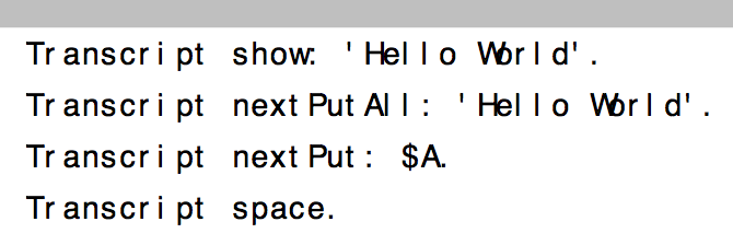
what with the 2x space?
Something I like about Source Code Pro is the greater spacing between identifiers. In comparison, I found DejaVu Sans and Source Sans Pro to be too dense, especially so with the latter. So I experimented with doubling the size of that space with the proportional fonts. I just Search-Replaced <space> with <space-space>, but in an IDE you could use one of the wider space character like the EN-QUAD [5]. Except the performance with Unicode versus ascii characters would need to be checked. I've attached a some more comparisons of identifier spacing. Sorry I mislead you with the Source Sans Pro 2X-spacing in previous PDF. You wont get that exactly out of the box without some code changes to use a wider space character. Check you opinion against the 1X-spacing. cheers -ben [5] http://www.cs.tut.fi/~jkorpela/chars/spaces.html Goubier Thierry wrote:
Excellent, I like the comparison a lot! Thanks!
My take is: - Unable to like Source Code Pro 9 (and it's so wide); - Source Sans Pro 9 has spacing issues (16r, the r is too close) and reading issues (it's the worse for the lL|i characters) - Source sans Pro 10 is better than 9 (but what with the 2x space?)
Overall, I'd stay with DejaVu Sans 9 based on this sample. In my opinion, the best compromise density / readability.
Thierry
Le 16/10/2013 19:56, btc@openinworld.com a écrit :
Goubier Thierry wrote:
I'd be more impressed if the argument was helping me distinguish between | and l.
Yes. It is designed to do that. Some common failings of monospaced fonts are noted [1] and dealt with. There comment section is also interesting.
The attached PDFs are the result of getting the urge to compare a broad coverage of code examples (taken from "Terse Guide to Squeak") against three fonts: * DejaVu Sans 9 point * Source Code Pro [1] [2] 9 point * Source Sans Pro [3] [4] 9 point & 10 point, since the width of 10 was the same as the others at 9. Also attached is the source excel file.
cheers -ben
[1] http://blogs.adobe.com/typblography/2012/09/source-code-pro.html [2] http://sourceforge.net/projects/sourcecodepro.adobe/files/ [3] http://blogs.adobe.com/typblography/2012/08/source-sans-pro.html [4] http://sourceforge.net/projects/sourcesans.adobe/postdownload?source=dlp
I'l let you try, then :)
Thierry
Oh, ok, thanks for the explanation. I noticed effectively that switching to Source Sans 10 increased significantly the density (copying the Source Sans font files in /usr/local/share/fonts/ made them visible to Pharo), and that, it solved the MNU on unicode glyphs as well. So all is well with the Source Sans Pro and I'm happy. Thierry Le 17/10/2013 15:22, btc@openinworld.com a écrit :
what with the 2x space?
Something I like about Source Code Pro is the greater spacing between identifiers. In comparison, I found DejaVu Sans and Source Sans Pro to be too dense, especially so with the latter. So I experimented with doubling the size of that space with the proportional fonts. I just Search-Replaced <space> with <space-space>, but in an IDE you could use one of the wider space character like the EN-QUAD [5]. Except the performance with Unicode versus ascii characters would need to be checked. I've attached a some more comparisons of identifier spacing. Sorry I mislead you with the Source Sans Pro 2X-spacing in previous PDF. You wont get that exactly out of the box without some code changes to use a wider space character. Check you opinion against the 1X-spacing. cheers -ben
[5] http://www.cs.tut.fi/~jkorpela/chars/spaces.html
Goubier Thierry wrote:
Excellent, I like the comparison a lot! Thanks!
My take is: - Unable to like Source Code Pro 9 (and it's so wide); - Source Sans Pro 9 has spacing issues (16r, the r is too close) and reading issues (it's the worse for the lL|i characters) - Source sans Pro 10 is better than 9 (but what with the 2x space?)
Overall, I'd stay with DejaVu Sans 9 based on this sample. In my opinion, the best compromise density / readability.
Thierry
Le 16/10/2013 19:56, btc@openinworld.com a écrit :
Goubier Thierry wrote:
I'd be more impressed if the argument was helping me distinguish between | and l.
Yes. It is designed to do that. Some common failings of monospaced fonts are noted [1] and dealt with. There comment section is also interesting.
The attached PDFs are the result of getting the urge to compare a broad coverage of code examples (taken from "Terse Guide to Squeak") against three fonts: * DejaVu Sans 9 point * Source Code Pro [1] [2] 9 point * Source Sans Pro [3] [4] 9 point & 10 point, since the width of 10 was the same as the others at 9. Also attached is the source excel file.
cheers -ben
[1] http://blogs.adobe.com/typblography/2012/09/source-code-pro.html [2] http://sourceforge.net/projects/sourcecodepro.adobe/files/ [3] http://blogs.adobe.com/typblography/2012/08/source-sans-pro.html [4] http://sourceforge.net/projects/sourcesans.adobe/postdownload?source=dlp
I'l let you try, then :)
Thierry
-- Thierry Goubier CEA list Laboratoire des Fondations des Systèmes Temps Réel Embarqués 91191 Gif sur Yvette Cedex France Phone/Fax: +33 (0) 1 69 08 32 92 / 83 95
Not sure if anyone noticed this previously, but I had a problem with Monticello repositories not showing the usual convention to bold and underline items to indicate which were in the image - and tracked this down to being introduced between builds #30469 and #30470. Coincidently this is where the default font seemed to change from DejaVu to Source Code Pro. Looks like the default is back to DejaVi in build #30497, so I'm not sure what you'd like to do about logging this as an issue. cheers -ben
yes, that's because I failed to configure the new fonts and system fallbacks to the default font... to everything. anyway I switched back, while I see why font changes are not taken into account. no log needed :) On Oct 17, 2013, at 7:53 PM, btc@openInWorld.com wrote:
Not sure if anyone noticed this previously, but I had a problem with Monticello repositories not showing the usual convention to bold and underline items to indicate which were in the image - and tracked this down to being introduced between builds #30469 and #30470. Coincidently this is where the default font seemed to change from DejaVu to Source Code Pro. Looks like the default is back to DejaVi in build #30497, so I'm not sure what you'd like to do about logging this as an issue.
cheers -ben
97 (..wellâ¦98) mails in one thread is quite a number. So fonts seems to be the biggest concern these days. That could say something about pharo ;) Norbert Am 17.10.2013 um 19:58 schrieb Esteban Lorenzano <estebanlm@gmail.com>:
yes, that's because I failed to configure the new fonts and system fallbacks to the default font... to everything. anyway I switched back, while I see why font changes are not taken into account.
no log needed :)
On Oct 17, 2013, at 7:53 PM, btc@openInWorld.com wrote:
Not sure if anyone noticed this previously, but I had a problem with Monticello repositories not showing the usual convention to bold and underline items to indicate which were in the image - and tracked this down to being introduced between builds #30469 and #30470. Coincidently this is where the default font seemed to change from DejaVu to Source Code Pro. Looks like the default is back to DejaVi in build #30497, so I'm not sure what you'd like to do about logging this as an issue.
cheers -ben
Yeah, there are subjects for which every one can have a cheap and strong opinion. It's not like discussing the arcane of OldCompiler, gory Morphic layout details, or whatever.. Every one wanting to improve this area is now aware of skinny reactions :) 2013/10/18 Norbert Hartl <norbert@hartl.name>
97 (..wellâ¦98) mails in one thread is quite a number. So fonts seems to be the biggest concern these days. That could say something about pharo ;)
Norbert Am 17.10.2013 um 19:58 schrieb Esteban Lorenzano <estebanlm@gmail.com>:
yes, that's because I failed to configure the new fonts and system fallbacks to the default font... to everything. anyway I switched back, while I see why font changes are not taken into account.
no log needed :)
On Oct 17, 2013, at 7:53 PM, btc@openInWorld.com wrote:
Not sure if anyone noticed this previously, but I had a problem with Monticello repositories not showing the usual convention to bold and underline items to indicate which were in the image - and tracked this down to being introduced between builds #30469 and #30470. Coincidently this is where the default font seemed to change from DejaVu to Source Code Pro. Looks like the default is back to DejaVi in build #30497, so I'm not sure what you'd like to do about logging this as an issue.
cheers -ben

That's why we call it a bikeshed: if you ask for opinions on something deeply arcane (nuclear reactor plans, compilers, ...) you get no reaction because the investment needed to actually comment properly is just too high. But everyone knows how to build a bikeshed, so everyone fights over the colour! frank On 18 October 2013 11:57, Nicolas Cellier <nicolas.cellier.aka.nice@gmail.com> wrote:
Yeah, there are subjects for which every one can have a cheap and strong opinion. It's not like discussing the arcane of OldCompiler, gory Morphic layout details, or whatever.. Every one wanting to improve this area is now aware of skinny reactions :)
2013/10/18 Norbert Hartl <norbert@hartl.name>
97 (..wellâ¦98) mails in one thread is quite a number. So fonts seems to be the biggest concern these days. That could say something about pharo ;)
Norbert Am 17.10.2013 um 19:58 schrieb Esteban Lorenzano <estebanlm@gmail.com>:
yes, that's because I failed to configure the new fonts and system fallbacks to the default font... to everything. anyway I switched back, while I see why font changes are not taken into account.
no log needed :)
On Oct 17, 2013, at 7:53 PM, btc@openInWorld.com wrote:
Not sure if anyone noticed this previously, but I had a problem with Monticello repositories not showing the usual convention to bold and underline items to indicate which were in the image - and tracked this down to being introduced between builds #30469 and #30470. Coincidently this is where the default font seemed to change from DejaVu to Source Code Pro. Looks like the default is back to DejaVi in build #30497, so I'm not sure what you'd like to do about logging this as an issue.
cheers -ben
On Tue, Oct 15, 2013 at 8:05 AM, Esteban Lorenzano <estebanlm@gmail.com>wrote:
On Oct 15, 2013, at 4:52 PM, Sven Van Caekenberghe <sven@stfx.eu> wrote:
On 15 Oct 2013, at 16:35, Esteban Lorenzano <estebanlm@gmail.com> wrote:
except that it is not accurate :)
- with a monospace you can have bolds and italic without problems (it
is a decent one)... and you also can play with sizes (for example, for comments)
- when you copy&paste you will lose part of your formatting no matter if you have a fixed font or a proportional one (is not true that you lose all of them... in fact I usually do not lose any)
Sorry, but there are no sensible arguments in favour of a monospaced font. It is just not needed (in Smalltalk). Another way to look at it is: 99.99 % of the world use proportional fonts.
BTW, I think whoever made this 'decision' knew it would be _very_ hard to get this passed ;-)
Maybe we should switch to C/Java/Javascript syntax so that we do not scare newcomers ? Sorry, I could not resist. not taken. and non sense. idea is to welcome newcomers, not to became another language. Now... if font is *part* of the language, we could be talking about the same. But since it is not, then we are comparing apples with tomatoes.
Smalltalk is much more than a language. It is also a class library, an incremental/interactive development environment, a set of tools, a number of graphics systems, a system for manipulating multiple media, and so on. Part of that is an aesthetic, especially when applied to the primary communications medium in the sytsem, text. So the apples with tomatoes "critique" is baloney. I can say that no, 99% of the world do not use proportional fonts... every
other programing environment uses monospaced fonts. yeah, I know "we are different"... but we still code. Ah, no, sorry... we "manipulate objects", but that looks really close to coding for me.
That's wrong. Few languages have been used to implement their own display system. Development "in" those languages is in fact, merely editing in whatever toolset the programmer chooses and not an integral part of the language at all. So most other languages neither use, nor don't use proportional or mono-spaced font. They are orthogonal to fonts. They are purely sequences of characters. Programmers impose formatting conventions to make texts that denote programs in those languages readable. But those languages are font-agnostic, and the conventions not integral parts of the language. Smalltalk systems are different. They typically implement their own tools, and hence can lay claim to coding in a particular font in a way most other systems cant; they don't do fonts.
and yes... I was expecting a lot of whining (even if it was not me *alone* who took the decision), but I was expecting from people at least wait to see the fonts before start the bashing ;)
Fuck off! Don't tell me I'm whining. OK, this discussion is the usual ad hominem piece of crap. Good bye.
On Oct 15, 2013, at 3:53 PM, Sven Van Caekenberghe <sven@stfx.eu>
wrote:
Excellent arguments ! I am with you 100%
On 15 Oct 2013, at 15:21, Igor Stasenko <siguctua@gmail.com> wrote:
Since the days when editors was able to allow me using any fonts, i
was always switching to variable-spaced font
for code pane. And i am not speaking about smalltalk or pharo here, it was C and Pascal those days :)
guess, what i would prefer in pharo? :)
The bad things about getting used to monospaced fonts is that you format code and it looks perfect, but then you print it or copy/paste it somewhere else where it uses other font, and all your beautiful formatting are gone. Needless to say, that printing press was invented way before first computer or digital printer, and all we know about fonts came to us from the printing world.. and i think i would be right saying that before first digital printers there was not such thing as monospaced fonts, because it is not economically efficient: you don't want to waste space on front page of your newspaper by aligning glyphs to some virtual grid. More than that, it works well only if you using same font size and no bold/underline variants whatever.. as soon as you use variants or different font size, all the benefits of 'formatting' using monospaced font is gone. That means, if we employ monospaced font for code, we will be forced to not use bold/italic variants, or different font size (for instance, i would be like to play with code highlight scheme, where comments using different font size, or where method name uses bigger font size etc).
-- Best regards, Igor Stasenko.
-- best, Eliot
On Oct 15, 2013, at 5:46 PM, Eliot Miranda <eliot.miranda@gmail.com> wrote:
On Tue, Oct 15, 2013 at 8:05 AM, Esteban Lorenzano <estebanlm@gmail.com> wrote:
On Oct 15, 2013, at 4:52 PM, Sven Van Caekenberghe <sven@stfx.eu> wrote:
On 15 Oct 2013, at 16:35, Esteban Lorenzano <estebanlm@gmail.com> wrote:
except that it is not accurate :)
- with a monospace you can have bolds and italic without problems (it is a decent one)... and you also can play with sizes (for example, for comments) - when you copy&paste you will lose part of your formatting no matter if you have a fixed font or a proportional one (is not true that you lose all of them... in fact I usually do not lose any)
Sorry, but there are no sensible arguments in favour of a monospaced font. It is just not needed (in Smalltalk). Another way to look at it is: 99.99 % of the world use proportional fonts.
BTW, I think whoever made this 'decision' knew it would be _very_ hard to get this passed ;-)
Maybe we should switch to C/Java/Javascript syntax so that we do not scare newcomers ? Sorry, I could not resist.
not taken. and non sense. idea is to welcome newcomers, not to became another language. Now... if font is *part* of the language, we could be talking about the same. But since it is not, then we are comparing apples with tomatoes.
Smalltalk is much more than a language. It is also a class library, an incremental/interactive development environment, a set of tools, a number of graphics systems, a system for manipulating multiple media, and so on. Part of that is an aesthetic, especially when applied to the primary communications medium in the sytsem, text.
So the apples with tomatoes "critique" is baloney.
I can say that no, 99% of the world do not use proportional fonts... every other programing environment uses monospaced fonts. yeah, I know "we are different"... but we still code. Ah, no, sorry... we "manipulate objects", but that looks really close to coding for me.
That's wrong. Few languages have been used to implement their own display system. Development "in" those languages is in fact, merely editing in whatever toolset the programmer chooses and not an integral part of the language at all. So most other languages neither use, nor don't use proportional or mono-spaced font. They are orthogonal to fonts. They are purely sequences of characters. Programmers impose formatting conventions to make texts that denote programs in those languages readable. But those languages are font-agnostic, and the conventions not integral parts of the language. Smalltalk systems are different. They typically implement their own tools, and hence can lay claim to coding in a particular font in a way most other systems cant; they don't do fonts.
and yes... I was expecting a lot of whining (even if it was not me *alone* who took the decision), but I was expecting from people at least wait to see the fonts before start the bashing ;)
Fuck off! Don't tell me I'm whining. OK, this discussion is the usual ad hominem piece of crap. Good bye.
Again, I was not trying to insult anyone. I do found value in your arguments (and any others, no matter agreement or disagreement), and I was not trying to become nor personal not passionate and definitively not aggressive. I apologies, trying to make a fun comment I made a non-cool one.
On Oct 15, 2013, at 3:53 PM, Sven Van Caekenberghe <sven@stfx.eu> wrote:
Excellent arguments ! I am with you 100%
On 15 Oct 2013, at 15:21, Igor Stasenko <siguctua@gmail.com> wrote:
Since the days when editors was able to allow me using any fonts, i was always switching to variable-spaced font for code pane. And i am not speaking about smalltalk or pharo here, it was C and Pascal those days :)
guess, what i would prefer in pharo? :)
The bad things about getting used to monospaced fonts is that you format code and it looks perfect, but then you print it or copy/paste it somewhere else where it uses other font, and all your beautiful formatting are gone. Needless to say, that printing press was invented way before first computer or digital printer, and all we know about fonts came to us from the printing world.. and i think i would be right saying that before first digital printers there was not such thing as monospaced fonts, because it is not economically efficient: you don't want to waste space on front page of your newspaper by aligning glyphs to some virtual grid. More than that, it works well only if you using same font size and no bold/underline variants whatever.. as soon as you use variants or different font size, all the benefits of 'formatting' using monospaced font is gone. That means, if we employ monospaced font for code, we will be forced to not use bold/italic variants, or different font size (for instance, i would be like to play with code highlight scheme, where comments using different font size, or where method name uses bigger font size etc).
-- Best regards, Igor Stasenko.
-- best, Eliot
2013/10/15 Esteban Lorenzano <estebanlm@gmail.com>:
On Oct 15, 2013, at 4:52 PM, Sven Van Caekenberghe <sven@stfx.eu> wrote:
On 15 Oct 2013, at 16:35, Esteban Lorenzano <estebanlm@gmail.com> wrote:
except that it is not accurate :)
- with a monospace you can have bolds and italic without problems (it is a decent one)... and you also can play with sizes (for example, for comments) - when you copy&paste you will lose part of your formatting no matter if you have a fixed font or a proportional one (is not true that you lose all of them... in fact I usually do not lose any)
Sorry, but there are no sensible arguments in favour of a monospaced font. It is just not needed (in Smalltalk). Another way to look at it is: 99.99 % of the world use proportional fonts.
BTW, I think whoever made this 'decision' knew it would be _very_ hard to get this passed ;-)
Maybe we should switch to C/Java/Javascript syntax so that we do not scare newcomers ? Sorry, I could not resist.
not taken. and non sense. idea is to welcome newcomers, not to became another language. Now... if font is *part* of the language, we could be talking about the same. But since it is not, then we are comparing apples with tomatoes.
I can say that no, 99% of the world do not use proportional fonts... every other programing environment uses monospaced fonts. yeah, I know "we are different"... but we still code. Ah, no, sorry... we "manipulate objects", but that looks really close to coding for me.
and yes... I was expecting a lot of whining (even if it was not me *alone* who took the decision), but I was expecting from people at least wait to see the fonts before start the bashing ;)
I started this thread because I tried the fonts and I discovered that something really bad happened to my eyes. Suddenly I had real problems to read the code. Above all it was much harder to me to see borders of keyword messages. Lines started to be much wider and it was harder to see them at once, their structure, blocks etc. Moreover, I had the feeling that code I'm looking at is not Smalltalk :-) I know that it's in my brain and how easy is to change the default font settings. I have nothing against it if it will make Pharo more friendlier to newcomers and I the new icons are good. I only wanted to know if others the same brain disability :-) It's interesting that I edit Smalltalk in text files with monospaced font quite often. To try the settings from the new theme eval this: SourceCodeProRegular new install. OpenSansRegular new install. FreeTypeFontProvider current updateFromSystem. SourceCodeFonts setSourceCodeFonts: 10. -- Pavel
On Oct 15, 2013, at 3:53 PM, Sven Van Caekenberghe <sven@stfx.eu> wrote:
Excellent arguments ! I am with you 100%
On 15 Oct 2013, at 15:21, Igor Stasenko <siguctua@gmail.com> wrote:
Since the days when editors was able to allow me using any fonts, i was always switching to variable-spaced font for code pane. And i am not speaking about smalltalk or pharo here, it was C and Pascal those days :)
guess, what i would prefer in pharo? :)
The bad things about getting used to monospaced fonts is that you format code and it looks perfect, but then you print it or copy/paste it somewhere else where it uses other font, and all your beautiful formatting are gone. Needless to say, that printing press was invented way before first computer or digital printer, and all we know about fonts came to us from the printing world.. and i think i would be right saying that before first digital printers there was not such thing as monospaced fonts, because it is not economically efficient: you don't want to waste space on front page of your newspaper by aligning glyphs to some virtual grid. More than that, it works well only if you using same font size and no bold/underline variants whatever.. as soon as you use variants or different font size, all the benefits of 'formatting' using monospaced font is gone. That means, if we employ monospaced font for code, we will be forced to not use bold/italic variants, or different font size (for instance, i would be like to play with code highlight scheme, where comments using different font size, or where method name uses bigger font size etc).
-- Best regards, Igor Stasenko.
On 15 Oct 2013, at 17:53, Pavel Krivanek <pavel.krivanek@gmail.com> wrote:
2013/10/15 Esteban Lorenzano <estebanlm@gmail.com>:
On Oct 15, 2013, at 4:52 PM, Sven Van Caekenberghe <sven@stfx.eu> wrote:
On 15 Oct 2013, at 16:35, Esteban Lorenzano <estebanlm@gmail.com> wrote:
except that it is not accurate :)
- with a monospace you can have bolds and italic without problems (it is a decent one)... and you also can play with sizes (for example, for comments) - when you copy&paste you will lose part of your formatting no matter if you have a fixed font or a proportional one (is not true that you lose all of them... in fact I usually do not lose any)
Sorry, but there are no sensible arguments in favour of a monospaced font. It is just not needed (in Smalltalk). Another way to look at it is: 99.99 % of the world use proportional fonts.
BTW, I think whoever made this 'decision' knew it would be _very_ hard to get this passed ;-)
Maybe we should switch to C/Java/Javascript syntax so that we do not scare newcomers ? Sorry, I could not resist.
not taken. and non sense. idea is to welcome newcomers, not to became another language. Now... if font is *part* of the language, we could be talking about the same. But since it is not, then we are comparing apples with tomatoes.
I can say that no, 99% of the world do not use proportional fonts... every other programing environment uses monospaced fonts. yeah, I know "we are different"... but we still code. Ah, no, sorry... we "manipulate objects", but that looks really close to coding for me.
and yes... I was expecting a lot of whining (even if it was not me *alone* who took the decision), but I was expecting from people at least wait to see the fonts before start the bashing ;)
I started this thread because I tried the fonts and I discovered that something really bad happened to my eyes. Suddenly I had real problems to read the code. Above all it was much harder to me to see borders of keyword messages. Lines started to be much wider and it was harder to see them at once, their structure, blocks etc. Moreover, I had the feeling that code I'm looking at is not Smalltalk :-)
I know that it's in my brain and how easy is to change the default font settings. I have nothing against it if it will make Pharo more friendlier to newcomers and I the new icons are good. I only wanted to know if others the same brain disability :-) It's interesting that I edit Smalltalk in text files with monospaced font quite often.
Exactly, that is well put. Pharo/Smalltalk prefers long message names, class names, etc⦠Hence being able to more on one line is a case to optimise for.
To try the settings from the new theme eval this:
SourceCodeProRegular new install. OpenSansRegular new install. FreeTypeFontProvider current updateFromSystem. SourceCodeFonts setSourceCodeFonts: 10.
-- Pavel
On Oct 15, 2013, at 3:53 PM, Sven Van Caekenberghe <sven@stfx.eu> wrote:
Excellent arguments ! I am with you 100%
On 15 Oct 2013, at 15:21, Igor Stasenko <siguctua@gmail.com> wrote:
Since the days when editors was able to allow me using any fonts, i was always switching to variable-spaced font for code pane. And i am not speaking about smalltalk or pharo here, it was C and Pascal those days :)
guess, what i would prefer in pharo? :)
The bad things about getting used to monospaced fonts is that you format code and it looks perfect, but then you print it or copy/paste it somewhere else where it uses other font, and all your beautiful formatting are gone. Needless to say, that printing press was invented way before first computer or digital printer, and all we know about fonts came to us from the printing world.. and i think i would be right saying that before first digital printers there was not such thing as monospaced fonts, because it is not economically efficient: you don't want to waste space on front page of your newspaper by aligning glyphs to some virtual grid. More than that, it works well only if you using same font size and no bold/underline variants whatever.. as soon as you use variants or different font size, all the benefits of 'formatting' using monospaced font is gone. That means, if we employ monospaced font for code, we will be forced to not use bold/italic variants, or different font size (for instance, i would be like to play with code highlight scheme, where comments using different font size, or where method name uses bigger font size etc).
-- Best regards, Igor Stasenko.
On Oct 15, 2013, at 6:08 AM, Esteban Lorenzano <estebanlm@gmail.com> wrote:
On Oct 15, 2013, at 1:47 PM, Sven Van Caekenberghe <sven@stfx.eu> wrote:
On 15 Oct 2013, at 13:29, Esteban Lorenzano <estebanlm@gmail.com> wrote:
well... fonts and UX in general are two different (yet related) issues.
UX is a huge an complicated task, and has to be taken very seriously if we want to succeed. To allow the appropriate/productive/happy flows in an environment requires a lot of effort and to put all the pieces together. Yes, I know, that sounds so general that is like not saying anything :) Here is the concrete: Put all the UX pieces together requires a lot of effort usually not taken into account. That's how the UX evolved more or less the same way as morphic: a patch over a patch without much thinking about the issue, just takign what is there and parching/extending as needed. As morphic, the current UX in pharo is broken: there is no coherence between tools and sometimes even inside the same tool (for example nautilus has different behavior inside the code panel than in the list panels on top). This is not the fault of any tool, just a consequence of how evolution was managed until now. So, we wanted a better UX for Pharo3 that included: a new Theme, new Icon set, and new tools that worked well together. But task demonstrated to be a hard to beat beast, and we just moved forward in small areas (there is for example a new centralized menu coming along with a new spotlight). And there is a prototype of a new theme and also some icons that where thought specially and that will fit nicely. But they will not be ready this year and after thinking a while (and getting feedback of people in community), we decided, for Pharo3:
- adopt the glamour theme. This is a step forward our current one because glamour guys (specially Doru) continued working on it to have a really clean and simple theme. - adopt the EclipsePack theme because is an iconset specially thought for programming that plays very well together. No matter if you do not like Eclipse (even if I think you are missing the relevance of Eclipse and a lot of good ideas that we could take from them), is about creating a unified vision. The old icon set (famfam) was not intended for programming environment and also there were a lot of different icons incorporated anarchically. - adopt a monospaced font for coding (right now Source Code Pro) and a non-monospaced for the rest (right now Open Sans).
I agree with everything, except the monospaced font. When, where, how was this decided ? I didn't see any discussion about this. I would be very surprised if you, or anyone else of the key developers, used that font.
mmm... there was a "subjacent" discussion for months, but I agree that we should use more the list. In any case, this is still an open discussion.
Anyone else having an opinion about the mono spaced font ?
It is not by erasing all differences with other systems that we will gain traction !
is not about erasing differences, is about not been different when been different does not follows a meaning. I have my own experience to support my pov here: in my years teaching with pharo, I always had "lateral problems" with things that were not relevant... I would like to erase that, yes. To keep pharo been unique in the things that really matters.
and Smalltalk is fundamentally different in its aesthetics and philosophy. Smalltalk was designed to be comprehensible by young people, not programmers. Just one example is the number base. Prefixing by 16r is more general, more powerful and more comprehensible than 0x, but is unfamiliar to most programmers. Throw that away and you end up with JavaScript or Ruby. What most other dynamic oo languages lack is an overall aesthetic and design philosophy. Just read the intro to the blue book to remind yourself of that philosophy and consider how deep and coherent it's effects on the system design are. All those other systems just want to be liked and are afraid to be different and are just a mess. If you want to make pharo blend in go ahead, but you'll end up with gruel, and insecure gruel at that. Monks paced fonts. Bah, humbug. Eliot (phone)
BTW: I don't see the any monospaced font in 30484, luckily ;-)
The objective is to offer a L&F that where visual elements plays well together. And there is another more important (IMHO) objective: to offer newcomers an environment easier to approach. Pharo (and all Smalltalk-inspired environments) is already very alien for newcomers. We get a lot of power in exchange of that alienish stuff, but very often the curve of learning or acceptance is too high and people that could step closer to us are pushed away. So, my idea is to keep been as alien as possible in the things that make us Pharo and be the less alien possible in the rest: A nice L&F that can be feel as "some kind" familiar, is part of it.
Said so... well you still can switch back to the old and ugly (IMO) L&F executing some lines of code in your workspace.
Same to fonts: monospaced fonts is the worldwide accepted way of present source code. Why should we stay different?
In any case, please give it a chance before drop it (once I can actually see why the fonts are not really applied) and we'll see how it works.
Esteban
On Oct 15, 2013, at 12:18 PM, Sven Van Caekenberghe <sven@stfx.eu> wrote:
On 15 Oct 2013, at 08:30, Pavel Krivanek <pavel.krivanek@gmail.com> wrote:
the issue that sets the new Pharo 3.0 look&feel uses a monospaced font for the code. It is only a coincidence that it is not set this way in the prebuild Pharo image.
not a coincidence, a bug that arise when I tried to change it :)
I have big doubts if this is the way to go. I think that proportional fonts are more natural for Smalltalk and without them the code is harder to read and not so beauty. I think that something like elastic tabstops would be much better solution. http://tibleiz.net/code-browser/elastic-tabstops.html
Well... we can still iterate over the idea before release, but we do the best we can with the tools we have in the moment :) For me, is frankly uncomfortable to use proportional fonts when coding... is so annoying that I even use monospaced for lists, etc... but well, I accept the "current legislation": monospaced for code, proportional for the rest.
Yeah, I can't imagine many Smalltalkers liking a mono-spaced font, I personally hate it.
Oh well, I'm a pharoer, and I love them :)
On the other way, it is only my personal opinion and if you think that the Eclipse-like look will attract more new users...
I don't like Eclipse ;-) But like Marcus says, it is just a different icon set. We want win any points on originality or personality though, which is a missed opportunity.
On Oct 15, 2013, at 3:55 PM, Eliot Miranda <eliot.miranda@gmail.com> wrote:
On Oct 15, 2013, at 6:08 AM, Esteban Lorenzano <estebanlm@gmail.com> wrote:
On Oct 15, 2013, at 1:47 PM, Sven Van Caekenberghe <sven@stfx.eu> wrote:
On 15 Oct 2013, at 13:29, Esteban Lorenzano <estebanlm@gmail.com> wrote:
well... fonts and UX in general are two different (yet related) issues.
UX is a huge an complicated task, and has to be taken very seriously if we want to succeed. To allow the appropriate/productive/happy flows in an environment requires a lot of effort and to put all the pieces together. Yes, I know, that sounds so general that is like not saying anything :) Here is the concrete: Put all the UX pieces together requires a lot of effort usually not taken into account. That's how the UX evolved more or less the same way as morphic: a patch over a patch without much thinking about the issue, just takign what is there and parching/extending as needed. As morphic, the current UX in pharo is broken: there is no coherence between tools and sometimes even inside the same tool (for example nautilus has different behavior inside the code panel than in the list panels on top). This is not the fault of any tool, just a consequence of how evolution was managed until now. So, we wanted a better UX for Pharo3 that included: a new Theme, new Icon set, and new tools that worked well together. But task demonstrated to be a hard to beat beast, and we just moved forward in small areas (there is for example a new centralized menu coming along with a new spotlight). And there is a prototype of a new theme and also some icons that where thought specially and that will fit nicely. But they will not be ready this year and after thinking a while (and getting feedback of people in community), we decided, for Pharo3:
- adopt the glamour theme. This is a step forward our current one because glamour guys (specially Doru) continued working on it to have a really clean and simple theme. - adopt the EclipsePack theme because is an iconset specially thought for programming that plays very well together. No matter if you do not like Eclipse (even if I think you are missing the relevance of Eclipse and a lot of good ideas that we could take from them), is about creating a unified vision. The old icon set (famfam) was not intended for programming environment and also there were a lot of different icons incorporated anarchically. - adopt a monospaced font for coding (right now Source Code Pro) and a non-monospaced for the rest (right now Open Sans).
I agree with everything, except the monospaced font. When, where, how was this decided ? I didn't see any discussion about this. I would be very surprised if you, or anyone else of the key developers, used that font.
mmm... there was a "subjacent" discussion for months, but I agree that we should use more the list. In any case, this is still an open discussion.
Anyone else having an opinion about the mono spaced font ?
It is not by erasing all differences with other systems that we will gain traction !
is not about erasing differences, is about not been different when been different does not follows a meaning. I have my own experience to support my pov here: in my years teaching with pharo, I always had "lateral problems" with things that were not relevant... I would like to erase that, yes. To keep pharo been unique in the things that really matters.
and Smalltalk is fundamentally different in its aesthetics and philosophy. Smalltalk was designed to be comprehensible by young people, not programmers. Just one example is the number base. Prefixing by 16r is more general, more powerful and more comprehensible than 0x, but is unfamiliar to most programmers. Throw that away and you end up with JavaScript or Ruby.
I don't think is a fair comparison. If that would be the case, we should still use a black and white theme with scrollbars in left and those horrible and pixelated fonts (no idea if there is a name for them). Progress is possible, perfection was not achieved in 81 or in 95. And I think erasing senseless barriers are closer to the spirit of the original smalltalk than stay immobile. Said so... the day I ask for a semantic or even syntactic change is the day you can all bash me like the traitor I will become (but I would like to have a literal format...) ;)
What most other dynamic oo languages lack is an overall aesthetic and design philosophy. Just read the intro to the blue book to remind yourself of that philosophy and consider how deep and coherent it's effects on the system design are. All those other systems just want to be liked and are afraid to be different and are just a mess. If you want to make pharo blend in go ahead, but you'll end up with gruel, and insecure gruel at that.
Monks paced fonts. Bah, humbug.
Eliot (phone)
BTW: I don't see the any monospaced font in 30484, luckily ;-)
The objective is to offer a L&F that where visual elements plays well together. And there is another more important (IMHO) objective: to offer newcomers an environment easier to approach. Pharo (and all Smalltalk-inspired environments) is already very alien for newcomers. We get a lot of power in exchange of that alienish stuff, but very often the curve of learning or acceptance is too high and people that could step closer to us are pushed away. So, my idea is to keep been as alien as possible in the things that make us Pharo and be the less alien possible in the rest: A nice L&F that can be feel as "some kind" familiar, is part of it.
Said so... well you still can switch back to the old and ugly (IMO) L&F executing some lines of code in your workspace.
Same to fonts: monospaced fonts is the worldwide accepted way of present source code. Why should we stay different?
In any case, please give it a chance before drop it (once I can actually see why the fonts are not really applied) and we'll see how it works.
Esteban
On Oct 15, 2013, at 12:18 PM, Sven Van Caekenberghe <sven@stfx.eu> wrote:
On 15 Oct 2013, at 08:30, Pavel Krivanek <pavel.krivanek@gmail.com> wrote:
the issue that sets the new Pharo 3.0 look&feel uses a monospaced font for the code. It is only a coincidence that it is not set this way in the prebuild Pharo image.
not a coincidence, a bug that arise when I tried to change it :)
I have big doubts if this is the way to go. I think that proportional fonts are more natural for Smalltalk and without them the code is harder to read and not so beauty. I think that something like elastic tabstops would be much better solution. http://tibleiz.net/code-browser/elastic-tabstops.html
Well... we can still iterate over the idea before release, but we do the best we can with the tools we have in the moment :) For me, is frankly uncomfortable to use proportional fonts when coding... is so annoying that I even use monospaced for lists, etc... but well, I accept the "current legislation": monospaced for code, proportional for the rest.
Yeah, I can't imagine many Smalltalkers liking a mono-spaced font, I personally hate it.
Oh well, I'm a pharoer, and I love them :)
On the other way, it is only my personal opinion and if you think that the Eclipse-like look will attract more new users...
I don't like Eclipse ;-) But like Marcus says, it is just a different icon set. We want win any points on originality or personality though, which is a missed opportunity.
On Tue, Oct 15, 2013 at 7:47 AM, Esteban Lorenzano <estebanlm@gmail.com>wrote:
On Oct 15, 2013, at 3:55 PM, Eliot Miranda <eliot.miranda@gmail.com> wrote:
On Oct 15, 2013, at 6:08 AM, Esteban Lorenzano <estebanlm@gmail.com>
wrote:
On Oct 15, 2013, at 1:47 PM, Sven Van Caekenberghe <sven@stfx.eu>
wrote:
On 15 Oct 2013, at 13:29, Esteban Lorenzano <estebanlm@gmail.com>
wrote:
well... fonts and UX in general are two different (yet related)
issues.
UX is a huge an complicated task, and has to be taken very seriously
if we want to succeed. To allow the appropriate/productive/happy flows in an environment requires a lot of effort and to put all the pieces together.
Yes, I know, that sounds so general that is like not saying anything :) Here is the concrete: Put all the UX pieces together requires a lot of effort usually not taken into account. That's how the UX evolved more or less the same way as morphic: a patch over a patch without much thinking about the issue, just takign what is there and parching/extending as needed. As morphic, the current UX in pharo is broken: there is no coherence between tools and sometimes even inside the same tool (for example nautilus has different behavior inside the code panel than in the list panels on top). This is not the fault of any tool, just a consequence of how evolution was managed until now. So, we wanted a better UX for Pharo3 that included: a new Theme, new Icon set, and new tools that worked well together. But task demonstrated to be a hard to beat beast, and we just moved forward in small areas (there is for example a new centralized menu coming along with a new spotlight). And there is a prototype of a new theme and also some icons that where thought specially and that will fit nicely. But they will not be ready this year and after thinking a while (and getting feedback of people in community), we decided, for Pharo3:
- adopt the glamour theme. This is a step forward our current one because glamour guys (specially Doru) continued working on it to have a really clean and simple theme. - adopt the EclipsePack theme because is an iconset specially thought for programming that plays very well together. No matter if you do not like Eclipse (even if I think you are missing the relevance of Eclipse and a lot of good ideas that we could take from them), is about creating a unified vision. The old icon set (famfam) was not intended for programming environment and also there were a lot of different icons incorporated anarchically. - adopt a monospaced font for coding (right now Source Code Pro) and a non-monospaced for the rest (right now Open Sans).
I agree with everything, except the monospaced font. When, where, how was this decided ? I didn't see any discussion about this. I would be very surprised if you, or anyone else of the key developers, used that font.
mmm... there was a "subjacent" discussion for months, but I agree that we should use more the list. In any case, this is still an open discussion.
Anyone else having an opinion about the mono spaced font ?
It is not by erasing all differences with other systems that we will
gain traction !
is not about erasing differences, is about not been different when been different does not follows a meaning. I have my own experience to support my pov here: in my years teaching with pharo, I always had "lateral problems" with things that were not relevant... I would like to erase that, yes. To keep pharo been unique in the things that really matters.
and Smalltalk is fundamentally different in its aesthetics and philosophy. Smalltalk was designed to be comprehensible by young people, not programmers. Just one example is the number base. Prefixing by 16r is more general, more powerful and more comprehensible than 0x, but is unfamiliar to most programmers. Throw that away and you end up with JavaScript or Ruby.
I don't think is a fair comparison. If that would be the case, we should still use a black and white theme with scrollbars in left and those horrible and pixelated fonts (no idea if there is a name for them).
Nonsense. When that black and white theme was invented it was ground-breaking (the first scroll bars, the first pop-up menu, etc). But that doesn't mean one can't improve on things. While I liked the simple text selection cut/redo scheme, the Windows separation of cut/copy/paste from undo/redo is much better and I depend on that now. Pop-out scroll bars are a great idea for conserving screen real estate it is flickery and annoyingly difficult to aim at when not in the current pane, etc. When that black-and-whitew look was invented it was impossible even to conceive of a high-resolution colour display because memory was so expensive. There's nothing in the aesthetics or philosophy that pushes against evolution, or taking advantage of technological innovation. However, there /are/ ways in which Squeak/Pharo has regressed. In particular the lack of menu memory is IMO a right-royal PITA. (menu memory is popping up a menu such that the last item selected is under the cursor, and hence selected. now many menus are created when a mouse button is clicked, there is no menu object to remember the previous selection. this scheme makes it very nice to group menu selections in groups, since e.g. a repeated sequence of cut followed by paste is a simple sequence of gestures moving the cursor one menu selection up or down to get from cut to paste and back to paste again).
Progress is possible,
Indeed it is. And moving from proportional to mono-spaced fonts is not progress, it is regress.
perfection was not achieved in 81 or in 95.
I didn't say it was. I said that systems designed with a coherent aesthetics and philosophy are more coherent, powerful and comprehensible than those which are not. And I think erasing senseless barriers are closer to the spirit of the
original smalltalk than stay immobile.
Consider the number format. Is that a "senseless barrier" to comprehensibility that should be replaced by 0x? There are many ways one could approach the issues of formatting proportionally-spaced code. Eliminating it, when its readability and elegance is so much better than mono-spaced fonts, isn't removing a senseless barrier. More like tripping over a low hurdle.
Said so... the day I ask for a semantic or even syntactic change is the day you can all bash me like the traitor I will become (but I would like to have a literal format...) ;)
Stick to the argument, please. If this discussion devolves into the ad hominem then it'll achieve nothing.
What most other dynamic oo languages lack is an overall aesthetic and design philosophy. Just read the intro to the blue book to remind yourself of that philosophy and consider how deep and coherent it's effects on the system design are. All those other systems just want to be liked and are afraid to be different and are just a mess. If you want to make pharo blend in go ahead, but you'll end up with gruel, and insecure gruel at that.
Monks paced fonts. Bah, humbug.
Eliot (phone)
BTW: I don't see the any monospaced font in 30484, luckily ;-)
The objective is to offer a L&F that where visual elements plays well
together.
And there is another more important (IMHO) objective: to offer newcomers an environment easier to approach. Pharo (and all Smalltalk-inspired environments) is already very alien for newcomers. We get a lot of power in exchange of that alienish stuff, but very often the curve of learning or acceptance is too high and people that could step closer to us are pushed away. So, my idea is to keep been as alien as possible in the things that make us Pharo and be the less alien possible in the rest: A nice L&F that can be feel as "some kind" familiar, is part of it.
Said so... well you still can switch back to the old and ugly (IMO) L&F executing some lines of code in your workspace.
Same to fonts: monospaced fonts is the worldwide accepted way of present source code. Why should we stay different?
In any case, please give it a chance before drop it (once I can actually see why the fonts are not really applied) and we'll see how it works.
Esteban
On Oct 15, 2013, at 12:18 PM, Sven Van Caekenberghe <sven@stfx.eu> wrote:
On 15 Oct 2013, at 08:30, Pavel Krivanek <pavel.krivanek@gmail.com>
wrote:
the issue that sets the new Pharo 3.0 look&feel uses a monospaced
font
for the code. It is only a coincidence that it is not set this way in the prebuild Pharo image.
not a coincidence, a bug that arise when I tried to change it :)
I have big doubts if this is the way to go. I think that
proportional
fonts are more natural for Smalltalk and without them the code is harder to read and not so beauty. I think that something like elastic tabstops would be much better solution. http://tibleiz.net/code-browser/elastic-tabstops.html
Well... we can still iterate over the idea before release, but we do the best we can with the tools we have in the moment :) For me, is frankly uncomfortable to use proportional fonts when coding... is so annoying that I even use monospaced for lists, etc... but well, I accept the "current legislation": monospaced for code, proportional for the rest.
Yeah, I can't imagine many Smalltalkers liking a mono-spaced font, I
personally hate it.
Oh well, I'm a pharoer, and I love them :)
On the other way, it is only my personal opinion and if you think
that
the Eclipse-like look will attract more new users...
I don't like Eclipse ;-) But like Marcus says, it is just a different icon set. We want win any points on originality or personality though, which is a missed opportunity.
-- best, Eliot
Begin forwarded message:
From: Eliot Miranda <eliot.miranda@gmail.com> Subject: Re: [Pharo-dev] default monospaced code font Date: October 15, 2013 5:37:33 PM GMT+02:00 To: Pharo Development List <pharo-dev@lists.pharo.org> Reply-To: Pharo Development List <pharo-dev@lists.pharo.org>
On Tue, Oct 15, 2013 at 7:47 AM, Esteban Lorenzano <estebanlm@gmail.com> wrote:
On Oct 15, 2013, at 3:55 PM, Eliot Miranda <eliot.miranda@gmail.com> wrote:
On Oct 15, 2013, at 6:08 AM, Esteban Lorenzano <estebanlm@gmail.com> wrote:
On Oct 15, 2013, at 1:47 PM, Sven Van Caekenberghe <sven@stfx.eu> wrote:
On 15 Oct 2013, at 13:29, Esteban Lorenzano <estebanlm@gmail.com> wrote:
well... fonts and UX in general are two different (yet related) issues.
UX is a huge an complicated task, and has to be taken very seriously if we want to succeed. To allow the appropriate/productive/happy flows in an environment requires a lot of effort and to put all the pieces together. Yes, I know, that sounds so general that is like not saying anything :) Here is the concrete: Put all the UX pieces together requires a lot of effort usually not taken into account. That's how the UX evolved more or less the same way as morphic: a patch over a patch without much thinking about the issue, just takign what is there and parching/extending as needed. As morphic, the current UX in pharo is broken: there is no coherence between tools and sometimes even inside the same tool (for example nautilus has different behavior inside the code panel than in the list panels on top). This is not the fault of any tool, just a consequence of how evolution was managed until now. So, we wanted a better UX for Pharo3 that included: a new Theme, new Icon set, and new tools that worked well together. But task demonstrated to be a hard to beat beast, and we just moved forward in small areas (there is for example a new centralized menu coming along with a new spotlight). And there is a prototype of a new theme and also some icons that where thought specially and that will fit nicely. But they will not be ready this year and after thinking a while (and getting feedback of people in community), we decided, for Pharo3:
- adopt the glamour theme. This is a step forward our current one because glamour guys (specially Doru) continued working on it to have a really clean and simple theme. - adopt the EclipsePack theme because is an iconset specially thought for programming that plays very well together. No matter if you do not like Eclipse (even if I think you are missing the relevance of Eclipse and a lot of good ideas that we could take from them), is about creating a unified vision. The old icon set (famfam) was not intended for programming environment and also there were a lot of different icons incorporated anarchically. - adopt a monospaced font for coding (right now Source Code Pro) and a non-monospaced for the rest (right now Open Sans).
I agree with everything, except the monospaced font. When, where, how was this decided ? I didn't see any discussion about this. I would be very surprised if you, or anyone else of the key developers, used that font.
mmm... there was a "subjacent" discussion for months, but I agree that we should use more the list. In any case, this is still an open discussion.
Anyone else having an opinion about the mono spaced font ?
It is not by erasing all differences with other systems that we will gain traction !
is not about erasing differences, is about not been different when been different does not follows a meaning. I have my own experience to support my pov here: in my years teaching with pharo, I always had "lateral problems" with things that were not relevant... I would like to erase that, yes. To keep pharo been unique in the things that really matters.
and Smalltalk is fundamentally different in its aesthetics and philosophy. Smalltalk was designed to be comprehensible by young people, not programmers. Just one example is the number base. Prefixing by 16r is more general, more powerful and more comprehensible than 0x, but is unfamiliar to most programmers. Throw that away and you end up with JavaScript or Ruby.
I don't think is a fair comparison. If that would be the case, we should still use a black and white theme with scrollbars in left and those horrible and pixelated fonts (no idea if there is a name for them).
Nonsense. When that black and white theme was invented it was ground-breaking (the first scroll bars, the first pop-up menu, etc). But that doesn't mean one can't improve on things. While I liked the simple text selection cut/redo scheme, the Windows separation of cut/copy/paste from undo/redo is much better and I depend on that now. Pop-out scroll bars are a great idea for conserving screen real estate it is flickery and annoyingly difficult to aim at when not in the current pane, etc. When that black-and-whitew look was invented it was impossible even to conceive of a high-resolution colour display because memory was so expensive. There's nothing in the aesthetics or philosophy that pushes against evolution, or taking advantage of technological innovation.
However, there /are/ ways in which Squeak/Pharo has regressed. In particular the lack of menu memory is IMO a right-royal PITA. (menu memory is popping up a menu such that the last item selected is under the cursor, and hence selected. now many menus are created when a mouse button is clicked, there is no menu object to remember the previous selection. this scheme makes it very nice to group menu selections in groups, since e.g. a repeated sequence of cut followed by paste is a simple sequence of gestures moving the cursor one menu selection up or down to get from cut to paste and back to paste again).
Progress is possible,
Indeed it is. And moving from proportional to mono-spaced fonts is not progress, it is regress.
perfection was not achieved in 81 or in 95.
I didn't say it was. I said that systems designed with a coherent aesthetics and philosophy are more coherent, powerful and comprehensible than those which are not.
yes, they are, I agree with that, and that's what we are trying to achieve... advancing one small step at a time, because we cannot doit all together, sadly. What I do not see is how proportional fonts fits more with a pharo coherence (which in my pov does not exists today) than a monospaced one.
And I think erasing senseless barriers are closer to the spirit of the original smalltalk than stay immobile.
Consider the number format. Is that a "senseless barrier" to comprehensibility that should be replaced by 0x? There are many ways one could approach the issues of formatting proportionally-spaced code. Eliminating it, when its readability and elegance is so much better than mono-spaced fonts, isn't removing a senseless barrier. More like tripping over a low hurdle.
Said so... the day I ask for a semantic or even syntactic change is the day you can all bash me like the traitor I will become (but I would like to have a literal format...) ;)
Stick to the argument, please. If this discussion devolves into the ad hominem then it'll achieve nothing.
I was doing a joke, I'm sorry if it was not interpreted like that. But the think is I do not think the number example applies, because changing a font is not the same as changing syntax. I would disagree with changing syntax because I find smalltalk beauty and coherent, which is something that I do not see in the rest of the system. I think we agree in the objective of bring coherence to Pharo, probably not in the ways of doing it :)
What most other dynamic oo languages lack is an overall aesthetic and design philosophy. Just read the intro to the blue book to remind yourself of that philosophy and consider how deep and coherent it's effects on the system design are. All those other systems just want to be liked and are afraid to be different and are just a mess. If you want to make pharo blend in go ahead, but you'll end up with gruel, and insecure gruel at that.
Monks paced fonts. Bah, humbug.
Eliot (phone)
BTW: I don't see the any monospaced font in 30484, luckily ;-)
The objective is to offer a L&F that where visual elements plays well together. And there is another more important (IMHO) objective: to offer newcomers an environment easier to approach. Pharo (and all Smalltalk-inspired environments) is already very alien for newcomers. We get a lot of power in exchange of that alienish stuff, but very often the curve of learning or acceptance is too high and people that could step closer to us are pushed away. So, my idea is to keep been as alien as possible in the things that make us Pharo and be the less alien possible in the rest: A nice L&F that can be feel as "some kind" familiar, is part of it.
Said so... well you still can switch back to the old and ugly (IMO) L&F executing some lines of code in your workspace.
Same to fonts: monospaced fonts is the worldwide accepted way of present source code. Why should we stay different?
In any case, please give it a chance before drop it (once I can actually see why the fonts are not really applied) and we'll see how it works.
Esteban
On Oct 15, 2013, at 12:18 PM, Sven Van Caekenberghe <sven@stfx.eu> wrote:
On 15 Oct 2013, at 08:30, Pavel Krivanek <pavel.krivanek@gmail.com> wrote:
the issue that sets the new Pharo 3.0 look&feel uses a monospaced font for the code. It is only a coincidence that it is not set this way in the prebuild Pharo image.
not a coincidence, a bug that arise when I tried to change it :)
I have big doubts if this is the way to go. I think that proportional fonts are more natural for Smalltalk and without them the code is harder to read and not so beauty. I think that something like elastic tabstops would be much better solution. http://tibleiz.net/code-browser/elastic-tabstops.html
Well... we can still iterate over the idea before release, but we do the best we can with the tools we have in the moment :) For me, is frankly uncomfortable to use proportional fonts when coding... is so annoying that I even use monospaced for lists, etc... but well, I accept the "current legislation": monospaced for code, proportional for the rest.
Yeah, I can't imagine many Smalltalkers liking a mono-spaced font, I personally hate it.
Oh well, I'm a pharoer, and I love them :)
On the other way, it is only my personal opinion and if you think that the Eclipse-like look will attract more new users...
I don't like Eclipse ;-) But like Marcus says, it is just a different icon set. We want win any points on originality or personality though, which is a missed opportunity.
-- best, Eliot

On 10/15/2013 11:06 AM, Esteban Lorenzano wrote:
*From: *Eliot Miranda <eliot.miranda@gmail.com <mailto:eliot.miranda@gmail.com>>
Progress is possible,
Indeed it is. And moving from proportional to mono-spaced fonts is not progress, it is regress.
perfection was not achieved in 81 or in 95.
I didn't say it was. I said that systems designed with a coherent aesthetics and philosophy are more coherent, powerful and comprehensible than those which are not.
yes, they are, I agree with that, and that's what we are trying to achieve... advancing one small step at a time, because we cannot doit all together, sadly. What I do not see is how proportional fonts fits more with a pharo coherence (which in my pov does not exists today) than a monospaced one.
But the change is away from proportional to monospace. I think the sale must be made as to what does that actually buy us. How does this improve our experience, pharo coherence? It seems that many of us here don't believe that it provides that coherence of UI/UX that your hoping to move us towards. So when changing from what we have, it seems that it needs to demonstrated that the change is for the better and not neutral or worse. I personally don't buy the it is less foreign to non-Smalltalkers argument. non-Smalltalkers would just move their distaste of Smalltalk somewhere else. Why do we have to use the image? Why can't I use Emacs, vim, Eclipse? Its all very personal and sometimes very visceral. I have seen some visceral comments from Igor regarding Python. I could make some from the C++ I've been looking at. We need to be the best open source Smalltalk-like experience. And not be constrained to other languages/editors/environments constraints and views on the world. So those who choose to advocate for a change. Advocate. Make the sale. Or else lets not make the change. Jimmie
On 15 October 2013 18:36, Jimmie Houchin <jlhouchin@gmail.com> wrote:
On 10/15/2013 11:06 AM, Esteban Lorenzano wrote:
*From: *Eliot Miranda <eliot.miranda@gmail.com>
Progress is possible,
Indeed it is. And moving from proportional to mono-spaced fonts is not progress, it is regress.
perfection was not achieved in 81 or in 95.
I didn't say it was. I said that systems designed with a coherent aesthetics and philosophy are more coherent, powerful and comprehensible than those which are not.
yes, they are, I agree with that, and that's what we are trying to achieve... advancing one small step at a time, because we cannot doit all together, sadly. What I do not see is how proportional fonts fits more with a pharo coherence (which in my pov does not exists today) than a monospaced one.
But the change is away from proportional to monospace. I think the sale must be made as to what does that actually buy us. How does this improve our experience, pharo coherence?
It seems that many of us here don't believe that it provides that coherence of UI/UX that your hoping to move us towards.
So when changing from what we have, it seems that it needs to demonstrated that the change is for the better and not neutral or worse.
I personally don't buy the it is less foreign to non-Smalltalkers argument. non-Smalltalkers would just move their distaste of Smalltalk somewhere else. Why do we have to use the image? Why can't I use Emacs, vim, Eclipse? Its all very personal and sometimes very visceral.
I have seen some visceral comments from Igor regarding Python. I could make some from the C++ I've been looking at.
ah.. python. yes, i hate their choice of using white space as part of language syntax. That is really retarded choice. And actually the roots of my disdain of it is same why i prefer proportional fonts: i like text, where white space is variable and not fixed, and used to make the text more readable, and ergonomically fit within its boundaries (like in newspaper column). If for people it would be easier to read text printed with monospaced font, then it would be like that long before first computer display appear in the world. Therefore, the whole idea that monospaced font is more readable is moot. I could justify such choice if we would have certain technical limitations (of the past), which forcing us to use less memory and text terminals.. but we're not.. We need to be the best open source Smalltalk-like experience. And not be
constrained to other languages/editors/environments constraints and views on the world.
So those who choose to advocate for a change. Advocate. Make the sale. Or else lets not make the change.
Jimmie
-- Best regards, Igor Stasenko.
I am anothet retarded that loves whitespaces :) And as a proper retarded I love python too. Igor Stasenko wrote
On 15 October 2013 18:36, Jimmie Houchin <
jlhouchin@
> wrote:
On 10/15/2013 11:06 AM, Esteban Lorenzano wrote:
*From: *Eliot Miranda <
eliot.miranda@
>
Progress is possible,
Indeed it is. And moving from proportional to mono-spaced fonts is not progress, it is regress.
perfection was not achieved in 81 or in 95.
I didn't say it was. I said that systems designed with a coherent aesthetics and philosophy are more coherent, powerful and comprehensible than those which are not.
yes, they are, I agree with that, and that's what we are trying to achieve... advancing one small step at a time, because we cannot doit all together, sadly. What I do not see is how proportional fonts fits more with a pharo coherence (which in my pov does not exists today) than a monospaced one.
But the change is away from proportional to monospace. I think the sale must be made as to what does that actually buy us. How does this improve our experience, pharo coherence?
It seems that many of us here don't believe that it provides that coherence of UI/UX that your hoping to move us towards.
So when changing from what we have, it seems that it needs to demonstrated that the change is for the better and not neutral or worse.
I personally don't buy the it is less foreign to non-Smalltalkers argument. non-Smalltalkers would just move their distaste of Smalltalk somewhere else. Why do we have to use the image? Why can't I use Emacs, vim, Eclipse? Its all very personal and sometimes very visceral.
I have seen some visceral comments from Igor regarding Python. I could make some from the C++ I've been looking at.
ah.. python. yes, i hate their choice of using white space as part of language syntax. That is really retarded choice. And actually the roots of my disdain of it is same why i prefer proportional fonts: i like text, where white space is variable and not fixed, and used to make the text more readable, and ergonomically fit within its boundaries (like in newspaper column). If for people it would be easier to read text printed with monospaced font, then it would be like that long before first computer display appear in the world. Therefore, the whole idea that monospaced font is more readable is moot.
I could justify such choice if we would have certain technical limitations (of the past), which forcing us to use less memory and text terminals.. but we're not..
We need to be the best open source Smalltalk-like experience. And not be
constrained to other languages/editors/environments constraints and views on the world.
So those who choose to advocate for a change. Advocate. Make the sale. Or else lets not make the change.
Jimmie
-- Best regards, Igor Stasenko.
-- View this message in context: http://forum.world.st/default-monospaced-code-font-tp4714433p4714847.html Sent from the Pharo Smalltalk Developers mailing list archive at Nabble.com.
Hi Igor, On Wed, Oct 16, 2013 at 1:33 AM, Igor Stasenko <siguctua@gmail.com> wrote:
On 15 October 2013 18:36, Jimmie Houchin <jlhouchin@gmail.com> wrote:
On 10/15/2013 11:06 AM, Esteban Lorenzano wrote:
*From: *Eliot Miranda <eliot.miranda@gmail.com>
Progress is possible,
Indeed it is. And moving from proportional to mono-spaced fonts is not progress, it is regress.
perfection was not achieved in 81 or in 95.
I didn't say it was. I said that systems designed with a coherent aesthetics and philosophy are more coherent, powerful and comprehensible than those which are not.
yes, they are, I agree with that, and that's what we are trying to achieve... advancing one small step at a time, because we cannot doit all together, sadly. What I do not see is how proportional fonts fits more with a pharo coherence (which in my pov does not exists today) than a monospaced one.
But the change is away from proportional to monospace. I think the sale must be made as to what does that actually buy us. How does this improve our experience, pharo coherence?
It seems that many of us here don't believe that it provides that coherence of UI/UX that your hoping to move us towards.
So when changing from what we have, it seems that it needs to demonstrated that the change is for the better and not neutral or worse.
I personally don't buy the it is less foreign to non-Smalltalkers argument. non-Smalltalkers would just move their distaste of Smalltalk somewhere else. Why do we have to use the image? Why can't I use Emacs, vim, Eclipse? Its all very personal and sometimes very visceral.
I have seen some visceral comments from Igor regarding Python. I could make some from the C++ I've been looking at.
ah.. python. yes, i hate their choice of using white space as part of language syntax. That is really retarded choice.
Slurring the off-side rule <http://en.wikipedia.org/wiki/Off-side_rule>with "retarded" is simply childish. I should declare that I knew and admired the inventor of the off-side rule, Peter Landin, for quite a few years at Queen Mary. And a more intelligent man you couldn't hope to meet. The off-side rule is a considered design, it is used by lots of languages, especially those in the functional tradition (e.g. Haskell and Curry), it is simple and elegant, and for people brought up in that tradition I'm sure it seems extremely natural. Like Smalltalk, these languages are concise, having a minimal ammount of supporting syntax for declarations. The off-side rule means no open and close braces, and what a field of disagreement over code aesthetics that eliminates. "retarded"? Come on, how about some thought and criticism?
And actually the roots of my disdain of it is same why i prefer proportional fonts: i like text, where white space is variable and not fixed, and used to make the text more readable, and ergonomically fit within its boundaries (like in newspaper column).
But that doesn't militate against the off-side rule (which doesn't have to be based on space count, or assuming tab with is 8, or..., simply needs to be based on the clear appearance of indentation, and there are presumably implementation choices there).
If for people it would be easier to read text printed with monospaced font, then it would be like that long before first computer display appear in the world. Therefore, the whole idea that monospaced font is more readable is moot.
Agreed.
I could justify such choice if we would have certain technical limitations (of the past), which forcing us to use less memory and text terminals.. but we're not..
Agreed. And please forgive my outburst the other day.
We need to be the best open source Smalltalk-like experience. And not be
constrained to other languages/editors/environments constraints and views on the world.
So those who choose to advocate for a change. Advocate. Make the sale. Or else lets not make the change.
Jimmie
-- best, Eliot
On 16 October 2013 18:31, Eliot Miranda <eliot.miranda@gmail.com> wrote:
Hi Igor,
On Wed, Oct 16, 2013 at 1:33 AM, Igor Stasenko <siguctua@gmail.com> wrote:
On 15 October 2013 18:36, Jimmie Houchin <jlhouchin@gmail.com> wrote:
On 10/15/2013 11:06 AM, Esteban Lorenzano wrote:
*From: *Eliot Miranda <eliot.miranda@gmail.com>
Progress is possible,
Indeed it is. And moving from proportional to mono-spaced fonts is not progress, it is regress.
perfection was not achieved in 81 or in 95.
I didn't say it was. I said that systems designed with a coherent aesthetics and philosophy are more coherent, powerful and comprehensible than those which are not.
yes, they are, I agree with that, and that's what we are trying to achieve... advancing one small step at a time, because we cannot doit all together, sadly. What I do not see is how proportional fonts fits more with a pharo coherence (which in my pov does not exists today) than a monospaced one.
But the change is away from proportional to monospace. I think the sale must be made as to what does that actually buy us. How does this improve our experience, pharo coherence?
It seems that many of us here don't believe that it provides that coherence of UI/UX that your hoping to move us towards.
So when changing from what we have, it seems that it needs to demonstrated that the change is for the better and not neutral or worse.
I personally don't buy the it is less foreign to non-Smalltalkers argument. non-Smalltalkers would just move their distaste of Smalltalk somewhere else. Why do we have to use the image? Why can't I use Emacs, vim, Eclipse? Its all very personal and sometimes very visceral.
I have seen some visceral comments from Igor regarding Python. I could make some from the C++ I've been looking at.
ah.. python. yes, i hate their choice of using white space as part of language syntax. That is really retarded choice.
Slurring the off-side rule <http://en.wikipedia.org/wiki/Off-side_rule>with "retarded" is simply childish. I should declare that I knew and admired the inventor of the off-side rule, Peter Landin, for quite a few years at Queen Mary. And a more intelligent man you couldn't hope to meet. The off-side rule is a considered design, it is used by lots of languages, especially those in the functional tradition (e.g. Haskell and Curry), it is simple and elegant, and for people brought up in that tradition I'm sure it seems extremely natural. Like Smalltalk, these languages are concise, having a minimal ammount of supporting syntax for declarations. The off-side rule means no open and close braces, and what a field of disagreement over code aesthetics that eliminates.
"retarded"? Come on, how about some thought and criticism?
I simply don't like it. Don't treat my criticism as a constructive one. It is emotional :) From other side, imagine that i invent rule that you should terminate statements not with period, but with white space (lets say tab). I bet, i will find some followers in the world, who will praise my design choice as extremely natural :)
And actually the roots of my disdain of it is same why i prefer proportional fonts: i like text, where white space is variable and not fixed, and used to make the text more readable, and ergonomically fit within its boundaries (like in newspaper column).
But that doesn't militate against the off-side rule (which doesn't have to be based on space count, or assuming tab with is 8, or..., simply needs to be based on the clear appearance of indentation, and there are presumably implementation choices there).
the bad thing about it that without special support in editors/tools it is going to be broken. just for experiment try to copy and paste python code into html and see if you can read it (and don't tell me that i should put it into <pre> tag). It is again, because in writing, white space was invented to separate words, not letters or statements or something else. For other things there is punctuation. So, as long as we're talking about text (be it source code or not), i prefer that such rule is persisted, and if we're talking about diagrams or some other variants of visual programming (like in sketch), i don't care.
If for people it would be easier to read text printed with monospaced
font, then it would be like that long before first computer display appear in the world. Therefore, the whole idea that monospaced font is more readable is moot.
Agreed.
I could justify such choice if we would have certain technical limitations (of the past), which forcing us to use less memory and text terminals.. but we're not..
Agreed.
And please forgive my outburst the other day.
We need to be the best open source Smalltalk-like experience. And not be
constrained to other languages/editors/environments constraints and views on the world.
So those who choose to advocate for a change. Advocate. Make the sale. Or else lets not make the change.
Jimmie
-- best, Eliot
-- Best regards, Igor Stasenko.
Interesting discussion. I'll raise a few issues. Le 15/10/2013 13:29, Esteban Lorenzano a écrit :
well... fonts and UX in general are two different (yet related) issues.
UX is a huge an complicated task, and has to be taken very seriously if we want to succeed. To allow the appropriate/productive/happy flows in an environment requires a lot of effort and to put all the pieces together. Yes, I know, that sounds so general that is like not saying anything :) Here is the concrete: Put all the UX pieces together requires a lot of effort usually not taken into account. That's how the UX evolved more or less the same way as morphic: a patch over a patch without much thinking about the issue, just takign what is there and parching/extending as needed. As morphic, the current UX in pharo is broken: there is no coherence between tools and sometimes even inside the same tool (for example nautilus has different behavior inside the code panel than in the list panels on top). This is not the fault of any tool, just a consequence of how evolution was managed until now.
Some of the thing most forgot is that when you do a GUI, what takes time is not doing it, it's polishing it. Making sure all small things play together nicely, and that you've spent days trying to get that drag and drop to work in the perfect way, with the right feedback and all (and focus navigation, and...).
So, we wanted a better UX for Pharo3 that included: a new Theme, new Icon set, and new tools that worked well together. But task demonstrated to be a hard to beat beast, and we just moved forward in small areas (there is for example a new centralized menu coming along with a new spotlight). And there is a prototype of a new theme and also some icons that where thought specially and that will fit nicely. But they will not be ready this year and after thinking a while (and getting feedback of people in community), we decided, for Pharo3:
- adopt the glamour theme. This is a step forward our current one because glamour guys (specially Doru) continued working on it to have a really clean and simple theme.
Is it the default theme coming with the latest 3.0, with that flat look? Hate it because it breaks one HCI guideline visual cue: feedback when pressing on a GUI element (scrollbars, buttons); there is none in that theme. There it looks like a step backward, coming back to the squeak look (which turned me away from squeak for many years: yes that's not rational but can't get over it. Pharo was the first to give me back the feedback at the GUI level)
- adopt the EclipsePack theme because is an iconset specially thought for programming that plays very well together. No matter if you do not like Eclipse (even if I think you are missing the relevance of Eclipse and a lot of good ideas that we could take from them), is about creating a unified vision. The old icon set (famfam) was not intended for programming environment and also there were a lot of different icons incorporated anarchically.
Iconset are hard. But some of the Eclipse iconset are downright ugly (packages).
- adopt a monospaced font for coding (right now Source Code Pro) and a non-monospaced for the rest (right now Open Sans).
Hum. Once you're set on a non-monospaced font for coding, as most smalltalkers have, going back to a monospaced font will hurt... I'm not even using a monospaced font for coding in C :(
The objective is to offer a L&F that where visual elements plays well together.
Work on that is the real key. Not sure the theme changes are part of it, however. I value more a drive to get everything Spec-iffied: tends to create a lot of common look and feel because applications tend to behave in the same way.
And there is another more important (IMHO) objective: to offer newcomers an environment easier to approach. Pharo (and all Smalltalk-inspired environments) is already very alien for newcomers. We get a lot of power in exchange of that alienish stuff, but very often the curve of learning or acceptance is too high and people that could step closer to us are pushed away. So, my idea is to keep been as alien as possible in the things that make us Pharo and be the less alien possible in the rest: A nice L&F that can be feel as "some kind" familiar, is part of it.
It's a good objective, but... There is something there; Pharo is different enough in it's approach that trying to match Eclipse won't work and may even disrupt more, because you will make it alike where it is not.
Said so... well you still can switch back to the old and ugly (IMO) L&F executing some lines of code in your workspace.
Or a setting somewhere :)
Same to fonts: monospaced fonts is the worldwide accepted way of present source code. Why should we stay different?
I wouldn't be so sure of that.
In any case, please give it a chance before drop it (once I can actually see why the fonts are not really applied) and we'll see how it works.
I will :) But, I'd be frank, here none of us is a HCI specialist, and it shows. Sorry, but it does. No usability testing, no look into HCI guidelines, but, at the same time, probably the most advanced GUI toolkit available (Morphic), some of the best mind when it comes to architecturing GUI code (and code on average), and the most productive environment around. If you want to make it familiar, look into Dolphin and VisualWorks and copy that :) Thierry -- Thierry Goubier CEA list Laboratoire des Fondations des Systèmes Temps Réel Embarqués 91191 Gif sur Yvette Cedex France Phone/Fax: +33 (0) 1 69 08 32 92 / 83 95
processing.org uses monospaced font, these are the art guys that have more sense graphics than any one this mailinglist (BTW, how many of you have visited an art school?) Besides Smalltalk, I don't know any other language that would use proportial fonts. After that, anybody who really knows how to use Pharo can modify it. The newcomer is the only one you target... On 2013-10-15, at 13:57, Goubier Thierry <thierry.goubier@cea.fr> wrote:
Interesting discussion. I'll raise a few issues.
Le 15/10/2013 13:29, Esteban Lorenzano a écrit :
well... fonts and UX in general are two different (yet related) issues.
UX is a huge an complicated task, and has to be taken very seriously if we want to succeed. To allow the appropriate/productive/happy flows in an environment requires a lot of effort and to put all the pieces together. Yes, I know, that sounds so general that is like not saying anything :) Here is the concrete: Put all the UX pieces together requires a lot of effort usually not taken into account. That's how the UX evolved more or less the same way as morphic: a patch over a patch without much thinking about the issue, just takign what is there and parching/extending as needed. As morphic, the current UX in pharo is broken: there is no coherence between tools and sometimes even inside the same tool (for example nautilus has different behavior inside the code panel than in the list panels on top). This is not the fault of any tool, just a consequence of how evolution was managed until now.
Some of the thing most forgot is that when you do a GUI, what takes time is not doing it, it's polishing it. Making sure all small things play together nicely, and that you've spent days trying to get that drag and drop to work in the perfect way, with the right feedback and all (and focus navigation, and...).
So, we wanted a better UX for Pharo3 that included: a new Theme, new Icon set, and new tools that worked well together. But task demonstrated to be a hard to beat beast, and we just moved forward in small areas (there is for example a new centralized menu coming along with a new spotlight). And there is a prototype of a new theme and also some icons that where thought specially and that will fit nicely. But they will not be ready this year and after thinking a while (and getting feedback of people in community), we decided, for Pharo3:
- adopt the glamour theme. This is a step forward our current one because glamour guys (specially Doru) continued working on it to have a really clean and simple theme.
Is it the default theme coming with the latest 3.0, with that flat look? Hate it because it breaks one HCI guideline visual cue: feedback when pressing on a GUI element (scrollbars, buttons); there is none in that theme.
There it looks like a step backward, coming back to the squeak look (which turned me away from squeak for many years: yes that's not rational but can't get over it. Pharo was the first to give me back the feedback at the GUI level)
- adopt the EclipsePack theme because is an iconset specially thought for programming that plays very well together. No matter if you do not like Eclipse (even if I think you are missing the relevance of Eclipse and a lot of good ideas that we could take from them), is about creating a unified vision. The old icon set (famfam) was not intended for programming environment and also there were a lot of different icons incorporated anarchically.
Iconset are hard. But some of the Eclipse iconset are downright ugly (packages).
- adopt a monospaced font for coding (right now Source Code Pro) and a non-monospaced for the rest (right now Open Sans).
Hum. Once you're set on a non-monospaced font for coding, as most smalltalkers have, going back to a monospaced font will hurt... I'm not even using a monospaced font for coding in C :(
The objective is to offer a L&F that where visual elements plays well together.
Work on that is the real key. Not sure the theme changes are part of it, however.
I value more a drive to get everything Spec-iffied: tends to create a lot of common look and feel because applications tend to behave in the same way.
And there is another more important (IMHO) objective: to offer newcomers an environment easier to approach. Pharo (and all Smalltalk-inspired environments) is already very alien for newcomers. We get a lot of power in exchange of that alienish stuff, but very often the curve of learning or acceptance is too high and people that could step closer to us are pushed away. So, my idea is to keep been as alien as possible in the things that make us Pharo and be the less alien possible in the rest: A nice L&F that can be feel as "some kind" familiar, is part of it.
It's a good objective, but... There is something there; Pharo is different enough in it's approach that trying to match Eclipse won't work and may even disrupt more, because you will make it alike where it is not.
Said so... well you still can switch back to the old and ugly (IMO) L&F executing some lines of code in your workspace.
Or a setting somewhere :)
Same to fonts: monospaced fonts is the worldwide accepted way of present source code. Why should we stay different?
I wouldn't be so sure of that.
In any case, please give it a chance before drop it (once I can actually see why the fonts are not really applied) and we'll see how it works.
I will :) But, I'd be frank, here none of us is a HCI specialist, and it shows. Sorry, but it does. No usability testing, no look into HCI guidelines, but, at the same time, probably the most advanced GUI toolkit available (Morphic), some of the best mind when it comes to architecturing GUI code (and code on average), and the most productive environment around.
If you want to make it familiar, look into Dolphin and VisualWorks and copy that :)
Thierry -- Thierry Goubier CEA list Laboratoire des Fondations des Systèmes Temps Réel Embarqués 91191 Gif sur Yvette Cedex France Phone/Fax: +33 (0) 1 69 08 32 92 / 83 95
Le 15/10/2013 14:46, Camillo Bruni a écrit :
processing.org uses monospaced font, these are the art guys that have more sense graphics than any one this mailinglist (BTW, how many of you have visited an art school?)
Not me. I'm often not impressed by the tools used by graphics designers. I can't get my head around the blender GUI, for example. Specialized communities, tools around their own concepts and very productive for the training they have in it. Not a good entry level GUI, in most cases. Innovative, interesting GUIs ? Game, arts projects (not tools, results out of their tools).
Besides Smalltalk, I don't know any other language that would use proportial fonts.
And? Your sample against mine. We're going nowhere :)
After that, anybody who really knows how to use Pharo can modify it. The newcomer is the only one you target...
Sort of. You can piss people off, when you do and say that. Who can afford to rewrite Nautilus among the people around here? Thierry
On 2013-10-15, at 13:57, Goubier Thierry <thierry.goubier@cea.fr> wrote:
Interesting discussion. I'll raise a few issues.
Le 15/10/2013 13:29, Esteban Lorenzano a écrit :
well... fonts and UX in general are two different (yet related) issues.
UX is a huge an complicated task, and has to be taken very seriously if we want to succeed. To allow the appropriate/productive/happy flows in an environment requires a lot of effort and to put all the pieces together. Yes, I know, that sounds so general that is like not saying anything :) Here is the concrete: Put all the UX pieces together requires a lot of effort usually not taken into account. That's how the UX evolved more or less the same way as morphic: a patch over a patch without much thinking about the issue, just takign what is there and parching/extending as needed. As morphic, the current UX in pharo is broken: there is no coherence between tools and sometimes even inside the same tool (for example nautilus has different behavior inside the code panel than in the list panels on top). This is not the fault of any tool, just a consequence of how evolution was managed until now.
Some of the thing most forgot is that when you do a GUI, what takes time is not doing it, it's polishing it. Making sure all small things play together nicely, and that you've spent days trying to get that drag and drop to work in the perfect way, with the right feedback and all (and focus navigation, and...).
So, we wanted a better UX for Pharo3 that included: a new Theme, new Icon set, and new tools that worked well together. But task demonstrated to be a hard to beat beast, and we just moved forward in small areas (there is for example a new centralized menu coming along with a new spotlight). And there is a prototype of a new theme and also some icons that where thought specially and that will fit nicely. But they will not be ready this year and after thinking a while (and getting feedback of people in community), we decided, for Pharo3:
- adopt the glamour theme. This is a step forward our current one because glamour guys (specially Doru) continued working on it to have a really clean and simple theme.
Is it the default theme coming with the latest 3.0, with that flat look? Hate it because it breaks one HCI guideline visual cue: feedback when pressing on a GUI element (scrollbars, buttons); there is none in that theme.
There it looks like a step backward, coming back to the squeak look (which turned me away from squeak for many years: yes that's not rational but can't get over it. Pharo was the first to give me back the feedback at the GUI level)
- adopt the EclipsePack theme because is an iconset specially thought for programming that plays very well together. No matter if you do not like Eclipse (even if I think you are missing the relevance of Eclipse and a lot of good ideas that we could take from them), is about creating a unified vision. The old icon set (famfam) was not intended for programming environment and also there were a lot of different icons incorporated anarchically.
Iconset are hard. But some of the Eclipse iconset are downright ugly (packages).
- adopt a monospaced font for coding (right now Source Code Pro) and a non-monospaced for the rest (right now Open Sans).
Hum. Once you're set on a non-monospaced font for coding, as most smalltalkers have, going back to a monospaced font will hurt... I'm not even using a monospaced font for coding in C :(
The objective is to offer a L&F that where visual elements plays well together.
Work on that is the real key. Not sure the theme changes are part of it, however.
I value more a drive to get everything Spec-iffied: tends to create a lot of common look and feel because applications tend to behave in the same way.
And there is another more important (IMHO) objective: to offer newcomers an environment easier to approach. Pharo (and all Smalltalk-inspired environments) is already very alien for newcomers. We get a lot of power in exchange of that alienish stuff, but very often the curve of learning or acceptance is too high and people that could step closer to us are pushed away. So, my idea is to keep been as alien as possible in the things that make us Pharo and be the less alien possible in the rest: A nice L&F that can be feel as "some kind" familiar, is part of it.
It's a good objective, but... There is something there; Pharo is different enough in it's approach that trying to match Eclipse won't work and may even disrupt more, because you will make it alike where it is not.
Said so... well you still can switch back to the old and ugly (IMO) L&F executing some lines of code in your workspace.
Or a setting somewhere :)
Same to fonts: monospaced fonts is the worldwide accepted way of present source code. Why should we stay different?
I wouldn't be so sure of that.
In any case, please give it a chance before drop it (once I can actually see why the fonts are not really applied) and we'll see how it works.
I will :) But, I'd be frank, here none of us is a HCI specialist, and it shows. Sorry, but it does. No usability testing, no look into HCI guidelines, but, at the same time, probably the most advanced GUI toolkit available (Morphic), some of the best mind when it comes to architecturing GUI code (and code on average), and the most productive environment around.
If you want to make it familiar, look into Dolphin and VisualWorks and copy that :)
Thierry -- Thierry Goubier CEA list Laboratoire des Fondations des Systèmes Temps Réel Embarqués 91191 Gif sur Yvette Cedex France Phone/Fax: +33 (0) 1 69 08 32 92 / 83 95
-- Thierry Goubier CEA list Laboratoire des Fondations des Systèmes Temps Réel Embarqués 91191 Gif sur Yvette Cedex France Phone/Fax: +33 (0) 1 69 08 32 92 / 83 95
Besides Smalltalk, I don't know any other language that would use proportial fonts.
And? Your sample against mine. We're going nowhere :)
Exactly, so we have options in the image to solve these cases, so we can agree to disagree.
After that, anybody who really knows how to use Pharo can modify it. The newcomer is the only one you target...
Sort of. You can piss people off, when you do and say that. Who can afford to rewrite Nautilus among the people around here?
I am talking about preferences here.
Le 15/10/2013 15:07, Camillo Bruni a écrit :
Besides Smalltalk, I don't know any other language that would use proportial fonts.
And? Your sample against mine. We're going nowhere :)
Exactly, so we have options in the image to solve these cases, so we can agree to disagree.
I agree with that :)
After that, anybody who really knows how to use Pharo can modify it. The newcomer is the only one you target...
Sort of. You can piss people off, when you do and say that. Who can afford to rewrite Nautilus among the people around here?
I am talking about preferences here.
My misunderstanding :) Not everything can be set by preferences, still. Themes are complex, for example. Thierry -- Thierry Goubier CEA list Laboratoire des Fondations des Systèmes Temps Réel Embarqués 91191 Gif sur Yvette Cedex France Phone/Fax: +33 (0) 1 69 08 32 92 / 83 95
On Oct 15, 2013, at 3:18 PM, Goubier Thierry <thierry.goubier@cea.fr> wrote:
Le 15/10/2013 15:07, Camillo Bruni a écrit :
Besides Smalltalk, I don't know any other language that would use proportial fonts.
And? Your sample against mine. We're going nowhere :)
Exactly, so we have options in the image to solve these cases, so we can agree to disagree.
I agree with that :)
After that, anybody who really knows how to use Pharo can modify it. The newcomer is the only one you target...
Sort of. You can piss people off, when you do and say that. Who can afford to rewrite Nautilus among the people around here?
I am talking about preferences here.
My misunderstanding :) Not everything can be set by preferences, still. Themes are complex, for example.
mmmm... themes are trivial (just go to "themes" and choose the one you want) but iconsets are still not possible (they will).
Thierry -- Thierry Goubier CEA list Laboratoire des Fondations des Systèmes Temps Réel Embarqués 91191 Gif sur Yvette Cedex France Phone/Fax: +33 (0) 1 69 08 32 92 / 83 95
On Oct 15, 2013, at 3:09 PM, Goubier Thierry <thierry.goubier@cea.fr> wrote:
Le 15/10/2013 14:46, Camillo Bruni a écrit :
processing.org uses monospaced font, these are the art guys that have more sense graphics than any one this mailinglist (BTW, how many of you have visited an art school?)
Not me.
I'm often not impressed by the tools used by graphics designers. I can't get my head around the blender GUI, for example.
Specialized communities, tools around their own concepts and very productive for the training they have in it. Not a good entry level GUI, in most cases.
Innovative, interesting GUIs ? Game, arts projects (not tools, results out of their tools).
Besides Smalltalk, I don't know any other language that would use proportial fonts.
And? Your sample against mine. We're going nowhere :)
After that, anybody who really knows how to use Pharo can modify it. The newcomer is the only one you target...
Sort of. You can piss people off, when you do and say that. Who can afford to rewrite Nautilus among the people around here?
just Ben :) I'm suffering a lot in this moment just to enhance it :)
Thierry
On 2013-10-15, at 13:57, Goubier Thierry <thierry.goubier@cea.fr> wrote:
Interesting discussion. I'll raise a few issues.
Le 15/10/2013 13:29, Esteban Lorenzano a écrit :
well... fonts and UX in general are two different (yet related) issues.
UX is a huge an complicated task, and has to be taken very seriously if we want to succeed. To allow the appropriate/productive/happy flows in an environment requires a lot of effort and to put all the pieces together. Yes, I know, that sounds so general that is like not saying anything :) Here is the concrete: Put all the UX pieces together requires a lot of effort usually not taken into account. That's how the UX evolved more or less the same way as morphic: a patch over a patch without much thinking about the issue, just takign what is there and parching/extending as needed. As morphic, the current UX in pharo is broken: there is no coherence between tools and sometimes even inside the same tool (for example nautilus has different behavior inside the code panel than in the list panels on top). This is not the fault of any tool, just a consequence of how evolution was managed until now.
Some of the thing most forgot is that when you do a GUI, what takes time is not doing it, it's polishing it. Making sure all small things play together nicely, and that you've spent days trying to get that drag and drop to work in the perfect way, with the right feedback and all (and focus navigation, and...).
So, we wanted a better UX for Pharo3 that included: a new Theme, new Icon set, and new tools that worked well together. But task demonstrated to be a hard to beat beast, and we just moved forward in small areas (there is for example a new centralized menu coming along with a new spotlight). And there is a prototype of a new theme and also some icons that where thought specially and that will fit nicely. But they will not be ready this year and after thinking a while (and getting feedback of people in community), we decided, for Pharo3:
- adopt the glamour theme. This is a step forward our current one because glamour guys (specially Doru) continued working on it to have a really clean and simple theme.
Is it the default theme coming with the latest 3.0, with that flat look? Hate it because it breaks one HCI guideline visual cue: feedback when pressing on a GUI element (scrollbars, buttons); there is none in that theme.
There it looks like a step backward, coming back to the squeak look (which turned me away from squeak for many years: yes that's not rational but can't get over it. Pharo was the first to give me back the feedback at the GUI level)
- adopt the EclipsePack theme because is an iconset specially thought for programming that plays very well together. No matter if you do not like Eclipse (even if I think you are missing the relevance of Eclipse and a lot of good ideas that we could take from them), is about creating a unified vision. The old icon set (famfam) was not intended for programming environment and also there were a lot of different icons incorporated anarchically.
Iconset are hard. But some of the Eclipse iconset are downright ugly (packages).
- adopt a monospaced font for coding (right now Source Code Pro) and a non-monospaced for the rest (right now Open Sans).
Hum. Once you're set on a non-monospaced font for coding, as most smalltalkers have, going back to a monospaced font will hurt... I'm not even using a monospaced font for coding in C :(
The objective is to offer a L&F that where visual elements plays well together.
Work on that is the real key. Not sure the theme changes are part of it, however.
I value more a drive to get everything Spec-iffied: tends to create a lot of common look and feel because applications tend to behave in the same way.
And there is another more important (IMHO) objective: to offer newcomers an environment easier to approach. Pharo (and all Smalltalk-inspired environments) is already very alien for newcomers. We get a lot of power in exchange of that alienish stuff, but very often the curve of learning or acceptance is too high and people that could step closer to us are pushed away. So, my idea is to keep been as alien as possible in the things that make us Pharo and be the less alien possible in the rest: A nice L&F that can be feel as "some kind" familiar, is part of it.
It's a good objective, but... There is something there; Pharo is different enough in it's approach that trying to match Eclipse won't work and may even disrupt more, because you will make it alike where it is not.
Said so... well you still can switch back to the old and ugly (IMO) L&F executing some lines of code in your workspace.
Or a setting somewhere :)
Same to fonts: monospaced fonts is the worldwide accepted way of present source code. Why should we stay different?
I wouldn't be so sure of that.
In any case, please give it a chance before drop it (once I can actually see why the fonts are not really applied) and we'll see how it works.
I will :) But, I'd be frank, here none of us is a HCI specialist, and it shows. Sorry, but it does. No usability testing, no look into HCI guidelines, but, at the same time, probably the most advanced GUI toolkit available (Morphic), some of the best mind when it comes to architecturing GUI code (and code on average), and the most productive environment around.
If you want to make it familiar, look into Dolphin and VisualWorks and copy that :)
Thierry -- Thierry Goubier CEA list Laboratoire des Fondations des Systèmes Temps Réel Embarqués 91191 Gif sur Yvette Cedex France Phone/Fax: +33 (0) 1 69 08 32 92 / 83 95
-- Thierry Goubier CEA list Laboratoire des Fondations des Systèmes Temps Réel Embarqués 91191 Gif sur Yvette Cedex France Phone/Fax: +33 (0) 1 69 08 32 92 / 83 95
Le 15/10/2013 15:16, Esteban Lorenzano a écrit :
On Oct 15, 2013, at 3:09 PM, Goubier Thierry <thierry.goubier@cea.fr> wrote:
Le 15/10/2013 14:46, Camillo Bruni a écrit :
processing.org uses monospaced font, these are the art guys that have more sense graphics than any one this mailinglist (BTW, how many of you have visited an art school?)
Not me.
I'm often not impressed by the tools used by graphics designers. I can't get my head around the blender GUI, for example.
Specialized communities, tools around their own concepts and very productive for the training they have in it. Not a good entry level GUI, in most cases.
Innovative, interesting GUIs ? Game, arts projects (not tools, results out of their tools).
Besides Smalltalk, I don't know any other language that would use proportial fonts.
And? Your sample against mine. We're going nowhere :)
After that, anybody who really knows how to use Pharo can modify it. The newcomer is the only one you target...
Sort of. You can piss people off, when you do and say that. Who can afford to rewrite Nautilus among the people around here?
just Ben :)
The amount of code in there is just impressive. And all the features! Never managed to use 5% of it :)
I'm suffering a lot in this moment just to enhance it :)
I wasn't good enough to improve it so I reimplemented another browser instead :) But I still regularly look for Nautilus to see how something is done (or if I'm missing some system events). Thierry -- Thierry Goubier CEA list Laboratoire des Fondations des Systèmes Temps Réel Embarqués 91191 Gif sur Yvette Cedex France Phone/Fax: +33 (0) 1 69 08 32 92 / 83 95
Camillo Bruni-3 wrote
processing.org uses monospaced font, these are the art guys that have more sense graphics than any one this mailinglist (BTW, how many of you have visited an art school?)
signature.asc (457 bytes) <http://forum.world.st/attachment/4714509/0/signature.asc>;
Guilty as charged, doing music and graphics as long as I do coding. I am pushing becoming a pro digital painter in the next 3-5 years. I have been to an art school last year, but I prefer learning alone. Goubier Thierry wrote
Not me.
I'm often not impressed by the tools used by graphics designers. I can't get my head around the blender GUI, for example.
Specialized communities, tools around their own concepts and very productive for the training they have in it. Not a good entry level GUI, in most cases.
Innovative, interesting GUIs ? Game, arts projects (not tools, results out of their tools).
-- Thierry Goubier CEA list Laboratoire des Fondations des Systèmes Temps Réel Embarqués 91191 Gif sur Yvette Cedex France Phone/Fax: +33 (0) 1 69 08 32 92 / 83 95
you should be , 3d apps are by very far the most innovative software out there and their technology is evolving so fast artists barely can keep up. The challanges that GUIs have to face are just pure insane, the level of complexity just overwhelming because of thousands of features that constantly are dependent on each other. To be put it short, 3d apps are GUI coder worst nightmare. 3d app are for very hard to use for users , power users , coders , amateur artists , traditional pro artist. They don't care about any of them. They focus on a single group , 3d artists. This is why you will rarely find any serious 3d app sacrificing complexity of the gui for luring in other groups. They are nuclear weapons meant to be used by people that have high depends and want to do million different things with them. The only exception is Scetchup. But even that is not used by 3d artists as much as regular users. Blender belongs to the mediocre examples of GUI design for 3d app, best implementation by far being Softimage XSI. That program is a seminar how very complex GUIs should be done. Music apps also have the tendency of large complexity with very solid GUI Designs, an example is Ableton Live. -- View this message in context: http://forum.world.st/default-monospaced-code-font-tp4714433p4714547.html Sent from the Pharo Smalltalk Developers mailing list archive at Nabble.com.
Le 15/10/2013 16:36, kilon a écrit :
you should be , 3d apps are by very far the most innovative software out there and their technology is evolving so fast artists barely can keep up.
The challanges that GUIs have to face are just pure insane, the level of complexity just overwhelming because of thousands of features that constantly are dependent on each other. To be put it short, 3d apps are GUI coder worst nightmare.
Yes, this is my opinion from looking at it far away. Not sure it came out that way... Very complex software for power users in their own group. Similar to, in my mind, hardware synthesis people (VHDL, SystemC, FPGA developpers) and probably the EDA people.
3d app are for very hard to use for users , power users , coders , amateur artists , traditional pro artist. They don't care about any of them. They focus on a single group , 3d artists. This is why you will rarely find any serious 3d app sacrificing complexity of the gui for luring in other groups. They are nuclear weapons meant to be used by people that have high depends and want to do million different things with them.
Yes, that was my point.
The only exception is Scetchup. But even that is not used by 3d artists as much as regular users.
Blender belongs to the mediocre examples of GUI design for 3d app, best implementation by far being Softimage XSI. That program is a seminar how very complex GUIs should be done.
Music apps also have the tendency of large complexity with very solid GUI Designs, an example is Ableton Live.
Thanks. I'll keep your references in mind. Have you looked into the end user programming mouvement? One way to tackle complexity at the GUI level there is to go back to one of the old ideas of the HCI field, which is : the GUI is a language, and think about ways to program the GUI. There is some work in what makes an easy language. Now, to go back to the original thread: do we want to dumb down the interface or do we want to keep it complex? Nautilus, for me, is 'we want to keep it complex' 'a la Blender' :):) Thierry -- Thierry Goubier CEA list Laboratoire des Fondations des Systèmes Temps Réel Embarqués 91191 Gif sur Yvette Cedex France Phone/Fax: +33 (0) 1 69 08 32 92 / 83 95

Which 3d apps has a nice GUI? I would be happy to have a look at it Alexandre
Le 15-10-2013 à 11:36, kilon <thekilon@yahoo.co.uk> a écrit :
Camillo Bruni-3 wrote
processing.org uses monospaced font, these are the art guys that have more sense graphics than any one this mailinglist (BTW, how many of you have visited an art school?)
signature.asc (457 bytes) <http://forum.world.st/attachment/4714509/0/signature.asc>;
Guilty as charged, doing music and graphics as long as I do coding. I am pushing becoming a pro digital painter in the next 3-5 years. I have been to an art school last year, but I prefer learning alone.
Goubier Thierry wrote
Not me.
I'm often not impressed by the tools used by graphics designers. I can't get my head around the blender GUI, for example.
Specialized communities, tools around their own concepts and very productive for the training they have in it. Not a good entry level GUI, in most cases.
Innovative, interesting GUIs ? Game, arts projects (not tools, results out of their tools).
-- Thierry Goubier CEA list Laboratoire des Fondations des Systèmes Temps Réel Embarqués 91191 Gif sur Yvette Cedex France Phone/Fax: +33 (0) 1 69 08 32 92 / 83 95
you should be , 3d apps are by very far the most innovative software out there and their technology is evolving so fast artists barely can keep up.
The challanges that GUIs have to face are just pure insane, the level of complexity just overwhelming because of thousands of features that constantly are dependent on each other. To be put it short, 3d apps are GUI coder worst nightmare.
3d app are for very hard to use for users , power users , coders , amateur artists , traditional pro artist. They don't care about any of them. They focus on a single group , 3d artists. This is why you will rarely find any serious 3d app sacrificing complexity of the gui for luring in other groups. They are nuclear weapons meant to be used by people that have high depends and want to do million different things with them.
The only exception is Scetchup. But even that is not used by 3d artists as much as regular users.
Blender belongs to the mediocre examples of GUI design for 3d app, best implementation by far being Softimage XSI. That program is a seminar how very complex GUIs should be done.
Music apps also have the tendency of large complexity with very solid GUI Designs, an example is Ableton Live.
-- View this message in context: http://forum.world.st/default-monospaced-code-font-tp4714433p4714547.html Sent from the Pharo Smalltalk Developers mailing list archive at Nabble.com.
On 10/15/2013 7:46 AM, Camillo Bruni wrote:
processing.org uses monospaced font, these are the art guys that have more sense graphics than any one this mailinglist (BTW, how many of you have visited an art school?)
Besides Smalltalk, I don't know any other language that would use proportial fonts.
After that, anybody who really knows how to use Pharo can modify it. The newcomer is the only one you target...
Regarding Art School. No I haven't but my father-in-law did, one of my daughters is. Regardless, it doesn't matter. Not that either do fonts. Has anybody involved with vim or emacs been to art school? Two of the most used and fought over editors out there and they are as ugly as ... Yet their ugliness doesn't deter their advocates. Why? Because their advocates find value in what you can do with them. I am very much in the proportional camp. I spend my day typing, and writing in proportional fonts. One of the nice things about Smalltalk and any higher level language in theory is that it brings you somewhat closer to natural language. And in general most things we do in our natural languages is in a proportional font. And no, I don't believe we need a cognitive indicator which tells our brain that this is different. We are writing software not an article. Once upon a time all or almost everything done on a computer was in a monospace font. Regardless as to whether or not it was writing software or writing a novel. People who like monospace often prefer underscores and not camelCase. They also like 79 character line breaks and all other sorts of conventions created due to the environment they operate in. Other languages do not have fonts. They generally do not have editors. They are quite different from the Smalltalk experience. We should not impose their constraints into our environment. Users of those languages choose editors. Users of those editors choose fonts. The language itself imposes no such constraints or opinions outside of community convention. We do not operate in any of those environments. We should not feel compelled to impose any of those constraints. Yes, I agree. We should not be different for different sake. But, I find value in proportional fonts. Let me repeat that, I find value in the proportional font. Therefore I do not believe that using a proportional font is being different just to be different. I and most people who are not explicitly placing themselves in this context, coding, find them to be more readable. Are magazines, newspapers, books, websites mainly in monospace? Most of what we read is proportional for a reason. Yes, anybody can change their personal use of the system and choose monospace or proportional. There is great value in establishing a good community standard for the image. Not necessarily a standard that is catering to beginners current comforts. But one that is a good community default. A default which experienced Smalltalkers find productive. Then provide good learning tools to enable beginners to be on a path of increasing productivity. A beginner will often stay with what they start with for a very long time. So if our initial image is one that caters to beginners, then they may live their a very long time. And not to their betterment. I think we should be comfortable with and embrace who we (Smalltalkers/Pharo) are. Not seek to change unnecessarily to conform to a different standard which was established based upon different criteria and constraints which do not apply to us. I personally do not understand how so many people find Smalltalk to be uncomfortable or difficult. I am far from a pro Smalltalker. But I find nothing else to be as comfortable and productive as Smalltalk/Pharo. My only thoughts is that everybody thinks in different ways. People are drawn to languages work like they think. And for some people Smalltalk isn't it. I know I find many languages out there to be less than pleasant and ugly no matter what font they use. :) Just my opinions. Thanks. Jimmie
Amen, brother :) On 15 October 2013 17:43, Jimmie Houchin <jlhouchin@gmail.com> wrote:
On 10/15/2013 7:46 AM, Camillo Bruni wrote:
processing.org uses monospaced font, these are the art guys that have more sense graphics than any one this mailinglist (BTW, how many of you have visited an art school?)
Besides Smalltalk, I don't know any other language that would use proportial fonts.
After that, anybody who really knows how to use Pharo can modify it. The newcomer is the only one you target...
Regarding Art School. No I haven't but my father-in-law did, one of my daughters is. Regardless, it doesn't matter. Not that either do fonts.
Has anybody involved with vim or emacs been to art school? Two of the most used and fought over editors out there and they are as ugly as ... Yet their ugliness doesn't deter their advocates. Why? Because their advocates find value in what you can do with them.
I am very much in the proportional camp. I spend my day typing, and writing in proportional fonts.
One of the nice things about Smalltalk and any higher level language in theory is that it brings you somewhat closer to natural language. And in general most things we do in our natural languages is in a proportional font. And no, I don't believe we need a cognitive indicator which tells our brain that this is different. We are writing software not an article.
Once upon a time all or almost everything done on a computer was in a monospace font. Regardless as to whether or not it was writing software or writing a novel.
People who like monospace often prefer underscores and not camelCase. They also like 79 character line breaks and all other sorts of conventions created due to the environment they operate in.
Other languages do not have fonts. They generally do not have editors. They are quite different from the Smalltalk experience. We should not impose their constraints into our environment. Users of those languages choose editors. Users of those editors choose fonts. The language itself imposes no such constraints or opinions outside of community convention.
We do not operate in any of those environments. We should not feel compelled to impose any of those constraints.
Yes, I agree. We should not be different for different sake. But, I find value in proportional fonts. Let me repeat that, I find value in the proportional font. Therefore I do not believe that using a proportional font is being different just to be different.
I and most people who are not explicitly placing themselves in this context, coding, find them to be more readable. Are magazines, newspapers, books, websites mainly in monospace? Most of what we read is proportional for a reason.
Yes, anybody can change their personal use of the system and choose monospace or proportional. There is great value in establishing a good community standard for the image. Not necessarily a standard that is catering to beginners current comforts. But one that is a good community default. A default which experienced Smalltalkers find productive. Then provide good learning tools to enable beginners to be on a path of increasing productivity. A beginner will often stay with what they start with for a very long time. So if our initial image is one that caters to beginners, then they may live their a very long time. And not to their betterment.
I think we should be comfortable with and embrace who we (Smalltalkers/Pharo) are. Not seek to change unnecessarily to conform to a different standard which was established based upon different criteria and constraints which do not apply to us.
I personally do not understand how so many people find Smalltalk to be uncomfortable or difficult. I am far from a pro Smalltalker. But I find nothing else to be as comfortable and productive as Smalltalk/Pharo.
My only thoughts is that everybody thinks in different ways. People are drawn to languages work like they think. And for some people Smalltalk isn't it. I know I find many languages out there to be less than pleasant and ugly no matter what font they use. :)
Just my opinions.
Thanks.
Jimmie
-- Best regards, Igor Stasenko.

On 15 oct. 2013, at 14:46, Camillo Bruni wrote:
processing.org uses monospaced font, these are the art guys that have more sense graphics than any one this mailinglist (BTW, how many of you have visited an art school?)
Me, many times. And surprisingly, most people there will tell you that (today's) art is not concerned with aesthetics :)
Besides Smalltalk, I don't know any other language that would use proportial fonts.
After that, anybody who really knows how to use Pharo can modify it. The newcomer is the only one you target...
On 2013-10-15, at 13:57, Goubier Thierry <thierry.goubier@cea.fr> wrote:
Interesting discussion. I'll raise a few issues.
Le 15/10/2013 13:29, Esteban Lorenzano a écrit :
well... fonts and UX in general are two different (yet related) issues.
UX is a huge an complicated task, and has to be taken very seriously if we want to succeed. To allow the appropriate/productive/happy flows in an environment requires a lot of effort and to put all the pieces together. Yes, I know, that sounds so general that is like not saying anything :) Here is the concrete: Put all the UX pieces together requires a lot of effort usually not taken into account. That's how the UX evolved more or less the same way as morphic: a patch over a patch without much thinking about the issue, just takign what is there and parching/extending as needed. As morphic, the current UX in pharo is broken: there is no coherence between tools and sometimes even inside the same tool (for example nautilus has different behavior inside the code panel than in the list panels on top). This is not the fault of any tool, just a consequence of how evolution was managed until now.
Some of the thing most forgot is that when you do a GUI, what takes time is not doing it, it's polishing it. Making sure all small things play together nicely, and that you've spent days trying to get that drag and drop to work in the perfect way, with the right feedback and all (and focus navigation, and...).
So, we wanted a better UX for Pharo3 that included: a new Theme, new Icon set, and new tools that worked well together. But task demonstrated to be a hard to beat beast, and we just moved forward in small areas (there is for example a new centralized menu coming along with a new spotlight). And there is a prototype of a new theme and also some icons that where thought specially and that will fit nicely. But they will not be ready this year and after thinking a while (and getting feedback of people in community), we decided, for Pharo3:
- adopt the glamour theme. This is a step forward our current one because glamour guys (specially Doru) continued working on it to have a really clean and simple theme.
Is it the default theme coming with the latest 3.0, with that flat look? Hate it because it breaks one HCI guideline visual cue: feedback when pressing on a GUI element (scrollbars, buttons); there is none in that theme.
There it looks like a step backward, coming back to the squeak look (which turned me away from squeak for many years: yes that's not rational but can't get over it. Pharo was the first to give me back the feedback at the GUI level)
- adopt the EclipsePack theme because is an iconset specially thought for programming that plays very well together. No matter if you do not like Eclipse (even if I think you are missing the relevance of Eclipse and a lot of good ideas that we could take from them), is about creating a unified vision. The old icon set (famfam) was not intended for programming environment and also there were a lot of different icons incorporated anarchically.
Iconset are hard. But some of the Eclipse iconset are downright ugly (packages).
- adopt a monospaced font for coding (right now Source Code Pro) and a non-monospaced for the rest (right now Open Sans).
Hum. Once you're set on a non-monospaced font for coding, as most smalltalkers have, going back to a monospaced font will hurt... I'm not even using a monospaced font for coding in C :(
The objective is to offer a L&F that where visual elements plays well together.
Work on that is the real key. Not sure the theme changes are part of it, however.
I value more a drive to get everything Spec-iffied: tends to create a lot of common look and feel because applications tend to behave in the same way.
And there is another more important (IMHO) objective: to offer newcomers an environment easier to approach. Pharo (and all Smalltalk-inspired environments) is already very alien for newcomers. We get a lot of power in exchange of that alienish stuff, but very often the curve of learning or acceptance is too high and people that could step closer to us are pushed away. So, my idea is to keep been as alien as possible in the things that make us Pharo and be the less alien possible in the rest: A nice L&F that can be feel as "some kind" familiar, is part of it.
It's a good objective, but... There is something there; Pharo is different enough in it's approach that trying to match Eclipse won't work and may even disrupt more, because you will make it alike where it is not.
Said so... well you still can switch back to the old and ugly (IMO) L&F executing some lines of code in your workspace.
Or a setting somewhere :)
Same to fonts: monospaced fonts is the worldwide accepted way of present source code. Why should we stay different?
I wouldn't be so sure of that.
In any case, please give it a chance before drop it (once I can actually see why the fonts are not really applied) and we'll see how it works.
I will :) But, I'd be frank, here none of us is a HCI specialist, and it shows. Sorry, but it does. No usability testing, no look into HCI guidelines, but, at the same time, probably the most advanced GUI toolkit available (Morphic), some of the best mind when it comes to architecturing GUI code (and code on average), and the most productive environment around.
If you want to make it familiar, look into Dolphin and VisualWorks and copy that :)
Thierry -- Thierry Goubier CEA list Laboratoire des Fondations des Systèmes Temps Réel Embarqués 91191 Gif sur Yvette Cedex France Phone/Fax: +33 (0) 1 69 08 32 92 / 83 95
OT: Call for politeness. Please people, keep the discussion constructively, I'm the first of apologies for/whe crossing the line. All opinions are relevant, every disagreement can put us a step closer to a consensus if we try to stay cool :) On Oct 15, 2013, at 7:37 PM, Camille Teruel <camille.teruel@gmail.com> wrote:
On 15 oct. 2013, at 14:46, Camillo Bruni wrote:
processing.org uses monospaced font, these are the art guys that have more sense graphics than any one this mailinglist (BTW, how many of you have visited an art school?)
Me, many times. And surprisingly, most people there will tell you that (today's) art is not concerned with aesthetics :)
Besides Smalltalk, I don't know any other language that would use proportial fonts.
After that, anybody who really knows how to use Pharo can modify it. The newcomer is the only one you target...
On 2013-10-15, at 13:57, Goubier Thierry <thierry.goubier@cea.fr> wrote:
Interesting discussion. I'll raise a few issues.
Le 15/10/2013 13:29, Esteban Lorenzano a écrit :
well... fonts and UX in general are two different (yet related) issues.
UX is a huge an complicated task, and has to be taken very seriously if we want to succeed. To allow the appropriate/productive/happy flows in an environment requires a lot of effort and to put all the pieces together. Yes, I know, that sounds so general that is like not saying anything :) Here is the concrete: Put all the UX pieces together requires a lot of effort usually not taken into account. That's how the UX evolved more or less the same way as morphic: a patch over a patch without much thinking about the issue, just takign what is there and parching/extending as needed. As morphic, the current UX in pharo is broken: there is no coherence between tools and sometimes even inside the same tool (for example nautilus has different behavior inside the code panel than in the list panels on top). This is not the fault of any tool, just a consequence of how evolution was managed until now.
Some of the thing most forgot is that when you do a GUI, what takes time is not doing it, it's polishing it. Making sure all small things play together nicely, and that you've spent days trying to get that drag and drop to work in the perfect way, with the right feedback and all (and focus navigation, and...).
So, we wanted a better UX for Pharo3 that included: a new Theme, new Icon set, and new tools that worked well together. But task demonstrated to be a hard to beat beast, and we just moved forward in small areas (there is for example a new centralized menu coming along with a new spotlight). And there is a prototype of a new theme and also some icons that where thought specially and that will fit nicely. But they will not be ready this year and after thinking a while (and getting feedback of people in community), we decided, for Pharo3:
- adopt the glamour theme. This is a step forward our current one because glamour guys (specially Doru) continued working on it to have a really clean and simple theme.
Is it the default theme coming with the latest 3.0, with that flat look? Hate it because it breaks one HCI guideline visual cue: feedback when pressing on a GUI element (scrollbars, buttons); there is none in that theme.
There it looks like a step backward, coming back to the squeak look (which turned me away from squeak for many years: yes that's not rational but can't get over it. Pharo was the first to give me back the feedback at the GUI level)
- adopt the EclipsePack theme because is an iconset specially thought for programming that plays very well together. No matter if you do not like Eclipse (even if I think you are missing the relevance of Eclipse and a lot of good ideas that we could take from them), is about creating a unified vision. The old icon set (famfam) was not intended for programming environment and also there were a lot of different icons incorporated anarchically.
Iconset are hard. But some of the Eclipse iconset are downright ugly (packages).
- adopt a monospaced font for coding (right now Source Code Pro) and a non-monospaced for the rest (right now Open Sans).
Hum. Once you're set on a non-monospaced font for coding, as most smalltalkers have, going back to a monospaced font will hurt... I'm not even using a monospaced font for coding in C :(
The objective is to offer a L&F that where visual elements plays well together.
Work on that is the real key. Not sure the theme changes are part of it, however.
I value more a drive to get everything Spec-iffied: tends to create a lot of common look and feel because applications tend to behave in the same way.
And there is another more important (IMHO) objective: to offer newcomers an environment easier to approach. Pharo (and all Smalltalk-inspired environments) is already very alien for newcomers. We get a lot of power in exchange of that alienish stuff, but very often the curve of learning or acceptance is too high and people that could step closer to us are pushed away. So, my idea is to keep been as alien as possible in the things that make us Pharo and be the less alien possible in the rest: A nice L&F that can be feel as "some kind" familiar, is part of it.
It's a good objective, but... There is something there; Pharo is different enough in it's approach that trying to match Eclipse won't work and may even disrupt more, because you will make it alike where it is not.
Said so... well you still can switch back to the old and ugly (IMO) L&F executing some lines of code in your workspace.
Or a setting somewhere :)
Same to fonts: monospaced fonts is the worldwide accepted way of present source code. Why should we stay different?
I wouldn't be so sure of that.
In any case, please give it a chance before drop it (once I can actually see why the fonts are not really applied) and we'll see how it works.
I will :) But, I'd be frank, here none of us is a HCI specialist, and it shows. Sorry, but it does. No usability testing, no look into HCI guidelines, but, at the same time, probably the most advanced GUI toolkit available (Morphic), some of the best mind when it comes to architecturing GUI code (and code on average), and the most productive environment around.
If you want to make it familiar, look into Dolphin and VisualWorks and copy that :)
Thierry -- Thierry Goubier CEA list Laboratoire des Fondations des Systèmes Temps Réel Embarqués 91191 Gif sur Yvette Cedex France Phone/Fax: +33 (0) 1 69 08 32 92 / 83 95
On Oct 15, 2013, at 1:57 PM, Goubier Thierry <thierry.goubier@cea.fr> wrote:
Interesting discussion. I'll raise a few issues.
Le 15/10/2013 13:29, Esteban Lorenzano a écrit :
well... fonts and UX in general are two different (yet related) issues.
UX is a huge an complicated task, and has to be taken very seriously if we want to succeed. To allow the appropriate/productive/happy flows in an environment requires a lot of effort and to put all the pieces together. Yes, I know, that sounds so general that is like not saying anything :) Here is the concrete: Put all the UX pieces together requires a lot of effort usually not taken into account. That's how the UX evolved more or less the same way as morphic: a patch over a patch without much thinking about the issue, just takign what is there and parching/extending as needed. As morphic, the current UX in pharo is broken: there is no coherence between tools and sometimes even inside the same tool (for example nautilus has different behavior inside the code panel than in the list panels on top). This is not the fault of any tool, just a consequence of how evolution was managed until now.
Some of the thing most forgot is that when you do a GUI, what takes time is not doing it, it's polishing it. Making sure all small things play together nicely, and that you've spent days trying to get that drag and drop to work in the perfect way, with the right feedback and all (and focus navigation, and...).
So, we wanted a better UX for Pharo3 that included: a new Theme, new Icon set, and new tools that worked well together. But task demonstrated to be a hard to beat beast, and we just moved forward in small areas (there is for example a new centralized menu coming along with a new spotlight). And there is a prototype of a new theme and also some icons that where thought specially and that will fit nicely. But they will not be ready this year and after thinking a while (and getting feedback of people in community), we decided, for Pharo3:
- adopt the glamour theme. This is a step forward our current one because glamour guys (specially Doru) continued working on it to have a really clean and simple theme.
Is it the default theme coming with the latest 3.0, with that flat look? Hate it because it breaks one HCI guideline visual cue: feedback when pressing on a GUI element (scrollbars, buttons); there is none in that theme.
There it looks like a step backward, coming back to the squeak look (which turned me away from squeak for many years: yes that's not rational but can't get over it. Pharo was the first to give me back the feedback at the GUI level)
- adopt the EclipsePack theme because is an iconset specially thought for programming that plays very well together. No matter if you do not like Eclipse (even if I think you are missing the relevance of Eclipse and a lot of good ideas that we could take from them), is about creating a unified vision. The old icon set (famfam) was not intended for programming environment and also there were a lot of different icons incorporated anarchically.
Iconset are hard. But some of the Eclipse iconset are downright ugly (packages).
- adopt a monospaced font for coding (right now Source Code Pro) and a non-monospaced for the rest (right now Open Sans).
Hum. Once you're set on a non-monospaced font for coding, as most smalltalkers have, going back to a monospaced font will hurt... I'm not even using a monospaced font for coding in C :(
The objective is to offer a L&F that where visual elements plays well together.
Work on that is the real key. Not sure the theme changes are part of it, however.
I value more a drive to get everything Spec-iffied: tends to create a lot of common look and feel because applications tend to behave in the same way.
And there is another more important (IMHO) objective: to offer newcomers an environment easier to approach. Pharo (and all Smalltalk-inspired environments) is already very alien for newcomers. We get a lot of power in exchange of that alienish stuff, but very often the curve of learning or acceptance is too high and people that could step closer to us are pushed away. So, my idea is to keep been as alien as possible in the things that make us Pharo and be the less alien possible in the rest: A nice L&F that can be feel as "some kind" familiar, is part of it.
It's a good objective, but... There is something there; Pharo is different enough in it's approach that trying to match Eclipse won't work and may even disrupt more, because you will make it alike where it is not.
Said so... well you still can switch back to the old and ugly (IMO) L&F executing some lines of code in your workspace.
Or a setting somewhere :)
Same to fonts: monospaced fonts is the worldwide accepted way of present source code. Why should we stay different?
I wouldn't be so sure of that.
In any case, please give it a chance before drop it (once I can actually see why the fonts are not really applied) and we'll see how it works.
I will :) But, I'd be frank, here none of us is a HCI specialist, and it shows. Sorry, but it does. No usability testing, no look into HCI guidelines, but, at the same time, probably the most advanced GUI toolkit available (Morphic), some of the best mind when it comes to architecturing GUI code (and code on average), and the most productive environment around.
Thanks for the open mind. This is still an open work, so we still can change stuff... but in any case our focus is: enhance the newcomer experience, allow power users to customize their environment by using preferences (in that case, yes, there will be preferences for switching back in any moment). And well... is true that none of us is HCI specialist, but I'm trying t do my best, and I'm in constant communication with HCI specialists who actually follow that list :)
If you want to make it familiar, look into Dolphin and VisualWorks and copy that :)
I do, all the time. But I also look other stuff besides the smalltalks, even if I do not like them. I try to have enough openness to incorporate the ideas I find interesting.
Thierry -- Thierry Goubier CEA list Laboratoire des Fondations des Systèmes Temps Réel Embarqués 91191 Gif sur Yvette Cedex France Phone/Fax: +33 (0) 1 69 08 32 92 / 83 95
Le 15/10/2013 15:15, Esteban Lorenzano a écrit :
Thanks for the open mind. This is still an open work, so we still can change stuff... but in any case our focus is: enhance the newcomer experience, allow power users to customize their environment by using preferences (in that case, yes, there will be preferences for switching back in any moment). And well... is true that none of us is HCI specialist, but I'm trying t do my best, and I'm in constant communication with HCI specialists who actually follow that list :)
We will certainly make it better this way :) It's a valuable effort.
If you want to make it familiar, look into Dolphin and VisualWorks and copy that :)
I do, all the time. But I also look other stuff besides the smalltalks, even if I do not like them. I try to have enough openness to incorporate the ideas I find interesting.
Cool. You are better than me for that :) I need to like the tool or the idea to try to reimplement or improve it. Thierry -- Thierry Goubier CEA list Laboratoire des Fondations des Systèmes Temps Réel Embarqués 91191 Gif sur Yvette Cedex France Phone/Fax: +33 (0) 1 69 08 32 92 / 83 95
Am 15.10.2013 um 12:18 schrieb Sven Van Caekenberghe <sven@stfx.eu>:
On 15 Oct 2013, at 08:30, Pavel Krivanek <pavel.krivanek@gmail.com> wrote:
the issue that sets the new Pharo 3.0 look&feel uses a monospaced font for the code. It is only a coincidence that it is not set this way in the prebuild Pharo image.
I have big doubts if this is the way to go. I think that proportional fonts are more natural for Smalltalk and without them the code is harder to read and not so beauty. I think that something like elastic tabstops would be much better solution. http://tibleiz.net/code-browser/elastic-tabstops.html
Yeah, I can't imagine many Smalltalkers liking a mono-spaced font, I personally hate it.
+1
On the other way, it is only my personal opinion and if you think that the Eclipse-like look will attract more new users...
I don't like Eclipse ;-) But like Marcus says, it is just a different icon set. We want win any points on originality or personality though, which is a missed opportunity.
Norbert
participants (25)
-
 Alexandre Bergel
 -
 btc@openinworld.com
 -
 Camille Teruel
 -
 Camillo Bruni
 -
 Eliot Miranda
 -
 Esteban Lorenzano
 -
 Frank Shearar
 -
 Gary Chambers
 -
 GOUBIER Thierry
 -
Goubier Thierry
-
 Guillermo Polito
 -
 Henrik Johansen
 -
 Igor Stasenko
 -
 Jimmie Houchin
 -
 kilon
kilon -
 Marcus Denker
 -
 Martin Dias
 -
 Nicolas Cellier
 -
 Norbert Hartl
 -
 Paul DeBruicker
 -
 Pavel Krivanek
 -
 phil@highoctane.be
 -
 Sven Van Caekenberghe
 -
 Tudor Girba
 -
 Yuriy Tymchuk