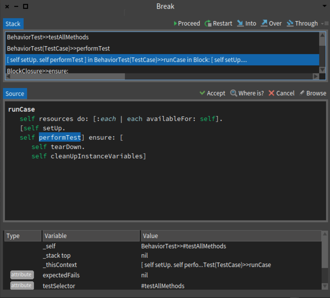
Which brings us to my question, where did tooltips go ? Squeak had them and then they were gone in pharo. Personally I dont see the point of having an icon to have text next to it. Seriously how much time it takes you to learn what each icon does ? and the debugger is not exactly a tool you will be using once per month, so the chance of forgeting gets pretty low after the first week. So my vote goes to get rid of text, it wastes valuable gui space in an environment where windows fight for space. And even on my 27'' monitor I rather have as compact as possible GUI. On Sat, Jan 9, 2016 at 3:05 PM stepharo <stepharo@free.fr> wrote:
Le 9/1/16 11:01, Esteban Lorenzano a écrit :
again re-send because of exceed limits with the image (thatâs new?)
with a small tweak, texts (AND icons :P):
And text. I asked that during two years in GT but I was told it was not possible. Like that I do not have to learn these icons What is the Where is?
would that be aceptable for you?
cheers! Esteban
On 09 Jan 2016, at 09:43, Esteban Lorenzano <estebanlm@gmail.com> wrote:
(re-send because I exceeded limit.)
Hi,
letâs think positive. the GTDebugger is a step forward⦠it allow a lot of better interactions and of course, it needs some iterations to make it appealing to everybody. For instance, I took me 2â to tweak the debugger presentation and to get this:
<Screen Shot 2016-01-09 at 09.29.59.png>
(I changed all available⦠is a trivial task)
and like IMO feels a lot better⦠and I think is a good compromise between the old and the new. Reasons to suggest this approach:
- it keeps old approach who(I think) was good (I can see the stack, and the flow feels natural from top to down) - it preserves âthe importantâ (the code) as central. - it gives space for adding columns (like the bytecode).
Now⦠I can understand you want icons with text, and that can be hacked tooâ¦
So⦠can we have an agreement?
Esteban
ps: btw⦠using GT with Fast Table we can also avoid those annoying paginated lists too
On 09 Jan 2016, at 08:53, stepharo <stepharo@free.fr> wrote:
Thanks for your testimony.
I'm not against GTDebugger per se. I believe that we should have better tools but we should take time for building better tools (even if this is two years that moosers use or not this new debugger). I would appreciate a process where users can give real feedback and we can simplify/shape our tools nicely.
Now for the mooc I will not present GTDebugger. So students will not use Pharo 50
Stef
Le 08/01/2016 21:22, stepharo a écrit :
I'm sorry but this debugger should not be the default one. MONDAY we are filming our mooc and we have to explain the debugger and personally I do not see the gain: - It looks a lot more complex to me and I do not want to have to redo all the screenshots of our lecture. - Just that I have to learn the meaning of small icons. - Why do we need a special pane for the evaluator - Why there is a type column. - Sorry but I'm not convinced about the moldable aspect behind the story (no need to argue I know it)
I would like to avoid to be forced to use not the latest version of Pharo for the mooc.
Such changes are arriving far too late in the release. We do not change the debugger itself the day of code freeze.
We decided that the GTDebugger can be included but to me it never meant that it should be the default one. I think that experts can choose the debugger they want. The newbies don't.
Stef
IMO the old debugger is way more intuitive. When I used the debugger of Eclipse for java I was lost. When I used Spec debugger I thought "Oh, this is not so hard in fact". And I lose the feeling with GTDebugger. And the debugger is one of the main source of interest for newbies.
Maybe we could have a button on the spec Debugger "Switch to GTDebugger"?