Yes I noticed the difference but for me its ok. I dont have a retina display though I am mostly a imac/ipad mid user but even if I did , it would be a low priority for me to fix. I rather have pharo developers focus on bootstraping the pharo image than this. On Thu, Dec 1, 2016 at 3:45 PM Tim Mackinnon <tim@testit.works> wrote:
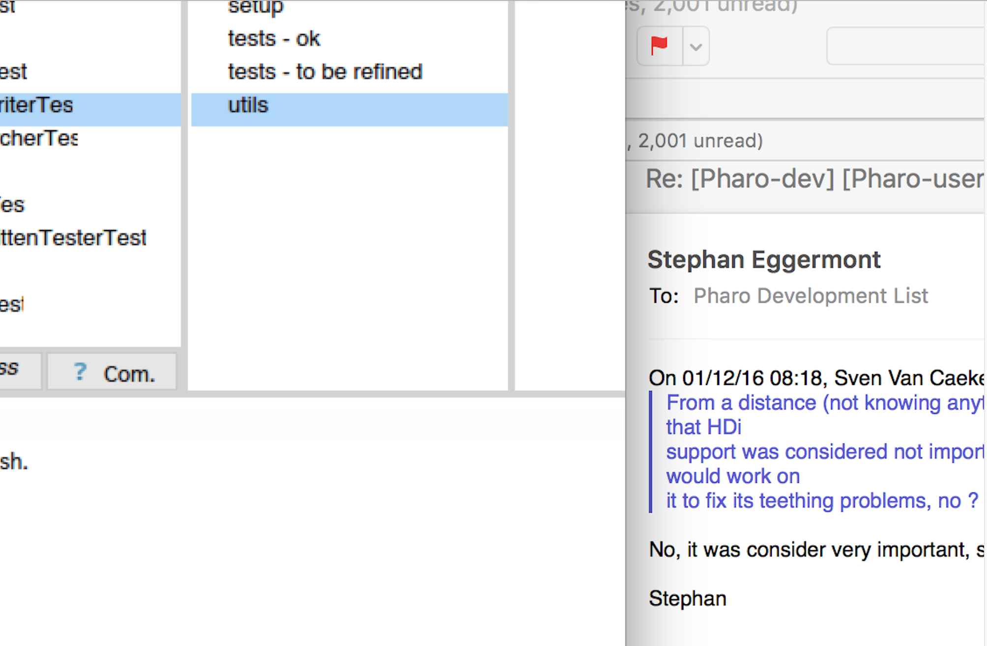
To give people a better view of this - here is the Pharo image next to the mail client (Iâm not sure if the screen captures really do it justice as when you scale them down in a picture everything looks fine - however if I zoom into that bottom corner in a second image it might make it more obvious).
I think this has been a problem brewing for a while, but if most contributors donât have retina screens (although they are getting much more common now) then I guess it goes unnoticed. I suspect in the next few years, as people start replacing machines - it will gain more visibility.
I find it quite distracting when switching from mail or other apps to Pharo and then you notice the fuzziness. Maybe if you spend a few hours in the code you might adjust.
Tim
The following is the bottom corner zoom in to show what I mean by fuzzy:
On 30 Nov 2016, at 23:53, Stephan Eggermont <stephan@stack.nl> wrote:
On 30/11/16 20:32, Sven Van Caekenberghe wrote:
Maybe, but the thing is, you are looking at it half size, in some sense, when it is on a Retina display. Anyway, to me, it is OK, but my eyes are no longer what they used to be. I can imagine young people being more sensitive to it.
Nah, it just is blurry. I've played a bit with krono's vm, and it is a very noticable difference. Much better readable and less tiring. And you mostly only notice when trying to go back from HiDPI to low.
Stephan