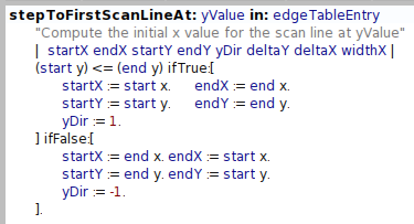
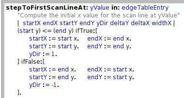
Hi, yes, the default font is not that readable. as a workarround try the following (and see before and after screenshots): ------- | fb | StandardFonts setFontsToStyleNamed: #small. fb :=StandardFonts defaultFont emphasized: 1. #($. $: $; $' $` $,) do: [:ch | StandardFonts defaultFont characterFormAt: ch put: (fb characterFormAt: ch) deepCopy. StandardFonts defaultFont widen: ch by: 1]. ------- this make the punctuation chars much more visible : it replace a regular one with the corresponding bold one and make it wider by 1 pixel. Cheers Alain Le 08/04/12 21:03, Stéphane Ducasse a écrit :
Hi guys
I do not like the default font because there is not enough space around : so this is difficult to see it for example in
:=
so what can be done? Can we modify this font?
Stef