[Pharo-project] font reading problems

Hi guys I do not like the default font because there is not enough space around : so this is difficult to see it for example in := so what can be done? Can we modify this font? Stef

I like monospace fonts mostly for programming... Courier new? DejaVu sans mono? On Sun, Apr 8, 2012 at 9:03 PM, Stéphane Ducasse <stephane.ducasse@inria.fr>wrote:
Hi guys
I do not like the default font because there is not enough space around : so this is difficult to see it for example in
:=
so what can be done? Can we modify this font?
Stef

Hi, On Apr 8, 2012, at 9:43 PM, Guillermo Polito wrote:
I like monospace fonts mostly for programming...
Courier new?
courier sucks :P
DejaVu sans mono?
+1
On Sun, Apr 8, 2012 at 9:03 PM, Stéphane Ducasse <stephane.ducasse@inria.fr> wrote: Hi guys
I do not like the default font because there is not enough space around : so this is difficult to see it for example in
:=
so what can be done? Can we modify this font?
Stef

Stéphane Ducasse wrote:
Hi guys
I do not like the default font because there is not enough space around : so this is difficult to see it for example in
:= ------------------------------------------------------------------------
so what can be done? Can we modify this font?
Stef As well, it is hard to see the period at the end of statement - particularly following a closing square bracket.

On 08 Apr 2012, at 21:03, Stéphane Ducasse wrote:
I do not like the default font because there is not enough space around : so this is difficult to see it for example in
:= <Screen Shot 2012-04-08 at 9.02.59 PM.pdf><Screen Shot 2012-04-08 at 9.03.22 PM.pdf>
so what can be done? Can we modify this font?
I always use a larger font, Bitmap DejaVu Sans Regular 12, currently called Medium I think. But now that you mention it, maybe it would be nice if colons were a bit more heavy. Smalltalk methods should be small, hence a bigger font still works. They also don't need monospace, let's keep it like that. Sven -- Sven Van Caekenberghe http://stfx.eu Smalltalk is the Red Pill
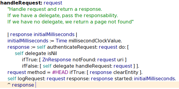
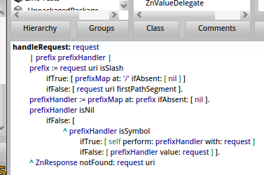
indeed much nicer. After this is a question of license to ship by default. For 1.4 we should probably put Bitmap DejaVu Sans Regular 12 or something like that. The default should be good. On Apr 9, 2012, at 10:59 AM, Alexis Parseghian wrote:
I have found Droid Sans to be quite pleasant to work with. <PharoScreenshot.3.png>

On Mon, Apr 9, 2012 at 11:05 AM, Stéphane Ducasse <stephane.ducasse@inria.fr> wrote: [Droid Sans]
indeed much nicer. After this is a question of license to ship by default.
Don't know how compatible it is with Pharo's MIT, but according to wikipedia the Droid font is under the Apache license. https://en.wikipedia.org/wiki/Droid_(font)

I agree with Sven that monospace isn't needed. I've only ever found monospace useful when I've had to work on code with a large number of nested blocks e.g. for if if if if while if ;). In which case it does help expose the codes structure, but I haven't seen that in Smalltalk. I generally go for Geneva http://en.wikipedia.org/wiki/Geneva_(typeface) But I'm not suggesting it be the default in Pharo :). +1 for Droid Sans (licence permitting) but I'd up the point size to be more in line with Svens message. Mark On 9 Apr 2012, at 08:56, Sven Van Caekenberghe wrote:
On 08 Apr 2012, at 21:03, Stéphane Ducasse wrote:
I do not like the default font because there is not enough space around : so this is difficult to see it for example in
:= <Screen Shot 2012-04-08 at 9.02.59 PM.pdf><Screen Shot 2012-04-08 at 9.03.22 PM.pdf>
so what can be done? Can we modify this font?
I always use a larger font, Bitmap DejaVu Sans Regular 12, currently called Medium I think.
<Screen Shot 2012-04-09 at 09.52.27.png>
But now that you mention it, maybe it would be nice if colons were a bit more heavy. Smalltalk methods should be small, hence a bigger font still works. They also don't need monospace, let's keep it like that.
Sven
-- Sven Van Caekenberghe http://stfx.eu Smalltalk is the Red Pill

Hello, I am a smalltalk neophyte and I have nothing super constructive to add other than I recently dipped my toe into smalltalk, and stumbled on Pharo. Cog + a streamlined fork of squeak? Count me in! I started to work through PBE, but I just could not get over the font issue. On my massive screen, I needed a magnifying glass to read the size 9 font, and the colon issue made it impossible for me to tell if I had placed a colon or not. I discovered how to bump the font up to 12, but it still was not very readable. Sven's example above looks awesome. It might be nice to also include options for increasing the font size beyond 12 for those of us with absurdly big monitors. -Joshua Litt On Mon, Apr 9, 2012 at 12:16 PM, Stéphane Ducasse <stephane.ducasse@inria.fr
wrote:
sound interesting.
On Apr 9, 2012, at 2:53 PM, Mark Smith wrote:
+1 for Droid Sans (licence permitting) but I'd up the point size to be more in line with Svens message.
On Apr 9, 2012, at 9:41 PM, Joshua Litt wrote:
Hello, I am a smalltalk neophyte and I have nothing super constructive to add other than I recently dipped my toe into smalltalk, and stumbled on Pharo.
welcome :)
Cog + a streamlined fork of squeak? Count me in!
I started to work through PBE, but I just could not get over the font issue. On my massive screen, I needed a magnifying glass to read the size 9 font, and the colon issue made it impossible for me to tell if I had placed a colon or not.
Joshua take either 1.3 or 1.4 and use the setting browser, type fonts and click a bit on the settings you should get what you want :)
I discovered how to bump the font up to 12, but it still was not very readable. Sven's example above looks awesome. It might be nice to also include options for increasing the font size beyond 12 for those of us with absurdly big monitors.
-Joshua Litt On Mon, Apr 9, 2012 at 12:16 PM, Stéphane Ducasse <stephane.ducasse@inria.fr> wrote: sound interesting.
On Apr 9, 2012, at 2:53 PM, Mark Smith wrote:
+1 for Droid Sans (licence permitting) but I'd up the point size to be more in line with Svens message.
Thank you for the welcome. I figured I was missing something. So, I see I can load my system fonts, and those can be any size. Very neat. Thanks for the help! On Mon, Apr 9, 2012 at 1:31 PM, Stéphane Ducasse <stephane.ducasse@inria.fr>wrote:
On Apr 9, 2012, at 9:41 PM, Joshua Litt wrote:
Hello, I am a smalltalk neophyte and I have nothing super constructive to add other than I recently dipped my toe into smalltalk, and stumbled on Pharo.
welcome :)
Cog + a streamlined fork of squeak? Count me in!
I started to work through PBE, but I just could not get over the font issue. On my massive screen, I needed a magnifying glass to read the size 9 font, and the colon issue made it impossible for me to tell if I had placed a colon or not.
Joshua take either 1.3 or 1.4 and use the setting browser, type fonts and click a bit on the settings you should get what you want :)
I discovered how to bump the font up to 12, but it still was not very
readable. Sven's example above looks awesome. It might be nice to also include options for increasing the font size beyond 12 for those of us with absurdly big monitors.
-Joshua Litt On Mon, Apr 9, 2012 at 12:16 PM, Stéphane Ducasse <
stephane.ducasse@inria.fr> wrote:
sound interesting.
On Apr 9, 2012, at 2:53 PM, Mark Smith wrote:
+1 for Droid Sans (licence permitting) but I'd up the point size to be more in line with Svens message.

Hi, yes, the default font is not that readable. as a workarround try the following (and see before and after screenshots): ------- | fb | StandardFonts setFontsToStyleNamed: #small. fb :=StandardFonts defaultFont emphasized: 1. #($. $: $; $' $` $,) do: [:ch | StandardFonts defaultFont characterFormAt: ch put: (fb characterFormAt: ch) deepCopy. StandardFonts defaultFont widen: ch by: 1]. ------- this make the punctuation chars much more visible : it replace a regular one with the corresponding bold one and make it wider by 1 pixel. Cheers Alain Le 08/04/12 21:03, Stéphane Ducasse a écrit :
Hi guys
I do not like the default font because there is not enough space around : so this is difficult to see it for example in
:=
so what can be done? Can we modify this font?
Stef
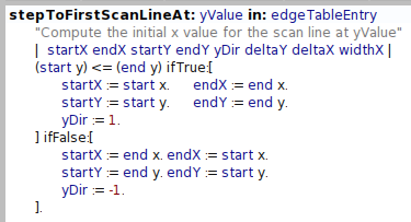
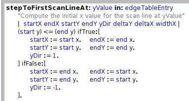
Really cool hack, Alain. Amazing that you can do such deep things with so little code. Sven On 10 Apr 2012, at 01:03, Alain Plantec wrote:
Hi,
yes, the default font is not that readable. as a workarround try the following (and see before and after screenshots): ------- | fb | StandardFonts setFontsToStyleNamed: #small. fb :=StandardFonts defaultFont emphasized: 1. #($. $: $; $' $` $,) do: [:ch | StandardFonts defaultFont characterFormAt: ch put: (fb characterFormAt: ch) deepCopy. StandardFonts defaultFont widen: ch by: 1]. -------
this make the punctuation chars much more visible : it replace a regular one with the corresponding bold one and make it wider by 1 pixel.
Cheers Alain
Le 08/04/12 21:03, Stéphane Ducasse a écrit :
Hi guys
I do not like the default font because there is not enough space around : so this is difficult to see it for example in
:=
so what can be done? Can we modify this font?
Stef
<before.png><after.png>

- just keep a ANIS ranged fixed-width font in the image for the emergency evaluator. - use freetype for all other fonts - use startup scripts to set default font => avoid 100+ thread on discussing which font might be the best... everyone choses his/her favorite On 2012-04-10, at 10:36, Sven Van Caekenberghe wrote:
Really cool hack, Alain. Amazing that you can do such deep things with so little code.
Sven
On 10 Apr 2012, at 01:03, Alain Plantec wrote:
Hi,
yes, the default font is not that readable. as a workarround try the following (and see before and after screenshots): ------- | fb | StandardFonts setFontsToStyleNamed: #small. fb :=StandardFonts defaultFont emphasized: 1. #($. $: $; $' $` $,) do: [:ch | StandardFonts defaultFont characterFormAt: ch put: (fb characterFormAt: ch) deepCopy. StandardFonts defaultFont widen: ch by: 1]. -------
this make the punctuation chars much more visible : it replace a regular one with the corresponding bold one and make it wider by 1 pixel.
Cheers Alain
Le 08/04/12 21:03, Stéphane Ducasse a écrit :
Hi guys
I do not like the default font because there is not enough space around : so this is difficult to see it for example in
:=
so what can be done? Can we modify this font?
Stef
<before.png><after.png>
On Apr 10, 2012, at 3:12 PM, Camillo Bruni wrote:
- just keep a ANIS ranged fixed-width font in the image for the emergency evaluator. - use freetype for all other fonts - use startup scripts to set default font
=> avoid 100+ thread on discussing which font might be the best... everyone choses his/her favorite
camillo with the fix of alain we get a readable font right out of the box and even of the emergency evaluator. Having a good default is key. Stef
On 2012-04-10, at 10:36, Sven Van Caekenberghe wrote:
Really cool hack, Alain. Amazing that you can do such deep things with so little code.
Sven
On 10 Apr 2012, at 01:03, Alain Plantec wrote:
Hi,
yes, the default font is not that readable. as a workarround try the following (and see before and after screenshots): ------- | fb | StandardFonts setFontsToStyleNamed: #small. fb :=StandardFonts defaultFont emphasized: 1. #($. $: $; $' $` $,) do: [:ch | StandardFonts defaultFont characterFormAt: ch put: (fb characterFormAt: ch) deepCopy. StandardFonts defaultFont widen: ch by: 1]. -------
this make the punctuation chars much more visible : it replace a regular one with the corresponding bold one and make it wider by 1 pixel.
Cheers Alain
Le 08/04/12 21:03, Stéphane Ducasse a écrit :
Hi guys
I do not like the default font because there is not enough space around : so this is difficult to see it for example in
:=
so what can be done? Can we modify this font?
Stef
<before.png><after.png>
Thanks alain yes this is the minimum that we should do may be we should have such methods as class side of StandardFonts. Stef On Apr 10, 2012, at 1:03 AM, Alain Plantec wrote:
Hi,
yes, the default font is not that readable. as a workarround try the following (and see before and after screenshots): ------- | fb | StandardFonts setFontsToStyleNamed: #small. fb :=StandardFonts defaultFont emphasized: 1. #($. $: $; $' $` $,) do: [:ch | StandardFonts defaultFont characterFormAt: ch put: (fb characterFormAt: ch) deepCopy. StandardFonts defaultFont widen: ch by: 1]. -------
this make the punctuation chars much more visible : it replace a regular one with the corresponding bold one and make it wider by 1 pixel.
Cheers Alain
Le 08/04/12 21:03, Stéphane Ducasse a écrit :
Hi guys
I do not like the default font because there is not enough space around : so this is difficult to see it for example in
:=
so what can be done? Can we modify this font?
Stef
<before.png><after.png>
esteban we should add this to 1.4 (as a method so that we can invoke it). Stef On Apr 10, 2012, at 1:03 AM, Alain Plantec wrote:
Hi,
yes, the default font is not that readable. as a workarround try the following (and see before and after screenshots): ------- | fb | StandardFonts setFontsToStyleNamed: #small. fb :=StandardFonts defaultFont emphasized: 1. #($. $: $; $' $` $,) do: [:ch | StandardFonts defaultFont characterFormAt: ch put: (fb characterFormAt: ch) deepCopy. StandardFonts defaultFont widen: ch by: 1]. -------
this make the punctuation chars much more visible : it replace a regular one with the corresponding bold one and make it wider by 1 pixel.
Cheers Alain
Le 08/04/12 21:03, Stéphane Ducasse a écrit :
Hi guys
I do not like the default font because there is not enough space around : so this is difficult to see it for example in
:=
so what can be done? Can we modify this font?
Stef
<before.png><after.png>
Le 10/04/12 21:34, Stéphane Ducasse a écrit :
esteban we should add this to 1.4 (as a method so that we can invoke it). so, you should remove the widen:by sent because it has to be sent only one time. I open an issue. Cheers Alain
Stef
On Apr 10, 2012, at 1:03 AM, Alain Plantec wrote:
Hi,
yes, the default font is not that readable. as a workarround try the following (and see before and after screenshots): ------- | fb | StandardFonts setFontsToStyleNamed: #small. fb :=StandardFonts defaultFont emphasized: 1. #($. $: $; $' $` $,) do: [:ch | StandardFonts defaultFont characterFormAt: ch put: (fb characterFormAt: ch) deepCopy. StandardFonts defaultFont widen: ch by: 1]. -------
this make the punctuation chars much more visible : it replace a regular one with the corresponding bold one and make it wider by 1 pixel.
Cheers Alain
Le 08/04/12 21:03, Stéphane Ducasse a écrit :
Hi guys
I do not like the default font because there is not enough space around : so this is difficult to see it for example in
:=
so what can be done? Can we modify this font?
Stef <before.png><after.png>
http://code.google.com/p/pharo/issues/detail?id=5591 just send StandardFonts class >>fixSmallDejaVuPunctuationMarks as a postcript Cheers Alain Le 10/04/12 22:07, Stéphane Ducasse a écrit :
thanks alain like that we integrate it in 1.4 and release it (we should check at the defaultAction od deprecation). On Apr 10, 2012, at 9:56 PM, Alain Plantec wrote:
y sent because it has to be sent only one time. I open an issue.
cool :) On Apr 10, 2012, at 10:46 PM, Alain Plantec wrote:
http://code.google.com/p/pharo/issues/detail?id=5591
just send StandardFonts class >>fixSmallDejaVuPunctuationMarks as a postcript
Cheers Alain
Le 10/04/12 22:07, Stéphane Ducasse a écrit :
thanks alain like that we integrate it in 1.4 and release it (we should check at the defaultAction od deprecation). On Apr 10, 2012, at 9:56 PM, Alain Plantec wrote:
y sent because it has to be sent only one time. I open an issue.
participants (10)
-
 Alain Plantec
 -
 Alexis Parseghian
 -
 Ben Coman
 -
 Camillo Bruni
 -
 Esteban Lorenzano
 -
 Guillermo Polito
 -
 Joshua Litt
 -
 Mark Smith
 -
 Stéphane Ducasse
 -
 Sven Van Caekenberghe