Idézet (Adrian Lienhard <adi@netstyle.ch>):
On Dec 6, 2009, at 19:43 , Levente Uzonyi wrote:
On Sun, 6 Dec 2009, Adrian Lienhard wrote:
Thanks, Marcus!
One step closer to 1.0.
Damien, I suggest not to select FreeType font in the Pharo image anymore but keep the Bitmap DejaVu font that comes with the core image now. The bitmap font is not that perfect, but apparently the speed
Not that perfect? What's the problem with it?
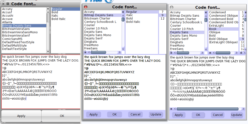
E.g., colon and dot are so small that I sometimes think they are missing (do you see the dot on the first line in the attached png?). Character spacing is sometimes strange. Its not bad at all, but not perfect either.
I guess it depends on your monitor's pixel size, I see the dot clearly.
FreeType's anti-aliasing is crappy compared to BitmapDejaVu.
What is crappy?
Crappy = low quality. See the attached image. Levente
Adrian