On Jun 13, 2008, at 5:13 PM, Damien Pollet wrote:
On Fri, Jun 13, 2008 at 11:50 AM, Stéphane Ducasse <stephane.ducasse@inria.fr> wrote:
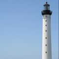
here are some proposals I like the blue one. But there have something. Please comment
What's really important in a logo / icon is the silhouette and the basic shapes. Here it's just a circle with some kind of striped band in the middle (try shrinking the images to 1-2 cm to see what I mean).
Also why not incorporate the Smalltalk balloon ? Pharo = lighthouse = light, plus balloon made me think of those:
http://flickr.com/photos/giuseppevironda/1251748131/ http://flickr.com/photos/giuseppevironda/1252610692/ http://flickr.com/photos/dans180/408851463/
or what about something like the crappy attached sketch?
-- Damien Pollet type less, do more [ | ] http://people.untyped.org/damien.polle <Picture 1.png>_______________________________________________ Pharo-project mailing list Pharo-project@lists.gforge.inria.fr http://lists.gforge.inria.fr/cgi-bin/mailman/listinfo/pharo-project