[Pharo-project] Pharo logos
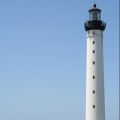
Hi guys here are some proposals I like the blue one. But there have something. Please comment Stef

On Fri, 2008-06-13 at 11:50 +0200, Stéphane Ducasse wrote:
Hi guys
here are some proposals I like the blue one. But there have something. Please comment
The circle of the light should be clipped by the darker area below. Otherwise the perpective flips and it appears odd. Norbert

Cool graphics! But ... the first one looks too much like we are struggling in the fog, and the last one looks like we are about to come under the shadow of an eclipse (!). Is it possible to have the fog at the bottom, so the lighthouse is emerging from the fog? - on On Jun 13, 2008, at 11:50, Stéphane Ducasse wrote:
Hi guys
here are some proposals I like the blue one. But there have something. Please comment
Stef
<Picture 2.pdf><Picture 3.pdf><Picture 1.pdf>_______________________________________________ Pharo-project mailing list Pharo-project@lists.gforge.inria.fr http://lists.gforge.inria.fr/cgi-bin/mailman/listinfo/pharo-project
:) I thought about that too. I passed the remark to samuel. On Jun 13, 2008, at 12:29 PM, Oscar Nierstrasz wrote:
Cool graphics!
But ... the first one looks too much like we are struggling in the fog, and the last one looks like we are about to come under the shadow of an eclipse (!).
Is it possible to have the fog at the bottom, so the lighthouse is emerging from the fog?
- on
On Jun 13, 2008, at 11:50, Stéphane Ducasse wrote:
Hi guys
here are some proposals I like the blue one. But there have something. Please comment
Stef
<Picture 2.pdf><Picture 3.pdf><Picture 1.pdf>_______________________________________________ Pharo-project mailing list Pharo-project@lists.gforge.inria.fr http://lists.gforge.inria.fr/cgi-bin/mailman/listinfo/pharo-project
_______________________________________________ Pharo-project mailing list Pharo-project@lists.gforge.inria.fr http://lists.gforge.inria.fr/cgi-bin/mailman/listinfo/pharo-project

i like the blue one as well.. Alexandre On 13 Jun 2008, at 12:29, Oscar Nierstrasz wrote:
Cool graphics!
But ... the first one looks too much like we are struggling in the fog, and the last one looks like we are about to come under the shadow of an eclipse (!).
Is it possible to have the fog at the bottom, so the lighthouse is emerging from the fog?
- on
On Jun 13, 2008, at 11:50, Stéphane Ducasse wrote:
Hi guys
here are some proposals I like the blue one. But there have something. Please comment
Stef
<Picture 2.pdf><Picture 3.pdf><Picture 1.pdf>_______________________________________________ Pharo-project mailing list Pharo-project@lists.gforge.inria.fr http://lists.gforge.inria.fr/cgi-bin/mailman/listinfo/pharo-project
_______________________________________________ Pharo-project mailing list Pharo-project@lists.gforge.inria.fr http://lists.gforge.inria.fr/cgi-bin/mailman/listinfo/pharo-project
-- _,.;:~^~:;._,.;:~^~:;._,.;:~^~:;._,.;:~^~:;._,.;: Alexandre Bergel http://www.bergel.eu ^~:;._,.;:~^~:;._,.;:~^~:;._,.;:~^~:;._,.;:~^~:;.

On Fri, Jun 13, 2008 at 1:15 PM, Alexandre Bergel <alexandre@bergel.eu> wrote:
i like the blue one as well..
Yes i also like this one. -- Serge Stinckwich Smalltalkers do: [:it | All with: Class, (And love: it)] http://blog.doesnotunderstand.org/
On Fri, 2008-06-13 at 11:50 +0200, Stéphane Ducasse wrote:
Hi guys
here are some proposals I like the blue one. But there have something. Please comment
I like the blue one, too. I don't know if it is important but lighthouses don't have just a light bubble in their center. There is a rotating lamp (or many). Without that it is not a lighthouse (the lamps and velocity are a code). Most images, icons and pictograms honor the moving part somehow. Maybe there are ideas to visualize that. Norbert

I do too. I'm wondering whether it would be better to fill the circle (lighthouse background) in white. Noury On 13 juin 08, at 13:15, Alexandre Bergel wrote:
i like the blue one as well..
Alexandre
On 13 Jun 2008, at 12:29, Oscar Nierstrasz wrote:
Cool graphics!
But ... the first one looks too much like we are struggling in the fog, and the last one looks like we are about to come under the shadow of an eclipse (!).
Is it possible to have the fog at the bottom, so the lighthouse is emerging from the fog?
- on
On Jun 13, 2008, at 11:50, Stéphane Ducasse wrote:
Hi guys
here are some proposals I like the blue one. But there have something. Please comment
Stef
<Picture 2.pdf><Picture 3.pdf><Picture 1.pdf>_______________________________________________ Pharo-project mailing list Pharo-project@lists.gforge.inria.fr http://lists.gforge.inria.fr/cgi-bin/mailman/listinfo/pharo-project
_______________________________________________ Pharo-project mailing list Pharo-project@lists.gforge.inria.fr http://lists.gforge.inria.fr/cgi-bin/mailman/listinfo/pharo-project
-- _,.;:~^~:;._,.;:~^~:;._,.;:~^~:;._,.;:~^~:;._,.;: Alexandre Bergel http://www.bergel.eu ^~:;._,.;:~^~:;._,.;:~^~:;._,.;:~^~:;._,.;:~^~:;.
_______________________________________________ Pharo-project mailing list Pharo-project@lists.gforge.inria.fr http://lists.gforge.inria.fr/cgi-bin/mailman/listinfo/pharo-project
Noury Bouraqadi ------------------------------------------------------------------ Dr. Noury Bouraqadi - Enseignant/Chercheur Responsable de l'enseignement de l'informatique ARMINES - Ecole des Mines de Douai - Dept. I.A. http://vst.ensm-douai.fr/noury European Smalltalk Users Group Board http://www.esug.org ------------------------------------------------------------------

On Fri, Jun 13, 2008 at 11:50 AM, Stéphane Ducasse <stephane.ducasse@inria.fr> wrote:
here are some proposals I like the blue one. But there have something. Please comment
What's really important in a logo / icon is the silhouette and the basic shapes. Here it's just a circle with some kind of striped band in the middle (try shrinking the images to 1-2 cm to see what I mean). Also why not incorporate the Smalltalk balloon ? Pharo = lighthouse = light, plus balloon made me think of those: http://flickr.com/photos/giuseppevironda/1251748131/ http://flickr.com/photos/giuseppevironda/1252610692/ http://flickr.com/photos/dans180/408851463/ or what about something like the crappy attached sketch? -- Damien Pollet type less, do more [ | ] http://people.untyped.org/damien.polle

On Jun 13, 2008, at 5:13 PM, Damien Pollet wrote:
On Fri, Jun 13, 2008 at 11:50 AM, Stéphane Ducasse <stephane.ducasse@inria.fr> wrote:
here are some proposals I like the blue one. But there have something. Please comment
What's really important in a logo / icon is the silhouette and the basic shapes. Here it's just a circle with some kind of striped band in the middle (try shrinking the images to 1-2 cm to see what I mean).
Also why not incorporate the Smalltalk balloon ? Pharo = lighthouse = light, plus balloon made me think of those:
http://flickr.com/photos/giuseppevironda/1251748131/ http://flickr.com/photos/giuseppevironda/1252610692/ http://flickr.com/photos/dans180/408851463/
or what about something like the crappy attached sketch?
-- Damien Pollet type less, do more [ | ] http://people.untyped.org/damien.polle <Picture 1.png>_______________________________________________ Pharo-project mailing list Pharo-project@lists.gforge.inria.fr http://lists.gforge.inria.fr/cgi-bin/mailman/listinfo/pharo-project
Pharo is not a paper lantern. It is a lighthouse showing the way to brave programmers during the tempest. Let us get rid of the balloon. Kill it. Stef On Jun 13, 2008, at 5:13 PM, Damien Pollet wrote:
On Fri, Jun 13, 2008 at 11:50 AM, Stéphane Ducasse <stephane.ducasse@inria.fr> wrote:
here are some proposals I like the blue one. But there have something. Please comment
What's really important in a logo / icon is the silhouette and the basic shapes. Here it's just a circle with some kind of striped band in the middle (try shrinking the images to 1-2 cm to see what I mean).
Also why not incorporate the Smalltalk balloon ? Pharo = lighthouse = light, plus balloon made me think of those:
http://flickr.com/photos/giuseppevironda/1251748131/ http://flickr.com/photos/giuseppevironda/1252610692/ http://flickr.com/photos/dans180/408851463/
or what about something like the crappy attached sketch?
-- Damien Pollet type less, do more [ | ] http://people.untyped.org/damien.polle <Picture 1.png>_______________________________________________ Pharo-project mailing list Pharo-project@lists.gforge.inria.fr http://lists.gforge.inria.fr/cgi-bin/mailman/listinfo/pharo-project

On Jun 13, 2008, at 17:51 , Stéphane Ducasse wrote:
Pharo is not a paper lantern. It is a lighthouse showing the way to brave programmers during the tempest.
Let us get rid of the balloon. Kill it.
+1 Adrian
Stef
On Jun 13, 2008, at 5:13 PM, Damien Pollet wrote:
On Fri, Jun 13, 2008 at 11:50 AM, Stéphane Ducasse <stephane.ducasse@inria.fr> wrote:
here are some proposals I like the blue one. But there have something. Please comment
What's really important in a logo / icon is the silhouette and the basic shapes. Here it's just a circle with some kind of striped band in the middle (try shrinking the images to 1-2 cm to see what I mean).
Also why not incorporate the Smalltalk balloon ? Pharo = lighthouse = light, plus balloon made me think of those:
http://flickr.com/photos/giuseppevironda/1251748131/ http://flickr.com/photos/giuseppevironda/1252610692/ http://flickr.com/photos/dans180/408851463/
or what about something like the crappy attached sketch?
-- Damien Pollet type less, do more [ | ] http://people.untyped.org/damien.polle <Picture 1.png>_______________________________________________ Pharo-project mailing list Pharo-project@lists.gforge.inria.fr http://lists.gforge.inria.fr/cgi-bin/mailman/listinfo/pharo-project
_______________________________________________ Pharo-project mailing list Pharo-project@lists.gforge.inria.fr http://lists.gforge.inria.fr/cgi-bin/mailman/listinfo/pharo-project

Remembers the balloon from VisualSmalltalk :-) Like the blue one best, perhaps some lens flare though... Gary.
-----Original Message----- From: pharo-project-bounces@lists.gforge.inria.fr [mailto:pharo-project-bounces@lists.gforge.inria.fr]On Behalf Of Adrian Lienhard Sent: 13 June 2008 5:53 PM To: An open mailing list to discuss any topics related to an open-sourceSmalltalk Subject: Re: [Pharo-project] Pharo logos
On Jun 13, 2008, at 17:51 , Stéphane Ducasse wrote:
Pharo is not a paper lantern. It is a lighthouse showing the way to brave programmers during the tempest.
Let us get rid of the balloon. Kill it.
+1
Adrian
Stef
On Jun 13, 2008, at 5:13 PM, Damien Pollet wrote:
On Fri, Jun 13, 2008 at 11:50 AM, Stéphane Ducasse <stephane.ducasse@inria.fr> wrote:
here are some proposals I like the blue one. But there have something. Please comment
What's really important in a logo / icon is the silhouette and the basic shapes. Here it's just a circle with some kind of striped band in the middle (try shrinking the images to 1-2 cm to see what I mean).
Also why not incorporate the Smalltalk balloon ? Pharo = lighthouse = light, plus balloon made me think of those:
http://flickr.com/photos/giuseppevironda/1251748131/ http://flickr.com/photos/giuseppevironda/1252610692/ http://flickr.com/photos/dans180/408851463/
or what about something like the crappy attached sketch?
-- Damien Pollet type less, do more [ | ] http://people.untyped.org/damien.polle <Picture 1.png>_______________________________________________ Pharo-project mailing list Pharo-project@lists.gforge.inria.fr http://lists.gforge.inria.fr/cgi-bin/mailman/listinfo/pharo-project
_______________________________________________ Pharo-project mailing list Pharo-project@lists.gforge.inria.fr http://lists.gforge.inria.fr/cgi-bin/mailman/listinfo/pharo-project
_______________________________________________ Pharo-project mailing list Pharo-project@lists.gforge.inria.fr http://lists.gforge.inria.fr/cgi-bin/mailman/listinfo/pharo-project
participants (9)
-
 Adrian Lienhard
 -
 Alexandre Bergel
 -
 Damien Pollet
 -
 Gary Chambers
 -
 Norbert Hartl
 -
 Noury Bouraqadi
 -
 Oscar Nierstrasz
 -
 Serge Stinckwich
 -
 Stéphane Ducasse