
Hi, today I moved to Pharo5. It is great to get feedback and solutions for problems so quickly. It is a pleasure to work with Pharo and to have the community. I am grateful for having this. I have one comment. I don't want to complain, I can use it but I was wondering about the new position and size of the debugger buttons. There is a longer distance now from code text pane to the buttons - I see this as disadvantage to earlier versions of Pharo from the user experience. The buttons are a lot of smaller - same disadvantage - both if you use the mouse. Ok, after seeing that, I thought "Sabine, you should use keyboard shortcuts here, too" (I use much of them but interesting - til now not in the debugger). Then I saw the shortcuts for Proceed cmd+r Restart cmd-shift-a Into cmd-e over cmd-shift-o through cmd-shift-t especially into, over and through have so different key combinations, two with shift, one without shift. When I debug, I often use for example into-into-over-over-over-throuhg-through--into-into etc...and with the combinations cmd-e and cmd-shit-e, it is more "finger-work". It would be better to have all those shortcuts with or all shortcuts without shift. And the letters not so far away at the keyboard (e-o-t) This is only my opinion and my first impression after one day with Pharo5. I am sure, after a few days, I forgot that this was uncomfortable because I have the shortcuts coming automatically into my fingers. Regards Sabine -- View this message in context: http://forum.world.st/One-comment-to-new-Pharo5-debugger-tp4897390.html Sent from the Pharo Smalltalk Users mailing list archive at Nabble.com.

Hi, yes, this question was raised before, but there are some disagreements over how it should be, so it may take some time http://forum.world.st/GTDebugger-shortcuts-usability-td4890316.html You can also use a startup script to reassign them, such as this one. https://github.com/peteruhnak/pharo-scripts/blob/master/config/5.0/uniformDe... But a startup script is a temporary solution. On Wed, May 25, 2016 at 9:43 PM, Sabine Manaa <manaa.sabine@gmail.com> wrote:
Hi,
today I moved to Pharo5. It is great to get feedback and solutions for problems so quickly. It is a pleasure to work with Pharo and to have the community. I am grateful for having this.
I have one comment. I don't want to complain, I can use it but I was wondering about the new position and size of the debugger buttons.
There is a longer distance now from code text pane to the buttons - I see this as disadvantage to earlier versions of Pharo from the user experience. The buttons are a lot of smaller - same disadvantage - both if you use the mouse.
Ok, after seeing that, I thought "Sabine, you should use keyboard shortcuts here, too" (I use much of them but interesting - til now not in the debugger).
Then I saw the shortcuts for Proceed cmd+r Restart cmd-shift-a Into cmd-e over cmd-shift-o through cmd-shift-t
especially into, over and through have so different key combinations, two with shift, one without shift. When I debug, I often use for example into-into-over-over-over-throuhg-through--into-into etc...and with the combinations cmd-e and cmd-shit-e, it is more "finger-work". It would be better to have all those shortcuts with or all shortcuts without shift. And the letters not so far away at the keyboard (e-o-t)
This is only my opinion and my first impression after one day with Pharo5. I am sure, after a few days, I forgot that this was uncomfortable because I have the shortcuts coming automatically into my fingers.
Regards Sabine
-- View this message in context: http://forum.world.st/One-comment-to-new-Pharo5-debugger-tp4897390.html Sent from the Pharo Smalltalk Users mailing list archive at Nabble.com.
Hi Peter, Thanks. I geht all the nabble mails and try to read at least the subject but I missed this one. I create my own shortcuts as first solution. Regards Sabine Am Mittwoch, 25. Mai 2016 schrieb Peter Uhnák [via Smalltalk] :
Hi,
yes, this question was raised before, but there are some disagreements over how it should be, so it may take some time http://forum.world.st/GTDebugger-shortcuts-usability-td4890316.html
You can also use a startup script to reassign them, such as this one. https://github.com/peteruhnak/pharo-scripts/blob/master/config/5.0/uniformDe... But a startup script is a temporary solution.
On Wed, May 25, 2016 at 9:43 PM, Sabine Manaa <[hidden email] <http:///user/SendEmail.jtp?type=node&node=4897397&i=0>> wrote:
Hi,
today I moved to Pharo5. It is great to get feedback and solutions for problems so quickly. It is a pleasure to work with Pharo and to have the community. I am grateful for having this.
I have one comment. I don't want to complain, I can use it but I was wondering about the new position and size of the debugger buttons.
There is a longer distance now from code text pane to the buttons - I see this as disadvantage to earlier versions of Pharo from the user experience. The buttons are a lot of smaller - same disadvantage - both if you use the mouse.
Ok, after seeing that, I thought "Sabine, you should use keyboard shortcuts here, too" (I use much of them but interesting - til now not in the debugger).
Then I saw the shortcuts for Proceed cmd+r Restart cmd-shift-a Into cmd-e over cmd-shift-o through cmd-shift-t
especially into, over and through have so different key combinations, two with shift, one without shift. When I debug, I often use for example into-into-over-over-over-throuhg-through--into-into etc...and with the combinations cmd-e and cmd-shit-e, it is more "finger-work". It would be better to have all those shortcuts with or all shortcuts without shift. And the letters not so far away at the keyboard (e-o-t)
This is only my opinion and my first impression after one day with Pharo5. I am sure, after a few days, I forgot that this was uncomfortable because I have the shortcuts coming automatically into my fingers.
Regards Sabine
-- View this message in context: http://forum.world.st/One-comment-to-new-Pharo5-debugger-tp4897390.html Sent from the Pharo Smalltalk Users mailing list archive at Nabble.com.
------------------------------ If you reply to this email, your message will be added to the discussion below:
http://forum.world.st/One-comment-to-new-Pharo5-debugger-tp4897390p4897397.h... To start a new topic under Pharo Smalltalk Users, email ml-node+s1294792n1310670h65@n4.nabble.com <javascript:_e(%7B%7D,'cvml','ml-node%2Bs1294792n1310670h65@n4.nabble.com');> To unsubscribe from Pharo Smalltalk Users, click here <http://forum.world.st/template/NamlServlet.jtp?macro=unsubscribe_by_code&nod...> . NAML <http://forum.world.st/template/NamlServlet.jtp?macro=macro_viewer&id=instant...>
-- View this message in context: http://forum.world.st/One-comment-to-new-Pharo5-debugger-tp4897390p4897442.h... Sent from the Pharo Smalltalk Users mailing list archive at Nabble.com.

Hi Sabine, this point was also « discussed » (no answer) here: http://forum.world.st/gtdebugger-debug-actions-buttons-td4874316.html <http://forum.world.st/gtdebugger-debug-actions-buttons-td4874316.html> Yes, the new buttons are counter-productive and there is even no setting to have them usable ⦠You can still with to the SpecDebugger through settings
Le 25 mai 2016 à 22:49, Peter Uhnák <i.uhnak@gmail.com> a écrit :
Hi,
yes, this question was raised before, but there are some disagreements over how it should be, so it may take some time http://forum.world.st/GTDebugger-shortcuts-usability-td4890316.html <http://forum.world.st/GTDebugger-shortcuts-usability-td4890316.html>
You can also use a startup script to reassign them, such as this one. https://github.com/peteruhnak/pharo-scripts/blob/master/config/5.0/uniformDe... <https://github.com/peteruhnak/pharo-scripts/blob/master/config/5.0/uniformDe...> But a startup script is a temporary solution.
On Wed, May 25, 2016 at 9:43 PM, Sabine Manaa <manaa.sabine@gmail.com <mailto:manaa.sabine@gmail.com>> wrote: Hi,
today I moved to Pharo5. It is great to get feedback and solutions for problems so quickly. It is a pleasure to work with Pharo and to have the community. I am grateful for having this.
I have one comment. I don't want to complain, I can use it but I was wondering about the new position and size of the debugger buttons.
There is a longer distance now from code text pane to the buttons - I see this as disadvantage to earlier versions of Pharo from the user experience. The buttons are a lot of smaller - same disadvantage - both if you use the mouse.
Ok, after seeing that, I thought "Sabine, you should use keyboard shortcuts here, too" (I use much of them but interesting - til now not in the debugger).
Then I saw the shortcuts for Proceed cmd+r Restart cmd-shift-a Into cmd-e over cmd-shift-o through cmd-shift-t
especially into, over and through have so different key combinations, two with shift, one without shift. When I debug, I often use for example into-into-over-over-over-throuhg-through--into-into etc...and with the combinations cmd-e and cmd-shit-e, it is more "finger-work". It would be better to have all those shortcuts with or all shortcuts without shift. And the letters not so far away at the keyboard (e-o-t)
This is only my opinion and my first impression after one day with Pharo5. I am sure, after a few days, I forgot that this was uncomfortable because I have the shortcuts coming automatically into my fingers.
Regards Sabine
-- View this message in context: http://forum.world.st/One-comment-to-new-Pharo5-debugger-tp4897390.html <http://forum.world.st/One-comment-to-new-Pharo5-debugger-tp4897390.html> Sent from the Pharo Smalltalk Users mailing list archive at Nabble.com.

Hi. Maybe me should give chance to standard Moose debugger view? (where stack pane on the left) 2016-05-26 9:37 GMT+02:00 Christophe Demarey <christophe.demarey@inria.fr>:
Hi Sabine,
this point was also « discussed » (no answer) here: http://forum.world.st/gtdebugger-debug-actions-buttons-td4874316.html Yes, the new buttons are counter-productive and there is even no setting to have them usable ⦠You can still with to the SpecDebugger through settings
Le 25 mai 2016 à 22:49, Peter Uhnák <i.uhnak@gmail.com> a écrit :
Hi,
yes, this question was raised before, but there are some disagreements over how it should be, so it may take some time http://forum.world.st/GTDebugger-shortcuts-usability-td4890316.html
You can also use a startup script to reassign them, such as this one. https://github.com/peteruhnak/pharo-scripts/blob/master/config/5.0/uniformDe... But a startup script is a temporary solution.
On Wed, May 25, 2016 at 9:43 PM, Sabine Manaa <manaa.sabine@gmail.com> wrote:
Hi,
today I moved to Pharo5. It is great to get feedback and solutions for problems so quickly. It is a pleasure to work with Pharo and to have the community. I am grateful for having this.
I have one comment. I don't want to complain, I can use it but I was wondering about the new position and size of the debugger buttons.
There is a longer distance now from code text pane to the buttons - I see this as disadvantage to earlier versions of Pharo from the user experience. The buttons are a lot of smaller - same disadvantage - both if you use the mouse.
Ok, after seeing that, I thought "Sabine, you should use keyboard shortcuts here, too" (I use much of them but interesting - til now not in the debugger).
Then I saw the shortcuts for Proceed cmd+r Restart cmd-shift-a Into cmd-e over cmd-shift-o through cmd-shift-t
especially into, over and through have so different key combinations, two with shift, one without shift. When I debug, I often use for example into-into-over-over-over-throuhg-through--into-into etc...and with the combinations cmd-e and cmd-shit-e, it is more "finger-work". It would be better to have all those shortcuts with or all shortcuts without shift. And the letters not so far away at the keyboard (e-o-t)
This is only my opinion and my first impression after one day with Pharo5. I am sure, after a few days, I forgot that this was uncomfortable because I have the shortcuts coming automatically into my fingers.
Regards Sabine
-- View this message in context: http://forum.world.st/One-comment-to-new-Pharo5-debugger-tp4897390.html Sent from the Pharo Smalltalk Users mailing list archive at Nabble.com <http://nabble.com>.

Yes, and there was also some discussion on the Pharo-users mailing list. Apparently the same comments more or less ... I give a big +1 on moving the buttons down, so that they are between the stack and the code pane. I still donât understand why they need to be so far away from the code pane, it makes much more sense above the code pane + we save on mouse movements. -- Does this mail seem too brief? Sorry for that, I donât mean to be rude! Please see http://emailcharter.org <http://emailcharter.org/> . Johan Fabry - http://pleiad.cl/~jfabry PLEIAD and RyCh labs - Computer Science Department (DCC) - University of Chile
On May 26, 2016, at 04:37, Christophe Demarey <Christophe.Demarey@inria.fr> wrote:
Hi Sabine,
this point was also « discussed » (no answer) here: http://forum.world.st/gtdebugger-debug-actions-buttons-td4874316.html <http://forum.world.st/gtdebugger-debug-actions-buttons-td4874316.html> Yes, the new buttons are counter-productive and there is even no setting to have them usable ⦠You can still with to the SpecDebugger through settings
Le 25 mai 2016 à 22:49, Peter Uhnák <i.uhnak@gmail.com <mailto:i.uhnak@gmail.com>> a écrit :
Hi,
yes, this question was raised before, but there are some disagreements over how it should be, so it may take some time http://forum.world.st/GTDebugger-shortcuts-usability-td4890316.html <http://forum.world.st/GTDebugger-shortcuts-usability-td4890316.html>
You can also use a startup script to reassign them, such as this one. https://github.com/peteruhnak/pharo-scripts/blob/master/config/5.0/uniformDe... <https://github.com/peteruhnak/pharo-scripts/blob/master/config/5.0/uniformDe...> But a startup script is a temporary solution.
On Wed, May 25, 2016 at 9:43 PM, Sabine Manaa <manaa.sabine@gmail.com <mailto:manaa.sabine@gmail.com>> wrote: Hi,
today I moved to Pharo5. It is great to get feedback and solutions for problems so quickly. It is a pleasure to work with Pharo and to have the community. I am grateful for having this.
I have one comment. I don't want to complain, I can use it but I was wondering about the new position and size of the debugger buttons.
There is a longer distance now from code text pane to the buttons - I see this as disadvantage to earlier versions of Pharo from the user experience. The buttons are a lot of smaller - same disadvantage - both if you use the mouse.
Ok, after seeing that, I thought "Sabine, you should use keyboard shortcuts here, too" (I use much of them but interesting - til now not in the debugger).
Then I saw the shortcuts for Proceed cmd+r Restart cmd-shift-a Into cmd-e over cmd-shift-o through cmd-shift-t
especially into, over and through have so different key combinations, two with shift, one without shift. When I debug, I often use for example into-into-over-over-over-throuhg-through--into-into etc...and with the combinations cmd-e and cmd-shit-e, it is more "finger-work". It would be better to have all those shortcuts with or all shortcuts without shift. And the letters not so far away at the keyboard (e-o-t)
This is only my opinion and my first impression after one day with Pharo5. I am sure, after a few days, I forgot that this was uncomfortable because I have the shortcuts coming automatically into my fingers.
Regards Sabine
-- View this message in context: http://forum.world.st/One-comment-to-new-Pharo5-debugger-tp4897390.html <http://forum.world.st/One-comment-to-new-Pharo5-debugger-tp4897390.html> Sent from the Pharo Smalltalk Users mailing list archive at Nabble.com <http://nabble.com/>.

On 26 May 2016, at 14:49, Johan Fabry <jfabry@dcc.uchile.cl> wrote:
Yes, and there was also some discussion on the Pharo-users mailing list. Apparently the same comments more or less ...
I give a big +1 on moving the buttons down, so that they are between the stack and the code pane. I still donât understand why they need to be so far away from the code pane, it makes much more sense above the code pane + we save on mouse movements.
is because of the âmoldableâ nature of the debugger, since the code panel could be anything (like a custom browser, etc.), it is not certain that buttons can be there⦠only âconstantâ place is the top of the browser⦠that does not means I do not agree it would be better closer to the code itself⦠but I will need to take a care look to that before proposing a possible change. Esteban
-- Does this mail seem too brief? Sorry for that, I donât mean to be rude! Please see http://emailcharter.org <http://emailcharter.org/> .
Johan Fabry - http://pleiad.cl/~jfabry <http://pleiad.cl/~jfabry> PLEIAD and RyCh labs - Computer Science Department (DCC) - University of Chile
On May 26, 2016, at 04:37, Christophe Demarey <Christophe.Demarey@inria.fr <mailto:Christophe.Demarey@inria.fr>> wrote:
Hi Sabine,
this point was also « discussed » (no answer) here: http://forum.world.st/gtdebugger-debug-actions-buttons-td4874316.html <http://forum.world.st/gtdebugger-debug-actions-buttons-td4874316.html> Yes, the new buttons are counter-productive and there is even no setting to have them usable ⦠You can still with to the SpecDebugger through settings
Le 25 mai 2016 à 22:49, Peter Uhnák <i.uhnak@gmail.com <mailto:i.uhnak@gmail.com>> a écrit :
Hi,
yes, this question was raised before, but there are some disagreements over how it should be, so it may take some time http://forum.world.st/GTDebugger-shortcuts-usability-td4890316.html <http://forum.world.st/GTDebugger-shortcuts-usability-td4890316.html>
You can also use a startup script to reassign them, such as this one. https://github.com/peteruhnak/pharo-scripts/blob/master/config/5.0/uniformDe... <https://github.com/peteruhnak/pharo-scripts/blob/master/config/5.0/uniformDe...> But a startup script is a temporary solution.
On Wed, May 25, 2016 at 9:43 PM, Sabine Manaa <manaa.sabine@gmail.com <mailto:manaa.sabine@gmail.com>> wrote: Hi,
today I moved to Pharo5. It is great to get feedback and solutions for problems so quickly. It is a pleasure to work with Pharo and to have the community. I am grateful for having this.
I have one comment. I don't want to complain, I can use it but I was wondering about the new position and size of the debugger buttons.
There is a longer distance now from code text pane to the buttons - I see this as disadvantage to earlier versions of Pharo from the user experience. The buttons are a lot of smaller - same disadvantage - both if you use the mouse.
Ok, after seeing that, I thought "Sabine, you should use keyboard shortcuts here, too" (I use much of them but interesting - til now not in the debugger).
Then I saw the shortcuts for Proceed cmd+r Restart cmd-shift-a Into cmd-e over cmd-shift-o through cmd-shift-t
especially into, over and through have so different key combinations, two with shift, one without shift. When I debug, I often use for example into-into-over-over-over-throuhg-through--into-into etc...and with the combinations cmd-e and cmd-shit-e, it is more "finger-work". It would be better to have all those shortcuts with or all shortcuts without shift. And the letters not so far away at the keyboard (e-o-t)
This is only my opinion and my first impression after one day with Pharo5. I am sure, after a few days, I forgot that this was uncomfortable because I have the shortcuts coming automatically into my fingers.
Regards Sabine
-- View this message in context: http://forum.world.st/One-comment-to-new-Pharo5-debugger-tp4897390.html <http://forum.world.st/One-comment-to-new-Pharo5-debugger-tp4897390.html> Sent from the Pharo Smalltalk Users mailing list archive at Nabble.com <http://nabble.com/>.

On Thu, May 26, 2016 at 9:59 PM, Esteban Lorenzano <estebanlm@gmail.com> wrote:
On 26 May 2016, at 14:49, Johan Fabry <jfabry@dcc.uchile.cl> wrote:
Yes, and there was also some discussion on the Pharo-users mailing list. Apparently the same comments more or less ...
I give a big +1 on moving the buttons down, so that they are between the stack and the code pane. I still donât understand why they need to be so far away from the code pane, it makes much more sense above the code pane + we save on mouse movements.
is because of the âmoldableâ nature of the debugger, since the code panel could be anything (like a custom browser, etc.), it is not certain that buttons can be there⦠only âconstantâ place is the top of the browserâ¦
I wonder about buttons down the left margin of the stack pane? With modern wide aspect displays and even two inspector panes at the bottom, I find I have a huge amount of white space to the right of the stack pane, so there would be little impact on this stack info. Perhaps a default wide margin to fit labels for newbies (though Through could be Thru, and Proceed could be Run), but also be able to shrink in width so that only the button icons are visible. What do you think? cheers -ben
that does not means I do not agree it would be better closer to the code itself⦠but I will need to take a care look to that before proposing a possible change.
Esteban
-- Does this mail seem too brief? Sorry for that, I donât mean to be rude! Please see http://emailcharter.org .
Johan Fabry - http://pleiad.cl/~jfabry PLEIAD and RyCh labs - Computer Science Department (DCC) - University of Chile
On May 26, 2016, at 04:37, Christophe Demarey <Christophe.Demarey@inria.fr> wrote:
Hi Sabine,
this point was also « discussed » (no answer) here: http://forum.world.st/gtdebugger-debug-actions-buttons-td4874316.html Yes, the new buttons are counter-productive and there is even no setting to have them usable ⦠You can still with to the SpecDebugger through settings
Le 25 mai 2016 à 22:49, Peter Uhnák <i.uhnak@gmail.com> a écrit :
Hi,
yes, this question was raised before, but there are some disagreements over how it should be, so it may take some time http://forum.world.st/GTDebugger-shortcuts-usability-td4890316.html
You can also use a startup script to reassign them, such as this one. https://github.com/peteruhnak/pharo-scripts/blob/master/config/5.0/uniformDe... But a startup script is a temporary solution.
On Wed, May 25, 2016 at 9:43 PM, Sabine Manaa <manaa.sabine@gmail.com> wrote:
Hi,
today I moved to Pharo5. It is great to get feedback and solutions for problems so quickly. It is a pleasure to work with Pharo and to have the community. I am grateful for having this.
I have one comment. I don't want to complain, I can use it but I was wondering about the new position and size of the debugger buttons.
There is a longer distance now from code text pane to the buttons - I see this as disadvantage to earlier versions of Pharo from the user experience. The buttons are a lot of smaller - same disadvantage - both if you use the mouse.
Ok, after seeing that, I thought "Sabine, you should use keyboard shortcuts here, too" (I use much of them but interesting - til now not in the debugger).
Then I saw the shortcuts for Proceed cmd+r Restart cmd-shift-a Into cmd-e over cmd-shift-o through cmd-shift-t
especially into, over and through have so different key combinations, two with shift, one without shift. When I debug, I often use for example into-into-over-over-over-throuhg-through--into-into etc...and with the combinations cmd-e and cmd-shit-e, it is more "finger-work". It would be better to have all those shortcuts with or all shortcuts without shift. And the letters not so far away at the keyboard (e-o-t)
This is only my opinion and my first impression after one day with Pharo5. I am sure, after a few days, I forgot that this was uncomfortable because I have the shortcuts coming automatically into my fingers.
Regards Sabine
-- View this message in context: http://forum.world.st/One-comment-to-new-Pharo5-debugger-tp4897390.html Sent from the Pharo Smalltalk Users mailing list archive at Nabble.com.

Yes, and there was also some discussion on the Pharo-users mailing list. Apparently the same comments more or less ...
I give a big +1 on moving the buttons down, so that they are between the stack and the code pane. I still donât understand why they need to be so far away from the code pane, it makes much more sense above the code pane + we save on mouse movements.
Because doru got trapped into his own view on "UI design". Even apple does not respect its own design documents. Stef
I will just leave this here, so that people that prefer the buttons in their original place can get them back ... I did some quick investigating, and itâs straightforward. Just change the implementation of GTGenericStackDebugger>>codeActionsPragmas to the following: codeActionsPragmas ^ #( codeDebuggingAction stackDebuggingAction ) Et voila, the stack debugging action buttons now are also available just above the code pane! For extra goodness, the following two-liner is now also going into my startup preferences, run-once code part: GTGenericStackDebugger compile: 'codeActionsPragmas ^ #(stackDebuggingAction codeDebuggingAction)' classified: 'building actions' Voila, I will never miss those buttons again :-) -- Does this mail seem too brief? Sorry for that, I donât mean to be rude! Please see http://emailcharter.org <http://emailcharter.org/> . Johan Fabry - http://pleiad.cl/~jfabry PLEIAD and RyCh labs - Computer Science Department (DCC) - University of Chile
On May 26, 2016, at 11:01, stepharo <stepharo@free.fr> wrote:
Yes, and there was also some discussion on the Pharo-users mailing list. Apparently the same comments more or less ...
I give a big +1 on moving the buttons down, so that they are between the stack and the code pane. I still donât understand why they need to be so far away from the code pane, it makes much more sense above the code pane + we save on mouse movements.
Because doru got trapped into his own view on "UI design".
Even apple does not respect its own design documents.
Stef
Johan, thank you, this works fine! regards Sabine 2016-05-27 2:33 GMT+02:00 jfabry [via Smalltalk] < ml-node+s1294792n4897659h24@n4.nabble.com>:
I will just leave this here, so that people that prefer the buttons in their original place can get them back ...
I did some quick investigating, and itâs straightforward. Just change the implementation of GTGenericStackDebugger>>codeActionsPragmas to the following:
codeActionsPragmas
^ #( codeDebuggingAction stackDebuggingAction )
Et voila, the stack debugging action buttons now are also available just above the code pane!
For extra goodness, the following two-liner is now also going into my startup preferences, run-once code part:
GTGenericStackDebugger compile: 'codeActionsPragmas ^ #(stackDebuggingAction codeDebuggingAction)' classified: 'building actions'
Voila, I will never miss those buttons again :-)
-- Does this mail seem too brief? Sorry for that, I donât mean to be rude! Please see http://emailcharter.org .
Johan Fabry - http://pleiad.cl/~jfabry PLEIAD and RyCh labs - Computer Science Department (DCC) - University of Chile
On May 26, 2016, at 11:01, stepharo <[hidden email] <http:///user/SendEmail.jtp?type=node&node=4897659&i=0>> wrote:
Yes, and there was also some discussion on the Pharo-users mailing list. Apparently the same comments more or less ...
I give a big +1 on moving the buttons down, so that they are between the stack and the code pane. I still donât understand why they need to be so far away from the code pane, it makes much more sense above the code pane + we save on mouse movements.
Because doru got trapped into his own view on "UI design".
Even apple does not respect its own design documents.
Stef
------------------------------ If you reply to this email, your message will be added to the discussion below:
http://forum.world.st/One-comment-to-new-Pharo5-debugger-tp4897390p4897659.h... To start a new topic under Pharo Smalltalk Users, email ml-node+s1294792n1310670h65@n4.nabble.com To unsubscribe from Pharo Smalltalk Users, click here <http://forum.world.st/template/NamlServlet.jtp?macro=unsubscribe_by_code&nod...> . NAML <http://forum.world.st/template/NamlServlet.jtp?macro=macro_viewer&id=instant...>
-- View this message in context: http://forum.world.st/One-comment-to-new-Pharo5-debugger-tp4897390p4897703.h... Sent from the Pharo Smalltalk Users mailing list archive at Nabble.com.
2016-05-27 2:08 GMT+02:00 Johan Fabry <jfabry@dcc.uchile.cl>:
codeActionsPragmas
^ #( codeDebuggingAction stackDebuggingAction )
I am wondering. Why people from GT team not do this? I was think it not easy. Anyway change following method to remove buttons from top pane: "protocol: building actions" stackDebuggingActionsPragmas ^ #( )
I think the reason not to change, is not a difficulty in implementation but a design view that is different from yours and mine. And from Sabineâs. And from Stefâs. And maybe from other persons too ⦠Just to say that I think this should have been discussed more. -- Does this mail seem too brief? Sorry for that, I donât mean to be rude! Please see http://emailcharter.org <http://emailcharter.org/> . Johan Fabry - http://pleiad.cl/~jfabry PLEIAD and RyCh labs - Computer Science Department (DCC) - University of Chile
On May 27, 2016, at 05:39, Denis Kudriashov <dionisiydk@gmail.com> wrote:
I am wondering. Why people from GT team not do this? I was think it not easy.
Anyway change following method to remove buttons from top pane:
"protocol: building actions" stackDebuggingActionsPragmas
^ #( )
Thanks Sabine! This is important that you report such problems. Several people including me already reported this problem that we will have to address for real. Stef Le 25/5/16 à 21:43, Sabine Manaa a écrit :
Hi,
today I moved to Pharo5. It is great to get feedback and solutions for problems so quickly. It is a pleasure to work with Pharo and to have the community. I am grateful for having this.
I have one comment. I don't want to complain, I can use it but I was wondering about the new position and size of the debugger buttons.
There is a longer distance now from code text pane to the buttons - I see this as disadvantage to earlier versions of Pharo from the user experience. The buttons are a lot of smaller - same disadvantage - both if you use the mouse.
Ok, after seeing that, I thought "Sabine, you should use keyboard shortcuts here, too" (I use much of them but interesting - til now not in the debugger).
Then I saw the shortcuts for Proceed cmd+r Restart cmd-shift-a Into cmd-e over cmd-shift-o through cmd-shift-t
especially into, over and through have so different key combinations, two with shift, one without shift. When I debug, I often use for example into-into-over-over-over-throuhg-through--into-into etc...and with the combinations cmd-e and cmd-shit-e, it is more "finger-work". It would be better to have all those shortcuts with or all shortcuts without shift. And the letters not so far away at the keyboard (e-o-t)
This is only my opinion and my first impression after one day with Pharo5. I am sure, after a few days, I forgot that this was uncomfortable because I have the shortcuts coming automatically into my fingers.
Regards Sabine
-- View this message in context: http://forum.world.st/One-comment-to-new-Pharo5-debugger-tp4897390.html Sent from the Pharo Smalltalk Users mailing list archive at Nabble.com.

Hi Sabine (and others that asked this question), Thanks for the feedback. Sorry for the delayed reply, but I am traveling these days and I have limited online time. Also, this email took some time to write (I started it about a week ago). I will answer the buttons issue. The reason they are in a different place than where they used to be is related to new constraints that come with the new debugger. While the default interface looks like a regular debugger, the main feature of the GTDebugger is that it can be customized to match a specific domain or library. Let me provide an example of a scenario of debugging PetitParser: PPArithmeticParser parse: '1+2*3^(34-2)â The default debugger looks like this: But, because we have PetitParser code on the stack, we can switch to a custom debugger: This one also features the input stream next to the code. Also, note that the stack received 3 new button actions. But, this is not all. Next to the source, there are other tabs, and we can switch to one of those: This one shows the source as well, but in a graphical form. So, if we step back and talk about the buttons, you will see that if we would have put the buttons on the source tabs, you have had no way to advance in this state. We could have also duplicated behavior and put the buttons on the new presentation as well, but the space is much smaller and since we now have large buttons instead of only icons we needed to deal with that as well. We encountered similar situations in other debuggers (not all, though). But, from a more point of view, the actions act on the stack. So, if we take an object-oriented approach for designing the UI, it makes sense to place those actions next to the context they act on. All these reasons made us choose to put them next to the stack and not next to the source. We certainly understand that this is a departure from the classic debugger and perhaps this is not the best way of doing things, but that was the rationale we went through. I would be happy to hear other suggestions, but please understand that we need to take into account the full spectrum of constraints when choosing solutions. In any case, the idea of this debugger is that you can change it in the way you want and customize it specifically for your needs. We still need to document how to do that, but if someone wants to start creating a custom debugger we could use the experience to drive the documentation. Does this explain the situation? Cheers, Doru
On May 25, 2016, at 9:43 PM, Sabine Manaa <manaa.sabine@gmail.com> wrote:
Hi,
today I moved to Pharo5. It is great to get feedback and solutions for problems so quickly. It is a pleasure to work with Pharo and to have the community. I am grateful for having this.
I have one comment. I don't want to complain, I can use it but I was wondering about the new position and size of the debugger buttons.
There is a longer distance now from code text pane to the buttons - I see this as disadvantage to earlier versions of Pharo from the user experience. The buttons are a lot of smaller - same disadvantage - both if you use the mouse.
Ok, after seeing that, I thought "Sabine, you should use keyboard shortcuts here, too" (I use much of them but interesting - til now not in the debugger).
Then I saw the shortcuts for Proceed cmd+r Restart cmd-shift-a Into cmd-e over cmd-shift-o through cmd-shift-t
especially into, over and through have so different key combinations, two with shift, one without shift. When I debug, I often use for example into-into-over-over-over-throuhg-through--into-into etc...and with the combinations cmd-e and cmd-shit-e, it is more "finger-work". It would be better to have all those shortcuts with or all shortcuts without shift. And the letters not so far away at the keyboard (e-o-t)
This is only my opinion and my first impression after one day with Pharo5. I am sure, after a few days, I forgot that this was uncomfortable because I have the shortcuts coming automatically into my fingers.
Regards Sabine
-- View this message in context: http://forum.world.st/One-comment-to-new-Pharo5-debugger-tp4897390.html Sent from the Pharo Smalltalk Users mailing list archive at Nabble.com.
-- www.tudorgirba.com www.feenk.com "Every thing should have the right to be different."

Hi Tudor, thank you for the explanation, which explains the situation. Speaking only for me: I never used custom debuggers, I always used the default debugger in different smalltalk IDEs and so, I am used to a kind of "standard". But as your signature points out "Every thing should have the right to be different." :-) I can live with the given alternatives (create my now shortcuts and move the buttons). I ask myself, how many people know, need and use specific debuggers. And in this context, which debugger should be the "default" debugger. Perhaps it is an important point for the first impression of new people coming to pharo (coming from other smalltalks) and people coming from other languages. If you come to a new IDE, I assume it will not be the first step to customize the debugger (at least not for me). But, again - for me everything is fine as it is. I love working with pharo an I was very impressed by several new features of the new version. Eg. the new integrated code critics is an insanely great new feature (which is also not like this in other smalltalk IDEs!!). Regards Sabine -- View this message in context: http://forum.world.st/One-comment-to-new-Pharo5-debugger-tp4897390p4899132.h... Sent from the Pharo Smalltalk Users mailing list archive at Nabble.com.
Hi,
On 04 Jun 2016, at 12:18, Sabine Manaa <manaa.sabine@gmail.com> wrote:
Hi Tudor,
thank you for the explanation, which explains the situation.
Speaking only for me: I never used custom debuggers, I always used the default debugger in different smalltalk IDEs and so,
one could say you never used custom debuggers because you never had the chance :)
I am used to a kind of "standard". But as your signature points out "Every thing should have the right to be different." :-)
I can live with the given alternatives (create my now shortcuts and move the buttons).
I ask myself, how many people know, need and use specific debuggers. And in this context, which debugger should be the "default" debugger. Perhaps it is an important point for the first impression of new people coming to pharo (coming from other smalltalks) and people coming from other languages. If you come to a new IDE, I assume it will not be the first step to customize the debugger (at least not for me).
But, again - for me everything is fine as it is. I love working with pharo an I was very impressed by several new features of the new version. Eg. the new integrated code critics is an insanely great new feature (which is also not like this in other smalltalk IDEs!!).
Iâm sure we can find a solution that appeals everybody, we just need to reflect/experiment a bit more. cheers! Esteban ps: Iâm also think the highest impact for this version (the one who can more directly help users) is QA⦠and Iâm very thankful yuri made such a tool. Next versions will start to feel the impact of reflectivity (breakpoints being just the first âsmellâ of what can be achieved there, but we are just starting to build the tools for benefit from it...
Regards Sabine
View this message in context: Re: One comment to new Pharo5 debugger <http://forum.world.st/One-comment-to-new-Pharo5-debugger-tp4897390p4899132.h...> Sent from the Pharo Smalltalk Users mailing list archive <http://forum.world.st/Pharo-Smalltalk-Users-f1310670.html> at Nabble.com.
Hi,
On Jun 4, 2016, at 12:18 PM, Sabine Manaa <manaa.sabine@gmail.com> wrote:
Hi Tudor,
thank you for the explanation, which explains the situation.
Speaking only for me: I never used custom debuggers, I always used the default debugger in different smalltalk IDEs and so, I am used to a kind of "standardâ.
That is because they do not exist anywhere else at this point in time :).
But as your signature points out "Every thing should have the right to be different." :-)
Indeed :)
I can live with the given alternatives (create my now shortcuts and move the buttons).
Great. Please note that there is an open issue with externalizing shortcuts which we did not get to address until Pharo 5, but we will certainly address for Pharo 6.
I ask myself, how many people know, need and use specific debuggers.
This is absolutely a legitimate question. I will open another thread to address it. But, given that this is a new concept, it is very important for us to get your opinion on what works and what does not. We think there is value in the concept of moldability, but we are at the beginning and I am convinced we need more iteration to strike a better balance between extensibility and usability.
And in this context, which debugger should be the "default" debugger. Perhaps it is an important point for the first impression of new people coming to pharo (coming from other smalltalks) and people coming from other languages. If you come to a new IDE, I assume it will not be the first step to customize the debugger (at least not for me).
Indeed, it will not be the first step. Just like it will not be the first step to extend the inspector. The main use case is for the framework builders to ship custom debuggers specific for their frameworks. See more in the other thread.
But, again - for me everything is fine as it is. I love working with pharo an I was very impressed by several new features of the new version. Eg. the new integrated code critics is an insanely great new feature (which is also not like this in other smalltalk IDEs!!).
Indeed, this is a useful addition and we need to make more room for this our tools. Cheers, Doru
Regards Sabine
View this message in context: Re: One comment to new Pharo5 debugger Sent from the Pharo Smalltalk Users mailing list archive at Nabble.com.
-- www.tudorgirba.com www.feenk.com "The coherence of a trip is given by the clearness of the goal."

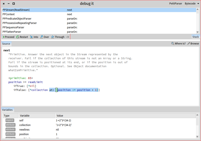
Hi, I undestand and really liked the idea of a moldable debugger and it's true that the button actions act over the stack, however the decision on what action to use is taken not looking to the stack pane (normally I've decided what to do looking on the source pane). In this context, the buttons are far away where the attention usually is (the code pane). IMHO for the user experience point of view I think is better to have the actions below the stack list and above the stack pane to let the user do not diverge his attention. I'm proposing not dettaching the action buttons for the stack pane, just changing the location (and also moving and inverting the direction of the tab label to not waste space). Maybe something like this (sorry no photoshop here :) ): â We need to figure it out a way to improve this situation. Regards, Gabriel On Sat, Jun 4, 2016 at 3:45 AM, Tudor Girba <tudor@tudorgirba.com> wrote:
Hi Sabine (and others that asked this question),
Thanks for the feedback. Sorry for the delayed reply, but I am traveling these days and I have limited online time. Also, this email took some time to write (I started it about a week ago).
I will answer the buttons issue. The reason they are in a different place than where they used to be is related to new constraints that come with the new debugger. While the default interface looks like a regular debugger, the main feature of the GTDebugger is that it can be customized to match a specific domain or library.
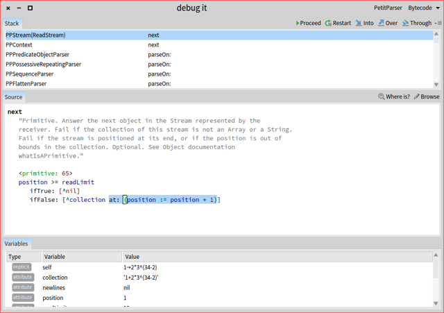
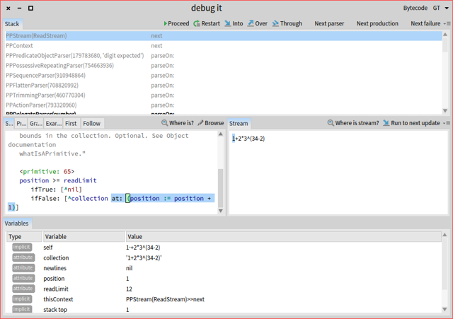
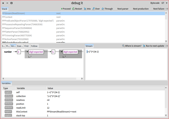
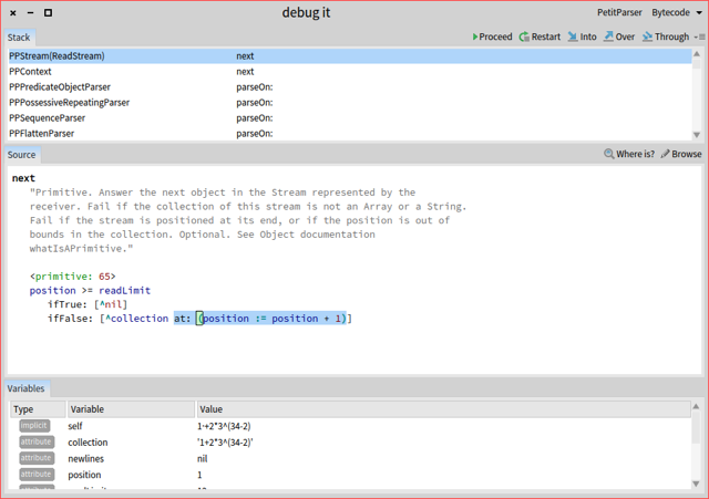
Let me provide an example of a scenario of debugging PetitParser:
PPArithmeticParser parse: '1+2*3^(34-2)â
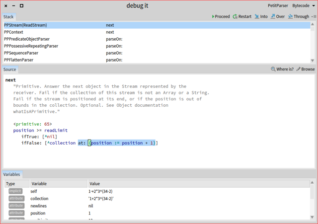
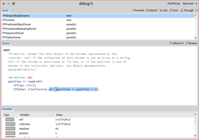
The default debugger looks like this:
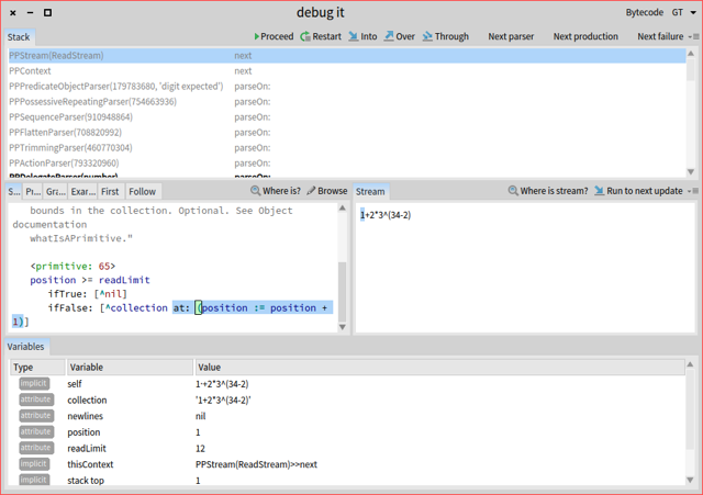
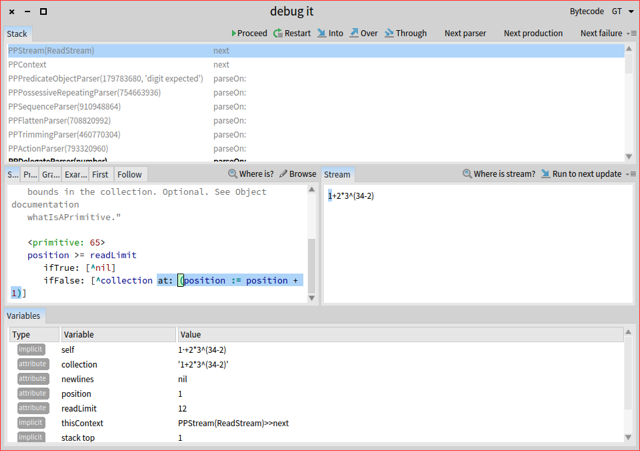
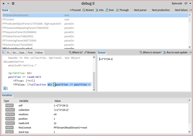
But, because we have PetitParser code on the stack, we can switch to a custom debugger:
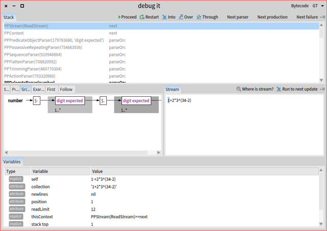
This one also features the input stream next to the code. Also, note that the stack received 3 new button actions. But, this is not all. Next to the source, there are other tabs, and we can switch to one of those:
This one shows the source as well, but in a graphical form.
So, if we step back and talk about the buttons, you will see that if we would have put the buttons on the source tabs, you have had no way to advance in this state. We could have also duplicated behavior and put the buttons on the new presentation as well, but the space is much smaller and since we now have large buttons instead of only icons we needed to deal with that as well. We encountered similar situations in other debuggers (not all, though).
But, from a more point of view, the actions act on the stack. So, if we take an object-oriented approach for designing the UI, it makes sense to place those actions next to the context they act on. All these reasons made us choose to put them next to the stack and not next to the source.
We certainly understand that this is a departure from the classic debugger and perhaps this is not the best way of doing things, but that was the rationale we went through. I would be happy to hear other suggestions, but please understand that we need to take into account the full spectrum of constraints when choosing solutions.
In any case, the idea of this debugger is that you can change it in the way you want and customize it specifically for your needs. We still need to document how to do that, but if someone wants to start creating a custom debugger we could use the experience to drive the documentation.
Does this explain the situation?
Cheers, Doru
On May 25, 2016, at 9:43 PM, Sabine Manaa <manaa.sabine@gmail.com> wrote:
Hi,
today I moved to Pharo5. It is great to get feedback and solutions for problems so quickly. It is a pleasure to work with Pharo and to have the community. I am grateful for having this.
I have one comment. I don't want to complain, I can use it but I was wondering about the new position and size of the debugger buttons.
There is a longer distance now from code text pane to the buttons - I see this as disadvantage to earlier versions of Pharo from the user experience. The buttons are a lot of smaller - same disadvantage - both if you use the mouse.
Ok, after seeing that, I thought "Sabine, you should use keyboard shortcuts here, too" (I use much of them but interesting - til now not in the debugger).
Then I saw the shortcuts for Proceed cmd+r Restart cmd-shift-a Into cmd-e over cmd-shift-o through cmd-shift-t
especially into, over and through have so different key combinations, two with shift, one without shift. When I debug, I often use for example into-into-over-over-over-throuhg-through--into-into etc...and with the combinations cmd-e and cmd-shit-e, it is more "finger-work". It would be better to have all those shortcuts with or all shortcuts without shift. And the letters not so far away at the keyboard (e-o-t)
This is only my opinion and my first impression after one day with Pharo5. I am sure, after a few days, I forgot that this was uncomfortable because I have the shortcuts coming automatically into my fingers.
Regards Sabine
-- View this message in context: http://forum.world.st/One-comment-to-new-Pharo5-debugger-tp4897390.html Sent from the Pharo Smalltalk Users mailing list archive at Nabble.com <http://nabble.com>.
-- www.tudorgirba.com www.feenk.com
"Every thing should have the right to be different."
On Sat, Jun 4, 2016 at 11:28 PM, Gabriel Cotelli <g.cotelli@gmail.com> wrote:
Hi, I undestand and really liked the idea of a moldable debugger and it's true that the button actions act over the stack, however the decision on what action to use is taken not looking to the stack pane (normally I've decided what to do looking on the source pane). In this context, the buttons are far away where the attention usually is (the code pane). IMHO for the user experience point of view I think is better to have the actions below the stack list and above the stack pane to let the user do not diverge his attention. I'm proposing not dettaching the action buttons for the stack pane, just changing the location (and also moving and inverting the direction of the tab label to not waste space).
Interesting idea. Only the [Stack] tab is a bit lonely over there on the right. Perhaps the tab could still be on the left, with the buttons left justified against it? btw, are there any use cases for multiple stack tabs? cheers -ben
Maybe something like this (sorry no photoshop here :) ): â We need to figure it out a way to improve this situation.
Regards, Gabriel
On Sat, Jun 4, 2016 at 3:45 AM, Tudor Girba <tudor@tudorgirba.com> wrote:
Hi Sabine (and others that asked this question),
Thanks for the feedback. Sorry for the delayed reply, but I am traveling these days and I have limited online time. Also, this email took some time to write (I started it about a week ago).
I will answer the buttons issue. The reason they are in a different place than where they used to be is related to new constraints that come with the new debugger. While the default interface looks like a regular debugger, the main feature of the GTDebugger is that it can be customized to match a specific domain or library.
Let me provide an example of a scenario of debugging PetitParser:
PPArithmeticParser parse: '1+2*3^(34-2)â
The default debugger looks like this:
But, because we have PetitParser code on the stack, we can switch to a custom debugger:
This one also features the input stream next to the code. Also, note that the stack received 3 new button actions. But, this is not all. Next to the source, there are other tabs, and we can switch to one of those:
This one shows the source as well, but in a graphical form.
So, if we step back and talk about the buttons, you will see that if we would have put the buttons on the source tabs, you have had no way to advance in this state. We could have also duplicated behavior and put the buttons on the new presentation as well, but the space is much smaller and since we now have large buttons instead of only icons we needed to deal with that as well. We encountered similar situations in other debuggers (not all, though).
But, from a more point of view, the actions act on the stack. So, if we take an object-oriented approach for designing the UI, it makes sense to place those actions next to the context they act on. All these reasons made us choose to put them next to the stack and not next to the source.
We certainly understand that this is a departure from the classic debugger and perhaps this is not the best way of doing things, but that was the rationale we went through. I would be happy to hear other suggestions, but please understand that we need to take into account the full spectrum of constraints when choosing solutions.
In any case, the idea of this debugger is that you can change it in the way you want and customize it specifically for your needs. We still need to document how to do that, but if someone wants to start creating a custom debugger we could use the experience to drive the documentation.
Does this explain the situation?
Cheers, Doru
On May 25, 2016, at 9:43 PM, Sabine Manaa <manaa.sabine@gmail.com> wrote:
Hi,
today I moved to Pharo5. It is great to get feedback and solutions for problems so quickly. It is a pleasure to work with Pharo and to have the community. I am grateful for having this.
I have one comment. I don't want to complain, I can use it but I was wondering about the new position and size of the debugger buttons.
There is a longer distance now from code text pane to the buttons - I see this as disadvantage to earlier versions of Pharo from the user experience. The buttons are a lot of smaller - same disadvantage - both if you use the mouse.
Ok, after seeing that, I thought "Sabine, you should use keyboard shortcuts here, too" (I use much of them but interesting - til now not in the debugger).
Then I saw the shortcuts for Proceed cmd+r Restart cmd-shift-a Into cmd-e over cmd-shift-o through cmd-shift-t
especially into, over and through have so different key combinations, two with shift, one without shift. When I debug, I often use for example into-into-over-over-over-throuhg-through--into-into etc...and with the combinations cmd-e and cmd-shit-e, it is more "finger-work". It would be better to have all those shortcuts with or all shortcuts without shift. And the letters not so far away at the keyboard (e-o-t)
This is only my opinion and my first impression after one day with Pharo5. I am sure, after a few days, I forgot that this was uncomfortable because I have the shortcuts coming automatically into my fingers.
Regards Sabine
-- View this message in context: http://forum.world.st/One-comment-to-new-Pharo5-debugger-tp4897390.html Sent from the Pharo Smalltalk Users mailing list archive at Nabble.com <http://nabble.com>.
-- www.tudorgirba.com www.feenk.com
"Every thing should have the right to be different."
Hi,
On Jun 4, 2016, at 7:09 PM, Ben Coman <btc@openinworld.com> wrote:
On Sat, Jun 4, 2016 at 11:28 PM, Gabriel Cotelli <g.cotelli@gmail.com> wrote: Hi, I undestand and really liked the idea of a moldable debugger and it's true that the button actions act over the stack, however the decision on what action to use is taken not looking to the stack pane (normally I've decided what to do looking on the source pane). In this context, the buttons are far away where the attention usually is (the code pane). IMHO for the user experience point of view I think is better to have the actions below the stack list and above the stack pane to let the user do not diverge his attention. I'm proposing not dettaching the action buttons for the stack pane, just changing the location (and also moving and inverting the direction of the tab label to not waste space).
Interesting idea. Only the [Stack] tab is a bit lonely over there on the right. Perhaps the tab could still be on the left, with the buttons left justified against it?
btw, are there any use cases for multiple stack tabs?
Do you mean if there are cases for seeing the stack in different ways or do you mean something else? Cheers, Doru
cheers -ben
Maybe something like this (sorry no photoshop here :) ): â We need to figure it out a way to improve this situation.
Regards, Gabriel
On Sat, Jun 4, 2016 at 3:45 AM, Tudor Girba <tudor@tudorgirba.com> wrote: Hi Sabine (and others that asked this question),
Thanks for the feedback. Sorry for the delayed reply, but I am traveling these days and I have limited online time. Also, this email took some time to write (I started it about a week ago).
I will answer the buttons issue. The reason they are in a different place than where they used to be is related to new constraints that come with the new debugger. While the default interface looks like a regular debugger, the main feature of the GTDebugger is that it can be customized to match a specific domain or library.
Let me provide an example of a scenario of debugging PetitParser:
PPArithmeticParser parse: '1+2*3^(34-2)â
The default debugger looks like this:
<debug-pp-default.png>
But, because we have PetitParser code on the stack, we can switch to a custom debugger:
<debug-pp-dedicated-source.png>
This one also features the input stream next to the code. Also, note that the stack received 3 new button actions. But, this is not all. Next to the source, there are other tabs, and we can switch to one of those:
<debug-pp-dedicated-visualization.png>
This one shows the source as well, but in a graphical form.
So, if we step back and talk about the buttons, you will see that if we would have put the buttons on the source tabs, you have had no way to advance in this state. We could have also duplicated behavior and put the buttons on the new presentation as well, but the space is much smaller and since we now have large buttons instead of only icons we needed to deal with that as well. We encountered similar situations in other debuggers (not all, though).
But, from a more point of view, the actions act on the stack. So, if we take an object-oriented approach for designing the UI, it makes sense to place those actions next to the context they act on. All these reasons made us choose to put them next to the stack and not next to the source.
We certainly understand that this is a departure from the classic debugger and perhaps this is not the best way of doing things, but that was the rationale we went through. I would be happy to hear other suggestions, but please understand that we need to take into account the full spectrum of constraints when choosing solutions.
In any case, the idea of this debugger is that you can change it in the way you want and customize it specifically for your needs. We still need to document how to do that, but if someone wants to start creating a custom debugger we could use the experience to drive the documentation.
Does this explain the situation?
Cheers, Doru
On May 25, 2016, at 9:43 PM, Sabine Manaa <manaa.sabine@gmail.com> wrote:
Hi,
today I moved to Pharo5. It is great to get feedback and solutions for problems so quickly. It is a pleasure to work with Pharo and to have the community. I am grateful for having this.
I have one comment. I don't want to complain, I can use it but I was wondering about the new position and size of the debugger buttons.
There is a longer distance now from code text pane to the buttons - I see this as disadvantage to earlier versions of Pharo from the user experience. The buttons are a lot of smaller - same disadvantage - both if you use the mouse.
Ok, after seeing that, I thought "Sabine, you should use keyboard shortcuts here, too" (I use much of them but interesting - til now not in the debugger).
Then I saw the shortcuts for Proceed cmd+r Restart cmd-shift-a Into cmd-e over cmd-shift-o through cmd-shift-t
especially into, over and through have so different key combinations, two with shift, one without shift. When I debug, I often use for example into-into-over-over-over-throuhg-through--into-into etc...and with the combinations cmd-e and cmd-shit-e, it is more "finger-work". It would be better to have all those shortcuts with or all shortcuts without shift. And the letters not so far away at the keyboard (e-o-t)
This is only my opinion and my first impression after one day with Pharo5. I am sure, after a few days, I forgot that this was uncomfortable because I have the shortcuts coming automatically into my fingers.
Regards Sabine
-- View this message in context: http://forum.world.st/One-comment-to-new-Pharo5-debugger-tp4897390.html Sent from the Pharo Smalltalk Users mailing list archive at Nabble.com.
-- www.tudorgirba.com www.feenk.com
"Every thing should have the right to be different."
-- www.tudorgirba.com www.feenk.com "Reasonable is what we are accustomed with."
On Sun, Jun 5, 2016 at 1:17 AM, Tudor Girba <tudor@tudorgirba.com> wrote:
Hi,
On Jun 4, 2016, at 7:09 PM, Ben Coman <btc@openinworld.com> wrote:
On Sat, Jun 4, 2016 at 11:28 PM, Gabriel Cotelli <g.cotelli@gmail.com> wrote: Hi, I undestand and really liked the idea of a moldable debugger and it's true that the button actions act over the stack, however the decision on what action to use is taken not looking to the stack pane (normally I've decided what to do looking on the source pane). In this context, the buttons are far away where the attention usually is (the code pane). IMHO for the user experience point of view I think is better to have the actions below the stack list and above the stack pane to let the user do not diverge his attention. I'm proposing not dettaching the action buttons for the stack pane, just changing the location (and also moving and inverting the direction of the tab label to not waste space).
Interesting idea. Only the [Stack] tab is a bit lonely over there on the right. Perhaps the tab could still be on the left, with the buttons left justified against it?
btw, are there any use cases for multiple stack tabs?
Do you mean if there are cases for seeing the stack in different ways or do you mean something else?
I meant, is the [Stack] tab really required? Will there ever be a second tab? Could the buttons be the sole occupant of that row - beneath the stack pane? Actually do like the idea of having a bottom hanging [Stack] tab directly opposing the [Source] tab. Could the buttons be left justified against that, and then if a second tab ever comes along, slide the buttons to the right a little? cheers -ben
Cheers, Doru
cheers -ben
Maybe something like this (sorry no photoshop here :) ):
We need to figure it out a way to improve this situation.
Regards, Gabriel
On Sat, Jun 4, 2016 at 3:45 AM, Tudor Girba <tudor@tudorgirba.com> wrote: Hi Sabine (and others that asked this question),
Thanks for the feedback. Sorry for the delayed reply, but I am traveling these days and I have limited online time. Also, this email took some time to write (I started it about a week ago).
I will answer the buttons issue. The reason they are in a different place than where they used to be is related to new constraints that come with the new debugger. While the default interface looks like a regular debugger, the main feature of the GTDebugger is that it can be customized to match a specific domain or library.
Let me provide an example of a scenario of debugging PetitParser:
PPArithmeticParser parse: '1+2*3^(34-2)â
The default debugger looks like this:
<debug-pp-default.png>
But, because we have PetitParser code on the stack, we can switch to a custom debugger:
<debug-pp-dedicated-source.png>
This one also features the input stream next to the code. Also, note that the stack received 3 new button actions. But, this is not all. Next to the source, there are other tabs, and we can switch to one of those:
<debug-pp-dedicated-visualization.png>
This one shows the source as well, but in a graphical form.
So, if we step back and talk about the buttons, you will see that if we would have put the buttons on the source tabs, you have had no way to advance in this state. We could have also duplicated behavior and put the buttons on the new presentation as well, but the space is much smaller and since we now have large buttons instead of only icons we needed to deal with that as well. We encountered similar situations in other debuggers (not all, though).
But, from a more point of view, the actions act on the stack. So, if we take an object-oriented approach for designing the UI, it makes sense to place those actions next to the context they act on. All these reasons made us choose to put them next to the stack and not next to the source.
We certainly understand that this is a departure from the classic debugger and perhaps this is not the best way of doing things, but that was the rationale we went through. I would be happy to hear other suggestions, but please understand that we need to take into account the full spectrum of constraints when choosing solutions.
In any case, the idea of this debugger is that you can change it in the way you want and customize it specifically for your needs. We still need to document how to do that, but if someone wants to start creating a custom debugger we could use the experience to drive the documentation.
Does this explain the situation?
Cheers, Doru
On May 25, 2016, at 9:43 PM, Sabine Manaa <manaa.sabine@gmail.com> wrote:
Hi,
today I moved to Pharo5. It is great to get feedback and solutions for problems so quickly. It is a pleasure to work with Pharo and to have the community. I am grateful for having this.
I have one comment. I don't want to complain, I can use it but I was wondering about the new position and size of the debugger buttons.
There is a longer distance now from code text pane to the buttons - I see this as disadvantage to earlier versions of Pharo from the user experience. The buttons are a lot of smaller - same disadvantage - both if you use the mouse.
Ok, after seeing that, I thought "Sabine, you should use keyboard shortcuts here, too" (I use much of them but interesting - til now not in the debugger).
Then I saw the shortcuts for Proceed cmd+r Restart cmd-shift-a Into cmd-e over cmd-shift-o through cmd-shift-t
especially into, over and through have so different key combinations, two with shift, one without shift. When I debug, I often use for example into-into-over-over-over-throuhg-through--into-into etc...and with the combinations cmd-e and cmd-shit-e, it is more "finger-work". It would be better to have all those shortcuts with or all shortcuts without shift. And the letters not so far away at the keyboard (e-o-t)
This is only my opinion and my first impression after one day with Pharo5. I am sure, after a few days, I forgot that this was uncomfortable because I have the shortcuts coming automatically into my fingers.
Regards Sabine
-- View this message in context: http://forum.world.st/One-comment-to-new-Pharo5-debugger-tp4897390.html Sent from the Pharo Smalltalk Users mailing list archive at Nabble.com.
-- www.tudorgirba.com www.feenk.com
"Every thing should have the right to be different."
-- www.tudorgirba.com www.feenk.com
"Reasonable is what we are accustomed with."
Well I put the buttons on the left on purpose because in the case you're debugging source code the content tends to be on the left half of the screen. So this keeps the actions close to the decision on what to use. On Jun 4, 2016 14:11, "Ben Coman" <btc@openinworld.com> wrote:
On Sat, Jun 4, 2016 at 11:28 PM, Gabriel Cotelli <g.cotelli@gmail.com> wrote:
Hi, I undestand and really liked the idea of a moldable debugger and it's true that the button actions act over the stack, however the decision on what action to use is taken not looking to the stack pane (normally I've decided what to do looking on the source pane). In this context, the buttons are far away where the attention usually is (the code pane). IMHO for the user experience point of view I think is better to have the actions below the stack list and above the stack pane to let the user do not diverge his attention. I'm proposing not dettaching the action buttons for the stack pane, just changing the location (and also moving and inverting the direction of the tab label to not waste space).
Interesting idea. Only the [Stack] tab is a bit lonely over there on the right. Perhaps the tab could still be on the left, with the buttons left justified against it?
btw, are there any use cases for multiple stack tabs?
cheers -ben
Maybe something like this (sorry no photoshop here :) ): â We need to figure it out a way to improve this situation.
Regards, Gabriel
On Sat, Jun 4, 2016 at 3:45 AM, Tudor Girba <tudor@tudorgirba.com> wrote:
Hi Sabine (and others that asked this question),
Thanks for the feedback. Sorry for the delayed reply, but I am traveling these days and I have limited online time. Also, this email took some time to write (I started it about a week ago).
I will answer the buttons issue. The reason they are in a different place than where they used to be is related to new constraints that come with the new debugger. While the default interface looks like a regular debugger, the main feature of the GTDebugger is that it can be customized to match a specific domain or library.
Let me provide an example of a scenario of debugging PetitParser:
PPArithmeticParser parse: '1+2*3^(34-2)â
The default debugger looks like this:
But, because we have PetitParser code on the stack, we can switch to a custom debugger:
This one also features the input stream next to the code. Also, note that the stack received 3 new button actions. But, this is not all. Next to the source, there are other tabs, and we can switch to one of those:
This one shows the source as well, but in a graphical form.
So, if we step back and talk about the buttons, you will see that if we would have put the buttons on the source tabs, you have had no way to advance in this state. We could have also duplicated behavior and put the buttons on the new presentation as well, but the space is much smaller and since we now have large buttons instead of only icons we needed to deal with that as well. We encountered similar situations in other debuggers (not all, though).
But, from a more point of view, the actions act on the stack. So, if we take an object-oriented approach for designing the UI, it makes sense to place those actions next to the context they act on. All these reasons made us choose to put them next to the stack and not next to the source.
We certainly understand that this is a departure from the classic debugger and perhaps this is not the best way of doing things, but that was the rationale we went through. I would be happy to hear other suggestions, but please understand that we need to take into account the full spectrum of constraints when choosing solutions.
In any case, the idea of this debugger is that you can change it in the way you want and customize it specifically for your needs. We still need to document how to do that, but if someone wants to start creating a custom debugger we could use the experience to drive the documentation.
Does this explain the situation?
Cheers, Doru
On May 25, 2016, at 9:43 PM, Sabine Manaa <manaa.sabine@gmail.com> wrote:
Hi,
today I moved to Pharo5. It is great to get feedback and solutions for problems so quickly. It is a pleasure to work with Pharo and to have the community. I am grateful for having this.
I have one comment. I don't want to complain, I can use it but I was wondering about the new position and size of the debugger buttons.
There is a longer distance now from code text pane to the buttons - I see this as disadvantage to earlier versions of Pharo from the user experience. The buttons are a lot of smaller - same disadvantage - both if you use the mouse.
Ok, after seeing that, I thought "Sabine, you should use keyboard shortcuts here, too" (I use much of them but interesting - til now not in the debugger).
Then I saw the shortcuts for Proceed cmd+r Restart cmd-shift-a Into cmd-e over cmd-shift-o through cmd-shift-t
especially into, over and through have so different key combinations, two with shift, one without shift. When I debug, I often use for example into-into-over-over-over-throuhg-through--into-into etc...and with the combinations cmd-e and cmd-shit-e, it is more "finger-work". It would be better to have all those shortcuts with or all shortcuts without shift. And the letters not so far away at the keyboard (e-o-t)
This is only my opinion and my first impression after one day with Pharo5. I am sure, after a few days, I forgot that this was uncomfortable because I have the shortcuts coming automatically into my fingers.
Regards Sabine
-- View this message in context: http://forum.world.st/One-comment-to-new-Pharo5-debugger-tp4897390.html Sent from the Pharo Smalltalk Users mailing list archive at Nabble.com <http://nabble.com>.
-- www.tudorgirba.com www.feenk.com
"Every thing should have the right to be different."

On Jun 4, 2016 14:11, "Ben Coman" <btc@openinworld.com> wrote:
On Sat, Jun 4, 2016 at 11:28 PM, Gabriel Cotelli <g.cotelli@gmail.com> wrote:
Hi, I undestand and really liked the idea of a moldable debugger and it's true that the button actions act over the stack, however the decision on what action to use is taken not looking to the stack pane (normally I've decided what to do looking on the source pane). In this context, the buttons are far away where the attention usually is (the code pane). IMHO for the user experience point of view I think is better to have the actions below the stack list and above the stack pane to let the user do not diverge his attention. I'm proposing not dettaching the action buttons for the stack pane, just changing the location (and also moving and inverting the direction of the tab label to not waste space).
Interesting idea. Only the [Stack] tab is a bit lonely over there on the right. Perhaps the tab could still be on the left, with the buttons left justified against it?
On Sun, Jun 5, 2016 at 1:36 AM, Gabriel Cotelli <g.cotelli@gmail.com> wrote:
Well I put the buttons on the left on purpose because in the case you're debugging source code the content tends to be on the left half of the screen. So this keeps the actions close to the decision on what to use.
I do agree. Here is my mockup, dependent on the number of [Stack] tabs expected. cheers -ben
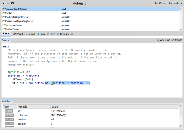
That looks really great ! It solves the practical problem and, for me, also addresses the conceptual issues that Doru has. Doru, what do you think of this solution? The buttons are still connected to the stack, they are just below the stack instead of on top. I also donât see why a âStackâ label is necessary, so it makes sense to me to remove it to gain some space. -- Does this mail seem too brief? Sorry for that, I donât mean to be rude! Please see http://emailcharter.org <http://emailcharter.org/> . Johan Fabry - http://pleiad.cl/~jfabry PLEIAD and RyCh labs - Computer Science Department (DCC) - University of Chile
On Jun 4, 2016, at 13:36, Gabriel Cotelli <g.cotelli@gmail.com> wrote:
Well I put the buttons on the left on purpose because in the case you're debugging source code the content tends to be on the left half of the screen. So this keeps the actions close to the decision on what to use.
Hi Doru, I think most people understand the great value of moldable tools. Maybe not all will use moldability but is a big plus to have. So, keep pushing! I just think we miss time to make the GT Debugger dealt view as productive as the spec debugger. There are users that do not use shortcuts (at least for debugger) and in this case, the over use of the mouse to reach step buttons is killing the productivity. To me, this issue could be addressed easily but could take time to implement in a generic / moldable way. I agree with Gabriel that buttons act on the stack (in fact also, on the source code pane that represents the AST) but what we mainly look at is the source code. Maybe buttons could be moved to the source code pane? I also have another suggestion: I very often have a debugger window with a lot of variables not visible by default : only 4 visible, need to scroll. Couldnât we split the variable pane in 2 part to display more variables? To open the inspector, you could either use the second column or open a third one. WDYT? Cheers, Christophe
Le 4 juin 2016 à 08:45, Tudor Girba <tudor@tudorgirba.com> a écrit :
Hi Sabine (and others that asked this question),
Thanks for the feedback. Sorry for the delayed reply, but I am traveling these days and I have limited online time. Also, this email took some time to write (I started it about a week ago).
I will answer the buttons issue. The reason they are in a different place than where they used to be is related to new constraints that come with the new debugger. While the default interface looks like a regular debugger, the main feature of the GTDebugger is that it can be customized to match a specific domain or library.
Let me provide an example of a scenario of debugging PetitParser:
PPArithmeticParser parse: '1+2*3^(34-2)â
The default debugger looks like this:
<debug-pp-default.png>
But, because we have PetitParser code on the stack, we can switch to a custom debugger:
<debug-pp-dedicated-source.png>
This one also features the input stream next to the code. Also, note that the stack received 3 new button actions. But, this is not all. Next to the source, there are other tabs, and we can switch to one of those:
<debug-pp-dedicated-visualization.png>
This one shows the source as well, but in a graphical form.
So, if we step back and talk about the buttons, you will see that if we would have put the buttons on the source tabs, you have had no way to advance in this state. We could have also duplicated behavior and put the buttons on the new presentation as well, but the space is much smaller and since we now have large buttons instead of only icons we needed to deal with that as well. We encountered similar situations in other debuggers (not all, though).
But, from a more point of view, the actions act on the stack. So, if we take an object-oriented approach for designing the UI, it makes sense to place those actions next to the context they act on. All these reasons made us choose to put them next to the stack and not next to the source.
We certainly understand that this is a departure from the classic debugger and perhaps this is not the best way of doing things, but that was the rationale we went through. I would be happy to hear other suggestions, but please understand that we need to take into account the full spectrum of constraints when choosing solutions.
In any case, the idea of this debugger is that you can change it in the way you want and customize it specifically for your needs. We still need to document how to do that, but if someone wants to start creating a custom debugger we could use the experience to drive the documentation.
Does this explain the situation?
Cheers, Doru
On May 25, 2016, at 9:43 PM, Sabine Manaa <manaa.sabine@gmail.com <mailto:manaa.sabine@gmail.com>> wrote:
Hi,
today I moved to Pharo5. It is great to get feedback and solutions for problems so quickly. It is a pleasure to work with Pharo and to have the community. I am grateful for having this.
I have one comment. I don't want to complain, I can use it but I was wondering about the new position and size of the debugger buttons.
There is a longer distance now from code text pane to the buttons - I see this as disadvantage to earlier versions of Pharo from the user experience. The buttons are a lot of smaller - same disadvantage - both if you use the mouse.
Ok, after seeing that, I thought "Sabine, you should use keyboard shortcuts here, too" (I use much of them but interesting - til now not in the debugger).
Then I saw the shortcuts for Proceed cmd+r Restart cmd-shift-a Into cmd-e over cmd-shift-o through cmd-shift-t
especially into, over and through have so different key combinations, two with shift, one without shift. When I debug, I often use for example into-into-over-over-over-throuhg-through--into-into etc...and with the combinations cmd-e and cmd-shit-e, it is more "finger-work". It would be better to have all those shortcuts with or all shortcuts without shift. And the letters not so far away at the keyboard (e-o-t)
This is only my opinion and my first impression after one day with Pharo5. I am sure, after a few days, I forgot that this was uncomfortable because I have the shortcuts coming automatically into my fingers.
Regards Sabine
-- View this message in context: http://forum.world.st/One-comment-to-new-Pharo5-debugger-tp4897390.html <http://forum.world.st/One-comment-to-new-Pharo5-debugger-tp4897390.html> Sent from the Pharo Smalltalk Users mailing list archive at Nabble.com <http://nabble.com/>.
-- www.tudorgirba.com <http://www.tudorgirba.com/> www.feenk.com
"Every thing should have the right to be different."
participants (10)
-
 Ben Coman
 -
 Christophe Demarey
 -
 Denis Kudriashov
 -
 Esteban Lorenzano
 -
 Gabriel Cotelli
 -
 Johan Fabry
 -
 Peter Uhnák
 -
 Sabine Manaa
 -
 stepharo
 -
 Tudor Girba