
Hi, I found the Font "Andika Basic"[2] which is an Open Source and Free- Software[1] Unicode-ready font made by the same people who brought us Gentium, the typeface for the nations. I suggest using Andika as the Pharo CI Font since it can be distributed along with Pharo and looks a little bit like Lucida Grande, the Mac-UI-font, but at the same time is more friendly and better readable[3]. According to the Andika Website, Andika is Swahili, which is spoken widely in southeastern regions of the African continent, and means "Write!". Have a look: [2] http://scripts.sil.org/cms/scripts/page.php?site_id=nrsi&item_id=Andika [3] http://minusfreun.de/blog/uploads/Pharo.png Jérôme [1] http://scripts.sil.org/cms/scripts/page.php?site_id=nrsi&id=OFL

thanks for the link and information! Stef On Feb 23, 2009, at 1:33 PM, Jérôme wrote:
Hi,
I found the Font "Andika Basic"[2] which is an Open Source and Free- Software[1] Unicode-ready font made by the same people who brought us Gentium, the typeface for the nations. I suggest using Andika as the Pharo CI Font since it can be distributed along with Pharo and looks a little bit like Lucida Grande, the Mac-UI-font, but at the same time is more friendly and better readable[3]. According to the Andika Website, Andika is Swahili, which is spoken widely in southeastern regions of the African continent, and means "Write!".
Have a look: [2] http://scripts.sil.org/cms/scripts/page.php?site_id=nrsi&item_id=Andika [3] http://minusfreun.de/blog/uploads/Pharo.png
Jérôme
[1] http://scripts.sil.org/cms/scripts/page.php?site_id=nrsi&id=OFL _______________________________________________ Pharo-project mailing list Pharo-project@lists.gforge.inria.fr http://lists.gforge.inria.fr/cgi-bin/mailman/listinfo/pharo-project

Looks nice & clean. 2009/2/23 Stéphane Ducasse <stephane.ducasse@inria.fr>:
thanks for the link and information!
Stef
On Feb 23, 2009, at 1:33 PM, Jérôme wrote:
Hi,
I found the Font "Andika Basic"[2] which is an Open Source and Free- Software[1] Unicode-ready font made by the same people who brought us Gentium, the typeface for the nations. I suggest using Andika as the Pharo CI Font since it can be distributed along with Pharo and looks a little bit like Lucida Grande, the Mac-UI-font, but at the same time is more friendly and better readable[3]. According to the Andika Website, Andika is Swahili, which is spoken widely in southeastern regions of the African continent, and means "Write!".
Have a look: [2] http://scripts.sil.org/cms/scripts/page.php?site_id=nrsi&item_id=Andika [3] http://minusfreun.de/blog/uploads/Pharo.png
Jérôme
[1] http://scripts.sil.org/cms/scripts/page.php?site_id=nrsi&id=OFL _______________________________________________ Pharo-project mailing list Pharo-project@lists.gforge.inria.fr http://lists.gforge.inria.fr/cgi-bin/mailman/listinfo/pharo-project
_______________________________________________ Pharo-project mailing list Pharo-project@lists.gforge.inria.fr http://lists.gforge.inria.fr/cgi-bin/mailman/listinfo/pharo-project
-- Best regards, Igor Stasenko AKA sig.

On linux it doesn't look very good. There is something weird with the font height and position. Well, it looks a lot better in pharo than in gnome :) screenshot is attached. Norbert On Mon, 2009-02-23 at 13:33 +0100, Jérôme wrote:
Hi,
I found the Font "Andika Basic"[2] which is an Open Source and Free- Software[1] Unicode-ready font made by the same people who brought us Gentium, the typeface for the nations. I suggest using Andika as the Pharo CI Font since it can be distributed along with Pharo and looks a little bit like Lucida Grande, the Mac-UI-font, but at the same time is more friendly and better readable[3]. According to the Andika Website, Andika is Swahili, which is spoken widely in southeastern regions of the African continent, and means "Write!".
Have a look: [2] http://scripts.sil.org/cms/scripts/page.php?site_id=nrsi&item_id=Andika [3] http://minusfreun.de/blog/uploads/Pharo.png
Jérôme
[1] http://scripts.sil.org/cms/scripts/page.php?site_id=nrsi&id=OFL _______________________________________________ Pharo-project mailing list Pharo-project@lists.gforge.inria.fr http://lists.gforge.inria.fr/cgi-bin/mailman/listinfo/pharo-project
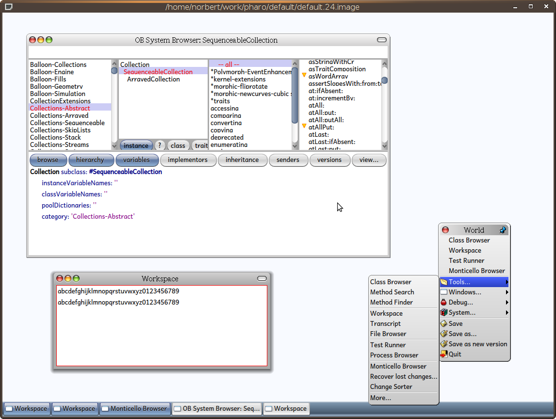
2009/2/23 Norbert Hartl <norbert@hartl.name>:
On linux it doesn't look very good. There is something weird with the font height and position. Well, it looks a lot better in pharo than in gnome :)
seems like you changed font after opening a browser window. And it using old font height to calculate line heights.
screenshot is attached.
Norbert
On Mon, 2009-02-23 at 13:33 +0100, Jérôme wrote:
Hi,
I found the Font "Andika Basic"[2] which is an Open Source and Free- Software[1] Unicode-ready font made by the same people who brought us Gentium, the typeface for the nations. I suggest using Andika as the Pharo CI Font since it can be distributed along with Pharo and looks a little bit like Lucida Grande, the Mac-UI-font, but at the same time is more friendly and better readable[3]. According to the Andika Website, Andika is Swahili, which is spoken widely in southeastern regions of the African continent, and means "Write!".
Have a look: [2] http://scripts.sil.org/cms/scripts/page.php?site_id=nrsi&item_id=Andika [3] http://minusfreun.de/blog/uploads/Pharo.png
Jérôme
[1] http://scripts.sil.org/cms/scripts/page.php?site_id=nrsi&id=OFL _______________________________________________ Pharo-project mailing list Pharo-project@lists.gforge.inria.fr http://lists.gforge.inria.fr/cgi-bin/mailman/listinfo/pharo-project
_______________________________________________ Pharo-project mailing list Pharo-project@lists.gforge.inria.fr http://lists.gforge.inria.fr/cgi-bin/mailman/listinfo/pharo-project
-- Best regards, Igor Stasenko AKA sig.
On Mon, 2009-02-23 at 20:18 +0200, Igor Stasenko wrote:
2009/2/23 Norbert Hartl <norbert@hartl.name>:
On linux it doesn't look very good. There is something weird with the font height and position. Well, it looks a lot better in pharo than in gnome :)
seems like you changed font after opening a browser window. And it using old font height to calculate line heights.
If I would have changed the font after opening the window I couldn't see the new font. The fonts are only applied on opening a window. You can see it in the workspace and the menu two. There is enough space through the big line height. In the class browser it is somehow cut off. Norbert
screenshot is attached.
Norbert
On Mon, 2009-02-23 at 13:33 +0100, Jérôme wrote:
Hi,
I found the Font "Andika Basic"[2] which is an Open Source and Free- Software[1] Unicode-ready font made by the same people who brought us Gentium, the typeface for the nations. I suggest using Andika as the Pharo CI Font since it can be distributed along with Pharo and looks a little bit like Lucida Grande, the Mac-UI-font, but at the same time is more friendly and better readable[3]. According to the Andika Website, Andika is Swahili, which is spoken widely in southeastern regions of the African continent, and means "Write!".
Have a look: [2] http://scripts.sil.org/cms/scripts/page.php?site_id=nrsi&item_id=Andika [3] http://minusfreun.de/blog/uploads/Pharo.png
Jérôme
[1] http://scripts.sil.org/cms/scripts/page.php?site_id=nrsi&id=OFL _______________________________________________ Pharo-project mailing list Pharo-project@lists.gforge.inria.fr http://lists.gforge.inria.fr/cgi-bin/mailman/listinfo/pharo-project
_______________________________________________ Pharo-project mailing list Pharo-project@lists.gforge.inria.fr http://lists.gforge.inria.fr/cgi-bin/mailman/listinfo/pharo-project
-- Best regards, Igor Stasenko AKA sig.
_______________________________________________ Pharo-project mailing list Pharo-project@lists.gforge.inria.fr http://lists.gforge.inria.fr/cgi-bin/mailman/listinfo/pharo-project

Can it be related to a problem I saw recently with text string inappropriately clipped toward the end (string length calculus seems too short of 1 or 2 pixels)? I can see it in last release when using deja vue font for example. It does not show up in #194 however. Hilaire 2009/2/23 Norbert Hartl <norbert@hartl.name>:
On Mon, 2009-02-23 at 20:18 +0200, Igor Stasenko wrote:
2009/2/23 Norbert Hartl <norbert@hartl.name>:
On linux it doesn't look very good. There is something weird with the font height and position. Well, it looks a lot better in pharo than in gnome :)
seems like you changed font after opening a browser window. And it using old font height to calculate line heights.
If I would have changed the font after opening the window I couldn't see the new font. The fonts are only applied on opening a window. You can see it in the workspace and the menu two. There is enough space through the big line height. In the class browser it is somehow cut off.
Norbert
screenshot is attached.
Norbert
On Mon, 2009-02-23 at 13:33 +0100, Jérôme wrote:
Hi,
I found the Font "Andika Basic"[2] which is an Open Source and Free- Software[1] Unicode-ready font made by the same people who brought us Gentium, the typeface for the nations. I suggest using Andika as the Pharo CI Font since it can be distributed along with Pharo and looks a little bit like Lucida Grande, the Mac-UI-font, but at the same time is more friendly and better readable[3]. According to the Andika Website, Andika is Swahili, which is spoken widely in southeastern regions of the African continent, and means "Write!".
Have a look: [2] http://scripts.sil.org/cms/scripts/page.php?site_id=nrsi&item_id=Andika [3] http://minusfreun.de/blog/uploads/Pharo.png
Jérôme
[1] http://scripts.sil.org/cms/scripts/page.php?site_id=nrsi&id=OFL _______________________________________________ Pharo-project mailing list Pharo-project@lists.gforge.inria.fr http://lists.gforge.inria.fr/cgi-bin/mailman/listinfo/pharo-project
_______________________________________________ Pharo-project mailing list Pharo-project@lists.gforge.inria.fr http://lists.gforge.inria.fr/cgi-bin/mailman/listinfo/pharo-project
-- Best regards, Igor Stasenko AKA sig.
_______________________________________________ Pharo-project mailing list Pharo-project@lists.gforge.inria.fr http://lists.gforge.inria.fr/cgi-bin/mailman/listinfo/pharo-project
_______________________________________________ Pharo-project mailing list Pharo-project@lists.gforge.inria.fr http://lists.gforge.inria.fr/cgi-bin/mailman/listinfo/pharo-project

That's just down to the fact that textstyles are applied on opening of browsers/morphs. Reopening the browsers should sort it. The slight other concern I have with this font is the apparently excessive line spacing, not as compact as, say, Arial. Regards, Gary ----- Original Message ----- From: "Hilaire Fernandes" <hilaire@ofset.org> To: <Pharo-project@lists.gforge.inria.fr> Sent: Monday, February 23, 2009 7:20 PM Subject: Re: [Pharo-project] Font for Pharo Can it be related to a problem I saw recently with text string inappropriately clipped toward the end (string length calculus seems too short of 1 or 2 pixels)? I can see it in last release when using deja vue font for example. It does not show up in #194 however. Hilaire 2009/2/23 Norbert Hartl <norbert@hartl.name>:
On Mon, 2009-02-23 at 20:18 +0200, Igor Stasenko wrote:
2009/2/23 Norbert Hartl <norbert@hartl.name>:
On linux it doesn't look very good. There is something weird with the font height and position. Well, it looks a lot better in pharo than in gnome :)
seems like you changed font after opening a browser window. And it using old font height to calculate line heights.
If I would have changed the font after opening the window I couldn't see the new font. The fonts are only applied on opening a window. You can see it in the workspace and the menu two. There is enough space through the big line height. In the class browser it is somehow cut off.
Norbert
screenshot is attached.
Norbert
On Mon, 2009-02-23 at 13:33 +0100, Jérôme wrote:
Hi,
I found the Font "Andika Basic"[2] which is an Open Source and Free- Software[1] Unicode-ready font made by the same people who brought us Gentium, the typeface for the nations. I suggest using Andika as the Pharo CI Font since it can be distributed along with Pharo and looks a little bit like Lucida Grande, the Mac-UI-font, but at the same time is more friendly and better readable[3]. According to the Andika Website, Andika is Swahili, which is spoken widely in southeastern regions of the African continent, and means "Write!".
Have a look: [2] http://scripts.sil.org/cms/scripts/page.php?site_id=nrsi&item_id=Andika [3] http://minusfreun.de/blog/uploads/Pharo.png
Jérôme
[1] http://scripts.sil.org/cms/scripts/page.php?site_id=nrsi&id=OFL _______________________________________________ Pharo-project mailing list Pharo-project@lists.gforge.inria.fr http://lists.gforge.inria.fr/cgi-bin/mailman/listinfo/pharo-project
_______________________________________________ Pharo-project mailing list Pharo-project@lists.gforge.inria.fr http://lists.gforge.inria.fr/cgi-bin/mailman/listinfo/pharo-project
-- Best regards, Igor Stasenko AKA sig.
_______________________________________________ Pharo-project mailing list Pharo-project@lists.gforge.inria.fr http://lists.gforge.inria.fr/cgi-bin/mailman/listinfo/pharo-project
_______________________________________________ Pharo-project mailing list Pharo-project@lists.gforge.inria.fr http://lists.gforge.inria.fr/cgi-bin/mailman/listinfo/pharo-project
-- http://blog.ofset.org/hilaire _______________________________________________ Pharo-project mailing list Pharo-project@lists.gforge.inria.fr http://lists.gforge.inria.fr/cgi-bin/mailman/listinfo/pharo-project
2009/2/24 Gary Chambers <gazzaguru2@btinternet.com>:
That's just down to the fact that textstyles are applied on opening of browsers/morphs. Reopening the browsers should sort it.
The slight other concern I have with this font is the apparently excessive line spacing, not as compact as, say, Arial.
Does anyone knows, how/where line height is calculated? Maybe this code does not takes font DPI in account, or assuming a fixed dpi which is mismatching with screen dpi.
Regards, Gary
----- Original Message ----- From: "Hilaire Fernandes" <hilaire@ofset.org> To: <Pharo-project@lists.gforge.inria.fr> Sent: Monday, February 23, 2009 7:20 PM Subject: Re: [Pharo-project] Font for Pharo
Can it be related to a problem I saw recently with text string inappropriately clipped toward the end (string length calculus seems too short of 1 or 2 pixels)? I can see it in last release when using deja vue font for example.
It does not show up in #194 however.
Hilaire
2009/2/23 Norbert Hartl <norbert@hartl.name>:
On Mon, 2009-02-23 at 20:18 +0200, Igor Stasenko wrote:
2009/2/23 Norbert Hartl <norbert@hartl.name>:
On linux it doesn't look very good. There is something weird with the font height and position. Well, it looks a lot better in pharo than in gnome :)
seems like you changed font after opening a browser window. And it using old font height to calculate line heights.
If I would have changed the font after opening the window I couldn't see the new font. The fonts are only applied on opening a window. You can see it in the workspace and the menu two. There is enough space through the big line height. In the class browser it is somehow cut off.
Norbert
screenshot is attached.
Norbert
On Mon, 2009-02-23 at 13:33 +0100, Jérôme wrote:
Hi,
I found the Font "Andika Basic"[2] which is an Open Source and Free- Software[1] Unicode-ready font made by the same people who brought us Gentium, the typeface for the nations. I suggest using Andika as the Pharo CI Font since it can be distributed along with Pharo and looks a little bit like Lucida Grande, the Mac-UI-font, but at the same time is more friendly and better readable[3]. According to the Andika Website, Andika is Swahili, which is spoken widely in southeastern regions of the African continent, and means "Write!".
Have a look: [2] http://scripts.sil.org/cms/scripts/page.php?site_id=nrsi&item_id=Andika [3] http://minusfreun.de/blog/uploads/Pharo.png
Jérôme
[1] http://scripts.sil.org/cms/scripts/page.php?site_id=nrsi&id=OFL _______________________________________________ Pharo-project mailing list Pharo-project@lists.gforge.inria.fr http://lists.gforge.inria.fr/cgi-bin/mailman/listinfo/pharo-project
_______________________________________________ Pharo-project mailing list Pharo-project@lists.gforge.inria.fr http://lists.gforge.inria.fr/cgi-bin/mailman/listinfo/pharo-project
-- Best regards, Igor Stasenko AKA sig.
_______________________________________________ Pharo-project mailing list Pharo-project@lists.gforge.inria.fr http://lists.gforge.inria.fr/cgi-bin/mailman/listinfo/pharo-project
_______________________________________________ Pharo-project mailing list Pharo-project@lists.gforge.inria.fr http://lists.gforge.inria.fr/cgi-bin/mailman/listinfo/pharo-project
-- http://blog.ofset.org/hilaire
_______________________________________________ Pharo-project mailing list Pharo-project@lists.gforge.inria.fr http://lists.gforge.inria.fr/cgi-bin/mailman/listinfo/pharo-project
_______________________________________________ Pharo-project mailing list Pharo-project@lists.gforge.inria.fr http://lists.gforge.inria.fr/cgi-bin/mailman/listinfo/pharo-project
-- Best regards, Igor Stasenko AKA sig.
It seems Andika has a higher line-spacing because it takes characters with multiple stacked unicode diacritics[2] into account which would be clipped otherwise[1]. If this is deemed not aceptable, there exists the SIL Type Tuner, which can change the line-height easily. [3] Unfortunatly I have no windows system. [1] http://scripts.sil.org/cms/scripts/page.php?site_id=nrsi&item_id=Andika_FAQ-... [2] http://en.wikipedia.org/wiki/Diacritic [3] http://scripts.sil.org/TypeTuner Am 24.02.2009 um 16:55 schrieb Igor Stasenko:
2009/2/24 Gary Chambers <gazzaguru2@btinternet.com>:
That's just down to the fact that textstyles are applied on opening of browsers/morphs. Reopening the browsers should sort it.
The slight other concern I have with this font is the apparently excessive line spacing, not as compact as, say, Arial.
Does anyone knows, how/where line height is calculated? Maybe this code does not takes font DPI in account, or assuming a fixed dpi which is mismatching with screen dpi.
Regards, Gary
----- Original Message ----- From: "Hilaire Fernandes" <hilaire@ofset.org> To: <Pharo-project@lists.gforge.inria.fr> Sent: Monday, February 23, 2009 7:20 PM Subject: Re: [Pharo-project] Font for Pharo
Can it be related to a problem I saw recently with text string inappropriately clipped toward the end (string length calculus seems too short of 1 or 2 pixels)? I can see it in last release when using deja vue font for example.
It does not show up in #194 however.
Hilaire
2009/2/23 Norbert Hartl <norbert@hartl.name>:
On Mon, 2009-02-23 at 20:18 +0200, Igor Stasenko wrote:
2009/2/23 Norbert Hartl <norbert@hartl.name>:
On linux it doesn't look very good. There is something weird with the font height and position. Well, it looks a lot better in pharo than in gnome :)
seems like you changed font after opening a browser window. And it using old font height to calculate line heights.
If I would have changed the font after opening the window I couldn't see the new font. The fonts are only applied on opening a window. You can see it in the workspace and the menu two. There is enough space through the big line height. In the class browser it is somehow cut off.
Norbert
screenshot is attached.
Norbert
On Mon, 2009-02-23 at 13:33 +0100, Jérôme wrote:
Hi,
I found the Font "Andika Basic"[2] which is an Open Source and Free- Software[1] Unicode-ready font made by the same people who brought us Gentium, the typeface for the nations. I suggest using Andika as the Pharo CI Font since it can be distributed along with Pharo and looks a little bit like Lucida Grande, the Mac-UI-font, but at the same time is more friendly and better readable[3]. According to the Andika Website, Andika is Swahili, which is spoken widely in southeastern regions of the African continent, and means "Write!".
Have a look: [2] http://scripts.sil.org/cms/scripts/page.php?site_id=nrsi&item_id=Andika [3] http://minusfreun.de/blog/uploads/Pharo.png
Jérôme
[1] http://scripts.sil.org/cms/scripts/page.php?site_id=nrsi&id=OFL _______________________________________________ Pharo-project mailing list Pharo-project@lists.gforge.inria.fr http://lists.gforge.inria.fr/cgi-bin/mailman/listinfo/pharo-project
_______________________________________________ Pharo-project mailing list Pharo-project@lists.gforge.inria.fr http://lists.gforge.inria.fr/cgi-bin/mailman/listinfo/pharo- project
-- Best regards, Igor Stasenko AKA sig.
_______________________________________________ Pharo-project mailing list Pharo-project@lists.gforge.inria.fr http://lists.gforge.inria.fr/cgi-bin/mailman/listinfo/pharo-project
_______________________________________________ Pharo-project mailing list Pharo-project@lists.gforge.inria.fr http://lists.gforge.inria.fr/cgi-bin/mailman/listinfo/pharo-project
-- http://blog.ofset.org/hilaire
_______________________________________________ Pharo-project mailing list Pharo-project@lists.gforge.inria.fr http://lists.gforge.inria.fr/cgi-bin/mailman/listinfo/pharo-project
_______________________________________________ Pharo-project mailing list Pharo-project@lists.gforge.inria.fr http://lists.gforge.inria.fr/cgi-bin/mailman/listinfo/pharo-project
-- Best regards, Igor Stasenko AKA sig.
_______________________________________________ Pharo-project mailing list Pharo-project@lists.gforge.inria.fr http://lists.gforge.inria.fr/cgi-bin/mailman/listinfo/pharo-project
Jérôme Agater j.agater@uni-oldenburg.de
2009/2/24 Jerome <jerome@minusfreun.de>:
It seems Andika has a higher line-spacing because it takes characters with multiple stacked unicode diacritics[2] into account which would be clipped otherwise[1]. If this is deemed not aceptable, there exists the SIL Type Tuner, which can change the line-height easily. [3] Unfortunatly I have no windows system.
here the .xml config produced by running: TypeTuner.exe -x and.xml AndBasR.ttf So, there is <feature name="Line spacing" value="Normal"> and possible values <value name="Normal"/> <value name="Tight"/> <value name="Loose"/> <value name="Imported"/> i can try to rebuild font using 'Tight' line spacing. But i don't want to install this font on my windoze box. Is squeak/freetype allows to load a truetype font from directory where vm located?
[1] http://scripts.sil.org/cms/scripts/page.php?site_id=nrsi&item_id=Andika_FAQ-... [2] http://en.wikipedia.org/wiki/Diacritic [3] http://scripts.sil.org/TypeTuner
Am 24.02.2009 um 16:55 schrieb Igor Stasenko:
2009/2/24 Gary Chambers <gazzaguru2@btinternet.com>:
That's just down to the fact that textstyles are applied on opening of browsers/morphs. Reopening the browsers should sort it.
The slight other concern I have with this font is the apparently excessive line spacing, not as compact as, say, Arial.
Does anyone knows, how/where line height is calculated? Maybe this code does not takes font DPI in account, or assuming a fixed dpi which is mismatching with screen dpi.
Regards, Gary
----- Original Message ----- From: "Hilaire Fernandes" <hilaire@ofset.org> To: <Pharo-project@lists.gforge.inria.fr> Sent: Monday, February 23, 2009 7:20 PM Subject: Re: [Pharo-project] Font for Pharo
Can it be related to a problem I saw recently with text string inappropriately clipped toward the end (string length calculus seems too short of 1 or 2 pixels)? I can see it in last release when using deja vue font for example.
It does not show up in #194 however.
Hilaire
2009/2/23 Norbert Hartl <norbert@hartl.name>:
On Mon, 2009-02-23 at 20:18 +0200, Igor Stasenko wrote:
2009/2/23 Norbert Hartl <norbert@hartl.name>:
On linux it doesn't look very good. There is something weird with the font height and position. Well, it looks a lot better in pharo than in gnome :)
seems like you changed font after opening a browser window. And it using old font height to calculate line heights.
If I would have changed the font after opening the window I couldn't see the new font. The fonts are only applied on opening a window. You can see it in the workspace and the menu two. There is enough space through the big line height. In the class browser it is somehow cut off.
Norbert
screenshot is attached.
Norbert
On Mon, 2009-02-23 at 13:33 +0100, Jérôme wrote:
Hi,
I found the Font "Andika Basic"[2] which is an Open Source and Free- Software[1] Unicode-ready font made by the same people who brought us Gentium, the typeface for the nations. I suggest using Andika as the Pharo CI Font since it can be distributed along with Pharo and looks a little bit like Lucida Grande, the Mac-UI-font, but at the same time is more friendly and better readable[3]. According to the Andika Website, Andika is Swahili, which is spoken widely in southeastern regions of the African continent, and means "Write!".
Have a look: [2] http://scripts.sil.org/cms/scripts/page.php?site_id=nrsi&item_id=Andika [3] http://minusfreun.de/blog/uploads/Pharo.png
Jérôme
[1] http://scripts.sil.org/cms/scripts/page.php?site_id=nrsi&id=OFL _______________________________________________ Pharo-project mailing list Pharo-project@lists.gforge.inria.fr http://lists.gforge.inria.fr/cgi-bin/mailman/listinfo/pharo-project
_______________________________________________ Pharo-project mailing list Pharo-project@lists.gforge.inria.fr http://lists.gforge.inria.fr/cgi-bin/mailman/listinfo/pharo- project
-- Best regards, Igor Stasenko AKA sig.
_______________________________________________ Pharo-project mailing list Pharo-project@lists.gforge.inria.fr http://lists.gforge.inria.fr/cgi-bin/mailman/listinfo/pharo-project
_______________________________________________ Pharo-project mailing list Pharo-project@lists.gforge.inria.fr http://lists.gforge.inria.fr/cgi-bin/mailman/listinfo/pharo-project
-- http://blog.ofset.org/hilaire
_______________________________________________ Pharo-project mailing list Pharo-project@lists.gforge.inria.fr http://lists.gforge.inria.fr/cgi-bin/mailman/listinfo/pharo-project
_______________________________________________ Pharo-project mailing list Pharo-project@lists.gforge.inria.fr http://lists.gforge.inria.fr/cgi-bin/mailman/listinfo/pharo-project
-- Best regards, Igor Stasenko AKA sig.
_______________________________________________ Pharo-project mailing list Pharo-project@lists.gforge.inria.fr http://lists.gforge.inria.fr/cgi-bin/mailman/listinfo/pharo-project
Jérôme Agater j.agater@uni-oldenburg.de
_______________________________________________ Pharo-project mailing list Pharo-project@lists.gforge.inria.fr http://lists.gforge.inria.fr/cgi-bin/mailman/listinfo/pharo-project
-- Best regards, Igor Stasenko AKA sig.

I looked at Andika with Marcus yesterday, and we both had the impression that Bitstream Vera fits better. Is there any advantage to the Andika font? Andika does not seem to provide a monotype too. Adrian On Feb 24, 2009, at 18:25 , Igor Stasenko wrote:
2009/2/24 Jerome <jerome@minusfreun.de>:
It seems Andika has a higher line-spacing because it takes characters with multiple stacked unicode diacritics[2] into account which would be clipped otherwise[1]. If this is deemed not aceptable, there exists the SIL Type Tuner, which can change the line-height easily. [3] Unfortunatly I have no windows system.
here the .xml config produced by running: TypeTuner.exe -x and.xml AndBasR.ttf
So, there is <feature name="Line spacing" value="Normal"> and possible values <value name="Normal"/> <value name="Tight"/> <value name="Loose"/> <value name="Imported"/>
i can try to rebuild font using 'Tight' line spacing. But i don't want to install this font on my windoze box. Is squeak/freetype allows to load a truetype font from directory where vm located?
[1] http://scripts.sil.org/cms/scripts/page.php?site_id=nrsi&item_id=Andika_FAQ-... [2] http://en.wikipedia.org/wiki/Diacritic [3] http://scripts.sil.org/TypeTuner
Am 24.02.2009 um 16:55 schrieb Igor Stasenko:
2009/2/24 Gary Chambers <gazzaguru2@btinternet.com>:
That's just down to the fact that textstyles are applied on opening of browsers/morphs. Reopening the browsers should sort it.
The slight other concern I have with this font is the apparently excessive line spacing, not as compact as, say, Arial.
Does anyone knows, how/where line height is calculated? Maybe this code does not takes font DPI in account, or assuming a fixed dpi which is mismatching with screen dpi.
Regards, Gary
----- Original Message ----- From: "Hilaire Fernandes" <hilaire@ofset.org> To: <Pharo-project@lists.gforge.inria.fr> Sent: Monday, February 23, 2009 7:20 PM Subject: Re: [Pharo-project] Font for Pharo
Can it be related to a problem I saw recently with text string inappropriately clipped toward the end (string length calculus seems too short of 1 or 2 pixels)? I can see it in last release when using deja vue font for example.
It does not show up in #194 however.
Hilaire
2009/2/23 Norbert Hartl <norbert@hartl.name>:
On Mon, 2009-02-23 at 20:18 +0200, Igor Stasenko wrote:
2009/2/23 Norbert Hartl <norbert@hartl.name>:
On linux it doesn't look very good. There is something weird with the font height and position. Well, it looks a lot better in pharo than in gnome :)
seems like you changed font after opening a browser window. And it using old font height to calculate line heights.
If I would have changed the font after opening the window I couldn't see the new font. The fonts are only applied on opening a window. You can see it in the workspace and the menu two. There is enough space through the big line height. In the class browser it is somehow cut off.
Norbert
screenshot is attached.
Norbert
On Mon, 2009-02-23 at 13:33 +0100, Jérôme wrote:
Hi,
I found the Font "Andika Basic"[2] which is an Open Source and Free- Software[1] Unicode-ready font made by the same people who brought us Gentium, the typeface for the nations. I suggest using Andika as the Pharo CI Font since it can be distributed along with Pharo and looks a little bit like Lucida Grande, the Mac-UI-font, but at the same time is more friendly and better readable[3]. According to the Andika Website, Andika is Swahili, which is spoken widely in southeastern regions of the African continent, and means "Write!".
Have a look: [2] http://scripts.sil.org/cms/scripts/page.php?site_id=nrsi&item_id=Andika [3] http://minusfreun.de/blog/uploads/Pharo.png
Jérôme
[1] http://scripts.sil.org/cms/scripts/page.php?site_id=nrsi&id=OFL _______________________________________________ Pharo-project mailing list Pharo-project@lists.gforge.inria.fr http://lists.gforge.inria.fr/cgi-bin/mailman/listinfo/pharo-project
_______________________________________________ Pharo-project mailing list Pharo-project@lists.gforge.inria.fr http://lists.gforge.inria.fr/cgi-bin/mailman/listinfo/pharo- project
-- Best regards, Igor Stasenko AKA sig.
_______________________________________________ Pharo-project mailing list Pharo-project@lists.gforge.inria.fr http://lists.gforge.inria.fr/cgi-bin/mailman/listinfo/pharo-project
_______________________________________________ Pharo-project mailing list Pharo-project@lists.gforge.inria.fr http://lists.gforge.inria.fr/cgi-bin/mailman/listinfo/pharo- project
-- http://blog.ofset.org/hilaire
_______________________________________________ Pharo-project mailing list Pharo-project@lists.gforge.inria.fr http://lists.gforge.inria.fr/cgi-bin/mailman/listinfo/pharo-project
_______________________________________________ Pharo-project mailing list Pharo-project@lists.gforge.inria.fr http://lists.gforge.inria.fr/cgi-bin/mailman/listinfo/pharo-project
-- Best regards, Igor Stasenko AKA sig.
_______________________________________________ Pharo-project mailing list Pharo-project@lists.gforge.inria.fr http://lists.gforge.inria.fr/cgi-bin/mailman/listinfo/pharo-project
Jérôme Agater j.agater@uni-oldenburg.de
_______________________________________________ Pharo-project mailing list Pharo-project@lists.gforge.inria.fr http://lists.gforge.inria.fr/cgi-bin/mailman/listinfo/pharo-project
-- Best regards, Igor Stasenko AKA sig. <and.xml>_______________________________________________ Pharo-project mailing list Pharo-project@lists.gforge.inria.fr http://lists.gforge.inria.fr/cgi-bin/mailman/listinfo/pharo-project
As I see it * Andika has a look similar to Lucida Grande, the display font of Mac OS X and therefore fits better to the Watery2 theme, while at the same time retains its own style. * It is a Unicode font, with an already remarkable range of Unicode characters that will be extened over time by the SIL people, while Vera is limited mainly to the characters in the Basic Latin and Latin-1 Supplement portions of Unicode * The visual identity of Vera is worn out by its use in other projects like GNOME â as Times New Roman's has been worn out to the overuse in Word * Pharo is new and its visual identity undefined, it therefor can profit from use of a font with a more fresh design Jérôme Am 24.02.2009 um 18:56 schrieb Adrian Lienhard:
I looked at Andika with Marcus yesterday, and we both had the impression that Bitstream Vera fits better. Is there any advantage to the Andika font? Andika does not seem to provide a monotype too.
Adrian
On Feb 24, 2009, at 18:25 , Igor Stasenko wrote:
2009/2/24 Jerome <jerome@minusfreun.de>:
It seems Andika has a higher line-spacing because it takes characters with multiple stacked unicode diacritics[2] into account which would be clipped otherwise[1]. If this is deemed not aceptable, there exists the SIL Type Tuner, which can change the line-height easily. [3] Unfortunatly I have no windows system.
here the .xml config produced by running: TypeTuner.exe -x and.xml AndBasR.ttf
So, there is <feature name="Line spacing" value="Normal"> and possible values <value name="Normal"/> <value name="Tight"/> <value name="Loose"/> <value name="Imported"/>
i can try to rebuild font using 'Tight' line spacing. But i don't want to install this font on my windoze box. Is squeak/freetype allows to load a truetype font from directory where vm located?
[1] http://scripts.sil.org/cms/scripts/page.php?site_id=nrsi&item_id=Andika_FAQ-... [2] http://en.wikipedia.org/wiki/Diacritic [3] http://scripts.sil.org/TypeTuner
Am 24.02.2009 um 16:55 schrieb Igor Stasenko:
2009/2/24 Gary Chambers <gazzaguru2@btinternet.com>:
That's just down to the fact that textstyles are applied on opening of browsers/morphs. Reopening the browsers should sort it.
The slight other concern I have with this font is the apparently excessive line spacing, not as compact as, say, Arial.
Does anyone knows, how/where line height is calculated? Maybe this code does not takes font DPI in account, or assuming a fixed dpi which is mismatching with screen dpi.
Regards, Gary
----- Original Message ----- From: "Hilaire Fernandes" <hilaire@ofset.org> To: <Pharo-project@lists.gforge.inria.fr> Sent: Monday, February 23, 2009 7:20 PM Subject: Re: [Pharo-project] Font for Pharo
Can it be related to a problem I saw recently with text string inappropriately clipped toward the end (string length calculus seems too short of 1 or 2 pixels)? I can see it in last release when using deja vue font for example.
It does not show up in #194 however.
Hilaire
2009/2/23 Norbert Hartl <norbert@hartl.name>:
On Mon, 2009-02-23 at 20:18 +0200, Igor Stasenko wrote:
2009/2/23 Norbert Hartl <norbert@hartl.name>:
On linux it doesn't look very good. There is something weird with the font height and position. Well, it looks a lot better in pharo than in gnome :)
seems like you changed font after opening a browser window. And it using old font height to calculate line heights.
If I would have changed the font after opening the window I couldn't see the new font. The fonts are only applied on opening a window. You can see it in the workspace and the menu two. There is enough space through the big line height. In the class browser it is somehow cut off.
Norbert
screenshot is attached.
Norbert
On Mon, 2009-02-23 at 13:33 +0100, Jérôme wrote:
Hi,
I found the Font "Andika Basic"[2] which is an Open Source and Free- Software[1] Unicode-ready font made by the same people who brought us Gentium, the typeface for the nations. I suggest using Andika as the Pharo CI Font since it can be distributed along with Pharo and looks a little bit like Lucida Grande, the Mac-UI-font, but at the same time is more friendly and better readable[3]. According to the Andika Website, Andika is Swahili, which is spoken widely in southeastern regions of the African continent, and means "Write!".
Have a look: [2] http://scripts.sil.org/cms/scripts/page.php?site_id=nrsi&item_id=Andika [3] http://minusfreun.de/blog/uploads/Pharo.png
Jérôme
[1] http://scripts.sil.org/cms/scripts/page.php?site_id=nrsi&id=OFL _______________________________________________ Pharo-project mailing list Pharo-project@lists.gforge.inria.fr http://lists.gforge.inria.fr/cgi-bin/mailman/listinfo/pharo-project
_______________________________________________ Pharo-project mailing list Pharo-project@lists.gforge.inria.fr http://lists.gforge.inria.fr/cgi-bin/mailman/listinfo/pharo- project
-- Best regards, Igor Stasenko AKA sig.
_______________________________________________ Pharo-project mailing list Pharo-project@lists.gforge.inria.fr http://lists.gforge.inria.fr/cgi-bin/mailman/listinfo/pharo-project
_______________________________________________ Pharo-project mailing list Pharo-project@lists.gforge.inria.fr http://lists.gforge.inria.fr/cgi-bin/mailman/listinfo/pharo- project
-- http://blog.ofset.org/hilaire
_______________________________________________ Pharo-project mailing list Pharo-project@lists.gforge.inria.fr http://lists.gforge.inria.fr/cgi-bin/mailman/listinfo/pharo- project
_______________________________________________ Pharo-project mailing list Pharo-project@lists.gforge.inria.fr http://lists.gforge.inria.fr/cgi-bin/mailman/listinfo/pharo- project
-- Best regards, Igor Stasenko AKA sig.
_______________________________________________ Pharo-project mailing list Pharo-project@lists.gforge.inria.fr http://lists.gforge.inria.fr/cgi-bin/mailman/listinfo/pharo-project
Jérôme Agater j.agater@uni-oldenburg.de
_______________________________________________ Pharo-project mailing list Pharo-project@lists.gforge.inria.fr http://lists.gforge.inria.fr/cgi-bin/mailman/listinfo/pharo-project
-- Best regards, Igor Stasenko AKA sig. <and.xml>_______________________________________________ Pharo-project mailing list Pharo-project@lists.gforge.inria.fr http://lists.gforge.inria.fr/cgi-bin/mailman/listinfo/pharo-project
_______________________________________________ Pharo-project mailing list Pharo-project@lists.gforge.inria.fr http://lists.gforge.inria.fr/cgi-bin/mailman/listinfo/pharo-project
Jérôme Agater j.agater@uni-oldenburg.de

On Tue, Feb 24, 2009 at 1:54 PM, Jérôme <jerome@minusfreun.de> wrote: As I see it
* Andika has a look similar to Lucida Grande, the display font of Mac OS X and therefore fits better to the Watery2 theme, while at the same time retains its own style. Am 24.02.2009 um 18:56 schrieb Adrian Lienhard:
I looked at Andika with Marcus yesterday, and we both had the impression that Bitstream Vera fits better. Is there any advantage to the Andika font? Andika does not seem to provide a monotype too.
I have to say that Andika looks a little "Comic Sans Serif" to me, and agree that Bitstream Vera Sans "fits" better as well. I really hadn't bothered to put in my "vote" because I can change the font to whatever I want, but from a marketing perspective I think the Bitstream Vera may lend a more "professional" air to the product you are trying to sell. However, having said that, the Andika font proportions seem to be more readable (there is a nice difference in size between the upper and lower case letters), so perhaps "out of the box practicality" should trump "gee that looks great!" Unfortunately, you have now put me in a positions that I can't make up my own mind! Just thoughts! Take care, Rob

On Tue, Feb 24, 2009 at 19:54, Jérôme <jerome@minusfreun.de> wrote:
    * It is a Unicode font, with an already remarkable range of Unicode characters that will be extened over time by the SIL people, while Vera is limited mainly to the characters in the Basic Latin and Latin-1 Supplement portions of Unicode
That's why you should all forget about vera and look at dejavu instead, since it's the open-source, unicode-complete version of vera.
    * The visual identity of Vera is worn out by its use in other projects like GNOME â as Times New Roman's has been worn out to the overuse in Word
Granted, but there are few opensource fonts that have this much coverage in this many styles (bold, italic, monospacedâ¦). Andika only has the roman style ATM, though in your screenshots it looks like pharo can fake other styles quite nicely. Also, I'm not convinced we need a mono font for code, the only real constraint is that the non-alphanumeric characters are clearly legible.
    * Pharo is new and its visual identity undefined, it therefor can profit from use of a font with a more fresh design
Sure, but I'd make sure the UI is fast and usable too. Now maybe it's best to go for the looks first and the usability second, that's what apple did with OS X after all.
Jérôme
Am 24.02.2009 um 18:56 schrieb Adrian Lienhard:
I looked at Andika with Marcus yesterday, and we both had the impression that Bitstream Vera fits better. Is there any advantage to the Andika font? Andika does not seem to provide a monotype too.
Adrian
On Feb 24, 2009, at 18:25 , Igor Stasenko wrote:
2009/2/24 Jerome <jerome@minusfreun.de>:
It seems Andika has a higher line-spacing because it takes characters with multiple stacked unicode diacritics[2] into account which would be clipped otherwise[1]. If this is deemed not aceptable, there exists the SIL Type Tuner, which can change the line-height easily. [3] Unfortunatly I have no windows system.
here the .xml config produced by running: TypeTuner.exe -x and.xml AndBasR.ttf
So, there is <feature name="Line spacing" value="Normal"> and possible values        <value name="Normal"/>        <value name="Tight"/>        <value name="Loose"/>        <value name="Imported"/>
i can try to rebuild font using 'Tight' line spacing. But i don't want to install this font on my windoze box. Is squeak/freetype allows to load a truetype font from directory where vm located?
[1] http://scripts.sil.org/cms/scripts/page.php?site_id=nrsi&item_id=Andika_FAQ-... [2] http://en.wikipedia.org/wiki/Diacritic [3] http://scripts.sil.org/TypeTuner
Am 24.02.2009 um 16:55 schrieb Igor Stasenko:
2009/2/24 Gary Chambers <gazzaguru2@btinternet.com>:
That's just down to the fact that textstyles are applied on opening of browsers/morphs. Reopening the browsers should sort it.
The slight other concern I have with this font is the apparently excessive line spacing, not as compact as, say, Arial.
Does anyone knows, how/where line height is calculated? Maybe this code does not takes font DPI in account, or assuming a fixed dpi which is mismatching with screen dpi.
Regards, Gary
----- Original Message ----- From: "Hilaire Fernandes" <hilaire@ofset.org> To: <Pharo-project@lists.gforge.inria.fr> Sent: Monday, February 23, 2009 7:20 PM Subject: Re: [Pharo-project] Font for Pharo
Can it be related to a problem I saw recently with text string inappropriately clipped toward the end (string length calculus seems too short of 1 or 2 pixels)? I can see it in last release when using deja vue font for example.
It does not show up in #194 however.
Hilaire
2009/2/23 Norbert Hartl <norbert@hartl.name>:
On Mon, 2009-02-23 at 20:18 +0200, Igor Stasenko wrote:
2009/2/23 Norbert Hartl <norbert@hartl.name>:
On linux it doesn't look very good. There is something weird with the font height and position. Well, it looks a lot better in pharo than in gnome :)
seems like you changed font after opening a browser window. And it using old font height to calculate line heights.
If I would have changed the font after opening the window I couldn't see the new font. The fonts are only applied on opening a window. You can see it in the workspace and the menu two. There is enough space through the big line height. In the class browser it is somehow cut off.
Norbert
screenshot is attached.
Norbert
On Mon, 2009-02-23 at 13:33 +0100, Jérôme wrote:
Hi,
I found the Font "Andika Basic"[2] which is an Open Source and Free- Software[1] Unicode-ready font made by the same people who brought us Gentium, the typeface for the nations. I suggest using Andika as the Pharo CI Font since it can be distributed along with Pharo and looks a little bit like Lucida Grande, the Mac-UI-font, but at the same time is more friendly and better readable[3]. According to the Andika Website, Andika is Swahili, which is spoken widely in southeastern regions of the African continent, and means "Write!".
Have a look: [2] http://scripts.sil.org/cms/scripts/page.php?site_id=nrsi&item_id=Andika [3] http://minusfreun.de/blog/uploads/Pharo.png
Jérôme
[1] http://scripts.sil.org/cms/scripts/page.php?site_id=nrsi&id=OFL _______________________________________________ Pharo-project mailing list Pharo-project@lists.gforge.inria.fr http://lists.gforge.inria.fr/cgi-bin/mailman/listinfo/pharo-project
_______________________________________________ Pharo-project mailing list Pharo-project@lists.gforge.inria.fr http://lists.gforge.inria.fr/cgi-bin/mailman/listinfo/pharo- project
-- Best regards, Igor Stasenko AKA sig.
_______________________________________________ Pharo-project mailing list Pharo-project@lists.gforge.inria.fr http://lists.gforge.inria.fr/cgi-bin/mailman/listinfo/pharo-project
_______________________________________________ Pharo-project mailing list Pharo-project@lists.gforge.inria.fr http://lists.gforge.inria.fr/cgi-bin/mailman/listinfo/pharo- project
-- http://blog.ofset.org/hilaire
_______________________________________________ Pharo-project mailing list Pharo-project@lists.gforge.inria.fr http://lists.gforge.inria.fr/cgi-bin/mailman/listinfo/pharo- project
_______________________________________________ Pharo-project mailing list Pharo-project@lists.gforge.inria.fr http://lists.gforge.inria.fr/cgi-bin/mailman/listinfo/pharo- project
-- Best regards, Igor Stasenko AKA sig.
_______________________________________________ Pharo-project mailing list Pharo-project@lists.gforge.inria.fr http://lists.gforge.inria.fr/cgi-bin/mailman/listinfo/pharo-project
Jérôme Agater j.agater@uni-oldenburg.de
_______________________________________________ Pharo-project mailing list Pharo-project@lists.gforge.inria.fr http://lists.gforge.inria.fr/cgi-bin/mailman/listinfo/pharo-project
-- Best regards, Igor Stasenko AKA sig. <and.xml>_______________________________________________ Pharo-project mailing list Pharo-project@lists.gforge.inria.fr http://lists.gforge.inria.fr/cgi-bin/mailman/listinfo/pharo-project
_______________________________________________ Pharo-project mailing list Pharo-project@lists.gforge.inria.fr http://lists.gforge.inria.fr/cgi-bin/mailman/listinfo/pharo-project
Jérôme Agater j.agater@uni-oldenburg.de
_______________________________________________ Pharo-project mailing list Pharo-project@lists.gforge.inria.fr http://lists.gforge.inria.fr/cgi-bin/mailman/listinfo/pharo-project
-- Damien Pollet type less, do more [ | ] http://people.untyped.org/damien.pollet
I just found that besides DejaVu, the Droid Fonts designed for Google Android are available under an apache licence: http://www.droidfonts.com/ On Wed, Feb 25, 2009 at 15:27, Damien Pollet <damien.pollet@gmail.com> wrote:
On Tue, Feb 24, 2009 at 19:54, Jérôme <jerome@minusfreun.de> wrote:
    * It is a Unicode font, with an already remarkable range of Unicode characters that will be extened over time by the SIL people, while Vera is limited mainly to the characters in the Basic Latin and Latin-1 Supplement portions of Unicode
That's why you should all forget about vera and look at dejavu instead, since it's the open-source, unicode-complete version of vera.
    * The visual identity of Vera is worn out by its use in other projects like GNOME â as Times New Roman's has been worn out to the overuse in Word
Granted, but there are few opensource fonts that have this much coverage in this many styles (bold, italic, monospacedâ¦). Andika only has the roman style ATM, though in your screenshots it looks like pharo can fake other styles quite nicely. Also, I'm not convinced we need a mono font for code, the only real constraint is that the non-alphanumeric characters are clearly legible.
    * Pharo is new and its visual identity undefined, it therefor can profit from use of a font with a more fresh design
Sure, but I'd make sure the UI is fast and usable too. Now maybe it's best to go for the looks first and the usability second, that's what apple did with OS X after all.
Jérôme
Am 24.02.2009 um 18:56 schrieb Adrian Lienhard:
I looked at Andika with Marcus yesterday, and we both had the impression that Bitstream Vera fits better. Is there any advantage to the Andika font? Andika does not seem to provide a monotype too.
Adrian
On Feb 24, 2009, at 18:25 , Igor Stasenko wrote:
2009/2/24 Jerome <jerome@minusfreun.de>:
It seems Andika has a higher line-spacing because it takes characters with multiple stacked unicode diacritics[2] into account which would be clipped otherwise[1]. If this is deemed not aceptable, there exists the SIL Type Tuner, which can change the line-height easily. [3] Unfortunatly I have no windows system.
here the .xml config produced by running: TypeTuner.exe -x and.xml AndBasR.ttf
So, there is <feature name="Line spacing" value="Normal"> and possible values        <value name="Normal"/>        <value name="Tight"/>        <value name="Loose"/>        <value name="Imported"/>
i can try to rebuild font using 'Tight' line spacing. But i don't want to install this font on my windoze box. Is squeak/freetype allows to load a truetype font from directory where vm located?
[1] http://scripts.sil.org/cms/scripts/page.php?site_id=nrsi&item_id=Andika_FAQ-... [2] http://en.wikipedia.org/wiki/Diacritic [3] http://scripts.sil.org/TypeTuner
Am 24.02.2009 um 16:55 schrieb Igor Stasenko:
2009/2/24 Gary Chambers <gazzaguru2@btinternet.com>:
That's just down to the fact that textstyles are applied on opening of browsers/morphs. Reopening the browsers should sort it.
The slight other concern I have with this font is the apparently excessive line spacing, not as compact as, say, Arial.
Does anyone knows, how/where line height is calculated? Maybe this code does not takes font DPI in account, or assuming a fixed dpi which is mismatching with screen dpi.
Regards, Gary
----- Original Message ----- From: "Hilaire Fernandes" <hilaire@ofset.org> To: <Pharo-project@lists.gforge.inria.fr> Sent: Monday, February 23, 2009 7:20 PM Subject: Re: [Pharo-project] Font for Pharo
Can it be related to a problem I saw recently with text string inappropriately clipped toward the end (string length calculus seems too short of 1 or 2 pixels)? I can see it in last release when using deja vue font for example.
It does not show up in #194 however.
Hilaire
2009/2/23 Norbert Hartl <norbert@hartl.name>:
On Mon, 2009-02-23 at 20:18 +0200, Igor Stasenko wrote:
2009/2/23 Norbert Hartl <norbert@hartl.name>:
On linux it doesn't look very good. There is something weird with the font height and position. Well, it looks a lot better in pharo than in gnome :)
seems like you changed font after opening a browser window. And it using old font height to calculate line heights.
If I would have changed the font after opening the window I couldn't see the new font. The fonts are only applied on opening a window. You can see it in the workspace and the menu two. There is enough space through the big line height. In the class browser it is somehow cut off.
Norbert
screenshot is attached.
Norbert
On Mon, 2009-02-23 at 13:33 +0100, Jérôme wrote:
Hi,
I found the Font "Andika Basic"[2] which is an Open Source and Free- Software[1] Unicode-ready font made by the same people who brought us Gentium, the typeface for the nations. I suggest using Andika as the Pharo CI Font since it can be distributed along with Pharo and looks a little bit like Lucida Grande, the Mac-UI-font, but at the same time is more friendly and better readable[3]. According to the Andika Website, Andika is Swahili, which is spoken widely in southeastern regions of the African continent, and means "Write!".
Have a look: [2] http://scripts.sil.org/cms/scripts/page.php?site_id=nrsi&item_id=Andika [3] http://minusfreun.de/blog/uploads/Pharo.png
Jérôme
[1] http://scripts.sil.org/cms/scripts/page.php?site_id=nrsi&id=OFL _______________________________________________ Pharo-project mailing list Pharo-project@lists.gforge.inria.fr http://lists.gforge.inria.fr/cgi-bin/mailman/listinfo/pharo-project
_______________________________________________ Pharo-project mailing list Pharo-project@lists.gforge.inria.fr http://lists.gforge.inria.fr/cgi-bin/mailman/listinfo/pharo- project
-- Best regards, Igor Stasenko AKA sig.
_______________________________________________ Pharo-project mailing list Pharo-project@lists.gforge.inria.fr http://lists.gforge.inria.fr/cgi-bin/mailman/listinfo/pharo-project
_______________________________________________ Pharo-project mailing list Pharo-project@lists.gforge.inria.fr http://lists.gforge.inria.fr/cgi-bin/mailman/listinfo/pharo- project
-- http://blog.ofset.org/hilaire
_______________________________________________ Pharo-project mailing list Pharo-project@lists.gforge.inria.fr http://lists.gforge.inria.fr/cgi-bin/mailman/listinfo/pharo- project
_______________________________________________ Pharo-project mailing list Pharo-project@lists.gforge.inria.fr http://lists.gforge.inria.fr/cgi-bin/mailman/listinfo/pharo- project
-- Best regards, Igor Stasenko AKA sig.
_______________________________________________ Pharo-project mailing list Pharo-project@lists.gforge.inria.fr http://lists.gforge.inria.fr/cgi-bin/mailman/listinfo/pharo-project
Jérôme Agater j.agater@uni-oldenburg.de
_______________________________________________ Pharo-project mailing list Pharo-project@lists.gforge.inria.fr http://lists.gforge.inria.fr/cgi-bin/mailman/listinfo/pharo-project
-- Best regards, Igor Stasenko AKA sig. <and.xml>_______________________________________________ Pharo-project mailing list Pharo-project@lists.gforge.inria.fr http://lists.gforge.inria.fr/cgi-bin/mailman/listinfo/pharo-project
_______________________________________________ Pharo-project mailing list Pharo-project@lists.gforge.inria.fr http://lists.gforge.inria.fr/cgi-bin/mailman/listinfo/pharo-project
Jérôme Agater j.agater@uni-oldenburg.de
_______________________________________________ Pharo-project mailing list Pharo-project@lists.gforge.inria.fr http://lists.gforge.inria.fr/cgi-bin/mailman/listinfo/pharo-project
-- Damien Pollet type less, do more [ | ] http://people.untyped.org/damien.pollet
-- Damien Pollet type less, do more [ | ] http://people.untyped.org/damien.pollet
In Mono type, DejaVu seems better to differenciate 0 and O; 1 and l. Hilaire 2009/4/3 Damien Pollet <damien.pollet@gmail.com>
I just found that besides DejaVu, the Droid Fonts designed for Google Android are available under an apache licence:
participants (10)
-
 Adrian Lienhard
 -
 Damien Pollet
 -
 Gary Chambers
 -
 Hilaire Fernandes
 -
 Igor Stasenko
 -
 Jerome
 -
Jérôme
-
 Norbert Hartl
 -
 Rob Rothwell
 -
 Stéphane Ducasse