
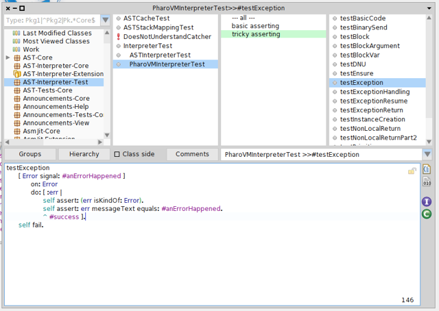
Hello guys, since I do not really like the new buttons introduced in Nautilus, and since the previous one were broken, I propose this new set of buttons based on the eclipse theme. Tell me what you think about it :) Ben


Just out of curiosity (this is not a rhetoric question, i just don't know it) - when should i look at the bytecode? And are there enough use cases to justify such a very prominent place in the UI? Or would a place in the context menu be enough? Or a plugin, if there are people - like compiler developers - who need these buttons on a regular basis? -- View this message in context: http://forum.world.st/New-Nautilus-side-bar-buttons-tp4751455p4751461.html Sent from the Pharo Smalltalk Developers mailing list archive at Nabble.com.

I am not a compiler developer but I am interested in bytecodes. The whole set of buttons on that location should be a plugin area IMHO. So that we can easily extend it. NautilusPlugins enhancements would make for a great Pharo4 theme indeed. Phil On Fri, Mar 28, 2014 at 6:24 PM, MartinW <wm@fastmail.fm> wrote:
Just out of curiosity (this is not a rhetoric question, i just don't know it) - when should i look at the bytecode? And are there enough use cases to justify such a very prominent place in the UI? Or would a place in the context menu be enough? Or a plugin, if there are people - like compiler developers - who need these buttons on a regular basis?
-- View this message in context: http://forum.world.st/New-Nautilus-side-bar-buttons-tp4751455p4751461.html Sent from the Pharo Smalltalk Developers mailing list archive at Nabble.com.
On 28 Mar 2014, at 18:24, MartinW <wm@fastmail.fm> wrote:
Just out of curiosity (this is not a rhetoric question, i just don't know it) - when should i look at the byte code?
Thatâs a good question :) I usually look at byte code when I have strange compilation errors.
And are there enough use cases to justify such a very prominent place in the UI?
I do not know if it needs such an important place, thatâs true. Maybe we should think about it for Pharo 4.0 :) Ben
Too bad, we'll have to wait for 4.0 (or 3.1 to get them...) Jokes aside, they are very nice. And I want them. Where is the slice? Phil On Fri, Mar 28, 2014 at 5:57 PM, Benjamin < Benjamin.VanRyseghem.Pharo@gmail.com> wrote:
Hello guys,
since I do not really like the new buttons introduced in Nautilus, and since the previous one were broken, I propose this new set of buttons based on the eclipse theme.
Tell me what you think about it :) Ben

On 28 Mar 2014, at 18:24, phil@highoctane.be wrote:
Too bad, we'll have to wait for 4.0 (or 3.1 to get themâ¦)
As it is actually fixing something, maybe it will make it :)
Jokes aside, they are very nice. And I want them. Where is the slice?

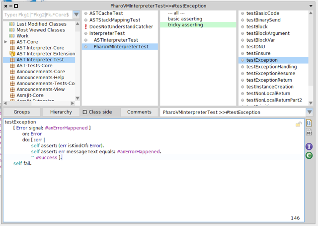
hi Benjamin,  I really like them better than the current UI mess regarding the right toolbar in Nautilus and would like to see them changed before for the release. But the "I" icon means (Java) interface in Eclipse and the button in Pharo is for instance variables. The "C" icon means (Java) class in Eclipse/Java and the button in Pharo is for class variables. That may confuse people coming from Eclipse world.  Thx T.  Gesendet: Freitag, 28. März 2014 um 17:57 Uhr Von: Benjamin <Benjamin.VanRyseghem.Pharo@gmail.com> An: "Pharo Development List" <pharo-dev@lists.pharo.org> Betreff: [Pharo-dev] New Nautilus side bar buttons Hello guys,  since I do not really like the new buttons introduced in Nautilus, and since the previous one were broken, I propose this new set of buttons based on the eclipse theme.   Tell me what you think about it :) Ben

Beautiful. Thank you ! But how dare you propose a change, please stop contributing, I hate people who actually do stuff ;-) On 28 Mar 2014, at 17:57, Benjamin <Benjamin.VanRyseghem.Pharo@gmail.com> wrote:
Hello guys,
since I do not really like the new buttons introduced in Nautilus, and since the previous one were broken, I propose this new set of buttons based on the eclipse theme.
<Nautilus new buttons.png> <closeup.png>
Tell me what you think about it :) Ben
On 28 Mar 2014, at 19:31, Sven Van Caekenberghe <sven@stfx.eu> wrote:
Beautiful. Thank you !
Thanks :)
But how dare you propose a change, please stop contributing, I hate people who actually do stuff ;-)
The question is not about people doing things, itâs about introducing things that are not fixes or critical. Of it is decided to not integrate this in 3.0, I am totally fine with it as the buttons work (even if they look bad). Ben
On 28 Mar 2014, at 19:35, Benjamin <Benjamin.VanRyseghem.Pharo@gmail.com> wrote:
But how dare you propose a change, please stop contributing, I hate people who actually do stuff ;-)
The question is not about people doing things, itâs about introducing things that are not fixes or critical. Of it is decided to not integrate this in 3.0, I am totally fine with it as the buttons work (even if they look bad).
Well, I am seriously pissed off by the latest discussion, can't you tell ?

On 28 Mar 2014, at 17:57, Benjamin <Benjamin.VanRyseghem.Pharo@gmail.com> wrote:
Hello guys,
since I do not really like the new buttons introduced in Nautilus, and since the previous one were broken, I propose this new set of buttons based on the eclipse theme.
<Nautilus new buttons.png> <closeup.png>
Tell me what you think about it :)
much nicer! Tx
Ben

Really? What was wrong with the old one? 2014-03-28 17:57 GMT+01:00 Benjamin <Benjamin.VanRyseghem.Pharo@gmail.com>:
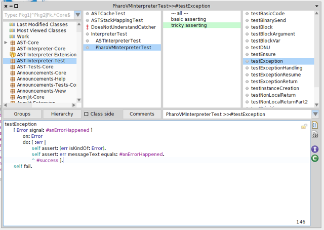
Hello guys,
since I do not really like the new buttons introduced in Nautilus, and since the previous one were broken, I propose this new set of buttons based on the eclipse theme.
Tell me what you think about it :) Ben


On Sat, Mar 29, 2014 at 12:44 AM, Benjamin < Benjamin.VanRyseghem.Pharo@gmail.com> wrote:
On 28 Mar 2014, at 23:16, Nicolai Hess <nicolaihess@web.de> wrote:
Really?
What was wrong with the old one?
They look 70' :) And the B button misses a butt :)
Ah, yet another effect of introducing a new compiler without decompiling abilities... Phil
Ben

Le 29/03/2014 10:08, phil@highoctane.be a écrit :
Ah, yet another effect of introducing a new compiler without decompiling abilities...
Ouch! -- Dr. Geo http://drgeo.eu
It looks nice but I don't think there are right because they are not really informative. Color scheme is strange why purple and green? Then byte code is not really bits. The old ones are just more informative althought not as nice. Hilaire Le 28/03/2014 17:57, Benjamin a écrit :
Hello guys,
since I do not really like the new buttons introduced in Nautilus, and since the previous one were broken, I propose this new set of buttons based on the eclipse theme.
-- Dr. Geo http://drgeo.eu

I must confess that I never use those buttons but yours doesnât look broken so, yes: +1 On Mar 28, 2014, at 1:57 PM, Benjamin <benjamin.vanryseghem.pharo@gmail.com> wrote:
Hello guys,
since I do not really like the new buttons introduced in Nautilus, and since the previous one were broken, I propose this new set of buttons based on the eclipse theme.
<Nautilus new buttons.png> <closeup.png>
Tell me what you think about it :) Ben

I like the buttons but the interface image can be confusing (not just mean âinterfaceâ in java, but we use a slightly modified version for mark traits). Also in color it looks like too strong for me. Using the gray version as suggested before in the thread can be a good solution (even if it has other problems :P) Esteban On 30 Mar 2014, at 11:32, Sebastian Sastre <sebastian@flowingconcept.com> wrote:

Same for me, I never use them. I don't really care what they look like but if there is a way to exend this area with a plugin or completely remove it from the layout, the one posting how to do it will get a beer/coffee in Cambridge this summer. On Sun, Mar 30, 2014 at 4:32 PM, Sebastian Sastre < sebastian@flowingconcept.com> wrote:
I must confess that I never use those buttons but yours doesnât look broken
so, yes: +1
On Mar 28, 2014, at 1:57 PM, Benjamin < benjamin.vanryseghem.pharo@gmail.com> wrote:
Hello guys,
since I do not really like the new buttons introduced in Nautilus, and since the previous one were broken, I propose this new set of buttons based on the eclipse theme.
<Nautilus new buttons.png> <closeup.png>
Tell me what you think about it :) Ben
It was supposed to be a plugin at the beginning, then some laziness happened, and it is not a plugin (yet) :) It also adds a lot of complexity in the morphic layout to manage this, but itâs doable :) Ben On 30 Mar 2014, at 21:29, François Stephany <tulipe.moutarde@gmail.com> wrote:
Same for me, I never use them.
I don't really care what they look like but if there is a way to exend this area with a plugin or completely remove it from the layout, the one posting how to do it will get a beer/coffee in Cambridge this summer.
On Sun, Mar 30, 2014 at 4:32 PM, Sebastian Sastre <sebastian@flowingconcept.com> wrote: I must confess that I never use those buttons but yours doesnât look broken
so, yes: +1
On Mar 28, 2014, at 1:57 PM, Benjamin <benjamin.vanryseghem.pharo@gmail.com> wrote:
Hello guys,
since I do not really like the new buttons introduced in Nautilus, and since the previous one were broken, I propose this new set of buttons based on the eclipse theme.
<Nautilus new buttons.png> <closeup.png>
Tell me what you think about it :) Ben
participants (11)
-
 Benjamin
 -
 Esteban Lorenzano
 -
 François Stephany
 -
 Hilaire Fernandes
 -
 MartinW
 -
 Nicolai Hess
 -
 Pharo4Stef
 -
 phil@highoctane.be
 -
 Sebastian Sastre
 -
 Sven Van Caekenberghe
 -
 Torsten Bergmann