[Pharo-project] [update 1.2] #12297

12297 ----- - Issue 3525: Compiler>>parserClass is broken and does not querying the class for providing the parser class. Thanks Igor Stasenko. - Glamourous setting as default.

On Wed, Jan 12, 2011 at 4:45 PM, Sven Van Caekenberghe <sven@beta9.be>wrote:
On 12 Jan 2011, at 16:30, Stéphane Ducasse wrote:
- Glamourous setting as default.
Yes! Maybe a bit dull, but clean and professional, my favorite!
But it is not about that. As torsten said, there are books, screencasts, screnshots, tutorials, etc, which are done with Watery2. you, and all Pharo advanced users can easily change the theme, and you probbaly even have a script prepare that you run in each clean image to adapt it to your taste. But I think we should make the life easier for new comers. In addition, it was never discussed in the mailing list such change (at least I didn't see it). cheers mariano

On Wed, Jan 12, 2011 at 4:56 PM, Mariano Martinez Peck < marianopeck@gmail.com> wrote:
On Wed, Jan 12, 2011 at 4:45 PM, Sven Van Caekenberghe <sven@beta9.be>wrote:
On 12 Jan 2011, at 16:30, Stéphane Ducasse wrote:
- Glamourous setting as default.
Yes! Maybe a bit dull, but clean and professional, my favorite!
But it is not about that. As torsten said, there are books, screencasts, screnshots, tutorials, etc, which are done with Watery2.
I agree with that and keeping Watery2 as default for 1.2 (even if I prefer Glamourous). Laurent
you, and all Pharo advanced users can easily change the theme, and you probbaly even have a script prepare that you run in each clean image to adapt it to your taste. But I think we should make the life easier for new comers. In addition, it was never discussed in the mailing list such change (at least I didn't see it).
cheers
mariano

On 12 January 2011 16:56, Mariano Martinez Peck <marianopeck@gmail.com> wrote:
On Wed, Jan 12, 2011 at 4:45 PM, Sven Van Caekenberghe <sven@beta9.be> wrote:
On 12 Jan 2011, at 16:30, Stéphane Ducasse wrote:
- Glamourous setting as default.
Yes! Maybe a bit dull, but clean and professional, my favorite!
But it is not about that. As torsten said, there are books, screencasts, screnshots, tutorials, etc, which are done with Watery2.
so , you're an addict! :) Ubuntu changes its skin every single release.. and i am pretty sure that there are books, screencasts, screnshots, tutorials, etc for Ubuntu as well. (btw i think they established really good tradition, because people could quickly distinguish one version from another by simply taking a glance on the screen) Get used to live in ever changing world :)
you, and all Pharo advanced users can easily change the theme, and you probbaly even have a script prepare that you run in each clean image to adapt it to your taste.
UIThemeWatery2 beCurrent. be my guest :) http://bit.ly/gi7vb7
But I think we should make the life easier for new comers. In addition, it was never discussed in the mailing list such change (at least I didn't see it).
i agree, it is better to discuss broadly before changing. I like the glamourous theme because it is minimalistic and elegant. Still the colors are a bit wrong as to my taste, especially selection (light blue).
cheers
mariano
-- Best regards, Igor Stasenko AKA sig.

On 12 Jan 2011, at 22:12, Igor Stasenko wrote:
Ubuntu changes its skin every single release.. and i am pretty sure that there are books, screencasts, screnshots, tutorials, etc for Ubuntu as well.
(btw i think they established really good tradition, because people could quickly distinguish one version from another by simply taking a glance on the screen)
Good point: new look == new version The compatibility point is also good. The OS independence point is also good.
Get used to live in ever changing world :)
you, and all Pharo advanced users can easily change the theme, and you probbaly even have a script prepare that you run in each clean image to adapt it to your taste.
UIThemeWatery2 beCurrent.
be my guest :) http://bit.ly/gi7vb7
But I think we should make the life easier for new comers. In addition, it was never discussed in the mailing list such change (at least I didn't see it).
i agree, it is better to discuss broadly before changing.
I like the glamourous theme because it is minimalistic and elegant. Still the colors are a bit wrong as to my taste, especially selection (light blue).
I made my own subclass overriding 3 color constants to orange. 'Sven-Glamour-Theme' @ SqueakSource project ADayAtTheBeach. Sven
On 12 January 2011 23:17, Sven Van Caekenberghe <sven@beta9.be> wrote:
On 12 Jan 2011, at 22:12, Igor Stasenko wrote:
Ubuntu changes its skin every single release.. and i am pretty sure that there are books, screencasts, screnshots, tutorials, etc for Ubuntu as well.
(btw i think they established really good tradition, because people could quickly distinguish one version from another by simply taking a glance on the screen)
Good point: new look == new version
The compatibility point is also good.
The OS independence point is also good.
Get used to live in ever changing world :)
you, and all Pharo advanced users can easily change the theme, and you probbaly even have a script prepare that you run in each clean image to adapt it to your taste.
UIThemeWatery2 beCurrent.
be my guest :) http://bit.ly/gi7vb7
But I think we should make the life easier for new comers. In addition, it was never discussed in the mailing list such change (at least I didn't see it).
i agree, it is better to discuss broadly before changing.
I like the glamourous theme because it is minimalistic and elegant. Still the colors are a bit wrong as to my taste, especially selection (light blue).
I made my own subclass overriding 3 color constants to orange. 'Sven-Glamour-Theme' @ SqueakSource project ADayAtTheBeach.
Kewl.. Orange is much much better. I modified it a little. Check it out
Sven
-- Best regards, Igor Stasenko AKA sig.
indeed igor this is nice. Doru may be you could take this change for your look? Stef On Jan 13, 2011, at 1:26 AM, Igor Stasenko wrote:
On 12 January 2011 23:17, Sven Van Caekenberghe <sven@beta9.be> wrote:
On 12 Jan 2011, at 22:12, Igor Stasenko wrote:
Ubuntu changes its skin every single release.. and i am pretty sure that there are books, screencasts, screnshots, tutorials, etc for Ubuntu as well.
(btw i think they established really good tradition, because people could quickly distinguish one version from another by simply taking a glance on the screen)
Good point: new look == new version
The compatibility point is also good.
The OS independence point is also good.
Get used to live in ever changing world :)
you, and all Pharo advanced users can easily change the theme, and you probbaly even have a script prepare that you run in each clean image to adapt it to your taste.
UIThemeWatery2 beCurrent.
be my guest :) http://bit.ly/gi7vb7
But I think we should make the life easier for new comers. In addition, it was never discussed in the mailing list such change (at least I didn't see it).
i agree, it is better to discuss broadly before changing.
I like the glamourous theme because it is minimalistic and elegant. Still the colors are a bit wrong as to my taste, especially selection (light blue).
I made my own subclass overriding 3 color constants to orange. 'Sven-Glamour-Theme' @ SqueakSource project ADayAtTheBeach.
Kewl.. Orange is much much better.
I modified it a little. Check it out
Sven
-- Best regards, Igor Stasenko AKA sig. <GLMUITheme2.st>

Hi, Thanks for the suggestion. However, I won't include it because it just does not fit the purpose of the original theme which is to be simple and non-intrusive (actually, there are still things left to remove but I did not get around to do it). Cheers, Doru On 13 Jan 2011, at 09:19, Stéphane Ducasse wrote:
indeed igor this is nice. Doru may be you could take this change for your look?
Stef
On Jan 13, 2011, at 1:26 AM, Igor Stasenko wrote:
On 12 January 2011 23:17, Sven Van Caekenberghe <sven@beta9.be> wrote:
On 12 Jan 2011, at 22:12, Igor Stasenko wrote:
Ubuntu changes its skin every single release.. and i am pretty sure that there are books, screencasts, screnshots, tutorials, etc for Ubuntu as well.
(btw i think they established really good tradition, because people could quickly distinguish one version from another by simply taking a glance on the screen)
Good point: new look == new version
The compatibility point is also good.
The OS independence point is also good.
Get used to live in ever changing world :)
you, and all Pharo advanced users can easily change the theme, and you probbaly even have a script prepare that you run in each clean image to adapt it to your taste.
UIThemeWatery2 beCurrent.
be my guest :) http://bit.ly/gi7vb7
But I think we should make the life easier for new comers. In addition, it was never discussed in the mailing list such change (at least I didn't see it).
i agree, it is better to discuss broadly before changing.
I like the glamourous theme because it is minimalistic and elegant. Still the colors are a bit wrong as to my taste, especially selection (light blue).
I made my own subclass overriding 3 color constants to orange. 'Sven-Glamour-Theme' @ SqueakSource project ADayAtTheBeach.
Kewl.. Orange is much much better.
I modified it a little. Check it out
Sven
-- Best regards, Igor Stasenko AKA sig. <GLMUITheme2.st>
-- www.tudorgirba.com "Next time you see your life passing by, say 'hi' and get to know her."
On Thu, Jan 13, 2011 at 10:23 AM, Tudor Girba <tudor.girba@gmail.com> wrote:
Hi,
Thanks for the suggestion. However, I won't include it because it just does not fit the purpose of the original theme which is to be simple and non-intrusive (actually, there are still things left to remove but I did not get around to do it).
I don't get it. I guess the theme is MIT and this is why it is included in PharoCore. What did you mean by "I won't include it" ? where?
Cheers, Doru
On 13 Jan 2011, at 09:19, Stéphane Ducasse wrote:
indeed igor this is nice. Doru may be you could take this change for your look?
Stef
On Jan 13, 2011, at 1:26 AM, Igor Stasenko wrote:
On 12 January 2011 23:17, Sven Van Caekenberghe <sven@beta9.be> wrote:
On 12 Jan 2011, at 22:12, Igor Stasenko wrote:
Ubuntu changes its skin every single release.. and i am pretty sure that there are books, screencasts, screnshots, tutorials, etc for Ubuntu as well.
(btw i think they established really good tradition, because people could quickly distinguish one version from another by simply taking a glance on the screen)
Good point: new look == new version
The compatibility point is also good.
The OS independence point is also good.
Get used to live in ever changing world :)
you, and all Pharo advanced users can easily change the theme, and
you
probbaly even have a script prepare that you run in each clean image to adapt it to your taste.
UIThemeWatery2 beCurrent.
be my guest :) http://bit.ly/gi7vb7
But I think we should make the life easier for new comers. In addition, it was never discussed in the mailing list such change (at least I didn't see it).
i agree, it is better to discuss broadly before changing.
I like the glamourous theme because it is minimalistic and elegant. Still the colors are a bit wrong as to my taste, especially selection (light blue).
I made my own subclass overriding 3 color constants to orange. 'Sven-Glamour-Theme' @ SqueakSource project ADayAtTheBeach.
Kewl.. Orange is much much better.
I modified it a little. Check it out
Sven
-- Best regards, Igor Stasenko AKA sig. <GLMUITheme2.st>
-- www.tudorgirba.com
"Next time you see your life passing by, say 'hi' and get to know her."
Of course, it is MIT and you can do what you want with it. I simply answered the question from Stef, and I meant that I won't include it in the code from the Glamour repository. If you do want to modify it in the mentioned direction, I would kindly ask you to use a different name to avoid confusion and conflicts - this theme is used by the Moose distribution. Cheers, Doru On 13 Jan 2011, at 10:32, Mariano Martinez Peck wrote:
On Thu, Jan 13, 2011 at 10:23 AM, Tudor Girba <tudor.girba@gmail.com> wrote: Hi,
Thanks for the suggestion. However, I won't include it because it just does not fit the purpose of the original theme which is to be simple and non-intrusive (actually, there are still things left to remove but I did not get around to do it).
I don't get it. I guess the theme is MIT and this is why it is included in PharoCore. What did you mean by "I won't include it" ? where?
Cheers, Doru
On 13 Jan 2011, at 09:19, Stéphane Ducasse wrote:
indeed igor this is nice. Doru may be you could take this change for your look?
Stef
On Jan 13, 2011, at 1:26 AM, Igor Stasenko wrote:
On 12 January 2011 23:17, Sven Van Caekenberghe <sven@beta9.be> wrote:
On 12 Jan 2011, at 22:12, Igor Stasenko wrote:
Ubuntu changes its skin every single release.. and i am pretty sure that there are books, screencasts, screnshots, tutorials, etc for Ubuntu as well.
(btw i think they established really good tradition, because people could quickly distinguish one version from another by simply taking a glance on the screen)
Good point: new look == new version
The compatibility point is also good.
The OS independence point is also good.
Get used to live in ever changing world :)
you, and all Pharo advanced users can easily change the theme, and you probbaly even have a script prepare that you run in each clean image to adapt it to your taste.
UIThemeWatery2 beCurrent.
be my guest :) http://bit.ly/gi7vb7
But I think we should make the life easier for new comers. In addition, it was never discussed in the mailing list such change (at least I didn't see it).
i agree, it is better to discuss broadly before changing.
I like the glamourous theme because it is minimalistic and elegant. Still the colors are a bit wrong as to my taste, especially selection (light blue).
I made my own subclass overriding 3 color constants to orange. 'Sven-Glamour-Theme' @ SqueakSource project ADayAtTheBeach.
Kewl.. Orange is much much better.
I modified it a little. Check it out
Sven
-- Best regards, Igor Stasenko AKA sig. <GLMUITheme2.st>
-- www.tudorgirba.com
"Next time you see your life passing by, say 'hi' and get to know her."
-- www.tudorgirba.com "In a world where everything is moving ever faster, one might have better chances to win by moving slower."
On 13 January 2011 10:41, Tudor Girba <tudor.girba@gmail.com> wrote:
Of course, it is MIT and you can do what you want with it. I simply answered the question from Stef, and I meant that I won't include it in the code from the Glamour repository. If you do want to modify it in the mentioned direction, I would kindly ask you to use a different name to avoid confusion and conflicts - this theme is used by the Moose distribution.
Can you clarify: a) you don't want to modify Glamorous theme (GLMUITheme) by taking all methods from GLMUITheme2. b) you don't want to add a GLMUITheme2 , which is a subclass of GLMUITheme because these changes could live in GLMUITheme2, which is perfectly fine, while keeping an original GLMUITheme not changed. And we can call GLMUITheme2 a 'Glamorous orange' :)
Cheers, Doru
-- Best regards, Igor Stasenko AKA sig.
Hi, On 13 Jan 2011, at 11:12, Igor Stasenko wrote:
On 13 January 2011 10:41, Tudor Girba <tudor.girba@gmail.com> wrote:
Of course, it is MIT and you can do what you want with it. I simply answered the question from Stef, and I meant that I won't include it in the code from the Glamour repository. If you do want to modify it in the mentioned direction, I would kindly ask you to use a different name to avoid confusion and conflicts - this theme is used by the Moose distribution.
Can you clarify: a) you don't want to modify Glamorous theme (GLMUITheme) by taking all methods from GLMUITheme2.
Yes
b) you don't want to add a GLMUITheme2 , which is a subclass of GLMUITheme because these changes could live in GLMUITheme2, which is perfectly fine, while keeping an original GLMUITheme not changed. And we can call GLMUITheme2 a 'Glamorous orange' :)
Yes :). It's true that technically it would work, but from an intention point of view it does not fit. Also, in general, except on very few occasions, I won't support adding anything that has a number at the end to distinguish the name :). Cheers, Doru -- www.tudorgirba.com "The coherence of a trip is given by the clearness of the goal."
On 13 January 2011 11:29, Tudor Girba <tudor.girba@gmail.com> wrote:
Hi,
On 13 Jan 2011, at 11:12, Igor Stasenko wrote:
On 13 January 2011 10:41, Tudor Girba <tudor.girba@gmail.com> wrote:
Of course, it is MIT and you can do what you want with it. I simply answered the question from Stef, and I meant that I won't include it in the code from the Glamour repository. If you do want to modify it in the mentioned direction, I would kindly ask you to use a different name to avoid confusion and conflicts - this theme is used by the Moose distribution.
Can you clarify: a) you don't want to modify Glamorous theme (GLMUITheme) by taking all methods from GLMUITheme2.
Yes
b) you don't want to add a GLMUITheme2 , which is a subclass of GLMUITheme because these changes could live in GLMUITheme2, which is perfectly fine, while keeping an original GLMUITheme not changed. And we can call GLMUITheme2 a  'Glamorous orange' :)
Yes :). It's true that technically it would work, but from an intention point of view it does not fit. Also, in general, except on very few occasions, I won't support adding anything that has a number at the end to distinguish the name :).
Not a big deal.. We can rename it to GLMOrangeUITheme and make available to Pharo people? Still no? :)
Cheers, Doru
-- www.tudorgirba.com
"The coherence of a trip is given by the clearness of the goal."
-- Best regards, Igor Stasenko AKA sig.
I tried to avoid a lengthy mail, but now I need to explain. UI design should be approached with the same rigor as system design. A community is better than an individual in producing solutions, but only when the effort is in concert under a shared vision. If the arguments are just about "I like this better", the process transforms into a design by committee which usually leads to poor results. So, let me share my "vision". The first thing that design should address is functionality (although visual appeal has a significant weight, too). In general, when you want to design something you should ask yourself why do you need to do that. The intention of the Glamour-Morphic-Theme package is to offer a look that uses a minimum amount of graphical variables while allowing you to focus on the main content - which is that thing that you work on, not that thing that you use for your work. I tried to start from zero and add a new variable (e.g., color) only when I could not distinguish something. There are still things that are superfluous (e.g., the border around all tabs, or the bulky shape of an expander), but I did not have enough time and Morphic expertise to do better. Now, orange vs blue is actually not just a matter of taste because your orange is not the same as my blue. There are two reasons: (1) it is stronger, and (2) it appears in more places (e.g., at the bottom of the scrollbar). This means that it will compete for my attention with more force. This might be your intention, but it is not mine because it takes away from my main focus which is the content. Suppose you would make the orange have the same visual weight as the current blue, then it would still not be the same because orange does not mean the same as blue in the cultural meaning it tends to raise. For example, blue is usually perceived as more neutral than other colors, and I want to use blue for this reason (and also because it is the color of Moose). So, all in all, I do not want GLMOrangeUITheme in the Glamour-Morphic-Theme package :), but I do invite people with a UI design interest to build a shared vision that matches the one of the overall Pharo. Doru On 13 Jan 2011, at 11:46, Igor Stasenko wrote:
On 13 January 2011 11:29, Tudor Girba <tudor.girba@gmail.com> wrote:
Hi,
On 13 Jan 2011, at 11:12, Igor Stasenko wrote:
On 13 January 2011 10:41, Tudor Girba <tudor.girba@gmail.com> wrote:
Of course, it is MIT and you can do what you want with it. I simply answered the question from Stef, and I meant that I won't include it in the code from the Glamour repository. If you do want to modify it in the mentioned direction, I would kindly ask you to use a different name to avoid confusion and conflicts - this theme is used by the Moose distribution.
Can you clarify: a) you don't want to modify Glamorous theme (GLMUITheme) by taking all methods from GLMUITheme2.
Yes
b) you don't want to add a GLMUITheme2 , which is a subclass of GLMUITheme because these changes could live in GLMUITheme2, which is perfectly fine, while keeping an original GLMUITheme not changed. And we can call GLMUITheme2 a 'Glamorous orange' :)
Yes :). It's true that technically it would work, but from an intention point of view it does not fit. Also, in general, except on very few occasions, I won't support adding anything that has a number at the end to distinguish the name :).
Not a big deal.. We can rename it to GLMOrangeUITheme
and make available to Pharo people? Still no? :)
Cheers, Doru
-- www.tudorgirba.com
"The coherence of a trip is given by the clearness of the goal."
-- Best regards, Igor Stasenko AKA sig.
-- www.tudorgirba.com "To lead is not to demand things, it is to make them happen."
On 13 January 2011 12:29, Tudor Girba <tudor.girba@gmail.com> wrote:
I tried to avoid a lengthy mail, but now I need to explain.
UI design should be approached with the same rigor as system design. A community is better than an individual in producing solutions, but only when the effort is in concert under a shared vision. If the arguments are just about "I like this better", the process transforms into a design by committee which usually leads to poor results. So, let me share my "vision".
The first thing that design should address is functionality (although visual appeal has a significant weight, too). In general, when you want to design something you should ask yourself why do you need to do that.
The intention of the Glamour-Morphic-Theme package is to offer a look that uses a minimum amount of graphical variables while allowing you to focus on the main content - which is that thing that you work on, not that thing that you use for your work.
I tried to start from zero and add a new variable (e.g., color) only when I could not distinguish something. There are still things that are superfluous (e.g., the border around all tabs, or the bulky shape of an expander), but I did not have enough time and Morphic expertise to do better.
That's why i like your theme. Because it is clean and simple and not overloaded with tons of eye candy. Yet it is elegant.
Now, orange vs blue is actually not just a matter of taste because your orange is not the same as my blue. There are two reasons: (1) it is stronger, and (2) it appears in more places (e.g., at the bottom of the scrollbar). This means that it will compete for my attention with more force. This might be your intention, but it is not mine because it takes away from my main focus which is the content.
I don't wanted to analyze why.. but if you want it.. Because orange for selection color fits much better: exactly because it should draw an attention, because i need that - i need to see what item(s) i selected, and orange serves better because it is higher contrast on gray/white background comparing to pale blue.
Suppose you would make the orange have the same visual weight as the current blue, then it would still not be the same because orange does not mean the same as blue in the cultural meaning it tends to raise. For example, blue is usually perceived as more neutral than other colors, and I want to use blue for this reason (and also because it is the color of Moose).
you lost me here. i never associating colors with cultural meaning.
So, all in all, I do not want GLMOrangeUITheme in the Glamour-Morphic-Theme package :), but I do invite people with a UI design interest to build a shared vision that matches the one of the overall Pharo.
Okay.. it can be always putted into separate package.
Doru
-- Best regards, Igor Stasenko AKA sig.
Hi, On 13 Jan 2011, at 13:18, Igor Stasenko wrote:
On 13 January 2011 12:29, Tudor Girba <tudor.girba@gmail.com> wrote:
I tried to avoid a lengthy mail, but now I need to explain.
UI design should be approached with the same rigor as system design. A community is better than an individual in producing solutions, but only when the effort is in concert under a shared vision. If the arguments are just about "I like this better", the process transforms into a design by committee which usually leads to poor results. So, let me share my "vision".
The first thing that design should address is functionality (although visual appeal has a significant weight, too). In general, when you want to design something you should ask yourself why do you need to do that.
The intention of the Glamour-Morphic-Theme package is to offer a look that uses a minimum amount of graphical variables while allowing you to focus on the main content - which is that thing that you work on, not that thing that you use for your work.
I tried to start from zero and add a new variable (e.g., color) only when I could not distinguish something. There are still things that are superfluous (e.g., the border around all tabs, or the bulky shape of an expander), but I did not have enough time and Morphic expertise to do better.
That's why i like your theme. Because it is clean and simple and not overloaded with tons of eye candy. Yet it is elegant.
Now, orange vs blue is actually not just a matter of taste because your orange is not the same as my blue. There are two reasons: (1) it is stronger, and (2) it appears in more places (e.g., at the bottom of the scrollbar). This means that it will compete for my attention with more force. This might be your intention, but it is not mine because it takes away from my main focus which is the content.
I don't wanted to analyze why.. but if you want it.. Because orange for selection color fits much better: exactly because it should draw an attention, because i need that - i need to see what item(s) i selected, and orange serves better because it is higher contrast on gray/white background comparing to pale blue.
Ok, we disagree, but that is fine, too :).
Suppose you would make the orange have the same visual weight as the current blue, then it would still not be the same because orange does not mean the same as blue in the cultural meaning it tends to raise. For example, blue is usually perceived as more neutral than other colors, and I want to use blue for this reason (and also because it is the color of Moose).
you lost me here. i never associating colors with cultural meaning.
So, all in all, I do not want GLMOrangeUITheme in the Glamour-Morphic-Theme package :), but I do invite people with a UI design interest to build a shared vision that matches the one of the overall Pharo.
Okay.. it can be always putted into separate package.
That is what I am saying :). Thanks for understanding. Cheers, Doru
Doru
-- Best regards, Igor Stasenko AKA sig.
-- www.tudorgirba.com "Some battles are better lost than fought."

On 13/01/2011 11:29, Tudor Girba wrote:
I tried to start from zero and add a new variable (e.g., color) only when I could not distinguish something. There are still things that are superfluous (e.g., the border around all tabs, or the bulky shape of an expander), but I did not have enough time and Morphic expertise to do better.
Now, orange vs blue is actually not just a matter of taste because your orange is not the same as my blue. There are two reasons: (1) it is stronger, and (2) it appears in more places (e.g., at the bottom of the scrollbar). This means that it will compete for my attention with more force. This might be your intention, but it is not mine because it takes away from my main focus which is the content.
I admit that I do like the blue for selections. However, I find that the blue gradient on the buttons is difficult to see clearly. I suspect this is because the chosen blue has high contrast against the white background of the list but *extremely* poor contrast with the grey button/frame background. If you look at the browser in greyscale, the difference stands out starkly (see the attached image). I also find all of the buttons without white borders seem to blend into the background so much as to become difficult to distinguish. Otherwise, I do like it :)
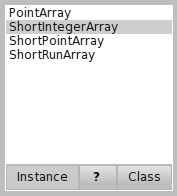
here is updated version of it. more consistent colors (note the ">" button now not highlighted by default, also added thin border for lists and thin border for system windows, and removed 1pixel-wide shadow for system window. -- Best regards, Igor Stasenko AKA sig.
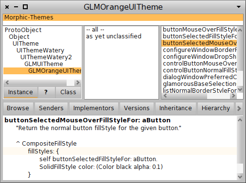
I like the simple border around the windows. I adopted it in the Glamorous Theme :) Cheers, Doru On 13 Jan 2011, at 19:36, Igor Stasenko wrote:
here is updated version of it. more consistent colors (note the ">" button now not highlighted by default, also added thin border for lists and thin border for system windows, and removed 1pixel-wide shadow for system window.
-- Best regards, Igor Stasenko AKA sig. <GLMOrangeUITheme.st><GLMOrangeUITheme.png>
-- www.tudorgirba.com "Relationships are of two kinds: those we choose and those that happen. They both matter."
On 13 January 2011 23:09, Tudor Girba <tudor.girba@gmail.com> wrote:
I like the simple border around the windows. I adopted it in the Glamorous Theme :)
btw, i suggest you to fix all the places to use theme settings instead of direct colors, so your theme settings could be changed from Settings UI For example: glamorousBaseSelectionColorFor: aButton ^ settings selectionColor instead of: glamorousBaseSelectionColorFor: aButton ^ self class baseSelectionColor and by changing 'Selection color' in settings, i can change Orange->Blue :) Btw, there is a bug in Polymorph, it ignores the 'Find replace selection color' setting There is one widget which doesn't honors the text selection color - find and replace dialog. Btw, it would be cool to make theme consistent with all colors, used by settings (filter by *color*)
Cheers, Doru
-- Best regards, Igor Stasenko AKA sig.
doru could push a new version in the inbox? Stef On Jan 13, 2011, at 11:09 PM, Tudor Girba wrote:
I like the simple border around the windows. I adopted it in the Glamorous Theme :)
Cheers, Doru
On 13 Jan 2011, at 19:36, Igor Stasenko wrote:
here is updated version of it. more consistent colors (note the ">" button now not highlighted by default, also added thin border for lists and thin border for system windows, and removed 1pixel-wide shadow for system window.
-- Best regards, Igor Stasenko AKA sig. <GLMOrangeUITheme.st><GLMOrangeUITheme.png>
-- www.tudorgirba.com
"Relationships are of two kinds: those we choose and those that happen. They both matter."
Done. Doru On 14 Jan 2011, at 09:06, Stéphane Ducasse wrote:
doru could push a new version in the inbox?
Stef
On Jan 13, 2011, at 11:09 PM, Tudor Girba wrote:
I like the simple border around the windows. I adopted it in the Glamorous Theme :)
Cheers, Doru
On 13 Jan 2011, at 19:36, Igor Stasenko wrote:
here is updated version of it. more consistent colors (note the ">" button now not highlighted by default, also added thin border for lists and thin border for system windows, and removed 1pixel-wide shadow for system window.
-- Best regards, Igor Stasenko AKA sig. <GLMOrangeUITheme.st><GLMOrangeUITheme.png>
-- www.tudorgirba.com
"Relationships are of two kinds: those we choose and those that happen. They both matter."
-- www.tudorgirba.com "Value is always contextual."
That is a good point. I actually used the Sim Daltonism application (for Mac) to check the color blindness issues, but it looks like I overlooked Monochromacy (however, this is pretty rare). I will try to look into that. Cheers, Doru On 13 Jan 2011, at 16:22, Douglas Brebner wrote:
On 13/01/2011 11:29, Tudor Girba wrote:
I tried to start from zero and add a new variable (e.g., color) only when I could not distinguish something. There are still things that are superfluous (e.g., the border around all tabs, or the bulky shape of an expander), but I did not have enough time and Morphic expertise to do better.
Now, orange vs blue is actually not just a matter of taste because your orange is not the same as my blue. There are two reasons: (1) it is stronger, and (2) it appears in more places (e.g., at the bottom of the scrollbar). This means that it will compete for my attention with more force. This might be your intention, but it is not mine because it takes away from my main focus which is the content.
I admit that I do like the blue for selections. However, I find that the blue gradient on the buttons is difficult to see clearly.
I suspect this is because the chosen blue has high contrast against the white background of the list but *extremely* poor contrast with the grey button/frame background. If you look at the browser in greyscale, the difference stands out starkly (see the attached image).
I also find all of the buttons without white borders seem to blend into the background so much as to become difficult to distinguish.
Otherwise, I do like it :) <Pharo-button-grey.jpg>
-- www.tudorgirba.com "Relationships are of two kinds: those we choose and those that happen. They both matter."
On 13/01/2011 22:04, Tudor Girba wrote:
That is a good point. I actually used the Sim Daltonism application (for Mac) to check the color blindness issues, but it looks like I overlooked Monochromacy (however, this is pretty rare). I will try to look into that.
Cheers, Doru
It's not just the colour blind that are affected (though they have it worst). Even people with perfect vision can find it difficult to distinguish adjacent areas of similar contrast. e.g. If you look at the save changes window that appears when quitting an image you'll notice the buttons almost disappear into the background. Still, it's good that someone is working on this :)
On 14 January 2011 12:33, Douglas Brebner <squeaklists@fang.demon.co.uk> wrote:
On 13/01/2011 22:04, Tudor Girba wrote:
That is a good point. I actually used the Sim Daltonism application (for Mac) to check the color blindness issues, but it looks like I overlooked Monochromacy (however, this is pretty rare). I will try to look into that.
Cheers, Doru
It's not just the colour blind that are affected (though they have it worst). Even people with perfect vision can find it difficult to distinguish adjacent areas of similar contrast.
e.g. If you look at the save changes window that appears when quitting an image you'll notice the buttons almost disappear into the background.
Still, it's good that someone is working on this :)
yeah.. if you not cleaning your house, do not expect guests to come :)
-- Best regards, Igor Stasenko AKA sig.

Just FYI... On the class side of UITheme there is the defaultSettings... used when changing themes to initialise the new theme. Handy for having settings that survive theme changes. For those of you wanting to retain certain colour changes, this is the thing to edit. Should survive updates etc. Would be nice to have Settings support for both the current and defaults though ;-) Regards, Gary ----- Original Message ----- From: "Igor Stasenko" <siguctua@gmail.com> To: <Pharo-project@lists.gforge.inria.fr> Sent: Friday, January 14, 2011 12:00 PM Subject: Re: [Pharo-project] [update 1.2] #12297
On 14 January 2011 12:33, Douglas Brebner <squeaklists@fang.demon.co.uk> wrote:
On 13/01/2011 22:04, Tudor Girba wrote:
That is a good point. I actually used the Sim Daltonism application (for Mac) to check the color blindness issues, but it looks like I overlooked Monochromacy (however, this is pretty rare). I will try to look into that.
Cheers, Doru
It's not just the colour blind that are affected (though they have it worst). Even people with perfect vision can find it difficult to distinguish adjacent areas of similar contrast.
e.g. If you look at the save changes window that appears when quitting an image you'll notice the buttons almost disappear into the background.
Still, it's good that someone is working on this :)
yeah.. if you not cleaning your house, do not expect guests to come :)
-- Best regards, Igor Stasenko AKA sig.
Well, i imagine that different themes can have a different set of editable settings available, and from that perspective the ThemeSettings is limiting, since it contains a list of 'standard' properties, no more no less. So, i proposing to rewrite all uses of: UITheme currentSettings foo with: UITheme current foo and let theme decide how to answer the requested value. For example, one could do: MyTheme>>fooColor ^ Color red "non-editable, hardcoded value" while another one could decide to use color from settings: MyCoolTheme>>fooColor ^ settings at: #fooColor default: Color red And also each theme could tell settings browser, which public properties it having, so, depending on currently installed theme, user could see and change only those, which related to it. Then settings could be a simple dict, where keys is symbols and values is property values. and then, when you changing the current theme , it should simply do: newTheme settings: oldTheme settings so, nothing will be lost, even if new theme does not using some properties, and when user will switching back to old theme, it will continue using settings which already registered by/for it. On 14 January 2011 18:05, Gary Chambers <gazzaguru2@btinternet.com> wrote:
Just FYI... On the class side of UITheme there is the defaultSettings... used when changing themes to initialise the new theme. Handy for having settings that survive theme changes.
For those of you wanting to retain certain colour changes, this is the thing to edit. Should survive updates etc.
Would be nice to have Settings support for both the current and defaults though ;-)
Regards, Gary
----- Original Message ----- From: "Igor Stasenko" <siguctua@gmail.com> To: <Pharo-project@lists.gforge.inria.fr> Sent: Friday, January 14, 2011 12:00 PM Subject: Re: [Pharo-project] [update 1.2] #12297
On 14 January 2011 12:33, Douglas Brebner <squeaklists@fang.demon.co.uk> wrote:
On 13/01/2011 22:04, Tudor Girba wrote:
That is a good point. I actually used the Sim Daltonism application (for Mac) to check the color blindness issues, but it looks like I overlooked Monochromacy (however, this is pretty rare). I will try to look into that.
Cheers, Doru
It's not just the colour blind that are affected (though they have it worst). Even people with perfect vision can find it difficult to distinguish adjacent areas of similar contrast.
e.g. If you look at the save changes window that appears when quitting an image you'll notice the buttons almost disappear into the background.
Still, it's good that someone is working on this :)
yeah.. if you not cleaning your house, do not expect guests to come :)
-- Best regards, Igor Stasenko AKA sig.
-- Best regards, Igor Stasenko AKA sig.
Well, currentSettings is a delegation to the current theme settings... Is equivalent to UITheme current settings. Settings are abstracted out to declutter the theme. The point I was making is that there are settings on the current theme (volatile) and default settings per theme. I take your point, for ease of overriding, but the settings (as called) ware abstracted out since UITheme is already quite a large facade... I don't agree with settings being a dictionary, too many things are already inexplicit! Some kind of meta-description is appropriate though, for use in the Settings browser. Is that not the case already? Regards, Gary ----- Original Message ----- From: "Igor Stasenko" <siguctua@gmail.com> To: <Pharo-project@lists.gforge.inria.fr> Sent: Friday, January 14, 2011 5:40 PM Subject: Re: [Pharo-project] [update 1.2] #12297
Well, i imagine that different themes can have a different set of editable settings available, and from that perspective the ThemeSettings is limiting, since it contains a list of 'standard' properties, no more no less.
So, i proposing to rewrite all uses of:
UITheme currentSettings foo
with:
UITheme current foo
and let theme decide how to answer the requested value.
For example, one could do:
MyTheme>>fooColor ^ Color red "non-editable, hardcoded value"
while another one could decide to use color from settings:
MyCoolTheme>>fooColor ^ settings at: #fooColor default: Color red
And also each theme could tell settings browser, which public properties it having, so, depending on currently installed theme, user could see and change only those, which related to it.
Then settings could be a simple dict, where keys is symbols and values is property values. and then, when you changing the current theme , it should simply do:
newTheme settings: oldTheme settings
so, nothing will be lost, even if new theme does not using some properties, and when user will switching back to old theme, it will continue using settings which already registered by/for it.
On 14 January 2011 18:05, Gary Chambers <gazzaguru2@btinternet.com> wrote:
Just FYI... On the class side of UITheme there is the defaultSettings... used when changing themes to initialise the new theme. Handy for having settings that survive theme changes.
For those of you wanting to retain certain colour changes, this is the thing to edit. Should survive updates etc.
Would be nice to have Settings support for both the current and defaults though ;-)
Regards, Gary
----- Original Message ----- From: "Igor Stasenko" <siguctua@gmail.com> To: <Pharo-project@lists.gforge.inria.fr> Sent: Friday, January 14, 2011 12:00 PM Subject: Re: [Pharo-project] [update 1.2] #12297
On 14 January 2011 12:33, Douglas Brebner <squeaklists@fang.demon.co.uk> wrote:
On 13/01/2011 22:04, Tudor Girba wrote:
That is a good point. I actually used the Sim Daltonism application (for Mac) to check the color blindness issues, but it looks like I overlooked Monochromacy (however, this is pretty rare). I will try to look into that.
Cheers, Doru
It's not just the colour blind that are affected (though they have it worst). Even people with perfect vision can find it difficult to distinguish adjacent areas of similar contrast.
e.g. If you look at the save changes window that appears when quitting an image you'll notice the buttons almost disappear into the background.
Still, it's good that someone is working on this :)
yeah.. if you not cleaning your house, do not expect guests to come :)
-- Best regards, Igor Stasenko AKA sig.
-- Best regards, Igor Stasenko AKA sig.
Example: UITheme currentSettings windowColor: Color orange. World themeChanged. UITheme current class defaultSettings windowColor: Color lightBlue. World themeChanged. " no change" UITheme currentSettings windowColor: Color yellow. World themeChanged. UITheme current class beCurrent "uses default of light blue" Switching between themes uses the theme defaults rather than any modifications to the current theme. Regards, Gary ----- Original Message ----- From: "Igor Stasenko" <siguctua@gmail.com> To: <Pharo-project@lists.gforge.inria.fr> Sent: Friday, January 14, 2011 5:40 PM Subject: Re: [Pharo-project] [update 1.2] #12297
Well, i imagine that different themes can have a different set of editable settings available, and from that perspective the ThemeSettings is limiting, since it contains a list of 'standard' properties, no more no less.
So, i proposing to rewrite all uses of:
UITheme currentSettings foo
with:
UITheme current foo
and let theme decide how to answer the requested value.
For example, one could do:
MyTheme>>fooColor ^ Color red "non-editable, hardcoded value"
while another one could decide to use color from settings:
MyCoolTheme>>fooColor ^ settings at: #fooColor default: Color red
And also each theme could tell settings browser, which public properties it having, so, depending on currently installed theme, user could see and change only those, which related to it.
Then settings could be a simple dict, where keys is symbols and values is property values. and then, when you changing the current theme , it should simply do:
newTheme settings: oldTheme settings
so, nothing will be lost, even if new theme does not using some properties, and when user will switching back to old theme, it will continue using settings which already registered by/for it.
On 14 January 2011 18:05, Gary Chambers <gazzaguru2@btinternet.com> wrote:
Just FYI... On the class side of UITheme there is the defaultSettings... used when changing themes to initialise the new theme. Handy for having settings that survive theme changes.
For those of you wanting to retain certain colour changes, this is the thing to edit. Should survive updates etc.
Would be nice to have Settings support for both the current and defaults though ;-)
Regards, Gary
----- Original Message ----- From: "Igor Stasenko" <siguctua@gmail.com> To: <Pharo-project@lists.gforge.inria.fr> Sent: Friday, January 14, 2011 12:00 PM Subject: Re: [Pharo-project] [update 1.2] #12297
On 14 January 2011 12:33, Douglas Brebner <squeaklists@fang.demon.co.uk> wrote:
On 13/01/2011 22:04, Tudor Girba wrote:
That is a good point. I actually used the Sim Daltonism application (for Mac) to check the color blindness issues, but it looks like I overlooked Monochromacy (however, this is pretty rare). I will try to look into that.
Cheers, Doru
It's not just the colour blind that are affected (though they have it worst). Even people with perfect vision can find it difficult to distinguish adjacent areas of similar contrast.
e.g. If you look at the save changes window that appears when quitting an image you'll notice the buttons almost disappear into the background.
Still, it's good that someone is working on this :)
yeah.. if you not cleaning your house, do not expect guests to come :)
-- Best regards, Igor Stasenko AKA sig.
-- Best regards, Igor Stasenko AKA sig.
On 13 Jan 2011, at 10:23, Tudor Girba wrote:
Hi,
Thanks for the suggestion. However, I won't include it because it just does not fit the purpose of the original theme which is to be simple and non-intrusive (actually, there are still things left to remove but I did not get around to do it).
Cheers, Doru
Making the theme even smaller/simpler would be great. I (and Igor) just made subclasses to customize Glamorous. On the other hand, the modifications add close to nothing, most are overrides. But again, this is a taste thing, you have every right not to like them. I respect the effort you put into this and would consider it a great loss to fork this over such small details. Sven
On 13 Jan 2011, at 01:26, Igor Stasenko wrote:
Kewl.. Orange is much much better.
I modified it a little. Check it out
The 'underline' for selected buttons is very nice. I don't see much (or any) difference in the orange. Although I don't really like the blue (it is a bit soft), it matches better with the Pharo logo (and we won't be changing that I think). Sven
participants (8)
-
 Douglas Brebner
 -
 Gary Chambers
 -
 Igor Stasenko
 -
 laurent laffont
 -
 Mariano Martinez Peck
 -
 Stéphane Ducasse
 -
 Sven Van Caekenberghe
 -
 Tudor Girba