May 9, 2010
11:31 a.m.
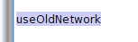
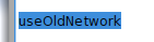
In Pharo 1.0 the background color of selected text looks as follows: In Pharo 1.1: The text is harder to read with the new color. Was this changed on purpose? Adrian