Awesome ! I'd love to have that in the image and use it for my everyday dev. Great work Igor please finish it so we can use it :) 2013/10/24 Igor Stasenko <siguctua@gmail.com>
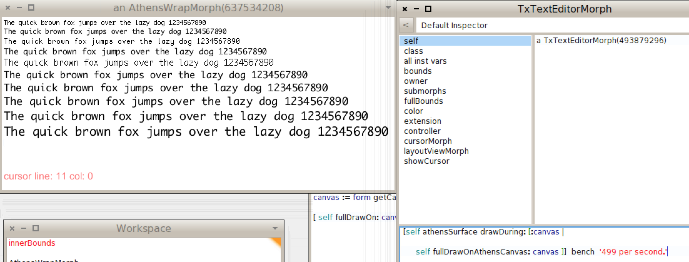
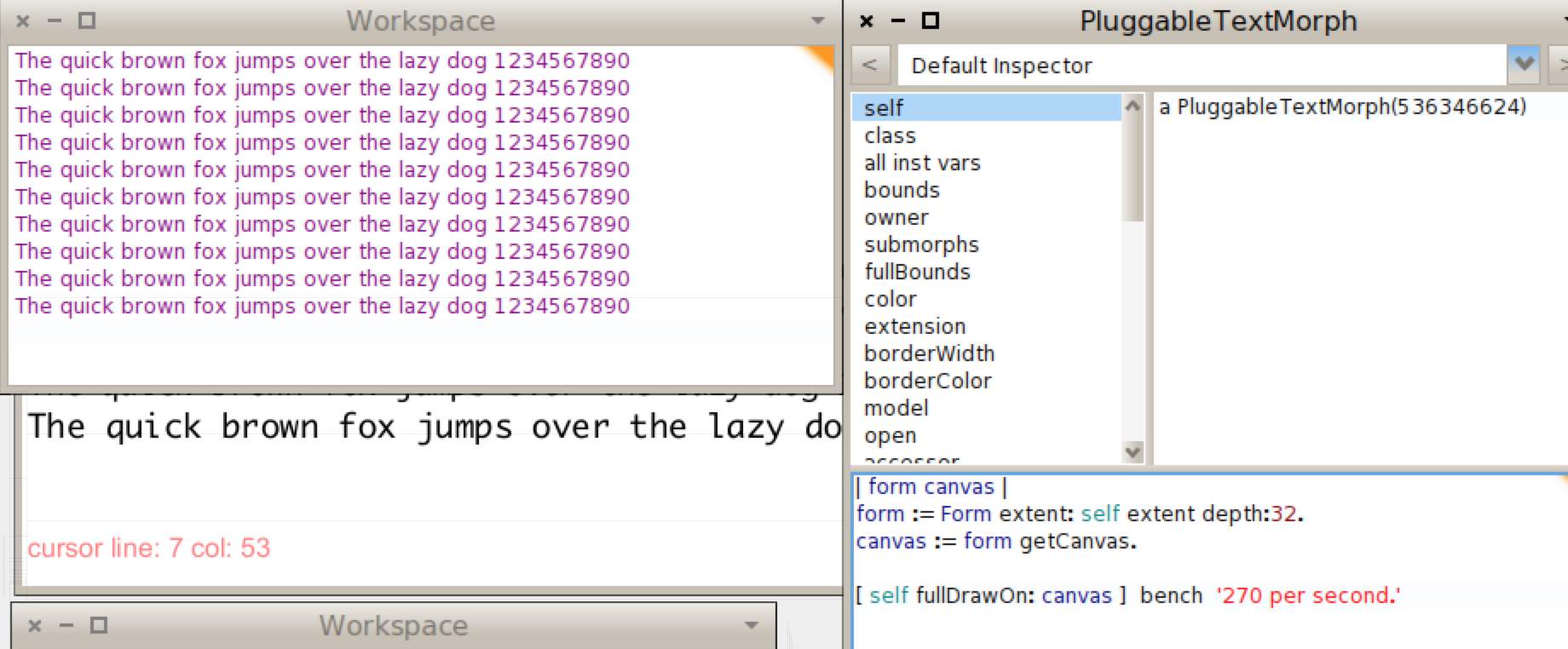
As a followup on discussion about improving/benching text stuff. Just out of curiosity, wanted to compare how sloooow athens with cairo comparing to good old bitblt in terms of displaying text.
See for yourselves. Sure comparison is very rough (text are different - in athens i using freetype font, in workspace is raster font) but at least both windows displaying same amount of text. (that i think what is relevant to us, humans ;) ) And, of course, to make things more precise need to write more code to make sure it renders exact contents of the text morph fully without any clipping, in both cases). And frankly, i am not in a mood of making/coding precise benchmark now. :)
Why i posting this, is mainly because i am quite surprised by numbers. i expected opposite proportion..
And i still almost didn't optimized things.
[image: Inline images 2][image: Inline images 1]
-- Best regards, Igor Stasenko.