Feb. 9, 2012
5:37 p.m.
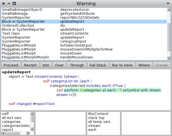
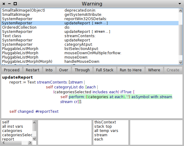
The debugger in Pharo 1.4 is looking very nice - cleaner and easier to follow. I wonder if the following might be an additional improvement... If you consider a class has a method subpart which has a block subpart, then the "natural flow" of these would continue from left to right. Referring to [1] - having the "Block" text on the left breaks this sense of "flow". What I've drawn in [2] feels more natural to me. Possible advantages: * It is easier to see the five SystemReporter items line up. * Balances brevity with giving a bit of context to distinguish nested blocks. [1] NewDebuggerStackView(1).png (attached) [2] NewDebuggerStackView(2).png (attached) cheers, -ben