Aug. 13, 2009
11:19 p.m.
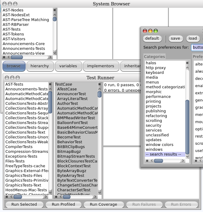
folks, just wondering what people think about the big 'blue' class browser buttons. Pharo is looking really nice, but i tend to prefer somewhat smaller, plainer buttons. e.g on the test runner, or the preference browser. the browser ones are twice as high! they just seem to stick out a bit. is it easy to switch off these blue buttons, or make all buttons consistent? thanks, Mike