I don´t know if I understand correctly the question...
Yes
The design code is saved in a basic message #specmorph: specMorph
| cLStatusbar container cLPanel | "container" container := CLPanel new. self containerSpec: container. container visible: false. container openInWorld.
"cLPanel" cLPanel := CLPanel new. container addMorph: cLPanel. self cLPanelSpec: cLPanel.
"cLStatusbar" cLStatusbar := CLStatusbar new. cLPanel addMorph: cLStatusbar. self cLStatusbarSpec: cLStatusbar.
^container
and another spec method for define each control of view, in current example be #cLPanelSpec:, #cLStatusbarSpec: and #containerSpec:, for example:
cLPanelSpec: aTCLControl
aTCLControl name: 'cLPanel'. aTCLControl usePolymorphStyleMechanism: false. aTCLControl balloonText: nil. aTCLControl enabled: true. aTCLControl location: 0@0. aTCLControl extent: 530@377. aTCLControl anchors: {true .true .true .true .}. aTCLControl imageResource: nil. aTCLControl style: {(BorderStyle width: 0 color: Color transparent) .(Color r: 0.892 g: 0.887 b: 0.879) .(Color r: 0.503 g: 0.553 b: 0.662) .false .true .}. aTCLControl minWidth: 2. aTCLControl minHeight: 2. aTCLControl layout: {ProportionalLayout .#spaceFill .#spaceFill .0 .false .false .false .0 .0 .1073741823 .#topToBottom .#none .#center .#topLeft .#topLeft .#none .#none .}.
ok this is better than to serialize the object.
I believe the definition of UI must be do with XUL, or XAML. Of that way don´t need a designer in Smalltalk, else could be use some of tools for create XAML o XUL uis. Later, a "Reader" could parse the XML and build a Morphic GUI or a Seaside GUI.
As I told you before (read my previous emails) you do not need XML or XAML. You just need what is done in VW a spec They have done that and it works well. Here I did not formatted it well but you GET EXACTLY THE SAME EXPRESSION POWER THAN XML without the need for yet another parser.
cLPanelSpec: aTCLControl
aTCLControl name: 'cLPanel'. aTCLControl usePolymorphStyleMechanism: false. aTCLControl balloonText: nil. aTCLControl enabled: true. aTCLControl location: 0@0. aTCLControl extent: 530@377. aTCLControl anchors: {true .true .true .true .}. aTCLControl imageResource: nil. aTCLControl style: {(BorderStyle width: 0 color: Color transparent) .(Color r: 0.892 g: 0.887 b: 0.879) .(Color r: 0.503 g: 0.553 b: 0.662) .false .true .}. aTCLControl minWidth: 2. aTCLControl minHeight: 2. aTCLControl layout: {ProportionalLayout .#spaceFill .#spaceFill .0 .false .false .false .0 .0 .1073741823 .#topToBottom .#none .#center .#topLeft .#topLeft .#none .#none .}.
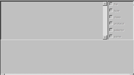
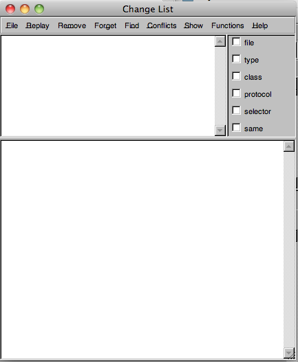
can be turned into #(Spec name: 'cLPanel'; usePolymorphStyleMechanism: false; ... and...) this is strictly equivalent to XML. Now if you build an XML reader we will be able to reuse the interpretation (oh there is this reference in the XML then I should create an object of a specific class). Look at the example below for the changeList widget. I do not have the time to format it well. #(#{UI.FullSpec} #window: #(#{UI.WindowSpec} #label: #(#{Kernel.UserMessage} #key: #ChangeList #defaultString: 'Change List' #catalogID: #labels) #min: #(#{Core.Point} 300 400) #bounds: #(#{Graphics.Rectangle} 512 268 942 768) #menu: #menuBar #isEventDriven: true) #component: #(#{UI.SpecCollection} #collection: #(#(#{UI.SequenceViewSpec} #properties: #(#{UI.PropertyListDictionary} #dragOkSelector #wantToDrag: #dragEnterSelector #dragEnter: #dragOverSelector #dragOver: #dragStartSelector #doDrag: #dropSelector #drop: #dragExitSelector #dragLeave:) #layout: #(#{Graphics.LayoutFrame} 0 0 0 0 -100 1 150 0) #name: #listView #model: #selectionInList #callbacksSpec: #(#{UI.UIEventCallbackSubSpec} #doubleClickSelector: #toggleRemoveForListController: #requestValueChangeSelector: #changeRequest) #menu: #changeListMenuHolder) #(#{UI.CompositeSpecCollection} #collection: #(#(#{UI.CheckBoxSpec} #layout: #(#{Core.Point} 4 0) #model: #fileFilterAdaptor #label: #(#{Kernel.UserMessage} #key: #file #defaultString: 'file' #catalogID: #labels)) #(#{UI.CheckBoxSpec} #layout: #(#{Core.Point} 4 25) #model: #changeTypeFilterAdaptor #label: #(#{Kernel.UserMessage} #key: #type #defaultString: 'type' #catalogID: #labels)) #(#{UI.CheckBoxSpec} #layout: #(#{Core.Point} 4 50) #model: #classNameFilterAdaptor #label: #(#{Kernel.UserMessage} #key: #class #defaultString: 'class' #catalogID: #labels)) #(#{UI.CheckBoxSpec} #layout: #(#{Core.Point} 4 75) #model: #protocolFilterAdaptor #label: #(#{Kernel.UserMessage} #key: #protocol #defaultString: 'protocol' #catalogID: #labels)) #(#{UI.CheckBoxSpec} #layout: #(#{Core.Point} 4 100) #model: #selectorFilterAdaptor #label: #(#{Kernel.UserMessage} #key: #selector #defaultString: 'selector' #catalogID: #labels)) #(#{UI.CheckBoxSpec} #layout: #(#{Core.Point} 4 125) #model: #valuesFilterAdaptor #label: #(#{Kernel.UserMessage} #key: #same #defaultString: 'same' #catalogID: #labels))) #compositeSpec: #(#{UI.CompositeSpec} #layout: #(#{Graphics.LayoutFrame} -100 1 0 0 0 1 150 0) #name: #filters #flags: 8)) #(#{UI.ResizingSplitterSpec} #layout: #(#{Graphics.LayoutFrame} 0 0 150 0 0 1 153 0) #name: #ResizingSplitter1 #horizontal: true #minAboveSize: 150 #minBelowSize: 25 #aboveWidgets: 'listView filters' #belowWidgets: 'textCanvas') #(#{UI.SubCanvasSpec} #layout: #(#{Graphics.LayoutFrame} 0 0 153 0 0 1 0 1) #name: #textCanvas #flags: 0 #minorKey: #standardText)))) The first view is what you get in the UIbuilder and the second view is the widget once it is open
Regards
-- View this message in context: http://forum.world.st/Best-way-for-change-a-window-style-tp3032341p3175227.h... Sent from the Pharo Smalltalk mailing list archive at Nabble.com.