On 13 January 2011 10:45, Torsten Bergmann <astares@gmx.de> wrote:
Stef wrote:
indeed igor this is nice. Doru may be you could take this change for your look?
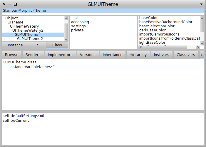
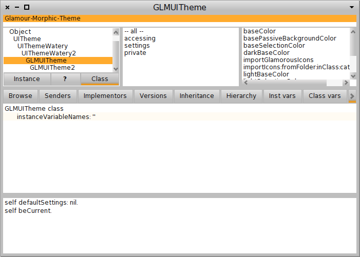
Do you really think this orange is an improvement? See attached comparision. Do we want to go back to colorfull "toy" style a la Squeak?
we're talking about changing single color, not introducing new colors. And i really don't like the button highlighting in original glamorous theme.. pale blue to gray gradient makes me vomit, that's why i changed the way how to indicate 'selected' button appearance, and i think this is more coherent with Glamorous vision :)
UI always depends on personal style but we should take care to keep it looking professional.
We should really hire a designer!
Bye T.
-- NEU: FreePhone - kostenlos mobil telefonieren und surfen! Jetzt informieren: http://www.gmx.net/de/go/freephone
-- Best regards, Igor Stasenko AKA sig.