
I have A Logo Proposal for Smalltalk <https://medium.com/@richardeng/a-logo-proposal-for-smalltalk-e78180f3ec02> . But there is one huge (insurmountable?) obstacle. -- View this message in context: http://forum.world.st/A-Logo-Proposal-for-Smalltalk-tp4945122.html Sent from the Pharo Smalltalk Users mailing list archive at Nabble.com.

Hi Richard, 2017-05-02 12:57 GMT+02:00 horrido <horrido.hobbies@gmail.com>:
I have A Logo Proposal for Smalltalk <https://medium.com/@richardeng/a-logo-proposal-for-smalltalk-e78180f3ec02
I like it.
. But there is one huge (insurmountable?) obstacle.
If you refer to a standard 'org' that would force the use / change of a logo, then I see no obstacle. I like it that the multiple shapes Smalltalk has have left space for creativity and freedom. If your logo is nice and creative enough, and that it can be freely used, then it will raise through the community and replace / displace the old one. Regards, Thierry
-- View this message in context: http://forum.world.st/A-Logo- Proposal-for-Smalltalk-tp4945122.html Sent from the Pharo Smalltalk Users mailing list archive at Nabble.com.
Thanks. The reason I think it's a problem is because I tried to use this logo in the Wikipedia Smalltalk article, but the Wikipedia overlords kept rejecting it, telling me that it wasn't an "official" logo and thus Wikipedia would not accept it. What makes a logo "official?" Why are all the other language logos in my article (which I gleaned from Wikipedia) any more "official?" Thierry Goubier wrote
Hi Richard,
2017-05-02 12:57 GMT+02:00 horrido <
horrido.hobbies@
>:
I have A Logo Proposal for Smalltalk <https://medium.com/@richardeng/a-logo-proposal-for-smalltalk-e78180f3ec02 > >
I like it.
. But there is one huge (insurmountable?) obstacle.
If you refer to a standard 'org' that would force the use / change of a logo, then I see no obstacle. I like it that the multiple shapes Smalltalk has have left space for creativity and freedom.
If your logo is nice and creative enough, and that it can be freely used, then it will raise through the community and replace / displace the old one.
Regards,
Thierry
-- View this message in context: http://forum.world.st/A-Logo- Proposal-for-Smalltalk-tp4945122.html Sent from the Pharo Smalltalk Users mailing list archive at Nabble.com.
-- View this message in context: http://forum.world.st/A-Logo-Proposal-for-Smalltalk-tp4945122p4945127.html Sent from the Pharo Smalltalk Users mailing list archive at Nabble.com.
2017-05-02 13:19 GMT+02:00 horrido <horrido.hobbies@gmail.com>:
Thanks. The reason I think it's a problem is because I tried to use this logo in the Wikipedia Smalltalk article, but the Wikipedia overlords kept rejecting it, telling me that it wasn't an "official" logo and thus Wikipedia would not accept it. What makes a logo "official?" Why are all the other language logos in my article (which I gleaned from Wikipedia) any more "official?"
Interesting angle for the problem (didn't think of that one). My analysis as I would review. The common agreed logo for smalltalk is a rendering of the Byte cover, this makes it the 'official' logo. Your's hasn't reached the level of agreement / support necessary to reach that level. And Wikipedia isn't the place where this change is to be decided: wikipedia will follow the will of the overall community. Other logos are either endorsed by the community or used by the master site for the language: for example, the Caml logo, the Clojure logo, both appeara on the 'official' website for the language. For Caml, many alternatives logos exist, but none of the alternatives appear on the wikipedia page. Now, changing a logo requires overcoming some friction(*)... writing around Smalltalk and allways tagging with it could be a way to make it popular and displace the old one. Your target would be reached once Wikipedia accept yours, and that may require ESUG to decide to switch, and so on. Regards, Thierry
Thierry Goubier wrote
Hi Richard,
2017-05-02 12:57 GMT+02:00 horrido <
horrido.hobbies@
>:
I have A Logo Proposal for Smalltalk <https://medium.com/@richardeng/a-logo-proposal- for-smalltalk-e78180f3ec02 > >
I like it.
. But there is one huge (insurmountable?) obstacle.
If you refer to a standard 'org' that would force the use / change of a logo, then I see no obstacle. I like it that the multiple shapes Smalltalk has have left space for creativity and freedom.
If your logo is nice and creative enough, and that it can be freely used, then it will raise through the community and replace / displace the old one.
Regards,
Thierry
-- View this message in context: http://forum.world.st/A-Logo- Proposal-for-Smalltalk-tp4945122.html Sent from the Pharo Smalltalk Users mailing list archive at Nabble.com.
-- View this message in context: http://forum.world.st/A-Logo- Proposal-for-Smalltalk-tp4945122p4945127.html Sent from the Pharo Smalltalk Users mailing list archive at Nabble.com.

A decade+ ago I created the one attached, and I've seen used in some Smalltalk related sites. I still like it but it can be done better. I don't like the balloon, it's an indirect reference to the Byte cover which hasn't much to do with Smalltalk directly; as Pascal triangles didn't have much to do with Pascal [1] the programming language. I think we can play a little more with the brackets which are something kind of unique to Smalltalk syntax. OTOH we have Pharo logo which is nice and unambiguous. Regards, [1] A prevoius cover of Byte Magazine shown Pascal triangles in a choppy sea, an you could see what later would be the Smalltalk island, isolated in an "ivory tower" way of looking at the world, and escaping from the sea problem by avoiding it completely, hence the balloon. http://70sscifiart.tumblr.com/post/157035900745/pascals-triangle-a-1978-byte... Esteban A. Maringolo 2017-05-02 9:06 GMT-03:00 Thierry Goubier <thierry.goubier@gmail.com>:
2017-05-02 13:19 GMT+02:00 horrido <horrido.hobbies@gmail.com>:
Thanks. The reason I think it's a problem is because I tried to use this logo in the Wikipedia Smalltalk article, but the Wikipedia overlords kept rejecting it, telling me that it wasn't an "official" logo and thus Wikipedia would not accept it. What makes a logo "official?" Why are all the other language logos in my article (which I gleaned from Wikipedia) any more "official?"
Interesting angle for the problem (didn't think of that one).
My analysis as I would review. The common agreed logo for smalltalk is a rendering of the Byte cover, this makes it the 'official' logo. Your's hasn't reached the level of agreement / support necessary to reach that level. And Wikipedia isn't the place where this change is to be decided: wikipedia will follow the will of the overall community.
Other logos are either endorsed by the community or used by the master site for the language: for example, the Caml logo, the Clojure logo, both appeara on the 'official' website for the language. For Caml, many alternatives logos exist, but none of the alternatives appear on the wikipedia page.
Now, changing a logo requires overcoming some friction(*)... writing around Smalltalk and allways tagging with it could be a way to make it popular and displace the old one. Your target would be reached once Wikipedia accept yours, and that may require ESUG to decide to switch, and so on.
Regards,
Thierry
Thierry Goubier wrote
Hi Richard,
2017-05-02 12:57 GMT+02:00 horrido <
horrido.hobbies@
>:
I have A Logo Proposal for Smalltalk
<https://medium.com/@richardeng/a-logo-proposal-for-smalltalk-e78180f3ec02 > >
I like it.
. But there is one huge (insurmountable?) obstacle.
If you refer to a standard 'org' that would force the use / change of a logo, then I see no obstacle. I like it that the multiple shapes Smalltalk has have left space for creativity and freedom.
If your logo is nice and creative enough, and that it can be freely used, then it will raise through the community and replace / displace the old one.
Regards,
Thierry
-- View this message in context: http://forum.world.st/A-Logo- Proposal-for-Smalltalk-tp4945122.html Sent from the Pharo Smalltalk Users mailing list archive at Nabble.com.
-- View this message in context: http://forum.world.st/A-Logo-Proposal-for-Smalltalk-tp4945122p4945127.html Sent from the Pharo Smalltalk Users mailing list archive at Nabble.com.


On 2 May 2017, at 16:01, Esteban A. Maringolo <emaringolo@gmail.com> wrote:
OTOH we have Pharo logo which is nice and unambiguous.
Indeed, the following 2 are very nice, IMHO: http://files.pharo.org/media/logo/icon-512x512.png http://files.pharo.org/media/logo/icon-lighthouse-512x512.png Also, 'Smalltalk' is not one thing, just like 'Lisp' is not one thing. Both are families of technologies that have evolved over decades, with many different implementations both commercial and open source. Sven


I prefer the rounded one more and it follows a better criteria for a design. Also the circle containing the pharo is the first thing I thought about when I saw the movie Arrival :) [image: Imágenes integradas 1] Because, maybe not only LISP was made with alien technology. I agree with Sven about Smalltalk not being a brand but more of a concept. You can have logos for Firefox, Edge and Chrome, but there is not logo for "web browser". Regards, Esteban A. Maringolo 2017-05-02 11:07 GMT-03:00 Sven Van Caekenberghe <sven@stfx.eu>:
On 2 May 2017, at 16:01, Esteban A. Maringolo <emaringolo@gmail.com> wrote:
OTOH we have Pharo logo which is nice and unambiguous.
Indeed, the following 2 are very nice, IMHO:
http://files.pharo.org/media/logo/icon-512x512.png
http://files.pharo.org/media/logo/icon-lighthouse-512x512.png
Also, 'Smalltalk' is not one thing, just like 'Lisp' is not one thing. Both are families of technologies that have evolved over decades, with many different implementations both commercial and open source.
Sven



2017-05-02 11:22 GMT-03:00 Esteban A. Maringolo <emaringolo@gmail.com>:
I prefer the rounded one more and it follows a better criteria for a design.
Also the circle containing the pharo is the first thing I thought about when I saw the movie Arrival :) [image: Imágenes integradas 1]
Couldn't resist myself... â See also attached image for Pharo 6 Arrival. :)



On 2 May 2017, at 16:35, Esteban A. Maringolo <emaringolo@gmail.com> wrote:
2017-05-02 11:22 GMT-03:00 Esteban A. Maringolo <emaringolo@gmail.com>: I prefer the rounded one more and it follows a better criteria for a design.
Also the circle containing the pharo is the first thing I thought about when I saw the movie Arrival :) <image.png>
Couldn't resist myself... <arrival-pharo-logo.png> â
See also attached image for Pharo 6 Arrival. :) <arrival-pharo.png>
Haha, very nice !

Ha, ha, Good one :-)... Smalltalk and Lisp families are kind of alien for this world :-), Offray On 02/05/17 09:35, Esteban A. Maringolo wrote:
2017-05-02 11:22 GMT-03:00 Esteban A. Maringolo <emaringolo@gmail.com <mailto:emaringolo@gmail.com>>:
I prefer the rounded one more and it follows a better criteria for a design.
Also the circle containing the pharo is the first thing I thought about when I saw the movie Arrival :) Imágenes integradas 1
Couldn't resist myself...
â
See also attached image for Pharo 6 Arrival. :)


<http://forum.world.st/file/n4945251/dreamy-pictures-2x.jpg> ;-) Offray Vladimir Luna Cárdenas-2 wrote
Ha, ha,
Good one :-)... Smalltalk and Lisp families are kind of alien for this world :-),
Offray
On 02/05/17 09:35, Esteban A. Maringolo wrote:
2017-05-02 11:22 GMT-03:00 Esteban A. Maringolo <
emaringolo@
> <mailto:
emaringolo@
>>:
I prefer the rounded one more and it follows a better criteria for a design.
Also the circle containing the pharo is the first thing I thought about when I saw the movie Arrival :) Imágenes integradas 1
Couldn't resist myself...
â
See also attached image for Pharo 6 Arrival. :)
image.png (43K) <http://forum.world.st/attachment/4945232/0/image.png>; arrival-pharo-logo.png (43K) <http://forum.world.st/attachment/4945232/1/arrival-pharo-logo.png>;
-- View this message in context: http://forum.world.st/A-Logo-Proposal-for-Smalltalk-tp4945122p4945251.html Sent from the Pharo Smalltalk Users mailing list archive at Nabble.com.
I've allways liked the Pharo logo in that shape. This is also what I like in Richard logo: the visual language used to render the image. I'm a long time smalltalk user (I started in 1992) and I don't relate at all with the square brackets thing. It feels like a insider joke, not particularly memorable. Smalltalk being 'multiple', I'm ok with more than one logo (language / platform). Regards, Thierry 2017-05-02 16:07 GMT+02:00 Sven Van Caekenberghe <sven@stfx.eu>:
On 2 May 2017, at 16:01, Esteban A. Maringolo <emaringolo@gmail.com> wrote:
OTOH we have Pharo logo which is nice and unambiguous.
Indeed, the following 2 are very nice, IMHO:
http://files.pharo.org/media/logo/icon-512x512.png
http://files.pharo.org/media/logo/icon-lighthouse-512x512.png
Also, 'Smalltalk' is not one thing, just like 'Lisp' is not one thing. Both are families of technologies that have evolved over decades, with many different implementations both commercial and open source.
Sven


Yes, but can the lighthouse logo be used to represent all Smalltalks? I don't think so. I like it very much, but the lighthouse has come to be closely associated with Pharo. Sven Van Caekenberghe-2 wrote
On 2 May 2017, at 16:01, Esteban A. Maringolo <
emaringolo@
> wrote:
OTOH we have Pharo logo which is nice and unambiguous.
Indeed, the following 2 are very nice, IMHO:
http://files.pharo.org/media/logo/icon-512x512.png
http://files.pharo.org/media/logo/icon-lighthouse-512x512.png
Also, 'Smalltalk' is not one thing, just like 'Lisp' is not one thing. Both are families of technologies that have evolved over decades, with many different implementations both commercial and open source.
Sven
icon-512x512.png (127K) <http://forum.world.st/attachment/4945184/0/icon-512x512.png>; icon-lighthouse-512x512.png (47K) <http://forum.world.st/attachment/4945184/1/icon-lighthouse-512x512.png>;
-- View this message in context: http://forum.world.st/A-Logo-Proposal-for-Smalltalk-tp4945122p4945204.html Sent from the Pharo Smalltalk Users mailing list archive at Nabble.com.
On 2 May 2017, at 16:33, horrido <horrido.hobbies@gmail.com> wrote:
Yes, but can the lighthouse logo be used to represent all Smalltalks? I don't think so. I like it very much, but the lighthouse has come to be closely associated with Pharo.
I thought that was obvious: the lighthouse logo is Pharo, not Smalltalk - just to be very clear. I think a stylised balloon is not bad, it just has to be less complex, more logo like, more abstract.
Sven Van Caekenberghe-2 wrote
On 2 May 2017, at 16:01, Esteban A. Maringolo <
emaringolo@
> wrote:
OTOH we have Pharo logo which is nice and unambiguous.
Indeed, the following 2 are very nice, IMHO:
http://files.pharo.org/media/logo/icon-512x512.png
http://files.pharo.org/media/logo/icon-lighthouse-512x512.png
Also, 'Smalltalk' is not one thing, just like 'Lisp' is not one thing. Both are families of technologies that have evolved over decades, with many different implementations both commercial and open source.
Sven
icon-512x512.png (127K) <http://forum.world.st/attachment/4945184/0/icon-512x512.png>; icon-lighthouse-512x512.png (47K) <http://forum.world.st/attachment/4945184/1/icon-lighthouse-512x512.png>;
-- View this message in context: http://forum.world.st/A-Logo-Proposal-for-Smalltalk-tp4945122p4945204.html Sent from the Pharo Smalltalk Users mailing list archive at Nabble.com.
Sven Van Caekenberghe-2 wrote
I think a stylised balloon is not bad, it just has to be less complex, more logo like, more abstract.
I've taken your comment to heart and I believe I've come up with the ideal logo: <http://forum.world.st/file/n4947093/hotairballoon-red-300.png> Beautifully abstract. Nice and simple. And it harkens back to the very famous BYTE 1981 cover *without tying Smalltalk to the past*. The hot air balloon motif for Smalltalk is universally recognized, and we cannot ignore it. -- View this message in context: http://forum.world.st/A-Logo-Proposal-for-Smalltalk-tp4945122p4947093.html Sent from the Pharo Smalltalk Users mailing list archive at Nabble.com.
On 14 May 2017, at 15:40, horrido <horrido.hobbies@gmail.com> wrote:
Sven Van Caekenberghe-2 wrote
I think a stylised balloon is not bad, it just has to be less complex, more logo like, more abstract.
I've taken your comment to heart and I believe I've come up with the ideal logo:
<http://forum.world.st/file/n4947093/hotairballoon-red-300.png>
Beautifully abstract. Nice and simple.
Yes, that is better. Personally, I think it could be simpler still, but I would not know how to do that. Have you tried putting it in several contexts, like as icons of different sizes ?
And it harkens back to the very famous BYTE 1981 cover *without tying Smalltalk to the past*. The hot air balloon motif for Smalltalk is universally recognized, and we cannot ignore it.
-- View this message in context: http://forum.world.st/A-Logo-Proposal-for-Smalltalk-tp4945122p4947093.html Sent from the Pharo Smalltalk Users mailing list archive at Nabble.com.
2017-05-02 11:33 GMT-03:00 horrido <horrido.hobbies@gmail.com>:
the lighthouse has come to be closely associated with Pharo.
Then it succeeded as an logo. I'd only change its typography. But the logo stays. I'd keep the O the same size as the rest of the letters. Regards! Esteban A. Maringolo
Interesting. I had a similar idea with another Smalltalk logo I whipped up for Smalltalk Renaissance: <http://forum.world.st/file/n4945197/smalltalk-logo.png> Esteban A. Maringolo wrote
A decade+ ago I created the one attached, and I've seen used in some Smalltalk related sites. I still like it but it can be done better.
-- View this message in context: http://forum.world.st/A-Logo-Proposal-for-Smalltalk-tp4945122p4945197.html Sent from the Pharo Smalltalk Users mailing list archive at Nabble.com.
I really like the minimalist nature of the "[ | ]" logo for Smalltalk, kind of similar to the lambdas (λ) from Lisp families and is cross-dialect and, as Esteban says, unique. Cheers, Offray On 02/05/17 09:01, Esteban A. Maringolo wrote:
A decade+ ago I created the one attached, and I've seen used in some Smalltalk related sites. I still like it but it can be done better.
I don't like the balloon, it's an indirect reference to the Byte cover which hasn't much to do with Smalltalk directly; as Pascal triangles didn't have much to do with Pascal [1] the programming language.
I think we can play a little more with the brackets which are something kind of unique to Smalltalk syntax.
OTOH we have Pharo logo which is nice and unambiguous.
Regards,
[1] A prevoius cover of Byte Magazine shown Pascal triangles in a choppy sea, an you could see what later would be the Smalltalk island, isolated in an "ivory tower" way of looking at the world, and escaping from the sea problem by avoiding it completely, hence the balloon. http://70sscifiart.tumblr.com/post/157035900745/pascals-triangle-a-1978-byte...
Esteban A. Maringolo
2017-05-02 9:06 GMT-03:00 Thierry Goubier <thierry.goubier@gmail.com>:
2017-05-02 13:19 GMT+02:00 horrido <horrido.hobbies@gmail.com>:
Thanks. The reason I think it's a problem is because I tried to use this logo in the Wikipedia Smalltalk article, but the Wikipedia overlords kept rejecting it, telling me that it wasn't an "official" logo and thus Wikipedia would not accept it. What makes a logo "official?" Why are all the other language logos in my article (which I gleaned from Wikipedia) any more "official?"
Interesting angle for the problem (didn't think of that one).
My analysis as I would review. The common agreed logo for smalltalk is a rendering of the Byte cover, this makes it the 'official' logo. Your's hasn't reached the level of agreement / support necessary to reach that level. And Wikipedia isn't the place where this change is to be decided: wikipedia will follow the will of the overall community.
Other logos are either endorsed by the community or used by the master site for the language: for example, the Caml logo, the Clojure logo, both appeara on the 'official' website for the language. For Caml, many alternatives logos exist, but none of the alternatives appear on the wikipedia page.
Now, changing a logo requires overcoming some friction(*)... writing around Smalltalk and allways tagging with it could be a way to make it popular and displace the old one. Your target would be reached once Wikipedia accept yours, and that may require ESUG to decide to switch, and so on.
Regards,
Thierry
Thierry Goubier wrote
Hi Richard,
2017-05-02 12:57 GMT+02:00 horrido < horrido.hobbies@ >:
I have A Logo Proposal for Smalltalk
<https://medium.com/@richardeng/a-logo-proposal-for-smalltalk-e78180f3ec02 > > I like it.
. But there is one huge (insurmountable?) obstacle.
If you refer to a standard 'org' that would force the use / change of a logo, then I see no obstacle. I like it that the multiple shapes Smalltalk has have left space for creativity and freedom.
If your logo is nice and creative enough, and that it can be freely used, then it will raise through the community and replace / displace the old one.
Regards,
Thierry
-- View this message in context: http://forum.world.st/A-Logo- Proposal-for-Smalltalk-tp4945122.html Sent from the Pharo Smalltalk Users mailing list archive at Nabble.com.
-- View this message in context: http://forum.world.st/A-Logo-Proposal-for-Smalltalk-tp4945122p4945127.html Sent from the Pharo Smalltalk Users mailing list archive at Nabble.com.
Esteban A. Maringolo wrote
A decade+ ago I created the one attached, and I've seen used in some Smalltalk related sites. I still like it but it can be done better.
*[|]* seems to be a popular choice. I got two votes for this at LinkedIn. It looks rather plain to me, though. It lacks sizzle. Maybe the best way to settle this is to have a Smalltalk logo competition. People can submit their logo designs and a panel of judges can decide on the best one. The winning entry would be the "official" Smalltalk logo. For the panel of judges, I would like representatives from each of the following: o ESUG o the Pharo project o the Squeak project (Alan Kay?) o Cincom o Instantiations o GemTalk Of course, my stylized hot air balloon would be Logo Candidate Entry #1. If you think this is a good idea, I'll start organizing it. The submission deadline for the competition would be July 18, 2017 (the first anniversary of my TechBeacon article, " How learning Smalltalk can make you a better developer <https://techbeacon.com/how-learning-smalltalk-can-make-you-better-developer> "). -- View this message in context: http://forum.world.st/A-Logo-Proposal-for-Smalltalk-tp4945122p4945390.html Sent from the Pharo Smalltalk Users mailing list archive at Nabble.com.

I got a shot at this and this gives the following. What we should do: - ensure the [|] shape has the gold ratio (so it is naturally attractive). - make sure the square is positioned so that the golden ratio is also all over the place. Color wise, I went for blue because Smalltalk has a natural elegance and goes for no crap. Phil On Wed, May 3, 2017 at 12:49 PM, horrido <horrido.hobbies@gmail.com> wrote:
Esteban A. Maringolo wrote
A decade+ ago I created the one attached, and I've seen used in some Smalltalk related sites. I still like it but it can be done better.
*[|]* seems to be a popular choice. I got two votes for this at LinkedIn.
It looks rather plain to me, though. It lacks sizzle.
Maybe the best way to settle this is to have a Smalltalk logo competition. People can submit their logo designs and a panel of judges can decide on the best one. The winning entry would be the "official" Smalltalk logo.
For the panel of judges, I would like representatives from each of the following:
o ESUG o the Pharo project o the Squeak project (Alan Kay?) o Cincom o Instantiations o GemTalk
Of course, my stylized hot air balloon would be Logo Candidate Entry #1.
If you think this is a good idea, I'll start organizing it. The submission deadline for the competition would be July 18, 2017 (the first anniversary of my TechBeacon article, " How learning Smalltalk can make you a better developer <https://techbeacon.com/how-learning-smalltalk-can-make-you-better-developer> ").
-- View this message in context: http://forum.world.st/A-Logo-Proposal-for-Smalltalk-tp4945122p4945390.html Sent from the Pharo Smalltalk Users mailing list archive at Nabble.com.
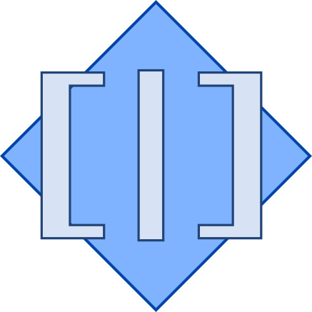
Hi Phil, I don't like the diamond in the back, nor the colors (looks old). Also the square brackets and vertical bar are not horizontally centered. I still like the concept though. I couldn't see the golden ratio. Can you overlay it? Regards! Esteban A. Maringolo 2017-05-03 9:38 GMT-03:00 phil@highoctane.be <phil@highoctane.be>:
I got a shot at this and this gives the following.
What we should do:
- ensure the [|] shape has the gold ratio (so it is naturally attractive). - make sure the square is positioned so that the golden ratio is also all over the place.
Color wise, I went for blue because Smalltalk has a natural elegance and goes for no crap.
Phil
On Wed, May 3, 2017 at 12:49 PM, horrido <horrido.hobbies@gmail.com> wrote:
Esteban A. Maringolo wrote
A decade+ ago I created the one attached, and I've seen used in some Smalltalk related sites. I still like it but it can be done better.
*[|]* seems to be a popular choice. I got two votes for this at LinkedIn.
It looks rather plain to me, though. It lacks sizzle.
Maybe the best way to settle this is to have a Smalltalk logo competition. People can submit their logo designs and a panel of judges can decide on the best one. The winning entry would be the "official" Smalltalk logo.
For the panel of judges, I would like representatives from each of the following:
o ESUG o the Pharo project o the Squeak project (Alan Kay?) o Cincom o Instantiations o GemTalk
Of course, my stylized hot air balloon would be Logo Candidate Entry #1.
If you think this is a good idea, I'll start organizing it. The submission deadline for the competition would be July 18, 2017 (the first anniversary of my TechBeacon article, " How learning Smalltalk can make you a better developer <https://techbeacon.com/how-learning-smalltalk-can-make-you-better-developer> ").
-- View this message in context: http://forum.world.st/A-Logo-Proposal-for-Smalltalk-tp4945122p4945390.html Sent from the Pharo Smalltalk Users mailing list archive at Nabble.com.
SVG file. Works in Inkscape. I wanted the [ | ] to be a golden rectangle. See https://en.wikipedia.org/wiki/Golden_ratio 1.618 something (1 + 5 sqrt) / 2 Look at how the reciprocal of the golden ratio looks like [|] We should have GoldenRatio in Float class. initialize "Float initialize" "Constants from Computer Approximations, pp. 182-183: Pi = 3.14159265358979323846264338327950288 Pi/2 = 1.57079632679489661923132169163975144 Pi*2 = 6.28318530717958647692528676655900576 Pi/180 = 0.01745329251994329576923690768488612 2.0 ln = 0.69314718055994530941723212145817657 2.0 sqrt = 1.41421356237309504880168872420969808" Pi := 3.14159265358979323846264338327950288. Halfpi := Pi / 2.0. Twopi := Pi * 2.0. ThreePi := Pi * 3.0. RadiansPerDegree := Pi / 180.0. Ln2 := 0.69314718055994530941723212145817657. Ln10 := 10.0 ln. Sqrt2 := 1.41421356237309504880168872420969808. E := 2.718281828459045235360287471353. Epsilon := 0.000000000001. "Defines precision of mathematical functions" MaxVal := 1.7976931348623157e308. MaxValLn := 709.782712893384. MinValLogBase2 := -1074. Infinity := MaxVal * MaxVal. NegativeInfinity := 0.0 - Infinity. NaN := Infinity - Infinity. NegativeZero := 1.0 / Infinity negated. On Wed, May 3, 2017 at 2:52 PM, Esteban A. Maringolo <emaringolo@gmail.com> wrote:
Hi Phil,
I don't like the diamond in the back, nor the colors (looks old). Also the square brackets and vertical bar are not horizontally centered.
I still like the concept though. I couldn't see the golden ratio. Can you overlay it?
Regards! Esteban A. Maringolo
2017-05-03 9:38 GMT-03:00 phil@highoctane.be <phil@highoctane.be>:
I got a shot at this and this gives the following.
What we should do:
- ensure the [|] shape has the gold ratio (so it is naturally attractive). - make sure the square is positioned so that the golden ratio is also all over the place.
Color wise, I went for blue because Smalltalk has a natural elegance and goes for no crap.
Phil
On Wed, May 3, 2017 at 12:49 PM, horrido <horrido.hobbies@gmail.com> wrote:
Esteban A. Maringolo wrote
A decade+ ago I created the one attached, and I've seen used in some Smalltalk related sites. I still like it but it can be done better.
*[|]* seems to be a popular choice. I got two votes for this at LinkedIn.
It looks rather plain to me, though. It lacks sizzle.
Maybe the best way to settle this is to have a Smalltalk logo competition. People can submit their logo designs and a panel of judges can decide on the best one. The winning entry would be the "official" Smalltalk logo.
For the panel of judges, I would like representatives from each of the following:
o ESUG o the Pharo project o the Squeak project (Alan Kay?) o Cincom o Instantiations o GemTalk
Of course, my stylized hot air balloon would be Logo Candidate Entry #1.
If you think this is a good idea, I'll start organizing it. The submission deadline for the competition would be July 18, 2017 (the first anniversary of my TechBeacon article, " How learning Smalltalk can make you a better developer <https://techbeacon.com/how-learning-smalltalk-can-make-you-better-developer> ").
-- View this message in context: http://forum.world.st/A-Logo-Proposal-for-Smalltalk-tp4945122p4945390.html Sent from the Pharo Smalltalk Users mailing list archive at Nabble.com.
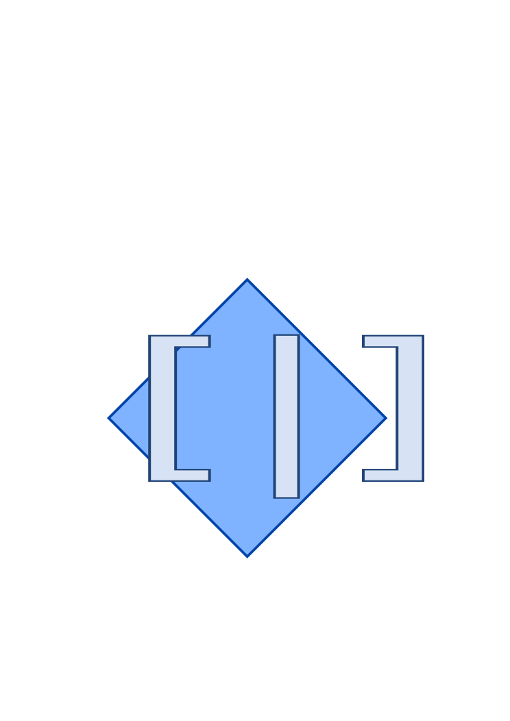


I prefer your first attempt (just centre the [|] against the square). Your first design instinct was correct. I prefer [|] having the same height. I like the blue colour but you may experiment with different colours. philippeback wrote
SVG file. Works in Inkscape.
I wanted the [ | ] to be a golden rectangle.
See https://en.wikipedia.org/wiki/Golden_ratio
1.618 something (1 + 5 sqrt) / 2
Look at how the reciprocal of the golden ratio looks like [|]
We should have GoldenRatio in Float class.
initialize "Float initialize" "Constants from Computer Approximations, pp. 182-183: Pi = 3.14159265358979323846264338327950288 Pi/2 = 1.57079632679489661923132169163975144 Pi*2 = 6.28318530717958647692528676655900576 Pi/180 = 0.01745329251994329576923690768488612 2.0 ln = 0.69314718055994530941723212145817657 2.0 sqrt = 1.41421356237309504880168872420969808"
Pi := 3.14159265358979323846264338327950288. Halfpi := Pi / 2.0. Twopi := Pi * 2.0. ThreePi := Pi * 3.0. RadiansPerDegree := Pi / 180.0.
Ln2 := 0.69314718055994530941723212145817657. Ln10 := 10.0 ln. Sqrt2 := 1.41421356237309504880168872420969808. E := 2.718281828459045235360287471353.
Epsilon := 0.000000000001. "Defines precision of mathematical functions"
MaxVal := 1.7976931348623157e308. MaxValLn := 709.782712893384. MinValLogBase2 := -1074.
Infinity := MaxVal * MaxVal. NegativeInfinity := 0.0 - Infinity. NaN := Infinity - Infinity. NegativeZero := 1.0 / Infinity negated.
On Wed, May 3, 2017 at 2:52 PM, Esteban A. Maringolo <
emaringolo@
> wrote:
Hi Phil,
I don't like the diamond in the back, nor the colors (looks old). Also the square brackets and vertical bar are not horizontally centered.
I still like the concept though. I couldn't see the golden ratio. Can you overlay it?
Regards! Esteban A. Maringolo
2017-05-03 9:38 GMT-03:00
phil@
<
phil@
>:
I got a shot at this and this gives the following.
What we should do:
- ensure the [|] shape has the gold ratio (so it is naturally attractive). - make sure the square is positioned so that the golden ratio is also all over the place.
Color wise, I went for blue because Smalltalk has a natural elegance and goes for no crap.
Phil
On Wed, May 3, 2017 at 12:49 PM, horrido <
horrido.hobbies@
> wrote:
Esteban A. Maringolo wrote
A decade+ ago I created the one attached, and I've seen used in some Smalltalk related sites. I still like it but it can be done better.
*[|]* seems to be a popular choice. I got two votes for this at LinkedIn.
It looks rather plain to me, though. It lacks sizzle.
Maybe the best way to settle this is to have a Smalltalk logo competition. People can submit their logo designs and a panel of judges can decide on the best one. The winning entry would be the "official" Smalltalk logo.
For the panel of judges, I would like representatives from each of the following:
o ESUG o the Pharo project o the Squeak project (Alan Kay?) o Cincom o Instantiations o GemTalk
Of course, my stylized hot air balloon would be Logo Candidate Entry #1.
If you think this is a good idea, I'll start organizing it. The submission deadline for the competition would be July 18, 2017 (the first anniversary of my TechBeacon article, " How learning Smalltalk can make you a better developer <https://techbeacon.com/how-learning-smalltalk-can-make-you-better-developer&...; ").
-- View this message in context: http://forum.world.st/A-Logo-Proposal-for-Smalltalk-tp4945122p4945390.html Sent from the Pharo Smalltalk Users mailing list archive at Nabble.com.
SmalltalkLogo.svg (3K) <http://forum.world.st/attachment/4945437/0/SmalltalkLogo.svg>; SmalltalkLogo.png (8K) <http://forum.world.st/attachment/4945437/1/SmalltalkLogo.png>; SmalltalkLogo2.svg (6K) <http://forum.world.st/attachment/4945437/2/SmalltalkLogo2.svg>;
-- View this message in context: http://forum.world.st/A-Logo-Proposal-for-Smalltalk-tp4945122p4945484.html Sent from the Pharo Smalltalk Users mailing list archive at Nabble.com.
I have to say, I really like it! Is this Logo Candidate Entry #2 ? philippeback wrote
I got a shot at this and this gives the following.
What we should do:
- ensure the [|] shape has the gold ratio (so it is naturally attractive). - make sure the square is positioned so that the golden ratio is also all over the place.
Color wise, I went for blue because Smalltalk has a natural elegance and goes for no crap.
Phil
On Wed, May 3, 2017 at 12:49 PM, horrido <
horrido.hobbies@
> wrote:
Esteban A. Maringolo wrote
A decade+ ago I created the one attached, and I've seen used in some Smalltalk related sites. I still like it but it can be done better.
*[|]* seems to be a popular choice. I got two votes for this at LinkedIn.
It looks rather plain to me, though. It lacks sizzle.
Maybe the best way to settle this is to have a Smalltalk logo competition. People can submit their logo designs and a panel of judges can decide on the best one. The winning entry would be the "official" Smalltalk logo.
For the panel of judges, I would like representatives from each of the following:
o ESUG o the Pharo project o the Squeak project (Alan Kay?) o Cincom o Instantiations o GemTalk
Of course, my stylized hot air balloon would be Logo Candidate Entry #1.
If you think this is a good idea, I'll start organizing it. The submission deadline for the competition would be July 18, 2017 (the first anniversary of my TechBeacon article, " How learning Smalltalk can make you a better developer <https://techbeacon.com/how-learning-smalltalk-can-make-you-better-developer&...; ").
-- View this message in context: http://forum.world.st/A-Logo-Proposal-for-Smalltalk-tp4945122p4945390.html Sent from the Pharo Smalltalk Users mailing list archive at Nabble.com.
SmalltalkLogo.png (7K) <http://forum.world.st/attachment/4945411/0/SmalltalkLogo.png>;
-- View this message in context: http://forum.world.st/A-Logo-Proposal-for-Smalltalk-tp4945122p4945482.html Sent from the Pharo Smalltalk Users mailing list archive at Nabble.com.

On Wed, May 3, 2017 at 6:49 PM, horrido <horrido.hobbies@gmail.com> wrote:
Esteban A. Maringolo wrote
A decade+ ago I created the one attached, and I've seen used in some Smalltalk related sites. I still like it but it can be done better.
*[|]* seems to be a popular choice. I got two votes for this at LinkedIn.
It looks rather plain to me, though. It lacks sizzle.
Maybe the best way to settle this is to have a Smalltalk logo competition. People can submit their logo designs and a panel of judges can decide on the best one. The winning entry would be the "official" Smalltalk logo.
For the panel of judges, I would like representatives from each of the
following:
o ESUG o the Pharo project o the Squeak project (Alan Kay?) o Cincom o Instantiations o GemTalk
I half like the idea of a Smalltalk logo, but logos are most effective when they are widely used. Once we have this "official" logo, how do you expect it to be used? Do you expect organisations to use it in their literature as part of their branding identity? Should it get equal weighting as their corporate identity? Will all these commercial entities feel the logo strengthens their position in solidarity, or dilutes their position. You know that some our community differentiate Pharo from Smalltalk. Also an important question to determine early on, how will copyright and trademark rights of the logo be controlled? cheers -ben Of course, my stylized hot air balloon would be Logo Candidate Entry #1.
If you think this is a good idea, I'll start organizing it. The submission deadline for the competition would be July 18, 2017 (the first anniversary of my TechBeacon article, " How learning Smalltalk can make you a better developer <https://techbeacon.com/how-learning-smalltalk-can-make- you-better-developer> ").
I expect it to be used in exactly the same way other languages like Clojure, Elixir, Kotlin, and Julia use theirs. Of course, whether these logos are widely used has more to do with the languages' promotional efforts. As for the commercial entities, they may choose to use it or not. This depends on their marketing approaches. Cincom doesn't have a product logo for VisualWorks, nor does Instantiations for VA Smalltalk, but GemTalk does for GemStone/S. It's entirely up to them. I think the logo can, and should, be used whenever the presentation is *not product-specific*. I wonder how other languages control their copyrights. Ben Coman wrote
I half like the idea of a Smalltalk logo, but logos are most effective when they are widely used. Once we have this "official" logo, how do you expect it to be used? Do you expect organisations to use it in their literature as part of their branding identity? Should it get equal weighting as their corporate identity? Will all these commercial entities feel the logo strengthens their position in solidarity, or dilutes their position. You know that some our community differentiate Pharo from Smalltalk.
Also an important question to determine early on, how will copyright and trademark rights of the logo be controlled?
cheers -ben
-- View this message in context: http://forum.world.st/A-Logo-Proposal-for-Smalltalk-tp4945122p4945487.html Sent from the Pharo Smalltalk Users mailing list archive at Nabble.com.

Hi, I find it fascinating how the discussion about Smalltalk dialects happen in a Pharo mailing list :). One thing should be clear though: Pharo has a distinct identity depicted by a clear logo. This will not change. Cheers, Tudor
On May 3, 2017, at 9:13 PM, horrido <horrido.hobbies@gmail.com> wrote:
I expect it to be used in exactly the same way other languages like Clojure, Elixir, Kotlin, and Julia use theirs. Of course, whether these logos are widely used has more to do with the languages' promotional efforts.
As for the commercial entities, they may choose to use it or not. This depends on their marketing approaches. Cincom doesn't have a product logo for VisualWorks, nor does Instantiations for VA Smalltalk, but GemTalk does for GemStone/S. It's entirely up to them.
I think the logo can, and should, be used whenever the presentation is *not product-specific*.
I wonder how other languages control their copyrights.
Ben Coman wrote
I half like the idea of a Smalltalk logo, but logos are most effective when they are widely used. Once we have this "official" logo, how do you expect it to be used? Do you expect organisations to use it in their literature as part of their branding identity? Should it get equal weighting as their corporate identity? Will all these commercial entities feel the logo strengthens their position in solidarity, or dilutes their position. You know that some our community differentiate Pharo from Smalltalk.
Also an important question to determine early on, how will copyright and trademark rights of the logo be controlled?
cheers -ben
-- View this message in context: http://forum.world.st/A-Logo-Proposal-for-Smalltalk-tp4945122p4945487.html Sent from the Pharo Smalltalk Users mailing list archive at Nabble.com.
-- www.tudorgirba.com www.feenk.com "The coherence of a trip is given by the clearness of the goal."
Tudor Girba-2 wrote
I find it fascinating how the discussion about Smalltalk dialects happen in a Pharo mailing list :).
It's no mystery. Pharo has the biggest and most active Smalltalk user community, so you can't beat it for community outreach. Also, Pharo seems to be closely allied with ESUG. Discussions here may percolate through to other user groups. -- View this message in context: http://forum.world.st/A-Logo-Proposal-for-Smalltalk-tp4945122p4945561.html Sent from the Pharo Smalltalk Users mailing list archive at Nabble.com.
So no one thinks this is a good idea? Unless some people give me the green light, I shan't proceed. horrido wrote
Maybe the best way to settle this is to have a Smalltalk logo competition. People can submit their logo designs and a panel of judges can decide on the best one. The winning entry would be the "official" Smalltalk logo.
For the panel of judges, I would like representatives from each of the following:
o ESUG o the Pharo project o the Squeak project (Alan Kay?) o Cincom o Instantiations o GemTalk
Of course, my stylized hot air balloon would be Logo Candidate Entry #1.
If you think this is a good idea, I'll start organizing it. The submission deadline for the competition would be July 18, 2017 (the first anniversary of my TechBeacon article, " How learning Smalltalk can make you a better developer <https://techbeacon.com/how-learning-smalltalk-can-make-you-better-developer> ").
-- View this message in context: http://forum.world.st/A-Logo-Proposal-for-Smalltalk-tp4945122p4945559.html Sent from the Pharo Smalltalk Users mailing list archive at Nabble.com.

Le 02/05/2017 à 12:57, horrido a écrit :
I have A Logo Proposal for Smalltalk <https://medium.com/@richardeng/a-logo-proposal-for-smalltalk-e78180f3ec02> . But there is one huge (insurmountable?) obstacle.
Hi, I like it but I find it too complex for a logo. I think it would be better to have something more "flat" and easy to reproduce. But that's my opinion, I can be wrong :)
-- View this message in context: http://forum.world.st/A-Logo-Proposal-for-Smalltalk-tp4945122.html Sent from the Pharo Smalltalk Users mailing list archive at Nabble.com.
-- Cyril Ferlicot https://ferlicot.fr http://www.synectique.eu 2 rue Jacques Prévert 01, 59650 Villeneuve d'ascq France
participants (9)
-
 Ben Coman
 -
 Cyril Ferlicot D.
 -
 Esteban A. Maringolo
 -
 horrido
 -
 Offray Vladimir Luna Cárdenas
 -
 phil@highoctane.be
 -
 Sven Van Caekenberghe
 -
 Thierry Goubier
 -
 Tudor Girba