
Hi, So in Pharo5 we have these 'beautiful' unreadable tooltips: tiny black font on light gray (ie. take a look to its squeak counter part, it looks so much more pro) Is there a way to programmatically change the backround color? Thanks Hilaire -- Dr. Geo http://drgeo.eu

Hi Hilaire, Can you provide a screenshot comparison of these? cheers -ben On Mon, Jan 30, 2017 at 10:22 PM, Hilaire <hilaire@drgeo.eu> wrote:
Hi,
So in Pharo5 we have these 'beautiful' unreadable tooltips: tiny black font on light gray (ie. take a look to its squeak counter part, it looks so much more pro)
Is there a way to programmatically change the backround color?
Thanks
Hilaire
-- Dr. Geo http://drgeo.eu
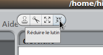
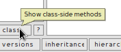
Hi Ben, Here are Squeak and Pharo5 tooltips view. In regard First impression count, it is a big loose for Pharo5. Well this whole theme is horrible anyway, contrast is too low in too many part. In the past I remember to have fix it (not sure) but really I'm fed up of such negligence. I think something is not working properly in the Pharo process release. Another complain, why do we have now for Morph #setBallonText: and #helpText: to set tooltips? With my little resource, I am just itching the surface, I wonder how it is deep underneath. Thanks Hilaire Le 30/01/2017 à 15:56, Ben Coman a écrit :
Hi Hilaire,
Can you provide a screenshot comparison of these?
-- Dr. Geo http://drgeo.eu

On Mon, Jan 30, 2017 at 4:16 PM, Hilaire <hilaire@drgeo.eu> wrote:
Hi Ben,
Here are Squeak and Pharo5 tooltips view.
In regard First impression count, it is a big loose for Pharo5. Well this whole theme is horrible anyway, contrast is too low in too many part.
In the past I remember to have fix it (not sure) but really I'm fed up of such negligence. I think something is not working properly in the Pharo process release.
Another complain, why do we have now for Morph #setBallonText: and #helpText: to set tooltips?
With my little resource, I am just itching the surface, I wonder how it is deep underneath.
This is FOSS, you can always provide bug reports, enhancement commits and propositions to ensure process quality. -- Serge Stinckwich UCBN & UMI UMMISCO 209 (IRD/UPMC) Every DSL ends up being Smalltalk http://www.doesnotunderstand.org/
I don't buy this argument at all: tooltips were modified to become unreadable, there are responsibility behind to be taken by someone. FOSS is not an excuse for mere quality. In the past I have to fix the WaterTheme because a merge was poorly done at some point without obviously no visual testing of the consequences. This is a poor way to do things, and it seems to occur too often in Pharo. The only proposal I can do is that a careful review is needed before release. Don't ask me how or who, I can't help much, but it is not a reason to shut up. Le 30/01/2017 à 17:08, Serge Stinckwich a écrit :
This is FOSS, you can always provide bug reports, enhancement commits and propositions to ensure process quality.
-- Dr. Geo http://drgeo.eu
On Tue, Jan 31, 2017 at 1:30 AM, Hilaire <hilaire@drgeo.eu> wrote:
I don't buy this argument at all: tooltips were modified to become unreadable, there are responsibility behind to be taken by someone. FOSS is not an excuse for mere quality.
The point is that people do FOSS to scratch their own itch, not someone else's. If you have an itch that you don't want to scratch yourself, you need to pay someone to scratch it for you. Now I have no problem with the tooltips. I'm quite happy with them. I know *nothing* about themes. They are not my itch. However I do value your work in the community with Dr Geo etc, so I've taken the past hour to discover a hack to help you. Thats all it took to learn how. After all this is Pharo. Try... BalloonMorph setBalloonColorTo: Color yellow. Or... Pharo3Theme subclass: #Pharo3aTheme instanceVariableNames: '' classVariableNames: '' package: 'AAATheme' Pharo3aTheme>>themeName ^ 'Pharo3a' Pharo3aTheme>>newBalloonHelpIn: aThemedMorph contents: aTextStringOrMorph for: aMorph corner: cornerSymbol "Answer a new balloon help morph with the given text and positioning for aMorph." ^ (super newBalloonHelpIn: aThemedMorph contents: aTextStringOrMorph for: aMorph corner: cornerSymbol) color: Color yellow muchLighter.. And then System > Settings > Appearance > User interface theme = Pharo3a Does that work for you? btw, I just saw your proposed fix to change UITheme>>balloonBackgroundColor. It didn't work for me in 50761 or 60262. cheers -ben
In the past I have to fix the WaterTheme because a merge was poorly done at some point without obviously no visual testing of the consequences.
This is a poor way to do things, and it seems to occur too often in Pharo.
The only proposal I can do is that a careful review is needed before release. Don't ask me how or who, I can't help much, but it is not a reason to shut up.
Le 30/01/2017 à 17:08, Serge Stinckwich a écrit :
This is FOSS, you can always provide bug reports, enhancement commits and propositions to ensure process quality.
-- Dr. Geo http://drgeo.eu
Thanks Ben. Le 30/01/2017 à 19:22, Ben Coman a écrit :
BalloonMorph setBalloonColorTo: Color yellow.
I did not know this one. Btw this method name is awful, #ballonColor: would have made it just fine
Or...
Pharo3Theme subclass: #Pharo3aTheme
I know this one, and I want to avoid it. But thanks again.
Does that work for you?
Sure the former one will do it for Phratch.
btw, I just saw your proposed fix to change UITheme>>balloonBackgroundColor. It didn't work for me in 50761 or 60262.
I have to switch theme back and forth. -- Dr. Geo http://drgeo.eu
On Tue, Jan 31, 2017 at 3:15 AM, Hilaire <hilaire@drgeo.eu> wrote:
Le 30/01/2017 à 19:22, Ben Coman a écrit :
BalloonMorph setBalloonColorTo: Color yellow.
I did not know this one. Btw this method name is awful, #ballonColor: would have made it just fine
I think it is meant to be used very rarely. It sets class variable holding the default colour.
btw, I just saw your proposed fix to change UITheme>>balloonBackgroundColor. It didn't work for me in 50761 or 60262.
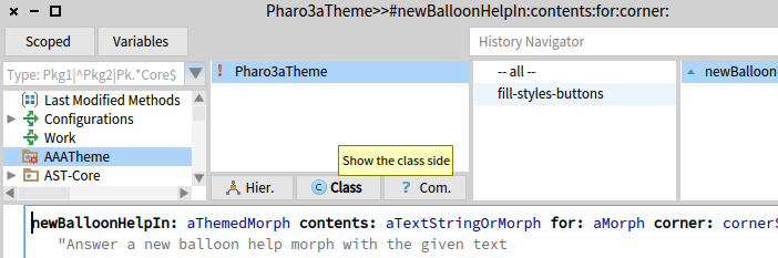
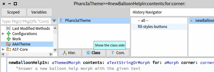
That worked. Now personally I don't really like yellow there for the tooltip. I think it clashes with the blue-ness of the rest of the theme. To keep in harmony with the blue of the theme? how would you consider the tooltip matching the selection colour... Pharo3Theme>>balloonBackgroundColor ^self selectionColor. or slightly lighter like this... Pharo3Theme>>balloonBackgroundColor ^Color cyan muchlighter. Any opinions from the rest of the community on making one of those two default? cheers -ben

Blue is fine too. It was so before. Le 31/01/2017 à 14:14, Ben Coman a écrit :
Any opinions from the rest of the community on making one of those two default?
-- Dr. Geo http://drgeo.eu
Le 30/01/2017 à 15:56, Ben Coman a écrit :
Hi Hilaire,
Can you provide a screenshot comparison of these?
On Mon, Jan 30, 2017 at 11:16 PM, Hilaire <hilaire@drgeo.eu> wrote:
Hi Ben,
Here are Squeak and Pharo5 tooltips view.
In regard First impression count, it is a big loose for Pharo5. Well this whole theme is horrible anyway, contrast is too low in too many part.
In the past I remember to have fix it (not sure) but really I'm fed up of such negligence. I think something is not working properly in the Pharo process release.
Another complain, why do we have now for Morph #setBallonText: and #helpText: to set tooltips?
With my little resource, I am just itching the surface, I wonder how it is deep underneath.
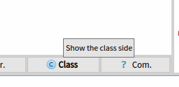
Your Tooltip.png the text appears to be more dark grey than black. I can understand that being harder to read. But why is it dark grey? On my system the text is blacker and I find that clear to read on on a light grey background. cheers -ben
On Tue, Jan 31, 2017 at 1:37 AM, Ben Coman <btc@openinworld.com> wrote:
Le 30/01/2017 à 15:56, Ben Coman a écrit :
Hi Hilaire,
Can you provide a screenshot comparison of these?
On Mon, Jan 30, 2017 at 11:16 PM, Hilaire <hilaire@drgeo.eu> wrote:
Hi Ben,
Here are Squeak and Pharo5 tooltips view.
In regard First impression count, it is a big loose for Pharo5. Well this whole theme is horrible anyway, contrast is too low in too many part.
In the past I remember to have fix it (not sure) but really I'm fed up of such negligence. I think something is not working properly in the Pharo process release.
Another complain, why do we have now for Morph #setBallonText: and #helpText: to set tooltips?
With my little resource, I am just itching the surface, I wonder how it is deep underneath.
Your Tooltip.png the text appears to be more dark grey than black. I can understand that being harder to read. But why is it dark grey? On my system the text is blacker and I find that clear to read on on a light grey background.
cheers -ben
Actually mine also looks fuzzy in the web browser. Opening both snapshots with a native tool and comparing them, you font looks different and slightly smaller. I'm using default fonts. Under System > Settings > Standard Fonts > Balloon-help I have Source Sans Pro Regular 9. What is your setting? cheers -ben
Indeed font is different, but this one can be changed programmatically, so can be fixed. I am not sure the same can be done for the background, it is more important to improve the contrast (for example yellow or even blue as it was some release ago). The Squeak tooltip is nice. Hilaire Le 30/01/2017 à 18:37, Ben Coman a écrit :
Your Tooltip.png the text appears to be more dark grey than black. I can understand that being harder to read. But why is it dark grey? On my system the text is blacker and I find that clear to read on on a light grey background.
-- Dr. Geo http://drgeo.eu
Well it can't. So here is the fix for pharo6 https://pharo.fogbugz.com/f/cases/edit/19627/ Le 30/01/2017 à 18:53, Hilaire a écrit :
I am not sure the same can be done for the background, it is more important to improve the contrast (for example yellow or even blue as it was some release ago).
-- Dr. Geo http://drgeo.eu

"So in Pharo5 we have these 'beautiful' unreadable tooltips: tiny black font on light gray (ie. take a look to its squeak counter part, it looks so much more pro)" I am able to read the Pharo tooltips and I have a 6 degree myopia. Sure they can be improved a lot I would not call them pretty but at least for me they are good enough to useful and they rarely bother me.
Does it make a difference? I guess you are wearing your glass when at computer. Le 30/01/2017 à 17:15, Dimitris Chloupis a écrit :
I am able to read the Pharo tooltips and I have a 6 degree myopia.
-- Dr. Geo http://drgeo.eu
On Mon, Jan 30, 2017 at 7:35 PM Hilaire <hilaire@drgeo.eu> wrote:
Does it make a difference? I guess you are wearing your glass when at computer.
Le 30/01/2017 à 17:15, Dimitris Chloupis a écrit :
I am able to read the Pharo tooltips and I have a 6 degree myopia.
-- Dr. Geo http://drgeo.eu
Of course it does, glasses greatly improve the problem, they do not make it go away. Even with glasses there is still some myopia left, because I do not change glasses with every small change in myopia, plus my doctor always gives me lower degree glasses to avoid strain on the eyes, apparently perfect vision glasses strain the myopic eye for some reason. "I don't buy this argument at all: tooltips were modified to become unreadable, there are responsibility behind to be taken by someone. FOSS is not an excuse for mere quality." This implies that commercial software does not have crappy GUI, to my experience 90% of it does. Mainly because the GUI is for some weird reason always a low priority in software development. Also being a FOSS is an excuse for mere quality. FOSS is about working for free people do not like working for free Thus its really hard to find developers for FOSS Thus it takes a very long time to fix long standing problems , even ones that are easy to fix. Its not an excuse its a reason and a fact of life. I would love if people stop demanding stuff out of the blue in FOSS and for some weird reason expect that they will magically happen. Sure I can go in and fix this now for Pharo Will I do it ? Nope None will pay me to do it so I rather work on my own projects which I find far more enjoyable anyway. The last time I fixed a bug in Pharo , there was so much complaining about the way I fixed it that I decided that it would be the very last contribution I did, bug fixing wise. Working on Pharo documentation for some reason has been far smoother experiencer for me, maybe because experienced Pharo coders do not care about beginner orientated documentation. Obviously if I find a bug that really bothers me , I will go in an fix, but so far cannot say I have found such a big. Auto completion is the one that annoys me the most, but still can live with it. Thank you for contributing to Pharo with this fix :)
Le 30/01/2017 à 19:46, Dimitris Chloupis a écrit :
Of course it does, glasses greatly improve the problem, they do not make it go away.
[..] Ok, I was just bugging you on this one.
"I don't buy this argument at all: tooltips were modified to become unreadable, there are responsibility behind to be taken by someone. FOSS is not an excuse for mere quality."
This implies that commercial software does not have crappy GUI, to my experience 90% of it does. Mainly because the GUI is for some weird
This is your say not mine. Free software to get success really need to have strong argument.
Also being a FOSS is an excuse for mere quality.
No, free software is like Darwinism, evolve and adapt to your ecosystem or disappear, same for proprietary software but... ...free software contrary to proprietary software may evolve more easily because of the source code at the disposal of everyone, so evolution and adaptation is easier, quicker. This is exactly what happen to Squeak, then the Pharo fork was the promise for a better software with a different management and more software evolution. In the long term Squeak may just be better, nothing is written in stone as in evolution. Pharo to attract more users in its community has no choice but to improve its overall quality; and as well the first impression count, little details can make some important different to retain users. For example in DrGeo, without affordable tooltips, people will just run it then go away, no obvious way to figure out this mess.
FOSS is about working for free
Again no :) There is paid people like in proprietary software and the bonus of unpaid talented or less talented people. Don't think the unpaid people are the looser, they may gain other important things like learning and improving own knowledge, experimenting/implementing new idea (got several case like that in DrGeo history), improving self-confidence, improving the part you need for your onw stuff/business, etc. So all in all, in the long term I think free software should be superior in quality and affordability to proprietary software.
The last time I fixed a bug in Pharo , there was so much complaining about the way I fixed it that I decided that it would be the very last
But I bet you learn things, especially when people were complaining: its was feedbacks, as the tooltips in the GUI provide it ;) Hilaire -- Dr. Geo http://drgeo.eu
Ok, I was just bugging you on this one.
I feel abused, shame on you :D
This is your say not mine. Free software to get success really need to have strong argument.
Actually the GUI is a a well documented problem, many blog post and many pages have been written by , maybe I am a minority but I definitely not the only on.
Also being a FOSS is an excuse for mere quality.
No, free software is like Darwinism, evolve and adapt to your ecosystem or disappear, same for proprietary software but...
...free software contrary to proprietary software may evolve more easily because of the source code at the disposal of everyone, so evolution and adaptation is easier, quicker. This is exactly what happen to Squeak, then the Pharo fork was the promise for a better software with a different management and more software evolution. In the long term Squeak may just be better, nothing is written in stone as in evolution. Pharo to attract more users in its community has no choice but to improve its overall quality; and as well the first impression count, little details can make some important different to retain users.
To an extend yes FOSS is easier to move forward because it does not need money to have contributors.
BUT That does not change the fact that it tends to has a lot less contributors than commercial software. Also no , FOSS will survive if does not evolve, it will lose users yes, maybe a lot of them but also a lot of people will keep using it because its free. There are still people out there coding for 30 year old technology, a small minority yes, but still tens of thousands of coders. Squeak situation was not about not wanting to evolve it was about people wanting to go different directions. Squeak still evolves , maybe not at the rate that it used to but still people contribute to it. Personally I do not blame the Squeakers or the Pharoers, it was the right choice to fork, those two different ideologies were really hard to live under one roof.
For example in DrGeo, without affordable tooltips, people will just run it then go away, no obvious way to figure out this mess
I think you put too much value to tooltips than they deserve, I will take a well documented , easy to maintained software without any tooltips over a badly documented hard to maintain software with tooltips anyday. Ask your users, what you and I think is of little important, in the end they matter the most. There is a reason why companies spend a ridiculous amount of money on customer surveys.
Again no :) There is paid people like in proprietary software and the bonus of unpaid talented or less talented people. Don't think the unpaid people are the looser, they may gain other important things like learning and improving own knowledge, experimenting/implementing new idea (got several case like that in DrGeo history), improving self-confidence, improving the part you need for your onw stuff/business, etc.
So all in all, in the long term I think free software should be superior in quality and affordability to proprietary software.
That's just wishful thinking, in end , work is work and the more people you have the easier it is to move forward. I did not say working for free makes you a loser, dont put words in my mouth. Not that it would make sense to claim so being a very active contributor to Pharo. I may not have done a lot with bug fixing but I have done a ton of work with PBE. Does that make me a loser ? But the truth remains that there are only 3 people working part time on PBE, me , Stef and Nicolai with other contributing even less part time. We are not enough, over idealize all you want FOSS but the truth is at least in the documentation department where I have a lot of experience we have a severe lack of contributors. Its a huge problem to say to newcomers that we do not even have an up to date general purpose introductory book. It has been almost a decade of Pharo and we are not there yet. Its sad but true. On the other hand , its none's fault , thats how things are with FOSS. So no idea why you would think our documentation should be superior when we have such a hard time to find people and of course the ones we have cannot invest more than a few hours per week if we are lucky. Where is this superiority you claiming, I definitely not see it.
The last time I fixed a bug in Pharo , there was so much complaining about the way I fixed it that I decided that it would be the very last
But I bet you learn things, especially when people were complaining: its was feedbacks, as the tooltips in the GUI provide it ;)
Yes I learned that being egocentric is not such a bad idea afterall, no the feedback did not help, it was just personal opinion and personal opinion is just taste. Some people wanted this way, some people wanted the other way. Personally I was ok with both approaches or my fix not being accepted. In the end my fix was integrated and later on was replaced. In the mean time everyone forgot the whole discussion and life goes on. Truth be told , I have learned a ton about Pharo by myself than with the help of others. Its really hard to find people with similar interests like mine and I have to go and explore by myself unless of course I came against a general problem, like tooltips, but I rarely am so lucky. Of course the help of this list has been extremely valuable through the years for me. Using Pharo is a lot fun but it also a ton of DIY. But you cannot have your cake and eat it too. I have been several times close to quitting Pharo but I never did it , mainly because I became more confident about myself and my ability to solve my own problems. I learned that sometimes you have to truth yourself and take the deep dive into the unknown. This is why I rarely complain about Pharo, apart for my occasional bursts of frustration. Saying all that I must note I am a huge supporter of open source because I believe in the extreme importance of open knowledge and I am proud to be part of the Pharo community.

One way to address this going forward is for theme developers to check their color selections against the e.g. Web Content Accessibility Guidelines (https://www.w3.org/TR/WCAG20/) Using a readily available tool: https://leaverou.github.io/contrast-ratio/ And/or one that makes suggestions of contrasting colors for a palette: http://colorsafe.co And all themes could be subject to passing at a minimum contrast grade (AA seems not too hard?) before being added to the core. And in that way we have a standard of 'good enough' that is more widely accepted than 'works on my machine, for my eyes, in this physical space, with this ambient lighting' Paul HilaireFernandes wrote
Hi,
So in Pharo5 we have these 'beautiful' unreadable tooltips: tiny black font on light gray (ie. take a look to its squeak counter part, it looks so much more pro)
Is there a way to programmatically change the backround color?
Thanks
Hilaire
-- Dr. Geo http://drgeo.eu
-- View this message in context: http://forum.world.st/These-beautiful-tooltips-tp4932206p4932319.html Sent from the Pharo Smalltalk Users mailing list archive at Nabble.com.

Well there is no subclass of GLMBrickColorThemer so dark themes get hardcoded light colors in places for example. The Sublimish theme revealed these kind of problems. I am busy investigating. I made such a subclass and it is used by #colors now. Was missing. GLM stuff should use UITheme current xxxColor items whenever possible. Also we should have a way to reset its color registry that is cached and makes it hard to do things especially in a playground that uses it... Maybe Brick can help in the future with a clean skinning and color theme setup. Especially if Bloc can do whatever window shape (pours oil on the fire...). Phil On Tue, Jan 31, 2017 at 4:08 AM, Paul DeBruicker <pdebruic@gmail.com> wrote:
One way to address this going forward is for theme developers to check their color selections against the e.g. Web Content Accessibility Guidelines (https://www.w3.org/TR/WCAG20/)
Using a readily available tool:
https://leaverou.github.io/contrast-ratio/
And/or one that makes suggestions of contrasting colors for a palette:
And all themes could be subject to passing at a minimum contrast grade (AA seems not too hard?) before being added to the core. And in that way we have a standard of 'good enough' that is more widely accepted than 'works on my machine, for my eyes, in this physical space, with this ambient lighting'
Paul
HilaireFernandes wrote
Hi,
So in Pharo5 we have these 'beautiful' unreadable tooltips: tiny black font on light gray (ie. take a look to its squeak counter part, it looks so much more pro)
Is there a way to programmatically change the backround color?
Thanks
Hilaire
-- Dr. Geo http://drgeo.eu
-- View this message in context: http://forum.world.st/These- beautiful-tooltips-tp4932206p4932319.html Sent from the Pharo Smalltalk Users mailing list archive at Nabble.com.
I would like to help in both accessibility and implementation detail of the theme. In the other hand I fell we are in such flux with the future UI in Pharo. What are the grounds we can stand on regarding UI? Hilaire Le 31/01/2017 à 11:21, phil@highoctane.be a écrit :
Well there is no subclass of GLMBrickColorThemer so dark themes get hardcoded light colors in places for example.
-- Dr. Geo http://drgeo.eu

On Tue, 31 Jan 2017 13:52:54 +0100, Hilaire <hilaire@drgeo.eu> wrote:
I would like to help in both accessibility and implementation detail of the theme. In the other hand I fell we are in such flux with the future UI in Pharo. What are the grounds we can stand on regarding UI?
Improve now. Think later. Bloc/Brick will not be ready before some versions of Pharo.
Hilaire
Le 31/01/2017 à 11:21, phil@highoctane.be a écrit :
Well there is no subclass of GLMBrickColorThemer so dark themes get hardcoded light colors in places for example.
-- Using Opera's mail client: http://www.opera.com/mail/
About colors, I am using these ones for some projects: http://clrs.cc/ Phil On Thu, Feb 2, 2017 at 7:38 PM, stepharong <stepharong@free.fr> wrote:
On Tue, 31 Jan 2017 13:52:54 +0100, Hilaire <hilaire@drgeo.eu> wrote:
I would like to help in both accessibility and implementation detail of
the theme. In the other hand I fell we are in such flux with the future UI in Pharo. What are the grounds we can stand on regarding UI?
Improve now. Think later. Bloc/Brick will not be ready before some versions of Pharo.
Hilaire
Le 31/01/2017 à 11:21, phil@highoctane.be a écrit :
Well there is no subclass of GLMBrickColorThemer so dark themes get hardcoded light colors in places for example.
-- Using Opera's mail client: http://www.opera.com/mail/

On 03/02/2017 07:55, phil@highoctane.be wrote:
About colors, I am using these ones for some projects: http://clrs.cc/
Phil
For my part I use these colors: https://www.materialui.co/colors 500 been the default color and the going higher or lower for contrasts. In fact these colors are implemented in the class MDLColor loadable via the group "color" en MaterialDesignLite project. Here are the guidelines associated with these colors: https://material.io/guidelines/style/color.html#color-color-palette -- Cyril Ferlicot http://www.synectique.eu 2 rue Jacques Prévert 01, 59650 Villeneuve d'ascq France
And there are useful A11Y (Accessibility combos down the page) http://clrs.cc/a11y/ Phil On Thu, Feb 2, 2017 at 7:38 PM, stepharong <stepharong@free.fr> wrote:
On Tue, 31 Jan 2017 13:52:54 +0100, Hilaire <hilaire@drgeo.eu> wrote:
I would like to help in both accessibility and implementation detail of
the theme. In the other hand I fell we are in such flux with the future UI in Pharo. What are the grounds we can stand on regarding UI?
Improve now. Think later. Bloc/Brick will not be ready before some versions of Pharo.
Hilaire
Le 31/01/2017 à 11:21, phil@highoctane.be a écrit :
Well there is no subclass of GLMBrickColorThemer so dark themes get hardcoded light colors in places for example.
-- Using Opera's mail client: http://www.opera.com/mail/
It would be nice to have a palette class with some nice defaults. Cyril could you package what you have in MDL out of MDL so that we can add it to Pharo? Stef
And there are useful A11Y (Accessibility combos down the page)
Phil
On Thu, Feb 2, 2017 at 7:38 PM, stepharong <stepharong@free.fr> wrote:
On Tue, 31 Jan 2017 13:52:54 +0100, Hilaire <hilaire@drgeo.eu> wrote:
I would like to help in both accessibility and implementation detail of the theme. In the other hand I fell we are in such flux with the future UI in Pharo. What are the grounds we can stand on regarding UI?
Improve now. Think later. Bloc/Brick will not be ready before some versions of Pharo.
Hilaire
Le 31/01/2017 à 11:21, phil@highoctane.be a écrit :
Well there is no subclass of GLMBrickColorThemer so dark themes get hardcoded light colors in places for example.
-- Using Opera's mail client: http://www.opera.com/mail/
-- Using Opera's mail client: http://www.opera.com/mail/
On 04/02/2017 18:26, stepharong wrote:
It would be nice to have a palette class with some nice defaults. Cyril could you package what you have in MDL out of MDL so that we can add it to Pharo?
Stef
I extracted it here: https://github.com/DuneSt/MaterialColors In the future I would like to add some utilities methods for example to choose the font color from the background color following MaterialDesign recommendations. Like that we would not have to care about the readability of a font color if the background changes. (Following https://material.io/guidelines/style/color.html#color-color-schemes) -- Cyril Ferlicot http://www.synectique.eu 2 rue Jacques Prévert 01, 59650 Villeneuve d'ascq France
A UI quality team review would be needed before each Pharo release, I mean with a real constraint to postpone release until a good enough quality is reached! In that context I can help. There are many place where tiny efforts could make the UI so much better for newcomers. For example when I saw the debugger tooltips, there are just helpless, their contents are the same as the button label, not acceptable!!! I can't understand the difference between 'over' and 'through'. I guess other may think I don't understand the difference because I am an idiot, but I guess there are a lot of idiots out there, and these are the ones we want to come and *to stay* with Pharo! So any wish to *really* improve the UI quality, or just words? Hilaire Le 02/02/2017 à 19:38, stepharong a écrit :
On Tue, 31 Jan 2017 13:52:54 +0100, Hilaire <hilaire@drgeo.eu> wrote:
I would like to help in both accessibility and implementation detail of the theme. In the other hand I fell we are in such flux with the future UI in Pharo. What are the grounds we can stand on regarding UI?
Improve now. Think later. Bloc/Brick will not be ready before some versions of Pharo.
-- Dr. Geo http://drgeo.eu

On 3 Feb 2017, at 09:21, Hilaire <hilaire@drgeo.eu> wrote:
A UI quality team review would be needed before each Pharo release, I mean with a real constraint to postpone release until a good enough quality is reached! In that context I can help.
There are many place where tiny efforts could make the UI so much better for newcomers.
For example when I saw the debugger tooltips, there are just helpless, their contents are the same as the button label, not acceptable!!!
I can't understand the difference between 'over' and 'through'. I guess other may think I don't understand the difference because I am an idiot, but I guess there are a lot of idiots out there, and these are the ones we want to come and *to stay* with Pharo!
So any wish to *really* improve the UI quality, or just words?
Yes, words is the problem: it is *so* easy to know what others have to do. Trivial. *Doing* is hard⦠maybe you should be in charge of reviewing all changes for pharo for one month? Marcus
Yes, my words as yours are cheap, but life not: - 6:30am, wake up, speedy breakfast, heading to school - all days: teaching kid, getting grads, metting other teachers, oh using DrGeo during class, it is cool, it is super stable, hopefully I kept it on Pharo 3 to avoid undetected incompatibility issues I faced otherwise. Wants to use Phratch, but the UI quality not good enough yet, need a few fixing. - afternoon and late afternoon: teacher work, coding/consulting/training ICT for IT department Some fun with Phratch bugs fixing. I want to remove all this UI bugs hanging around before producing video courses for teachers. Oh, what these tools are about, there are no tips (not good for teacher or kids!). Oh using wrong method to activate tooltip, API changes, why two methods now, I don't understand the logic, okay got the tips to show up, oh they look like shit (not pro). Time for dinner. Later on the evening: try to figure out this tooltips why there are so awfull, wasting time again on that. Why is it so ugly. I will not release DrGeo looking like that, why is it happening in pharo. Getting upset. And then so on with other problems Complaining on the list about the overall Pharo quality. Oh I appear to be the bad guy, I should take responsibility, ok may be during my bed time then. If you read carefully I proposed to help in my previous, so no need to reply with this trivial "show me the code". If there is a UI quality team, I want and I can help a bit, but my plates are already mostly full. But if Pharo thinks quality is good enough then ok, I will shut up. Hilaire Le 03/02/2017 à 09:54, denker a écrit :
Yes, words is the problem: it is *so* easy to know what others have to do. Trivial. *Doing* is hard⦠maybe you should be in charge of reviewing all changes for pharo for one month?
-- Dr. Geo http://drgeo.eu
On Fri, Feb 3, 2017 at 12:00 PM, Hilaire <hilaire@drgeo.eu> wrote:
Yes, my words as yours are cheap, but life not:
Hi Hilaire,
- 6:30am, wake up, speedy breakfast, heading to school
- all days: teaching kid, getting grads, metting other teachers, oh using DrGeo during class, it is cool, it is super stable, hopefully I kept it on Pharo 3 to avoid undetected incompatibility issues I faced otherwise. Wants to use Phratch, but the UI quality not good enough yet, need a few fixing.
- afternoon and late afternoon: teacher work, coding/consulting/training ICT for IT department
Some fun with Phratch bugs fixing. I want to remove all this UI bugs hanging around before producing video courses for teachers. Oh, what these tools are about, there are no tips (not good for teacher or kids!). Oh using wrong method to activate tooltip, API changes, why two methods now, I don't understand the logic, okay got the tips to show up, oh they look like shit (not pro). Time for dinner.
Later on the evening: try to figure out this tooltips why there are so awfull, wasting time again on that. Why is it so ugly. I will not release DrGeo looking like that, why is it happening in pharo. Getting upset. And then so on with other problems
Complaining on the list about the overall Pharo quality. Oh I appear to be the bad guy, I should take responsibility, ok may be during my bed time then.
What you describe looks very similar to my experience. I have lectures at the university (15h nowadays), research papers to wrote, students to supervise on some Pharo projects, projects based on Pharo to push and sometimes some annoying bugs related to UI. Spend sometime to try to fix this problems but I have to stop at one point because this is my main activity ... I guess we are all suffering from the same experience and the only solutions maybe is to add or fix some issues on the bug tracker. But if you try to fix some bugs, you realize that is not an easy task, etc ... Like Markus say during his talk last ESUG, even doing a small step is already great.
If you read carefully I proposed to help in my previous, so no need to reply with this trivial "show me the code". If there is a UI quality team, I want and I can help a bit, but my plates are already mostly full. But if Pharo thinks quality is good enough then ok, I will shut up.
I prefer people complaining, than people talking endlessly ;-) I like the idea of a UI quality team and more dedicated teams should be built maybe on documentation, CI, etc ... I guess for an UI quality team, the first step is to propose a process on how to assess the quality of a release. Regards, -- Serge Stinckwich UCBN & UMI UMMISCO 209 (IRD/UPMC) Every DSL ends up being Smalltalk http://www.doesnotunderstand.org/
UI quality team could be fun. Here are some ideas how it could be organised: - at least 3/5/7 persons looking at issues and reporting it. Why three? Easier to decide and UI may for some part be very opinionated These persons could discuss how to fix it, if no consensus, the team could ask to the whole community @devel. - should the team discuss on a dedicated mailing list? May be to avoid too much noise on @devel... - the team will look mostly at non blocking bugs, ones in the sphere of "First impression count", so it can be clarity of the UI (message, tips, color, etc) or some annoying bugs regarding usability - the team should be able to fix itself most of these issues. How does it sound? Hilaire Le 03/02/2017 à 12:25, Serge Stinckwich a écrit :
I like the idea of a UI quality team and more dedicated teams should be built maybe on documentation, CI, etc ... I guess for an UI quality team, the first step is to propose a process on how to assess the quality of a release.
-- Dr. Geo http://drgeo.eu
On Fri, 03 Feb 2017 22:20:28 +0100, Hilaire <hilaire@drgeo.eu> wrote:
UI quality team could be fun.
Here are some ideas how it could be organised:
- at least 3/5/7 persons looking at issues and reporting it. Why three? Easier to decide and UI may for some part be very opinionated These persons could discuss how to fix it, if no consensus, the team could ask to the whole community @devel.
- should the team discuss on a dedicated mailing list? May be to avoid too much noise on @devel...
- the team will look mostly at non blocking bugs, ones in the sphere of "First impression count", so it can be clarity of the UI (message, tips, color, etc) or some annoying bugs regarding usability
- the team should be able to fix itself most of these issues.
How does it sound?
good but will we find these people?
Hilaire
Le 03/02/2017 à 12:25, Serge Stinckwich a écrit :
I like the idea of a UI quality team and more dedicated teams should be built maybe on documentation, CI, etc ... I guess for an UI quality team, the first step is to propose a process on how to assess the quality of a release.
-- Using Opera's mail client: http://www.opera.com/mail/
Will Serge, Dimitris willing to join in with me? Hilaire Le 04/02/2017 à 18:26, stepharong a écrit :
How does it sound?
good but will we find these people?
-- Dr. Geo http://drgeo.eu
Le 04/02/2017 à 20:46, Hilaire a écrit :
Will Serge, Dimitris willing to join in with me?
Hilaire
Le 04/02/2017 à 18:26, stepharong a écrit :
How does it sound?
good but will we find these people?
If you create a mailing list I would be interested to subscribe. I would like to help to improve everything in the category "first impression count" but I don't know if I will have the time in the next month. -- Cyril Ferlicot http://www.synectique.eu 2 rue Jacques Prévert 01, 59650 Villeneuve d'ascq France
I guess we can find better qualified people about UI quality than me ;-) Doru or Johan are examples. Envoyé de mon iPhone
Le 4 févr. 2017 à 21:07, Cyril Ferlicot D. <cyril.ferlicot@gmail.com> a écrit :
Le 04/02/2017 à 20:46, Hilaire a écrit : Will Serge, Dimitris willing to join in with me?
Hilaire
Le 04/02/2017 à 18:26, stepharong a écrit :
How does it sound?
good but will we find these people?
If you create a mailing list I would be interested to subscribe.
I would like to help to improve everything in the category "first impression count" but I don't know if I will have the time in the next month.
-- Cyril Ferlicot
2 rue Jacques Prévert 01, 59650 Villeneuve d'ascq France
May be more naive eyes will more likely see glitches Le 04/02/2017 à 22:45, serge.stinckwich@gmail.com a écrit :
I guess we can find better qualified people about UI quality than me ;-) Doru or Johan are examples.
-- Dr. Geo http://drgeo.eu

Thanks for the vote of confidence :-) but sadly due to my move I wonât be able to spend much time on Pharo in the near future :-( -- Does this mail seem too brief? Sorry for that, I donât mean to be rude! Please see http://emailcharter.org . Johan Fabry - http://pleiad.cl/~jfabry PLEIAD and RyCh labs - Computer Science Department (DCC) - University of Chile
On 04 Feb 2017, at 18:45, serge.stinckwich@gmail.com wrote:
I guess we can find better qualified people about UI quality than me ;-) Doru or Johan are examples.
Envoyé de mon iPhone
Complaining on the list about the overall Pharo quality. Oh I appear to be the bad guy, I should take responsibility, ok may be during my bed time then.
If you read carefully I proposed to help in my previous, so no need to reply with this trivial "show me the code". If there is a UI quality team, I want and I can help a bit, but my plates are already mostly full. But if Pharo thinks quality is good enough then ok, I will shut up.
No, what I say is 1) Even the most trivial thing only gets done because someone does it. (one could think that there is some smallness and obviousness where things just âdo themselvesâ⦠I mean, that problem X is so obvious and trivial! Nope. Someone has to do it. Physically do that instead of something else. 2) Because something is not done does not mean that it was rejected (or people think that what we have is perfect). The problem is that there is just nobody whose fault this is⦠there is just nobody who did the obvious, because there is just nobody who did it. No bad intention, no judging. It just needs to be done. Teams can be nice to make it more fun, to have more drive. Marcus
On Fri, Feb 3, 2017 at 4:54 PM, denker <marcus.denker@inria.fr> wrote:
On 3 Feb 2017, at 09:21, Hilaire <hilaire@drgeo.eu> wrote:
A UI quality team review would be needed before each Pharo release, I mean with a real constraint to postpone release until a good enough quality is reached!
Its always a question of resources and priorities. For example, is the tooltip text more important than... 17240 Spur - when saving an image, it never shrinks 18638 Image is growing in size (unnecessary instances of UndoRedoRecords) 19606 Switch SSL Plugin Code for macOS to openssl 19645 Enabling search triggers error in the FastTable renderer for Glamour 18654 Setting are not being loaded 18668 Computer UUID does not change when image is moved to another machine Maybe yes from your perspective, passion and needs. Maybe you don't feel you have time, expertise or passion to work on those listed issues yourself. But others may consider it more important for themselves to work on the listed issues, and that is what they work on with their limited time. But since the Release can't be dragged out forever, a cut must be made and perhaps the polish of the UI suffers. Now its often the case that the person who clearly sees the issues, and is driven to find them, is best placed to solve them. If you are willing to volunteer some effort there, I think that would be a great thing. I don't want to drive it, but I would certainly be willing to give close support to quickly review your slices and collaborate on anything gnarly. cheers -ben
In that context I can help.
There are many place where tiny efforts could make the UI so much better for newcomers.
For example when I saw the debugger tooltips, there are just helpless, their contents are the same as the button label, not acceptable!!!
I can't understand the difference between 'over' and 'through'. I guess other may think I don't understand the difference because I am an idiot, but I guess there are a lot of idiots out there, and these are the ones we want to come and *to stay* with Pharo!
So any wish to *really* improve the UI quality, or just words?
Yes, words is the problem: it is *so* easy to know what others have to do. Trivial. *Doing* is hard⦠maybe you should be in charge of reviewing all changes for pharo for one month?

Hi Hilaire, Thanks for caring about the UI. Unfortunately, your message sounded like an angry complaint and this often has the tendency to stifle collaboration. As I am sure this was not your intention, letâs try to take that energy and transform it into something positive that can lead to action. Concretely: You complained about the text in the tooltips. I understand that you do not have time to fix the code, but here is what you can easily do: propose the concrete pieces of text that would work for you and we can take it from there. What do you say? Cheers, Doru
On Feb 3, 2017, at 3:38 PM, Ben Coman <btc@openInWorld.com> wrote:
On Fri, Feb 3, 2017 at 4:54 PM, denker <marcus.denker@inria.fr> wrote:
On 3 Feb 2017, at 09:21, Hilaire <hilaire@drgeo.eu> wrote:
A UI quality team review would be needed before each Pharo release, I mean with a real constraint to postpone release until a good enough quality is reached!
Its always a question of resources and priorities.
For example, is the tooltip text more important than... 17240 Spur - when saving an image, it never shrinks 18638 Image is growing in size (unnecessary instances of UndoRedoRecords) 19606 Switch SSL Plugin Code for macOS to openssl 19645 Enabling search triggers error in the FastTable renderer for Glamour 18654 Setting are not being loaded 18668 Computer UUID does not change when image is moved to another machine
Maybe yes from your perspective, passion and needs. Maybe you don't feel you have time, expertise or passion to work on those listed issues yourself. But others may consider it more important for themselves to work on the listed issues, and that is what they work on with their limited time. But since the Release can't be dragged out forever, a cut must be made and perhaps the polish of the UI suffers.
Now its often the case that the person who clearly sees the issues, and is driven to find them, is best placed to solve them. If you are willing to volunteer some effort there, I think that would be a great thing. I don't want to drive it, but I would certainly be willing to give close support to quickly review your slices and collaborate on anything gnarly.
cheers -ben
In that context I can help.
There are many place where tiny efforts could make the UI so much better for newcomers.
For example when I saw the debugger tooltips, there are just helpless, their contents are the same as the button label, not acceptable!!!
I can't understand the difference between 'over' and 'through'. I guess other may think I don't understand the difference because I am an idiot, but I guess there are a lot of idiots out there, and these are the ones we want to come and *to stay* with Pharo!
So any wish to *really* improve the UI quality, or just words?
Yes, words is the problem: it is *so* easy to know what others have to do. Trivial. *Doing* is hard⦠maybe you should be in charge of reviewing all changes for pharo for one month?
-- www.tudorgirba.com www.feenk.com "No matter how many recipes we know, we still value a chef."
Le 03/02/2017 à 17:12, Tudor Girba a écrit :
Unfortunately, your message sounded like an angry complaint and this often has the tendency to stifle collaboration. As I am sure this was not your intention, letâs try to take that energy and transform it into something positive that can lead to action.
Concretely: You complained about the text in the tooltips. I understand that you do not have time to fix the code, but here is what you can easily do: propose the concrete pieces of text that would work for you and we can take it from there.
What do you say?
I say we have an important misunderstanding, it would have been better you re-read my previous post than trying to interpret my intention. The only way to respond to you is to ask you to explain me, if you know, what are the differences between 'over' and 'through' buttons in the debugger. Then I may be able to word tooltips for these two buttons, but you will have already word it in your explanation I guess. Ok we are just making round circle here ;) I guess a UI quality team could see that sort of tiny itches and ask to the community, then fix it. Hilaire -- Dr. Geo http://drgeo.eu

The over button means step over the message highlighted, the through button means step into the message highlighted and single step through the statements in the message. Sent from my iPhone
On Feb 3, 2017, at 13:29, Hilaire <hilaire@drgeo.eu> wrote:
Le 03/02/2017 à 17:12, Tudor Girba a écrit : Unfortunately, your message sounded like an angry complaint and this often has the tendency to stifle collaboration. As I am sure this was not your intention, letâs try to take that energy and transform it into something positive that can lead to action.
Concretely: You complained about the text in the tooltips. I understand that you do not have time to fix the code, but here is what you can easily do: propose the concrete pieces of text that would work for you and we can take it from there.
What do you say?
I say we have an important misunderstanding, it would have been better you re-read my previous post than trying to interpret my intention.
The only way to respond to you is to ask you to explain me, if you know, what are the differences between 'over' and 'through' buttons in the debugger. Then I may be able to word tooltips for these two buttons, but you will have already word it in your explanation I guess. Ok we are just making round circle here ;)
I guess a UI quality team could see that sort of tiny itches and ask to the community, then fix it.
Hilaire
-- Dr. Geo http://drgeo.eu
On Feb 3, 2017, at 13:29, Hilaire <hilaire@drgeo.eu> wrote:
what are the differences between 'over' and 'through' buttons in the debugger.
On Sat, Feb 4, 2017 at 8:09 AM, John Pfersich <jpfersich@gmail.com> wrote:
The over button means step over the message highlighted, the through button means step into the message highlighted and single step through the statements in the message.
I'm not sure if I am correct, but more than stepping over/through messages, I normally think about it as how blocks are handled. Over is step over a block. Through is step through a block. Try debugging this, purely with Over and then purely with Through... self inform: '1'. #(2 3 4) do: [:n| self inform: n printString ]. self inform: '5'. However its not completely about blocks, since Over versus Through has little difference on debugging this... self inform: '1'. 2 to: 4 do: [:n| self inform: n printString ]. self inform: '5'. So it seems it affects a certain subset of messages, which is at least the usual enumeration messages... #do: #collect: #select: #detect: but I don't know what the comprehensive list is. So maybe that it another way to define the difference Over steps over enumeration of a block Through step through enumeration of a block or... Over steps of iteration of a block Through step through iteration of a block I'm not sure which is more correct. cheers -ben

Well, we got a real Debugger Model which says: DebugSession>>#stepInto: aContext "Send the selected message in selectedContext, and take control in the method invoked to allow further step or send." DebugSession>>#stepOver: aContext "Send the selected message in selectedContext, and regain control after the invoked method returns." DebugSession>>#stepThrough: aContext "Send messages until you return to selectedContext. Used to step into a block in the method." I must admit that Over vs Through confuses the hell out of me, but playing with it, this is one feature I should have learned to use much earlier! My interpretation now is: Through is just like Over but it will stop again whenever the context becomes the current one while doing the Over. And you are right: it is very useful when dealing with iteration blocks, since each time inside one of the blocks used as arguments, the debugger will stop, and you can trace the execution. Try Debug It on the following expression: #(1 2 3 4 5) sum. Start by stepping Into the #sum, next step Over the first assignment (sample := self anyOne) and then use Through for the #inject:into: iteration and observe how you get control back each time through (aha) the block [:accum :each | accum + each]. Pretty cool actually.
On 4 Feb 2017, at 17:10, Ben Coman <btc@openinworld.com> wrote:
On Feb 3, 2017, at 13:29, Hilaire <hilaire@drgeo.eu> wrote:
what are the differences between 'over' and 'through' buttons in the debugger.
On Sat, Feb 4, 2017 at 8:09 AM, John Pfersich <jpfersich@gmail.com> wrote:
The over button means step over the message highlighted, the through button means step into the message highlighted and single step through the statements in the message.
I'm not sure if I am correct, but more than stepping over/through messages, I normally think about it as how blocks are handled.
Over is step over a block. Through is step through a block.
Try debugging this, purely with Over and then purely with Through... self inform: '1'. #(2 3 4) do: [:n| self inform: n printString ]. self inform: '5'.
However its not completely about blocks, since Over versus Through has little difference on debugging this... self inform: '1'. 2 to: 4 do: [:n| self inform: n printString ]. self inform: '5'.
So it seems it affects a certain subset of messages, which is at least the usual enumeration messages... #do: #collect: #select: #detect: but I don't know what the comprehensive list is.
So maybe that it another way to define the difference Over steps over enumeration of a block Through step through enumeration of a block
or... Over steps of iteration of a block Through step through iteration of a block
I'm not sure which is more correct. cheers -ben
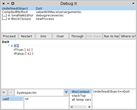
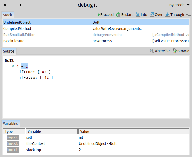
Hi Hilaire, I did not reinterpret your intention. I gave you feedback. You can take it into account or not. But, I actually do not understand where the original problem comes from. I probably miss something and that is why please allow me to describe what I see and then you can indicate more concretely where the issue comes from. This whole discussion was spawned on the premise that things are degrading going forward from Pharo 3.0 to 6.0, and the debugger actions was one issue. Here is a screenshot of a Pharo 3 debugger: Now, letâs look at the debugger from 6.0. The main actions that exist in Pharo 6 also exist in Pharo 3 including Over and Through. These actions exist also in Pharo 1. Furthermore, in the Pharo 3 debugger (which is also available in Pharo 6), there are no tooltips. The main goal of the tooltip from GTDebugger is to offer the shortcuts associated with the buttons. There were shortcuts associated to the debugger actions in Pharo 3, but when looking at the buttons this information was not offered directly. Could you point me to where the interface has degraded and how the tooltips decrease value? Cheers, Doru
On Feb 3, 2017, at 10:29 PM, Hilaire <hilaire@drgeo.eu> wrote:
Le 03/02/2017 à 17:12, Tudor Girba a écrit :
Unfortunately, your message sounded like an angry complaint and this often has the tendency to stifle collaboration. As I am sure this was not your intention, letâs try to take that energy and transform it into something positive that can lead to action.
Concretely: You complained about the text in the tooltips. I understand that you do not have time to fix the code, but here is what you can easily do: propose the concrete pieces of text that would work for you and we can take it from there.
What do you say?
I say we have an important misunderstanding, it would have been better you re-read my previous post than trying to interpret my intention.
The only way to respond to you is to ask you to explain me, if you know, what are the differences between 'over' and 'through' buttons in the debugger. Then I may be able to word tooltips for these two buttons, but you will have already word it in your explanation I guess. Ok we are just making round circle here ;)
I guess a UI quality team could see that sort of tiny itches and ask to the community, then fix it.
Hilaire
-- Dr. Geo http://drgeo.eu
-- www.tudorgirba.com www.feenk.com "Every now and then stop and ask yourself if the war you're fighting is the right one."
Damned you are inferring a lot on my writing, but I understand now. In my previous post I had no argument against the *new* debugger, nor I wrote its interface degraded. I just made an absolute remark regarding lack of information on non obvious function, in the debugger in my example, which apply to both P3 and P5. Don't make it personal, it is not. Btw in the past I wrote I see no reason to complain about the top positioning of the buttons, you see... As you wrote about comparing Pharo3 and Pharo5 debugger tooltips, now I think the situation improve because there is a least shortcut mentioned in the tips. But still a description of each button is in my opinion more than needed. Le 04/02/2017 à 08:34, Tudor Girba a écrit :
Could you point me to where the interface has degraded and how the tooltips decrease value?
-- Dr. Geo http://drgeo.eu
Hilaire can you create bug entry to little usability glitches. Esteban told me that he will do a pass. Stef On Fri, 03 Feb 2017 09:21:18 +0100, Hilaire <hilaire@drgeo.eu> wrote:
A UI quality team review would be needed before each Pharo release, I mean with a real constraint to postpone release until a good enough quality is reached! In that context I can help.
There are many place where tiny efforts could make the UI so much better for newcomers.
For example when I saw the debugger tooltips, there are just helpless, their contents are the same as the button label, not acceptable!!!
I can't understand the difference between 'over' and 'through'. I guess other may think I don't understand the difference because I am an idiot, but I guess there are a lot of idiots out there, and these are the ones we want to come and *to stay* with Pharo!
So any wish to *really* improve the UI quality, or just words?
Hilaire
Le 02/02/2017 à 19:38, stepharong a écrit :
On Tue, 31 Jan 2017 13:52:54 +0100, Hilaire <hilaire@drgeo.eu> wrote:
I would like to help in both accessibility and implementation detail of the theme. In the other hand I fell we are in such flux with the future UI in Pharo. What are the grounds we can stand on regarding UI?
Improve now. Think later. Bloc/Brick will not be ready before some versions of Pharo.
-- Using Opera's mail client: http://www.opera.com/mail/
+1 there are colors that I cannot see well in the drak theme and I'm not disabled or color blind.
One way to address this going forward is for theme developers to check their color selections against the e.g. Web Content Accessibility Guidelines (https://www.w3.org/TR/WCAG20/)
Using a readily available tool:
https://leaverou.github.io/contrast-ratio/
And/or one that makes suggestions of contrasting colors for a palette:
And all themes could be subject to passing at a minimum contrast grade (AA seems not too hard?) before being added to the core. And in that way we have a standard of 'good enough' that is more widely accepted than 'works on my machine, for my eyes, in this physical space, with this ambient lighting'
Paul
HilaireFernandes wrote
Hi,
So in Pharo5 we have these 'beautiful' unreadable tooltips: tiny black font on light gray (ie. take a look to its squeak counter part, it looks so much more pro)
Is there a way to programmatically change the backround color?
Thanks
Hilaire
-- Dr. Geo http://drgeo.eu
-- View this message in context: http://forum.world.st/These-beautiful-tooltips-tp4932206p4932319.html Sent from the Pharo Smalltalk Users mailing list archive at Nabble.com.
-- Using Opera's mail client: http://www.opera.com/mail/
participants (14)
-
 Ben Coman
 -
 Cyril Ferlicot D.
 -
 denker
 -
 Dimitris Chloupis
 -
 Hilaire
 -
 Johan Fabry
 -
 John Pfersich
 -
 Paul DeBruicker
 -
 phil@highoctane.be
 -
 Serge Stinckwich
 -
serge.stinckwich@gmail.com
-
 stepharong
 -
 Sven Van Caekenberghe
 -
 Tudor Girba