[Pharo-project] Smart Suggestion Version 1

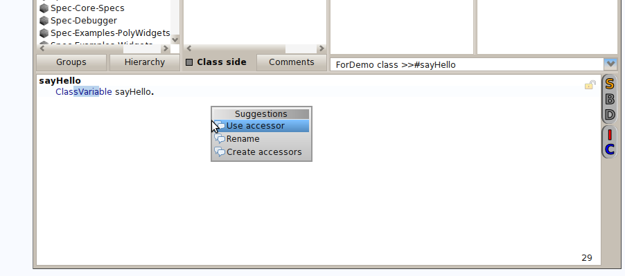
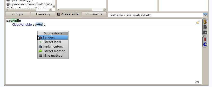
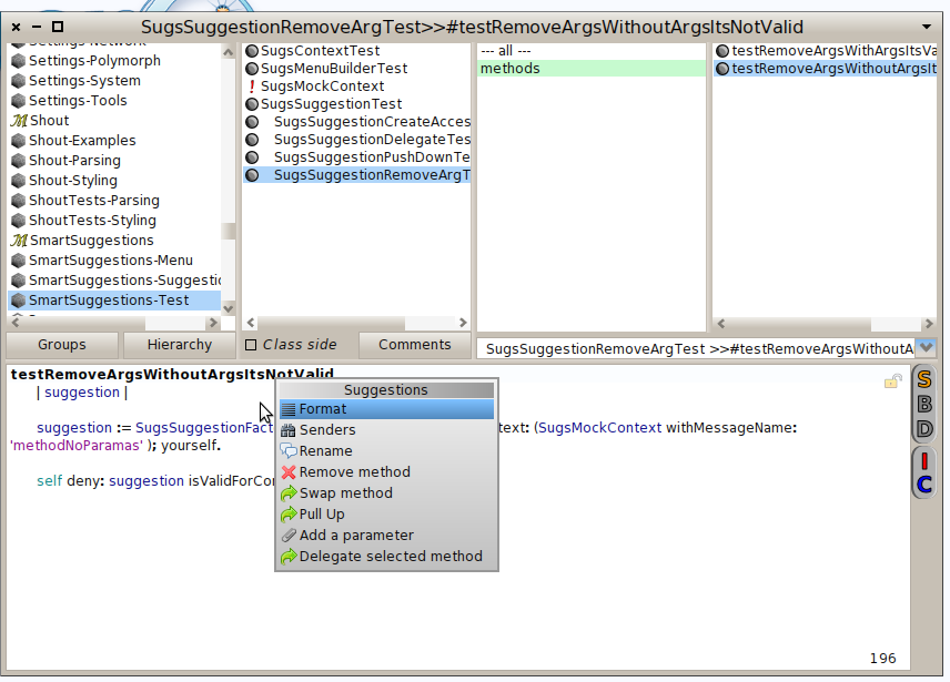
Hello! After some work I think that Smart Suggestions it's ready to have some real feedback to continue growing up :) What is it? The idea it's to have suggestions based in the text selected or the cursor position. Actually there are suggestions for: - Temporary/Instance/Class Variable - Class - Method (when you are in the selector) - Source (multiple lines) - Message How to install it? Gofer it smalltalkhubUser: 'gisela' project: 'SmartSuggestions'; package: 'SmartSuggestions'; load. Some screen shots: (to activate de menu the shortcut es Ctrl + t for windows or unix and Command + t for mac) [image: Imágenes integradas 1] [image: Imágenes integradas 2] [image: Imágenes integradas 3] How to define a new action? It's easy to define your own action only use the pragma in your custom method and make sure to retunr an instance of SugsSuggestion, examples in SugsSuggestionFactory are categorized by the selection. If you have some comments I will be very happy to heard about, I have removed the actions form nautilus menu, because it was to much visual noise (at least for me) if you want to add it, only uncoment the pragma in: #SugsMenuBuilder>>addSuggestionToSourceCodeMenu: ps: It could appear a DNU when fetching the suggestions for a class variable the description and solution are in https://pharo.fogbugz.com/default.asp?10380#75204

On Apr 24, 2013, at 1:18 AM, Gisela Decuzzi <giseladecuzzi@gmail.com> wrote:
Hello! After some work I think that Smart Suggestions it's ready to have some real feedback to continue growing up :)
What is it? The idea it's to have suggestions based in the text selected or the cursor position. Actually there are suggestions for: - Temporary/Instance/Class Variable - Class - Method (when you are in the selector) - Source (multiple lines) - Message
Nice!
If you have some comments I will be very happy to heard about, I have removed the actions form nautilus menu, because it was to much visual noise (at least for me) if you want to add it, only uncoment the pragma in: #SugsMenuBuilder>>addSuggestionToSourceCodeMenu:
Maybe we can make a destination between two cases: 1) cursor is placed somewhere. Here people are interested in suggestions. The context menu like it is now makes sense (I would add one entry for the suggestions, in addition to the shortcut) 2) The user *selected* something explicitly. Here I think we should show a modified context menu that only has those things the make sense on the selection. Nobody want to "Debug it" a variable, or "print it" a syntactically invalid selection...
ps: It could appear a DNU when fetching the suggestions for a class variable the description and solution are in https://pharo.fogbugz.com/default.asp?10380#75204
I am tempted to deprecate #definesMethod: and just rename it to canUnderstand: (and fix all senders) This way the RB model for code would be one step closer to normal classes and methods. The real plan of course is to unify *all* meta models for code and just use Ring. The RBMethod/RBClass hierarchy is one of the candidates for that, PseudoClass and PseudoMethod the other. (I am sure there are eve more). Marcus

Le 24/04/2013 09:22, Marcus Denker a écrit :
On Apr 24, 2013, at 1:18 AM, Gisela Decuzzi <giseladecuzzi@gmail.com <mailto:giseladecuzzi@gmail.com>> wrote:
Hello! After some work I think that Smart Suggestions it's ready to have some real feedback to continue growing up :)
What is it? The idea it's to have suggestions based in the text selected or the cursor position. Actually there are suggestions for: - Temporary/Instance/Class Variable - Class - Method (when you are in the selector) - Source (multiple lines) - Message
Nice!
If you have some comments I will be very happy to heard about, I have removed the actions form nautilus menu, because it was to much visual noise (at least for me) if you want to add it, only uncoment the pragma in: #SugsMenuBuilder>>addSuggestionToSourceCodeMenu:
Maybe we can make a destination between two cases:
1) cursor is placed somewhere. Here people are interested in suggestions. The context menu like it is now makes sense (I would add one entry for the suggestions, in addition to the shortcut)
2) The user *selected* something explicitly. Here I think we should show a modified context menu that only has those things the make sense on the selection. Nobody want to "Debug it" a variable, or "print it" a syntactically invalid selection...
Hum, this one looks cool. The default action menu is quite long (debugIt, exploreIt, etc...) and making it shorter is a nice touch.
Marcus
Thierry -- Thierry Goubier CEA list Laboratoire des Fondations des Systèmes Temps Réel Embarqués 91191 Gif sur Yvette Cedex France Phone/Fax: +33 (0) 1 69 08 32 92 / 83 95

Am 24.04.2013 um 10:00 schrieb Goubier Thierry <thierry.goubier@cea.fr>:
Maybe we can make a destination between two cases:
1) cursor is placed somewhere. Here people are interested in suggestions. The context menu like it is now makes sense (I would add one entry for the suggestions, in addition to the shortcut)
2) The user *selected* something explicitly. Here I think we should show a modified context menu that only has those things the make sense on the selection. Nobody want to "Debug it" a variable, or "print it" a syntactically invalid selection...
Hum, this one looks cool. The default action menu is quite long (debugIt, exploreIt, etc...) and making it shorter is a nice touch.
Yes, but unfortunately it doesn't work that way most of the time for the unexperienced.. Learning a UI means knowing where things are. A changing context menu mostly leads to confusion because you struggle finding things you saw before. Those things only make sense if you're already comfortable with the UI and the environment. I think that is one reason we menu entries are often just greyed out. This way you have the orientation because the menu is of the same shape and by seeing greyed out stuff you can immediately learn that some menu entries do not make sense in this context. Maybe the way it can work is to have this as an option. First grey out things and the expert can switch them off to make disabled entries invisible. But then I'm far from being an UI/UX expert. Norbert
On Apr 24, 2013, at 10:30 AM, Norbert Hartl <norbert@hartl.name> wrote:
Am 24.04.2013 um 10:00 schrieb Goubier Thierry <thierry.goubier@cea.fr>:
Maybe we can make a destination between two cases:
1) cursor is placed somewhere. Here people are interested in suggestions. The context menu like it is now makes sense (I would add one entry for the suggestions, in addition to the shortcut)
2) The user *selected* something explicitly. Here I think we should show a modified context menu that only has those things the make sense on the selection. Nobody want to "Debug it" a variable, or "print it" a syntactically invalid selection...
Hum, this one looks cool. The default action menu is quite long (debugIt, exploreIt, etc...) and making it shorter is a nice touch.
Yes, but unfortunately it doesn't work that way most of the time for the unexperienced.. Learning a UI means knowing where things are. A changing context menu mostly leads to confusion because you struggle finding things you saw before. Those things only make sense if you're already comfortable with the UI and the environment. I think that is one reason we menu entries are often just greyed out. This way you have the orientation because the menu is of the same shape and by seeing greyed out stuff you can immediately learn that some menu entries do not make sense in this context. Maybe the way it can work is to have this as an option. First grey out things and the expert can switch them off to make disabled entries invisible.
But aren't *context* menus named like that because they depend on the context? If I get a context menu for a class or a method in the panes above, they are different, too. Marcus
Am 24.04.2013 um 10:42 schrieb Marcus Denker <marcus.denker@inria.fr>:
On Apr 24, 2013, at 10:30 AM, Norbert Hartl <norbert@hartl.name> wrote:
Am 24.04.2013 um 10:00 schrieb Goubier Thierry <thierry.goubier@cea.fr>:
Maybe we can make a destination between two cases:
1) cursor is placed somewhere. Here people are interested in suggestions. The context menu like it is now makes sense (I would add one entry for the suggestions, in addition to the shortcut)
2) The user *selected* something explicitly. Here I think we should show a modified context menu that only has those things the make sense on the selection. Nobody want to "Debug it" a variable, or "print it" a syntactically invalid selection...
Hum, this one looks cool. The default action menu is quite long (debugIt, exploreIt, etc...) and making it shorter is a nice touch.
Yes, but unfortunately it doesn't work that way most of the time for the unexperienced.. Learning a UI means knowing where things are. A changing context menu mostly leads to confusion because you struggle finding things you saw before. Those things only make sense if you're already comfortable with the UI and the environment. I think that is one reason we menu entries are often just greyed out. This way you have the orientation because the menu is of the same shape and by seeing greyed out stuff you can immediately learn that some menu entries do not make sense in this context. Maybe the way it can work is to have this as an option. First grey out things and the expert can switch them off to make disabled entries invisible.
But aren't *context* menus named like that because they depend on the context?
It doesn't help much if you use a term consistently if the thing _the term describes_ doesn't work out at the end. And according to wikipedia they were called pop-up menus in smalltalk :)
If I get a context menu for a class or a method in the panes above, they are different, too.
I didn't mean that there is only one menu in the system and it has to look the same everywhere. I just wanted to note that there are things to take care of when building menu logic. Norbert
Le 24/04/2013 10:29, Norbert Hartl a écrit :
Am 24.04.2013 um 10:00 schrieb Goubier Thierry <thierry.goubier@cea.fr <mailto:thierry.goubier@cea.fr>>:
Maybe we can make a destination between two cases:
1) cursor is placed somewhere. Here people are interested in suggestions. The context menu like it is now makes sense (I would add one entry for the suggestions, in addition to the shortcut)
2) The user *selected* something explicitly. Here I think we should show a modified context menu that only has those things the make sense on the selection. Nobody want to "Debug it" a variable, or "print it" a syntactically invalid selection...
Hum, this one looks cool. The default action menu is quite long (debugIt, exploreIt, etc...) and making it shorter is a nice touch.
Yes, but unfortunately it doesn't work that way most of the time for the unexperienced.. Learning a UI means knowing where things are. A changing context menu mostly leads to confusion because you struggle finding things you saw before. Those things only make sense if you're already comfortable with the UI and the environment. I think that is one reason we menu entries are often just greyed out. This way you have the orientation because the menu is of the same shape and by seeing greyed out stuff you can immediately learn that some menu entries do not make sense in this context.
Yes. You're right for that, however, the issue is that the base menu is too long from an UI point of view (no more than 7 +/-2 elements). The minimum you get on a code pane (when you build the menu yourself properly, as I do for the AltBrowser) is 12 commands: (accept, cancel, undo, redo, cut, copy, paste, do it, print it, inspect it, explore it, debug it) with the last five greyed out if you haven't selected anything. It looks hard to decrease to a more reasonable number - especially the five ways of executing some selection. Suggestions are very much selection or cursor dependent; and there will be a lot of them, so greying out will be unmanageable. I don't think that having a menu long and deep, with just a few entries non-greyed out, will be usable. And given that the suggestions are selection/cursor based, guessing when a greyed entry will activate itself will be an interesting exercise for a newcomer :)
Maybe the way it can work is to have this as an option. First grey out things and the expert can switch them off to make disabled entries invisible.
Or have a suggestions submenu which restrict changing entries to a subset of the menu: Main, essential items are few and fixed; changing things are restricted to a specific submenu.
But then I'm far from being an UI/UX expert.
Me neither. I worked in that field a long time ago, but that's all. Thierry
Norbert
-- Thierry Goubier CEA list Laboratoire des Fondations des Systèmes Temps Réel Embarqués 91191 Gif sur Yvette Cedex France Phone/Fax: +33 (0) 1 69 08 32 92 / 83 95
I can add the entrance in Nautilus menu today, I didn't think in that and it can be cool. I want to put some contextual information about the selection. I think that on Friday I can make the slice. 2013/4/24 Goubier Thierry <thierry.goubier@cea.fr>
Le 24/04/2013 10:29, Norbert Hartl a écrit :
Am 24.04.2013 um 10:00 schrieb Goubier Thierry <thierry.goubier@cea.fr <mailto:thierry.goubier@cea.fr**>>:
Maybe we can make a destination between two cases:
1) cursor is placed somewhere. Here people are interested in suggestions. The context menu like it is now makes sense (I would add one entry for the suggestions, in addition to the shortcut)
2) The user *selected* something explicitly. Here I think we should show a modified context menu that only has those things the make sense on the selection. Nobody want to "Debug it" a variable, or "print it" a syntactically invalid selection...
Hum, this one looks cool. The default action menu is quite long (debugIt, exploreIt, etc...) and making it shorter is a nice touch.
Yes, but unfortunately it doesn't work that way most of the time for the unexperienced.. Learning a UI means knowing where things are. A changing context menu mostly leads to confusion because you struggle finding things you saw before. Those things only make sense if you're already comfortable with the UI and the environment. I think that is one reason we menu entries are often just greyed out. This way you have the orientation because the menu is of the same shape and by seeing greyed out stuff you can immediately learn that some menu entries do not make sense in this context.
Yes. You're right for that, however, the issue is that the base menu is too long from an UI point of view (no more than 7 +/-2 elements). The minimum you get on a code pane (when you build the menu yourself properly, as I do for the AltBrowser) is 12 commands: (accept, cancel, undo, redo, cut, copy, paste, do it, print it, inspect it, explore it, debug it) with the last five greyed out if you haven't selected anything.
It looks hard to decrease to a more reasonable number - especially the five ways of executing some selection.
Suggestions are very much selection or cursor dependent; and there will be a lot of them, so greying out will be unmanageable. I don't think that having a menu long and deep, with just a few entries non-greyed out, will be usable. And given that the suggestions are selection/cursor based, guessing when a greyed entry will activate itself will be an interesting exercise for a newcomer :)
Maybe the way it can work is to have this as an option. First grey out
things and the expert can switch them off to make disabled entries invisible.
Or have a suggestions submenu which restrict changing entries to a subset of the menu: Main, essential items are few and fixed; changing things are restricted to a specific submenu.
But then I'm far from being an UI/UX expert.
Me neither. I worked in that field a long time ago, but that's all.
Thierry
Norbert
-- Thierry Goubier CEA list Laboratoire des Fondations des Systèmes Temps Réel Embarqués 91191 Gif sur Yvette Cedex France Phone/Fax: +33 (0) 1 69 08 32 92 / 83 95

What would be good is that when we get the sender/implementor is to get - the name of the entity as first entry in the menu - get the entity selected in the text. blockClosureValue: aBlockClosure message: aMessage |newMessage| newMessage := Message selector: #valueWithArguments: arguments: (Array with: aMessage arguments). ^self blockClosureValueWithArguments: aBlockClosure message: newMessage when I'm on selector: it works I get selector:arguments: now when I'm #valueWithArgurments it does not What would be cool is to have a way to select the enclosing expression but you know it:) When can we push that into 3.0 Stef
Hello! After some work I think that Smart Suggestions it's ready to have some real feedback to continue growing up :)
What is it? The idea it's to have suggestions based in the text selected or the cursor position. Actually there are suggestions for: - Temporary/Instance/Class Variable - Class - Method (when you are in the selector) - Source (multiple lines) - Message
How to install it? Gofer it smalltalkhubUser: 'gisela' project: 'SmartSuggestions'; package: 'SmartSuggestions'; load.
Some screen shots: (to activate de menu the shortcut es Ctrl + t for windows or unix and Command + t for mac) <Method.png> <ClassVariable.png> <Message.png>
How to define a new action? It's easy to define your own action only use the pragma in your custom method and make sure to retunr an instance of SugsSuggestion, examples in SugsSuggestionFactory are categorized by the selection.
If you have some comments I will be very happy to heard about, I have removed the actions form nautilus menu, because it was to much visual noise (at least for me) if you want to add it, only uncoment the pragma in: #SugsMenuBuilder>>addSuggestionToSourceCodeMenu:
ps: It could appear a DNU when fetching the suggestions for a class variable the description and solution are in https://pharo.fogbugz.com/default.asp?10380#75204

On 2013-04-24, at 10:10, stephane ducasse <stephane.ducasse@free.fr> wrote:
What would be good is that when we get the sender/implementor is to get - the name of the entity as first entry in the menu - get the entity selected in the text.
blockClosureValue: aBlockClosure message: aMessage |newMessage| newMessage := Message selector: #valueWithArguments: arguments: (Array with: aMessage arguments). ^self blockClosureValueWithArguments: aBlockClosure message: newMessage
when I'm on selector: it works I get selector:arguments:
yes please ;), like a real context menu!
What would be cool is to have a way to select the enclosing expression but you know it:)
just create enough sub-menus (we could even put the old menu as a submenu for now :P so nobody can complain about removed "functionality"...) In the end, for most pro users, and by that I rely on my experience with very complex 3D software, menus are mostly there to learn the shortcuts. That means they do not have to be super navigable (e.g. one big list) but logically structured (e.g. submenus).
When can we push that into 3.0
=> push it as early as possible => improve it gradually

Ben On Apr 24, 2013, at 12:47 PM, Camillo Bruni <camillobruni@gmail.com> wrote:
On 2013-04-24, at 10:10, stephane ducasse <stephane.ducasse@free.fr> wrote:
What would be good is that when we get the sender/implementor is to get - the name of the entity as first entry in the menu - get the entity selected in the text.
blockClosureValue: aBlockClosure message: aMessage |newMessage| newMessage := Message selector: #valueWithArguments: arguments: (Array with: aMessage arguments). ^self blockClosureValueWithArguments: aBlockClosure message: newMessage
when I'm on selector: it works I get selector:arguments:
yes please ;), like a real context menu!
What would be cool is to have a way to select the enclosing expression but you know it:)
just create enough sub-menus (we could even put the old menu as a submenu for now :P so nobody can complain about removed "functionality"...)
In the end, for most pro users, and by that I rely on my experience with very complex 3D software, menus are mostly there to learn the shortcuts. That means they do not have to be super navigable (e.g. one big list) but logically structured (e.g. submenus).
When can we push that into 3.0
=> push it as early as possible => improve it gradually
+10 :) Ben
Ok, I got the point :) https://pharo.fogbugz.com/default.asp?10392#75301 Now I will work to mark the selections and the problems with senders form the symbol. 2013/4/24 Benjamin <benjamin.vanryseghem.pharo@gmail.com>
Ben
On Apr 24, 2013, at 12:47 PM, Camillo Bruni <camillobruni@gmail.com> wrote:
On 2013-04-24, at 10:10, stephane ducasse <stephane.ducasse@free.fr> wrote:
What would be good is that when we get the sender/implementor is to get - the name of the entity as first entry in the menu - get the entity selected in the text.
blockClosureValue: aBlockClosure message: aMessage |newMessage| newMessage := Message selector: #valueWithArguments: arguments: (Array with: aMessage arguments). ^self blockClosureValueWithArguments: aBlockClosure message: newMessage
when I'm on selector: it works I get selector:arguments:
yes please ;), like a real context menu!
What would be cool is to have a way to select the enclosing expression but you know it:)
just create enough sub-menus (we could even put the old menu as a submenu for now :P so nobody can complain about removed "functionality"...)
In the end, for most pro users, and by that I rely on my experience with very complex 3D software, menus are mostly there to learn the shortcuts. That means they do not have to be super navigable (e.g. one big list) but logically structured (e.g. submenus).
When can we push that into 3.0
=> push it as early as possible => improve it gradually
+10 :)
Ben
On Apr 24, 2013, at 3:21 PM, Gisela Decuzzi <giseladecuzzi@gmail.com> wrote:
Ok, I got the point :) https://pharo.fogbugz.com/default.asp?10392#75301
Now I will work to mark the selections and the problems with senders form the symbol.
Thanks :) I'm toying with rubric and I dream about seeing the expressions surrounding my cursor :). Stef
2013/4/24 stephane ducasse <stephane.ducasse@free.fr>
What would be cool is to have a way to select the enclosing expression but you know it:)
Now I'm selecting the node from the expression where you asked for suggestions... I'm looking to for underline the scope but it's an advance. Also if you want to try it's working in Rubric text editor example (but only throw the menu).
On Apr 26, 2013, at 4:41 PM, Gisela Decuzzi <giseladecuzzi@gmail.com> wrote:
2013/4/24 stephane ducasse <stephane.ducasse@free.fr> What would be cool is to have a way to select the enclosing expression but you know it:)
Now I'm selecting the node from the expression where you asked for suggestions... I'm looking to for underline the scope but it's an advance.
Also if you want to try it's working in Rubric text editor example (but only throw the menu).
I should look at it :)
participants (7)
-
 Benjamin
 -
 Camillo Bruni
 -
 Gisela Decuzzi
 -
 Goubier Thierry
 -
 Marcus Denker
 -
 Norbert Hartl
 -
 stephane ducasse