A question about the Dark Theme main background color

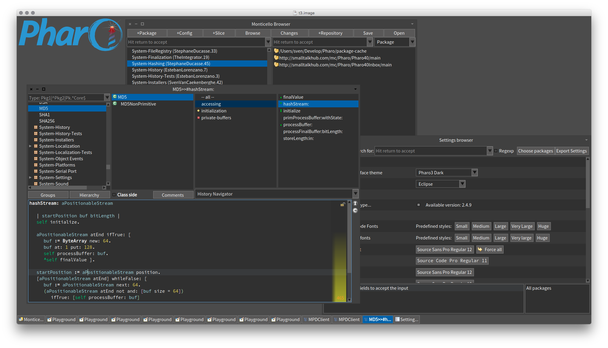
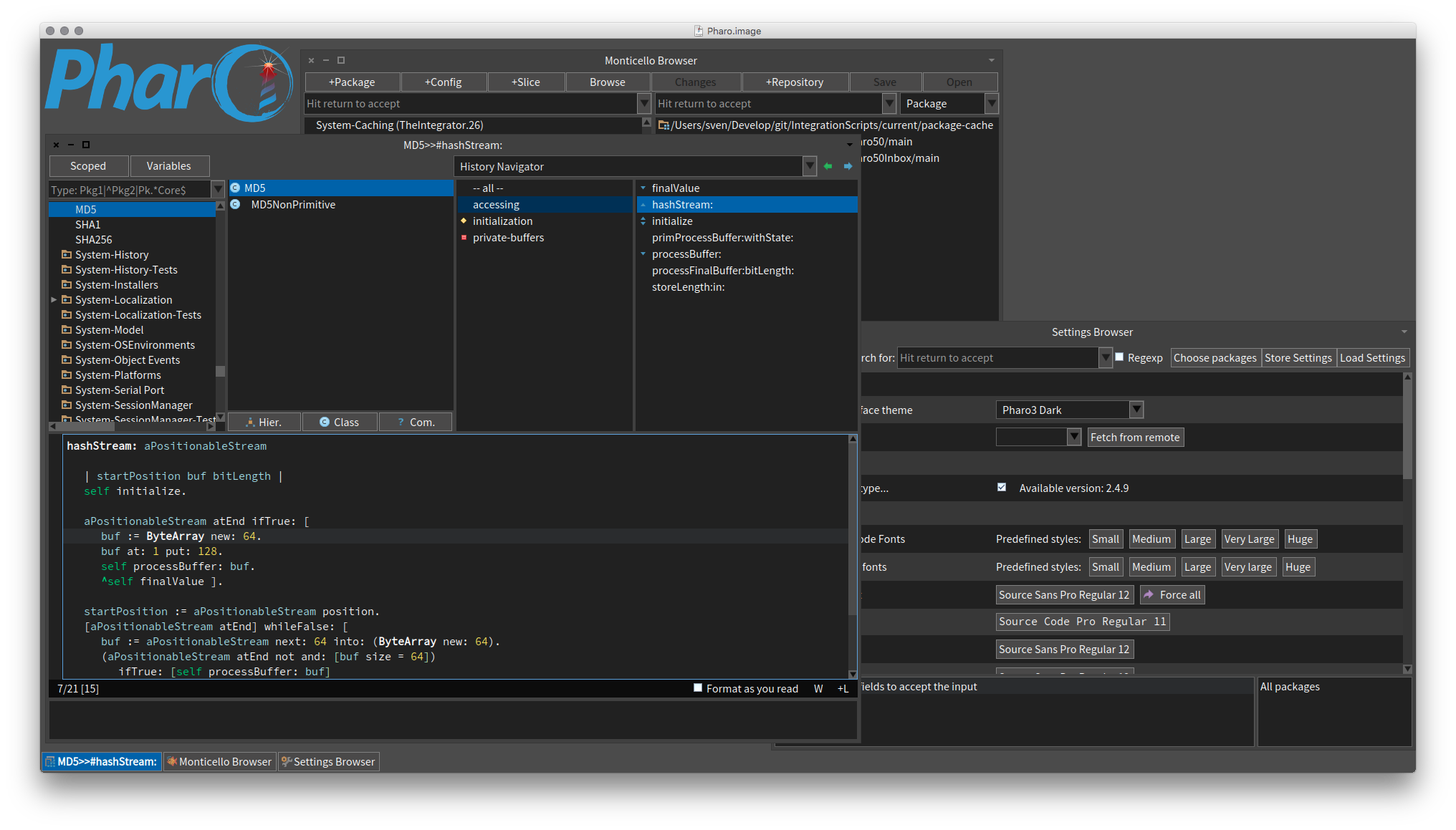
I know that colours are a matter of taste, but I have a question about the Dark Theme main background color. Here is a screenshot of my 4.0 image: Versus the same in 5.0 Note how the background of the contents of windows is much darker, the contrast being very hard. Was this an intentional change ? Does the majority prefer that colour ? How can I change it back to the softer one ? Thx, Sven BTW: Also note how much less space there is for the real code (yes I use pretty large fonts, but they are the same in both), how much space is lost in decoration around code in Nautilus, how busy it looks ... just my opinion.

Hi,
On 03 Mar 2016, at 12:04, Sven Van Caekenberghe <sven@stfx.eu> wrote:
I know that colours are a matter of taste, but I have a question about the Dark Theme main background color.
Here is a screenshot of my 4.0 image:
<Screen Shot 2016-03-03 at 11.55.30.png> Versus the same in 5.0
<Screen Shot 2016-03-03 at 11.55.36.png> Note how the background of the contents of windows is much darker, the contrast being very hard.
Was this an intentional change ?
yes, I made it because the older one was worst for the eyes than this one (I largely borrowed from the IntelliJ Dark Theme and colors there are like they are now, not like before).
Does the majority prefer that colour ?
It is an old (very old change, almost a year now)⦠at the moment, someones liked it, someones hated it (as always with L&F changes)⦠so it remained.
How can I change it back to the softer one ?
override Pharo3DarkTheme>>backgroundColor with the color you want⦠this should be in settings, but I didnât found the time to implement it (there is an implementation,but it does not works)⦠maybe if someone wants to revive it we can add it at the beginning of Pharo6. NOTE: since GT guys have their own theme framework, with their own hardcoded colors, this will most probably do not work all the cases (but it will work for the case you want). cheers, Esteban
Thx,
Sven
BTW: Also note how much less space there is for the real code (yes I use pretty large fonts, but they are the same in both), how much space is lost in decoration around code in Nautilus, how busy it looks ... just my opinion.
OK, thanks, I got it.
On 03 Mar 2016, at 13:33, Esteban Lorenzano <estebanlm@gmail.com> wrote:
Hi,
On 03 Mar 2016, at 12:04, Sven Van Caekenberghe <sven@stfx.eu> wrote:
I know that colours are a matter of taste, but I have a question about the Dark Theme main background color.
Here is a screenshot of my 4.0 image:
<Screen Shot 2016-03-03 at 11.55.30.png> Versus the same in 5.0
<Screen Shot 2016-03-03 at 11.55.36.png> Note how the background of the contents of windows is much darker, the contrast being very hard.
Was this an intentional change ?
yes, I made it because the older one was worst for the eyes than this one (I largely borrowed from the IntelliJ Dark Theme and colors there are like they are now, not like before).
Does the majority prefer that colour ?
It is an old (very old change, almost a year now)⦠at the moment, someones liked it, someones hated it (as always with L&F changes)⦠so it remained.
How can I change it back to the softer one ?
override Pharo3DarkTheme>>backgroundColor with the color you want⦠this should be in settings, but I didnât found the time to implement it (there is an implementation,but it does not works)⦠maybe if someone wants to revive it we can add it at the beginning of Pharo6.
NOTE: since GT guys have their own theme framework, with their own hardcoded colors, this will most probably do not work all the cases (but it will work for the case you want).
cheers, Esteban
Thx,
Sven
BTW: Also note how much less space there is for the real code (yes I use pretty large fonts, but they are the same in both), how much space is lost in decoration around code in Nautilus, how busy it looks ... just my opinion.

Personally I much prefer the newer darker version, the old looked like I had bad monitor configuration and not enough contrast configured :) On Thu, Mar 3, 2016 at 1:43 PM, Sven Van Caekenberghe <sven@stfx.eu> wrote:
OK, thanks, I got it.
On 03 Mar 2016, at 13:33, Esteban Lorenzano <estebanlm@gmail.com> wrote:
Hi,
On 03 Mar 2016, at 12:04, Sven Van Caekenberghe <sven@stfx.eu> wrote:
I know that colours are a matter of taste, but I have a question about the Dark Theme main background color.
Here is a screenshot of my 4.0 image:
<Screen Shot 2016-03-03 at 11.55.30.png> Versus the same in 5.0
<Screen Shot 2016-03-03 at 11.55.36.png> Note how the background of the contents of windows is much darker, the contrast being very hard.
Was this an intentional change ?
yes, I made it because the older one was worst for the eyes than this one (I largely borrowed from the IntelliJ Dark Theme and colors there are like they are now, not like before).
Does the majority prefer that colour ?
It is an old (very old change, almost a year now)⦠at the moment, someones liked it, someones hated it (as always with L&F changes)⦠so it remained.
How can I change it back to the softer one ?
override Pharo3DarkTheme>>backgroundColor with the color you want⦠this should be in settings, but I didnât found the time to implement it (there is an implementation,but it does not works)⦠maybe if someone wants to revive it we can add it at the beginning of Pharo6.
NOTE: since GT guys have their own theme framework, with their own hardcoded colors, this will most probably do not work all the cases (but it will work for the case you want).
cheers, Esteban
Thx,
Sven
BTW: Also note how much less space there is for the real code (yes I
use pretty large fonts, but they are the same in both), how much space is lost in decoration around code in Nautilus, how busy it looks ... just my opinion.
On 03 Mar 2016, at 14:12, Peter Uhnák <i.uhnak@gmail.com> wrote:
Personally I much prefer the newer darker version, the old looked like I had bad monitor configuration and not enough contrast configured :)
you see? :) I also prefer the newer⦠but I understand some people would like to change it⦠thatâs why we need to revive the settings for themes! Esteban
On Thu, Mar 3, 2016 at 1:43 PM, Sven Van Caekenberghe <sven@stfx.eu <mailto:sven@stfx.eu>> wrote: OK, thanks, I got it.
On 03 Mar 2016, at 13:33, Esteban Lorenzano <estebanlm@gmail.com <mailto:estebanlm@gmail.com>> wrote:
Hi,
On 03 Mar 2016, at 12:04, Sven Van Caekenberghe <sven@stfx.eu <mailto:sven@stfx.eu>> wrote:
I know that colours are a matter of taste, but I have a question about the Dark Theme main background color.
Here is a screenshot of my 4.0 image:
<Screen Shot 2016-03-03 at 11.55.30.png> Versus the same in 5.0
<Screen Shot 2016-03-03 at 11.55.36.png> Note how the background of the contents of windows is much darker, the contrast being very hard.
Was this an intentional change ?
yes, I made it because the older one was worst for the eyes than this one (I largely borrowed from the IntelliJ Dark Theme and colors there are like they are now, not like before).
Does the majority prefer that colour ?
It is an old (very old change, almost a year now)⦠at the moment, someones liked it, someones hated it (as always with L&F changes)⦠so it remained.
How can I change it back to the softer one ?
override Pharo3DarkTheme>>backgroundColor with the color you want⦠this should be in settings, but I didnât found the time to implement it (there is an implementation,but it does not works)⦠maybe if someone wants to revive it we can add it at the beginning of Pharo6.
NOTE: since GT guys have their own theme framework, with their own hardcoded colors, this will most probably do not work all the cases (but it will work for the case you want).
cheers, Esteban
Thx,
Sven
BTW: Also note how much less space there is for the real code (yes I use pretty large fonts, but they are the same in both), how much space is lost in decoration around code in Nautilus, how busy it looks ... just my opinion.

I also prefer the darker one , though I use my own personal blue theme. -- View this message in context: http://forum.world.st/A-question-about-the-Dark-Theme-main-background-color-... Sent from the Pharo Smalltalk Developers mailing list archive at Nabble.com.

Darcula for everyone! Even Netbeans has it now! On Mar 3, 2016 3:02 PM, "kilon.alios" <kilon.alios@gmail.com> wrote:
I also prefer the darker one , though I use my own personal blue theme.
-- View this message in context:
http://forum.world.st/A-question-about-the-Dark-Theme-main-background-color-...
Sent from the Pharo Smalltalk Developers mailing list archive at Nabble.com.
participants (5)
-
 Esteban Lorenzano
 -
 kilon.alios
 -
 Peter Uhnák
 -
 philippe.back@highoctane.be
 -
 Sven Van Caekenberghe