[Pharo-project] glamorous theme :)

Hi, Over the past week I worked on a new theme for Pharo called the Glamorous Theme :). The theme is developed in the context of the Glamour project, and its goal is to create a look that: - does not look like a specific operating system. In particular, the icons should be operating system agnostic, because, for example, people in Windows are confused by the red, yellow, green buttons of apple. - uses a limited amount of colors and effects. It is still work in progress, but you can get the current version by executing: Gofer new squeaksource: 'Glamour'; package: 'Glamour-Morphic-Theme'; load. GLMUITheme defaultSettings: nil. GLMUITheme beCurrent. GLMUITheme setPreferredWorldBackground. Cheers, Doru -- www.tudorgirba.com "Problem solving efficiency grows with the abstractness level of problem understanding."

Hi Doru, Nice indeed, clean & professional, x-platform. I see that you managed to get 'button with focus' (blue border) drawn correctly, even though you subclass 'Watery2' which has round buttons, which was a problem with the Pro theme. I tried to solve it, but I got lost. Maybe you can see what is wrong there ? (see my mail aug 30). Regards, Sven On 04 Sep 2010, at 23:18, Tudor Girba wrote:
Hi,
Over the past week I worked on a new theme for Pharo called the Glamorous Theme :). The theme is developed in the context of the Glamour project, and its goal is to create a look that: - does not look like a specific operating system. In particular, the icons should be operating system agnostic, because, for example, people in Windows are confused by the red, yellow, green buttons of apple. - uses a limited amount of colors and effects.
It is still work in progress, but you can get the current version by executing:
Gofer new squeaksource: 'Glamour'; package: 'Glamour-Morphic-Theme'; load. GLMUITheme defaultSettings: nil. GLMUITheme beCurrent. GLMUITheme setPreferredWorldBackground.
Cheers, Doru
-- www.tudorgirba.com
"Problem solving efficiency grows with the abstractness level of problem understanding."
_______________________________________________ Pharo-project mailing list Pharo-project@lists.gforge.inria.fr http://lists.gforge.inria.fr/cgi-bin/mailman/listinfo/pharo-project
Hi Sven, I am not sure I understand what you are referring to. Could you be more explicit? The reason I chose square shapes is that as long as we do not have proper and fast antialiasing, it requires images (like in the watery2 theme) which are time consuming to produce, or it just does not look nice. Cheers, Doru On 5 Sep 2010, at 08:23, Sven Van Caekenberghe wrote:
Hi Doru,
Nice indeed, clean & professional, x-platform. I see that you managed to get 'button with focus' (blue border) drawn correctly, even though you subclass 'Watery2' which has round buttons, which was a problem with the Pro theme. I tried to solve it, but I got lost. Maybe you can see what is wrong there ? (see my mail aug 30).
Regards,
Sven
On 04 Sep 2010, at 23:18, Tudor Girba wrote:
Hi,
Over the past week I worked on a new theme for Pharo called the Glamorous Theme :). The theme is developed in the context of the Glamour project, and its goal is to create a look that: - does not look like a specific operating system. In particular, the icons should be operating system agnostic, because, for example, people in Windows are confused by the red, yellow, green buttons of apple. - uses a limited amount of colors and effects.
It is still work in progress, but you can get the current version by executing:
Gofer new squeaksource: 'Glamour'; package: 'Glamour-Morphic-Theme'; load. GLMUITheme defaultSettings: nil. GLMUITheme beCurrent. GLMUITheme setPreferredWorldBackground.
Cheers, Doru
-- www.tudorgirba.com
"Problem solving efficiency grows with the abstractness level of problem understanding."
_______________________________________________ Pharo-project mailing list Pharo-project@lists.gforge.inria.fr http://lists.gforge.inria.fr/cgi-bin/mailman/listinfo/pharo-project
_______________________________________________ Pharo-project mailing list Pharo-project@lists.gforge.inria.fr http://lists.gforge.inria.fr/cgi-bin/mailman/listinfo/pharo-project
-- www.tudorgirba.com "We cannot reach the flow of things unless we let go."
On 05 Sep 2010, at 09:08, Tudor Girba wrote:
Hi Sven,
I am not sure I understand what you are referring to. Could you be more explicit?
Sorry: if you switch to the Pro theme (UIThemePro from the Polymorph-Themes-Pro package, PharoInbox) and do "UITheme exampleBasicControls." you get the following window: The Default Button has an ugly blue border (well the blue border has the wrong shape). Every dialog has this ugly button that's why it is a pity because the Theme is otherwise quite nice. I really got lost trying to fix this (I lack knowledge of all this drawing code). But you probably encountered similar problems.
The reason I chose square shapes is that as long as we do not have proper and fast antialiasing, it requires images (like in the watery2 theme) which are time consuming to produce, or it just does not look nice.
Having a fast theme is also a definitive plus, sure.
Cheers, Doru
On 5 Sep 2010, at 08:23, Sven Van Caekenberghe wrote:
Hi Doru,
Nice indeed, clean & professional, x-platform. I see that you managed to get 'button with focus' (blue border) drawn correctly, even though you subclass 'Watery2' which has round buttons, which was a problem with the Pro theme. I tried to solve it, but I got lost. Maybe you can see what is wrong there ? (see my mail aug 30).
Regards,
Sven
On 04 Sep 2010, at 23:18, Tudor Girba wrote:
Hi,
Over the past week I worked on a new theme for Pharo called the Glamorous Theme :). The theme is developed in the context of the Glamour project, and its goal is to create a look that: - does not look like a specific operating system. In particular, the icons should be operating system agnostic, because, for example, people in Windows are confused by the red, yellow, green buttons of apple. - uses a limited amount of colors and effects.
It is still work in progress, but you can get the current version by executing:
Gofer new squeaksource: 'Glamour'; package: 'Glamour-Morphic-Theme'; load. GLMUITheme defaultSettings: nil. GLMUITheme beCurrent. GLMUITheme setPreferredWorldBackground.
Cheers, Doru
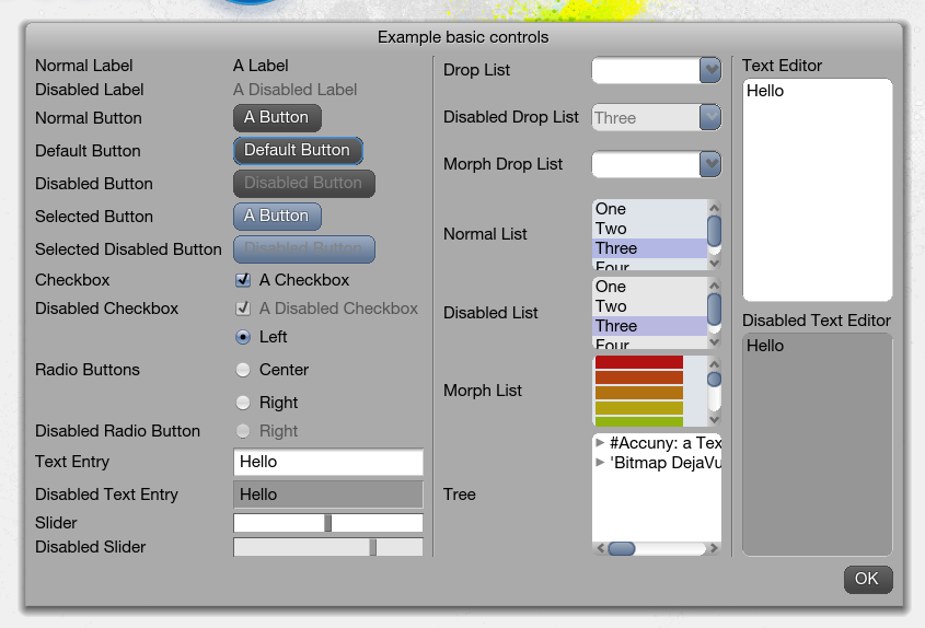
Indeed, I struggled with this, too, and I have no idea why it happens. It should overlap with the normal border. It looks like some kind of Morphic voodoo :) Doru On 5 Sep 2010, at 09:37, Sven Van Caekenberghe wrote:
On 05 Sep 2010, at 09:08, Tudor Girba wrote:
Hi Sven,
I am not sure I understand what you are referring to. Could you be more explicit?
Sorry: if you switch to the Pro theme (UIThemePro from the Polymorph- Themes-Pro package, PharoInbox) and do "UITheme exampleBasicControls." you get the following window:
<Screen shot 2010-09-05 at 09.28.50.png>
The Default Button has an ugly blue border (well the blue border has the wrong shape). Every dialog has this ugly button that's why it is a pity because the Theme is otherwise quite nice.
I really got lost trying to fix this (I lack knowledge of all this drawing code). But you probably encountered similar problems.
The reason I chose square shapes is that as long as we do not have proper and fast antialiasing, it requires images (like in the watery2 theme) which are time consuming to produce, or it just does not look nice.
Having a fast theme is also a definitive plus, sure.
Cheers, Doru
On 5 Sep 2010, at 08:23, Sven Van Caekenberghe wrote:
Hi Doru,
Nice indeed, clean & professional, x-platform. I see that you managed to get 'button with focus' (blue border) drawn correctly, even though you subclass 'Watery2' which has round buttons, which was a problem with the Pro theme. I tried to solve it, but I got lost. Maybe you can see what is wrong there ? (see my mail aug 30).
Regards,
Sven
On 04 Sep 2010, at 23:18, Tudor Girba wrote:
Hi,
Over the past week I worked on a new theme for Pharo called the Glamorous Theme :). The theme is developed in the context of the Glamour project, and its goal is to create a look that: - does not look like a specific operating system. In particular, the icons should be operating system agnostic, because, for example, people in Windows are confused by the red, yellow, green buttons of apple. - uses a limited amount of colors and effects.
It is still work in progress, but you can get the current version by executing:
Gofer new squeaksource: 'Glamour'; package: 'Glamour-Morphic-Theme'; load. GLMUITheme defaultSettings: nil. GLMUITheme beCurrent. GLMUITheme setPreferredWorldBackground.
Cheers, Doru
_______________________________________________ Pharo-project mailing list Pharo-project@lists.gforge.inria.fr http://lists.gforge.inria.fr/cgi-bin/mailman/listinfo/pharo-project
-- www.tudorgirba.com "Not knowing how to do something is not an argument for how it cannot be done."

Nice work! For buttons, the focus corner radius is controlled by the theme method: #buttonFocusIndicatorCornerRadiusFor: Regards, Gary ----- Original Message ----- From: "Sven Van Caekenberghe" <sven@beta9.be> To: <Pharo-project@lists.gforge.inria.fr> Sent: Sunday, September 05, 2010 8:37 AM Subject: Re: [Pharo-project] glamorous theme :) On 05 Sep 2010, at 09:08, Tudor Girba wrote:
Hi Sven,
I am not sure I understand what you are referring to. Could you be more explicit?
Sorry: if you switch to the Pro theme (UIThemePro from the Polymorph-Themes-Pro package, PharoInbox) and do "UITheme exampleBasicControls." you get the following window: -------------------------------------------------------------------------------- The Default Button has an ugly blue border (well the blue border has the wrong shape). Every dialog has this ugly button that's why it is a pity because the Theme is otherwise quite nice. I really got lost trying to fix this (I lack knowledge of all this drawing code). But you probably encountered similar problems.
The reason I chose square shapes is that as long as we do not have proper and fast antialiasing, it requires images (like in the watery2 theme) which are time consuming to produce, or it just does not look nice.
Having a fast theme is also a definitive plus, sure.
Cheers, Doru
On 5 Sep 2010, at 08:23, Sven Van Caekenberghe wrote:
Hi Doru,
Nice indeed, clean & professional, x-platform. I see that you managed to get 'button with focus' (blue border) drawn correctly, even though you subclass 'Watery2' which has round buttons, which was a problem with the Pro theme. I tried to solve it, but I got lost. Maybe you can see what is wrong there ? (see my mail aug 30).
Regards,
Sven
On 04 Sep 2010, at 23:18, Tudor Girba wrote:
Hi,
Over the past week I worked on a new theme for Pharo called the Glamorous Theme :). The theme is developed in the context of the Glamour project, and its goal is to create a look that: - does not look like a specific operating system. In particular, the icons should be operating system agnostic, because, for example, people in Windows are confused by the red, yellow, green buttons of apple. - uses a limited amount of colors and effects.
It is still work in progress, but you can get the current version by executing:
Gofer new squeaksource: 'Glamour'; package: 'Glamour-Morphic-Theme'; load. GLMUITheme defaultSettings: nil. GLMUITheme beCurrent. GLMUITheme setPreferredWorldBackground.
Cheers, Doru
--------------------------------------------------------------------------------
_______________________________________________ Pharo-project mailing list Pharo-project@lists.gforge.inria.fr http://lists.gforge.inria.fr/cgi-bin/mailman/listinfo/pharo-project
Hi Gary, Thanks for the reply. On 06 Sep 2010, at 12:20, Gary Chambers wrote:
Nice work!
The 'Pro' theme is not mine, it was written by ja@anymorphic.com. I am just playing with it, trying to make it work for me.
For buttons, the focus corner radius is controlled by the theme method:
#buttonFocusIndicatorCornerRadiusFor:
Yeah, I found that too, but although a radius around 6 comes close, it does not seem to fit exactly... Sven

screenshots PLEASE! On Sep 4, 2010, at 11:18 PM, Tudor Girba wrote:
Hi,
Over the past week I worked on a new theme for Pharo called the Glamorous Theme :). The theme is developed in the context of the Glamour project, and its goal is to create a look that: - does not look like a specific operating system. In particular, the icons should be operating system agnostic, because, for example, people in Windows are confused by the red, yellow, green buttons of apple. - uses a limited amount of colors and effects.
It is still work in progress, but you can get the current version by executing:
Gofer new squeaksource: 'Glamour'; package: 'Glamour-Morphic-Theme'; load. GLMUITheme defaultSettings: nil. GLMUITheme beCurrent. GLMUITheme setPreferredWorldBackground.
Cheers, Doru
-- www.tudorgirba.com
"Problem solving efficiency grows with the abstractness level of problem understanding."
_______________________________________________ Moose-dev mailing list Moose-dev@iam.unibe.ch https://www.iam.unibe.ch/mailman/listinfo/moose-dev

I like it. Screenshot: http://picasaweb.google.com/lh/photo/C8Psie5Q-msL2ZDAiIf3BQ?feat=directlink Laurent Laffont http://pharocasts.blogspot.com/ http://magaloma.blogspot.com/ On Sun, Sep 5, 2010 at 9:54 AM, Stéphane Ducasse <stephane.ducasse@inria.fr>wrote:
screenshots PLEASE! On Sep 4, 2010, at 11:18 PM, Tudor Girba wrote:
Hi,
Over the past week I worked on a new theme for Pharo called the Glamorous Theme :). The theme is developed in the context of the Glamour project, and its goal is to create a look that: - does not look like a specific operating system. In particular, the icons should be operating system agnostic, because, for example, people in Windows are confused by the red, yellow, green buttons of apple. - uses a limited amount of colors and effects.
It is still work in progress, but you can get the current version by executing:
Gofer new squeaksource: 'Glamour'; package: 'Glamour-Morphic-Theme'; load. GLMUITheme defaultSettings: nil. GLMUITheme beCurrent. GLMUITheme setPreferredWorldBackground.
Cheers, Doru
-- www.tudorgirba.com
"Problem solving efficiency grows with the abstractness level of problem understanding."
_______________________________________________ Moose-dev mailing list Moose-dev@iam.unibe.ch https://www.iam.unibe.ch/mailman/listinfo/moose-dev
_______________________________________________ Pharo-project mailing list Pharo-project@lists.gforge.inria.fr http://lists.gforge.inria.fr/cgi-bin/mailman/listinfo/pharo-project
a bit too grey for me, I prefer anymorphic on that front. Stef On Sep 5, 2010, at 10:15 AM, laurent laffont wrote:
I like it.
Screenshot: http://picasaweb.google.com/lh/photo/C8Psie5Q-msL2ZDAiIf3BQ?feat=directlink
Laurent Laffont
http://pharocasts.blogspot.com/ http://magaloma.blogspot.com/
On Sun, Sep 5, 2010 at 9:54 AM, Stéphane Ducasse <stephane.ducasse@inria.fr> wrote: screenshots PLEASE! On Sep 4, 2010, at 11:18 PM, Tudor Girba wrote:
Hi,
Over the past week I worked on a new theme for Pharo called the Glamorous Theme :). The theme is developed in the context of the Glamour project, and its goal is to create a look that: - does not look like a specific operating system. In particular, the icons should be operating system agnostic, because, for example, people in Windows are confused by the red, yellow, green buttons of apple. - uses a limited amount of colors and effects.
It is still work in progress, but you can get the current version by executing:
Gofer new squeaksource: 'Glamour'; package: 'Glamour-Morphic-Theme'; load. GLMUITheme defaultSettings: nil. GLMUITheme beCurrent. GLMUITheme setPreferredWorldBackground.
Cheers, Doru
-- www.tudorgirba.com
"Problem solving efficiency grows with the abstractness level of problem understanding."
_______________________________________________ Moose-dev mailing list Moose-dev@iam.unibe.ch https://www.iam.unibe.ch/mailman/listinfo/moose-dev
_______________________________________________ Pharo-project mailing list Pharo-project@lists.gforge.inria.fr http://lists.gforge.inria.fr/cgi-bin/mailman/listinfo/pharo-project
_______________________________________________ Moose-dev mailing list Moose-dev@iam.unibe.ch https://www.iam.unibe.ch/mailman/listinfo/moose-dev
On 05 Sep 2010, at 09:54, Stéphane Ducasse wrote:
screenshots PLEASE!
http://homepage.mac.com/svc/Screenshots/Screenshot-20100905T111347.png Doru, I made the #baseSelectionColor almost black (I didn't like the blue, de gustibus non est disputandum ;-) by overwriting it: baseSelectionColor ^ "Color r: 0.38 g: 0.64 b: 0.88" Color darkGray muchDarker I could subclass as well I guess, or you could make it into a variable with a setter, what do you think ? Anyway, very well done, it feels very fast, which was a goal I presume. Sven PS: the name is a nice pun too!
Hi, On 5 Sep 2010, at 11:23, Sven Van Caekenberghe wrote:
On 05 Sep 2010, at 09:54, Stéphane Ducasse wrote:
screenshots PLEASE!
http://homepage.mac.com/svc/Screenshots/Screenshot-20100905T111347.png
Doru,
I made the #baseSelectionColor almost black (I didn't like the blue, de gustibus non est disputandum ;-) by overwriting it:
baseSelectionColor ^ "Color r: 0.38 g: 0.64 b: 0.88" Color darkGray muchDarker
:) No comment.
I could subclass as well I guess, or you could make it into a variable with a setter, what do you think ?
In my mind, the theme should be the entry point that attaches a name to a consistent design. We already have ThemeSettings which already introduce a lot of complexity and which leads to a mess. I would actually prefer to have only a hierarchy of Themes without any, or in exceptional cases very limited, parametrization options. Perhaps the selection color could be made a parameter, but at the moment I would still prefer subclassing.
Anyway, very well done, it feels very fast, which was a goal I presume.
Thanks. Speed was a goal indeed. Cheers, Doru
Sven
PS: the name is a nice pun too!
:) -- www.tudorgirba.com "Reasonable is what we are accustomed with."
On 05 Sep 2010, at 12:02, Tudor Girba wrote:
In my mind, the theme should be the entry point that attaches a name to a consistent design. We already have ThemeSettings which already introduce a lot of complexity and which leads to a mess. I would actually prefer to have only a hierarchy of Themes without any, or in exceptional cases very limited, parametrization options.
Perhaps the selection color could be made a parameter, but at the moment I would still prefer subclassing.
OK, I understand, UIThemes are already complex enough. I'll subclass, the hooks are there (you made some extra elements explicit, so that is good). Sven

On 5 September 2010 12:23, Sven Van Caekenberghe <sven@beta9.be> wrote:
On 05 Sep 2010, at 09:54, Stéphane Ducasse wrote:
screenshots PLEASE!
http://homepage.mac.com/svc/Screenshots/Screenshot-20100905T111347.png
No round corners! kewl! :))
Doru,
I made the #baseSelectionColor almost black (I didn't like the blue, de gustibus non est disputandum ;-) by overwriting it:
baseSelectionColor     ^ "Color r: 0.38 g: 0.64 b: 0.88" Color darkGray muchDarker
I could subclass as well I guess, or you could make it into a variable with a setter, what do you think ?
Anyway, very well done, it feels very fast, which was a goal I presume.
Sven
PS: the name is a nice pun too! _______________________________________________ Pharo-project mailing list Pharo-project@lists.gforge.inria.fr http://lists.gforge.inria.fr/cgi-bin/mailman/listinfo/pharo-project
-- Best regards, Igor Stasenko AKA sig.

http://homepage.mac.com/svc/Screenshots/Screenshot-20100905T111347.png
No round corners! kewl! :))
I would prefer round corners. Alexandre -- _,.;:~^~:;._,.;:~^~:;._,.;:~^~:;._,.;:~^~:;._,.;: Alexandre Bergel http://www.bergel.eu ^~:;._,.;:~^~:;._,.;:~^~:;._,.;:~^~:;._,.;:~^~:;.

So, so now we have 2 themes that appear to be better than the one we use now... I suggest to choose one, maybe adapt it slightly, and integrate it into Pharo 1.2. Personally, I prefer Glamorous over the Pro theme [1] (I just miss the round corners like Alex :). The dark buttons of the Pro theme look cool at first, but they are very dominant. How do we proceed? Cheers, Adrian [1] Polymorph-Themes-Pro package in the PharoInbox repositrory On Sep 6, 2010, at 16:41 , Alexandre Bergel wrote:
http://homepage.mac.com/svc/Screenshots/Screenshot-20100905T111347.png
No round corners! kewl! :))
I would prefer round corners.
Alexandre
-- _,.;:~^~:;._,.;:~^~:;._,.;:~^~:;._,.;:~^~:;._,.;: Alexandre Bergel http://www.bergel.eu ^~:;._,.;:~^~:;._,.;:~^~:;._,.;:~^~:;._,.;:~^~:;.
_______________________________________________ Pharo-project mailing list Pharo-project@lists.gforge.inria.fr http://lists.gforge.inria.fr/cgi-bin/mailman/listinfo/pharo-project

On Mon, Sep 6, 2010 at 5:10 PM, Adrian Lienhard <adi@netstyle.ch> wrote:
So, so now we have 2 themes that appear to be better than the one we use now... I suggest to choose one, maybe adapt it slightly, and integrate it into Pharo 1.2.
Personally, I prefer Glamorous over the Pro theme [1] (I just miss the round corners like Alex :). The dark buttons of the Pro theme look cool at first, but they are very dominant.
How do we proceed?
First, who is willing to maitain it? Will Doru or gary maitain it? Anyway, is not a big deal I think. It is a theme, and actually, that's why you can set it via a preference. what about doing a poll/survey?
Cheers, Adrian
[1] Polymorph-Themes-Pro package in the PharoInbox repositrory
On Sep 6, 2010, at 16:41 , Alexandre Bergel wrote:
http://homepage.mac.com/svc/Screenshots/Screenshot-20100905T111347.png
No round corners! kewl! :))
I would prefer round corners.
Alexandre
-- _,.;:~^~:;._,.;:~^~:;._,.;:~^~:;._,.;:~^~:;._,.;: Alexandre Bergel http://www.bergel.eu ^~:;._,.;:~^~:;._,.;:~^~:;._,.;:~^~:;._,.;:~^~:;.
_______________________________________________ Pharo-project mailing list Pharo-project@lists.gforge.inria.fr http://lists.gforge.inria.fr/cgi-bin/mailman/listinfo/pharo-project
_______________________________________________ Pharo-project mailing list Pharo-project@lists.gforge.inria.fr http://lists.gforge.inria.fr/cgi-bin/mailman/listinfo/pharo-project
On Mon, Sep 6, 2010 at 5:35 PM, Mariano Martinez Peck <marianopeck@gmail.com
wrote:
On Mon, Sep 6, 2010 at 5:10 PM, Adrian Lienhard <adi@netstyle.ch> wrote:
So, so now we have 2 themes that appear to be better than the one we use now... I suggest to choose one, maybe adapt it slightly, and integrate it into Pharo 1.2.
Personally, I prefer Glamorous over the Pro theme [1] (I just miss the round corners like Alex :). The dark buttons of the Pro theme look cool at first, but they are very dominant.
How do we proceed?
First, who is willing to maitain it? Will Doru or gary maitain it?
Sorry, not gary....the author of the Pro tool. Particulary, I liked more the Pro over the glamourous. Although I don't care which is is default. I DO care that we have a maitainer for them. Specially for the default one.
Anyway, is not a big deal I think. It is a theme, and actually, that's why you can set it via a preference.
what about doing a poll/survey?
Cheers, Adrian
[1] Polymorph-Themes-Pro package in the PharoInbox repositrory
On Sep 6, 2010, at 16:41 , Alexandre Bergel wrote:
http://homepage.mac.com/svc/Screenshots/Screenshot-20100905T111347.png
No round corners! kewl! :))
I would prefer round corners.
Alexandre
-- _,.;:~^~:;._,.;:~^~:;._,.;:~^~:;._,.;:~^~:;._,.;: Alexandre Bergel http://www.bergel.eu ^~:;._,.;:~^~:;._,.;:~^~:;._,.;:~^~:;._,.;:~^~:;.
_______________________________________________ Pharo-project mailing list Pharo-project@lists.gforge.inria.fr http://lists.gforge.inria.fr/cgi-bin/mailman/listinfo/pharo-project
_______________________________________________ Pharo-project mailing list Pharo-project@lists.gforge.inria.fr http://lists.gforge.inria.fr/cgi-bin/mailman/listinfo/pharo-project
Hi,
On Mon, Sep 6, 2010 at 5:10 PM, Adrian Lienhard <adi@netstyle.ch> wrote: So, so now we have 2 themes that appear to be better than the one we use now... I suggest to choose one, maybe adapt it slightly, and integrate it into Pharo 1.2.
Personally, I prefer Glamorous over the Pro theme [1] (I just miss the round corners like Alex :). The dark buttons of the Pro theme look cool at first, but they are very dominant.
How do we proceed?
First, who is willing to maitain it? Will Doru or gary maitain it?
I will continue to work on the Glamorous theme at least in the near future. Cheers, Doru
Anyway, is not a big deal I think. It is a theme, and actually, that's why you can set it via a preference.
what about doing a poll/survey?
Cheers, Adrian
[1] Polymorph-Themes-Pro package in the PharoInbox repositrory
On Sep 6, 2010, at 16:41 , Alexandre Bergel wrote:
http://homepage.mac.com/svc/Screenshots/Screenshot-20100905T111347.png
No round corners! kewl! :))
I would prefer round corners.
Alexandre
-- _,.;:~^~:;._,.;:~^~:;._,.;:~^~:;._,.;:~^~:;._,.;: Alexandre Bergel http://www.bergel.eu ^~:;._,.;:~^~:;._,.;:~^~:;._,.;:~^~:;._,.;:~^~:;.
_______________________________________________ Pharo-project mailing list Pharo-project@lists.gforge.inria.fr http://lists.gforge.inria.fr/cgi-bin/mailman/listinfo/pharo-project
_______________________________________________ Pharo-project mailing list Pharo-project@lists.gforge.inria.fr http://lists.gforge.inria.fr/cgi-bin/mailman/listinfo/pharo-project
_______________________________________________ Pharo-project mailing list Pharo-project@lists.gforge.inria.fr http://lists.gforge.inria.fr/cgi-bin/mailman/listinfo/pharo-project
-- www.tudorgirba.com "Next time you see your life passing by, say 'hi' and get to know her."
First we should be able to load them int 1.2 core and anymorphic has a refernece to OB task or something. Personnally (except for the corner button I prefer anymorphic but this is a question of choice). Stef On Sep 6, 2010, at 10:10 PM, Adrian Lienhard wrote:
So, so now we have 2 themes that appear to be better than the one we use now... I suggest to choose one, maybe adapt it slightly, and integrate it into Pharo 1.2.
Personally, I prefer Glamorous over the Pro theme [1] (I just miss the round corners like Alex :). The dark buttons of the Pro theme look cool at first, but they are very dominant.
How do we proceed?
Cheers, Adrian
[1] Polymorph-Themes-Pro package in the PharoInbox repositrory
On Sep 6, 2010, at 16:41 , Alexandre Bergel wrote:
http://homepage.mac.com/svc/Screenshots/Screenshot-20100905T111347.png
No round corners! kewl! :))
I would prefer round corners.
Alexandre
-- _,.;:~^~:;._,.;:~^~:;._,.;:~^~:;._,.;:~^~:;._,.;: Alexandre Bergel http://www.bergel.eu ^~:;._,.;:~^~:;._,.;:~^~:;._,.;:~^~:;._,.;:~^~:;.
_______________________________________________ Pharo-project mailing list Pharo-project@lists.gforge.inria.fr http://lists.gforge.inria.fr/cgi-bin/mailman/listinfo/pharo-project
_______________________________________________ Pharo-project mailing list Pharo-project@lists.gforge.inria.fr http://lists.gforge.inria.fr/cgi-bin/mailman/listinfo/pharo-project
On 06 Sep 2010, at 22:10, Adrian Lienhard wrote:
So, so now we have 2 themes that appear to be better than the one we use now... I suggest to choose one, maybe adapt it slightly, and integrate it into Pharo 1.2.
Personally, I prefer Glamorous over the Pro theme [1] (I just miss the round corners like Alex :). The dark buttons of the Pro theme look cool at first, but they are very dominant.
How do we proceed?
I would include a small number of well maintained/supported themes. Of course, every image needs a default, but choice is good here (it is the whole point). Sven
tx Doru don;t you want to put a bit of blue in the look instead of all this grey. Stef On Sep 5, 2010, at 11:23 AM, Sven Van Caekenberghe wrote:
On 05 Sep 2010, at 09:54, Stéphane Ducasse wrote:
screenshots PLEASE!
http://homepage.mac.com/svc/Screenshots/Screenshot-20100905T111347.png
Doru,
I made the #baseSelectionColor almost black (I didn't like the blue, de gustibus non est disputandum ;-) by overwriting it:
baseSelectionColor ^ "Color r: 0.38 g: 0.64 b: 0.88" Color darkGray muchDarker
I could subclass as well I guess, or you could make it into a variable with a setter, what do you think ?
Anyway, very well done, it feels very fast, which was a goal I presume.
Sven
PS: the name is a nice pun too! _______________________________________________ Pharo-project mailing list Pharo-project@lists.gforge.inria.fr http://lists.gforge.inria.fr/cgi-bin/mailman/listinfo/pharo-project
Hi Stef, I am not sure what you are referring to (and I am not sure you are looking at the right screenshot). There is blue/lightblue to focus you on what is the current selection (tab, button, selected text). I did not use it for embellishments because that is much harder to get right, and I really wanted to get as much as possible with only 2 base colors and 2-3 shades. Cheers, Doru On 5 Sep 2010, at 19:10, Stéphane Ducasse wrote:
tx Doru don;t you want to put a bit of blue in the look instead of all this grey.
Stef
On Sep 5, 2010, at 11:23 AM, Sven Van Caekenberghe wrote:
On 05 Sep 2010, at 09:54, Stéphane Ducasse wrote:
screenshots PLEASE!
http://homepage.mac.com/svc/Screenshots/ Screenshot-20100905T111347.png
Doru,
I made the #baseSelectionColor almost black (I didn't like the blue, de gustibus non est disputandum ;-) by overwriting it:
baseSelectionColor ^ "Color r: 0.38 g: 0.64 b: 0.88" Color darkGray muchDarker
I could subclass as well I guess, or you could make it into a variable with a setter, what do you think ?
Anyway, very well done, it feels very fast, which was a goal I presume.
Sven
PS: the name is a nice pun too! _______________________________________________ Pharo-project mailing list Pharo-project@lists.gforge.inria.fr http://lists.gforge.inria.fr/cgi-bin/mailman/listinfo/pharo-project
_______________________________________________ Pharo-project mailing list Pharo-project@lists.gforge.inria.fr http://lists.gforge.inria.fr/cgi-bin/mailman/listinfo/pharo-project
-- www.tudorgirba.com "Yesterday is a fact. Tomorrow is a possibility. Today is a challenge."
Hi Doru, Using Glamourous I hardly see which button is focused in System Browser between instance or class. So I've made mistakes several times yesterday :) I really like this theme, especially on a slow computer. Cheers, Laurent Laffont http://pharocasts.blogspot.com/ http://magaloma.blogspot.com/ On Sat, Sep 4, 2010 at 11:18 PM, Tudor Girba <tudor.girba@gmail.com> wrote:
Hi,
Over the past week I worked on a new theme for Pharo called the Glamorous Theme :). The theme is developed in the context of the Glamour project, and its goal is to create a look that: - does not look like a specific operating system. In particular, the icons should be operating system agnostic, because, for example, people in Windows are confused by the red, yellow, green buttons of apple. - uses a limited amount of colors and effects.
It is still work in progress, but you can get the current version by executing:
Gofer new squeaksource: 'Glamour'; package: 'Glamour-Morphic-Theme'; load. GLMUITheme defaultSettings: nil. GLMUITheme beCurrent. GLMUITheme setPreferredWorldBackground.
Cheers, Doru
-- www.tudorgirba.com
"Problem solving efficiency grows with the abstractness level of problem understanding."
_______________________________________________ Pharo-project mailing list Pharo-project@lists.gforge.inria.fr http://lists.gforge.inria.fr/cgi-bin/mailman/listinfo/pharo-project
Laurent, On 07 Sep 2010, at 08:47, laurent laffont wrote:
Using Glamourous I hardly see which button is focused in System Browser between instance or class. So I've made mistakes several times yesterday :)
You could try my subclass, it tries to solve that problem (to my taste anyway; Des goûts et des couleurs, on ne dispute / discute pas). It is in SqueakSource ADayAtTheBeach package Pharo-Hacking-Sven (it has 2 subclasses, one for the Pro theme as well). Sven
Hi Laurent, On the Macbook Pro monitor it works well, but indeed, I also thought this would be a problem on less strong monitors. I now updated the color to get a stronger shade of blue. Cheers, Doru On 7 Sep 2010, at 08:47, laurent laffont wrote:
Hi Doru,
Using Glamourous I hardly see which button is focused in System Browser between instance or class. So I've made mistakes several times yesterday :)
I really like this theme, especially on a slow computer.
Cheers,
Laurent Laffont
http://pharocasts.blogspot.com/ http://magaloma.blogspot.com/
On Sat, Sep 4, 2010 at 11:18 PM, Tudor Girba <tudor.girba@gmail.com> wrote: Hi,
Over the past week I worked on a new theme for Pharo called the Glamorous Theme :). The theme is developed in the context of the Glamour project, and its goal is to create a look that: - does not look like a specific operating system. In particular, the icons should be operating system agnostic, because, for example, people in Windows are confused by the red, yellow, green buttons of apple. - uses a limited amount of colors and effects.
It is still work in progress, but you can get the current version by executing:
Gofer new squeaksource: 'Glamour'; package: 'Glamour-Morphic-Theme'; load. GLMUITheme defaultSettings: nil. GLMUITheme beCurrent. GLMUITheme setPreferredWorldBackground.
Cheers, Doru
-- www.tudorgirba.com
"Problem solving efficiency grows with the abstractness level of problem understanding."
_______________________________________________ Pharo-project mailing list Pharo-project@lists.gforge.inria.fr http://lists.gforge.inria.fr/cgi-bin/mailman/listinfo/pharo-project
-- www.tudorgirba.com "It's not what we do that matters most, it's how we do it."
On Tue, Sep 7, 2010 at 9:48 PM, Tudor Girba <tudor.girba@gmail.com> wrote:
Hi Laurent,
On the Macbook Pro monitor it works well, but indeed, I also thought this would be a problem on less strong monitors.
I now updated the color to get a stronger shade of blue.
What do you think of this one (with a pressed look) ? buttonSelectedFillStyleFor: aButton "Return the normal button fillStyle for the given button." | toptop top bottom base | base := self glamorousBaseColorFor: aButton. toptop := base muchDarker. top := base. bottom := (self glamorousLightSelectionColorFor: aButton) muchLighter. ^(GradientFillStyle ramp: { 0.0->toptop. 0.1->top. 0.9->bottom.}) origin: aButton bounds origin; direction: 0 @ aButton height; radial: false Laurent Laffont http://pharocasts.blogspot.com/ http://magaloma.blogspot.com/
Cheers, Doru
On 7 Sep 2010, at 08:47, laurent laffont wrote:
Hi Doru,
Using Glamourous I hardly see which button is focused in System Browser between instance or class. So I've made mistakes several times yesterday :)
I really like this theme, especially on a slow computer.
Cheers,
Laurent Laffont
http://pharocasts.blogspot.com/ http://magaloma.blogspot.com/
On Sat, Sep 4, 2010 at 11:18 PM, Tudor Girba <tudor.girba@gmail.com> wrote: Hi,
Over the past week I worked on a new theme for Pharo called the Glamorous Theme :). The theme is developed in the context of the Glamour project, and its goal is to create a look that: - does not look like a specific operating system. In particular, the icons should be operating system agnostic, because, for example, people in Windows are confused by the red, yellow, green buttons of apple. - uses a limited amount of colors and effects.
It is still work in progress, but you can get the current version by executing:
Gofer new squeaksource: 'Glamour'; package: 'Glamour-Morphic-Theme'; load. GLMUITheme defaultSettings: nil. GLMUITheme beCurrent. GLMUITheme setPreferredWorldBackground.
Cheers, Doru
-- www.tudorgirba.com
"Problem solving efficiency grows with the abstractness level of problem understanding."
_______________________________________________ Pharo-project mailing list Pharo-project@lists.gforge.inria.fr http://lists.gforge.inria.fr/cgi-bin/mailman/listinfo/pharo-project
-- www.tudorgirba.com
"It's not what we do that matters most, it's how we do it."
It's not bad, but and I do not use this metaphor in the theme. As I said, the goal of the theme is to be really simple and to exercise the minimum amount of graphical variables that would still enable the distinction between the different ui states. The theme is not quite where I would like it to be, but definitely the "pressed button" would introduce another graphical variable that is not really needed from my point of view. Cheers, Doru On 7 Sep 2010, at 22:37, laurent laffont wrote:
On Tue, Sep 7, 2010 at 9:48 PM, Tudor Girba <tudor.girba@gmail.com> wrote: Hi Laurent,
On the Macbook Pro monitor it works well, but indeed, I also thought this would be a problem on less strong monitors.
I now updated the color to get a stronger shade of blue.
What do you think of this one (with a pressed look) ?
buttonSelectedFillStyleFor: aButton "Return the normal button fillStyle for the given button."
| toptop top bottom base | base := self glamorousBaseColorFor: aButton. toptop := base muchDarker. top := base. bottom := (self glamorousLightSelectionColorFor: aButton) muchLighter.
^(GradientFillStyle ramp: { 0.0->toptop. 0.1->top. 0.9->bottom.}) origin: aButton bounds origin; direction: 0 @ aButton height; radial: false
Laurent Laffont
http://pharocasts.blogspot.com/ http://magaloma.blogspot.com/
Cheers, Doru
On 7 Sep 2010, at 08:47, laurent laffont wrote:
Hi Doru,
Using Glamourous I hardly see which button is focused in System Browser between instance or class. So I've made mistakes several times yesterday :)
I really like this theme, especially on a slow computer.
Cheers,
Laurent Laffont
http://pharocasts.blogspot.com/ http://magaloma.blogspot.com/
On Sat, Sep 4, 2010 at 11:18 PM, Tudor Girba <tudor.girba@gmail.com> wrote: Hi,
Over the past week I worked on a new theme for Pharo called the Glamorous Theme :). The theme is developed in the context of the Glamour project, and its goal is to create a look that: - does not look like a specific operating system. In particular, the icons should be operating system agnostic, because, for example, people in Windows are confused by the red, yellow, green buttons of apple. - uses a limited amount of colors and effects.
It is still work in progress, but you can get the current version by executing:
Gofer new squeaksource: 'Glamour'; package: 'Glamour-Morphic-Theme'; load. GLMUITheme defaultSettings: nil. GLMUITheme beCurrent. GLMUITheme setPreferredWorldBackground.
Cheers, Doru
-- www.tudorgirba.com
"Problem solving efficiency grows with the abstractness level of problem understanding."
_______________________________________________ Pharo-project mailing list Pharo-project@lists.gforge.inria.fr http://lists.gforge.inria.fr/cgi-bin/mailman/listinfo/pharo-project
-- www.tudorgirba.com
"It's not what we do that matters most, it's how we do it."
-- www.tudorgirba.com "Relationships are of two kinds: those we choose and those that happen. They both matter."
participants (9)
-
 Adrian Lienhard
 -
 Alexandre Bergel
 -
 Gary Chambers
 -
 Igor Stasenko
 -
 laurent laffont
 -
 Mariano Martinez Peck
 -
 Stéphane Ducasse
 -
 Sven Van Caekenberghe
 -
 Tudor Girba