[Pharo-project] Logos
Begin forwarded message:
From: Samuel MORELLO <samuel.morello@ouvanous.com> Date: June 18, 2008 10:55:19 AM CEDT To: Stéphane Ducasse <stephane.ducasse@inria.fr> Subject: Re: [OUVANOUS] Re: Nouvelle version
les voici ;-)
Le 18 juin 08 à 10:39, Stéphane DUCASSE a écrit :
--- Reply ABOVE THIS LINE to post a comment to the project ---
Company: Smalltalk Project: Pharo Link: https://ouvanous.projectpath.com/C18821220
Stéphane DUCASSE said:
ou cela :)
..........................................................................
Read the original message, view this comment, and download attachments at: https://ouvanous.projectpath.com/C18821220
You can always check the Overview for the latest project activity: https://ouvanous.projectpath.com/projects/1873269/project/log

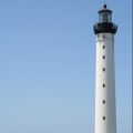
When the icon is small, the lighthouse is not easily recognizable. 2008/6/18 Stéphane Ducasse <stephane.ducasse@inria.fr>:
Begin forwarded message:
From: Samuel MORELLO <samuel.morello@ouvanous.com> Date: June 18, 2008 10:55:19 AM CEDT To: Stéphane Ducasse <stephane.ducasse@inria.fr> Subject: Re: [OUVANOUS] Re: Nouvelle version
les voici ;-)
Le 18 juin 08 à 10:39, Stéphane DUCASSE a écrit :
--- Reply ABOVE THIS LINE to post a comment to the project ---
Company: Smalltalk Project: Pharo Link: https://ouvanous.projectpath.com/C18821220
Stéphane DUCASSE said:
ou cela :)
..........................................................................
Read the original message, view this comment, and download attachments at: https://ouvanous.projectpath.com/C18821220
You can always check the Overview for the latest project activity: https://ouvanous.projectpath.com/projects/1873269/project/log
_______________________________________________ Pharo-project mailing list Pharo-project@lists.gforge.inria.fr http://lists.gforge.inria.fr/cgi-bin/mailman/listinfo/pharo-project
-- Serge Stinckwich Smalltalkers do: [:it | All with: Class, (And love: it)] http://blog.doesnotunderstand.org/

Hello, For little things, you can may be only use the lighthouse without the text and the circle. It take less size and you can make it larger Cheers, Samuel Le 18 juin 08 à 13:02, Serge Stinckwich a écrit :
When the icon is small, the lighthouse is not easily recognizable.
2008/6/18 Stéphane Ducasse <stephane.ducasse@inria.fr>:
Begin forwarded message:
From: Samuel MORELLO <samuel.morello@ouvanous.com> Date: June 18, 2008 10:55:19 AM CEDT To: Stéphane Ducasse <stephane.ducasse@inria.fr> Subject: Re: [OUVANOUS] Re: Nouvelle version
les voici ;-)
Le 18 juin 08 à 10:39, Stéphane DUCASSE a écrit :
--- Reply ABOVE THIS LINE to post a comment to the project ---
Company: Smalltalk Project: Pharo Link: https://ouvanous.projectpath.com/C18821220
Stéphane DUCASSE said:
ou cela :)
..........................................................................
Read the original message, view this comment, and download attachments at: https://ouvanous.projectpath.com/C18821220
You can always check the Overview for the latest project activity: https://ouvanous.projectpath.com/projects/1873269/project/log
_______________________________________________ Pharo-project mailing list Pharo-project@lists.gforge.inria.fr http://lists.gforge.inria.fr/cgi-bin/mailman/listinfo/pharo-project
-- Serge Stinckwich Smalltalkers do: [:it | All with: Class, (And love: it)] http://blog.doesnotunderstand.org/
_______________________________________________ Pharo-project mailing list Pharo-project@lists.gforge.inria.fr http://lists.gforge.inria.fr/cgi-bin/mailman/listinfo/pharo-project

I suggest to show the logo to people that do not know the name already. Will they not read it as "Phar" without "o"? I fear its not obvious that the large circle is part of the name. Adrian On Jun 18, 2008, at 11:33 , Stéphane Ducasse wrote:
Begin forwarded message:
From: Samuel MORELLO <samuel.morello@ouvanous.com> Date: June 18, 2008 10:55:19 AM CEDT To: Stéphane Ducasse <stephane.ducasse@inria.fr> Subject: Re: [OUVANOUS] Re: Nouvelle version
les voici ;-)
Le 18 juin 08 à 10:39, Stéphane DUCASSE a écrit :
--- Reply ABOVE THIS LINE to post a comment to the project ---
Company: Smalltalk Project: Pharo Link: https://ouvanous.projectpath.com/C18821220
Stéphane DUCASSE said:
ou cela :)
..........................................................................
Read the original message, view this comment, and download attachments at: https://ouvanous.projectpath.com/C18821220
You can always check the Overview for the latest project activity: https://ouvanous.projectpath.com/projects/1873269/project/log <pharo-0.7.5.pdf><pharo-0.7.7.pdf>
Pharo-project mailing list Pharo-project@lists.gforge.inria.fr http://lists.gforge.inria.fr/cgi-bin/mailman/listinfo/pharo-project

On Wed, Jun 18, 2008 at 1:37 PM, Adrian Lienhard <adi@netstyle.ch> wrote:
I suggest to show the logo to people that do not know the name already. Will they not read it as "Phar" without "o"? I fear its not obvious that the large circle is part of the name.
I think it could be better to make the $o the same size of the text. -- Damien Cassou Peter von der Ahé: «I'm beginning to see why Gilad wished us good luck». (http://blogs.sun.com/ahe/entry/override_snafu)
On Wed, Jun 18, 2008 at 1:39 PM, Damien Cassou <damien.cassou@gmail.com> wrote:
On Wed, Jun 18, 2008 at 1:37 PM, Adrian Lienhard <adi@netstyle.ch> wrote:
I suggest to show the logo to people that do not know the name already. Will they not read it as "Phar" without "o"? I fear its not obvious that the large circle is part of the name.
I think it could be better to make the $o the same size of the text.
I've just asked my colleague and he reads "pharo" so it is ok. -- Damien Cassou Peter von der Ahé: «I'm beginning to see why Gilad wished us good luck». (http://blogs.sun.com/ahe/entry/override_snafu)

On Wed, Jun 18, 2008 at 1:02 PM, Serge Stinckwich <serge.stinckwich@doesnotunderstand.org> wrote:
When the icon is small, the lighthouse is not easily recognizable.
Maybe make the white stripes thinner than the dark ones ? Also without the circle it misses some kind of base, maybe a wave that would suggest the curvature of the circle if it were there ? The red eye looks a little Terminator-esque, somewhat menacing :-)
2008/6/18 Stéphane Ducasse <stephane.ducasse@inria.fr>:
Begin forwarded message:
From: Samuel MORELLO <samuel.morello@ouvanous.com> Date: June 18, 2008 10:55:19 AM CEDT To: Stéphane Ducasse <stephane.ducasse@inria.fr> Subject: Re: [OUVANOUS] Re: Nouvelle version
les voici ;-)
Le 18 juin 08 à 10:39, Stéphane DUCASSE a écrit :
--- Reply ABOVE THIS LINE to post a comment to the project ---
Company: Smalltalk Project: Pharo Link: https://ouvanous.projectpath.com/C18821220
Stéphane DUCASSE said:
ou cela :)
..........................................................................
Read the original message, view this comment, and download attachments at: https://ouvanous.projectpath.com/C18821220
You can always check the Overview for the latest project activity: https://ouvanous.projectpath.com/projects/1873269/project/log
_______________________________________________ Pharo-project mailing list Pharo-project@lists.gforge.inria.fr http://lists.gforge.inria.fr/cgi-bin/mailman/listinfo/pharo-project
-- Serge Stinckwich Smalltalkers do: [:it | All with: Class, (And love: it)] http://blog.doesnotunderstand.org/
_______________________________________________ Pharo-project mailing list Pharo-project@lists.gforge.inria.fr http://lists.gforge.inria.fr/cgi-bin/mailman/listinfo/pharo-project
-- Damien Pollet type less, do more [ | ] http://people.untyped.org/damien.pollet

On Wed, Jun 18, 2008 at 8:05 AM, Damien Pollet <damien.pollet@gmail.com> wrote: ...
Maybe make the white stripes thinner than the dark ones ? Also without the circle it misses some kind of base, maybe a wave that would suggest the curvature of the circle if it were there ?
The red eye looks a little Terminator-esque, somewhat menacing :-)
I think you mean Tolkien-esque, the eye of Sauron anyone? :-) I think the logos are looking great, and I have zero artistic talent, but I will venture a suggestion nonetheless: what about simplifying the top of the lighthouse? If the shape was simpler (perhaps like an "n") and the light bigger, then perhaps the logo would be more distinct even at small sizes. Best Regards, Victor Rodriguez.
2008/6/18 Stéphane Ducasse <stephane.ducasse@inria.fr>:
Begin forwarded message:
From: Samuel MORELLO <samuel.morello@ouvanous.com> Date: June 18, 2008 10:55:19 AM CEDT To: Stéphane Ducasse <stephane.ducasse@inria.fr> Subject: Re: [OUVANOUS] Re: Nouvelle version
les voici ;-)
Le 18 juin 08 à 10:39, Stéphane DUCASSE a écrit :
--- Reply ABOVE THIS LINE to post a comment to the project ---
Company: Smalltalk Project: Pharo Link: https://ouvanous.projectpath.com/C18821220
Stéphane DUCASSE said:
ou cela :)
..........................................................................
Read the original message, view this comment, and download attachments at: https://ouvanous.projectpath.com/C18821220
You can always check the Overview for the latest project activity: https://ouvanous.projectpath.com/projects/1873269/project/log
_______________________________________________ Pharo-project mailing list Pharo-project@lists.gforge.inria.fr http://lists.gforge.inria.fr/cgi-bin/mailman/listinfo/pharo-project
-- Serge Stinckwich Smalltalkers do: [:it | All with: Class, (And love: it)] http://blog.doesnotunderstand.org/
_______________________________________________ Pharo-project mailing list Pharo-project@lists.gforge.inria.fr http://lists.gforge.inria.fr/cgi-bin/mailman/listinfo/pharo-project
-- Damien Pollet type less, do more [ | ] http://people.untyped.org/damien.pollet
_______________________________________________ Pharo-project mailing list Pharo-project@lists.gforge.inria.fr http://lists.gforge.inria.fr/cgi-bin/mailman/listinfo/pharo-project
Hi Damien, I have made some tests with the O at the same size , and it was not conclusive. The circle is finer than the text weight and at the same size, it loose consistency. Regarding the mail of Victor, i will to try to simplify the top of the lighthouse and give a less frightening look to the light ;-) Samuel On Wed, Jun 18, 2008 at 1:39 PM, Damien Cassou <damien.cassou@gmail.com> wrote:
On Wed, Jun 18, 2008 at 1:37 PM, Adrian Lienhard <adi@netstyle.ch> wrote:
I suggest to show the logo to people that do not know the name already. Will they not read it as "Phar" without "o"? I fear its not obvious that the large circle is part of the name.
I think it could be better to make the $o the same size of the text.
-- Damien Cassou Peter von der Ahé: «I'm beginning to see why Gilad wished us good luck». (http://blogs.sun.com/ahe/entry/override_snafu)
_______________________________________________ Pharo-project mailing list Pharo-project@lists.gforge.inria.fr http://lists.gforge.inria.fr/cgi-bin/mailman/listinfo/pharo-project
-- Samuel +33 (0)6 20 65 22 99
I'm eager to see that. I like the thrash style of geeky surfers :) Stef On Jun 18, 2008, at 3:02 PM, Samuel MORELLO wrote:
Hi Damien,
I have made some tests with the O at the same size , and it was not conclusive. The circle is finer than the text weight and at the same size, it loose consistency.
Regarding the mail of Victor, i will to try to simplify the top of the lighthouse and give a less frightening look to the light ;-)
Samuel
On Wed, Jun 18, 2008 at 1:39 PM, Damien Cassou <damien.cassou@gmail.com
wrote: On Wed, Jun 18, 2008 at 1:37 PM, Adrian Lienhard <adi@netstyle.ch> wrote:
I suggest to show the logo to people that do not know the name already. Will they not read it as "Phar" without "o"? I fear its not obvious that the large circle is part of the name.
I think it could be better to make the $o the same size of the text.
-- Damien Cassou Peter von der Ahé: «I'm beginning to see why Gilad wished us good luck». (http://blogs.sun.com/ahe/entry/override_snafu)
_______________________________________________ Pharo-project mailing list Pharo-project@lists.gforge.inria.fr http://lists.gforge.inria.fr/cgi-bin/mailman/listinfo/pharo-project
-- Samuel +33 (0)6 20 65 22 99 _______________________________________________ Pharo-project mailing list Pharo-project@lists.gforge.inria.fr http://lists.gforge.inria.fr/cgi-bin/mailman/listinfo/pharo-project

Victor Rodriguez wrote:
On Wed, Jun 18, 2008 at 8:05 AM, Damien Pollet <damien.pollet@gmail.com> wrote: ...
Maybe make the white stripes thinner than the dark ones ? Also without the circle it misses some kind of base, maybe a wave that would suggest the curvature of the circle if it were there ?
The red eye looks a little Terminator-esque, somewhat menacing :-)
I think you mean Tolkien-esque, the eye of Sauron anyone? :-)
Yes, that was the first thing I noticed. Maybe making it more a yellow/orange tone would help? Michael
On Wed, Jun 18, 2008 at 12:34 PM, Michael Rueger <m.rueger@acm.org> wrote:
Victor Rodriguez wrote:
On Wed, Jun 18, 2008 at 8:05 AM, Damien Pollet <damien.pollet@gmail.com> wrote: ...
Maybe make the white stripes thinner than the dark ones ? Also without the circle it misses some kind of base, maybe a wave that would suggest the curvature of the circle if it were there ?
The red eye looks a little Terminator-esque, somewhat menacing :-)
I think you mean Tolkien-esque, the eye of Sauron anyone? :-)
Yes, that was the first thing I noticed. Maybe making it more a yellow/orange tone would help?
I thought about yellow too, but didn't say anything since yellow might become hard to see in lgiht backgrounds. Indeed, I shouldn't say anything at all, since I don't really know about graphical design. :-) Which is why I really appreciate Samuel Morello's work, thanks! Victor.
Michael
_______________________________________________ Pharo-project mailing list Pharo-project@lists.gforge.inria.fr http://lists.gforge.inria.fr/cgi-bin/mailman/listinfo/pharo-project

On Wed, 2008-06-18 at 12:52 -0400, Victor Rodriguez wrote:
On Wed, Jun 18, 2008 at 12:34 PM, Michael Rueger <m.rueger@acm.org> wrote:
Victor Rodriguez wrote:
On Wed, Jun 18, 2008 at 8:05 AM, Damien Pollet <damien.pollet@gmail.com> wrote: ...
Maybe make the white stripes thinner than the dark ones ? Also without the circle it misses some kind of base, maybe a wave that would suggest the curvature of the circle if it were there ?
The red eye looks a little Terminator-esque, somewhat menacing :-)
I think you mean Tolkien-esque, the eye of Sauron anyone? :-)
Yes, that was the first thing I noticed. Maybe making it more a yellow/orange tone would help?
I thought about yellow too, but didn't say anything since yellow might become hard to see in lgiht backgrounds.
Which is exactly as it is. A light background could be called day light. As the light is hard to see when it is day they switch it off :) That is the main problem I think. In the day light you can see the lighthouse building but no light. At night there is only a shape of a building but light. So it is difficult to show both at the same time. Norbert
Indeed, I shouldn't say anything at all, since I don't really know about graphical design. :-) Which is why I really appreciate Samuel Morello's work, thanks!
Victor.
Michael
_______________________________________________ Pharo-project mailing list Pharo-project@lists.gforge.inria.fr http://lists.gforge.inria.fr/cgi-bin/mailman/listinfo/pharo-project
_______________________________________________ Pharo-project mailing list Pharo-project@lists.gforge.inria.fr http://lists.gforge.inria.fr/cgi-bin/mailman/listinfo/pharo-project
participants (9)
-
 Adrian Lienhard
 -
 Damien Cassou
 -
 Damien Pollet
 -
 Michael Rueger
 -
 Norbert Hartl
 -
 Samuel MORELLO
 -
 Serge Stinckwich
 -
 Stéphane Ducasse
 -
 Victor Rodriguez