[Pharo-project] free fonts

http://www.pinvoke.com/font/ I think that for the demo mode we should get a better font since italic "" is not working well. Now it would be great to have a set of free font for pharo. stef

On Nov 30, 2008, at 10:35 , Stéphane Ducasse wrote:
I think that for the demo mode we should get a better font since italic "" is not working well.
Yes, and not only for the demo font, but *all* default fonts should be reconsidered now that we have the machinery in place. I don't think that the fonts of www.pinvoke.com/font/ are particularly well suited. From a mail I sent on September 22, considering the code font I wrote: I think Bitstream Vera Sans Mono would be quite good. I slightly prefer Monaco, which is shipped with OS X, but I don't know its license (http://en.wikipedia.org/wiki/Monaco_(typeface)). For an evaluation of programmer fonts see http://www.lowing.org/fonts/ Another list can be found here: http://wiki.macromates.com/Main/AlternativeFonts The latter list, for example includes http://www.ms-studio.com/FontSales/anonymous.html which looks nice too. Adrian
Now it would be great to have a set of free font for pharo.
stef
_______________________________________________ Pharo-project mailing list Pharo-project@lists.gforge.inria.fr http://lists.gforge.inria.fr/cgi-bin/mailman/listinfo/pharo-project

Please don't include any font with ambiguous licensing! Wouldn't want to bring back a fonts clause to the license! On Sun, Nov 30, 2008 at 5:33 AM, Adrian Lienhard <adi@netstyle.ch> wrote:
On Nov 30, 2008, at 10:35 , Stéphane Ducasse wrote:
I think that for the demo mode we should get a better font since italic "" is not working well.
Yes, and not only for the demo font, but *all* default fonts should be reconsidered now that we have the machinery in place.
I don't think that the fonts of www.pinvoke.com/font/ are particularly well suited.
From a mail I sent on September 22, considering the code font I wrote:
I think Bitstream Vera Sans Mono would be quite good. I slightly prefer Monaco, which is shipped with OS X, but I don't know its license (http://en.wikipedia.org/wiki/Monaco_(typeface)).
For an evaluation of programmer fonts see http://www.lowing.org/fonts/ Another list can be found here: http://wiki.macromates.com/Main/AlternativeFonts The latter list, for example includes http://www.ms-studio.com/FontSales/anonymous.html which looks nice too.
Adrian
Now it would be great to have a set of free font for pharo.
stef
_______________________________________________ Pharo-project mailing list Pharo-project@lists.gforge.inria.fr http://lists.gforge.inria.fr/cgi-bin/mailman/listinfo/pharo-project
_______________________________________________ Pharo-project mailing list Pharo-project@lists.gforge.inria.fr http://lists.gforge.inria.fr/cgi-bin/mailman/listinfo/pharo-project

On Mon, Dec 1, 2008 at 12:33 AM, Adrian Lienhard <adi@netstyle.ch> wrote:
On Nov 30, 2008, at 10:35 , Stéphane Ducasse wrote:
I think that for the demo mode we should get a better font since italic "" is not working well.
Yes, and not only for the demo font, but *all* default fonts should be reconsidered now that we have the machinery in place.
I don't think that the fonts of www.pinvoke.com/font/ are particularly well suited.
From a mail I sent on September 22, considering the code font I wrote:
I think Bitstream Vera Sans Mono would be quite good. I slightly prefer Monaco, which is shipped with OS X, but I don't know its license (http://en.wikipedia.org/wiki/Monaco_(typeface)<http://en.wikipedia.org/wiki/Monaco_%28typeface%29> ).
For an evaluation of programmer fonts see http://www.lowing.org/fonts/ Another list can be found here: http://wiki.macromates.com/Main/AlternativeFonts The latter list, for example includes http://www.ms-studio.com/FontSales/anonymous.html which looks nice too.
A variable-width font should be used rather than fixed-width fonts. Smalltalk has always used variable-width fonts; it makes stuff easier to read. When deciding on a font, you need to keep in mind the vertical positioning of the hash, colon, asterisk, up-arrow and left-arrow (if used) with respect to the text they precede or follow. Otherwise your 5*5 (multiplication, should be 5Ã5), #symbols, selectors:, variable â assignments, â return values etc can look silly. Gulik. -- http://people.squeakfoundation.org/person/mikevdg http://gulik.pbwiki.com/

On 30.11.2008, at 22:47, Michael van der Gulik wrote:
A variable-width font should be used rather than fixed-width fonts. Smalltalk has always used variable-width fonts; it makes stuff easier to read.
Evertime someone argues with "Smalltalk has always done X", it is always a good hint that something needs to be changed fast. mArcus -- Marcus Denker -- denker@iam.unibe.ch http://www.iam.unibe.ch/~denker

Evertime someone argues with "Smalltalk has always done X", it is always a good hint that something needs to be changed fast.
:-) Alexandre -- _,.;:~^~:;._,.;:~^~:;._,.;:~^~:;._,.;:~^~:;._,.;: Alexandre Bergel http://www.bergel.eu ^~:;._,.;:~^~:;._,.;:~^~:;._,.;:~^~:;._,.;:~^~:;.

On Sun, Nov 30, 2008 at 12:33, Adrian Lienhard <adi@netstyle.ch> wrote:
I think Bitstream Vera Sans Mono would be quite good.
Yes, especially since it has a full family of bold/italics and variable-width sans/serif variants. The DejaVu fonts are derived from Vera but have a condensed (less wide) version. Also both have very good unicode coverage, so unless someone finds a prettier alternative with the same technical qualities, I would say the choice is rather obvious.
I slightly prefer Monaco, which is shipped with OS X, but I don't know its license (http://en.wikipedia.org/wiki/Monaco_(typeface)).
I doubt you can redistribute it like that.
http://www.ms-studio.com/FontSales/anonymous.html which looks nice too.
Yuck, looks like Courier and unknown license. For a single mono-space font, Inconsolata looks more like Monaco, is under OFL, and has a bit more glyphs (up arrow). -- Damien Pollet type less, do more [ | ] http://people.untyped.org/damien.pollet
+1 On Nov 30, 2008, at 4:39 PM, David Mitchell wrote:
Please don't include any font with ambiguous licensing! Wouldn't want to bring back a fonts clause to the license!
On Sun, Nov 30, 2008 at 5:33 AM, Adrian Lienhard <adi@netstyle.ch> wrote:
On Nov 30, 2008, at 10:35 , Stéphane Ducasse wrote:
I think that for the demo mode we should get a better font since italic "" is not working well.
Yes, and not only for the demo font, but *all* default fonts should be reconsidered now that we have the machinery in place.
I don't think that the fonts of www.pinvoke.com/font/ are particularly well suited.
From a mail I sent on September 22, considering the code font I wrote:
I think Bitstream Vera Sans Mono would be quite good. I slightly prefer Monaco, which is shipped with OS X, but I don't know its license (http://en.wikipedia.org/wiki/Monaco_(typeface)).
For an evaluation of programmer fonts see http://www.lowing.org/ fonts/ Another list can be found here: http://wiki.macromates.com/Main/AlternativeFonts The latter list, for example includes http://www.ms-studio.com/FontSales/anonymous.html which looks nice too.
Adrian
Now it would be great to have a set of free font for pharo.
stef
_______________________________________________ Pharo-project mailing list Pharo-project@lists.gforge.inria.fr http://lists.gforge.inria.fr/cgi-bin/mailman/listinfo/pharo-project
_______________________________________________ Pharo-project mailing list Pharo-project@lists.gforge.inria.fr http://lists.gforge.inria.fr/cgi-bin/mailman/listinfo/pharo-project
_______________________________________________ Pharo-project mailing list Pharo-project@lists.gforge.inria.fr http://lists.gforge.inria.fr/cgi-bin/mailman/listinfo/pharo-project
of course we won't do that. Adrian On Dec 2, 2008, at 10:52 , Stéphane Ducasse wrote:
+1 On Nov 30, 2008, at 4:39 PM, David Mitchell wrote:
Please don't include any font with ambiguous licensing! Wouldn't want to bring back a fonts clause to the license!
On Sun, Nov 30, 2008 at 5:33 AM, Adrian Lienhard <adi@netstyle.ch> wrote:
On Nov 30, 2008, at 10:35 , Stéphane Ducasse wrote:
I think that for the demo mode we should get a better font since italic "" is not working well.
Yes, and not only for the demo font, but *all* default fonts should be reconsidered now that we have the machinery in place.
I don't think that the fonts of www.pinvoke.com/font/ are particularly well suited.
From a mail I sent on September 22, considering the code font I wrote:
I think Bitstream Vera Sans Mono would be quite good. I slightly prefer Monaco, which is shipped with OS X, but I don't know its license (http://en.wikipedia.org/wiki/Monaco_(typeface)).
For an evaluation of programmer fonts see http://www.lowing.org/fonts/ Another list can be found here: http://wiki.macromates.com/Main/AlternativeFonts The latter list, for example includes http://www.ms-studio.com/FontSales/anonymous.html which looks nice too.
Adrian
Now it would be great to have a set of free font for pharo.
stef
_______________________________________________ Pharo-project mailing list Pharo-project@lists.gforge.inria.fr http://lists.gforge.inria.fr/cgi-bin/mailman/listinfo/pharo-project
_______________________________________________ Pharo-project mailing list Pharo-project@lists.gforge.inria.fr http://lists.gforge.inria.fr/cgi-bin/mailman/listinfo/pharo-project
_______________________________________________ Pharo-project mailing list Pharo-project@lists.gforge.inria.fr http://lists.gforge.inria.fr/cgi-bin/mailman/listinfo/pharo-project
_______________________________________________ Pharo-project mailing list Pharo-project@lists.gforge.inria.fr http://lists.gforge.inria.fr/cgi-bin/mailman/listinfo/pharo-project

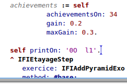
I agree with Damien, Bitsream Vera fonts really looks great, especially with the freetype plugin. Since one week, I am now using Pharo with these fonts for development and it's incredibly confortable. Oh by the way it seems that it is only when I am using these fonts from my Linux distribution I can enjoy the beautifull rendering. So may be user now in Windows and Mac has never so how nice the rendering is with these fonts. I am using both Bitstream Vera Sans and Bitstream Vera Sans Mono. This last one is especially good for code to avoid reading confusion between 0O, l1 (see screenshot) When using the embedded Bitstream font, it seems the old not-so-nice True Type rendering is used. I saw that from the latest PharoPolymorphTT distribution where the original Bitstream Vera fonts are still there.. By the way, how to add a TT font in the image so it can be used by the FreeType rendering engine? Hilaire 2008/12/1 Damien Pollet <damien.pollet@gmail.com>:
On Sun, Nov 30, 2008 at 12:33, Adrian Lienhard <adi@netstyle.ch> wrote:
I think Bitstream Vera Sans Mono would be quite good.
Yes, especially since it has a full family of bold/italics and variable-width sans/serif variants. The DejaVu fonts are derived from Vera but have a condensed (less wide) version. Also both have very good unicode coverage, so unless someone finds a prettier alternative with the same technical qualities, I would say the choice is rather obvious.
I slightly prefer Monaco, which is shipped with OS X, but I don't know its license (http://en.wikipedia.org/wiki/Monaco_(typeface)).
I doubt you can redistribute it like that.
http://www.ms-studio.com/FontSales/anonymous.html which looks nice too.
Yuck, looks like Courier and unknown license.
For a single mono-space font, Inconsolata looks more like Monaco, is under OFL, and has a bit more glyphs (up arrow). -- Damien Pollet type less, do more [ | ] http://people.untyped.org/damien.pollet
_______________________________________________ Pharo-project mailing list Pharo-project@lists.gforge.inria.fr http://lists.gforge.inria.fr/cgi-bin/mailman/listinfo/pharo-project
participants (8)
-
 Adrian Lienhard
 -
 Alexandre Bergel
 -
 Damien Pollet
 -
 David Mitchell
 -
 Hilaire Fernandes
 -
 Marcus Denker
 -
 Michael van der Gulik
 -
 Stéphane Ducasse