[Pharo-project] Nautilus look & feel

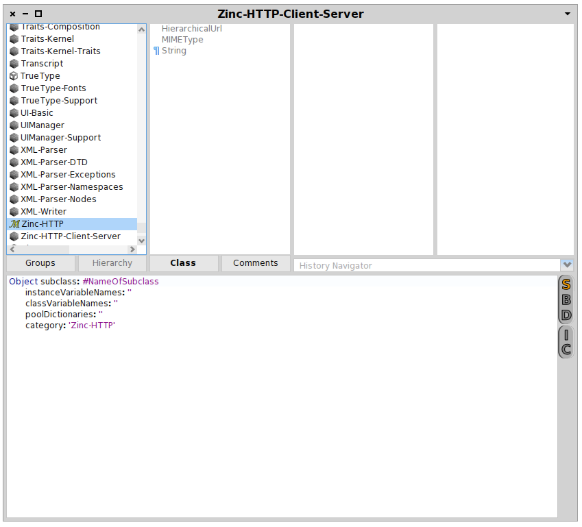
While a design competition is fine, there are still some things we can improve now without needing someone with taste :) When looking at a nautilus browser (in the moose daily build, ConfigurationOfNautilus-BenjaminVanRyseghem.238), I notice the following: Inconsistent use of space: - method and method category panes in the top row go 1px further down; - the four buttons in the middle have equal horizontal spacing, though they belong to three groups; - no space between SBD/IC and text pane; - the background of the selection downarrow of the history navigator should be one pixel larger up and down; - the selection downarrow should be centered in its background, and aligned center with SBD/IC; - the line between the text part and the arrow part of the history navigator should be removed to be consistent with the scrollbars. Why is Class bold? Why different fonts for SBD/IC and Groups/Hierarchy/Class/Comments? Inconsistent use of widgets: - SBD and IS use the same widget for two kinds of behavior (popup menu vs 1 of three choice); - SBD and Class/Instance button have similar behavior and different widgets; - SBD/IC use a rounded widget with very different lighting/shadow. Inconsistent use of color: - Graying out hierarchy means no selection possible. The grayed-out classes can be selected. The grayed-out History Navigator can be selected - SBD/IC widgets very much dominate because of the heavy shadows/dark gray & black outline; - The history navigator select is the only widget using a gradient. Hierarchy shows disabled, SBD & IC not. Calculation of horizontal width for package scrollbar is incorrect. Only SBD, IC show a hover text explanation. What is the meaning of the icons? TrueType has a kind of cube icon. Hover, left- and rightclick provide no information. Stephan
participants (1)
-
 Stephan Eggermont