[Calypso] Toolbar and Statusbar Look - voting time

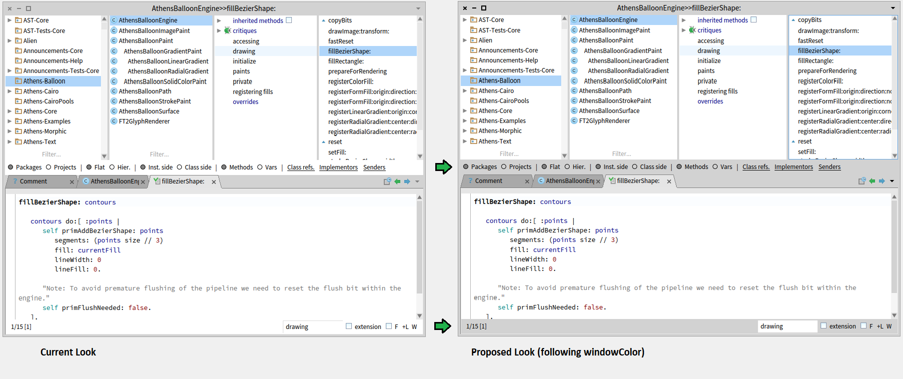
Hi all, as you know Denis Kudriashov does a fantastic job in implementing the new Calypso system browser. The plan is that at some point in time will be a replacement for Nautilus in the standard image. Even if not yet integrated one can already use it (either by loading from catalog or github [1]) For me the more I use it (and get used to it) the more I like Calypso and I guess others enjoy it too already. But unfortunately there is a single but very prominently visible UI thing that I dislike on the current look: For the "Pharo3Theme" (light theme) the current implementation of Calypso has a white toolbar in the middle and a white status bar at the bottom. Technically Dennis sets the colors of these morphs to transparent to have this effect (see LEFT example of the attached screenshot) To me this lookes strange and unusual because - usually (on Windows, GTK, Java Swing, Linux window managers) such areas like a status bar follow the window color and are displayed in gray when that is the default window theme color (see [2], [3], [4]) - these white bars would better fit for the "Glamorous Whitespace" theme (as this theme is already more white areas) Also the current white bars do not make a pleasant contrast to the other panes of Calypso: - there is not really a visual distinction to the package/class/protocol-tag/method panes and filters for the middle part (toolbar) - there is not really a visual distinction from the code pane for the bottom part (statusbar) - the divider line in the code pane just stops in a white area without borders To me this looks rather ugly and I would like Pharo to look more professional and clean ;) So I proposed a simple PR [5] today to change this and technically using the window color of the theme - the result can be seen on the right side of the attached screenshot and discussed with Denis on Discord. Denis on the other hand still likes the white approach on the left more while I prefer the right one. He wrote that he wants other people comment on this issue first to which I agree and therefore I write this mail to discuss it here on the dev-list and find out about what the majority in the community prefers. So it would be good if others could - comment about their personal preference - or just vote with "LEFT" (white/transparent) or "RIGHT" (window color) in reply to this mail - or make another proposal (which is only accepted with screenshot and PR ;) Also please do not mix other UI discussions into this thread. Thanks in advance! Bye T. [1] https://github.com/dionisiydk/Calypso [2] http://cdn.osxdaily.com/wp-content/uploads/2011/08/show-status-bar-and-disk-... [3] http://i.stack.imgur.com/pgt5n.png [4] http://python.zirael.org/gtk-statusbar1-1.png [5] https://github.com/dionisiydk/Calypso/pull/91



I agree Right is a lot better and I would love to get FastTable or related fixed so that we can see the filter input field at the end of the left pane. On Wed, Sep 13, 2017 at 6:32 PM, Brad Selfridge <bsselfridge@gmail.com> wrote:
"RIGHT" (window color)
-- Brad Selfridge 913-269-2385

right.
On 13 Sep 2017, at 19:01, Stephane Ducasse <stepharo.self@gmail.com> wrote:
I agree Right is a lot better and I would love to get FastTable or related fixed so that we can see the filter input field at the end of the left pane.
On Wed, Sep 13, 2017 at 6:32 PM, Brad Selfridge <bsselfridge@gmail.com> wrote:
"RIGHT" (window color)
-- Brad Selfridge 913-269-2385

Right On 13 September 2017 at 18:08:26, Torsten Bergmann (astares@gmx.de) wrote: Hi all, as you know Denis Kudriashov does a fantastic job in implementing the new Calypso system browser. The plan is that at some point in time will be a replacement for Nautilus in the standard image. Even if not yet integrated one can already use it (either by loading from catalog or github [1]) For me the more I use it (and get used to it) the more I like Calypso and I guess others enjoy it too already. But unfortunately there is a single but very prominently visible UI thing that I dislike on the current look: For the "Pharo3Theme" (light theme) the current implementation of Calypso has a white toolbar in the middle and a white status bar at the bottom. Technically Dennis sets the colors of these morphs to transparent to have this effect (see LEFT example of the attached screenshot) To me this lookes strange and unusual because - usually (on Windows, GTK, Java Swing, Linux window managers) such areas like a status bar follow the window color and are displayed in gray when that is the default window theme color (see [2], [3], [4]) - these white bars would better fit for the "Glamorous Whitespace" theme (as this theme is already more white areas) Also the current white bars do not make a pleasant contrast to the other panes of Calypso: - there is not really a visual distinction to the package/class/protocol-tag/method panes and filters for the middle part (toolbar) - there is not really a visual distinction from the code pane for the bottom part (statusbar) - the divider line in the code pane just stops in a white area without borders To me this looks rather ugly and I would like Pharo to look more professional and clean ;) So I proposed a simple PR [5] today to change this and technically using the window color of the theme - the result can be seen on the right side of the attached screenshot and discussed with Denis on Discord. Denis on the other hand still likes the white approach on the left more while I prefer the right one. He wrote that he wants other people comment on this issue first to which I agree and therefore I write this mail to discuss it here on the dev-list and find out about what the majority in the community prefers. So it would be good if others could - comment about their personal preference - or just vote with "LEFT" (white/transparent) or "RIGHT" (window color) in reply to this mail - or make another proposal (which is only accepted with screenshot and PR ;) Also please do not mix other UI discussions into this thread. Thanks in advance! Bye T. [1] https://github.com/dionisiydk/Calypso [2] http://cdn.osxdaily.com/wp-content/uploads/2011/08/show-status-bar-and-disk-... [3] http://i.stack.imgur.com/pgt5n.png [4] http://python.zirael.org/gtk-statusbar1-1.png [5] https://github.com/dionisiydk/Calypso/pull/91

Thank's guys for comments. And thank's Torsten for this initiative. I will merge your changes soon. 2017-09-14 7:09 GMT+02:00 Max Leske <maxleske@gmail.com>:
Right
On 13 September 2017 at 18:08:26, Torsten Bergmann (astares@gmx.de) wrote:
Hi all,
as you know Denis Kudriashov does a fantastic job in implementing the new Calypso system browser. The plan is that at some point in time will be a replacement for Nautilus in the standard image. Even if not yet integrated one can already use it (either by loading from catalog or github [1])
For me the more I use it (and get used to it) the more I like Calypso and I guess others enjoy it too already.
But unfortunately there is a single but very prominently visible UI thing that I dislike on the current look:
For the "Pharo3Theme" (light theme) the current implementation of Calypso has a white toolbar in the middle and a white status bar at the bottom. Technically Dennis sets the colors of these morphs to transparent to have this effect (see LEFT example of the attached screenshot)
To me this lookes strange and unusual because - usually (on Windows, GTK, Java Swing, Linux window managers) such areas like a status bar follow the window color and are displayed in gray when that is the default window theme color (see [2], [3], [4]) - these white bars would better fit for the "Glamorous Whitespace" theme (as this theme is already more white areas)
Also the current white bars do not make a pleasant contrast to the other panes of Calypso: - there is not really a visual distinction to the package/class/protocol-tag/method panes and filters for the middle part (toolbar) - there is not really a visual distinction from the code pane for the bottom part (statusbar) - the divider line in the code pane just stops in a white area without borders
To me this looks rather ugly and I would like Pharo to look more professional and clean ;)
So I proposed a simple PR [5] today to change this and technically using the window color of the theme - the result can be seen on the right side of the attached screenshot and discussed with Denis on Discord.
Denis on the other hand still likes the white approach on the left more while I prefer the right one.
He wrote that he wants other people comment on this issue first to which I agree and therefore I write this mail to discuss it here on the dev-list and find out about what the majority in the community prefers.
So it would be good if others could - comment about their personal preference - or just vote with "LEFT" (white/transparent) or "RIGHT" (window color) in reply to this mail - or make another proposal (which is only accepted with screenshot and PR ;)
Also please do not mix other UI discussions into this thread. Thanks in advance!
Bye T.
[1] https://github.com/dionisiydk/Calypso [2] http://cdn.osxdaily.com/wp-content/uploads/2011/08/show- status-bar-and-disk-space-lion.jpg [3] http://i.stack.imgur.com/pgt5n.png [4] http://python.zirael.org/gtk-statusbar1-1.png [5] https://github.com/dionisiydk/Calypso/pull/91

On 14 September 2017 at 09:24, Denis Kudriashov <dionisiydk@gmail.com> wrote:
Thank's guys for comments. And thank's Torsten for this initiative. I will merge your changes soon.
RIGHT. A bit late to the party, but I agree that the right version is much easier to read. Thanks, Alistair
2017-09-14 7:09 GMT+02:00 Max Leske <maxleske@gmail.com>:
Right
On 13 September 2017 at 18:08:26, Torsten Bergmann (astares@gmx.de) wrote:
Hi all,
as you know Denis Kudriashov does a fantastic job in implementing the new Calypso system browser. The plan is that at some point in time will be a replacement for Nautilus in the standard image. Even if not yet integrated one can already use it (either by loading from catalog or github [1])
For me the more I use it (and get used to it) the more I like Calypso and I guess others enjoy it too already.
But unfortunately there is a single but very prominently visible UI thing that I dislike on the current look:
For the "Pharo3Theme" (light theme) the current implementation of Calypso has a white toolbar in the middle and a white status bar at the bottom. Technically Dennis sets the colors of these morphs to transparent to have this effect (see LEFT example of the attached screenshot)
To me this lookes strange and unusual because - usually (on Windows, GTK, Java Swing, Linux window managers) such areas like a status bar follow the window color and are displayed in gray when that is the default window theme color (see [2], [3], [4]) - these white bars would better fit for the "Glamorous Whitespace" theme (as this theme is already more white areas)
Also the current white bars do not make a pleasant contrast to the other panes of Calypso: - there is not really a visual distinction to the package/class/protocol-tag/method panes and filters for the middle part (toolbar) - there is not really a visual distinction from the code pane for the bottom part (statusbar) - the divider line in the code pane just stops in a white area without borders
To me this looks rather ugly and I would like Pharo to look more professional and clean ;)
So I proposed a simple PR [5] today to change this and technically using the window color of the theme - the result can be seen on the right side of the attached screenshot and discussed with Denis on Discord.
Denis on the other hand still likes the white approach on the left more while I prefer the right one.
He wrote that he wants other people comment on this issue first to which I agree and therefore I write this mail to discuss it here on the dev-list and find out about what the majority in the community prefers.
So it would be good if others could - comment about their personal preference - or just vote with "LEFT" (white/transparent) or "RIGHT" (window color) in reply to this mail - or make another proposal (which is only accepted with screenshot and PR ;)
Also please do not mix other UI discussions into this thread. Thanks in advance!
Bye T.
[1] https://github.com/dionisiydk/Calypso [2] http://cdn.osxdaily.com/wp-content/uploads/2011/08/show-status-bar-and-disk-... [3] http://i.stack.imgur.com/pgt5n.png [4] http://python.zirael.org/gtk-statusbar1-1.png [5] https://github.com/dionisiydk/Calypso/pull/91
Thanks Denis for your positive mindset and constant willingness to improve. On Thu, Sep 14, 2017 at 3:05 PM, Alistair Grant <akgrant0710@gmail.com> wrote:
On 14 September 2017 at 09:24, Denis Kudriashov <dionisiydk@gmail.com> wrote:
Thank's guys for comments. And thank's Torsten for this initiative. I will merge your changes soon.
RIGHT.
A bit late to the party, but I agree that the right version is much easier to read.
Thanks, Alistair
2017-09-14 7:09 GMT+02:00 Max Leske <maxleske@gmail.com>:
Right
On 13 September 2017 at 18:08:26, Torsten Bergmann (astares@gmx.de) wrote:
Hi all,
as you know Denis Kudriashov does a fantastic job in implementing the new Calypso system browser. The plan is that at some point in time will be a replacement for Nautilus in the standard image. Even if not yet integrated one can already use it (either by loading from catalog or github [1])
For me the more I use it (and get used to it) the more I like Calypso and I guess others enjoy it too already.
But unfortunately there is a single but very prominently visible UI thing that I dislike on the current look:
For the "Pharo3Theme" (light theme) the current implementation of Calypso has a white toolbar in the middle and a white status bar at the bottom. Technically Dennis sets the colors of these morphs to transparent to have this effect (see LEFT example of the attached screenshot)
To me this lookes strange and unusual because - usually (on Windows, GTK, Java Swing, Linux window managers) such areas like a status bar follow the window color and are displayed in gray when that is the default window theme color (see [2], [3], [4]) - these white bars would better fit for the "Glamorous Whitespace" theme (as this theme is already more white areas)
Also the current white bars do not make a pleasant contrast to the other panes of Calypso: - there is not really a visual distinction to the package/class/protocol-tag/method panes and filters for the middle part (toolbar) - there is not really a visual distinction from the code pane for the bottom part (statusbar) - the divider line in the code pane just stops in a white area without borders
To me this looks rather ugly and I would like Pharo to look more professional and clean ;)
So I proposed a simple PR [5] today to change this and technically using the window color of the theme - the result can be seen on the right side of the attached screenshot and discussed with Denis on Discord.
Denis on the other hand still likes the white approach on the left more while I prefer the right one.
He wrote that he wants other people comment on this issue first to which I agree and therefore I write this mail to discuss it here on the dev-list and find out about what the majority in the community prefers.
So it would be good if others could - comment about their personal preference - or just vote with "LEFT" (white/transparent) or "RIGHT" (window color) in reply to this mail - or make another proposal (which is only accepted with screenshot and PR ;)
Also please do not mix other UI discussions into this thread. Thanks in advance!
Bye T.
[1] https://github.com/dionisiydk/Calypso [2] http://cdn.osxdaily.com/wp-content/uploads/2011/08/show-status-bar-and-disk-... [3] http://i.stack.imgur.com/pgt5n.png [4] http://python.zirael.org/gtk-statusbar1-1.png [5] https://github.com/dionisiydk/Calypso/pull/91
"Denis Kudriashov" wrote
Thank's guys for comments. And thank's Torsten for this initiative. I will merge your changes soon.
No - we have to thank you. For Calypso, for accepting the community decision and (in advance) for merging the first Calypso pull request. I'm pretty sure the next Pharo versions will rock even more ... Bye T.
I would really like to be able to define methods without being forced to give a protocol. On Thu, Sep 14, 2017 at 9:29 PM, Torsten Bergmann <astares@gmx.de> wrote:
"Denis Kudriashov" wrote
Thank's guys for comments. And thank's Torsten for this initiative. I will merge your changes soon.
No - we have to thank you. For Calypso, for accepting the community decision and (in advance) for merging the first Calypso pull request.
I'm pretty sure the next Pharo versions will rock even more ...
Bye T.

On Thu, Sep 14, 2017 at 4:29 PM, Torsten Bergmann <astares@gmx.de> wrote:
"Denis Kudriashov" wrote
Thank's guys for comments. And thank's Torsten for this initiative. I will merge your changes soon.
No - we have to thank you. For Calypso, for accepting the community decision and (in advance) for merging the first Calypso pull request.
+1. I am already enjoying it since a couple of months and Denis was also quick to incorporate my suggestions :) BTW, RIGHT, of course.
I'm pretty sure the next Pharo versions will rock even more ...
Bye T.
-- Mariano http://marianopeck.wordpress.com
2017-09-18 13:47 GMT+02:00 Mariano Martinez Peck <marianopeck@gmail.com>:
On Thu, Sep 14, 2017 at 4:29 PM, Torsten Bergmann <astares@gmx.de> wrote:
"Denis Kudriashov" wrote
Thank's guys for comments. And thank's Torsten for this initiative. I will merge your changes soon.
No - we have to thank you. For Calypso, for accepting the community decision and (in advance) for merging the first Calypso pull request.
+1. I am already enjoying it since a couple of months and Denis was also quick to incorporate my suggestions :)
Now I am not so quick. I am in the middle of refactoring and cleaning and I not created special branch for it. (I must do it always).
BTW, RIGHT, of course.
I'm pretty sure the next Pharo versions will rock even more ...
Bye T.
-- Mariano http://marianopeck.wordpress.com
I know it is possible. But I expect that this issue can wait a bit :) 2017-09-19 17:43 GMT+02:00 Torsten Bergmann <astares@gmx.de>:
Mhhh ... I guess this is something you can handle with some git commands.
https://www.mikeplate.com/2012/04/21/rewind-master-if- you-forgot-to-create-new-branch-in-git/
Bye T. *Gesendet:* Dienstag, 19. September 2017 um 17:07 Uhr *Von:* "Denis Kudriashov" <dionisiydk@gmail.com> *An:* "Pharo Development List" <pharo-dev@lists.pharo.org> *Betreff:* Re: [Pharo-dev] [Calypso] Toolbar and Statusbar Look - voting time
2017-09-18 13:47 GMT+02:00 Mariano Martinez Peck <marianopeck@gmail.com>:
On Thu, Sep 14, 2017 at 4:29 PM, Torsten Bergmann <astares@gmx.de> wrote:
"Denis Kudriashov" wrote
Thank's guys for comments. And thank's Torsten for this initiative. I will merge your changes soon.
No - we have to thank you. For Calypso, for accepting the community decision and (in advance) for merging the first Calypso pull request.
+1. I am already enjoying it since a couple of months and Denis was also quick to incorporate my suggestions :)
Now I am not so quick. I am in the middle of refactoring and cleaning and I not created special branch for it. (I must do it always).
BTW, RIGHT, of course.
I'm pretty sure the next Pharo versions will rock even more ...
Bye T.
-- Mariano http://marianopeck.wordpress.com
participants (9)
-
 Alistair Grant
 -
 Brad Selfridge
 -
 Denis Kudriashov
 -
 Esteban Lorenzano
 -
 Mariano Martinez Peck
 -
 Max Leske
 -
 Stephane Ducasse
 -
 Sven Van Caekenberghe
 -
 Torsten Bergmann