[ann] gtdebugger in pharo 5.0

Hi, We are about to integrate in Pharo a new member of the Glamorous Toolkit: the GTDebugger. As this is a significant change that might affect your workflow, here is some background information to help you deal with the change. First, you should know that the change is not irreversible and it is easily possible to disabled the new debugger through a setting. However, please do take the time to provide us feedback if something does not work out for you. We want to know what can be improved and we try to react as fast as we can. A practical change comes from the fact that the variables are manipulated through a GTInspector, which makes it cheaper to maintain in the longer run. While the first thing that will capture the attention is the default generic interface, the real power comes from the moldable nature of the debugger. Like all other GT tools, GTDebugger is also moldable by design. This means that we can construct custom debuggers for specific libraries at small costs (often measured in a couple of hundred lines of code). Here is an introductory overview blog post that also includes some links for further reading: http://www.humane-assessment.com/blog/gtdebugger-in-pharo/ <http://www.humane-assessment.com/blog/gtdebugger-in-pharo/> Please let us know what you think. Cheers, Doru -- www.tudorgirba.com <http://www.tudorgirba.com/> www.feenk.com "Beauty is where we see it."

Hi, with a moldable debugger we should (in the future) be able to support debugging also different/other programming languages/DSLs in Pharo :) - although usually one does necessary have such a use case. So I guess GTInspector or other will be adopted to own needs more than GTDebugger. However: The only objection so far is that I dislike the order/size of the panes. The placement of the panes in GTDebugger (as for instance found in Moose) requires often to use the scrollbars of the pane showing the stack because of the text length. In GTDebugger the stack is at the top left, the source at the top right with a common splitter beneath the two panes: therefore the height (depth) of the stack pane is always the height of the code pane. When you have a long method to debug on the right much space is wasted for a deep stack on the left although you might only be interested in a few top frames. Contrary when you have are interested in a deep/full stack and you increase the height of the stack pane on the left you directly increase the height of the code pane and for short methods you waste a lot of space in the source pane as well. This is much better solved with the positioning in the traditinal Debugger: - Stack - Source - other So in my opinion We should preserve: - TOP: the stack at the top (using the full width of the window, so only vertical scrolling has to be done to "roll" on the stack, no need for horizontal scrolling as the area is wide enough) - MIDDLE: the source code pane in the middle (also using the full width of the window and there fore in alignment with code pane in the the usual tools like Nautilus, change sorter, ...) - BOTTON: one or more panel for inspection at the bottom It would be OK for me if others like the new layout better - but at least there should be an option to support the traditional layout as well (or support pane movemen/docking as in other IDEs) Also the debugger window in Moose wastes a lot of space/has unused space within the windows client are itself. For instance the splitters are very thick which might be an issue of the moose theme.  Thanks T. Gesendet: Freitag, 08. Januar 2016 um 11:24 Uhr Von: "Tudor Girba" <tudor@tudorgirba.com> An: "Pharo Development List" <pharo-dev@lists.pharo.org>, "Moose-dev Moose Dev" <moose-dev@iam.unibe.ch>, "Any question about pharo is welcome" <pharo-users@lists.pharo.org> Betreff: [Pharo-dev] [ann] gtdebugger in pharo 5.0 Hi,  We are about to integrate in Pharo a new member of the Glamorous Toolkit: the GTDebugger. As this is a significant change that might affect your workflow, here is some background information to help you deal with the change.  First, you should know that the change is not irreversible and it is easily possible to disabled the new debugger through a setting. However, please do take the time to provide us feedback if something does not work out for you. We want to know what can be improved and we try to react as fast as we can.  A practical change comes from the fact that the variables are manipulated through a GTInspector, which makes it cheaper to maintain in the longer run.   While the first thing that will capture the attention is the default generic interface, the real power comes from the moldable nature of the debugger. Like all other GT tools, GTDebugger is also moldable by design. This means that we can construct custom debuggers for specific libraries at small costs (often measured in a couple of hundred lines of code).   Here is an introductory overview blog post that also includes some links for further reading: http://www.humane-assessment.com/blog/gtdebugger-in-pharo/  Please let us know what you think.  Cheers, Doru   -- www.tudorgirba.com[http://www.tudorgirba.com] www.feenk.com[http://www.feenk.com] "Beauty is where we see it." Â

I second Torstenâs comment with regard to the use of space, I also think the original positioning of stack and code panes is more efficient.
On Jan 8, 2016, at 14:28, Torsten Bergmann <astares@gmx.de> wrote:
Hi,
with a moldable debugger we should (in the future) be able to support debugging also different/other programming languages/DSLs in Pharo :) - although usually one does necessary have such a use case. So I guess GTInspector or other will be adopted to own needs more than GTDebugger.
However: The only objection so far is that I dislike the order/size of the panes. The placement of the panes in GTDebugger (as for instance found in Moose) requires often to use the scrollbars of the pane showing the stack because of the text length.
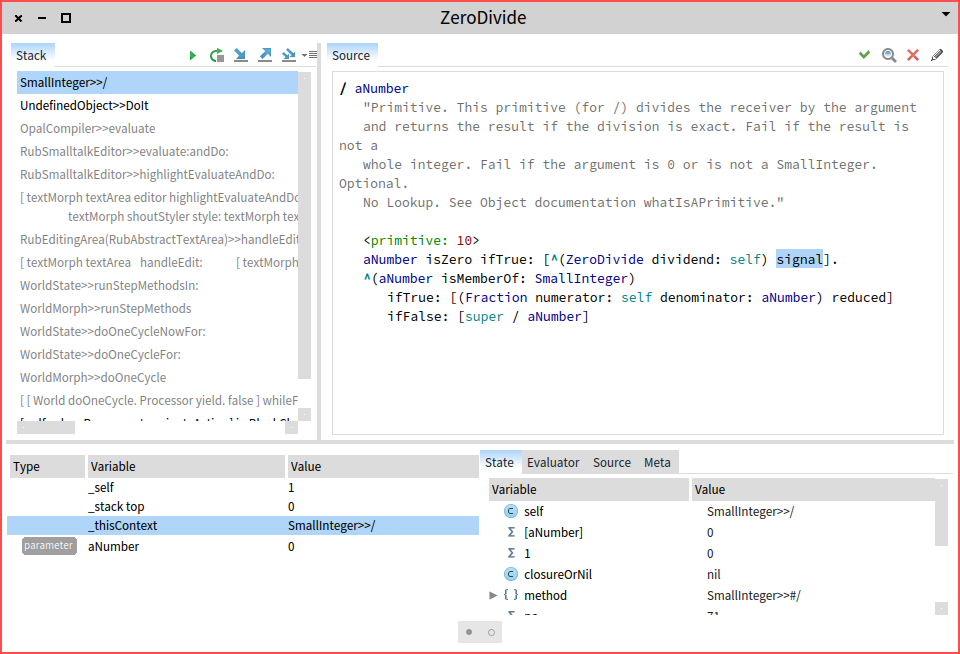
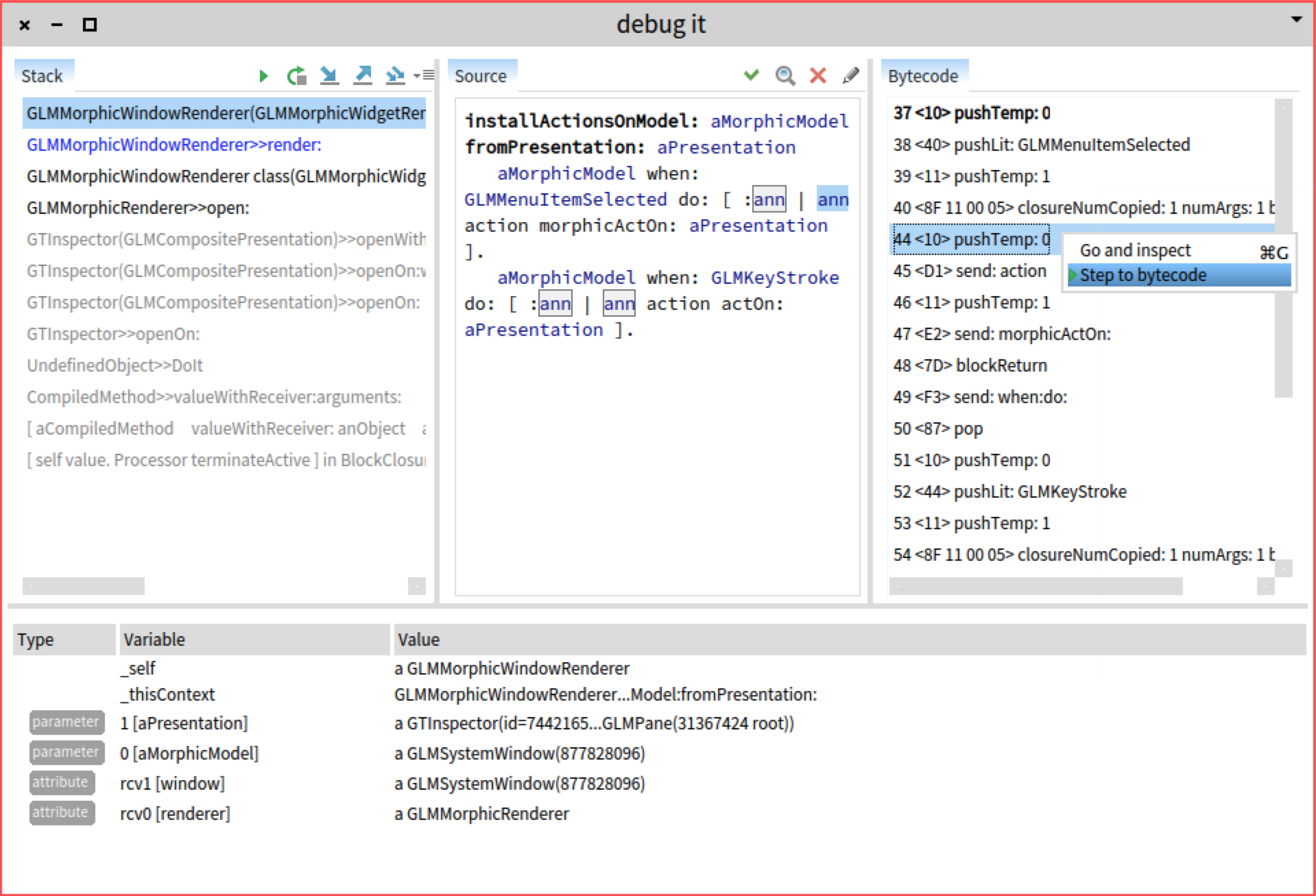
In GTDebugger the stack is at the top left, the source at the top right with a common splitter beneath the two panes: therefore the height (depth) of the stack pane is always the height of the code pane. When you have a long method to debug on the right much space is wasted for a deep stack on the left although you might only be interested in a few top frames.
Contrary when you have are interested in a deep/full stack and you increase the height of the stack pane on the left you directly increase the height of the code pane and for short methods you waste a lot of space in the source pane as well.
This is much better solved with the positioning in the traditinal Debugger: - Stack - Source - other
So in my opinion We should preserve:
- TOP: the stack at the top (using the full width of the window, so only vertical scrolling has to be done to "roll" on the stack, no need for horizontal scrolling as the area is wide enough) - MIDDLE: the source code pane in the middle (also using the full width of the window and there fore in alignment with code pane in the the usual tools like Nautilus, change sorter, ...) - BOTTON: one or more panel for inspection at the bottom
It would be OK for me if others like the new layout better - but at least there should be an option to support the traditional layout as well (or support pane movemen/docking as in other IDEs)
Also the debugger window in Moose wastes a lot of space/has unused space within the windows client are itself. For instance the splitters are very thick which might be an issue of the moose theme.
Thanks T.
Gesendet: Freitag, 08. Januar 2016 um 11:24 Uhr Von: "Tudor Girba" <tudor@tudorgirba.com> An: "Pharo Development List" <pharo-dev@lists.pharo.org>, "Moose-dev Moose Dev" <moose-dev@iam.unibe.ch>, "Any question about pharo is welcome" <pharo-users@lists.pharo.org> Betreff: [Pharo-dev] [ann] gtdebugger in pharo 5.0
Hi,
We are about to integrate in Pharo a new member of the Glamorous Toolkit: the GTDebugger. As this is a significant change that might affect your workflow, here is some background information to help you deal with the change.
First, you should know that the change is not irreversible and it is easily possible to disabled the new debugger through a setting. However, please do take the time to provide us feedback if something does not work out for you. We want to know what can be improved and we try to react as fast as we can.
A practical change comes from the fact that the variables are manipulated through a GTInspector, which makes it cheaper to maintain in the longer run.
While the first thing that will capture the attention is the default generic interface, the real power comes from the moldable nature of the debugger. Like all other GT tools, GTDebugger is also moldable by design. This means that we can construct custom debuggers for specific libraries at small costs (often measured in a couple of hundred lines of code).
Here is an introductory overview blog post that also includes some links for further reading: http://www.humane-assessment.com/blog/gtdebugger-in-pharo/
Please let us know what you think.
Cheers, Doru
-- www.tudorgirba.com[http://www.tudorgirba.com] www.feenk.com[http://www.feenk.com]
"Beauty is where we see it."
---> Save our in-boxes! http://emailcharter.org <--- Johan Fabry - http://pleiad.cl/~jfabry PLEIAD and RyCh labs - Computer Science Department (DCC) - University of Chile
Thanks. What do you think of the new solution? Is it sufficient? Doru
On Jan 8, 2016, at 8:05 PM, Johan Fabry <jfabry@dcc.uchile.cl> wrote:
I second Torstenâs comment with regard to the use of space, I also think the original positioning of stack and code panes is more efficient.
On Jan 8, 2016, at 14:28, Torsten Bergmann <astares@gmx.de> wrote:
Hi,
with a moldable debugger we should (in the future) be able to support debugging also different/other programming languages/DSLs in Pharo :) - although usually one does necessary have such a use case. So I guess GTInspector or other will be adopted to own needs more than GTDebugger.
However: The only objection so far is that I dislike the order/size of the panes. The placement of the panes in GTDebugger (as for instance found in Moose) requires often to use the scrollbars of the pane showing the stack because of the text length.
In GTDebugger the stack is at the top left, the source at the top right with a common splitter beneath the two panes: therefore the height (depth) of the stack pane is always the height of the code pane. When you have a long method to debug on the right much space is wasted for a deep stack on the left although you might only be interested in a few top frames.
Contrary when you have are interested in a deep/full stack and you increase the height of the stack pane on the left you directly increase the height of the code pane and for short methods you waste a lot of space in the source pane as well.
This is much better solved with the positioning in the traditinal Debugger: - Stack - Source - other
So in my opinion We should preserve:
- TOP: the stack at the top (using the full width of the window, so only vertical scrolling has to be done to "roll" on the stack, no need for horizontal scrolling as the area is wide enough) - MIDDLE: the source code pane in the middle (also using the full width of the window and there fore in alignment with code pane in the the usual tools like Nautilus, change sorter, ...) - BOTTON: one or more panel for inspection at the bottom
It would be OK for me if others like the new layout better - but at least there should be an option to support the traditional layout as well (or support pane movemen/docking as in other IDEs)
Also the debugger window in Moose wastes a lot of space/has unused space within the windows client are itself. For instance the splitters are very thick which might be an issue of the moose theme.
Thanks T.
Gesendet: Freitag, 08. Januar 2016 um 11:24 Uhr Von: "Tudor Girba" <tudor@tudorgirba.com> An: "Pharo Development List" <pharo-dev@lists.pharo.org>, "Moose-dev Moose Dev" <moose-dev@iam.unibe.ch>, "Any question about pharo is welcome" <pharo-users@lists.pharo.org> Betreff: [Pharo-dev] [ann] gtdebugger in pharo 5.0
Hi,
We are about to integrate in Pharo a new member of the Glamorous Toolkit: the GTDebugger. As this is a significant change that might affect your workflow, here is some background information to help you deal with the change.
First, you should know that the change is not irreversible and it is easily possible to disabled the new debugger through a setting. However, please do take the time to provide us feedback if something does not work out for you. We want to know what can be improved and we try to react as fast as we can.
A practical change comes from the fact that the variables are manipulated through a GTInspector, which makes it cheaper to maintain in the longer run.
While the first thing that will capture the attention is the default generic interface, the real power comes from the moldable nature of the debugger. Like all other GT tools, GTDebugger is also moldable by design. This means that we can construct custom debuggers for specific libraries at small costs (often measured in a couple of hundred lines of code).
Here is an introductory overview blog post that also includes some links for further reading: http://www.humane-assessment.com/blog/gtdebugger-in-pharo/
Please let us know what you think.
Cheers, Doru
-- www.tudorgirba.com[http://www.tudorgirba.com] www.feenk.com[http://www.feenk.com]
"Beauty is where we see it."
---> Save our in-boxes! http://emailcharter.org <---
Johan Fabry - http://pleiad.cl/~jfabry PLEIAD and RyCh labs - Computer Science Department (DCC) - University of Chile
-- www.tudorgirba.com www.feenk.com "It's not how it is, it is how we see it."
It looks much better to me, yes. I would need to use it some time before I could give more detailed feedback. (And I canât really do that until the FFI is fixed, because all my development crashes the VM since I am using Roassal. So I am still on the last Pharo version before the VM switch.) One last thing is that I am not convinced on having the âproceedâ, âstep intoâ, âstep overâ et cetera buttons on the stack pane. To me they are more related to the source code pane, as you always see the results of pressing those buttons there, but on the stack not always, e.g. the âstep overâ actions.
On Jan 9, 2016, at 19:06, Tudor Girba <tudor@tudorgirba.com> wrote:
Thanks. What do you think of the new solution? Is it sufficient?
Doru
---> Save our in-boxes! http://emailcharter.org <--- Johan Fabry - http://pleiad.cl/~jfabry PLEIAD and RyCh labs - Computer Science Department (DCC) - University of Chile
Hi, Thanks a lot for the detailed feedback.
On Jan 8, 2016, at 7:28 PM, Torsten Bergmann <astares@gmx.de <mailto:astares@gmx.de>> wrote:
Hi,
with a moldable debugger we should (in the future) be able to support debugging also different/other programming languages/DSLs in Pharo :)
Yes. This would work quite well if the language would project on the AST of Pharo, like Helvetia does.
- although usually one does necessary have such a use case. So I guess GTInspector or other will be adopted to own needs more than GTDebugger.
The debugger can be specialized for specific libraries or frameworks, not only languages. For example, we currently have extensions for PetitParser, Glamour, Announcements and they are meaningful.
However: The only objection so far is that I dislike the order/size of the panes.
That is actually encouraging :).
The placement of the panes in GTDebugger (as for instance found in Moose) requires often to use the scrollbars of the pane showing the stack because of the text length.
The horizontal bar could also be prevented by making the items in the list wrapped (so, they might occupy multiple lines).
In GTDebugger the stack is at the top left, the source at the top right with a common splitter beneath the two panes: therefore the height (depth) of the stack pane is always the height of the code pane. When you have a long method to debug on the right much space is wasted for a deep stack on the left although you might only be interested in a few top frames.
Contrary when you have are interested in a deep/full stack and you increase the height of the stack pane on the left you directly increase the height of the code pane and for short methods you waste a lot of space in the source pane as well.
The reason for this choice was to expose the developer to more of the stack, but it is not an essential design choice.
This is much better solved with the positioning in the traditinal Debugger: - Stack - Source - other
So in my opinion We should preserve:
- TOP: the stack at the top (using the full width of the window, so only vertical scrolling has to be done to "roll" on the stack, no need for horizontal scrolling as the area is wide enough) - MIDDLE: the source code pane in the middle (also using the full width of the window and there fore in alignment with code pane in the the usual tools like Nautilus, change sorter, ...) - BOTTON: one or more panel for inspection at the bottom
We will play with this a bit. Or does anyone else would like to give it a try?
It would be OK for me if others like the new layout better - but at least there should be an option to support the traditional layout as well (or support pane movemen/docking as in other IDEs)
Movement would be certainly interesting and I would be happy if someone would implement this in Morphic.
Also the debugger window in Moose wastes a lot of space/has unused space within the windows client are itself. For instance the splitters are very thick which might be an issue of the moose theme.
Itâs actually an issue in Glamour, but it can be adapted. Cheers, Doru
Thanks T.
Gesendet: Freitag, 08. Januar 2016 um 11:24 Uhr Von: "Tudor Girba" <tudor@tudorgirba.com <mailto:tudor@tudorgirba.com>> An: "Pharo Development List" <pharo-dev@lists.pharo.org <mailto:pharo-dev@lists.pharo.org>>, "Moose-dev Moose Dev" <moose-dev@iam.unibe.ch <mailto:moose-dev@iam.unibe.ch>>, "Any question about pharo is welcome" <pharo-users@lists.pharo.org <mailto:pharo-users@lists.pharo.org>> Betreff: [Pharo-dev] [ann] gtdebugger in pharo 5.0
Hi,
We are about to integrate in Pharo a new member of the Glamorous Toolkit: the GTDebugger. As this is a significant change that might affect your workflow, here is some background information to help you deal with the change.
First, you should know that the change is not irreversible and it is easily possible to disabled the new debugger through a setting. However, please do take the time to provide us feedback if something does not work out for you. We want to know what can be improved and we try to react as fast as we can.
A practical change comes from the fact that the variables are manipulated through a GTInspector, which makes it cheaper to maintain in the longer run.
While the first thing that will capture the attention is the default generic interface, the real power comes from the moldable nature of the debugger. Like all other GT tools, GTDebugger is also moldable by design. This means that we can construct custom debuggers for specific libraries at small costs (often measured in a couple of hundred lines of code).
Here is an introductory overview blog post that also includes some links for further reading: http://www.humane-assessment.com/blog/gtdebugger-in-pharo/ <http://www.humane-assessment.com/blog/gtdebugger-in-pharo/>
Please let us know what you think.
Cheers, Doru
-- www.tudorgirba.com <http://www.tudorgirba.com/>[http://www.tudorgirba.com <http://www.tudorgirba.com/>] www.feenk.com <http://www.feenk.com/>[http://www.feenk.com <http://www.feenk.com/>]
"Beauty is where we see it."
-- www.tudorgirba.com <http://www.tudorgirba.com/> www.feenk.com <http://www.feenk.com/> "Presenting is storytelling."
Hi,
On Jan 8, 2016, at 7:28 PM, Torsten Bergmann <astares@gmx.de <mailto:astares@gmx.de>> wrote:
Hi,
with a moldable debugger we should (in the future) be able to support debugging also different/other programming languages/DSLs in Pharo :)
Yes. This would work quite well if the language would project on the AST of Pharo, like Helvetia does.
- although usually one does necessary have such a use case. So I guess GTInspector or other will be adopted to own needs more than GTDebugger.
The debugger can be specialized for specific libraries or frameworks, not necessarily only languages. For example, we currently have extensions for PetitParser, Glamour, Announcements. I expect that every framework would benefit from a specialized debugger. This would not be an odd behavior at all.
However: The only objection so far is that I dislike the order/size of the panes. The placement of the panes in GTDebugger (as for instance found in Moose) requires often to use the scrollbars of the pane showing the stack because of the text length.
In GTDebugger the stack is at the top left, the source at the top right with a common splitter beneath the two panes: therefore the height (depth) of the stack pane is always the height of the code pane. When you have a long method to debug on the right much space is wasted for a deep stack on the left although you might only be interested in a few top frames.
Contrary when you have are interested in a deep/full stack and you increase the height of the stack pane on the left you directly increase the height of the code pane and for short methods you waste a lot of space in the source pane as well.
This is much better solved with the positioning in the traditinal Debugger: - Stack - Source - other
So in my opinion We should preserve:
- TOP: the stack at the top (using the full width of the window, so only vertical scrolling has to be done to "roll" on the stack, no need for horizontal scrolling as the area is wide enough) - MIDDLE: the source code pane in the middle (also using the full width of the window and there fore in alignment with code pane in the the usual tools like Nautilus, change sorter, ...) - BOTTON: one or more panel for inspection at the bottom
It would be OK for me if others like the new layout better - but at least there should be an option to support the traditional layout as well (or support pane movemen/docking as in other IDEs)
Thanks. We took this into account.
Also the debugger window in Moose wastes a lot of space/has unused space within the windows client are itself. For instance the splitters are very thick which might be an issue of the moose theme.
Thanks. We reduced the splitter size in Glamour. Doru
Thanks T.
Gesendet: Freitag, 08. Januar 2016 um 11:24 Uhr Von: "Tudor Girba" <tudor@tudorgirba.com <mailto:tudor@tudorgirba.com>> An: "Pharo Development List" <pharo-dev@lists.pharo.org <mailto:pharo-dev@lists.pharo.org>>, "Moose-dev Moose Dev" <moose-dev@iam.unibe.ch <mailto:moose-dev@iam.unibe.ch>>, "Any question about pharo is welcome" <pharo-users@lists.pharo.org <mailto:pharo-users@lists.pharo.org>> Betreff: [Pharo-dev] [ann] gtdebugger in pharo 5.0
Hi,
We are about to integrate in Pharo a new member of the Glamorous Toolkit: the GTDebugger. As this is a significant change that might affect your workflow, here is some background information to help you deal with the change.
First, you should know that the change is not irreversible and it is easily possible to disabled the new debugger through a setting. However, please do take the time to provide us feedback if something does not work out for you. We want to know what can be improved and we try to react as fast as we can.
A practical change comes from the fact that the variables are manipulated through a GTInspector, which makes it cheaper to maintain in the longer run.
While the first thing that will capture the attention is the default generic interface, the real power comes from the moldable nature of the debugger. Like all other GT tools, GTDebugger is also moldable by design. This means that we can construct custom debuggers for specific libraries at small costs (often measured in a couple of hundred lines of code).
Here is an introductory overview blog post that also includes some links for further reading: http://www.humane-assessment.com/blog/gtdebugger-in-pharo/ <http://www.humane-assessment.com/blog/gtdebugger-in-pharo/>
Please let us know what you think.
Cheers, Doru
-- www.tudorgirba.com <http://www.tudorgirba.com/>[http://www.tudorgirba.com <http://www.tudorgirba.com/>] www.feenk.com <http://www.feenk.com/>[http://www.feenk.com <http://www.feenk.com/>]
"Beauty is where we see it."
-- www.tudorgirba.com <http://www.tudorgirba.com/> www.feenk.com <http://www.feenk.com/> "Presenting is storytelling."

2016-01-08 11:24 GMT+01:00 Tudor Girba <tudor@tudorgirba.com>:
Hi,
We are about to integrate in Pharo a new member of the Glamorous Toolkit: the GTDebugger. As this is a significant change that might affect your workflow, here is some background information to help you deal with the change.
First, you should know that the change is not irreversible and it is easily possible to disabled the new debugger through a setting. However, please do take the time to provide us feedback if something does not work out for you. We want to know what can be improved and we try to react as fast as we can.
A practical change comes from the fact that the variables are manipulated through a GTInspector, which makes it cheaper to maintain in the longer run.
Accept and Cancel buttons shouldn't be there or should not act on if the codepane hasn't changed. (every press on "accept" writes a new method version, although the contents didn't changed - tested on Latest update: #50524 ) Most (all?) other tools don't have Accept/Cancel buttons. - I really miss the "List Methods using 'varname'/List Methods storing into 'varname' - is "stackTop" now gone ? I thought you wanted to add it to the stack ? - thisContext is gone as well ? - the Bytecode/GT button is badly placed, it looks like the "downarrow" window menu icon is a dropdown menu with label "Bytecode" (since when do we put buttons in the title pane? - the evaluator pane is shown as "dirty", as it does not make a difference if we accept the text in this pane, there shouldn't be a dirty indicator. - you can not use the inspector pane to change inst var values - there is no way to refresh the inspector pane I don't open bugtracker entries now, I 'll wait maybe this issues aren't bugs but features. nicolai

no, Iâm quite sure they are bugs :) I also believe the other tools do not have accept/cancel visible (they are in contextual menus), so maybe they should be there. Esteban
On 12 Jan 2016, at 23:24, Nicolai Hess <nicolaihess@gmail.com> wrote:
2016-01-08 11:24 GMT+01:00 Tudor Girba <tudor@tudorgirba.com <mailto:tudor@tudorgirba.com>>: Hi,
We are about to integrate in Pharo a new member of the Glamorous Toolkit: the GTDebugger. As this is a significant change that might affect your workflow, here is some background information to help you deal with the change.
First, you should know that the change is not irreversible and it is easily possible to disabled the new debugger through a setting. However, please do take the time to provide us feedback if something does not work out for you. We want to know what can be improved and we try to react as fast as we can.
A practical change comes from the fact that the variables are manipulated through a GTInspector, which makes it cheaper to maintain in the longer run.
Accept and Cancel buttons shouldn't be there or should not act on if the codepane hasn't changed. (every press on "accept" writes a new method version, although the contents didn't changed - tested on Latest update: #50524 )
Most (all?) other tools don't have Accept/Cancel buttons.
- I really miss the "List Methods using 'varname'/List Methods storing into 'varname' - is "stackTop" now gone ? I thought you wanted to add it to the stack ? - thisContext is gone as well ? - the Bytecode/GT button is badly placed, it looks like the "downarrow" window menu icon is a dropdown menu with label "Bytecode" (since when do we put buttons in the title pane? - the evaluator pane is shown as "dirty", as it does not make a difference if we accept the text in this pane, there shouldn't be a dirty indicator. - you can not use the inspector pane to change inst var values - there is no way to refresh the inspector pane
I don't open bugtracker entries now, I 'll wait maybe this issues aren't bugs but features.
nicolai

Hi Nicolai, Thanks for reporting these issues. They are indeed bugs and we are working on fixing them. Cheers, Andrei On Tue, Jan 12, 2016 at 11:24 PM, Nicolai Hess <nicolaihess@gmail.com> wrote:
2016-01-08 11:24 GMT+01:00 Tudor Girba <tudor@tudorgirba.com>:
Hi,
We are about to integrate in Pharo a new member of the Glamorous Toolkit: the GTDebugger. As this is a significant change that might affect your workflow, here is some background information to help you deal with the change.
First, you should know that the change is not irreversible and it is easily possible to disabled the new debugger through a setting. However, please do take the time to provide us feedback if something does not work out for you. We want to know what can be improved and we try to react as fast as we can.
A practical change comes from the fact that the variables are manipulated through a GTInspector, which makes it cheaper to maintain in the longer run.
Accept and Cancel buttons shouldn't be there or should not act on if the codepane hasn't changed. (every press on "accept" writes a new method version, although the contents didn't changed - tested on Latest update: #50524 )
Most (all?) other tools don't have Accept/Cancel buttons.
- I really miss the "List Methods using 'varname'/List Methods storing into 'varname' - is "stackTop" now gone ? I thought you wanted to add it to the stack ? - thisContext is gone as well ? - the Bytecode/GT button is badly placed, it looks like the "downarrow" window menu icon is a dropdown menu with label "Bytecode" (since when do we put buttons in the title pane? - the evaluator pane is shown as "dirty", as it does not make a difference if we accept the text in this pane, there shouldn't be a dirty indicator. - you can not use the inspector pane to change inst var values - there is no way to refresh the inspector pane
I don't open bugtracker entries now, I 'll wait maybe this issues aren't bugs but features.
nicolai
Hi, Thanks indeed for the feedback. I think not quite all are bugs, but see more details inside.
On Jan 14, 2016, at 12:59 PM, Andrei Chis <chisvasileandrei@gmail.com> wrote:
Hi Nicolai,
Thanks for reporting these issues. They are indeed bugs and we are working on fixing them.
Cheers, Andrei
On Tue, Jan 12, 2016 at 11:24 PM, Nicolai Hess <nicolaihess@gmail.com> wrote:
2016-01-08 11:24 GMT+01:00 Tudor Girba <tudor@tudorgirba.com>: Hi,
We are about to integrate in Pharo a new member of the Glamorous Toolkit: the GTDebugger. As this is a significant change that might affect your workflow, here is some background information to help you deal with the change.
First, you should know that the change is not irreversible and it is easily possible to disabled the new debugger through a setting. However, please do take the time to provide us feedback if something does not work out for you. We want to know what can be improved and we try to react as fast as we can.
A practical change comes from the fact that the variables are manipulated through a GTInspector, which makes it cheaper to maintain in the longer run.
Accept and Cancel buttons shouldn't be there or should not act on if the codepane hasn't changed. (every press on "accept" writes a new method version, although the contents didn't changed - tested on Latest update: #50524 )
Good catch. This will happen even if the button would not be present.
Most (all?) other tools don't have Accept/Cancel buttons.
The logic is that these are actions that do not depend on the selection, so in Glamour we map these on actions that are applicable to the entire presentation. A similar approach is present in the inspector, although probably it does not appear so prominently because there is no text. We could try to add them in a dropdown menu. Would that help?
- I really miss the "List Methods using 'varname'/List Methods storing into âvarname'
Please open an issue for this.
- is "stackTop" now gone ? I thought you wanted to add it to the stack ? - thisContext is gone as well ?
These were removed due to emergency mail exchange that happened during the last weekend.
- the Bytecode/GT button is badly placed, it looks like the "downarrow" window menu icon is a dropdown menu with label âBytecode"
We could try to fix by adding more space to the left of the menu bar in the theme. Could you open an issue?
(since when do we put buttons in the title pane?
Since Glamour makes it easy to have them there :). The GTPlayground and GTInspector have them, too.
- the evaluator pane is shown as "dirty", as it does not make a difference if we accept the text in this pane, there shouldn't be a dirty indicator.
This is a problem that seems to exist with basically every pharoScript in Glamour. You commented on an issue for this: https://pharo.fogbugz.com/f/cases/16757/GLMHighlighterTextRubEditingMode-alw...
- you can not use the inspector pane to change inst var values
This is a problem but it is not specific to the debugger.
- there is no way to refresh the inspector pane
Indeed. Would it be enough if we added a refresh for the whole debugger? Cheers, Doru
I don't open bugtracker entries now, I 'll wait maybe this issues aren't bugs but features.
nicolai
_______________________________________________ Moose-dev mailing list Moose-dev@list.inf.unibe.ch https://www.list.inf.unibe.ch/listinfo/moose-dev
-- www.tudorgirba.com www.feenk.com "Not knowing how to do something is not an argument for how it cannot be done."

On 15 Jan 2016, at 13:39, Tudor Girba <tudor@tudorgirba.com> wrote:
On Jan 14, 2016, at 12:59 PM, Andrei Chis <chisvasileandrei@gmail.com> wrote:
Most (all?) other tools don't have Accept/Cancel buttons.
The logic is that these are actions that do not depend on the selection, so in Glamour we map these on actions that are applicable to the entire presentation. A similar approach is present in the inspector, although probably it does not appear so prominently because there is no text. We could try to add them in a dropdown menu. Would that help?
In my opinion, they actions should either be directly visible in the window, or in the contextual menu, or both. But not in a dropdown. They are common actions, so I see no value in putting them in a dropdown. Dropdown menus are only interesting for actions that need to be discoverable, by providing a visual clue to explore. But they are more often than not, a bad idea. Actually, I would love if Pharo had more toolbars and menu bars. A good rule of Human Interface Guidelines (HIG) is that actions should be accessible in multiple ways: Toolbars and buttons. Not too many of them please, just for essential, application-specific actions. Menus, either in the window MS-style or at the top of the display Apple-style. Contextual menu. Shortcuts (all of them, discoverable by examining menus and contextual menus).
problem is that *all other tools* have accept/cancel in context menu. if you change one, you need to change all⦠otherwise you are breaking muscular/visual memory for no gain. So⦠I propose to put them in same place all other tools have it: in the contextual menu. cheers, Esteban ps: in general, contextual menus are not the ones depending on selection, but the ones depending on the widget (a contextual menu in a list is different than a contextual menu of a text area, etc.). Then⦠once in the *context* we want, you can pick selection actions or not. So put them there is perfectly OK.
On 15 Jan 2016, at 18:28, David Allouche <david@allouche.net> wrote:
On 15 Jan 2016, at 13:39, Tudor Girba <tudor@tudorgirba.com <mailto:tudor@tudorgirba.com>> wrote:
On Jan 14, 2016, at 12:59 PM, Andrei Chis <chisvasileandrei@gmail.com <mailto:chisvasileandrei@gmail.com>> wrote:
Most (all?) other tools don't have Accept/Cancel buttons.
The logic is that these are actions that do not depend on the selection, so in Glamour we map these on actions that are applicable to the entire presentation. A similar approach is present in the inspector, although probably it does not appear so prominently because there is no text. We could try to add them in a dropdown menu. Would that help?
In my opinion, they actions should either be directly visible in the window, or in the contextual menu, or both. But not in a dropdown.
They are common actions, so I see no value in putting them in a dropdown. Dropdown menus are only interesting for actions that need to be discoverable, by providing a visual clue to explore. But they are more often than not, a bad idea.
Actually, I would love if Pharo had more toolbars and menu bars. A good rule of Human Interface Guidelines (HIG) is that actions should be accessible in multiple ways:
Toolbars and buttons. Not too many of them please, just for essential, application-specific actions. Menus, either in the window MS-style or at the top of the display Apple-style. Contextual menu. Shortcuts (all of them, discoverable by examining menus and contextual menus).

- is "stackTop" now gone ? I thought you wanted to add it to the stack ?
If we add it back I would like to have a real video explaining it. For now I'm starting to redo some old videos and also simple ones to explain basic points in Pharo. Stef
- thisContext is gone as well ? These were removed due to emergency mail exchange that happened during the last weekend.
- the Bytecode/GT button is badly placed, it looks like the "downarrow" window menu icon is a dropdown menu with label âBytecode" We could try to fix by adding more space to the left of the menu bar in the theme. Could you open an issue?
(since when do we put buttons in the title pane? Since Glamour makes it easy to have them there :). The GTPlayground and GTInspector have them, too.
- the evaluator pane is shown as "dirty", as it does not make a difference if we accept the text in this pane, there shouldn't be a dirty indicator. This is a problem that seems to exist with basically every pharoScript in Glamour. You commented on an issue for this: https://pharo.fogbugz.com/f/cases/16757/GLMHighlighterTextRubEditingMode-alw...
- you can not use the inspector pane to change inst var values This is a problem but it is not specific to the debugger.
- there is no way to refresh the inspector pane Indeed. Would it be enough if we added a refresh for the whole debugger?
Cheers, Doru
I don't open bugtracker entries now, I 'll wait maybe this issues aren't bugs but features.
nicolai
_______________________________________________ Moose-dev mailing list Moose-dev@list.inf.unibe.ch https://www.list.inf.unibe.ch/listinfo/moose-dev -- www.tudorgirba.com www.feenk.com
"Not knowing how to do something is not an argument for how it cannot be done."
2016-01-15 13:39 GMT+01:00 Tudor Girba <tudor@tudorgirba.com>:
Hi,
Thanks indeed for the feedback. I think not quite all are bugs, but see more details inside.
On Jan 14, 2016, at 12:59 PM, Andrei Chis <chisvasileandrei@gmail.com> wrote:
Hi Nicolai,
Thanks for reporting these issues. They are indeed bugs and we are working on fixing them.
Cheers, Andrei
On Tue, Jan 12, 2016 at 11:24 PM, Nicolai Hess <nicolaihess@gmail.com> wrote:
2016-01-08 11:24 GMT+01:00 Tudor Girba <tudor@tudorgirba.com>: Hi,
We are about to integrate in Pharo a new member of the Glamorous Toolkit: the GTDebugger. As this is a significant change that might affect your workflow, here is some background information to help you deal with the change.
First, you should know that the change is not irreversible and it is easily possible to disabled the new debugger through a setting. However, please do take the time to provide us feedback if something does not work out for you. We want to know what can be improved and we try to react as fast as we can.
A practical change comes from the fact that the variables are manipulated through a GTInspector, which makes it cheaper to maintain in the longer run.
Accept and Cancel buttons shouldn't be there or should not act on if the codepane hasn't changed. (every press on "accept" writes a new method version, although the contents didn't changed - tested on Latest update: #50524 )
Good catch. This will happen even if the button would not be present.
Most (all?) other tools don't have Accept/Cancel buttons.
The logic is that these are actions that do not depend on the selection, so in Glamour we map these on actions that are applicable to the entire presentation. A similar approach is present in the inspector, although probably it does not appear so prominently because there is no text. We could try to add them in a dropdown menu. Would that help?
- I really miss the "List Methods using 'varname'/List Methods storing into âvarname'
Please open an issue for this.
This issue is one year old: 14583 <https://pharo.fogbugz.com/f/cases/14583/inspector-and-instvars-list-methods-...> inspector and instvars : list methods storing into/using
- is "stackTop" now gone ? I thought you wanted to add it to the stack ? - thisContext is gone as well ?
These were removed due to emergency mail exchange that happened during the last weekend.
- the Bytecode/GT button is badly placed, it looks like the "downarrow" window menu icon is a dropdown menu with label âBytecode"
We could try to fix by adding more space to the left of the menu bar in the theme. Could you open an issue?
(since when do we put buttons in the title pane?
Since Glamour makes it easy to have them there :). The GTPlayground and GTInspector have them, too.
still I don't think this is a good idea. What is the difference between action buttons in the title pane and the other one.
- the evaluator pane is shown as "dirty", as it does not make a difference if we accept the text in this pane, there shouldn't be a dirty indicator.
This is a problem that seems to exist with basically every pharoScript in Glamour. You commented on an issue for this:
https://pharo.fogbugz.com/f/cases/16757/GLMHighlighterTextRubEditingMode-alw...
Yes this is working nwo in 3.8.
- you can not use the inspector pane to change inst var values
This is a problem but it is not specific to the debugger.
- there is no way to refresh the inspector pane
Indeed. Would it be enough if we added a refresh for the whole debugger?
I don't know if there is an easy solution. But it was nice in the old debugger resp. inspector pane to have auto-updates for this values.
Cheers, Doru
I don't open bugtracker entries now, I 'll wait maybe this issues aren't bugs but features.
nicolai
_______________________________________________ Moose-dev mailing list Moose-dev@list.inf.unibe.ch https://www.list.inf.unibe.ch/listinfo/moose-dev
-- www.tudorgirba.com www.feenk.com
"Not knowing how to do something is not an argument for how it cannot be done."
Hi,
On Jan 17, 2016, at 7:56 PM, Nicolai Hess <nicolaihess@gmail.com> wrote:
[â¦]
- I really miss the "List Methods using 'varname'/List Methods storing into âvarname'
Please open an issue for this.
This issue is one year old: 14583 inspector and instvars : list methods storing into/using
Ok. Thanks. Fixed.
[â¦]
(since when do we put buttons in the title pane?
Since Glamour makes it easy to have them there :). The GTPlayground and GTInspector have them, too.
still I don't think this is a good idea. What is the difference between action buttons in the title pane and the other one.
We have now moved the accept and cancel to the contextual menu for now. However, the longer term goal is to change this pattern. Here is a longer explanation. We think of the IDE like terms an object-oriented system built using a language. From this point of view, an action is put in the context that provides enough information to trigger it. So, for actions that do not rely on the selection, or on the cursor position, we can safely put them in the toolbar of the presentation. For global actions (like refreshing the whole inspector), we put them all the way in the title bar. For example: - "Do Itâ depends on the selection or cursor, and thus it is added to the context menu - âAccept" is not specific to the current location of the cursor or of the selection and can be made presentation specific (added to the toolbar of the presentation). - Switching the whole debugger to a âBytecodeâ one is global for the whole debugger, and it is added to the top of the visual hierarchy. This choice also documents the scope of an action. For example, imagine having a global toolbar with actions that only do something in a certain pane (out of possible many). How will you know before triggering what is the effect going to be? But, if you always put the action to the scope that it affects, there is a more clear connection because cause and effect. And there is yet another advantage. When you stick with this design, you get potentially reusable components. This does require some getting used to. And this design will not necessarily work for general UIs. But, an IDE is not a general UI. It is made for programmers, and in our case, it is made for object-oriented programmers, and we can use the abilities of such programmers in our designs. Does this explanation make more sense? Cheers, Doru -- www.tudorgirba.com www.feenk.com "To utilize feedback, you first have to acquire it."
2016-01-17 22:09 GMT+01:00 Tudor Girba <tudor@tudorgirba.com>:
Hi,
On Jan 17, 2016, at 7:56 PM, Nicolai Hess <nicolaihess@gmail.com> wrote:
[â¦]
- I really miss the "List Methods using 'varname'/List Methods storing into âvarname'
Please open an issue for this.
This issue is one year old: 14583 inspector and instvars : list methods storing into/using
Ok. Thanks. Fixed.
Thanks Doru, I commented on the bug report. Will this be included in the (left most) inspector pane in the debugger? (this is difficult to use in the "State"-pane, because as soon as you try to bring up the popup-menu, the pane "slides away"). nicolai
-- www.tudorgirba.com www.feenk.com
"To utilize feedback, you first have to acquire it."
participants (8)
-
 Andrei Chis
 -
 David Allouche
 -
 Esteban Lorenzano
 -
 Johan Fabry
 -
 Nicolai Hess
 -
 stepharo
 -
 Torsten Bergmann
 -
 Tudor Girba