[Pharo-project] Look and font competition
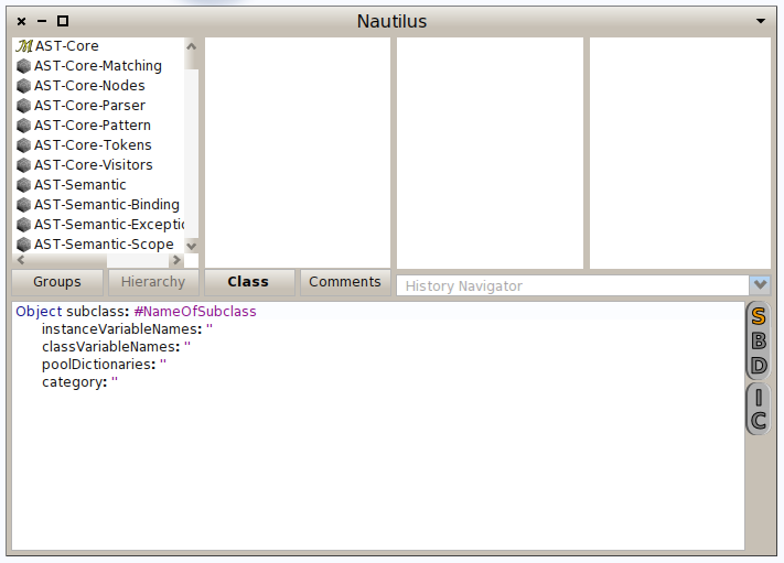
Hi guys this morning Igor shows me all his work around dynlib loading of third party plugins. And yes now we get all the third party plugins downloaded and compiled (yes with only one copy of FT2)â¦.Great stuff! Now we would like to organize a little competition for the official look of Pharo 2.0. So if you feel that you are a little bit designer inside, please send us proposals. We propose this one :) based on Curlz MT (welcome to the world of the pink little ponies) :)

Stef, don't use pdf for image transfer.. it turns a beautiful, nicely antialiased png picture into horrible back-to-80's patches. On 10 June 2012 10:27, Stéphane Ducasse <stephane.ducasse@inria.fr> wrote:
Hi guys
this morning Igor shows me all his work around dynlib loading of third party plugins. And yes now we get all the third party plugins downloaded and compiled (yes with only one copy of FT2)â¦.Great stuff!
Now we would like to organize a little competition for the official look of Pharo 2.0. So if you feel that you are a little bit designer inside, please send us proposals. We propose this one :) based on Curlz MT (welcome to the world of the pink little ponies) :)
-- Best regards, Igor Stasenko.
ah.. sorry it looks like google's viewer using crappy rendering quality.. if i download it and look using preview , the image quality is preserved On 10 June 2012 16:44, Igor Stasenko <siguctua@gmail.com> wrote:
Stef, don't use pdf for image transfer.. it turns a beautiful, nicely antialiased png picture into horrible back-to-80's patches.
On 10 June 2012 10:27, Stéphane Ducasse <stephane.ducasse@inria.fr> wrote:
Hi guys
this morning Igor shows me all his work around dynlib loading of third party plugins. And yes now we get all the third party plugins downloaded and compiled (yes with only one copy of FT2)â¦.Great stuff!
Now we would like to organize a little competition for the official look of Pharo 2.0. So if you feel that you are a little bit designer inside, please send us proposals. We propose this one :) based on Curlz MT (welcome to the world of the pink little ponies) :)
-- Best regards, Igor Stasenko.
-- Best regards, Igor Stasenko.

What about slightly warmer base color that plain gray. baseColor ^ Color r: 199 g: 192 b: 181 range: 255 I'm confident with DejaVu font. I tried several others but in case I found some font that looked prettier, it was hardly usable for the code (e.g. URW Ghotic L). -- Pavel On Sun, Jun 10, 2012 at 10:27 AM, Stéphane Ducasse <stephane.ducasse@inria.fr> wrote:
Hi guys
this morning Igor shows me all his work around dynlib loading of third party plugins. And yes now we get all the third party plugins downloaded and compiled (yes with only one copy of FT2)â¦.Great stuff!
Now we would like to organize a little competition for the official look of Pharo 2.0. So if you feel that you are a little bit designer inside, please send us proposals. We propose this one :) based on Curlz MT (welcome to the world of the pink little ponies) :)

Anonymous Pro is a cool font for editing code (http://www.ms-studio.com/FontSales/anonymouspro.html) Olivier ;-)
On Sun, Jun 10, 2012 at 10:27 AM, Stéphane Ducasse <stephane.ducasse@inria.fr> wrote:
Hi guys
this morning Igor shows me all his work around dynlib loading of third party plugins. And yes now we get all the third party plugins downloaded and compiled (yes with only one copy of FT2)â¦.Great stuff!
Now we would like to organize a little competition for the official look of Pharo 2.0. So if you feel that you are a little bit designer inside, please send us proposals. We propose this one :) based on Curlz MT (welcome to the world of the pink little ponies) :)
<PharoScreenshot.3.png>

As this gif shows, and I prefer, the SBDIC buttons should be hidden away and prefereably as a drop down as it used to be earlier. In normal dev workflow, its rare to slip to using this access and even if its often, I find it to my aesthetic sense a little better to have an usual drop down list.

Stéphane Ducasse wrote:
Hi guys
this morning Igor shows me all his work around dynlib loading of third party plugins. And yes now we get all the third party plugins downloaded and compiled (yes with only one copy of FT2)â¦.Great stuff!
Now we would like to organize a little competition for the official look of Pharo 2.0. So if you feel that you are a little bit designer inside, please send us proposals. We propose this one :) based on Curlz MT (welcome to the world of the pink little ponies) :)
Perhaps you want to consider something like Microsoft's beloved paper clip helper ?
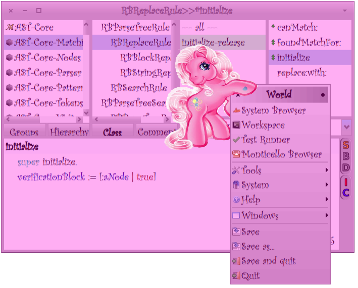

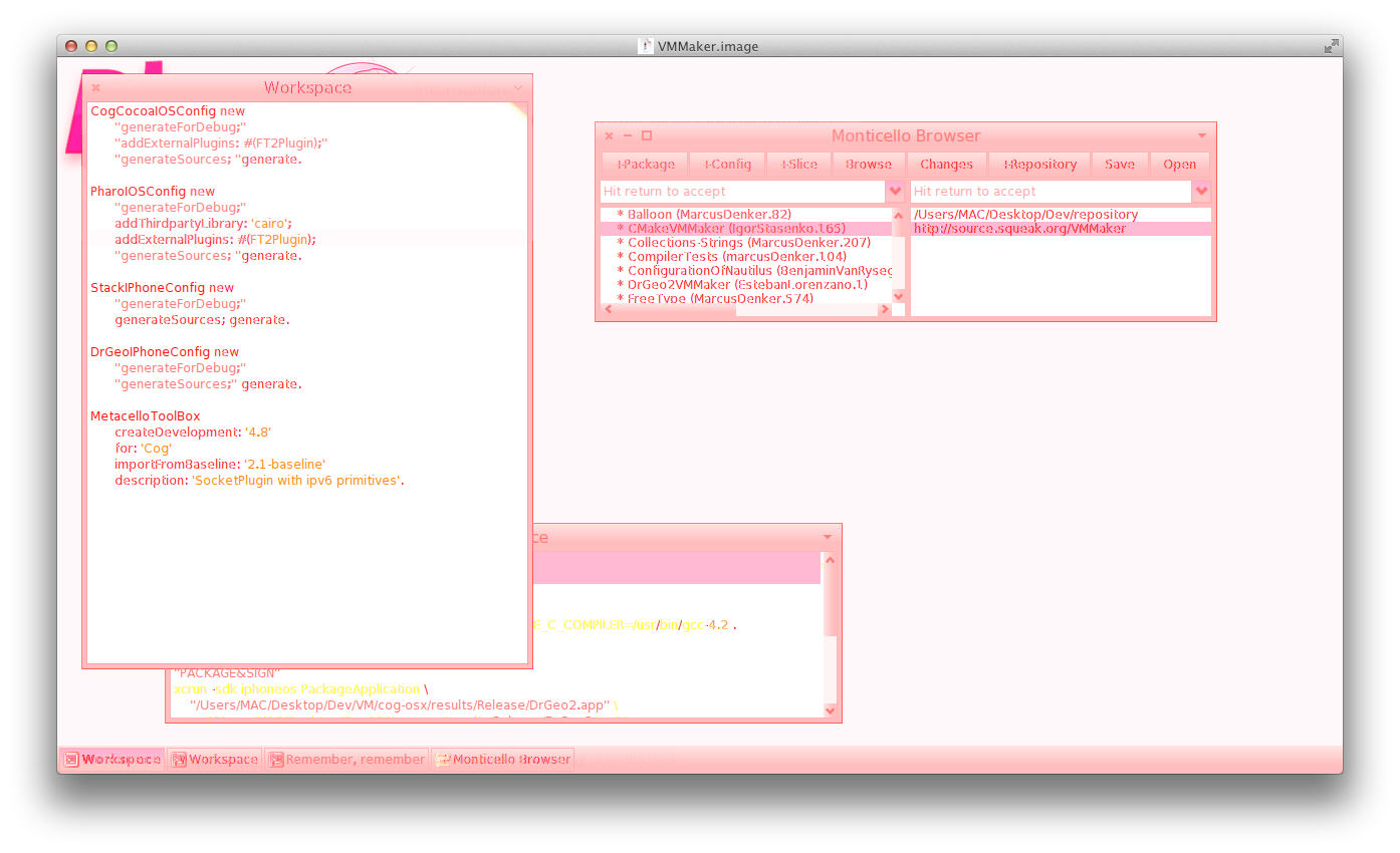
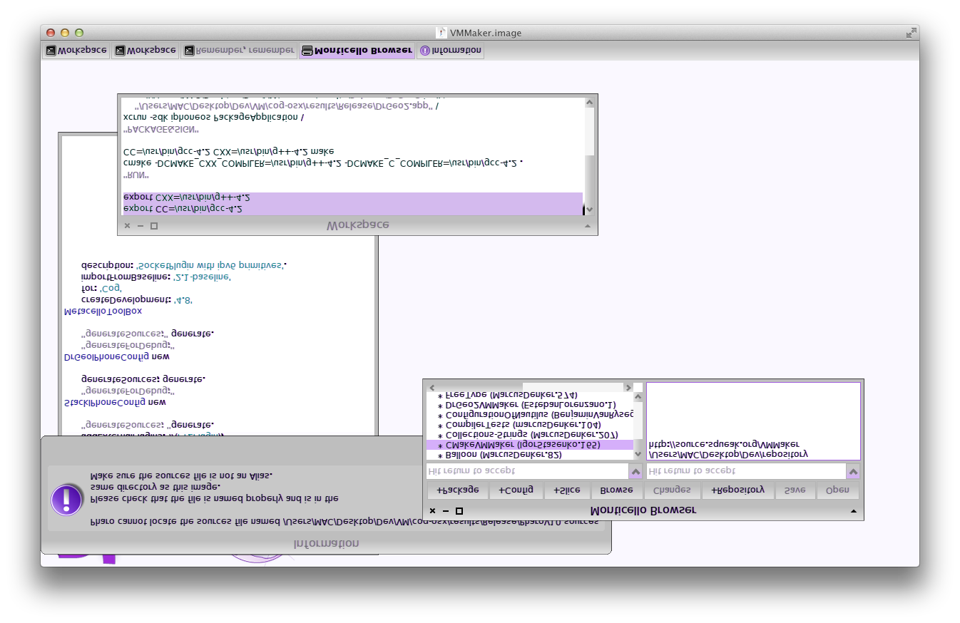
yesterday we where hacking with Igor a non-OpenGL version of vm... and then we said... why not VM-support for look and feel? So, we quickly coded this different options for look and feel (to get these, you just need to fuck up matrix translations and endianess): "lovely pink": "dislexic purple": :) On Jun 12, 2012, at 11:00 AM, Ben Coman wrote:
Stéphane Ducasse wrote:
Hi guys
this morning Igor shows me all his work around dynlib loading of third party plugins. And yes now we get all the third party plugins downloaded and compiled (yes with only one copy of FT2)â¦.Great stuff! Now we would like to organize a little competition for the official look of Pharo 2.0. So if you feel that you are a little bit designer inside, please send us proposals. We propose this one :) based on Curlz MT (welcome to the world of the pink little ponies) :)
Perhaps you want to consider something like Microsoft's beloved paper clip helper ?
<PharoPonyInterface.png>

On Tue, Jun 12, 2012 at 11:14 AM, Esteban Lorenzano <estebanlm@gmail.com>wrote:
yesterday we where hacking with Igor a non-OpenGL version of vm... and then we said... why not VM-support for look and feel? So, we quickly coded this different options for look and feel (to get these, you just need to fuck up matrix translations and endianess):
stop it! It burns -- Damien Cassou http://damiencassou.seasidehosting.st "Lambdas are relegated to relative obscurity until Java makes them popular by not having them." James Iry
On Jun 12, 2012, at 11:37 AM, Damien Cassou wrote:
On Tue, Jun 12, 2012 at 11:14 AM, Esteban Lorenzano <estebanlm@gmail.com> wrote: yesterday we where hacking with Igor a non-OpenGL version of vm... and then we said... why not VM-support for look and feel? So, we quickly coded this different options for look and feel (to get these, you just need to fuck up matrix translations and endianess):
stop it! It burns
LOL you do not like pink ponies but you like pink flyod. strange no? Stef
-- Damien Cassou http://damiencassou.seasidehosting.st
"Lambdas are relegated to relative obscurity until Java makes them popular by not having them." James Iry
Ben you are cool :) I'm amazed I should buy a windows machine, I would have never imagine that they did it! You really beat us on that one :). May be we will not put it on web for the Pharo2.0 announce :) Now if somebody with better design tastes than us would have some time we would really like to get a real professional style for 2.0. Stef
this morning Igor shows me all his work around dynlib loading of third party plugins. And yes now we get all the third party plugins downloaded and compiled (yes with only one copy of FT2)â¦.Great stuff! Now we would like to organize a little competition for the official look of Pharo 2.0. So if you feel that you are a little bit designer inside, please send us proposals. We propose this one :) based on Curlz MT (welcome to the world of the pink little ponies) :)
Perhaps you want to consider something like Microsoft's beloved paper clip helper ?
<PharoPonyInterface.png>

Stéphane Ducasse wrote
Now if somebody with better design tastes than us would have some time we would really like to get a real professional style for 2.0.
Design is not a question of 'fonts' and 'tastes'. Better UI ususally has some serious research background. You probably have to pay - or get interested - (the right) professionals to do it, and itâs worth it too! If there is one sheer 'taste' thing, i wonder if Pharo is capable of having textured UI-elements, like Mac OSX Lion. I attach an image of a button with a subtle texture to illustrate what i mean. Also, have a look at how this guy, Matt Gemmell, has something like Halos (I know, you donât like them ;) adopted for iOS. It looks amazing! http://mattgemmell.com/2012/05/14/mgtilemenu/ http://forum.world.st/file/n4634496/texture.png -- View this message in context: http://forum.world.st/Look-and-font-competition-tp4634175p4634496.html Sent from the Pharo Smalltalk mailing list archive at Nabble.com.
On Jun 12, 2012, at 6:49 PM, Helene Bilbo wrote:
Stéphane Ducasse wrote
Now if somebody with better design tastes than us would have some time we would really like to get a real professional style for 2.0.
Design is not a question of 'fonts' and 'tastes'. Better UI ususally has some serious research background. You probably have to pay - or get interested - (the right) professionals to do it, and itâs worth it too!
Yes but so far we cannot afford it.
If there is one sheer 'taste' thing, i wonder if Pharo is capable of having textured UI-elements, like Mac OSX Lion. I attach an image of a button with a subtle texture to illustrate what i mean.
Also, have a look at how this guy, Matt Gemmell, has something like Halos (I know, you donât like them ;) adopted for iOS. It looks amazing!
This is not that I do not like them. I do not like that when the get in our way. Else they are cool interaction devices.
I'm not sure that you do not get lost with tile Menu
Why could not we have button with a texture. There is a Iconic button
-- View this message in context: http://forum.world.st/Look-and-font-competition-tp4634175p4634496.html Sent from the Pharo Smalltalk mailing list archive at Nabble.com.
On 12 June 2012 18:49, Helene Bilbo <thereluctantprogrammer@fastmail.fm> wrote:
Stéphane Ducasse wrote
Now if somebody with better design tastes than us would have some time we would really like to get a real professional style for 2.0.
Design is not a question of 'fonts' and 'tastes'. Better UI ususally has some serious research background. You probably have to pay - or get interested - (the right) professionals to do it, and itâs worth it too!
If there is one sheer 'taste' thing, i wonder if Pharo is capable of having textured UI-elements, like Mac OSX Lion. I attach an image of a button with a subtle texture to illustrate what i mean.
Piece of cake. It always has it.. -- Best regards, Igor Stasenko.
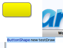
The subtle texture is more like overlaying the existing elements with white noise. While one can make an IconicButton of course, one can not make a Window Title Bar this way. There must be a way to make it directly in code? With more and more high resolution displays it will get interesting some day. Look at the OS X Lion - Pharo comparison screenshot: http://forum.world.st/file/n4634551/SubtleTexture.jpg -- View this message in context: http://forum.world.st/Look-and-font-competition-tp4634175p4634551.html Sent from the Pharo Smalltalk mailing list archive at Nabble.com.
On 12 June 2012 23:28, Helene Bilbo <thereluctantprogrammer@fastmail.fm> wrote:
The subtle texture is more like overlaying the existing elements with white noise.
While one can make an IconicButton of course, one can not make a Window Title Bar this way. There must be a way to make it directly in code? With more and more high resolution displays it will get interesting some day. Look at the OS X Lion - Pharo comparison screenshot:
oh .. it is indeed subtle.. i didn't get what you mean first time. yes, of course, that's possible.. just not sure if it worth to waste CPU cycles on this, as you said, subtle stuff.
-- View this message in context: http://forum.world.st/Look-and-font-competition-tp4634175p4634551.html Sent from the Pharo Smalltalk mailing list archive at Nabble.com.
-- Best regards, Igor Stasenko.

2012/6/12 Igor Stasenko <siguctua@gmail.com>
On 12 June 2012 23:28, Helene Bilbo <thereluctantprogrammer@fastmail.fm> wrote:
The subtle texture is more like overlaying the existing elements with white noise.
While one can make an IconicButton of course, one can not make a Window Title Bar this way. There must be a way to make it directly in code? With more and more high resolution displays it will get interesting some day. Look at the OS X Lion - Pharo comparison screenshot:
oh .. it is indeed subtle.. i didn't get what you mean first time. yes, of course, that's possible.. just not sure if it worth to waste CPU cycles on this, as you said, subtle stuff.
EFLs use bitmaps to render everything, it runs fast, you don't need antialiasing, and you can customize the appearance however you like. Couldn't it be an inspiration?
On 13 June 2012 10:52, camille teruel <camille.teruel@gmail.com> wrote:
2012/6/12 Igor Stasenko <siguctua@gmail.com>
On 12 June 2012 23:28, Helene Bilbo <thereluctantprogrammer@fastmail.fm> wrote:
The subtle texture is more like overlaying the existing elements with white noise.
While one can make an IconicButton of course, one can not make a Window Title Bar this way. There must be a way to make it directly in code? With more and more high resolution displays it will get interesting some day. Look at the OS X Lion - Pharo comparison screenshot:
oh .. it is indeed subtle.. i didn't get what you mean first time. yes, of course, that's possible.. just not sure if it worth to waste CPU cycles on this, as you said, subtle stuff.
EFLs use bitmaps to render everything, it runs fast, you don't need antialiasing, and you can customize the appearance however you like. Couldn't it be an inspiration?
EFL? what is it.. got a link? -- Best regards, Igor Stasenko.
EFL stands for Enlightenment Foundation Librairies It is a set of C librairies that are used for the E17 window manager (a famous vaporware). E17 is still in alpha (since a very long time but it is usable, give it a try if you have a linux distro somewhere), because they're currently working on EFLs stabilisation. These libraries have a pretty good reputation. That's the main website: http://www.enlightenment.org/ The canva library is called Evas. 2012/6/13 Igor Stasenko <siguctua@gmail.com>
On 13 June 2012 10:52, camille teruel <camille.teruel@gmail.com> wrote:
2012/6/12 Igor Stasenko <siguctua@gmail.com>
On 12 June 2012 23:28, Helene Bilbo <thereluctantprogrammer@fastmail.fm
wrote:
The subtle texture is more like overlaying the existing elements with white noise.
While one can make an IconicButton of course, one can not make a Window Title Bar this way. There must be a way to make it directly in code? With more and more high resolution displays it will get interesting some day. Look at the OS X Lion - Pharo comparison screenshot:
oh .. it is indeed subtle.. i didn't get what you mean first time. yes, of course, that's possible.. just not sure if it worth to waste CPU cycles on this, as you said, subtle stuff.
EFLs use bitmaps to render everything, it runs fast, you don't need antialiasing, and you can customize the appearance however you like. Couldn't it be an inspiration?
EFL? what is it.. got a link?
-- Best regards, Igor Stasenko.
On 13 June 2012 14:51, camille teruel <camille.teruel@gmail.com> wrote:
EFL stands for Enlightenment Foundation Librairies It is a set of C librairies that are used for the E17 window manager (a famous vaporware). E17 is still in alpha (since a very long time but it is usable, give it a try if you have a linux distro somewhere), because they're currently working on EFLs stabilisation. These libraries have a pretty good reputation. That's the main website: http://www.enlightenment.org/ The canva library is called Evas.
ahh.. Enlightenment.. it was vaporware since the first time i saw it, back in 98 (i think) :)
2012/6/13 Igor Stasenko <siguctua@gmail.com>
On 13 June 2012 10:52, camille teruel <camille.teruel@gmail.com> wrote:
2012/6/12 Igor Stasenko <siguctua@gmail.com>
On 12 June 2012 23:28, Helene Bilbo <thereluctantprogrammer@fastmail.fm> wrote:
The subtle texture is more like overlaying the existing elements with white noise.
While one can make an IconicButton of course, one can not make a Window Title Bar this way. There must be a way to make it directly in code? With more and more high resolution displays it will get interesting some day. Look at the OS X Lion - Pharo comparison screenshot:
oh .. it is indeed subtle.. i didn't get what you mean first time. yes, of course, that's possible.. just not sure if it worth to waste CPU cycles on this, as you said, subtle stuff.
EFLs use bitmaps to render everything, it runs fast, you don't need antialiasing, and you can customize the appearance however you like. Couldn't it be an inspiration?
EFL? what is it.. got a link?
-- Best regards, Igor Stasenko.
-- Best regards, Igor Stasenko.

Polymorph does support such things... The buttons in Watery2 theme for example. For sizeable things (as opposed to scaleable) a composite fill style can be made with elements for corners, edges and middle. Regards, Gary ----- Original Message ----- From: "Igor Stasenko" <siguctua@gmail.com> To: <Pharo-project@lists.gforge.inria.fr> Sent: Tuesday, June 12, 2012 10:44 PM Subject: Re: [Pharo-project] Look and font competition
On 12 June 2012 23:28, Helene Bilbo <thereluctantprogrammer@fastmail.fm> wrote:
The subtle texture is more like overlaying the existing elements with white noise.
While one can make an IconicButton of course, one can not make a Window Title Bar this way. There must be a way to make it directly in code? With more and more high resolution displays it will get interesting some day. Look at the OS X Lion - Pharo comparison screenshot:
oh .. it is indeed subtle.. i didn't get what you mean first time. yes, of course, that's possible.. just not sure if it worth to waste CPU cycles on this, as you said, subtle stuff.
-- View this message in context: http://forum.world.st/Look-and-font-competition-tp4634175p4634551.html Sent from the Pharo Smalltalk mailing list archive at Nabble.com.
-- Best regards, Igor Stasenko.
Stéphane Ducasse wrote:
Hi guys
this morning Igor shows me all his work around dynlib loading of third party plugins. And yes now we get all the third party plugins downloaded and compiled (yes with only one copy of FT2)â¦.Great stuff!
Now we would like to organize a little competition for the official look of Pharo 2.0. So if you feel that you are a little bit designer inside, please send us proposals. We propose this one :) based on Curlz MT (welcome to the world of the pink little ponies) :)
I've got an interest in graphic design. I've just done a bit of reading around to familiarize myself with font choice. First of all, there is the question of monospaced versus proportional fonts. It is widely believed that monospaced fonts are better for programming but then Smalltalk is often different and better. I notice that Pharo 1.4 uses proportional fonts and I've never had a problem with that. There is good discussion at [1]. Then there are considerations of technology differences to consider between platforms. * A difference in rendering between Microsoft and Apple [2] * Whether ClearType is available cross platform? Some advantages [3] * Is TrueType available on all platforms? * Will anti-aliasing be always-on? [1] http://programmers.stackexchange.com/questions/5473/does-anyone-prefer-propo... [2] http://www.joelonsoftware.com/items/2007/06/12.html [3] http://blogs.msdn.com/b/fontblog/archive/2005/12/13/503236.aspx Some points against proportional fonts are: 1. Not designed for programming. Distinguishing small-o, cap-o & zero and one, small-i, cap-i, small-l, cap-L is the critical feature. Punctuation is often not very distinctive. A little while ago there was a hack to make the period character larger. Also in Pharo 1.4 cap-i and small-l are hard to distinguish. 2. Alignment of indents. Mainly this is where different developers can use 8, 4 or 2 spaces for fixed tabstops which affects the alignment of text. However searching World > System > Settings for "tab" doesn't show this is configurable, so Pharo seems to sidestep this issue. So I like... * Droid Sans (http://www.google.com/webfonts/specimen/Droid+Sans) Apache License. Steve Matteson. * Ubuntu (http://www.google.com/webfonts/specimen/Ubuntu) (similar to Open Font License) Some points for monospaced fonts are: 3. Some characters are just wider than others. Cramming an 'm' into the space of an 'i' makes it challenging to design a good readable monospace font. 4. Most programmer fonts lack italic and bold - which I think becomes important for Nautilus. * From http://www.codeproject.com/Articles/30040/Font-Survey-42-of-the-Best-Monospa... I like... * Liberation Mono. In particular it seems the clearest of the lot when ClearType is disabled. It deals very well with point (1) above. However while the download page says it is Open Font License the download itself contains only a modified GPL2 license that allows embedding without modification of the font. Steve Matteson. * Droid Sans Mono. Same author. Distinguishable point (1). Strong period. Strong number 1 which matches how it appears in engineering drawings. Apache license. Also consider that people like what they are familiar with, and Android will become fairly widespread. * Dina. Clean without ClearType. Identical even with ClearType. MIT type license. AnonymousPro does also looks good. Disclaimer: I am yet to use these fonts in anger. Just reporting impressions so far. cheers -ben As an aside, even with monospaced fonts there remains an issue with fixed tabstops where new text inserted preceeding a tab stop bumps the tab out of alignment with other vertically aligned text. An very interesting fix for this is "elastic tabstops" [2] [3] [2] http://nickgravgaard.com/elastictabstops/ [3] http://tibleiz.net/code-browser/elastic-tabstops.html
As an aside, even with monospaced fonts there remains an issue with fixed tabstops where new text inserted preceeding a tab stop bumps the tab out of alignment with other vertically aligned text. Â An very interesting fix for this is "elastic tabstops" [2] [3] [2] http://nickgravgaard.com/elastictabstops/ [3] http://tibleiz.net/code-browser/elastic-tabstops.html
we should do that :) -- Best regards, Igor Stasenko.
On Jun 12, 2012, at 6:43 PM, Igor Stasenko wrote:
As an aside, even with monospaced fonts there remains an issue with fixed tabstops where new text inserted preceeding a tab stop bumps the tab out of alignment with other vertically aligned text. An very interesting fix for this is "elastic tabstops" [2] [3] [2] http://nickgravgaard.com/elastictabstops/ [3] http://tibleiz.net/code-browser/elastic-tabstops.html
we should do that :)
but we need the code in pharo :)
-- Best regards, Igor Stasenko.
I've got an interest in graphic design. I've just done a bit of reading around to familiarize myself with font choice.
Thanks for sharing that with us.
First of all, there is the question of monospaced versus proportional fonts. It is widely believed that monospaced fonts are better for programming but then Smalltalk is often different and better. I notice that Pharo 1.4 uses proportional fonts and I've never had a problem with that.
Indeed. For us one of the key point is ifTrue: [:each | and of course . and bla; yourself. readibility.
There is good discussion at [1]. Then there are considerations of technology differences to consider between platforms. * A difference in rendering between Microsoft and Apple [2] * Whether ClearType is available cross platform? Some advantages [3] * Is TrueType available on all platforms? * Will anti-aliasing be always-on? [1] http://programmers.stackexchange.com/questions/5473/does-anyone-prefer-propo... [2] http://www.joelonsoftware.com/items/2007/06/12.html [3] http://blogs.msdn.com/b/fontblog/archive/2005/12/13/503236.aspx
Some points against proportional fonts are:
1. Not designed for programming. Distinguishing small-o, cap-o & zero and one, small-i, cap-i, small-l, cap-L is the critical feature. Punctuation is often not very distinctive. A little while ago there was a hack to make the period character larger. Also in Pharo 1.4 cap-i and small-l are hard to distinguish. 2. Alignment of indents. Mainly this is where different developers can use 8, 4 or 2 spaces for fixed tabstops which affects the alignment of text. However searching World > System > Settings for "tab" doesn't show this is configurable, so Pharo seems to sidestep this issue.
So I like... * Droid Sans (http://www.google.com/webfonts/specimen/Droid+Sans) Apache License. Steve Matteson.
* Ubuntu (http://www.google.com/webfonts/specimen/Ubuntu) (similar to Open Font License)
Some points for monospaced fonts are:
3. Some characters are just wider than others. Cramming an 'm' into the space of an 'i' makes it challenging to design a good readable monospace font.
4. Most programmer fonts lack italic and bold - which I think becomes important for Nautilus.
* From http://www.codeproject.com/Articles/30040/Font-Survey-42-of-the-Best-Monospa... I like...
* Liberation Mono. In particular it seems the clearest of the lot when ClearType is disabled. It deals very well with point (1) above. However while the download page says it is Open Font License the download itself contains only a modified GPL2 license that allows embedding without modification of the font. Steve Matteson.
* Droid Sans Mono. Same author. Distinguishable point (1). Strong period. Strong number 1 which matches how it appears in engineering drawings. Apache license. Also consider that people like what they are familiar with, and Android will become fairly widespread.
* Dina. Clean without ClearType. Identical even with ClearType. MIT type license.
AnonymousPro does also looks good.
Disclaimer: I am yet to use these fonts in anger. Just reporting impressions so far.
cheers -ben
As an aside, even with monospaced fonts there remains an issue with fixed tabstops where new text inserted preceeding a tab stop bumps the tab out of alignment with other vertically aligned text. An very interesting fix for this is "elastic tabstops" [2] [3] [2] http://nickgravgaard.com/elastictabstops/ [3] http://tibleiz.net/code-browser/elastic-tabstops.html
I attached proper document icons for .image, .changes and .sources files to this issue: http://code.google.com/p/pharo/issues/detail?id=5626 -- View this message in context: http://forum.world.st/Look-and-font-competition-tp4634175p4634497.html Sent from the Pharo Smalltalk mailing list archive at Nabble.com.
thanks! Stef On Jun 12, 2012, at 6:52 PM, Helene Bilbo wrote:
I attached proper document icons for .image, .changes and .sources files to this issue: http://code.google.com/p/pharo/issues/detail?id=5626
-- View this message in context: http://forum.world.st/Look-and-font-competition-tp4634175p4634497.html Sent from the Pharo Smalltalk mailing list archive at Nabble.com.

On 10.06.2012 10:27, Stéphane Ducasse wrote:
Hi guys
this morning Igor shows me all his work around dynlib loading of third party plugins. And yes now we get all the third party plugins downloaded and compiled (yes with only one copy of FT2)â¦.Great stuff!
Now we would like to organize a little competition for the official look of Pharo 2.0. So if you feel that you are a little bit designer inside, please send us proposals. We propose this one :) based on Curlz MT (welcome to the world of the pink little ponies) :)
Both license-wise, unicode coverage-wise, as well as aesthetically speaking, I still think DejaVu is a very good default font choice. Cheers, Henry
participants (12)
-
 Ben Coman
 -
 camille teruel
 -
 Damien Cassou
 -
 Esteban Lorenzano
 -
 Gary Chambers
 -
 Helene Bilbo
 -
 Henrik Sperre Johansen
 -
 Igor Stasenko
 -
 Olivier Auverlot
 -
 Pavel Krivanek
 -
 S Krish
 -
 Stéphane Ducasse