[Pharo-project] [update 1.2] #12297

Tudor Girba
I tried to start from zero and add a new variable (e.g., color) only when I >could not distinguish something
If that is true then why do you use the additional blue for activated buttons instead of using a gray one: lightSelectionColor ^ Color gray in your original theme - you can distinguish buttons already using the gray-style gradient (see attached example). However ... all of this is very specific to a particular persons view of the world. As you said you've choosen blue since it is the color of Moose... Bye T. -- GMX DSL Doppel-Flat ab 19,99 Euro/mtl.! Jetzt mit gratis Handy-Flat! http://portal.gmx.net/de/go/dsl
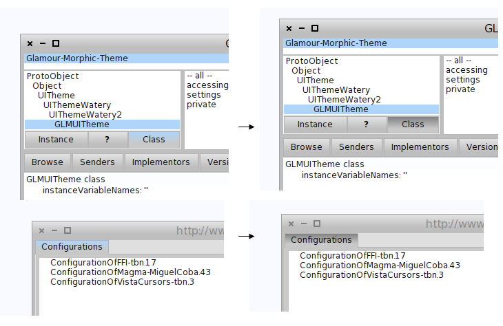

Because we could not distinguish it enough when there are many controls on the board. Exactly because color is used so sparingly makes a light blue efficient. Any design will depend on someone's perception, but this does not mean that there cannot be reasons behind it :). Cheers, Doru On 13 Jan 2011, at 13:31, Torsten Bergmann wrote:
Tudor Girba
I tried to start from zero and add a new variable (e.g., color) only when I >could not distinguish something
If that is true then why do you use the additional blue for activated buttons instead of using a gray one:
lightSelectionColor ^ Color gray
in your original theme - you can distinguish buttons already using the gray-style gradient (see attached example).
However ... all of this is very specific to a particular persons view of the world. As you said you've choosen blue since it is the color of Moose...
Bye T.
-- GMX DSL Doppel-Flat ab 19,99 Euro/mtl.! Jetzt mit gratis Handy-Flat! http://portal.gmx.net/de/go/dsl <screen.png>
-- www.tudorgirba.com "Speaking louder won't make the point worthier."
participants (2)
-
 Torsten Bergmann
 -
 Tudor Girba