[Pharo-project] Improving the GUI

Hi, I'd like to get your opinion about how we could improve the GUI. I believe that even a few small changes will make a significant difference, especially for new people that come to Pharo. Just the cleaned up world menu is such a relief... Here a three suggestions: Better fonts ---------------- I think the current code font is not a good one and it is too small (for today's screen resolutions). I like for example the font used in TextMate, which is Monaco 12, a monotype font. The page http://www.lowing.org/fonts/ gives some samples for good code fonts. I've tried out the other fonts in the Pharo image like the BitstreamVeraSansMono but they are all very blurry. Just not good enough. I'm not a font expert, so I don't know what the options for a better font are. Better menus ------------------------------- Current problems: - bad organization menus only work when you have learned where something is located - duplicated entries e.g., Appearance is both in the top level world menu and in the submenu Help - useless entries e.g., set font, set style etc. in the context menu are useless since code is never styled - defective entries: e.g., "Make project link" in the context menu does not work Larger windows ------------------------------- The default size of windows is usually too small. Often, after opening a window I have to resize it. For example the hierarchy browser shows only the 5 first classes. Any other ideas what could be improved in the short term? I'm looking for stuff that we can do now without having to rewrite the whole system... Cheers, Adrian ___________________ http://www.adrian-lienhard.ch/

+1 Very good point. I agree on all of them. Is it possible to choose any ttf font and make a NiceFont out of it? I don't know the real name but the package on universe is called this way. Or do you think we should make the trutetype plugin mandatory? Norbert On Sun, 2008-07-20 at 11:22 +0200, Adrian Lienhard wrote:
Hi,
I'd like to get your opinion about how we could improve the GUI. I believe that even a few small changes will make a significant difference, especially for new people that come to Pharo. Just the cleaned up world menu is such a relief...
Here a three suggestions:
Better fonts ---------------- I think the current code font is not a good one and it is too small (for today's screen resolutions). I like for example the font used in TextMate, which is Monaco 12, a monotype font. The page http://www.lowing.org/fonts/ gives some samples for good code fonts. I've tried out the other fonts in the Pharo image like the BitstreamVeraSansMono but they are all very blurry. Just not good enough. I'm not a font expert, so I don't know what the options for a better font are.
Better menus ------------------------------- Current problems: - bad organization menus only work when you have learned where something is located - duplicated entries e.g., Appearance is both in the top level world menu and in the submenu Help - useless entries e.g., set font, set style etc. in the context menu are useless since code is never styled - defective entries: e.g., "Make project link" in the context menu does not work
Larger windows ------------------------------- The default size of windows is usually too small. Often, after opening a window I have to resize it. For example the hierarchy browser shows only the 5 first classes.
Any other ideas what could be improved in the short term? I'm looking for stuff that we can do now without having to rewrite the whole system...
Cheers, Adrian
___________________ http://www.adrian-lienhard.ch/
_______________________________________________ Pharo-project mailing list Pharo-project@lists.gforge.inria.fr http://lists.gforge.inria.fr/cgi-bin/mailman/listinfo/pharo-project

Be careful on licensing when creating bitmaps (StrikeFonts) or fonts and then redistributing. One nice thing about the Vera fonts is that they are open source. Many countries have weird rules about fonts. On Sun, Jul 20, 2008 at 4:51 AM, Norbert Hartl <norbert@hartl.name> wrote:
+1 Very good point. I agree on all of them.
Is it possible to choose any ttf font and make a NiceFont out of it? I don't know the real name but the package on universe is called this way.
Or do you think we should make the trutetype plugin mandatory?
Norbert
On Sun, 2008-07-20 at 11:22 +0200, Adrian Lienhard wrote:
Hi,
I'd like to get your opinion about how we could improve the GUI. I believe that even a few small changes will make a significant difference, especially for new people that come to Pharo. Just the cleaned up world menu is such a relief...
Here a three suggestions:
Better fonts ---------------- I think the current code font is not a good one and it is too small (for today's screen resolutions). I like for example the font used in TextMate, which is Monaco 12, a monotype font. The page http://www.lowing.org/fonts/ gives some samples for good code fonts. I've tried out the other fonts in the Pharo image like the BitstreamVeraSansMono but they are all very blurry. Just not good enough. I'm not a font expert, so I don't know what the options for a better font are.
Better menus ------------------------------- Current problems: - bad organization menus only work when you have learned where something is located - duplicated entries e.g., Appearance is both in the top level world menu and in the submenu Help - useless entries e.g., set font, set style etc. in the context menu are useless since code is never styled - defective entries: e.g., "Make project link" in the context menu does not work
Larger windows ------------------------------- The default size of windows is usually too small. Often, after opening a window I have to resize it. For example the hierarchy browser shows only the 5 first classes.
Any other ideas what could be improved in the short term? I'm looking for stuff that we can do now without having to rewrite the whole system...
Cheers, Adrian
___________________ http://www.adrian-lienhard.ch/
_______________________________________________ Pharo-project mailing list Pharo-project@lists.gforge.inria.fr http://lists.gforge.inria.fr/cgi-bin/mailman/listinfo/pharo-project
_______________________________________________ Pharo-project mailing list Pharo-project@lists.gforge.inria.fr http://lists.gforge.inria.fr/cgi-bin/mailman/listinfo/pharo-project

Yes I like these ideas. This is what I started to do with the menu world cleaning. This is important that we continue. Bigger windows. Yes! Stef On Jul 20, 2008, at 11:22 AM, Adrian Lienhard wrote:
Hi,
I'd like to get your opinion about how we could improve the GUI. I believe that even a few small changes will make a significant difference, especially for new people that come to Pharo. Just the cleaned up world menu is such a relief...
Here a three suggestions:
Better fonts ---------------- I think the current code font is not a good one and it is too small (for today's screen resolutions). I like for example the font used in TextMate, which is Monaco 12, a monotype font. The page http://www.lowing.org/fonts/ gives some samples for good code fonts. I've tried out the other fonts in the Pharo image like the BitstreamVeraSansMono but they are all very blurry. Just not good enough. I'm not a font expert, so I don't know what the options for a better font are.
Better menus ------------------------------- Current problems: - bad organization menus only work when you have learned where something is located - duplicated entries e.g., Appearance is both in the top level world menu and in the submenu Help - useless entries e.g., set font, set style etc. in the context menu are useless since code is never styled - defective entries: e.g., "Make project link" in the context menu does not work
Larger windows ------------------------------- The default size of windows is usually too small. Often, after opening a window I have to resize it. For example the hierarchy browser shows only the 5 first classes.
Any other ideas what could be improved in the short term? I'm looking for stuff that we can do now without having to rewrite the whole system...
Cheers, Adrian
___________________ http://www.adrian-lienhard.ch/
_______________________________________________ Pharo-project mailing list Pharo-project@lists.gforge.inria.fr http://lists.gforge.inria.fr/cgi-bin/mailman/listinfo/pharo-project
Someone told me (damien probably) that nicefont was touching a lot of place in the system. Ideally I would like to avoid to depend on a pluggin for things as essential as font rendering (at least in a basic image). Did somebody check a bit the code of niceFont? Stef On Jul 20, 2008, at 11:51 AM, Norbert Hartl wrote:
+1 Very good point. I agree on all of them.
Is it possible to choose any ttf font and make a NiceFont out of it? I don't know the real name but the package on universe is called this way.
Or do you think we should make the trutetype plugin mandatory?
Norbert
On Sun, 2008-07-20 at 11:22 +0200, Adrian Lienhard wrote:
Hi,
I'd like to get your opinion about how we could improve the GUI. I believe that even a few small changes will make a significant difference, especially for new people that come to Pharo. Just the cleaned up world menu is such a relief...
Here a three suggestions:
Better fonts ---------------- I think the current code font is not a good one and it is too small (for today's screen resolutions). I like for example the font used in TextMate, which is Monaco 12, a monotype font. The page http://www.lowing.org/fonts/ gives some samples for good code fonts. I've tried out the other fonts in the Pharo image like the BitstreamVeraSansMono but they are all very blurry. Just not good enough. I'm not a font expert, so I don't know what the options for a better font are.
Better menus ------------------------------- Current problems: - bad organization menus only work when you have learned where something is located - duplicated entries e.g., Appearance is both in the top level world menu and in the submenu Help - useless entries e.g., set font, set style etc. in the context menu are useless since code is never styled - defective entries: e.g., "Make project link" in the context menu does not work
Larger windows ------------------------------- The default size of windows is usually too small. Often, after opening a window I have to resize it. For example the hierarchy browser shows only the 5 first classes.
Any other ideas what could be improved in the short term? I'm looking for stuff that we can do now without having to rewrite the whole system...
Cheers, Adrian
___________________ http://www.adrian-lienhard.ch/
_______________________________________________ Pharo-project mailing list Pharo-project@lists.gforge.inria.fr http://lists.gforge.inria.fr/cgi-bin/mailman/listinfo/pharo-project
_______________________________________________ Pharo-project mailing list Pharo-project@lists.gforge.inria.fr http://lists.gforge.inria.fr/cgi-bin/mailman/listinfo/pharo-project

Better menus ------------------------------- Current problems: - bad organization menus only work when you have learned where something is located - duplicated entries e.g., Appearance is both in the top level world menu and in the submenu Help - useless entries e.g., set font, set style etc. in the context menu are useless since code is never styled - defective entries: e.g., "Make project link" in the context menu does not work
Would it be possible to have accordion effects?
Larger windows ------------------------------- The default size of windows is usually too small. Often, after opening a window I have to resize it. For example the hierarchy browser shows only the 5 first classes.
I always open them fullscreen. I think that would be a better default... I struggled but couldn't achieve that :( Cédrick

On Sun, Jul 20, 2008 at 5:41 PM, Stéphane Ducasse <stephane.ducasse@inria.fr> wrote:
Someone told me (damien probably) that nicefont was touching a lot of place in the system. Ideally I would like to avoid to depend on a pluggin for things as essential as font rendering (at least in a basic image).
That's why I chose NiceFonts (http://www.jvuletich.org/NiceFonts.html), it is easy to install and use. However, it is a set of patches which touch a lot of places.
Did somebody check a bit the code of niceFont?
I think it is needed before inclusion. -- Damien Cassou Peter von der Ahé: «I'm beginning to see why Gilad wished us good luck». (http://blogs.sun.com/ahe/entry/override_snafu)

Dear all, I remember well my first impression with Squeak a year or so ago and all troubles I had then and have them actually still. Yes, it is a look&feel problem. And more feel than look. Look are fonts etc. while feel are menus, basic window handling, mouse buttons, controls behaving as closer to target OS as user is accustomized of, user interface consistency and behavior as expected, etc. I therefore propose to start with "feel" part of user experience first and my priority would be: - swapMouseButtons preset depending on target OS (this one is probably the most annoying thing for newcomers!) - window controls (minimize/maximize, close) and their order more in line with mainstream rules - better menus as Adrian proposed - more overall consistency of menus (for instance: inspect/explore always on the same place in menu: or on the top or on the bottom) - merging inspector into explorer and having only Inspect - ctrl-mouse left behavior = select! (also very annoying one!) - do we really need those window controls, coming up with ctrl-left mouse? (rotate etc? halos?) Those feel troubles I have are on Linux and mostly the same on Windows but are probably different on Mac. Best regards Janko Adrian Lienhard wrote:
Hi,
I'd like to get your opinion about how we could improve the GUI. I believe that even a few small changes will make a significant difference, especially for new people that come to Pharo. Just the cleaned up world menu is such a relief...
Here a three suggestions:
Better fonts ---------------- I think the current code font is not a good one and it is too small (for today's screen resolutions). I like for example the font used in TextMate, which is Monaco 12, a monotype font. The page http://www.lowing.org/fonts/ gives some samples for good code fonts. I've tried out the other fonts in the Pharo image like the BitstreamVeraSansMono but they are all very blurry. Just not good enough. I'm not a font expert, so I don't know what the options for a better font are.
Better menus ------------------------------- Current problems: - bad organization menus only work when you have learned where something is located - duplicated entries e.g., Appearance is both in the top level world menu and in the submenu Help - useless entries e.g., set font, set style etc. in the context menu are useless since code is never styled - defective entries: e.g., "Make project link" in the context menu does not work
Larger windows ------------------------------- The default size of windows is usually too small. Often, after opening a window I have to resize it. For example the hierarchy browser shows only the 5 first classes.
Any other ideas what could be improved in the short term? I'm looking for stuff that we can do now without having to rewrite the whole system...
Cheers, Adrian
___________________ http://www.adrian-lienhard.ch/
_______________________________________________ Pharo-project mailing list Pharo-project@lists.gforge.inria.fr http://lists.gforge.inria.fr/cgi-bin/mailman/listinfo/pharo-project
-- Janko Mivšek Svetovalec za informatiko Eranova d.o.o. Ljubljana, Slovenija www.eranova.si tel: 01 514 22 55 faks: 01 514 22 56 gsm: 031 674 565
On Jul 21, 2008, at 11:22 AM, Janko Mivšek wrote:
Dear all,
I remember well my first impression with Squeak a year or so ago and all troubles I had then and have them actually still.
Yes, it is a look&feel problem. And more feel than look. Look are fonts etc. while feel are menus, basic window handling, mouse buttons, controls behaving as closer to target OS as user is accustomized of, user interface consistency and behavior as expected, etc.
I therefore propose to start with "feel" part of user experience first and my priority would be:
- swapMouseButtons preset depending on target OS (this one is probably the most annoying thing for newcomers!) - window controls (minimize/maximize, close) and their order more in line with mainstream rules - better menus as Adrian proposed - more overall consistency of menus (for instance: inspect/explore always on the same place in menu: or on the top or on the bottom) - merging inspector into explorer and having only Inspect - ctrl-mouse left behavior = select! (also very annoying one!) - do we really need those window controls, coming up with ctrl-left mouse? (rotate etc? halos?)
Yes I always wanted to disable them.
Those feel troubles I have are on Linux and mostly the same on Windows but are probably different on Mac.
Best regards Janko
Adrian Lienhard wrote:
Hi, I'd like to get your opinion about how we could improve the GUI. I believe that even a few small changes will make a significant difference, especially for new people that come to Pharo. Just the cleaned up world menu is such a relief... Here a three suggestions: Better fonts ---------------- I think the current code font is not a good one and it is too small (for today's screen resolutions). I like for example the font used in TextMate, which is Monaco 12, a monotype font. The page http://www.lowing.org/fonts/ gives some samples for good code fonts. I've tried out the other fonts in the Pharo image like the BitstreamVeraSansMono but they are all very blurry. Just not good enough. I'm not a font expert, so I don't know what the options for a better font are. Better menus ------------------------------- Current problems: - bad organization menus only work when you have learned where something is located - duplicated entries e.g., Appearance is both in the top level world menu and in the submenu Help - useless entries e.g., set font, set style etc. in the context menu are useless since code is never styled - defective entries: e.g., "Make project link" in the context menu does not work Larger windows ------------------------------- The default size of windows is usually too small. Often, after opening a window I have to resize it. For example the hierarchy browser shows only the 5 first classes. Any other ideas what could be improved in the short term? I'm looking for stuff that we can do now without having to rewrite the whole system... Cheers, Adrian ___________________ http://www.adrian-lienhard.ch/ _______________________________________________ Pharo-project mailing list Pharo-project@lists.gforge.inria.fr http://lists.gforge.inria.fr/cgi-bin/mailman/listinfo/pharo-project
-- Janko Mivšek Svetovalec za informatiko Eranova d.o.o. Ljubljana, Slovenija www.eranova.si tel: 01 514 22 55 faks: 01 514 22 56 gsm: 031 674 565
_______________________________________________ Pharo-project mailing list Pharo-project@lists.gforge.inria.fr http://lists.gforge.inria.fr/cgi-bin/mailman/listinfo/pharo-project
- do we really need those window controls, coming up with ctrl-left mouse? (rotate etc? halos?)
Yes I always wanted to disable them.
I find there are of no use for browsers... What I'd like instead of bringing halo is: -moving the browser (middle button), -change the size of the browser (bottom right expand) (CTRL-middle button) Cédrick

On Wed, Jul 23, 2008 at 12:18 PM, cdrick <cdrick65@gmail.com> wrote:
- do we really need those window controls, coming up with ctrl-left mouse? (rotate etc? halos?)
Yes I always wanted to disable them.
Still, it is nice to be able to go and inspect any visible object⦠probably a less intrusive UI than halos for this would be a looking glass / pipette tool that would work like the one in the color palette on Mac OS X: click the tool, click anywhere on the screen to choose that pixel's color. Instead, the tool would switch modes for the clicked window, from "interacting with the application through its UI controls" to "visually editing composed morphs".
I find there are of no use for browsers...
What I'd like instead of bringing halo is: -moving the browser (middle button), -change the size of the browser (bottom right expand) (CTRL-middle button)
this is a little linuxish :) -- Damien Pollet type less, do more [ | ] http://people.untyped.org/damien.pollet
Hi, One week has passed and 17 messages have been sent in this thread so far. I think we should stop talking and start producing results now! I propose to proceed as follows: - gather all ideas from the thread and organize them on a wiki page - pick a few ideas that have an impact and that can be realized in reasonable time - produce a sample image and screenshots to show it to the Pharo community to get feedback - push into the update stream Anybody interested to join a task force? Cheers, Adrian BTW, I've been investigating NiceFonts (http://www.jvuletich.org/NiceFonts.html ) and I'm in contact with Juan who helped me with it ___________________ http://www.adrian-lienhard.ch/ On Jul 25, 2008, at 15:17 , Damien Pollet wrote:
On Wed, Jul 23, 2008 at 12:18 PM, cdrick <cdrick65@gmail.com> wrote:
- do we really need those window controls, coming up with ctrl-left mouse? (rotate etc? halos?)
Yes I always wanted to disable them.
Still, it is nice to be able to go and inspect any visible object⦠probably a less intrusive UI than halos for this would be a looking glass / pipette tool that would work like the one in the color palette on Mac OS X: click the tool, click anywhere on the screen to choose that pixel's color. Instead, the tool would switch modes for the clicked window, from "interacting with the application through its UI controls" to "visually editing composed morphs".
I find there are of no use for browsers...
What I'd like instead of bringing halo is: -moving the browser (middle button), -change the size of the browser (bottom right expand) (CTRL- middle button)
this is a little linuxish :)
-- Damien Pollet type less, do more [ | ] http://people.untyped.org/damien.pollet _______________________________________________ Pharo-project mailing list Pharo-project@lists.gforge.inria.fr http://lists.gforge.inria.fr/cgi-bin/mailman/listinfo/pharo-project

BTW, I've been investigating NiceFonts (http://www.jvuletich.org/NiceFonts.html) and I'm in contact with Juan who helped me with it
I agree, these fonts look very pleasing to the eye. However as far as I understand the approach would break with any unicode/internationalization effort. The world is not ASCII anymore. It simply does not scale to have 95,221 glyphs for every font-family, font-size, font-weight, etc. Or is there something I am overlooking? Cheers, Lukas -- Lukas Renggli http://www.lukas-renggli.ch
On Jul 26, 2008, at 11:21 , Lukas Renggli wrote:
BTW, I've been investigating NiceFonts (http://www.jvuletich.org/NiceFonts.html) and I'm in contact with Juan who helped me with it
I agree, these fonts look very pleasing to the eye.
Yes, the quality is good. (Compared to the typeface in the screenshot, I'd prefer a monospace typeface, though.)
However as far as I understand the approach would break with any unicode/internationalization effort. The world is not ASCII anymore. It simply does not scale to have 95,221 glyphs for every font-family, font-size, font-weight, etc. Or is there something I am overlooking?
You are right in that this approach does not scale if we want to provide fonts for all scripts of the world. Its just makes sense for a few font sizes and families (3x3?). However, this is not the point. I just want to make a small step to have a more professional *default* font replacing the crappy one we have now, rather than finding an optimal solution. The fonts currently shipped with Squeak also do not support other scripts than latin. If you want to write your code in Thai, you have to install such a font first. NiceFonts is a hack. Nevertheless, it has the potential to provide an intermediate solution until we have FreeType support with sub-pixel antialiasing in the VM. Unfortunately, although people seem to have been working on this for several years now, it has been widely used nor has become part of the VM. NiceFonts just adds support to create new StrikeFonts, it does not prevent you from loading other fonts, so nothing needs to be sacrificed. Moreover, I want to be able to unload those fonts again to save memory for server images. I think it would be a mistake to wait until there is a perfect solution (this mistake has been done too often in the history of Squeak...). Unless somebody suggests a better alternative, I think we should figure out whether NiceFonts does the job or not. Damn, already talking again! ;) Cheers, Adrian
Mike You are much than us from the font perspective. What do you think? I like the idea to have something like nicefonts just as a fallback when we do not have truetype fonts. Stef PS: I will contact andy tween to know more about the status of true type fonts
I'm and you are right let us do it. stef On Jul 26, 2008, at 11:04 AM, Adrian Lienhard wrote:
Hi,
One week has passed and 17 messages have been sent in this thread so far. I think we should stop talking and start producing results now!
I propose to proceed as follows: - gather all ideas from the thread and organize them on a wiki page - pick a few ideas that have an impact and that can be realized in reasonable time - produce a sample image and screenshots to show it to the Pharo community to get feedback - push into the update stream
Anybody interested to join a task force?
Cheers, Adrian
BTW, I've been investigating NiceFonts (http://www.jvuletich.org/NiceFonts.html ) and I'm in contact with Juan who helped me with it
___________________ http://www.adrian-lienhard.ch/
On Jul 25, 2008, at 15:17 , Damien Pollet wrote:
On Wed, Jul 23, 2008 at 12:18 PM, cdrick <cdrick65@gmail.com> wrote:
- do we really need those window controls, coming up with ctrl- left mouse? (rotate etc? halos?)
Yes I always wanted to disable them.
Still, it is nice to be able to go and inspect any visible object⦠probably a less intrusive UI than halos for this would be a looking glass / pipette tool that would work like the one in the color palette on Mac OS X: click the tool, click anywhere on the screen to choose that pixel's color. Instead, the tool would switch modes for the clicked window, from "interacting with the application through its UI controls" to "visually editing composed morphs".
I find there are of no use for browsers...
What I'd like instead of bringing halo is: -moving the browser (middle button), -change the size of the browser (bottom right expand) (CTRL- middle button)
this is a little linuxish :)
-- Damien Pollet type less, do more [ | ] http://people.untyped.org/damien.pollet _______________________________________________ Pharo-project mailing list Pharo-project@lists.gforge.inria.fr http://lists.gforge.inria.fr/cgi-bin/mailman/listinfo/pharo-project
_______________________________________________ Pharo-project mailing list Pharo-project@lists.gforge.inria.fr http://lists.gforge.inria.fr/cgi-bin/mailman/listinfo/pharo-project
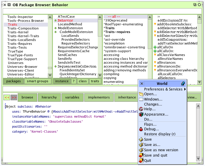
Basically it works (see attached screenshot) but the needed plugins are not distributed with the VM by default. I think there is a problem with getting italics the same way as with the bitmap fonts (in my image, omnibrowser shows some lines in the bitmap font and I think it would be italics in a default image, for Behavior and SequenceableCollection and a few methods in the screenshot). Also there is the problem that not all platforms provide the same fonts so either the image should detect that and change the font settings (eg switch from lucida grande + monaco on mac to the Dejavu on linux), or we should bundle a set of fonts On Sat, Jul 26, 2008 at 3:40 PM, Stéphane Ducasse <stephane.ducasse@inria.fr> wrote:
Mike
You are much than us from the font perspective. What do you think? I like the idea to have something like nicefonts just as a fallback when we do not have truetype fonts.
Stef
PS: I will contact andy tween to know more about the status of true type fonts
_______________________________________________ Pharo-project mailing list Pharo-project@lists.gforge.inria.fr http://lists.gforge.inria.fr/cgi-bin/mailman/listinfo/pharo-project
-- Damien Pollet type less, do more [ | ] http://people.untyped.org/damien.pollet
participants (9)
-
 Adrian Lienhard
 -
 cdrick
 -
 Damien Cassou
 -
 Damien Pollet
 -
 David Mitchell
 -
 Janko Mivšek
 -
 Lukas Renggli
 -
 Norbert Hartl
 -
 Stéphane Ducasse