spotter: top search for senders and references

Hi, With the latest GT integration, we also integrated the search for senders and references from the first step. Here is a detailed explanation about it, including what we still want to do, how itâs done, and how to discover what else is around: http://www.humane-assessment.com/blog/spotting-senders-references-with-gtspo... Please let us know what you think. Cheers, Doru -- www.tudorgirba.com www.feenk.com "Problem solving efficiency grows with the abstractness level of problem understanding."
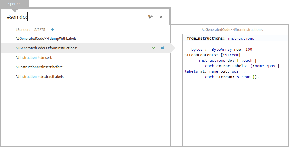

It turns the search field into a "kind of" command line interface, with #sen/#ref as commands. I love CLIs so I welcome it, but I think It "perverts" the search field and uses an awkward syntax. I prefer to type "senders" than to type a special character like #. I would prefer adding a suffix command so you search for 'do: senders' or 'do: implementors'. Regards! Esteban A. Maringolo 2016-01-19 10:43 GMT-03:00 Tudor Girba <tudor@tudorgirba.com>:
Hi,
With the latest GT integration, we also integrated the search for senders and references from the first step.
Here is a detailed explanation about it, including what we still want to do, how itâs done, and how to discover what else is around:
http://www.humane-assessment.com/blog/spotting-senders-references-with-gtspo...
Please let us know what you think.
Cheers, Doru
-- www.tudorgirba.com www.feenk.com
"Problem solving efficiency grows with the abstractness level of problem understanding."

On 19 Jan 2016, at 15:23, Esteban A. Maringolo <emaringolo@gmail.com> wrote:
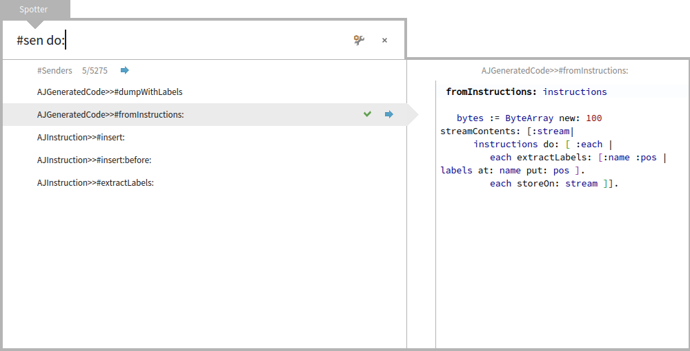
It turns the search field into a "kind of" command line interface, with #sen/#ref as commands. I love CLIs so I welcome it, but I think It "perverts" the search field and uses an awkward syntax. I prefer to type "senders" than to type a special character like #.
I would prefer adding a suffix command so you search for 'do: senders' or 'do: implementorsâ.
just that there is no syntactical way to know when you want senders or just retrieve methods who start with do: and continue with keyword sen⦠etc. thatâs the reason from the hashtag (which is now a common symbol to filter/tag like in twitter/facebook/etc.) cheers, Esteban
Regards!
Esteban A. Maringolo
2016-01-19 10:43 GMT-03:00 Tudor Girba <tudor@tudorgirba.com <mailto:tudor@tudorgirba.com>>: Hi,
With the latest GT integration, we also integrated the search for senders and references from the first step.
Here is a detailed explanation about it, including what we still want to do, how itâs done, and how to discover what else is around: http://www.humane-assessment.com/blog/spotting-senders-references-with-gtspo... <http://www.humane-assessment.com/blog/spotting-senders-references-with-gtspo...>
<spotter-senders.png>
Please let us know what you think.
Cheers, Doru
-- www.tudorgirba.com <http://www.tudorgirba.com/> www.feenk.com <http://www.feenk.com/>
"Problem solving efficiency grows with the abstractness level of problem understanding."
On 19 Jan 2016, at 16:15, Esteban Lorenzano <estebanlm@gmail.com> wrote:
On 19 Jan 2016, at 15:23, Esteban A. Maringolo <emaringolo@gmail.com <mailto:emaringolo@gmail.com>> wrote:
It turns the search field into a "kind of" command line interface, with #sen/#ref as commands. I love CLIs so I welcome it, but I think It "perverts" the search field and uses an awkward syntax. I prefer to type "senders" than to type a special character like #.
I would prefer adding a suffix command so you search for 'do: senders' or 'do: implementorsâ.
just that there is no syntactical way to know when you want senders or just retrieve methods who start with do: and continue with keyword sen⦠etc. thatâs the reason from the hashtag (which is now a common symbol to filter/tag like in twitter/facebook/etc.)
ah, btw⦠you can also do: do: #sen it does not have to be in front⦠just you need to use the hash :)
cheers, Esteban
Regards!
Esteban A. Maringolo
2016-01-19 10:43 GMT-03:00 Tudor Girba <tudor@tudorgirba.com <mailto:tudor@tudorgirba.com>>: Hi,
With the latest GT integration, we also integrated the search for senders and references from the first step.
Here is a detailed explanation about it, including what we still want to do, how itâs done, and how to discover what else is around: http://www.humane-assessment.com/blog/spotting-senders-references-with-gtspo... <http://www.humane-assessment.com/blog/spotting-senders-references-with-gtspo...>
<spotter-senders.png>
Please let us know what you think.
Cheers, Doru
-- www.tudorgirba.com <http://www.tudorgirba.com/> www.feenk.com <http://www.feenk.com/>
"Problem solving efficiency grows with the abstractness level of problem understanding."

cool now could we have an help menu that describes the key elements. People cannot discover that by themselves. A menu item is cheap. Stef Le 19/1/16 14:43, Tudor Girba a écrit :
Hi,
With the latest GT integration, we also integrated the search for senders and references from the first step.
Here is a detailed explanation about it, including what we still want to do, how itâs done, and how to discover what else is around: http://www.humane-assessment.com/blog/spotting-senders-references-with-gtspo...
Please let us know what you think.
Cheers, Doru
-- www.tudorgirba.com <http://www.tudorgirba.com> www.feenk.com
"Problem solving efficiency grows with the abstractness level of problem understanding."
2016-01-19 13:34 GMT-03:00 stepharo <stepharo@free.fr>:
cool now could we have an help menu that describes the key elements. People cannot discover that by themselves. A menu item is cheap.
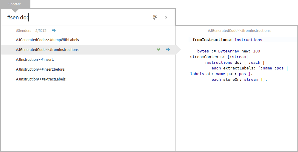
The thing with the hybrid things is that if it is not self discoverable as in a menu item it can't be described by a --help flag like in a traditional command line. Regards! Esteban A. Maringolo
On 19 Jan 2016, at 18:08, Esteban A. Maringolo <emaringolo@gmail.com> wrote:
2016-01-19 13:34 GMT-03:00 stepharo <stepharo@free.fr>:
cool now could we have an help menu that describes the key elements. People cannot discover that by themselves. A menu item is cheap.
The thing with the hybrid things is that if it is not self discoverable as in a menu item it can't be described by a --help flag like in a traditional command line.
we need a cheat sheet, otherwise, is arcane knowledge, reserved for the oracle.
Regards!
Esteban A. Maringolo
this is why we have ghost text in input field. To indicate to the user the kind of input he may type So Spotter could show #class Point | #implementors do: | in really light grey in the input place. Stef Le 19/1/16 18:08, Esteban A. Maringolo a écrit :
2016-01-19 13:34 GMT-03:00 stepharo <stepharo@free.fr>:
cool now could we have an help menu that describes the key elements. People cannot discover that by themselves. A menu item is cheap. The thing with the hybrid things is that if it is not self discoverable as in a menu item it can't be described by a --help flag like in a traditional command line.
Regards!
Esteban A. Maringolo
Doru on the blog you mention selectors but I'm confused, I thought that methods were implementors. So what is selectors? I checked and they are methods too. Stef Just for the record, there are parts the world where you have to use your GSM to browse the web. Even in France there are parts of the world where you cannot access to Youtube videos.
Hi,
With the latest GT integration, we also integrated the search for senders and references from the first step.
Here is a detailed explanation about it, including what we still want to do, how itâs done, and how to discover what else is around: http://www.humane-assessment.com/blog/spotting-senders-references-with-gtspo...
Please let us know what you think.
Cheers, Doru
-- www.tudorgirba.com <http://www.tudorgirba.com> www.feenk.com
"Problem solving efficiency grows with the abstractness level of problem understanding."
Hi,
On Jan 19, 2016, at 5:52 PM, stepharo <stepharo@free.fr> wrote:
Doru
on the blog you mention selectors but I'm confused, I thought that methods were implementors. So what is selectors? I checked and they are methods too.
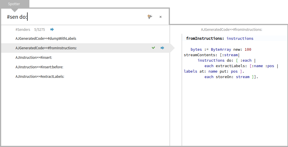
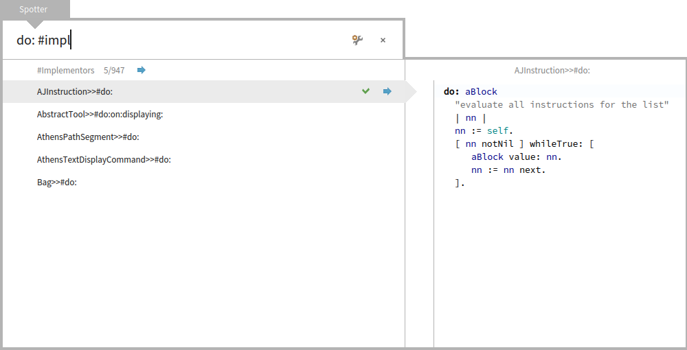
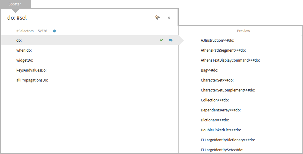
So, the difference is as follows. #Implementors lists actual methods. For example, if I search for do:, I will get multiple methods implementing do:. Also, when you preview, you get directly the source code of the method. If you trigger the action (Enter) you get the code browser opened on the method. #Selectors, will show only one occurrence of do:, and when you preview it, you see the list of implementors. Essentially, #Selectors behaves like completion and it allows you to discover new selectors. Whatâs more, if you trigger the action (Enter) on a selector, you get the implementors browser for this selector. Does this make sense? Cheers, Doru
Stef
Just for the record, there are parts the world where you have to use your GSM to browse the web. Even in France there are parts of the world where you cannot access to Youtube videos.
Hi,
With the latest GT integration, we also integrated the search for senders and references from the first step.
Here is a detailed explanation about it, including what we still want to do, how itâs done, and how to discover what else is around: http://www.humane-assessment.com/blog/spotting-senders-references-with-gtspo...
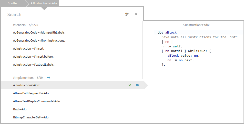
<Mail Attachment.png>
Please let us know what you think.
Cheers, Doru
-- www.tudorgirba.com www.feenk.com
"Problem solving efficiency grows with the abstractness level of problem understanding."
-- www.tudorgirba.com www.feenk.com "When people care, great things can happen."
It has to be the oposite: #implementors should show what people understand until now (a list of implementors) #methods should show the actual methods (as now does #implementors) why complicate things if we can do it in a way that satisfaces everybody? Esteban
On 19 Jan 2016, at 18:07, Tudor Girba <tudor@tudorgirba.com> wrote:
Hi,
On Jan 19, 2016, at 5:52 PM, stepharo <stepharo@free.fr <mailto:stepharo@free.fr>> wrote:
Doru
on the blog you mention selectors but I'm confused, I thought that methods were implementors. So what is selectors? I checked and they are methods too.
So, the difference is as follows.
#Implementors lists actual methods. For example, if I search for do:, I will get multiple methods implementing do:. Also, when you preview, you get directly the source code of the method. If you trigger the action (Enter) you get the code browser opened on the method.
<a GTSpotterMorph(804686592)2016-01-19T18-00-41-751893+01-00.png>
#Selectors, will show only one occurrence of do:, and when you preview it, you see the list of implementors.
<a GTSpotterMorph(804686592)2016-01-19T18-00-47-165509+01-00.png>
Essentially, #Selectors behaves like completion and it allows you to discover new selectors. Whatâs more, if you trigger the action (Enter) on a selector, you get the implementors browser for this selector.
Does this make sense?
Cheers, Doru
Stef
Just for the record, there are parts the world where you have to use your GSM to browse the web. Even in France there are parts of the world where you cannot access to Youtube videos.
Hi,
With the latest GT integration, we also integrated the search for senders and references from the first step.
Here is a detailed explanation about it, including what we still want to do, how itâs done, and how to discover what else is around: http://www.humane-assessment.com/blog/spotting-senders-references-with-gtspo... <http://www.humane-assessment.com/blog/spotting-senders-references-with-gtspo...>
<Mail Attachment.png>
Please let us know what you think.
Cheers, Doru
-- www.tudorgirba.com www.feenk.com
"Problem solving efficiency grows with the abstractness level of problem understanding."
-- www.tudorgirba.com <http://www.tudorgirba.com/> www.feenk.com <http://www.feenk.com/>
"When people care, great things can happen."
Hi,
On Jan 19, 2016, at 6:14 PM, Esteban Lorenzano <estebanlm@gmail.com> wrote:
It has to be the oposite:
#implementors should show what people understand until now (a list of implementors) #methods should show the actual methods (as now does #implementors)
Hmm, I think I do not understand so please bare with me. You seem to suggest that #Implementors would show selectors (symbols), and #Methods would show .
why complicate things if we can do it in a way that satisfaces everybody?
The goal is certainly not to confuse. Only that the problem is a bit more complicated than what might appear. When you are inside a method, you will naturally want to see #Implementors and #Senders. And in both of these categories, you will have methods and the preview will show code. If on the top search, #Implementors will just be symbols, then we have two meanings for the same label. We could also use #Methods and #Senders when inside a method, but that would not match well either. So, that is why we use #Implementors in the top search. Does this make more sense? I am asking because these are not carved in stone :) Cheers, Doru
Esteban
On 19 Jan 2016, at 18:07, Tudor Girba <tudor@tudorgirba.com> wrote:
Hi,
On Jan 19, 2016, at 5:52 PM, stepharo <stepharo@free.fr> wrote:
Doru
on the blog you mention selectors but I'm confused, I thought that methods were implementors. So what is selectors? I checked and they are methods too.
So, the difference is as follows.
#Implementors lists actual methods. For example, if I search for do:, I will get multiple methods implementing do:. Also, when you preview, you get directly the source code of the method. If you trigger the action (Enter) you get the code browser opened on the method.
<a GTSpotterMorph(804686592)2016-01-19T18-00-41-751893+01-00.png>
#Selectors, will show only one occurrence of do:, and when you preview it, you see the list of implementors.
<a GTSpotterMorph(804686592)2016-01-19T18-00-47-165509+01-00.png>
Essentially, #Selectors behaves like completion and it allows you to discover new selectors. Whatâs more, if you trigger the action (Enter) on a selector, you get the implementors browser for this selector.
Does this make sense?
Cheers, Doru
Stef
Just for the record, there are parts the world where you have to use your GSM to browse the web. Even in France there are parts of the world where you cannot access to Youtube videos.
Hi,
With the latest GT integration, we also integrated the search for senders and references from the first step.
Here is a detailed explanation about it, including what we still want to do, how itâs done, and how to discover what else is around: http://www.humane-assessment.com/blog/spotting-senders-references-with-gtspo...
<Mail Attachment.png>
Please let us know what you think.
Cheers, Doru
-- www.tudorgirba.com www.feenk.com
"Problem solving efficiency grows with the abstractness level of problem understanding."
-- www.tudorgirba.com www.feenk.com
"When people care, great things can happen."
-- www.tudorgirba.com www.feenk.com "We are all great at making mistakes."
Essentially, #Selectors behaves like completion and it allows you to discover new selectors. Whatâs more, if you trigger the action (Enter) on a selector, you get the implementors browser for this selector.
Does this make sense?
Not really. It looks really complex to remember. To me selectors is part of implementors. I find it confusing. How do you get the right pane opened? Because I cannot get it. I clieck on the check or the arrow but it does not open. Again another discoverability problem. I think that my remarks about how to learn spotter still stands. Yes I can read your blog and may be remember everything but this is the way UI works. Stef
Hi,
On Jan 19, 2016, at 6:17 PM, stepharo <stepharo@free.fr> wrote:
Essentially, #Selectors behaves like completion and it allows you to discover new selectors. Whatâs more, if you trigger the action (Enter) on a selector, you get the implementors browser for this selector.
Does this make sense?
Not really. It looks really complex to remember. To me selectors is part of implementors. I find it confusing.
I am not sure I understand. Here is the reasoning behind the names. Perhaps we can find better ones: - The Implementors Browser shows methods implementing a selector. - So, from this point of view, an implementor is a method.
How do you get the right pane opened? Because I cannot get it. I clieck on the check or the arrow but it does not open.
On which arrow? :) When I tested the UI with users, and there were some, all of them felt that the gray arrow that goes outside the border is strange, and they clicked on it to see what it does. It seems that you do not see it like that. Perhaps the contrast is not strong enough, and we can work on that. And then, in Spotter we have another discovery mechanism: Shift. When you press it, all clickable things get highlighted (including the arrow). We chose Shift because it is something that you type often as part of a text, so it will be very likely that you will press it when working with Spotter as well. And this will get you to see that something happens.
Again another discoverability problem. I think that my remarks about how to learn spotter still stands. Yes I can read your blog and may be remember everything but this is the way UI works.
Thanks for describing your way of working. It is useful. In any case, a help would certainly be useful, and it is on the todo list as well. Cheers, Doru
Stef
-- www.tudorgirba.com www.feenk.com "It's not how it is, it is how we see it."
Does this make sense?
Not really. It looks really complex to remember. To me selectors is part of implementors. I find it confusing. I am not sure I understand.
Here is the reasoning behind the names. Perhaps we can find better ones: - The Implementors Browser shows methods implementing a selector. - So, from this point of view, an implementor is a method. I do not think that having a query for something that we do not use is good. I look for implementors and I'm used to get a list of methods
How do you get the right pane opened? Because I cannot get it. I clieck on the check or the arrow but it does not open. On which arrow? :)
When I tested the UI with users, and there were some, all of them felt that the gray arrow that goes outside the border is strange, and they clicked on it to see what it does.
I never thought about clicking on it. I thought it was a decoration not an active element.
It seems that you do not see it like that. Perhaps the contrast is not strong enough, and we can work on that. I see the arrow but it does not have an icon so why should I start to click on everything to see if it reacts. This is not the way I use User Interface. In general the UI tells me where I should click and I click. I did not ask the question to be dum or to show that Spotter UI is not intuitive: I could not find how to get the pane. So this is totally obscure that the arrow is more than a decoration. Putting an icon inside would make the trick because all the other parts the clickable once have icons.
And then, in Spotter we have another discovery mechanism: Shift. When you press it, all clickable things get highlighted (including the arrow). We chose Shift because it is something that you type often as part of a text, so it will be very likely that you will press it when working with Spotter as well. And this will get you to see that something happens.
Seriously not! Because you do not see how my hands are on the keyboard (we compared with esteban) my hand is fully over the keyboard with my tiptoe on numbers and higher like fn key so pressing shift = pain to me because shift is near to my wrest. In general I do not use shift. This is shift+ enter does not work for me. I would like to have esc + enter because esc is on the top left and I have my finger often on it. The proof is that I never saw that shift had any meaning and as I told you when I started to use Spotter I got pain in my hand => STOP using it. Damien has pain in all his fingers and looking for the reason (and the reason may be emacs shortcuts) so I do not play with strange short cuts. I started to use Spotter when I saw that I can use the right shift below enter. Now shift + cmd + arrows is nearly impossible because those are all keys at the bottom of the keyboard. So at the end what you believe is handy is handy for certain people but not other. I will not change my hand over keyboard position because I'm really efficient with it and I have no pain :)
Again another discoverability problem. I think that my remarks about how to learn spotter still stands. Yes I can read your blog and may be remember everything but this is the way UI works. Thanks for describing your way of working. It is useful.
In any case, a help would certainly be useful, and it is on the todo list as well.
Yes and it does not have to be perfect and a menu to reset it.
Cheers, Doru
Stef
-- www.tudorgirba.com www.feenk.com
"It's not how it is, it is how we see it."

BTW, thanks for the explanations for Spotter.
On 19 Jan 2016, at 18:37, Tudor Girba <tudor@tudorgirba.com> wrote:
And then, in Spotter we have another discovery mechanism: Shift. When you press it, all clickable things get highlighted (including the arrow). We chose Shift because it is something that you type often as part of a text, so it will be very likely that you will press it when working with Spotter as well. And this will get you to see that something happens.
I am lazy and fearful of RSI. If I can avoid using the shift key at all, I am quite happy. So I did not notice that the arrows where clickable. Here are a few suggestions that would fit my workflow. I also think that "Selectors" should appear after classes and before packages, and be called "Messages". Typically I want to open a specific class, or a specific message in a specific class. The short list of implementors at the top level is usually noise and might have confused Stef. It becomes relevant once the message is fully specified. Diving in should be done with right arrow when at the end of the command line. Diving out with left arrow at the start of the command line. When a list of paginated (only first N items), then the category line should be accessible with arrows, so we can dive into a category just with arrows. That would be awesome.
Le 19/1/16 20:25, David Allouche a écrit :
BTW, thanks for the explanations for Spotter.
On 19 Jan 2016, at 18:37, Tudor Girba <tudor@tudorgirba.com> wrote:
And then, in Spotter we have another discovery mechanism: Shift. When you press it, all clickable things get highlighted (including the arrow). We chose Shift because it is something that you type often as part of a text, so it will be very likely that you will press it when working with Spotter as well. And this will get you to see that something happens. I am lazy and fearful of RSI. If I can avoid using the shift key at all, I am quite happy. So I did not notice that the arrows where clickable.
:) Same here.
Here are a few suggestions that would fit my workflow.
I also think that "Selectors" should appear after classes and before packages, and be called "Messages". Typically I want to open a specific class, or a specific message in a specific class.
The short list of implementors at the top level is usually noise and might have confused Stef. It becomes relevant once the message is fully specified.
Diving in should be done with right arrow when at the end of the command line.
Diving out with left arrow at the start of the command line.
I was wondering what is the benefit to have cmd - shit arrow vs arrow
When a list of paginated (only first N items), then the category line should be accessible with arrows, so we can dive into a category just with arrows.
That would be awesome.
Hi,
On Jan 19, 2016, at 9:18 PM, stepharo <stepharo@free.fr> wrote:
Le 19/1/16 20:25, David Allouche a écrit :
BTW, thanks for the explanations for Spotter.
You are welcome. Please keep challenging. This is how good design happens.
On 19 Jan 2016, at 18:37, Tudor Girba <tudor@tudorgirba.com> wrote:
And then, in Spotter we have another discovery mechanism: Shift. When you press it, all clickable things get highlighted (including the arrow). We chose Shift because it is something that you type often as part of a text, so it will be very likely that you will press it when working with Spotter as well. And this will get you to see that something happens. I am lazy and fearful of RSI. If I can avoid using the shift key at all, I am quite happy. So I did not notice that the arrows where clickable.
:) Same here.
What is RSI? Most people I know use Shift to type an upper case, and we observed that when people search, they often tend to still use uppercase. Not all, but many. That is why we put this functionality on Shift. This does not mean that it is enough, but we just wanted to increase the chance of people stumbling across this without any documentation. It only partially succeeded. Anyway, we should externalize the key bindings. Another thing on the to do list :)
Here are a few suggestions that would fit my workflow.
I also think that "Selectors" should appear after classes and before packages, and be called "Messages". Typically I want to open a specific class, or a specific message in a specific class.
#Messages is not a bad name, but then again I also thought that #Selectors was explicit enough :). What do others think?
The short list of implementors at the top level is usually noise and might have confused Stef. It becomes relevant once the message is fully specified.
Diving in should be done with right arrow when at the end of the command line. Diving out with left arrow at the start of the command line. I was wondering what is the benefit to have cmd - shit arrow vs arrow
Left/Right is used to move inside the text area (there is only one text field in the whole UI), and that is why you cannot consistently use it for navigating through results. Navigating when the cursor is at the end is a tempting idea, but it implies a mode that is not contextual (you need to things to look at). That is why I would not want to have it in this interface.
When a list of paginated (only first N items), then the category line should be accessible with arrows, so we can dive into a category just with arrows.
We explicitly chose not to do that because we did not want to mingle different kinds of elements in the same list. So, like this, when you press Cmd+Right, you will always dive in one single element, and not in many by mistake. Actually, our original goal was to have a way to expand the list in place (not only to dive in category). For this we wanted a ⦠line and clicking on that would expand the list in place. We did not get to do it yet, but I think this would solve quite some of the reported problems. But, please do keep challenging. And give it a try with writing your own processors. It would help us a lot. Cheers, Doru
That would be awesome.
-- www.tudorgirba.com www.feenk.com "Obvious things are difficult to teach."

On 19 Jan 2016, at 22:40, Tudor Girba <tudor@tudorgirba.com> wrote:
What is RSI?
Since you asked to keep challenging⦠Preamble: Sorry, I did one of those long messages again. I hope I am not annoying people with that.
On 19 Jan 2016, at 22:40, Tudor Girba <tudor@tudorgirba.com> wrote:
Hi,
On Jan 19, 2016, at 9:18 PM, stepharo <stepharo@free.fr> wrote:
Le 19/1/16 20:25, David Allouche a écrit :
BTW, thanks for the explanations for Spotter.
You are welcome. Please keep challenging. This is how good design happens.
On 19 Jan 2016, at 18:37, Tudor Girba <tudor@tudorgirba.com> wrote:
And then, in Spotter we have another discovery mechanism: Shift. When you press it, all clickable things get highlighted (including the arrow). We chose Shift because it is something that you type often as part of a text, so it will be very likely that you will press it when working with Spotter as well. And this will get you to see that something happens. I am lazy and fearful of RSI. If I can avoid using the shift key at all, I am quite happy. So I did not notice that the arrows where clickable.
:) Same here.
What is RSI?
Most people I know use Shift to type an upper case, and we observed that when people search, they often tend to still use uppercase. Not all, but many. That is why we put this functionality on Shift. This does not mean that it is enough, but we just wanted to increase the chance of people stumbling across this without any documentation. It only partially succeeded.
You already stated your reasoning, and I understand it. I was just making noise for people like Stef and me, who never use Shift unless they HAVE TO.
Anyway, we should externalize the key bindings. Another thing on the to do list :)
Sure, great!
Here are a few suggestions that would fit my workflow.
I also think that "Selectors" should appear after classes and before packages, and be called "Messages". Typically I want to open a specific class, or a specific message in a specific class.
#Messages is not a bad name, but then again I also thought that #Selectors was explicit enough :). What do others think?
Any interest in putting "Messages" after "Classes" and before "Packages"? Another advantage of "Messages" is that "#m" is unambiguous. Currently, "#se" is ambiguous (#senders and #selectors), that is a serious annoyance.
The short list of implementors at the top level is usually noise and might have confused Stef. It becomes relevant once the message is fully specified.
Diving in should be done with right arrow when at the end of the command line. Diving out with left arrow at the start of the command line. I was wondering what is the benefit to have cmd - shit arrow vs arrow
Left/Right is used to move inside the text area (there is only one text field in the whole UI), and that is why you cannot consistently use it for navigating through results.
Navigating when the cursor is at the end is a tempting idea, but it implies a mode that is not contextual (you need to things to look at). That is why I would not want to have it in this interface.
Not overloading unmodified right/left arrows sounds like an obvious good idea. But as you already mentioned, Spotter is a special context, so one needs to take a step back to evaluate the interaction possibilities. Typically, in the Spotter command line, I never use left-right arrows, and I think this is common. If people mistype something, and have immediate feedback, they tend to use backspace to fix it, instead of in-line editing. Spotter is also very similar to a class browser like Nautilus, where left-right arrows are the primary way to dive in and out of packages, classes, protocols, methods. That makes right and left arrows intuitive to dive in and out in Spotter. If right and left arrows dive in and out, it's very easy to cancel a mistake, just immediately press the opposite arrow. That also means that dive-out should remember what was the search line, so immediately diving back in does not lose the previous input, as is the current behaviour. Can you fix that? Cmd-arrows and Cmd-shift-arrows is uncommon, and it takes a conscious effort to remember, it's not intuitive in any way. Cmd-arrows and Cmd-shift-arrows are slow and hard to reach combinations. They require me to move my left arm from the shoulder so left hand goes to the modifier keys corner. Reaching arrows already requires me to move my right arm so my right hand gets over the arrow pad. So every time I want to dive in or out, I need to move both arms and completely lose kinaesthetic connection with the home row. Then to continue filtering I need to find the home row again. Repetitive switching between home row and cmd-shift-arrows is frustrating at a deep, motor level. That kind of frustration leads to angry people and the Dark Side. One could consider using Tab and Shift-Tab instead, but that would be a bad choice. Tab should mean "autocomplete this", and in the context of Spotter you cannot overload this with navigation. (I could expand on that) I am not sure what you mean by "not contextual": I type some words, use up/down arrows to choose the line I want, which is often not the first one, then use right arrow to dive in. That is contextual: I am looking at the list, I already have my hand on the arrow pad, I did a vertical motion action and now I want to do an horizontal motion action. If you insist right-left arrow should not be overloaded in the search line, then you could use the first down arrow to move out of "command context" and into "matches context". Other actions like Enter and Backspace need not depend on the context. But I am convinced it is not necessary to make a distinction between command context and matches context. At the very least, I would like some reassurance that the Spotter UI machinery would make it easy for people like me to hack in the interaction behaviour they expect from arrow keys.
When a list of paginated (only first N items), then the category line should be accessible with arrows, so we can dive into a category just with arrows.
We explicitly chose not to do that because we did not want to mingle different kinds of elements in the same list. So, like this, when you press Cmd+Right, you will always dive in one single element, and not in many by mistake.
I understand that. But I think it is the wrong trade-off. Diving into the wrong element with right arrow is cheap, just press left arrow to dive out. That's easy to do and totally intuitive. To prevent a cheap, easily corrected mistake, you make one of the most common actions significantly harder. That is bad UI design, sorry to be harsh.
Actually, our original goal was to have a way to expand the list in place (not only to dive in category). For this we wanted a ⦠line and clicking on that would expand the list in place. We did not get to do it yet, but I think this would solve quite some of the reported problems.
Expanding in place is a bad idea. Please do not do that. Categories often have dozens, sometimes hundreds of items. Once you have expanded such a category, the rest of the list is essentially lost, you need an easy way to cancel that, and that easy way is diving out. Also when you are scrolling a long expanded list, you do NOT want to scroll past the end and into another category, that would be annoying, and not useful. What you do need is to make it easier NOT to have browse the full categories at all. For that: Prefix matches should be sorted in lexicographic order of the thing being matched first, and its container second. "items" in the top search, should show implementors only for "#items", there are a lot of them, and not things like DialogGroupManagerUI>>#itemSelected. When a category is fully specified by #word ("items #i"), it should display the full list. There should still be the ability to dive into the category (retaining "items" in the command line), But there is NO benefit in adding a layer of indirection. Non-prefix matches, or matches for a line containing multiple words need fuzzy search relevance sorting with history sensitivity. For exemple: "if else" should find ifNil:else:, ifTrue:else: etc. "m m" should find MenuMorph as one of the first results. Only other classes whose two first two words start with M should come before. "menu morph items" should find "#Implementors: MenuMorph>>#items" Here's another few, unrelated, suggestion. For the top-level list: When the line is empty: Display a short graphic cheat sheet. Not a wall of plain text, something pretty with boxes and small bits of text that the eye wants to read. That should explain # words and important action keys. That should provide a way to immediately dive into categories. Provide an easy way to disable the cheat sheet: a button "Do not show me this" Do not use separate lists per category, but one list with all matches, sorted by search proximity and with history sensitivity History sensitivity here is very beneficial, it effectively lets one define custom shortcuts, by always using the same letters to reach to frequently used items. For example in Alfred on my Mac, "sl" finds "Sleep" first and "Slack" second. Categories can be displayed again by typing a single #. Keep the categories separated in the list after diving in, it is essential for things like senders/implementors. And some suggestion for all lists: Please, please, GET RID OF VERTICAL WRAP AROUND, thanks. When I hit the bottom of the list, I want to know I got there. When a non matching #word is typed ("#x"), the available #words should be displayed, not the empty list. When moving into category with arrow up/down, please scroll more. If the category list is long compared to the scroller viewport, at 50-75% of the viewport should display the category I just moved in. Scrolling should probably be a bit optimistic. Unless we are at the end of the list, the current line should never be the first or last displayed, unless the viewport is very small. When the current category name is out of the viewport, it should stick at the top, maybe with some transparency gradient over the first item, I need to know what category I am in. It is especially important when scrolling up, after overshooting. I hope you are familiar with Alfred (Mac only) and Sublime Text. They both provide very useful fuzzy search with history sensitivity.
But, please do keep challenging. And give it a try with writing your own processors. It would help us a lot.
Right now, I keep bouncing in all sorts of bugs in other packages. So I am rather happy to just provide feedback for enhancements, so I can spend more time fixing the actual bugs. :-) Regards.

Le 20/01/2016 10:48, David Allouche a écrit :
On 20 Jan 2016, at 10:39, David Allouche <david@allouche.net <mailto:david@allouche.net>> wrote:
And some suggestion for all lists:
Another one: Esc should close Spotter.
That one is nice to have, yes. Thierry
I see Cmd-W does that, but Spotter is not a "normal" window, it is an incremental search popup.
Thanks.

On 20 Jan 2016, at 10:51, Thierry Goubier <thierry.goubier@gmail.com> wrote:
Le 20/01/2016 10:48, David Allouche a écrit :
On 20 Jan 2016, at 10:39, David Allouche <david@allouche.net <mailto:david@allouche.net>> wrote:
And some suggestion for all lists:
Another one: Esc should close Spotter.
That one is nice to have, yes.
But it is already there, no? Uko
Thierry
I see Cmd-W does that, but Spotter is not a "normal" window, it is an incremental search popup.
Thanks.
Hi,
On Jan 20, 2016, at 10:48 AM, David Allouche <david@allouche.net> wrote:
On 20 Jan 2016, at 10:39, David Allouche <david@allouche.net> wrote:
And some suggestion for all lists:
Another one: Esc should close Spotter.
It does. Doru
I see Cmd-W does that, but Spotter is not a "normal" window, it is an incremental search popup.
Thanks.
-- www.tudorgirba.com www.feenk.com "Every now and then stop and ask yourself if the war you're fighting is the right one."
On 20 Jan 2016, at 11:05, Tudor Girba <tudor@tudorgirba.com> wrote:
Hi,
On Jan 20, 2016, at 10:48 AM, David Allouche <david@allouche.net> wrote:
On 20 Jan 2016, at 10:39, David Allouche <david@allouche.net> wrote:
And some suggestion for all lists:
Another one: Esc should close Spotter.
It does.
Right. I'm puzzled. I did double check before. That's how I found out about Cmd-W. Sorry for the noise.
Hi, This is indeed long and I am unable to read this now. It might take a while to get to reply. Cheers, Doru
On Jan 20, 2016, at 10:39 AM, David Allouche <david@allouche.net> wrote:
Since you asked to keep challengingâ¦
Preamble: Sorry, I did one of those long messages again. I hope I am not annoying people with that.
On 19 Jan 2016, at 22:40, Tudor Girba <tudor@tudorgirba.com> wrote:
Hi,
On Jan 19, 2016, at 9:18 PM, stepharo <stepharo@free.fr> wrote:
Le 19/1/16 20:25, David Allouche a écrit :
BTW, thanks for the explanations for Spotter.
You are welcome. Please keep challenging. This is how good design happens.
On 19 Jan 2016, at 18:37, Tudor Girba <tudor@tudorgirba.com> wrote:
And then, in Spotter we have another discovery mechanism: Shift. When you press it, all clickable things get highlighted (including the arrow). We chose Shift because it is something that you type often as part of a text, so it will be very likely that you will press it when working with Spotter as well. And this will get you to see that something happens. I am lazy and fearful of RSI. If I can avoid using the shift key at all, I am quite happy. So I did not notice that the arrows where clickable.
:) Same here.
What is RSI?
Most people I know use Shift to type an upper case, and we observed that when people search, they often tend to still use uppercase. Not all, but many. That is why we put this functionality on Shift. This does not mean that it is enough, but we just wanted to increase the chance of people stumbling across this without any documentation. It only partially succeeded.
You already stated your reasoning, and I understand it. I was just making noise for people like Stef and me, who never use Shift unless they HAVE TO.
Anyway, we should externalize the key bindings. Another thing on the to do list :)
Sure, great!
Here are a few suggestions that would fit my workflow.
I also think that "Selectors" should appear after classes and before packages, and be called "Messages". Typically I want to open a specific class, or a specific message in a specific class.
#Messages is not a bad name, but then again I also thought that #Selectors was explicit enough :). What do others think?
Any interest in putting "Messages" after "Classes" and before "Packages"?
Another advantage of "Messages" is that "#m" is unambiguous. Currently, "#se" is ambiguous (#senders and #selectors), that is a serious annoyance.
The short list of implementors at the top level is usually noise and might have confused Stef. It becomes relevant once the message is fully specified.
Diving in should be done with right arrow when at the end of the command line. Diving out with left arrow at the start of the command line. I was wondering what is the benefit to have cmd - shit arrow vs arrow
Left/Right is used to move inside the text area (there is only one text field in the whole UI), and that is why you cannot consistently use it for navigating through results.
Navigating when the cursor is at the end is a tempting idea, but it implies a mode that is not contextual (you need to things to look at). That is why I would not want to have it in this interface.
Not overloading unmodified right/left arrows sounds like an obvious good idea.
But as you already mentioned, Spotter is a special context, so one needs to take a step back to evaluate the interaction possibilities.
Typically, in the Spotter command line, I never use left-right arrows, and I think this is common. If people mistype something, and have immediate feedback, they tend to use backspace to fix it, instead of in-line editing.
Spotter is also very similar to a class browser like Nautilus, where left-right arrows are the primary way to dive in and out of packages, classes, protocols, methods. That makes right and left arrows intuitive to dive in and out in Spotter.
If right and left arrows dive in and out, it's very easy to cancel a mistake, just immediately press the opposite arrow. That also means that dive-out should remember what was the search line, so immediately diving back in does not lose the previous input, as is the current behaviour. Can you fix that?
Cmd-arrows and Cmd-shift-arrows is uncommon, and it takes a conscious effort to remember, it's not intuitive in any way.
Cmd-arrows and Cmd-shift-arrows are slow and hard to reach combinations. They require me to move my left arm from the shoulder so left hand goes to the modifier keys corner. Reaching arrows already requires me to move my right arm so my right hand gets over the arrow pad. So every time I want to dive in or out, I need to move both arms and completely lose kinaesthetic connection with the home row. Then to continue filtering I need to find the home row again. Repetitive switching between home row and cmd-shift-arrows is frustrating at a deep, motor level. That kind of frustration leads to angry people and the Dark Side.
One could consider using Tab and Shift-Tab instead, but that would be a bad choice. Tab should mean "autocomplete this", and in the context of Spotter you cannot overload this with navigation. (I could expand on that)
I am not sure what you mean by "not contextual": I type some words, use up/down arrows to choose the line I want, which is often not the first one, then use right arrow to dive in. That is contextual: I am looking at the list, I already have my hand on the arrow pad, I did a vertical motion action and now I want to do an horizontal motion action.
If you insist right-left arrow should not be overloaded in the search line, then you could use the first down arrow to move out of "command context" and into "matches context". Other actions like Enter and Backspace need not depend on the context. But I am convinced it is not necessary to make a distinction between command context and matches context.
At the very least, I would like some reassurance that the Spotter UI machinery would make it easy for people like me to hack in the interaction behaviour they expect from arrow keys.
When a list of paginated (only first N items), then the category line should be accessible with arrows, so we can dive into a category just with arrows.
We explicitly chose not to do that because we did not want to mingle different kinds of elements in the same list. So, like this, when you press Cmd+Right, you will always dive in one single element, and not in many by mistake.
I understand that. But I think it is the wrong trade-off.
Diving into the wrong element with right arrow is cheap, just press left arrow to dive out. That's easy to do and totally intuitive.
To prevent a cheap, easily corrected mistake, you make one of the most common actions significantly harder. That is bad UI design, sorry to be harsh.
Actually, our original goal was to have a way to expand the list in place (not only to dive in category). For this we wanted a ⦠line and clicking on that would expand the list in place. We did not get to do it yet, but I think this would solve quite some of the reported problems.
Expanding in place is a bad idea. Please do not do that.
Categories often have dozens, sometimes hundreds of items. Once you have expanded such a category, the rest of the list is essentially lost, you need an easy way to cancel that, and that easy way is diving out. Also when you are scrolling a long expanded list, you do NOT want to scroll past the end and into another category, that would be annoying, and not useful.
What you do need is to make it easier NOT to have browse the full categories at all. For that:
⢠Prefix matches should be sorted in lexicographic order of the thing being matched first, and its container second. ⢠"items" in the top search, should show implementors only for "#items", there are a lot of them, and not things like DialogGroupManagerUI>>#itemSelected. ⢠When a category is fully specified by #word ("items #i"), it should display the full list. There should still be the ability to dive into the category (retaining "items" in the command line), But there is NO benefit in adding a layer of indirection. ⢠Non-prefix matches, or matches for a line containing multiple words need fuzzy search relevance sorting with history sensitivity. For exemple: ⢠"if else" should find ifNil:else:, ifTrue:else: etc. ⢠"m m" should find MenuMorph as one of the first results. Only other classes whose two first two words start with M should come before. ⢠"menu morph items" should find "#Implementors: MenuMorph>>#items"
Here's another few, unrelated, suggestion. For the top-level list:
⢠When the line is empty: ⢠Display a short graphic cheat sheet. Not a wall of plain text, something pretty with boxes and small bits of text that the eye wants to read. ⢠That should explain # words and important action keys. ⢠That should provide a way to immediately dive into categories. ⢠Provide an easy way to disable the cheat sheet: a button "Do not show me this" ⢠Do not use separate lists per category, but one list with all matches, sorted by search proximity and with history sensitivity ⢠History sensitivity here is very beneficial, it effectively lets one define custom shortcuts, by always using the same letters to reach to frequently used items. For example in Alfred on my Mac, "sl" finds "Sleep" first and "Slack" second. ⢠Categories can be displayed again by typing a single #. ⢠Keep the categories separated in the list after diving in, it is essential for things like senders/implementors.
And some suggestion for all lists: ⢠Please, please, GET RID OF VERTICAL WRAP AROUND, thanks. When I hit the bottom of the list, I want to know I got there. ⢠When a non matching #word is typed ("#x"), the available #words should be displayed, not the empty list. ⢠When moving into category with arrow up/down, please scroll more. If the category list is long compared to the scroller viewport, at 50-75% of the viewport should display the category I just moved in. ⢠Scrolling should probably be a bit optimistic. Unless we are at the end of the list, the current line should never be the first or last displayed, unless the viewport is very small. ⢠When the current category name is out of the viewport, it should stick at the top, maybe with some transparency gradient over the first item, I need to know what category I am in. It is especially important when scrolling up, after overshooting. I hope you are familiar with Alfred (Mac only) and Sublime Text. They both provide very useful fuzzy search with history sensitivity.
But, please do keep challenging. And give it a try with writing your own processors. It would help us a lot.
Right now, I keep bouncing in all sorts of bugs in other packages. So I am rather happy to just provide feedback for enhancements, so I can spend more time fixing the actual bugs. :-)
Regards.
-- www.tudorgirba.com www.feenk.com "It's not how it is, it is how we see it."
Le 20/1/16 10:39, David Allouche a écrit :
Since you asked to keep challengingâ¦
Preamble: Sorry, I did one of those long messages again. I hope I am not annoying people with that.
Not at all thanks for sharing that. I appreciate that you take the time to write it because I'm a lot more intuitive and have not the time fully develop my gut feeling. So I sound harsh and at the end I do not use the features. And people get sad when I say it. Stef
On 21 Jan 2016, at 22:36, stepharo <stepharo@free.fr> wrote:
Le 20/1/16 10:39, David Allouche a écrit :
Since you asked to keep challengingâ¦
Preamble: Sorry, I did one of those long messages again. I hope I am not annoying people with that.
Not at all thanks for sharing that. I appreciate that you take the time to write it because I'm a lot more intuitive and have not the time fully develop my gut feeling. So I sound harsh and at the end I do not use the features. And people get sad when I say it.
Thanks for the kind words. :-) I hope that will motivate Tudor to read my messageâ¦
You already stated your reasoning, and I understand it. I was just making noise for people like Stef and me, who never use Shift unless they HAVE TO.
I like that I'm not alone.
The short list of implementors at the top level is usually noise and might have confused Stef. It becomes relevant once the message is fully specified.
Diving in should be done with right arrow when at the end of the command line. Diving out with left arrow at the start of the command line. I was wondering what is the benefit to have cmd - shit arrow vs arrow
Not overloading unmodified right/left arrows sounds like an obvious good idea.
But as you already mentioned, Spotter is a special context, so one needs to take a step back to evaluate the interaction possibilities.
Typically, in the Spotter command line, I never use left-right arrows, and I think this is common. If people mistype something, and have immediate feedback, they tend to use backspace to fix it, instead of in-line editing.
Spotter is also very similar to a class browser like Nautilus, where left-right arrows are the primary way to dive in and out of packages, classes, protocols, methods. That makes right and left arrows intuitive to dive in and out in Spotter.
If right and left arrows dive in and out, it's very easy to cancel a mistake, just immediately press the opposite arrow. That also means that dive-out should remember what was the search line, so immediately diving back in does not lose the previous input, as is the current behaviour. Can you fix that?
Cmd-arrows and Cmd-shift-arrows is uncommon, and it takes a conscious effort to remember, it's not intuitive in any way.
Yes luc told me that he never remembers. Me too :) And I would not say that luc is a newbie more a power user.
Cmd-arrows and Cmd-shift-arrows are slow and hard to reach combinations. T
100% right
hey require me to move my left arm from the shoulder so left hand goes to the modifier keys corner. Reaching arrows already requires me to move my right arm so my right hand gets over the arrow pad. So every time I want to dive in or out, I need to move both arms and completely lose kinaesthetic connection with the home row. Then to continue filtering I need to find the home row again. Repetitive switching between home row and cmd-shift-arrows is frustrating at a deep, motor level. That kind of frustration leads to angry people and the Dark Side. Me too :) No Luc I'm not your father (sorry a personal joke - ... luc will not read because of bandwidth problem but still).
One could consider using Tab and Shift-Tab instead, but that would be a bad choice. Tab should mean "autocomplete this", and in the context of Spotter you cannot overload this with navigation. (I could expand on that)
I am not sure what you mean by "not contextual": I type some words, use up/down arrows to choose the line I want, which is often not the first one, then use right arrow to dive in. That is contextual: I am looking at the list, I already have my hand on the arrow pad, I did a vertical motion action and now I want to do an horizontal motion action.
If you insist right-left arrow should not be overloaded in the search line, then you could use the first down arrow to move out of "command context" and into "matches context". Other actions like Enter and Backspace need not depend on the context. But I am convinced it is not necessary to make a distinction between command context and matches context.
At the very least, I would like some reassurance that the Spotter UI machinery would make it easy for people like me to hack in the interaction behaviour they expect from arrow keys.
When a list of paginated (only first N items), then the category line should be accessible with arrows, so we can dive into a category just with arrows.
We explicitly chose not to do that because we did not want to mingle different kinds of elements in the same list. So, like this, when you press Cmd+Right, you will always dive in one single element, and not in many by mistake.
I understand that. But I think it is the wrong trade-off.
Diving into the wrong element with right arrow is cheap, just press left arrow to dive out. That's easy to do and totally intuitive.
To prevent a cheap, easily corrected mistake, you make one of the most common actions significantly harder. That is bad UI design, sorry to be harsh.
Actually, our original goal was to have a way to expand the list in place (not only to dive in category). For this we wanted a ⦠line and clicking on that would expand the list in place. We did not get to do it yet, but I think this would solve quite some of the reported problems.
Expanding in place is a bad idea. Please do not do that.
Categories often have dozens, sometimes hundreds of items. Once you have expanded such a category, the rest of the list is essentially lost, you need an easy way to cancel that, and that easy way is diving out. Also when you are scrolling a long expanded list, you do NOT want to scroll past the end and into another category, that would be annoying, and not useful.
What you do need is to make it easier NOT to have browse the full categories at all. For that:
* Prefix matches should be sorted in lexicographic order *of the thing being matched* first, and its container second. o "items" in the top search, should show implementors only for "#items", there are a lot of them, and not things like DialogGroupManagerUI>>#itemSelected. * When a category is fully specified by #word ("items #i"), it should display the full list. There should still be the ability to dive into the category (retaining "items" in the command line), But there is NO benefit in adding a layer of indirection. * Non-prefix matches, or matches for a line containing multiple words need fuzzy search relevance sorting with history sensitivity. For exemple: o "if else" should find ifNil:else:, ifTrue:else: etc. o "m m" should find MenuMorph as one of the first results. Only other classes whose two first two words start with M should come before. o "menu morph items" should find "#Implementors: MenuMorph>>#items"
Here's another few, unrelated, suggestion. For the top-level list:
* When the line is empty: o Display a short graphic cheat sheet. Not a wall of plain text, something pretty with boxes and small bits of text that the eye wants to read. o That should explain # words and important action keys. o That should provide a way to immediately dive into categories. o Provide an easy way to disable the cheat sheet: a button "Do not show me this" * Do not use separate lists per category, but one list with all matches, sorted by search proximity and with history sensitivity o History sensitivity here is very beneficial, it effectively lets one define custom shortcuts, by always using the same letters to reach to frequently used items. For example in Alfred on my Mac, "sl" finds "Sleep" first and "Slack" second. o Categories can be displayed again by typing a single #. * Keep the categories separated in the list after diving in, it is essential for things like senders/implementors.
And some suggestion for all lists:
* Please, please, GET RID OF VERTICAL WRAP AROUND, thanks. When I hit the bottom of the list, I want to know I got there. * When a non matching #word is typed ("#x"), the available #words should be displayed, not the empty list. * When moving into category with arrow up/down, please scroll more. If the category list is long compared to the scroller viewport, at 50-75% of the viewport should display the category I just moved in. * Scrolling should probably be a bit optimistic. Unless we are at the end of the list, the current line should never be the first or last displayed, unless the viewport is very small. * When the current category name is out of the viewport, it should stick at the top, maybe with some transparency gradient over the first item, I need to know what category I am in. It is especially important when scrolling up, after overshooting.
I hope you are familiar with Alfred (Mac only) and Sublime Text. They both provide very useful fuzzy search with history sensitivity.
But, please do keep challenging. And give it a try with writing your own processors. It would help us a lot.
Right now, I keep bouncing in all sorts of bugs in other packages.
Which one? We should kill them.
So I am rather happy to just provide feedback for enhancements, so I can spend more time fixing the actual bugs. :-)
Regards.
Hi, I promised to get back to this one. I know itâs late, but I somehow did not manage until now. I apologize. There is a bit of discrepancy between what happens during the development of GT and what is being communicated. One of the feelings that seem to come through is that the feedback is not taken into account. We think this is not quite so. As an exemplification, here is an overview of what happened as a result of this long thread: - the preview triangle in spotter is more prominent and it gets highlighted on hover - Selectors are now called Messages - there are shortcuts available for special categories like References, Implementors or Senders - when only one search category is available, the results are expanded in place - help was added with a shortcuts overview (this is just a step) - scrolling was improved. - you get buttons available on mouse over a category or an item I hope this helps a bit. Cheers, Doru
On Jan 20, 2016, at 10:39 AM, David Allouche <david@allouche.net> wrote:
Since you asked to keep challengingâ¦
Preamble: Sorry, I did one of those long messages again. I hope I am not annoying people with that.
On 19 Jan 2016, at 22:40, Tudor Girba <tudor@tudorgirba.com> wrote:
Hi,
On Jan 19, 2016, at 9:18 PM, stepharo <stepharo@free.fr> wrote:
Le 19/1/16 20:25, David Allouche a écrit :
BTW, thanks for the explanations for Spotter.
You are welcome. Please keep challenging. This is how good design happens.
On 19 Jan 2016, at 18:37, Tudor Girba <tudor@tudorgirba.com> wrote:
And then, in Spotter we have another discovery mechanism: Shift. When you press it, all clickable things get highlighted (including the arrow). We chose Shift because it is something that you type often as part of a text, so it will be very likely that you will press it when working with Spotter as well. And this will get you to see that something happens. I am lazy and fearful of RSI. If I can avoid using the shift key at all, I am quite happy. So I did not notice that the arrows where clickable.
:) Same here.
What is RSI?
Most people I know use Shift to type an upper case, and we observed that when people search, they often tend to still use uppercase. Not all, but many. That is why we put this functionality on Shift. This does not mean that it is enough, but we just wanted to increase the chance of people stumbling across this without any documentation. It only partially succeeded.
You already stated your reasoning, and I understand it. I was just making noise for people like Stef and me, who never use Shift unless they HAVE TO.
Anyway, we should externalize the key bindings. Another thing on the to do list :)
Sure, great!
Here are a few suggestions that would fit my workflow.
I also think that "Selectors" should appear after classes and before packages, and be called "Messages". Typically I want to open a specific class, or a specific message in a specific class.
#Messages is not a bad name, but then again I also thought that #Selectors was explicit enough :). What do others think?
Any interest in putting "Messages" after "Classes" and before "Packagesâ? Another advantage of "Messages" is that "#m" is unambiguous. Currently, "#se" is ambiguous (#senders and #selectors), that is a serious annoyance.
The short list of implementors at the top level is usually noise and might have confused Stef. It becomes relevant once the message is fully specified.
Diving in should be done with right arrow when at the end of the command line. Diving out with left arrow at the start of the command line. I was wondering what is the benefit to have cmd - shit arrow vs arrow
Left/Right is used to move inside the text area (there is only one text field in the whole UI), and that is why you cannot consistently use it for navigating through results.
Navigating when the cursor is at the end is a tempting idea, but it implies a mode that is not contextual (you need to things to look at). That is why I would not want to have it in this interface.
Not overloading unmodified right/left arrows sounds like an obvious good idea.
But as you already mentioned, Spotter is a special context, so one needs to take a step back to evaluate the interaction possibilities.
Typically, in the Spotter command line, I never use left-right arrows, and I think this is common. If people mistype something, and have immediate feedback, they tend to use backspace to fix it, instead of in-line editing.
Spotter is also very similar to a class browser like Nautilus, where left-right arrows are the primary way to dive in and out of packages, classes, protocols, methods. That makes right and left arrows intuitive to dive in and out in Spotter.
If right and left arrows dive in and out, it's very easy to cancel a mistake, just immediately press the opposite arrow. That also means that dive-out should remember what was the search line, so immediately diving back in does not lose the previous input, as is the current behaviour. Can you fix that?
Cmd-arrows and Cmd-shift-arrows is uncommon, and it takes a conscious effort to remember, it's not intuitive in any way.
Cmd-arrows and Cmd-shift-arrows are slow and hard to reach combinations. They require me to move my left arm from the shoulder so left hand goes to the modifier keys corner. Reaching arrows already requires me to move my right arm so my right hand gets over the arrow pad. So every time I want to dive in or out, I need to move both arms and completely lose kinaesthetic connection with the home row. Then to continue filtering I need to find the home row again. Repetitive switching between home row and cmd-shift-arrows is frustrating at a deep, motor level. That kind of frustration leads to angry people and the Dark Side.
One could consider using Tab and Shift-Tab instead, but that would be a bad choice. Tab should mean "autocomplete this", and in the context of Spotter you cannot overload this with navigation. (I could expand on that)
I am not sure what you mean by "not contextual": I type some words, use up/down arrows to choose the line I want, which is often not the first one, then use right arrow to dive in. That is contextual: I am looking at the list, I already have my hand on the arrow pad, I did a vertical motion action and now I want to do an horizontal motion action.
If you insist right-left arrow should not be overloaded in the search line, then you could use the first down arrow to move out of "command context" and into "matches context". Other actions like Enter and Backspace need not depend on the context. But I am convinced it is not necessary to make a distinction between command context and matches context.
At the very least, I would like some reassurance that the Spotter UI machinery would make it easy for people like me to hack in the interaction behaviour they expect from arrow keys.
When a list of paginated (only first N items), then the category line should be accessible with arrows, so we can dive into a category just with arrows.
We explicitly chose not to do that because we did not want to mingle different kinds of elements in the same list. So, like this, when you press Cmd+Right, you will always dive in one single element, and not in many by mistake.
I understand that. But I think it is the wrong trade-off.
Diving into the wrong element with right arrow is cheap, just press left arrow to dive out. That's easy to do and totally intuitive.
To prevent a cheap, easily corrected mistake, you make one of the most common actions significantly harder. That is bad UI design, sorry to be harsh.
Actually, our original goal was to have a way to expand the list in place (not only to dive in category). For this we wanted a ⦠line and clicking on that would expand the list in place. We did not get to do it yet, but I think this would solve quite some of the reported problems.
Expanding in place is a bad idea. Please do not do that.
Categories often have dozens, sometimes hundreds of items. Once you have expanded such a category, the rest of the list is essentially lost, you need an easy way to cancel that, and that easy way is diving out. Also when you are scrolling a long expanded list, you do NOT want to scroll past the end and into another category, that would be annoying, and not useful.
What you do need is to make it easier NOT to have browse the full categories at all. For that:
⢠Prefix matches should be sorted in lexicographic order of the thing being matched first, and its container second. ⢠"items" in the top search, should show implementors only for "#items", there are a lot of them, and not things like DialogGroupManagerUI>>#itemSelected. ⢠When a category is fully specified by #word ("items #i"), it should display the full list. There should still be the ability to dive into the category (retaining "items" in the command line), But there is NO benefit in adding a layer of indirection. ⢠Non-prefix matches, or matches for a line containing multiple words need fuzzy search relevance sorting with history sensitivity. For exemple: ⢠"if else" should find ifNil:else:, ifTrue:else: etc. ⢠"m m" should find MenuMorph as one of the first results. Only other classes whose two first two words start with M should come before. ⢠"menu morph items" should find "#Implementors: MenuMorph>>#items"
Here's another few, unrelated, suggestion. For the top-level list:
⢠When the line is empty: ⢠Display a short graphic cheat sheet. Not a wall of plain text, something pretty with boxes and small bits of text that the eye wants to read. ⢠That should explain # words and important action keys. ⢠That should provide a way to immediately dive into categories. ⢠Provide an easy way to disable the cheat sheet: a button "Do not show me this" ⢠Do not use separate lists per category, but one list with all matches, sorted by search proximity and with history sensitivity ⢠History sensitivity here is very beneficial, it effectively lets one define custom shortcuts, by always using the same letters to reach to frequently used items. For example in Alfred on my Mac, "sl" finds "Sleep" first and "Slack" second. ⢠Categories can be displayed again by typing a single #. ⢠Keep the categories separated in the list after diving in, it is essential for things like senders/implementors.
And some suggestion for all lists: ⢠Please, please, GET RID OF VERTICAL WRAP AROUND, thanks. When I hit the bottom of the list, I want to know I got there. ⢠When a non matching #word is typed ("#x"), the available #words should be displayed, not the empty list. ⢠When moving into category with arrow up/down, please scroll more. If the category list is long compared to the scroller viewport, at 50-75% of the viewport should display the category I just moved in. ⢠Scrolling should probably be a bit optimistic. Unless we are at the end of the list, the current line should never be the first or last displayed, unless the viewport is very small. ⢠When the current category name is out of the viewport, it should stick at the top, maybe with some transparency gradient over the first item, I need to know what category I am in. It is especially important when scrolling up, after overshooting. I hope you are familiar with Alfred (Mac only) and Sublime Text. They both provide very useful fuzzy search with history sensitivity.
But, please do keep challenging. And give it a try with writing your own processors. It would help us a lot.
Right now, I keep bouncing in all sorts of bugs in other packages. So I am rather happy to just provide feedback for enhancements, so I can spend more time fixing the actual bugs. :-)
Regards.
-- www.tudorgirba.com www.feenk.com "It's not what we do that matters most, it's how we do it."
On 19 Jan 2016, at 22:40, Tudor Girba <tudor@tudorgirba.com> wrote:
Most people I know use Shift to type an upper case, and we observed that when people search, they often tend to still use uppercase. Not all, but many. That is why we put this functionality on Shift. This does not mean that it is enough, but we just wanted to increase the chance of people stumbling across this without any documentation. It only partially succeeded.
Hi. My 2 cents on showing the functionality. In some games that I play there firs time you open a new interface they highlight all the main parts and you can learn what each one does. Also they have a small â?â button in the corner of the window that again highlights all important parts when you click it. We already have the highlighting. Maybe putting a small â?â button in the corner will not kill the cool design. This button can be used to turn on the highlight rather then relying on the random shift press. Also you can turn on the highlight for the first time a person opens a sportier window in his/her machine. Cheers. Uko
participants (8)
-
 David Allouche
 -
 Esteban A. Maringolo
 -
 Esteban Lorenzano
 -
 stepharo
 -
 Sven Van Caekenberghe
 -
 Thierry Goubier
 -
 Tudor Girba
 -
 Yuriy Tymchuk