[Pharo-project] Some browser UI refining

get rid of annoying 1-pixel height while line between buttons bar and text field. added padding at bottom of button bar, so it looks symmetric -- Best regards, Igor Stasenko AKA sig.
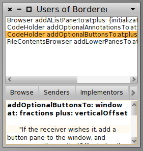
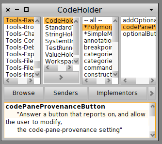

Igor, A suggestion: when you produce a "before" and an "after" picture, please use the same stuff so the differences are easier to compare. In the examples attached it is very hard to do so. -- Cesar Rabak Em 14/01/2011 09:50, Igor Stasenko < siguctua@gmail.com > escreveu: get rid of annoying 1-pixel height while line between buttons bar and text field. added padding at bottom of button bar, so it looks symmetric -- Best regards, Igor Stasenko AKA sig.
On 15 January 2011 01:49, <csrabak@bol.com.br> wrote:
Igor,
A suggestion: when you produce a "before" and an "after" picture, please use the same stuff so the differences are easier to compare.
In the examples attached it is very hard to do so.
yup.. i wanted to do 'before' , but was too lazy to take other image and take a screenshot there :)
-- Cesar Rabak
Em 14/01/2011 09:50, Igor Stasenko < siguctua@gmail.com > escreveu: get rid of annoying 1-pixel height while line between buttons bar and text field. added padding at bottom of button bar, so it looks symmetric
-- Best regards, Igor Stasenko AKA sig.
-- Best regards, Igor Stasenko AKA sig.
participants (2)
-
 csrabak@bol.com.br
 -
 Igor Stasenko